
The 'Find Content' form (formerly Administer > Content) has a prominent new place in Drupal 7. However, the form poses accessibility challenges. The filter form is composed of radio buttons and dropdowns that visually correspond for sighted users but there is no indication they correspond for screen-reader users.
JAWS reads the form like this:
Show only items where
list of one items definition list of one items nesting level one
radio button checked status
radio button not checked type
radio button not checked term is is
combo box published
combo box article
combo box accessibility
list end nesting level one
filter button
Upon encountering this form, screen-reader users may believe they have the option of using all 3 dropdowns. There is no indication of how the radio button works and that the radio button choice is activating only the one selected dropdown.
In addition, when users select a choice from any of the 3 dropdowns, the corresponding radio button is automatically checked but there is no indication of that in JAWS.
Attached is a possible alternative form. Does anyone see disadvantages to this design? An advantage for all users is that the form is simpler with no radio buttons and multiple filters can be applied in one step.
| Comment | File | Size | Author |
|---|---|---|---|
| #36 | node-filter-551034_v4.patch | 6.37 KB | bowersox |
| #17 | node-filter-551034_v3.patch | 7.67 KB | bowersox |
| #14 | node-filter-551034_v2.patch | 7.25 KB | bowersox |
| #13 | screenshot-111.png | 34.9 KB | mgifford |
| #13 | screenshot-112.png | 39.29 KB | mgifford |


Comments
Comment #1
bowersox CreditAttribution: bowersox commentedtagging
Comment #2
Everett Zufelt CreditAttribution: Everett Zufelt commented@brandonojc
Can you please provide a textual description of your proposed changes? Being a screen-reader user myself I can't assess the value of changes stored in a screen-shot only.
Comment #3
bowersox CreditAttribution: bowersox commented@Everett
The idea proposed is to eliminate the radio buttons from the Find Content filter. Instead we would keep the 3 dropdown select fields and add a visual label element for each. The dropdowns would each have an "all" value selected by default, in addition to their existing values ("published", "not published", and such). A user could pick from one or more than one of the dropdowns to choose filters, such as status = published and type = article and terms = all. The user would still click the Filter button to apply the filters. The rest would continue to work as it currently does.
Does that seem reasonable? Is there any functionality that is lost or any reason the radio buttons were needed?
Comment #4
annmcmeekin CreditAttribution: annmcmeekin commentedSubscribing
Comment #5
Everett Zufelt CreditAttribution: Everett Zufelt commented@Brandon
Your suggestion seems reasonable to me. Might be useful to get some input from usability folk in #drupal or #drupal-accessibility, or perhaps posting to g.d.o/usability to get some other perspectives.
Comment #6
Cliff CreditAttribution: Cliff commentedSo, Brandon, if I understand you correctly, JAWS would read your form something like this:
If so, other than perhaps changing "all" to "any" in the combo boxes, then this would be a significant improvement. The form would make more sense to anyone hearing it with JAWS and would work just as well as the current form for anyone who can see. In fact, it might work even better for people who can see but have cognitive disabilities.
I, for example, had a real "WTF?" moment when I first encountered that form. It kind of looks like I can pick something in column 1 (the radio buttons) and then select each of the three attributes in column 2 (the combo boxes) for the one thing I chose in column 1. I did figure it out before I clicked "Filter," but it made me think, and I hear that's not a good thing in Web design.
Your design, on the other hand, wouldn't have forced me to stop and think. I could have figured it out in one pass, and could have done a more sophisticated search.
I guess it's up to the code warriors to let us know whether that more sophisticated search would lead to performance problems. I don't know one way or the other, but it's the only potential drawback I can think of.
If I have misunderstood, please clarify.
Comment #7
bowersox CreditAttribution: bowersox commented@Cliff
Yes, your description is exactly what is proposed here. The 'WTF?' moment is what I'm hoping we can avoid.
Regarding performance, I don't believe there would be a performance issue because even the current interface allows you to build multiple filters (e.g., Status is Published and Status is Promoted and Type is Article and Tag is Accessibility).
Thanks for the feedback and for the suggestion about 'any' instead of 'all'!
Comment #8
Frank Ralf CreditAttribution: Frank Ralf commentedI agree with Cliff. This version is much better and more concise.
Comment #9
bowersox CreditAttribution: bowersox commentedPlease review the following patch. It is an initial version so it does not have tests updated yet. If we can review and finalize this, it will make a big usability and accessibility improvement for "Find Content".
Comment #11
Everett Zufelt CreditAttribution: Everett Zufelt commentedHaven't reviewed this patch, although I do like the concept. Wondering if this is something that can be worked on after code freeze?
Comment #12
bowersox CreditAttribution: bowersox commented@Everett
Yes, if you find out that we can make this change after code freeze that would be great. Otherwise I'll keep pushing to get it all done this week. It does change the visual interface on this screen, although not the API.
Comment #13
mgiffordI applied the patch. It worked well. I don't see any changes in the visuals of the site and have attached screen-shots. Just got to figure out where the tests are failing.
+1
Comment #14
bowersox CreditAttribution: bowersox commentedPlease review this updated patch. It now includes the updated tests and the visual layout is good in all core themes.
I tested Garland, Minnelli, Seven and Stark in Firefox 3.5, Safari 4, IE 6 and IE 7. If the community supports this change I think it will be good for accessibility and usability. I'm also willing to do a later patch to make the same change to the People page, and then we could remove the 'multiselect' CSS entirely.
Comment #15
bowersox CreditAttribution: bowersox commentedTo Test the patch:
If you want to get fancy:
Comment #16
mgifford+1 Patch applies nicely.
I tested the basic test by @brandonojc in FF, Opera, Safari & Chrome in the Mac. All looked good.
Did fancy tests just in FF. Found an error, but it's totally unrelated to the patch. By selecting blocked users here /admin/people I get this error:
But that's got nothing to do with this patch.
I think this is RTBC!
Comment #17
bowersox CreditAttribution: bowersox commentedThis patch is updated to keep 2 lines of code that are good safety checks. Here is the updated section of node_filter_form_submit:
Otherwise this patch is identical to #14.
Comment #18
bryan.cribbs CreditAttribution: bryan.cribbs commentedI had tested the previous version (#14), and just retested with the updated version (#17).
Worked as it ought to in my testing. Looks like the #17 update restored some important input cleansing from the original that was missing in patch #14, good catch! I looked over the other chunks of code touched by the patch, and based on my own review as well as that of others above, setting this to rtbc.
Comment #19
mgiffordOk, I've implemented this and tested it -- it is working fine, thanks for the additional safety checks!
Comment #20
Everett Zufelt CreditAttribution: Everett Zufelt commentedI applied the patch in #17 to a clean install of head. As far as accessibility goes this seems to work well. I think the list of currently applied filters may be more clearly understood if there was a better explanation "Currently applied filters". I also find it confusing that once I select a content type and apply a filter that I cannot select another content type, but I can select multiple published states.
None of these are show stoppers for me so +1 with minor reservations.
Comment #21
mgiffordI think these additional concerns and clarifications would benefit this piece of Drupal generally, however I think this is a new usability issue which should be opened in relation to this function.
Clearer explanations & ability to swap out content types would be good to fix (in a separate issue).
Comment #22
bowersox CreditAttribution: bowersox commentedThanks, everyone. I agree that those additional suggestions would make it even more user-friendly and we can work on that as a subsequent issue.
Comment #23
Cliff CreditAttribution: Cliff commented+1, guys. Great work!
Comment #24
heather CreditAttribution: heather commentedRemoving tag "needs usability review" since this is RTBC.
Hoping this one gets in ASAP.
I'm a sighted user, and I always found that visually confusing. Great accessibility and usability improvement.
Comment #25
Bojhan CreditAttribution: Bojhan commentedSorry, can anyone explain to me why its better. Did we change its behaviour? Because you can still only filter on one item? or? Maybe I have to apply the patch, but the screenshots should have made it clear - hence why we didn't removed the Need usability review.
Comment #26
heather CreditAttribution: heather commentedBojhan, I think you would need to be a JAWS user, or try to test with someone with vision impairments. As a sighted user, you don't see a big change in the functionality. See the posts above for the script of what is read out.
However it makes a change in the complexity of selection. I think it does simplify for a sighted user as well. Making it a two step process (drop down + click filter) rather than a 3 step process (click radio button, drop down, click filter).
It has exactly the same functionality, as you point out.
Comment #27
Frank Ralf CreditAttribution: Frank Ralf commentedI've just learned over at #467296: Accessibility improvements for vertical tabs about the following open source tools for testing accessibility with screen-readers:
hth
Frank
Comment #28
Cliff CreditAttribution: Cliff commented@Bojhan: As a usability and accessibility specialist, I can affirm that this patch does improve the interface for all users.
For these reasons, anyone who is not familiar with the existing interface would not be able to understand their options when first encountering it:
For example, it seems that you could choose to search for all items where "status" included "published," "article," and "accessibility."
No doubt at this point you're responding, "But that doesn't make any sense!" And you're absolutely right. In other words, the first impression you get from the layout of the interface is wrong, so you have to stop and figure it out again. Having to stop your work and figure out the interface is a classic indicator of poor usability. And because people who use screen readers hear at this point the indecipherable nonsense listed in the description of this issue, the existing interface offers poor accessibility.
Basically, the patch removes the radio buttons and adds the term "any" to each of the selection lists. As a result:
If I understand Everett in #20, the filtering on multiple parameters does not always work smoothly. Even so, that glitch is far less of a problem than either of the two problems solved by the patch, is a different issue, and can be solved later.
Comment #29
Bojhan CreditAttribution: Bojhan commented@Cliff Thanks for the in-depth explanation, I was really puzzled how this was any better. I think this is good to go then, I just tested it as well. Although I see certain improvements can be made in the interaction and labeling, that could and probably should be dealt with in a other issue
Comment #30
Everett Zufelt CreditAttribution: Everett Zufelt commentedWondering if there are other filters in D7 that could use the same modifications (user filter perhaps)?
Comment #31
bowersox CreditAttribution: bowersox commented@Everett, the only other filter like this in core is the People page (/admin/people). As a follow-up patch I intend to make the same modification on that page, and then we can remove a lot of dead unused CSS code. I am just waiting for this one to get committed in order to roll that second patch. Thanks, everyone, for the lively reviews and discussion to make sure we get this stuff right.
Comment #32
mgiffordThis was first RTBC now almost two months ago. - Bump!
Comment #33
bowersox CreditAttribution: bowersox commentedFYI, When this is committed I still plan to apply the same changes to the People page -- the only other "multiselect" form in Drupal, meaning it also uses a set of radios that correspond to dropdowns in an inaccessible way. Since that patch will depend on this one, I've been waiting for this to be committed to roll that one, but with the looming deadlines for Drupal 7 how should I proceed?
Comment #34
mgiffordI'm not really sure what to suggest. There have been 8 accessibility items sitting as RTBC in the Drupal 7 issue queue. I've commented on all of them since I had hoped that raising them to the top of the issue queue would help.
I'm not sure how to make them a priority for core. The lack of movement on these issues has really stalled the momentum that we had in August/September.
Comment #35
webchick@mgifford and others: Pursuant to the Drupal 7 development schedule, patches around API clean-ups and feature exceptions were given priority during the period from Drupalcon to Oct. 15 (later extended to Oct. 17). The next month (from now until Dec. 1) is where we focus on accessibility, usability, and performance. Hence why some of these have been sitting in the queue for awhile.
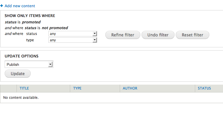
For those curious about what impact this patch has for sighted users, here are some screenshots:
Before:

After:

For those who didn't grow up playing a healthy dose of "spot the differences," the visible changes in this patch are:
1. Instead of the inactive filters showing "Where status is published" to indicate that you haven't selected anything yet, they now say "Where status is any."
2. Instead of a confusing radio button / combo box pair to select the filters, we now just use combo boxes.
3. Instead of the buttons saying "Undo", "Reset", etc. they now say "Undo filters", "Reset filters", etc.
The first two changes make total sense and make the form easier to use for everyone. #3, however, is a bit unfortunate, since the interface looks a whole lot more cluttered now with that extra word everywhere, and we traditionally do not add the subject of the verb next to button names in core (e.g. on node forms, it's "Save" and "Preview" not "Save Article" and "Preview Article").
Are those extended labels strictly necessary for accessibility, or can it be inferred that they're regarding the filters due to their proximity to the filter options?
Then, just a couple very minor things:
+++ modules/node/node.admin.inc 1 Sep 2009 16:56:10 -0000@@ -89,16 +90,30 @@ function node_filters() {
+ ) + node_type_get_names()
...
+ ) + $taxonomy
...
+ ) + $languages);
The last indexes of these arrays should end in a comma (silly but true).
Also, on that last one, the ); should be moved to the following line like we do with taxonomy and node types.
Otherwise, this looks good to go (though there's a mysterious class 'b' in there -- ugh! but that's not the fault of this patch). But, I'd love to revert the button name changes if we possibly can.
I'm on crack. Are you, too?
Comment #36
bowersox CreditAttribution: bowersox commented@webchick: thanks for the detailed review and for explaining the accessibility timeline. We're all eager to revive the push to make Drupal 7 the most accessible open source CMS ever!
Please review this updated patch. It differs from the prior patch #17 as follows:
Details about button names: Regarding the button names, I scrapped that in this patch as suggested. The original idea was to help screenreader users avoid confusion. For example, screenreader users might think that the 'Undo' button in the top part of the form would un-publish a set of nodes from the bottom part of the form. Screenreaders would read the buttons and fields in order but without the visual context. Nonetheless, there are fieldsets around the top and bottom so I think it will be accessible and usable. And if anyone wants to change the button names, they can use string overrides in settings.php or a contrib module.
Comment #37
webchickOk cool. Thanks, brandon! Let's get one final review from mgifford/Everett/Cliff/etc. about the kosherness of the button name revert, and then I think this is good to go.
Comment #38
mgiffordConsistency is a good thing in any system. I'm not opposed to this patch going in with the shorter button names. It's definitely a balancing act trying to accommodate all of Drupal's users.
If there is a compelling reason why this isn't sufficient I'm sure it will be brought up again. However, it's a big improvement with the latest patch.
I did want to test changing the button names around in a theme to see if that would be one option for people to consider. I just used a theme override in Seven's template.php:
This worked, except that I couldn't submit the reset button any more. Function node_filter_form_submit() searches specifically for the case 'Refine', so this isn't something that's easy to override.
I'm sure something could be worked into a companion accessibility module, but just wanted to point out this problem.
But please commit #36.
Comment #39
mgiffordI didn't mark this RTBC, sorry.
Comment #40
webchick@mgifford: That is true. I actually noticed that when I was reviewing the old patch. However, this is actually a bug with the way that this form submission is implemented for the filter form function, so not strictly related to this patch, which is more of a UI change. I filed a follow-up issue for that over at #621672: node_filter_form still uses old-style button name checking, if you're curious.
The only other thing I noticed is that CSS code like:
needs to be designated as something that gets flipped in right-to-left languages (Hebrew, Arabic, etc.) so we need to write this as:
And then put a mirror version of it in node-rtl.css.
So I made that fix and then committed this to HEAD. Great work, folks! :)
Do we need to open a separate issue to do this for user filters too?
Comment #41
mgiffordBrilliant! Thanks for letting me know about the new follow-up issue regarding the old-style button name checking. Also, appreciate that you caught & fixed the RTL issue. It's totally great to see how good Drupal core is with bi-directional content!
I'll open up a new issue for user filters. Seems like it could use some similar clarification in the interface.
Comment #42
Cliff CreditAttribution: Cliff commentedLet me just chime in here very late to say that you guys have done fantastic work without me. My guess is that the specific function of each button is clear from context, so I agree that we should be OK there.
Mike, please ping me about the user filter issue if you need my help and I don't find it soon.
Comment #43
mgiffordThanks cliff. I posted the issue here - http://drupal.org/node/622136
Need to craft up a patch though. Probably will need help with that!
Comment #45
drupalvino CreditAttribution: drupalvino commentedHi,
Im using drupal 7. In my case, I need to filter the contents by content type fields in admin>content.
Any idea about this. Is there any contributed module for this.
Plz guide me. Its very urgent.
Comment #46
Frank Ralf CreditAttribution: Frank Ralf commentedThis is a more than two year old already closed thread regarding a different topic. Please start a new thread. Thanks!