
 Support for Drupal 7 is ending on 5 January 2025—it’s time to migrate to Drupal 10! Learn about the many benefits of Drupal 10 and find migration tools in our resource center.
Problem/Motivation
Styles are defined with a label. We can group them to filter them.
But for users, picking a style means picking appearance. A label is disconnected from the WYSIWYG principle and sometimes picking a label to describe a Style is hard.
Proposed resolution
Display a style icon when picking a style.
We need to define though how we are displaying that icon. Tiny icons inside a drop down are unsatisfying. Do we need to create a grid for selection, similar to the Entity Browser?
Also the admin UI to choose a theme offers an overview with big image and details.
We NEED visual indication for everything.
Remaining tasks
User interface changes
API changes
Data model changes
| Comment | File | Size | Author |
|---|---|---|---|
| #20 | normal_p.txt | 937 bytes | johnchque |
| #20 | button_p.txt | 1.45 KB | johnchque |
| #20 | Screenshot from 2017-04-14 12-42-47.png | 4.64 KB | johnchque |
| #20 | Screenshot from 2017-04-14 12-42-29.png | 9.21 KB | johnchque |
| #6 | behavior-form-style.png | 17.21 KB | Ginovski |


Comments
Comment #2
Primsi CreditAttribution: Primsi at MD Systems GmbH for MD Systems GmbH commentedWe have similar questions in #2848116: Allow specifying icons representing grid layouts in yaml files. I was thinking about this a bit and:
Comment #3
Primsi CreditAttribution: Primsi at MD Systems GmbH for MD Systems GmbH commentedComment #4
Primsi CreditAttribution: Primsi at MD Systems GmbH for MD Systems GmbH commentedIf we use some small-enough icon we could use that in the closed display summary too.
Comment #5
johnchqueThe idea that came with the original grid layout(#2835795: Create a fixed equal width grid plugin) of displaying next to the select makes sense I would say. What if for styles adding a square with a letter on it would represent the style that will be applied. Like:
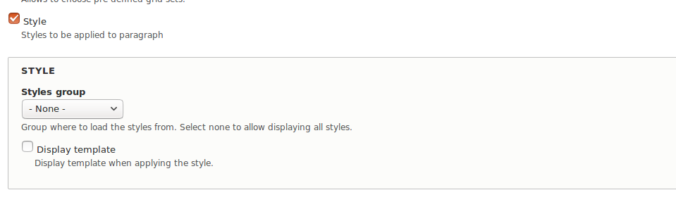
Comment #6
Ginovski CreditAttribution: Ginovski at MD Systems GmbH commentedProposal:
1. Checkbox in the configuration form (Display template) - for whether to show an image or not
2. Image in the behavior form defined with a path in the yml file.
Screenshots:

Configuration form:
Behavior form when adding style:

Comment #8
Ginovski CreditAttribution: Ginovski at MD Systems GmbH commentedComment #9
Primsi CreditAttribution: Primsi at MD Systems GmbH for MD Systems GmbH commentedThis was probably just a temporary name and path, but let's have those images named according to the style and put somewhere else. Not sure what the convention for images in modules, probably /images
Are we going to update this with ajax depending on the selection? That could work
On a general note, we have to keep in mind, that the ui is cluttered as it is now.
I am not sure if we really need this per paragraph type. Maybe we can make this configurable globally. See paragraph_collection.settings.yml
Comment #10
johnchquehmmm i was thinking on instead using images, we could generate dynamically the preview, so I mean, add the classes so it looks as it should.
Comment #11
Primsi CreditAttribution: Primsi at MD Systems GmbH for MD Systems GmbH commented@yongt9412 well that would be certainly nice, I am not sure though how complex this would be. There are a lot of elements that a style can affect. So we would have to generate markup that would cover a lot of cases. Having images sort of moves the responsibility to the style creator.
Comment #12
pivica CreditAttribution: pivica at MD Systems GmbH commented@yongt9412 cool idea but i think it's a way to big work. Lets not forget that some styles can be general and applied to lot of components or all of them and some can be more specific or very specific. If we have dependency information in Styles to what components they can be applied then we could do this, without that info its not possible - and i think we don't have this info for now? Even if we add this info in the future this will still be a fair amount of work to implement. Going with simple image is much faster for now.
Comment #13
johnchqueYeah, too much work for now, maybe later. :) Instead then, shouldn't we use a simple image file? maybe svg?
Comment #14
pivica CreditAttribution: pivica at MD Systems GmbH commentedYeah simple image file is OK. If we can create SVG vectors that would be better for sure because images can be scaled then.
Comment #15
pivica CreditAttribution: pivica at MD Systems GmbH commentedBut the problem with SVG is that Drupal file field support is not that good or something i think? I know we used that in couple of places and stuff like image styles does not work - which make sense its only when Drupal think it should apply image style to vector and then maybe mess can happen?
On the other hand if we are not using field for this for storage then it is fine. Are we using it or not?
Comment #16
Ginovski CreditAttribution: Ginovski at MD Systems GmbH commentedI found a jquery plugin which we can use, combobox (http://www.marghoobsuleman.com/jquery-image-dropdown)
We can use this for the dropdown (this plugin adds icons to the options) and display image additionally when selecting an option.
Comment #17
miro_dietikerI think the image drop down is too small inspace for the icon. We need a more icon centric selection area that is more a grid or horizontal slider.
If we use svg, we can skip server side scaling / image styles completely. The browser can handle the svg's very well and sizes are typically small. What is the problem with native svg output?
Comment #18
Primsi CreditAttribution: Primsi at MD Systems GmbH for MD Systems GmbH commentedWe could for starters just convert it to checkboxes and use images as labels (http://stackoverflow.com/questions/17541614/use-image-instead-of-radio-b...), so that we can move forward here. If this works fine we can use the same approach for grids.
One thing to keep in mind is that we now have #2861611: Display description when layout or style is selected, which helps to further explain a style or grid.
Comment #19
miro_dietiker@yongt9412 Many styles can be well represented by that box with background and text. And it would help a lot to do so.
To standardize showing an icon though simplifies a lot.
At least for our example styles, we should make an example with an icon that looks like you propose. It will take a minute to adapt that to other custom styles.
But some styles should contain a bit more information though. Such as font size, border.. Really not sure how to reduce these styles to a super compact icon. I was thinking about using an icon that has ratio 2:1 because summary is more wide. That could allow to use two squares representing different aspects of the style.
Comment #20
johnchqueJust did some testing to see if it would work. Also included the txt file (that ca be changed to svg). :)
Comment #21
miro_dietikerThe problem with #20 proposal is still it needs a lot of vertical space.
The first indicator should go into the drop down already and use as much vertical space as regular text.
So we can only work with some effects in horizontal direction.
I still think that we can provide something that allows a user to understand it better.
Alternatively, we need to switch the style selection away from the drop down to an image preview selection. Last time when we searched for some nice library that offers a UI component, we didn't succeed though.
Comment #22
miro_dietikerParagraphs now support displaying icons in the paragraph summary, provided by plugins.
Thus styles should be able to provide their icons.
Comment #23
miro_dietikerComment #24
miro_dietikerInterestingly, Varbase implements a visual indication for such behavior settings.
See the video at the linked issue.