
In #2497361: [meta] Fix issues found during UMN Usability Testing 2015, we noted that not a single participant was able to spot the "Edit" option on the far right of the toolbar:
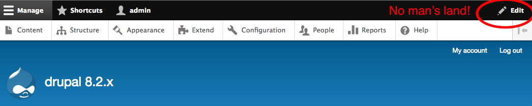
Need to work on making this more discoverable for people.
@tkoleary worked up a prototype that pushes Edit to the far left, styles it in blue, and replaces the far-right menu item with the User menu, which is a more standard thing to find in the upper-right corner of websites:

| Comment | File | Size | Author |
|---|---|---|---|
| Screen Shot 2016-07-07 at 12.27.20 AM.png | 31.55 KB | webchick | |
| Screen Shot 2016-07-07 at 12.33.16 AM.png | 43.34 KB | webchick |


Comments
Comment #2
webchickComment #3
webchickComment #4
Bojhan CreditAttribution: Bojhan as a volunteer and commentedSorry, but the design has changed significantly - the meta outlays more details then we could review up to this point. Some of the issues were raised during UX hours and/or the other issues but never resolved.
1) Is it always blue, or just when selected?
2) Does this hide the collapsible menu? (e.g. when Manage is open).
3) Are we changing the other tabs too? Or is this a one-off pattern?
4) Awesome, however does this mean you click on "account" and then still get the links on the left? or does it show on the right)
5) Lets move this to discussion. I am very doubtful user will understand that.
6) Whoaa, what? So pressing "quick edit" for inline editing you get the whole edit mode? But then one can't quickly switch between editing. This sounds debatable too, from a UX point of view you don't want to force users into modes - when its not actually needed. When you Quick edit from the front-end that does not imply you want to quick edit all the things, seems like unnecessary overhead and assuming a sequence of edits.
7) Does this overlap contrib provided trays? We might want to provide a very high z-index.
Comment #6
webchickThis issue ended up getting rolled into the implementation patch at #2753941: [Experimental] Create Outside In module MVP to provide block configuration in Off-Canvas tray and expand site edit mode.
Moving Bojhan's comments over to the parent meta.
Comment #7
webchickActually, let's do this instead.
Comment #8
webchickComment #9
tkoleary CreditAttribution: tkoleary at Acquia commented@bojhan
Given that the module is committed as experimental we should do some usability testing. Your list of questions is a good place to start for a test plan.
Comment #10
Bojhan CreditAttribution: Bojhan as a volunteer and commented@tkoleary It sucks we rarely can do in-person brainstorming. But can you make like a concept model. Of where all the different parts align and overlap, with scenarios/activities? I will gladly help form it - but it will do great to understand the space.
Comment #11
tkoleary CreditAttribution: tkoleary at Acquia commented@bojhan
Sure. I'll work on putting that together and share in UX weekly meeting.
Comment #13
tedbowThis issue seems like it was used for design by the UX team before the Settings Tray module was implemented. I think we have implemented the all of the most haves in this list.
This issue is listed a "must have" in #2762505: Introduce "outside in" quick edit pattern to core
I wanted to got through the points @Bojhan and update where things are currently
Move Quick Edit's "Edit" link to the far left of the Toolbar [required]CompletedWhen clicked, triggers Edit mode [required]CompletedStyle the button in blue/white [must have]Add "Quick Edit" to all contextual links that are editable; also triggers edit mode [required]CompletedWhen clicked, sidebar opens, showing the target's configuration [required]CompletedExcept nodes, which trigger the existing "quick edit" functionality without opening sidebar [required]CompletedAll contextual links which are *not* "Quick edit" get a "..." appended to them, to signify that they're going to take users away from the current page. [should have]duplicate from above in listFrom my reading the only ones left are "should haves".
#2754489: Move the "user" link to where most users expect it to be is actually in the toolbar module.
It would be great it we could either move this to a "should have" on #2762505: Introduce "outside in" quick edit pattern to core
because all the most haves here are done.
It also might make sense to close this issue and just create issues for the few remaining items.
Here are my answers to @Bojhan's questions as the module is currently implemented. My answers are bolded.
Also in "Edit Mode" you can edit anything in the toolbar tray. Also "Edit mode" is intended to stop you from leaving the current page by clicking on other links until you click "Editing" again to leave edit mode. In most cases the toolbar tray only has links to leave the page.
it DOES NOT trigger edit. This sounds it looks like what @Bojhan was saying would be better.
Comment #14
tedbowSwitching to outside_in.module component(Settings Tray module) probably wasn't available when issue was created.
Comment #15
Bojhan CreditAttribution: Bojhan as a volunteer and commented1) Is that not a deviation from how we treat other items? I know we are trying to make it shout, but this might conflict later on. I would rather not do that, but also leave it up to @tkoleary to decide.
2) Alright, makes sense!
3) see 1)
4) Lets at least discuss this in a follow-up?
5) I am unsure about the solution, so can we create a separate issue for this?
6) Could you clarify this some more, so when you go into edit mode, all items are editable?
7) Alright, great!
Comment #16
tedbow#13
@Bojhan in #15
This is being discussed here #2754489-15: Move the "user" link to where most users expect it to be
So I think that is good for the follow up.
RE: 5)
Follow up: #2877467: In edit mode add "..." or another visual marker for contextual links that will leave current page
RE 6) Clarifying
I am not really sure about the question so I will describe how Settings Tray's "Edit Mode" and "Inline Editing" provided QuickEdit module work together.
If not currently in "Edit Mode".
Clicking the "Quick Edit" link on the node(provided by Quick Edit module) then behaves the same as if Settings Tray was not enabled. "Edit Mode" from Settings Tray is not started
If you click "Quick Edit" on any other block besides "main content"(not the main node) then the configuration for the form will open in the Off-canvas tray and "Edit Mode" will be enabled.
If currently in "Edit Mode".
Clicking the "Quick Edit" link on the node(provided by Quick Edit module) will open "Inline Editing" of node but will not exit edit mode. It will close the Off-canvas tray though if it is currently open.
Also in "Edit mode" you can simply click any field in the node itself and it will open "Inline Editing" of node but will not exit edit mode. It will close the Off-canvas tray though if it is currently open.
Here is short video that shows how it works https://youtu.be/1StTDI0AQPA
Comment #17
Bojhan CreditAttribution: Bojhan as a volunteer and commentedRegarding 6) this clarifies it for me, its not seamless but also quite fine.
Lets close this issue in favor of the smaller followups.
Comment #18
tedbow@Bojhan thanks for taking another look at this issue!
Closing as "fixed" because all points are covered in other issues or were already implemented in the module
Comment #20
tedbowChanging to new settings_tray.module component. @drpal thanks for script help! :)