
 Support for Drupal 7 is ending on 5 January 2025—it’s time to migrate to Drupal 10! Learn about the many benefits of Drupal 10 and find migration tools in our resource center.
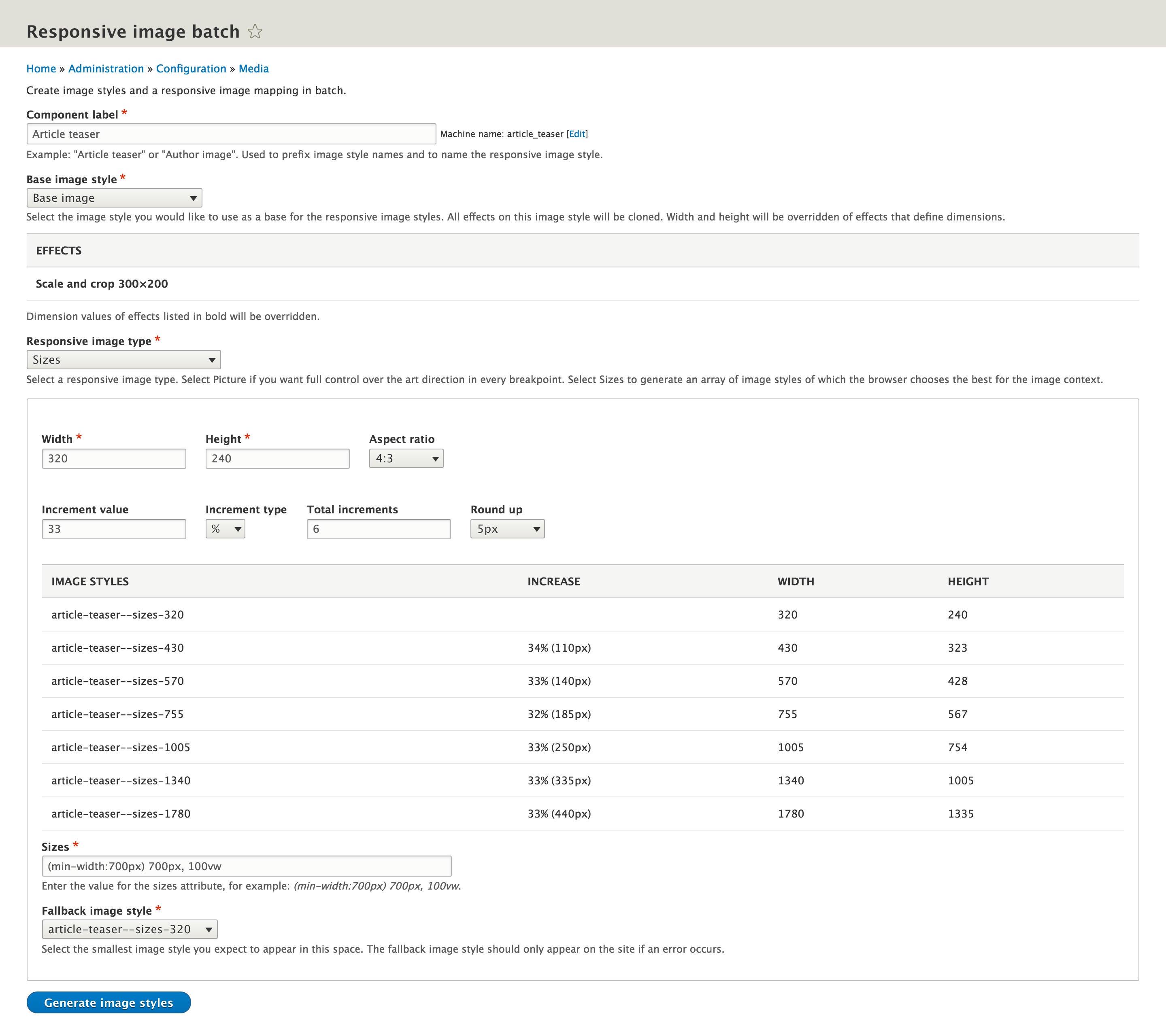
Currently this module supports creating responsive images using Sizes. I've created an interface where you fill out image dimensions for the smallest image plus the ability to increment by a value in percentage or pixels. This all works nice, but I'm still not sure if this is the best possible way to calculate Sizes. Maybe a more manual process is preferred, adding new rows (image styles) one by one which has a text field to fill out a width for each one individually? I'd love to hear some more ideas.
Current layout:

1) Increment number removed, and maximum width added. Increments until maximum width reached:

2) Simplified version with no custom height setting (only aspect ratio), and round up removed.

- Is the round up select field useful or clutter?
- The Width & Maximum width can also have a slider, but I don't think that's really necessary.
- Adding a 2x checkbox to account for 2x retina sounds appealing, but I don't know how to add it so it makes sense. If we add a 2x version of every image style, it would break the promise of the increment value. And if we would keep "Total increments", then it would break that promise too. Also, should we add an arbitrary 2x checkbox, while multiplier values are available through the Breakpoint settings? Maybe there's now 2x multiplier added to the settings, or maybe it has 1x, 1.5x, and 2x. What would we do then? Suggestions? I'd love to make it work if possible.
| Comment | File | Size | Author |
|---|---|---|---|
| #4 | responsive-image-batch-sizes-proposal2.jpg | 141.07 KB | Danny_Joris |
| #4 | responsive-image-batch-sizes-proposal.jpg | 194.3 KB | Danny_Joris |
| #4 | responsive-image-batch-sizes-current.jpg | 161.8 KB | Danny_Joris |


Comments
Comment #2
Danny_Joris CreditAttribution: Danny_Joris at Lullabot commentedComment #3
Danny_Joris CreditAttribution: Danny_Joris at Lullabot commentedComment #4
Danny_Joris CreditAttribution: Danny_Joris at Lullabot commented