
 Support for Drupal 7 is ending on 5 January 2025—it’s time to migrate to Drupal 10! Learn about the many benefits of Drupal 10 and find migration tools in our resource center.
Suggested commit message:
git commit -m 'Issue #2661128 by meichr, kannan@kiluvai.com, Pnoi, emma.maria: Bartik - Responsive menu-toggle shows up in show mode after switching from mobile to pad or desktop display'
Bartik theme has a responsible primary navigation built in with three display sizes for mobile, pad and desktop.
In mobile display either a "Show" or a "Hide" menu-toggle bar are being provided to show or hide the primary menu. These two bars are not needed in pad and desktop navigation display as the primary menu is always visible in those display sizes.
Brief steps to reproduce:
- Start on a small screen (Width < 461 px)
- Show the primary menu by using the toggle
- Enter a breakpoint 461px or wider by resizing browser, rotating device, etc.
The expected behaviour is that the menu toggle will not be displayed on wider viewports but it is still displayed if the menu was toggled open on a smaller viewport.
On small screens and tablets this can be a problem with different pixel widths for portrait and landscape display and when resizing windows on desktop.
Reproduction
I've used Firefox with built-in tool 'Responsive design view' to create screen shots using the mobile format 360x640px, but the bug hits anytime when the Bartik breakpoint of 461px is crossed by switching from portrait to landscape orientation or increasing the width of a browser window after the mobile menu has been opened.
You can reproduce the error easily on a freshly installed Drupal 8.1.x by the following steps:
- Step - Open firefox, turn on the 'Responsive design view' in the 'Tools=>Developer' menu, switch to 360x640px format (portrait) and open the freshly installed D8.1.x test site.

- Step - Click on the toggle-menu sign to open the menu (consisting only of the 'Home' link)

- Step - Click on the orientation button of the 'Responsive design view' tool to switch from portrait to landscape orientation
- Without the patch installed, you still see the "Hide - Main navigation" bar, although Bartik should have hidden it now.
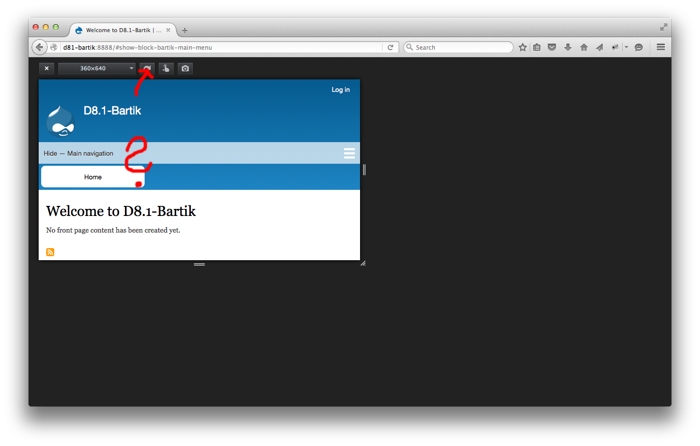
- With the patch installed, you will not see the "Hide - Main navigation" bar, as it is not needed in this display size of the responsive theme.

- Without the patch installed, you still see the "Hide - Main navigation" bar, although Bartik should have hidden it now.
Solution
Apply patch of first comment in this issue. Please make sure to clear the cache after applying the patch ('drush cr' or via UI).


Comments
Comment #2
meichr CreditAttribution: meichr as a volunteer commentedHere is a patch which adds two CSS selectors for hiding the "Hide - Main navigation" bar including the hamburger icon in pad and desktop display size.
Comment #3
dcrocks CreditAttribution: dcrocks as a volunteer commentedtest it
Comment #4
kannan@kiluvai.com CreditAttribution: kannan@kiluvai.com at Kiluvai Tech Solutions Private Limited commentedTested this in Chrome and firefox it was working good as specified, Test is done using developer toolbar.
Steps done for testing
Comment #5
star-szrThanks, assigning to @emma.maria to take a look. This could use screenshots as well.
Comment #6
kannan@kiluvai.com CreditAttribution: kannan@kiluvai.com at Kiluvai Tech Solutions Private Limited commentedAttaching screenshots
Comment #7
meichr CreditAttribution: meichr as a volunteer commentedThanks to DrupalConAsia2016, kannan@kiluvai.com and Cottser for evaluating this.
The error is still there in Drupal 8.1.x (March 19, 2016) and the patch of #1 still applies to Drupal 8.1.x without warnings or errors.
I hope the attached screenshots explain the problem and its reproduction more easily.
Edit: Moved the illustrated reproduction description to the top.
Comment #8
meichr CreditAttribution: meichr as a volunteer commentedComment #9
meichr CreditAttribution: meichr as a volunteer commentedTrying to clarify the title.
It appears emma.maria has been responsible during DrupalConAsia2016 sprints only, I hope I'm not bold removing her from the assignment. Please correct me and apologize, if I'm wrong.
Comment #10
meichr CreditAttribution: meichr as a volunteer commentedCorrecting title typo.
Comment #11
meichr CreditAttribution: meichr as a volunteer commentedGot it! emma.maria is one of the maintainers of the D8 core Bartik theme. Can't assign it back to her by myself, sorry.
Comment #12
meichr CreditAttribution: meichr as a volunteer commentedBug is also present in current Drupal-8.2.x-dev and can be corrected by the patch in #1 as well.
Comment #13
emma.mariaThe more pressing bug that I see here is that the text...
"Show - Main Navigation"
"Hide - Main Navigation"
... is always visible on the mobile menu bar.
Comment #14
dcrocks CreditAttribution: dcrocks as a volunteer commentedThis was changed in #2547639: Rename ambiguous "Menu" toggle in Bartik for accessibility, initially because of this:
2 menus in mobile display
Comment #15
emma.mariaOh! I was completely unaware of this issue. I'm normally flagged for Bartik changes.
Thank you @dcrocks!!!
Comment #16
emma.mariaCode review of #2.
Instead of repeating the styles within two separate media queries (tablet width and then the desktop width), we should just add a tablet and up media query for this code.
We are only targeting the mobile toggle, which has no further state changes above 461px.
For eg.
Comment #17
meichr CreditAttribution: meichr as a volunteer commentedComment #18
meichr CreditAttribution: meichr as a volunteer commentedThank you for reviewing my patch. That makes sense to reduce lines of code.
The new media query needs to be added at the end of primary-menu.css to overwrite the CSS in the display width smaller than 461px in bigger display sizes like tablet and desktop display. The new patch is attached here and applies at least to today's git code base in 8.1.x. I've named the patch according to How to create a Drupal patch using git., I hope that is good.
All the above screen shots still apply and I've not added a desktop screenshot to keep the length of this issue simple, but I tested it similarly by setting a desktop width like 1280 using the Firefox tools.
Comment #19
emma.mariaHi @meichr thanks for the patch.
Ignoring how the rest of the file is currently structured (it is in the process of being refactored here - #2502045: Replace the "Primary menu" component with a reusable component in Bartik.) please can you make the following amendments to the patch to help it pass Drupal CSS coding standards.
Can the comment be placed completely outside of the ruleset and be placed in a Doxygen comment style. The media query is helping to set a state onto the component (ie. the component is hidden when the screen are these dimensions) and we want the comment to explain the whole scenario of the code we are adding here.
See the coding standards for how to comment for a complete ruleset here:
https://www.drupal.org/node/1887862#multi-line-comments
Also to keep things succinct, the comment copy can be shortened to something like:
"Ensures that the open mobile menu hides when the screen dimensions become bigger than 461px."
If you feel it needs more to explain why we adding this style you can also add...
"- see *insert URL to this issue*"
at the end of the comment.
Thanks!
Comment #20
emma.mariaComment #21
meichr CreditAttribution: meichr as a volunteer commentedComment #22
meichr CreditAttribution: meichr as a volunteer commentedHi @emma.maria. Thanks for the time you take to help me getting more experienced and providing the link to the coding standards.
I understand from your remark, that because the new media query has only been created for one ruleset hiding the button that I move the comment explaining the hiding ruleset before the media query. Would there ever be another ruleset to be added to this same media query the existing comment then would have to be placed inside the media query before the hiding ruleset. I didn't find any specifics about such a case in the coding standards.
I've added the revised patch.
Regarding #2502045: Replace the "Primary menu" component with a reusable component in Bartik.: should this patch be worked into the current patch over there? Or do you plan to commit this patch individually to 8.1.x?
Thanks.
Comment #23
emma.mariaHi @meichr
We want to try and move away from everything being grouped by media queries. You lose the ease of seeing how a component is styled at different states if it's scattered throughout a file. Also not every component needs styles for every media query and it definitely becomes harder to maintain if you need to jump around the file looking for all the styles for one component.
We ideally want to have all of the code for a component grouped together in a file with each media query it uses.
For example.
So for the question....
If another component needs the same media query, we would add another media query declaration around that other component. Yes there will be duplicate media queries all over the file, but the organisation of the styles should be component first and not media query first.
Also answering...
Keep this work only in this issue. This bug issue will be committed before that bigger task and therefore this work will automatically end up in that issue from it being applied to the core codebase.
Thanks for the patch @meichr!
The last step is for someone apart from @meichr to add some review screenshots (showing the menu is now hidden at tablet and desktop widths) and set it to RTBC. I will do this later today if no one else does.
Comment #24
Pnoia CreditAttribution: Pnoia as a volunteer commentedI'll do the screenshots
Comment #25
Pnoia CreditAttribution: Pnoia as a volunteer commentedI followed steps in issue summary and things are resolved with patch from #22.
Comment #26
Pnoia CreditAttribution: Pnoia as a volunteer commentedComment #27
Pnoia CreditAttribution: Pnoia as a volunteer commentedComment #28
meichr CreditAttribution: meichr as a volunteer commentedThanks, @Pnoi !
Comment #29
emma.mariaThanks @Pnoi for the review!
Suggested commit message:
git commit -m 'Issue #2661128 by meichr, kannan@kiluvai.com, Pnoi, emma.maria: Bartik - Responsive menu-toggle shows up in show mode after switching from mobile to pad or desktop display'Comment #30
xjmSince this involves a visual bugfix to Bartik, tagging for RC target triage.
Comment #31
star-szrDiscussed with @xjm and we agreed that this is not a high impact bugfix (kind of an edge case and not really that broken/disruptive to users IMO even when the bug does happen), so removing from RC triage and moving to 8.2.x. https://www.drupal.org/core/d8-allowed-changes#rc
This took me a while to decode the issue summary and reproduce so I've updated it slightly, mostly tried to put a brief numbered list of steps to reproduce that I think sum up the bug here.
Sorry to have to push back on this but "bigger than 461px" doesn't seem accurate (it's actually 461px or wider, not 462 or wider). I think we should say something like "wider than 460px" or "461px or wider".
Comment #32
meichr CreditAttribution: meichr as a volunteer commentedThanks, @Cottser! Have updated the patch with the corrected remark.
Comment #33
emma.mariaComment #34
emma.mariaThe patch matches what was asked by @Cottser. I'm marking this RTBC again.
Comment #35
star-szrCommitted ae233ac and pushed to 8.2.x. Thanks!
Comment #37
emma.mariaWell done all!
Also I forgot to say a big thank you to @Cottser for the thorough review at #31!