
 Support for Drupal 7 is ending on 5 January 2025—it’s time to migrate to Drupal 10! Learn about the many benefits of Drupal 10 and find migration tools in our resource center.
Basic setup for Horizontal Grid using twitter bootstrap enabled themes.
This is a very basic setup for Bootstrap 2 (see comments below for Bootstrap 3), but should get you rolling fast.
- Edit view
- Set views format to "Responsive grid"
- Click format settings
- Set Number of columns to match the number of columns you would like (2, 3, 4, etc).
- Leave alignment set to default (horizontal).
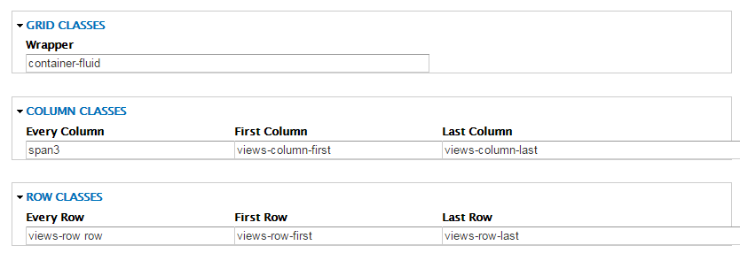
- Under grid classes, set wrapper to "container-fluid" (for a fluid grid).
- Under row classes, set to "views-row row". (This class "row" is necessary).
- Under column classes, set to one of the following: "span3" for 4 columns, "span6" for 2 columns, "span4" for 3 columns. (Number of columns should match step 1)
Other various setups are possible. Please read for more information: http://getbootstrap.com/2.3.2/scaffolding.html
See example of 4 column fluid grid in pictures.
*Sorry to the mods, not sure of the proper Category and Status for this "Issue". Just saw a few others struggling with getting this started so I thought a short post might be helpful.
| Comment | File | Size | Author |
|---|---|---|---|
| #5 | 4-Issue-font-dependent.png | 25.07 KB | JohnRofls |
| #5 | 3-Issue-no-occur-top-row.png | 26.2 KB | JohnRofls |
| #5 | 2-Issue.png | 21.81 KB | JohnRofls |
| #5 | 1-Normal.png | 21.11 KB | JohnRofls |


Comments
Comment #1
mach5_kel CreditAttribution: mach5_kel commentedEdited for clarity and grammar.
Comment #2
mach5_kel CreditAttribution: mach5_kel commentedComment #3
Marcela V. CreditAttribution: Marcela V. commentedHi,
I follow the steps but it didn't work for me: I just got a vertical list. So, I made a little change: I set "col-md-3" instead "span3" in Column Class. I tested it in Bootstrap and Bootstrap Business and now is working :)
Comment #4
torgosPizzaYes, it should be noted that the CSS classes in the original post appear to be for Bootstrap 2.3.2., whereas the Bootstrap framework is currently at 3.3.5..
Comment #5
JohnRofls CreditAttribution: JohnRofls as a volunteer commentedYes and there is little online documentation pointing to this need to use col-md-3, etc instead of span3.
I vote we add this little tid-bit to the module description as the current description is setting up people for failure.
Also, I've got this working except for one very bizarre issue which I'm not sure belongs as an issue for this module or is possibly a css / twitter bootstrap related issue..
From width 276 - 300 (nothing to do with breakpoints per say but rather because of the width of words on my view) the following happens. Picture 1 the grid is displayed as desired. In my Picture 2, we see the 5th item move to the 6th position and the 6th item move to what would be position 7. This is clearly because the "Request Content" becomes two lines long. Seems logical enough.
Then, something peculiar happens. Picture 3 shows that the second item text "Hosted Projects" becomes two lines and yet does not break the grid structure. So Font affects the responsive grid layout, but only sometimes? Which of course resolves itself when all words become two lines long.
It's the change between picture 2 and 3 that lead me to believe this is possibly an issue relevant to this module. Should I open this up as an issue for this module? Anyone got any advice?
Thanks.
Comment #6
sonicthoughts CreditAttribution: sonicthoughts as a volunteer commentednote in step 3: "Under grid classes, set wrapper to "container-fluid" (for a fluid grid)." Be careful as bootstrap 3 does not allow nestable containers. Bootstrap Theme probably has page in a container already. It may be necessary to clear the columns as per: http://www.bluthemes.com/blog/3/clearing-bootstrap-3-columns
Comment #7
henkit CreditAttribution: henkit as a volunteer commented#3 worked for me using bootstrap, thanks Marcela!
Comment #8
realgt CreditAttribution: realgt commentedFor anyone else who had a weird issue with grid spacing where it ends up with empty spaces, i had to add this to a custom css file.
Comment #9
mach5_kel CreditAttribution: mach5_kel commentedThanks for the updates to my original post everyone. At the time bootstrap 2 was more in full force, although 3 is now the norm. At the time I was a bootstrap newb. Bootstrap 4 has been announced and alpha is out :) . I will edit the OP, so no one has to scroll down here to find out which version.
Comment #10
mach5_kel CreditAttribution: mach5_kel commentedComment #12
kyletaylored CreditAttribution: kyletaylored as a volunteer and at LevelTen Interactive commentedI added a link in the README.txt to this issue.
Comment #14
knalstaaf CreditAttribution: knalstaaf commentedThis worked for me to avoid the gaps that are caused by the default row behaviour: