
Closed (fixed)
Project:
Drupal core
Version:
8.0.x-dev
Component:
toolbar.module
Priority:
Normal
Category:
Bug report
Assigned:
Unassigned
Issue tags:
Reporter:
Created:
26 Nov 2014 at 14:10 UTC
Updated:
15 Mar 2015 at 12:44 UTC
Jump to comment: Most recent, Most recent file

Comments
Comment #1
wim leersI pinged LewisNyman to get his feedback. While definitely inconsistent with Seven and different from Bartik in earlier versions (beta 3), I'm not sure how big a problem this really is. Are there actually users going to resize to such incredibly narrow sizes? (It's more narrow than 320px.)
Comment #2
tom verhaeghe commentedThere are quite a lot of mobile devices with tiny screens, e.g. Samsung Galaxy Mini (240x320), but there's more here :-)
Comment #3
wim leersFair enough :)
Comment #4
DickJohnson commentedComment #5
DickJohnson commentedOn howitshouldbe.mov it is shown that active menu should push content down. By current situation we don't have anything like that in core. It of course can be done like that, but guys like LewisNyman, emma.maria or WimLeers could throw their opinions around if this is the best approach. Also, if that is done, should it start from <601px instead of something below 320px.
Comment #6
lewisnymanIt should not push content down, but it makes sense for it to overlay 100% of the screen when the screen is so narrow that nothing useful can be shown.
Comment #7
DickJohnson commentedYup, that's exactly what I thought. Will add an patch today.
Comment #8
DickJohnson commentedOk. So on 608px both navigation and sidebars are hiddened by toolbar-menu for some pixles and at least for me there ux problems are starting, so decided to write the patch to 609px. Spend lot of time thinking between current height and between height: auto. Decided to go with current height so that the menu is taking control of the whole screen.
I think that there should be some discussion on the admin toolbar responsiveness generally as it's acting is quite weird.
Patch and few screenshots as attachments.


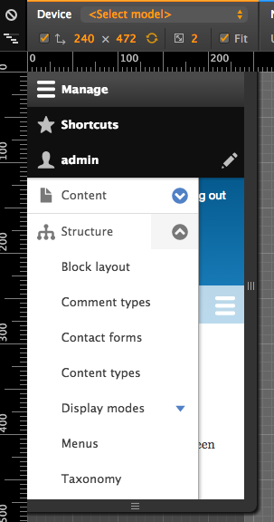
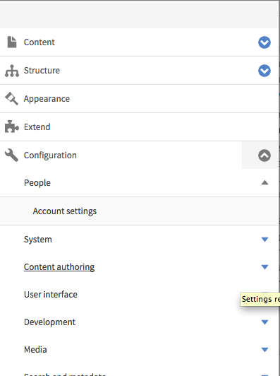
608px before and after:
263px before and after:


Comment #9
lewisnymanComment #11
DickJohnson commentedCSS -> SMACSS split made this patch to fail. Rerolling in few hours.
Comment #12
DickJohnson commentedNew patch around.
Comment #13
emma.mariaThis issue needs the following:
A Beta evaluation added to the issue summary.
A code review of the patch.
A visual review + screenshots to show what the patch affects.
Comment #14
emma.mariaWhilst reviewing this I noticed that actually the toolbar behaves the same in Seven and Bartik at head. See screenshots...
Therefore it does not make sense to add this just to Bartik, we would need to add it to each theme or it will be inconsistent. It makes sense to add this fix to the toolbar module. People now expect menus to be 100% width on mobile devices, and people will want this out the box for any theme default or contrib.
Moving to toolbar module, a new patch is needed, feel free to tell me otherwise :)
Comment #15
sabreena commentedFor narrow viewports, added 100% width for toolbar menu and making it generic by placing it in toolbar module.
Attaching screenshots and patch (toolbar-menu-for-narrow-viewports-2382561-15.patch).
Comment #16
aliyakhan commentedWidth looks perfect, however hover state require little work. Attached shots
Comment #17
aliyakhan commentedThe above thing has been fixed in other issue.Here's the link https://www.drupal.org/node/2409427
So it is good to go.
Comment #18
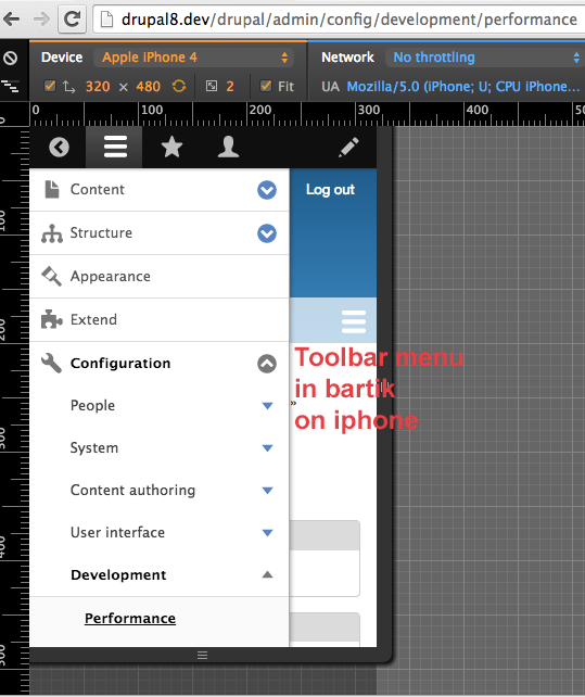
wim leersPlease see #1 & #2 — this was intended only for extremely narrow viewports!
We don't want this on e.g. iPhones.
Comment #19
lewisnymanHere are are undoing CSS that was already set somewhere else, the default width of a div is 100%.
See line 140 of toolbar.module.css:
If we wrap the width properties in a min-width media query then we wouldn't have to override it later. I think the value that Wim is looking for is
min-width: 321pxComment #20
aliyakhan commentedAs far as i understand it, @Wim @Lewis extremely narrow viewports is <320px where the toolbar should be of 100% width. And leave rest resolutions as it is? Also looks like 320px screen resolutions looks ok. Attached a shot. Will add patch accordingly.
Comment #21
wim leersI wrote #18 after having looked at the #15 screenshots, which show something else than #20. Confused now. Once there's a NR patch again, I'll test locally.
Comment #22
sabreena commented@Lewis - Wrapping the width properties in a min-width media query at line 140 in toolbar.module.css doesn't seem to be feasible for viewports < 264px. At this breakpoint toolbar-oriented class is removed, also if we add min-width media query as:
@media screen and (min-width: 320px) {
.toolbar-processed .toolbar-tray-vertical { width: 240px; width: 15rem; }
}
toolbar tray doesn't span 100% width below 264px by default.
Added a new patch for extremely narrow viewports as per #18.
Comment #23
sabreena commentedUpdated screenshots for viewport < 320px
Comment #24
sabreena commentedComment #25
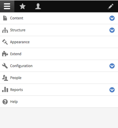
aliyakhan commentedIn case there no further enhancements required, On <320px toolbar expands to 100%.
Comment #26
wim leersLooks good :) Thanks!
Comment #27
alexpottCSS is not frozen in beta. Committed 02965ca and pushed to 8.0.x. Thanks!