
 Support for Drupal 7 is ending on 5 January 2025—it’s time to migrate to Drupal 10! Learn about the many benefits of Drupal 10 and find migration tools in our resource center.
By TOKY Branding + Design on
KSS Architects is a nationally recognized architecture firm with offices in Princeton, New Jersey and Philadelphia, Pennsylvania. KSS works with clients in the fields of education, culture, land development, urban development, and corporate environments.
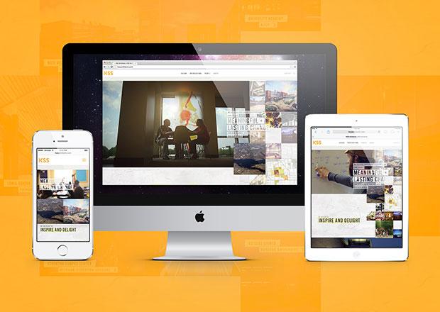
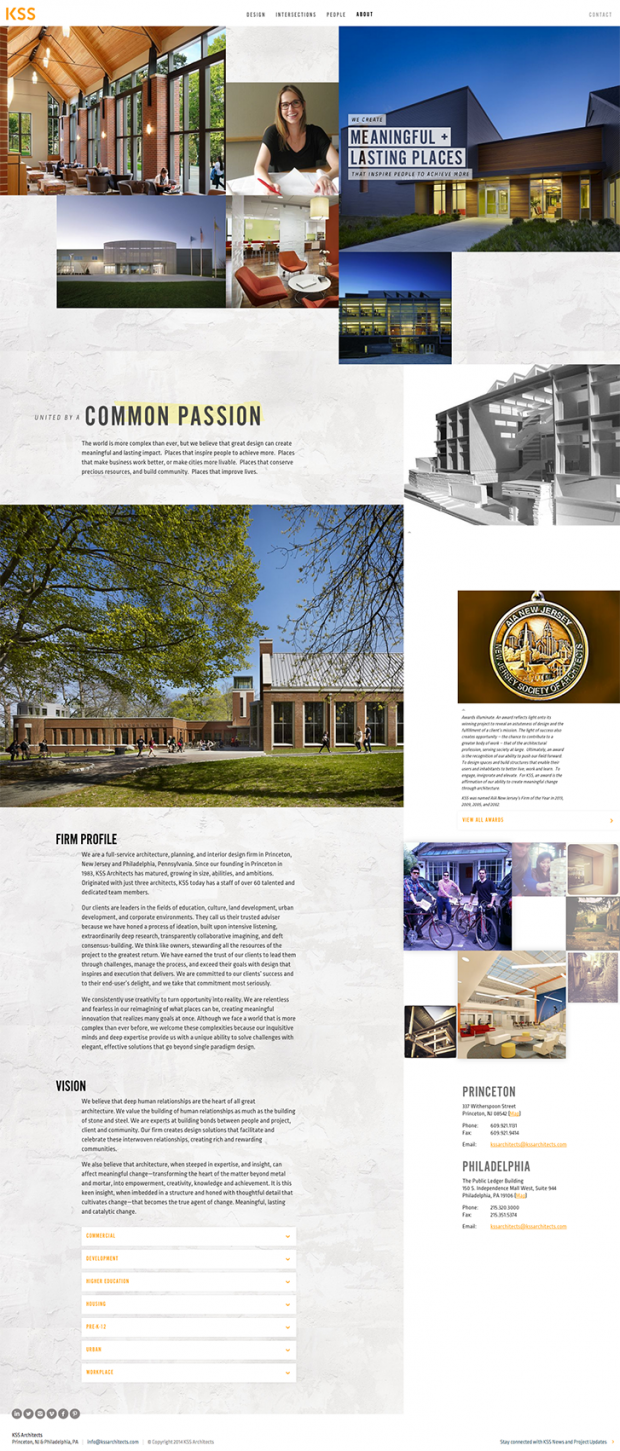
After completing brand strategy for KSS, TOKY Branding + Design created a website that would better showcase the architecture firm’s personality, process, and projects. TOKY specializes in Web and print work for clients in architecture, building, and design, as well as the arts, education, and premium consumer products.
Why Drupal was chosen:
Our site redesign called for content that is tied together in sophisticated ways — whether that means connecting one blog post to other related blog posts, individual bios to the People landing page, or projects to the Home Page. This requirement steered us toward Drupal because we knew that we could use the entity architecture to display content entities and relationships in ways that may not be easily accomplished in another CMS.
The original KSS site was built on a custom CMS that was both outdated and difficult to use. In order to fuel the site with a stream of fresh, relevant content, the client needed a more intuitive system. We knew that Drupal would allow members of their team to structure, categorize, and publish content quickly and easily.
Describe the project (goals, requirements and outcome):
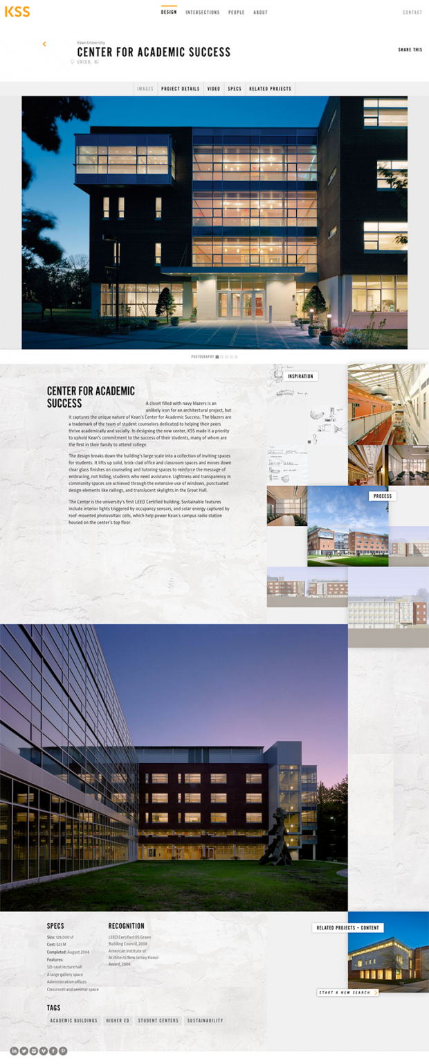
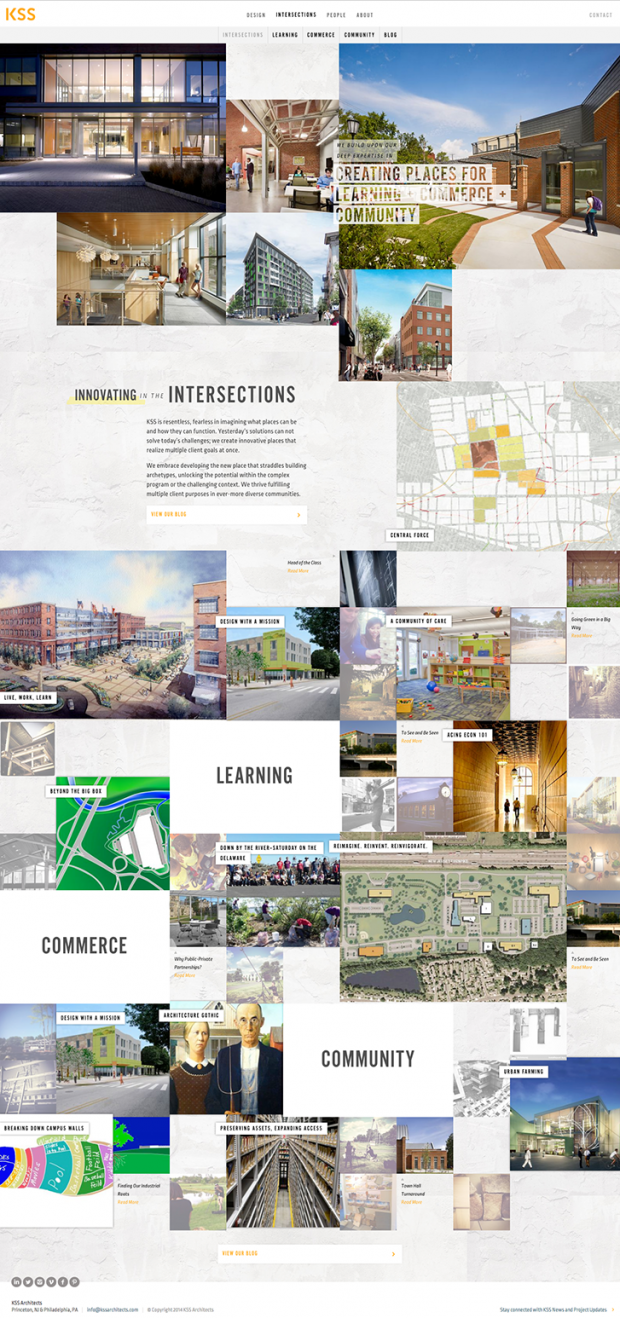
The primary goal of this project was to incorporate new brand messaging, identity, and social content into a website that would position KSS distinctly from other architecture firms. KSS prides itself on a deeply collaborative process, and TOKY looked for ways to articulate that differentiator online in a striking visual manner. To do this, we moved away from what has become the traditional image-focused architecture website model, and instead focused on the thinking behind the work. The Project pages pull in a variety of process-centric content, from sources of inspiration to sketches and progress shots. The People page was built to showcase the diverse range of personality, departments, and skill sets that intersect at KSS.
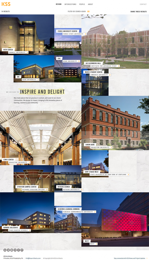
KSS thrives on complex projects that allow the team to harness expertise across different capabilities and industries. We used the Our Work page to highlight this differentiation. The page lets visitors filter projects according to both industry and capability, showing how their skill sets and specialities intersect to produce unique spaces.
Architecture firms are not typically perceived as the most social media-savvy, but TOKY saw an opportunity to fuel several different pages with visual social content. We integrated Instagram throughout the website, automatically pulling in the latest images from the @kssarchitects account. This allows the site content to remain fresh, without the client bearing the manual and frequent chore of collecting, sizing, and uploading images.
Development
In terms of development, this project took six months to complete. We used agile project management, and had milestones every two weeks to review and test specific sections of the site.
We faced many challenges while developing the theme layer of the website. The most difficult issue we encountered was the difference in how different browsers handle subpixel rendering: many newer browsers have subpixel rendering, older ones do not, and IE10+ simply rounds up when there are floating point numbers in CSS layout calculations. This was an issue since the design called for varying grids of pixel-perfect images to line up at any screen size. Our solution was to use JavaScript to ensure that all browsers behave the same way and simply round down. This caused the total grid width to either be wider or equivalent to the browser viewport. When the grid is too wide everything is wrapped in an element with overflow: hidden so that any extra pixels are cut off. This isn’t noticeable to the end user because only a handful of pixels are cut off. The end result is a pixel perfect layout no matter what device is being used.
Throughout the website there are Instagram photos from the @kssarchitects account. In many cases, such as the Home page, the Instagram photos are interwoven with page content, which requires a much more involved preprocess function than most sites require. In our theme files, the template_preprocess_node() and template_preprocess_views_view_unformatted() functions are very long because of the tedious rendering those functions handle. The basic process is to first load all of the most recent Instagram images, which are loaded externally via cron every few hours. Next, we iterate through the content loaded by Drupal, inserting the Instagram images at specific indexes. The outcome is a front-end that remains fresh with new Instagram content, and a less burdensome content management back-end for the site editors.
On the Home page, we incorporated a large looping video that needed to translate well to mobile. Since embedded video doesn’t play in the browser on devices like iPhones, we swapped to a GIF image for smaller screen sizes. This way desktop computers get a nice, longer video, while bandwidth-limited phones get a smaller GIF image with a similar user experience.
Technical specifications
Drupal version:
Drupal 7.x
Key modules/theme/distribution used:
Why these modules/theme/distribution were chosen:
The theme we created for KSS sits atop of a base theme TOKY built to combine our favorite parts of the Zen, Zentropy, Boron, and the Boilerplate themes.
Breakpoints (breakpoints): The complex design of the site necessitated nine different breakpoints, all with 2x multipliers for retina displays. This module, combined with the Picture module, provides the best possible image file for every device.
Campaign Monitor (campaignmonitor): KSS uses Campaign Monitor as their mail marketing hub. We used the module of the same name to integrate their account with email signups from the site’s footer.
Date Popup Authored (date_popup_authored): We knew blog posts would be future- and backdated, so we used the Date Popup Authored module to provide a better user experience when performing this action.
Entity Reference (entityreference): We used the Entity Reference module to connect and manage content across the site. Examples include blog posts associated with a person from the People page as the author, related blog posts on a blog post, and projects on the Home Page slideshow.
Field Collection (field_collection): Field Collections were used for faster site building so that components could be added to multiple content types, but be adjusted in just one location. We used the Field Collection module for expandable content areas, featured content, office locations, and many other groups of content.
Google Site Search (gss): After major search engines had enough time to index the new site, we added our own search functionality through Google’s Custom Search.
jQuery Update (jquery_update): Version v1.4.4 of jQuery, provided by Drupal core, was too old for the nine different jQuery plugins used throughout the site’s front-end. jQuery Update allows us to swap between v1.10 on the front-end and v1.4.4 on the back end so all progressive enhancements work as intended.
Maxlength (maxlength): Given the site’s complex design, some text areas needed to be restricted to a certain character count to avoid breaks or overlaps. We used the Maxlength module in these instances as a helpful reminder to the authors.
Media (media): The media module is the backbone for all media management throughout the site, from the slideshows to media added through the many TinyMCE WYSIYWGs.
MediaElement (mediaelement): We used MediaElement.js for our front-end solution to local audio and video file playback to ensure that this media would work on touch devices.
Menu Block (menu_block): Certain pages display second-level section navigation below the main navigation for easier browsing. We used the Menu Block module to make this possible.
Metatag (metatag): Along with allowing the client to fine tune their meta description and search-related information, we designed the site search results so that every page can have a featured search results thumbnail using <meta name="thumbnail" />.
Picture (picture): We created 19 different Picture mappings that are used throughout the site. Nearly all images use either a <picture> tag or an <img srcset> for the best possible display on all devices.
Taxonomy Display (taxonomy_display): We used Views to create the unique layout for blog filter displays, but found an issue with the way that the module converted a taxonomy name in a path argument to the correct taxonomy term. The Taxonomy module helped fix that issue by overriding the core taxonomy term page display with our View and allowing the paths to be handled by core.
Typogify (typogrify): The Typogify module helps to keep the site’s pesky dumb quotes under control and convert them to smart ones.
View Unpublished (view_unpublished): The View Unpublished module allowed the client to compose blog posts, projects, and other pages without publishing them immediately. The module also allowed them to have multiple contributors for the same piece of content.
Vocabulary Permissions Per Role (vppr): For finer control over taxonomy content management, we used the Vocabulary Permissions Per Role module so that site editors can add, delete, and edit taxonomy terms, but are not granted permission to change vocabularies.
Organizations involved:
Team members:
Project team:
Eric Thoelke, Executive Creative Director
Jay David, Interactive Creative Director
Melissa Allen, Senior Web Producer
Daniel Korte, Developer
Kathy Sprehe, Developer
Sectors:
Urban planning
