
There are two big problems with the accessibility of Bluecheese, especially for keyboard only users.
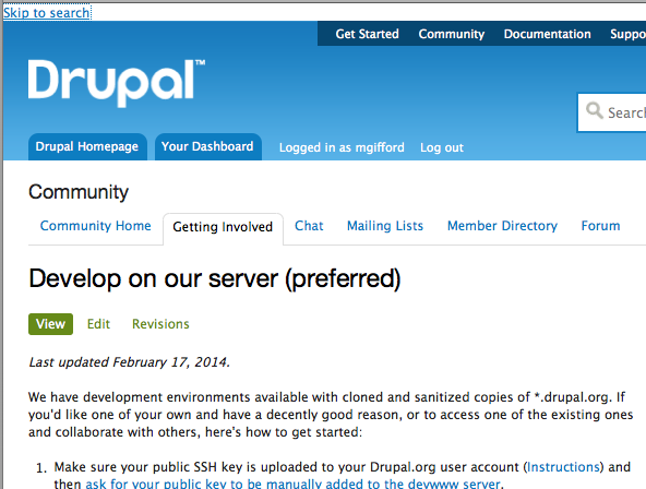
1) the Skip link is pretty small, hard to read and way out of the way. In this screenshot it's about as close as you can get to the content, but if your browser is wider, you just notice this ugly white bar at the top of the screen.
It looks way nicer and is way more effective in Bartik or Seven, so let's bring that over to Bluecheese.
2) Because of the structure of the page it is difficult to get the id="main" role="main" to include the Title, the main content & not he sidebars & other navigational elements.
When you tab to the main content it is distracting to loose the Title.
As Lucia Greco mentioned on Skype: "I do note that page has the main content about two lines to low. the h tag for the content is above the main content landmark"
I'm not sure the best way to fix this though without shifting around a lot of code in Bluecheese.
Somewhere in one of the threads I was reading in the last month or so there was also a discussion about that block and the space the Title occupies across the whole screen. I do think that needs to be re-thought, but not sure where that issue is situated.

| Comment | File | Size | Author |
|---|---|---|---|
| main-no-title.png | 168.55 KB | mgifford | |
| skip-link.png | 72.43 KB | mgifford |


Comments
Comment #1
mgiffordComment #2
opdaviesComment #6
drummThe new skip link styles have been deployed.