
If the Chart display format settings would allow for a 'Grouping field' to be set (like with display Table, Grid, etc), the rows of a view like this:
Uid | Month | Sales
001 | Jan     | $100
001 | Feb    | $200
001 | Mar    | $75
002 | Jan     | $50
002 | Feb    | $100
002 | Mar    | $25
Could be grouped as:
Uid | Month | Sales
001 | Jan      | $100
     | Feb     | $200
     | Mar     | $75
002 | Jan      | $50
     | Feb     | $100
     | Mar     | $25
and displayed as two lines in the same line chart. The output of the 'grouping field' could be used as the label in the legend.
| Comment | File | Size | Author |
|---|---|---|---|
| #11 | fix-grouping_2146927_11.patch | 2.58 KB | WorldFallz |
| #10 | fix-grouping_2146927_10.patch | 2.27 KB | WorldFallz |
| #7 | charts-grouping2.png | 19.74 KB | WorldFallz |
| #7 | charts-grouping1.png | 27.32 KB | WorldFallz |
| #6 | charts_grouping-2146927-6.patch | 9.49 KB | quicksketch |


Comments
Comment #1
haggins CreditAttribution: haggins commentedI need the same. Any idea for a workaround in the meantime?
Comment #2
herd45 CreditAttribution: herd45 commented+1
Comment #3
quicksketch@herd45 has contacted me about sponsoring this functionality. I'll be working on implementing it in the next few weeks.
Comment #4
quicksketchHi guys, I've contacted @herd45 in particular about this, but there is already "official" support for multiple series on the same chart, but it doesn't use the "grouping field" option within Views. Here's how to set up your charts for multiple series:
Hi @herd45, I wrote you an e-mail as well, but I'll elaborate here for posterity and for other people to reference.
Charts module already supports multiple-series charting through the "sub-chart" feature. You can use it by following these steps:
1. Make a chart on the first series you would like to graph, using line, point, or column charts using Views.
2. On the same view, add a new display of the type "sub-chart".
3. On this new display, in the middle column there is a setting for "Combine with parent chart" option. Set this to the first display you configured.
4. Change the options on this second display to make whatever differences you like. Usually to set up multiple series, this mean adjusting the filters to make the series include a different set of data.
5. While changing the options, you might also want to change the chart display settings to give this new series a different color. The combined settings of all subcharts will be included in the same legend.
I looked at adding the more typical "grouping" option to this module, but the additional overhead of grouping combined with the existing ability to have subcharts would make an already complicated Views-integration extremely difficult to follow (and therefor maintain). The only disadvantage of this sub-chart approach is that it can be a bit tedious if you have a large number of series to combine on a single chart.
Comment #5
quicksketchSorry in my explanations above when I said 'sub-chart' I meant 'Chart add-on'. Internally they're referred to as subcharts.
After communicating with @herd45 (whose sponsoring this feature) offline, I can understand there are situations where grouping fields are still a more desirable solution, especially when dealing with dynamic values.
So after re-evaluating this functionality and how charts work, I think I've come up with a solution that makes it so that grouping can be supported. There are a few limitations in place though:
- Only one level of grouping is supported. Views will let you sub-group, but in the case of charts I don't think that functionality makes sense or would be understood.
- Because when grouping you have an unknown number of resulting series, you can't assign colors to individual groups. Instead the chart-wide colors are used, just like it would for a pie chart.
- Grouping only works on dual-axis charts. Though a pie chart in theory could be bisected into a donut chart, not all libraries support donut charts and our API doesn't at this point either.
Please let me know if this option works as expected or if there are any obvious missing pieces.
Comment #6
quicksketchIn the above patch, there was an issue where a huge amount of NULL data would end up in the result when using Google charts due to labels being repeated for every row of data. This patch fixes the label display.
Comment #7
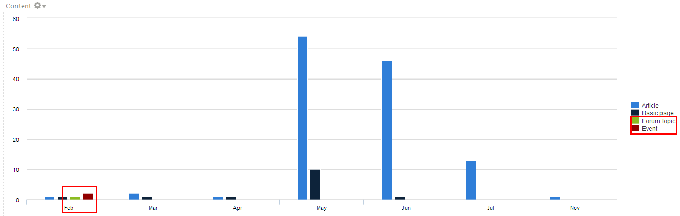
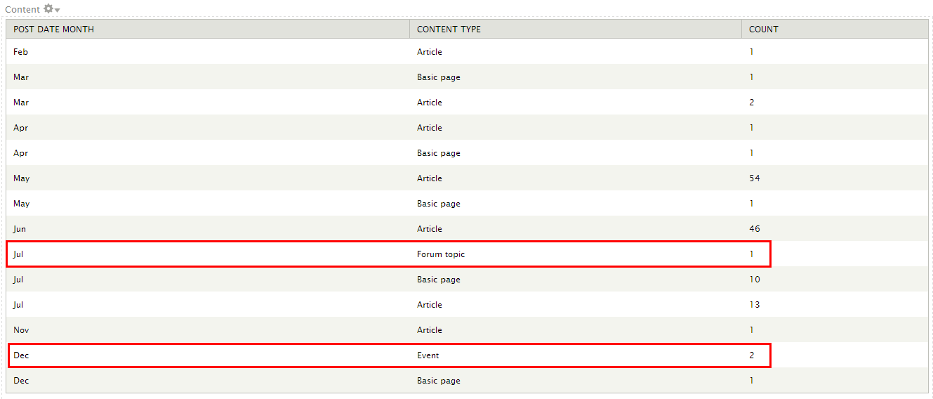
WorldFallz CreditAttribution: WorldFallz commentedTesting this out, it appears that the groups shift down to the first empty spot. It's probably easier to explain with some pix. I created a fresh site, enabled the forum module, created an event content type, and some dummy nodes. I then created a view to display the number of nodes grouped by month of post date (using views aggregation & views_date_format_sql) and content type.
1. In this screen cap of a simple table of the data, it's clear that the forum node was published in July and the event node in Dec:

2. A simple grouped column chart (grouping field set to "Content: Type", labels set to "Post date month", and data set to count of "Content: Nid") produces the following output.

The columns for the forum and events nodes have been shifted to february (the first empty positions) rather than their proper locations.
I'm working on trying to fix it (i believe it's the loop that generates the data at about line 248 of charts_plugin_style_chart.inc /
foreach ($data_set['rows'] as $result_number => $row) {)), but I just wanted to post this in case anyone else already has or stumbles upon it.Comment #8
WorldFallz CreditAttribution: WorldFallz commentedSeem the index for the row data should be tied to the series. So instead of:
it should be something like:
But that results in a blank chart.
Comment #9
WorldFallz CreditAttribution: WorldFallz commentedTurns out this problem actually already exists with rc1 when using the chart add-on method described above in #5 and happens with both google charts and highcharts.
[EDIT}
The patch at https://drupal.org/node/2052429#comment-8512211 fixes the issue when the series are combined with the add-on method. Now I just need to figure out something similar for the grouping method.
Comment #10
WorldFallz CreditAttribution: WorldFallz commentedOK, here's a patch against the latest 7.x-2.x that takes an approach similar to the one in the other thread linked above. Seems to work well so far. The next thing I'm going to do is try combining this with the continuous axis changes to see if there's any breakage.
Comment #11
WorldFallz CreditAttribution: WorldFallz commentedadded some error checking for which type of charts should get this handling. previous patch throws errors on charts to which it doesn't apply.
Comment #12
bsarchive CreditAttribution: bsarchive commented@WorldFallz did you get anywhere with combining this with the continuous axis patch?
Comment #13
Pierre.Vriens CreditAttribution: Pierre.Vriens commentedI think this issue should be considered for inclusion in 7.X-2.x release that I'm trying to get finalised. And it looks like @WorldFallz (hey there again!) did some great work together with @Quicksketch to address this issue. However I must admit that I don't feel comfortable enough (yet) with all the bits and bytes of the charts modules, to be 100% sure about these questions I ask myself:
Comment #14
Pierre.Vriens CreditAttribution: Pierre.Vriens commentedComment #15
jtblalock CreditAttribution: jtblalock commentedHey,
I'm new to drupal, but would really like the functionality mentioned in this issue. I tried to apply the patch from post #11, but it doesn't apply to 7.x-2.0-rc1 and I was worried that going back to a previous version might leave me with other bugs/issues. I'm not a php dev, but would help with testing if needed. Please let me know if I can do anything.