
Motivation:
- The current Druplicon logo was created in 2004 - 11 years ago.
- It's been removed from the drupal.org header, replaced with the new wordmark (But is lower down on the page).
- It's been removed from the drupal 8 installer but there is some intention to replace it in some way.
- It is no longer part of the drupal logo, and has become a community mascot.
- Concern has been expressed by many that the icon is dated and needs a refresh
Latest proposed solutions
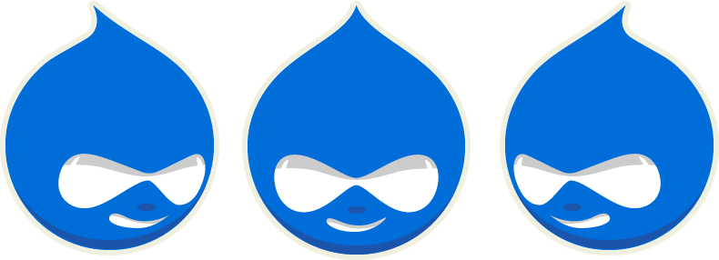
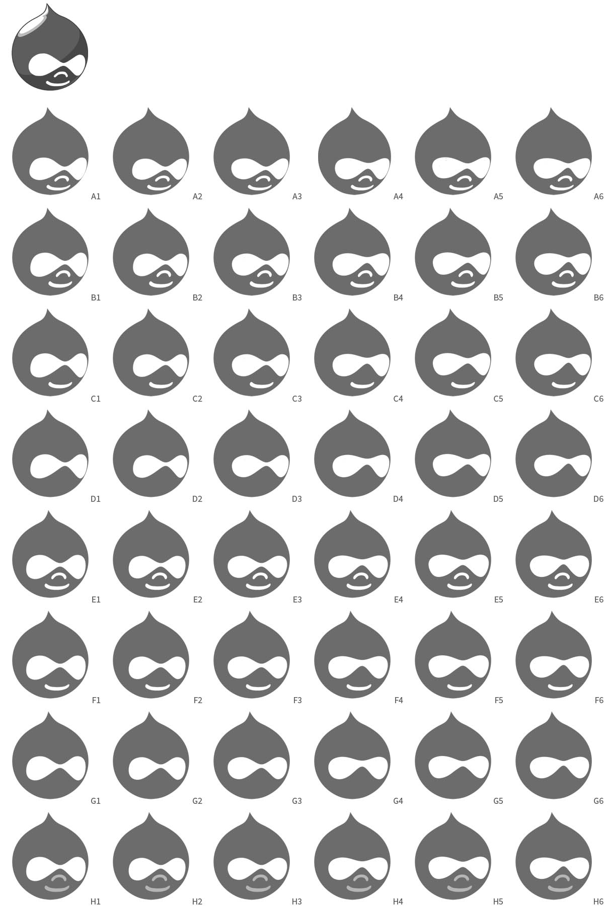
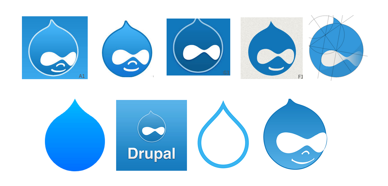
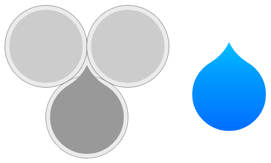
Version: Delta
Version: Echo

Other proposed solutions
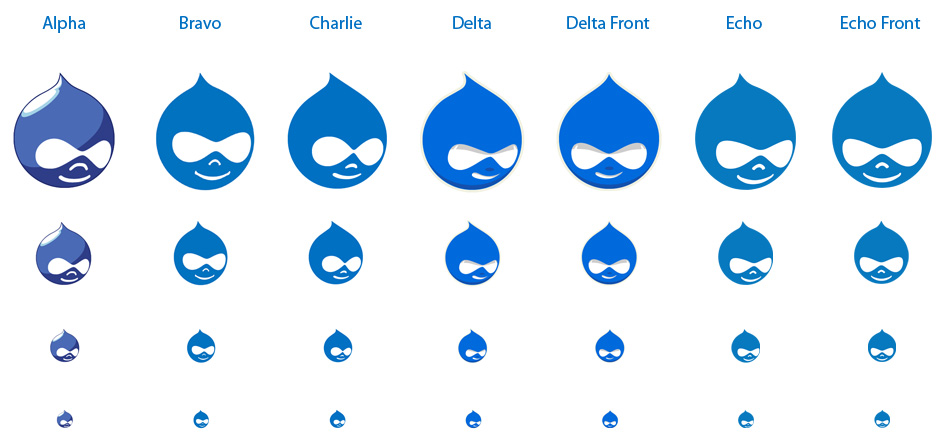
Named using the phonetic alphabet in the order they were created so it's easy to discuss:
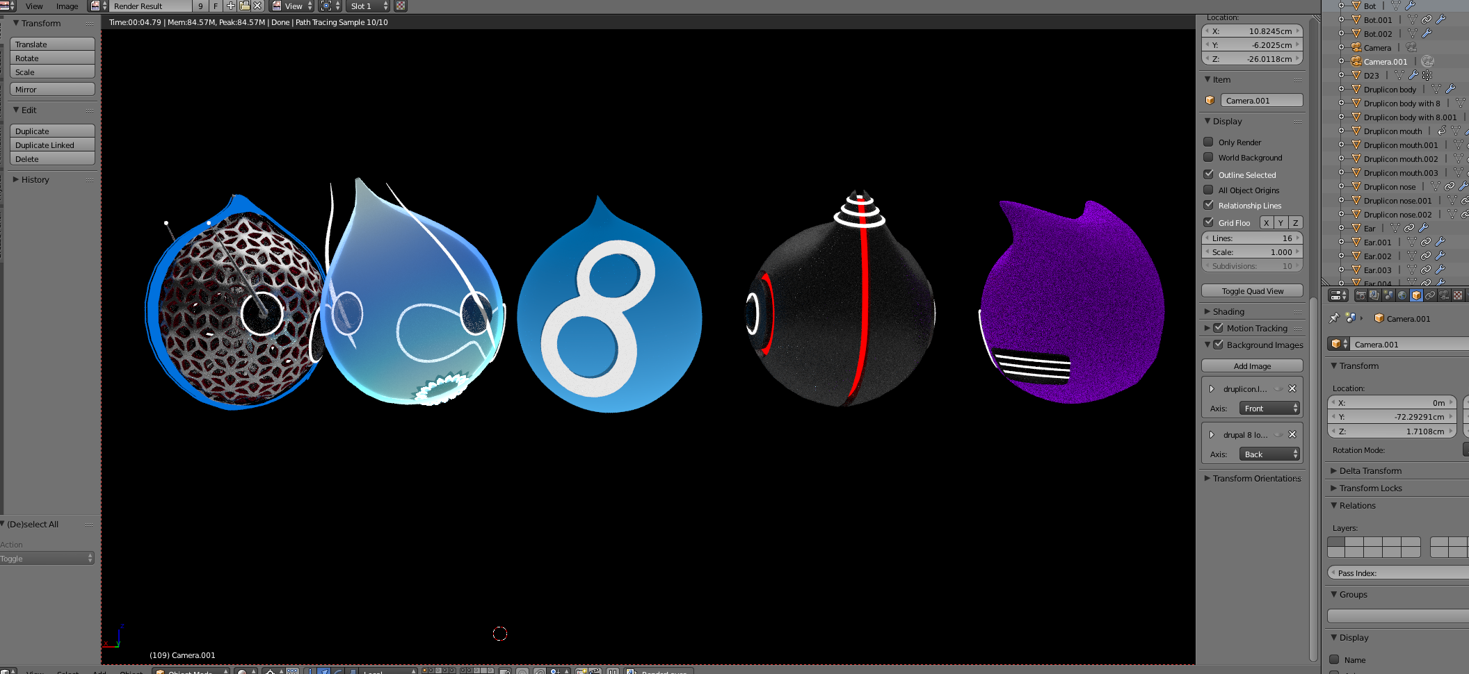
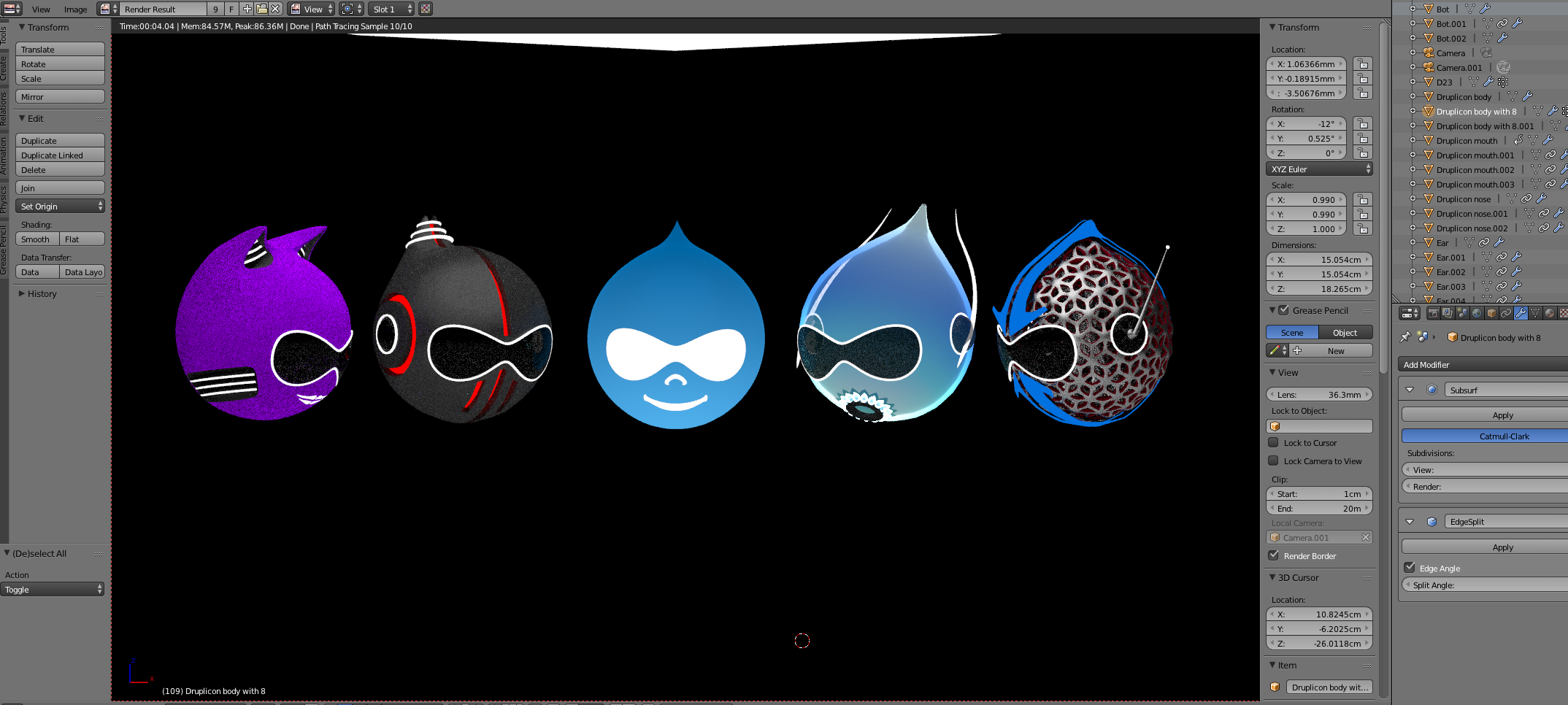
Here is a size comparison to compare how scalable the icon is, the sizes on the original graphic are 116px, 64px, 32px, 16px (favicon size) :
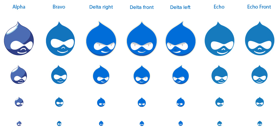
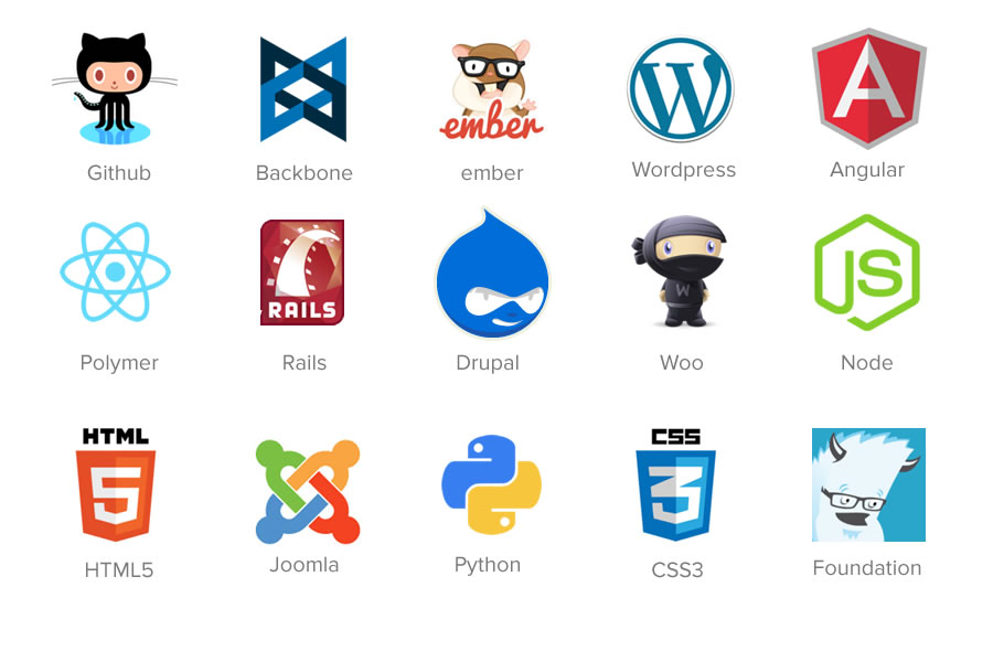
Here are all the proposed versions at the same size alongside other icons:
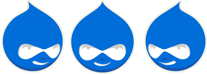
Alpha (the current 2004 druplicon)
![]()
Bravo
![]()
"Charlie" removed since Delta is an update of Charlie.
Delta

Delta Front

Echo
![]()
Echo Front
![]()
History of Druplicon: https://drupal.org/druplicon
Remaining Tasks
None.
| Task | Novice task? | Contributor instructions | Complete? |
|---|---|---|---|
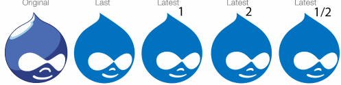
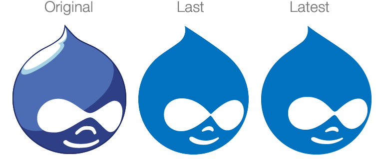
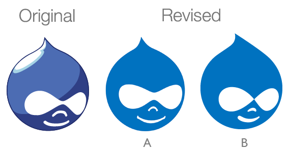
| Add comparison between original, revision A from Sept 2013 and revision B from Oct 2014. | @sphism | Done | |
| Update the image to move the eyes to the right as mentioned in #152 and #154 | @tkoleary | Done | |
| Decide how to make this official (closed: fixed) | Poll? or Dries decree? | ||
| Update the issue summary | Instructions | (done in #156) | |
| Embed before and after screenshots in the issue summary | Instructions | (done) |
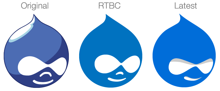
Comparison
[Needs new image]
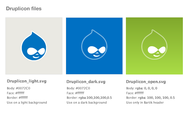
Available files
[Needs new image]
Appropriate color use
[Needs new image]
As it should appear in Bartik
[Needs new image]
| Comment | File | Size | Author |
|---|---|---|---|
| #402 | DrupalCon2023_Pittsburgh.png | 59.55 KB | Grevil |
| #402 | ddd.png | 46.57 KB | Grevil |
| #389 | Screenshot 2020-07-27 at 19.43.22.png | 4.15 KB | rfmarcelino |
| #386 | druplicon_2013_exploration_styles.jpg | 236.85 KB | sphism |
| #382 | druplicon_comparison--no-nose.jpg | 51.29 KB | Grienauer |


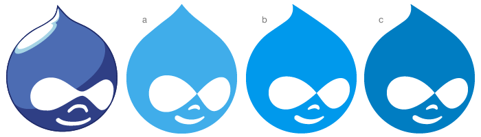
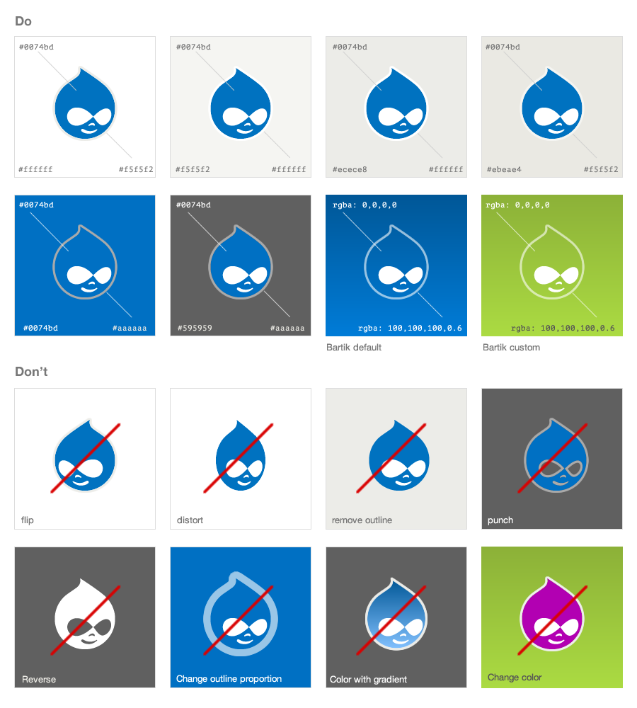
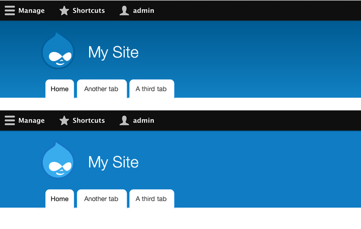
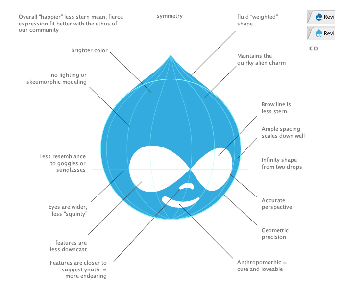
Comments
Comment #1
nod_And to avoid people stepping all over each others, keep in mind that the DA is working on something related: https://association.drupal.org/node/18263 I know it's about a logo and not the druplicon but consistency helps. So let's just keep that in mind and reach out whenever possible/required/beneficial.
Comment #4
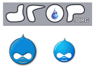
Gábor Hojtsy@chx: the current Druplicon is a result of several revisions of original Druplicons:
Saying the current one is *the* one is as valid as to say any of the older ones were the ones. We should have stayed with the smiley blue 3d drop from the O in drop all along? Where we fools to adapt?
(Aside: see also interesting and wildly changing font choices for the "Drupal" word through the years in http://www.slideshare.net/fgm-osinet/les-blocs-drupal-de-droporg-drupal-8)
Comment #5
Gábor HojtsyLOL, the status change was due to @chx's comment that he deleted.
Comment #6
sphism CreditAttribution: sphism commented@Gábor Hojtsy: thanks for posting the older druplicons, I'd not seen the Drop one before.
I didn't see chx' comment so I've no idea what your comment relates to.
Last year I made an attempt to revise the druplicon, keeping it as close to the current version as possible: http://matt-terry.com/articles/drupal-druplicon-2012
The reason I like using blender is that it allows us to show it from different angles easily, render different materials and do weird things like this: Druplicon 2012 screen saver
Does anyone have alink to any old conversations when the current version was created? I'd love to read peoples thoughts from back then to see the intentions behind it.
@nod_: Thanks for the link, that is very very interesting, I was hoping someone was working on this but couldn't find anything, I might just apply for that... hmm
Comment #7
Gábor Hojtsy@sphism: I'm not sure there even was a documented conversation about the logo directions back then, certainly less people felt they belonged to the logo, so it was definitely easier to experiment and adapt. If you click through Frederic's slides I linked, you'll see several font choices and color variants of the Druplicon even (eg. yellow) appearing in different stages of Drupal.
Comment #8
sphism CreditAttribution: sphism commented@Gábor Hojtsy: Yeah I just had a good look through all those slides, awesome stuff :)
Can you offer any insight into why druplicon has been somewhat abandoned in recent years?
It has always seemed odd to me how the logo seems to be neglected - for example when the d.o redesign happened the wordmark replaced the logo entirely, and now with the d8 installer the wordmark can't be used AND the logo has been removed, so there's no real branding left at all, sort of looks like a cheap imitation of drupal imo.
There's obviously huge resistance to any change, but i'm really keen to see if I can make some changes, even if they are only minor.
I'd also love to do some completely 'blue sky' drupal designs, but first things first ;)
Comment #9
Gábor HojtsyI think you summarised the reasons above pretty well in the issue summary. Many people believe the Druplicon is a good community mascot but not very professional or friendly for an "enterprise software" (also many people disagree). So it was made less important on the d.o front page in favor of the wordmark. The goals of the wordmark I believe were to have a Drupal logo that is "enterprise friendly" and "not freely modifiable" (compared to the Druplicon that is licensed under the GPL and is therefore free to change/adapt as people wish).
Here it is in Mark Boulton's words from http://web.archive.org/web/20100119002709/http://www.markboultondesign.c... (the URL itself is not accessible anymore):
You can dig through the web archive for Mark's other posts on the wordmark and drupal.org redesign, eg. http://www.markboultondesign.com/news/detail/initial_wordmark_designs/ and http://www.markboultondesign.com/news/detail/whats_in_a_wordmark/ with the Web Archive too.
Comment #10
elv CreditAttribution: elv commentedOh man, thank you for initiating this! I've been saying Druplicon needs an overhaul for years, but no time, blah blah… Here are a few thoughts on this topic.
- First, and probably most important: Druplicon is no longer Drupal's logo. It's been replaced by the wordmark (https://drupal.org/drupal-media-kit). It's not "sort of been pushed out of central drupal branding", it's officially out. It's now a mascot. It has also become a kind of symbol for the community and the people within it. And this is good news, first because as you explained with great detail it's outdated, and secondly it means we have a lot more freedom.
- There is still a lot of confusion between the logo (wordmark) and the mascot (Druplicon). Even in the official media kit some pages are a outdated and still show Druplicon as the logo. And hell! The favicon for Drupal.org is still Druplicon… No wonder that for many people Druplicon is still the logo. This could be a good opportunity to explain the difference clearly once and for all.
- As it's now a mascot, I don't think we need to limit its representation to just one image. It's a character, it should live it's life, it's not an untouchable historic piece of art in a museum.
For years people have adapted/transformed/butchered it for the better or the worse. Drupal Camp designers have shown great creativity, and should be able to keep doing this. I think my favorite is the reversed Druplicon / bee from Drupal Camp Manchester (https://camp2012.nwdrupal.org.uk/) :)
- I've always found the general shape awkward. A big circle with a tiny spike, it feels disproportionate to me, it's a difficult shape to work with, and quite frankly, I don't think the shape alone really looks like a drop.
I think we should drop (ha!) the old graphic entirely and create a modern looking character based on the same basic elements: drop shape, eyes, smile (we can skip the nose) with a different overall style. Not sure we should keep the infinite loop in the eyes because first it's in large part responsible for the nasty/malicious look, and secondly I think few people notice it.
* The general shape could look more like a drop
* It should be easier to draw and modify than today's Druplicon. Infinite loops are hard to nail!
* Not sure we need an official color
* Simple shapes FTW!
* Can we make it a kind of smiley, with different expressions?
- For what it's worth, here's a drop shape I created that has been used for several French Drupal Camps (like http://paris2013.drupalcamp.fr/ and http://paris2011.drupalcamp.fr/) and also for Drupal Design Camp / Frontend United graphics and t-shirts (http://www.flickr.com/photos/elv/9441041093/)
SVG file here: http://elv.free.fr/pub/drupal/drop.svg
Comment #11
Gábor HojtsyIMHO the infinity eyes is what makes it readily recognisable in any variation, no wonder @sphism kept that in all options in the OP.
From https://drupal.org/druplicon
Comment #12
sphism CreditAttribution: sphism commentedThanks Gábor that all makes for very interesting reading..
What I don't get is this: druplicon is GPL, that's fair enough, but can't there be other versions of druplicon that are trademarked and not GPL? Surely if you open source a blue droplet with eyes, that doesn't open source every variation there after. Couldn't you retain one for official use on d.o?
Also I don't understand how other software's distribute their official logo's with their GPL code.
Comment #13
Gábor HojtsyYeah well, I refrained from any statement as to whether I agree with the need for the wordmark or not, because I cannot tell really :D As for how other open source software deals with trademarking things, see a very public dispute documented at http://en.wikipedia.org/wiki/Mozilla_Corporation_software_rebranded_by_t...
Comment #14
sphism CreditAttribution: sphism commented@elv, sorry I missed your post earlier, I'll have a good read through it all now, thanks for getting involved
Comment #15
sphism CreditAttribution: sphism commented@elv: People may say it's no longer the logo, but it IS, it's not a mascot... It's far more recognisable than the Drupal wordmark, imagine if you wrote a different word in that 'typeface' no one would go "that's like the drupal logo", whereas all the crazy different versions of druplicon are still highly recognisable as being drupal related, and I agree that inverted bumble bee one is a great example. I think that's because druplicon is fundamentally a very good logo - granted it's dated, yadda yadda, but the essence is very sound i think.
For starters I'm coming at this with the intention of achieving something manageable... 'revise' the current logo, as much as I would love to redesign it completely I think there would be massive objections to it.
That's definitely a really nice droplet shape, and excellent for drupal camps and so on. Is there a semi-official set of assets for making drupal camp logos? I think it would be good if there was, not so much "these are the assets you have to use", more like "here's some helpful files to get you started, feel free to add more of your own"
I think the bare minimum for the drupal logo is a droplet, and the eyes. Personally I'm not too bothered if the eyes look like an infinity symbol or not, or that people look at it and think, "wow, must be infinitely flexible" but I think those 2 elements are what makes it a strong logo.
Now it may well be that a Drupal logo isn't actually druplicon the smiling droplet, but for now that's what i'm concerning myself with
Comment #16
elv CreditAttribution: elv commentedOkay, now I have a better understanding of what you're trying to achieve. Basically you want to keep the good ol' Druplicon people love but with a modern style, while I came here for the kill with the idea of creating something different :)
These approaches are not necessarily mutually exclusive though, so I'll follow the topic anyway and bring my ideas and sketches, as they will be a lot more useful here than in a corner of my brain. Whatever we end up with is good for the community.
Re/ the logo/wordmark distinction, well the Drupal Association and Mark Boulton decided the logo would be the wordmark, and so it is. I don't think our role is to fight this decision. On Drupal.org, on Drupalcon websites, on marketing material, t-shirts, stickers, you will only see the wordmark. Druplicon on the other hand is used a lot on the community side of things
Comment #17
Gábor HojtsyWell, in fact DrupalCons follow the good old logo variant model, although they did move more away from the actual Druplicon (no humanoid nature for the drop). But if you look at https://prague2013.drupal.org/ or https://portland2013.drupal.org/ the logo is derived from a drop shape. http://munich2012.drupal.org/ is actually truest to Druplicon from the recent examples, it includes it almost verbatim. There is no major use of the wordmark around Drupalcon sites that I can see.
Comment #18
sphism CreditAttribution: sphism commented@elv: All ideas are welcome
@gabor: yeah Drupalcon Munich definitely used Druplicon, and definitely did not use the Drupal wordmark at all, anywhere that I recall.
Question, how can the Drupal wordmark be the drupal logo if we can't use it in the Drupal software?
Comment #19
elv CreditAttribution: elv commented@gabor: True that, I typed a bit too fast! The wordmark is notably absent from Druplacon websites. It's for Drupal only. Drupalcons are apart.
Munich is a bit of an exception though, Drupalcons usually use a logo with a drop, but not the good'ol Druplicon. Copenhagen had more cartoony Druplicon variants that were in the same spirit, and I think before that one we have to go back in time to Szeged in 2008 for something as close to the original Druplicon.
@sphism: Yeah it's silly. And soon we will also have a Drupal 8 logo that will confuse people even more.
Comment #20
Gábor Hojtsy@elv: the Drupal 7 logo was a slight variation of the Drupal wordmark with a big 7. Mogdesign did this: http://mogdesign.eu/portfolio/drupal-7-branding it was used eg. to produce a special version of drupal.org's design to celebrate the occasion: https://drupal.org/drupal-7.0 - not sure if the Drupal 8 logo will be any far from the wordmark and/or the mascot :)
Comment #21
chx CreditAttribution: chx commentedWell, the installer issue after close to 200 comments have managed to get a solution which is the least recognizable Druplicon possible (at least the droplets had a recognizable shape). This issue will make sure that nowhere in Drupal 8 will have the Druplicon left. And that's good 'cos the code is not Drupal anymore either so why would be the looks?
Comment #22
Jsaylor CreditAttribution: Jsaylor commentedHi all, first of all great discussion! I would love to help however I can.
I wanted to address the Drupal 8 branding. From a brand identity standpoint, it makes sense to use the existing Drupal wordmark similar to the Drupal 7 treatment. As elv points out, departing from the Drupal wordmark would cause confusion. I also wanted to make sure to communicate that the Druplicon is not within the scope of the launch work we're doing with Drupal 8, so any update to the Druplicon can happen separately at a different pace, and as the group here sees fit.
As this discussion highlights, there is probably a broader discussion and subsequent documentation that should happen at some point that clearly and officially defines the role of the Druplicon (mascot vs. official logo, etc.) and the Drupal wordmark.
I'm looking forward to following the discussion here and, again, helping however I can. Cheers.
Joe Saylor
Membership and Marcomm Manager
Drupal Association
jsaylor@association.drupal.org
Comment #23
sphism CreditAttribution: sphism commentedHey Chx: that's the exact opposite of my intentions here, and as I hope you noticed in the Drupal 8 installer thread that I'm actually very keen to see Druplicon in the installer, and not just as a drip, or as a swooshy backdrop, but as a logo.
I believe that part of the reason, maybe even most of the reason that Druplicon has been abandoned over recent years is that the graphic hasn't been updated in a long time, how many companies still use their logo from 2004? So my aim is to revise the graphic, not to kill off Druplicon.
I've been very careful to produce a set of variations which are very true to the current version, I'm not saying we have to ditch the nose and mouth, I'm saying that from a graphical logo designers perspective the essential elements are the eyes and body shape.
I'm also putting forward the idea that the eyes on the current logo aren't actually symmetrical in 3d, and they are a bit of a funky shape at the bottom, so let's make it a little better.
The highlights can go back in, I just didn't want to complicated the proposed 'shapes'.
Comment #24
webchickFWIW, I'm totally supportive of this kind of design exploration. 2004 was a mighty long time ago.
Comment #25
Gábor HojtsyDrupalCamp Leuven is a great example where they took the infinity eyes at heart :)
Also references to the drop on the site, but never both at the same time :D http://leuven2013.drupalcamp.be/
Comment #26
sphism CreditAttribution: sphism commentedYeah, nice, it would be great to have some guidelines for different ways to use certain graphic elements. I know the whole gpl Druplicon thing means anyone can do anything they like with it, but maybe we can help people do really cool things with it.
i spent the day yesterday having a think about the Druplicon eye's, infinity, and the number 8 ;) but that's for another thread (very tricky to get anything along those lines to look good, but I did manage to use a moebius strip to form the infinity eyes and make a droplet shape in the figure 8, which was nice)
I used to work for a big company who would refresh their graphics monthly! It doesn't necessarily dilute a brand, it can just as easily portray a vibrant, flexible, multifaceted brand...
All food for thought
Comment #27
pounardRotate Druplicon by 90° (any way) and you have a nice logo for Drupal 8 :D
Comment #28
iSoLate CreditAttribution: iSoLate commentedNice! comment #25... that logo just has to be it!
Comment #29
sphism CreditAttribution: sphism commentedThis is probably better suited to a different thread but here's something I've been playing with, not for the main druplicon, more a thought from Drupal 8
It's kinda hard to see what shape it is from only one angle, but it's kinda like a Pringles chip (a circle from one side, and a sine wave from another)
If you follow one side around you'll see it's a moebius as well.
Looking at it from this angle you get a nice figure 8, which is very much the in the form of infinity, and very similar to the druplicon eyes, and within the bottom loop you have a sort of drupal droplet.
Now it's now as good as it could be, but is it a shape worth exploring more?
Comment #30
Gábor HojtsyYou may want to explore that and submit at https://association.drupal.org/node/18263 ? :)
Comment #31
sphism CreditAttribution: sphism commented@Gabor: Yeah I had a skype call with Joe regarding drupal 8 the other day, and then sketched out this idea after that :)
Comment #32
yoroy CreditAttribution: yoroy commentedGood concept sphishm, definately worth exploring further.
Comment #33
mortendk CreditAttribution: mortendk commentedyup +1000 for this :)
what i would like to was going 2 ways in the future:
0. kill the old druplicon - its out vintage version & we can all love it going retro like the apple logos with the colored stripes in it.
1. Make our mascot a real mascot.
- if the Drop is alive n well, well lets give it. hats n mustards, wands, lip, wigs whatever on - so it can turn into a fun character we can use for whatever - think TUX with a cowboy hat. We tried to do that around DrupalCon cph 3 years ago. It worked out pretty good as a gimmick thing.
We have had a ton of request of reuse of em later on.
2. Make a more simplyfied version of a drop.
aka Something that will work in a 16 x 16 px version (yes the favicon) - i think that elv's simplyfied drop is pretty much spot on. Its clean its reusable can be done in many versions & keeps the feel of a Drop alive.
Should we call a BOF for next week in Prague ? ;)
Comment #34
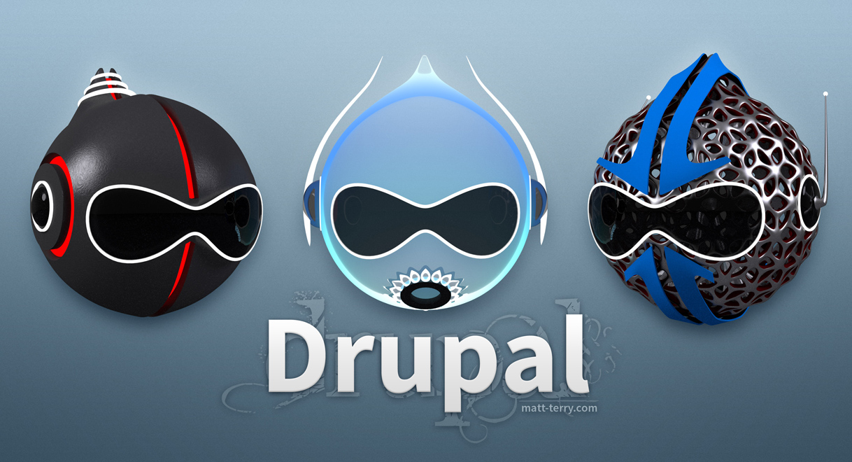
sphism CreditAttribution: sphism commentedRenegade Drupal 8 Logo - Community Edition :) http://bit.ly/184PwzK
Comment #35
sphism CreditAttribution: sphism commentedHere's the Renegade Drupal logo, which is the first in a series I'm planning, here are some thoughts behind it:
Comment #36
klonos...you are kidding. Right?
Comment #37
sphism CreditAttribution: sphism commented@klonos: for the lulz ;)
Rebellion is in the air this Friday 13th...
Comment #38
jbrown CreditAttribution: jbrown commentedRenegade Druplicon is spectacular!
I've never seen the Druplicon for 7 in #37. Is it new, or has it been around for a while?
Comment #39
sphism CreditAttribution: sphism commented@jbrown: Thanks :) That drupal 7 druplicon is the one I made a year or so ago:
Drupal Druplicon 2012
and a little video thing to go with it, it was intended for use at the beginning of the drupalcon sessions.
Druplicon 2012 Slogan Screensaver
Comment #40
jbrown CreditAttribution: jbrown commentedIs it possible to render these 3D Druplicons as SVG?
Comment #41
sphism CreditAttribution: sphism commentedI've been looking into that. They are made in Blender, which has just added an awesome render engine called Freestyle which lets you render nice sketchy graphics and it seems that there's some ways coming out imminently to render Freestyle as SVG - http://www.geocities.jp/blenderyard/freestyle/svgwriter_b26/README.html
wow, geocities - that's a blast from the past.
However. I have managed to output very flat graphics from blender which are very very easy to turn into svg ( egrender out the body and face separately as transparent pngs, then convert )
Also there's a whole load of post processing you can do in Blender, it may be possible to use the Compositor to convert to SVG
edit: more details about rendering Blender Freestyle SVG: http://blenderartists.org/forum/showthread.php?89986-Freestyle-for-Blend...
Comment #42
sphism CreditAttribution: sphism commentedJust realised this graphic never made it onto this thread.
This is the 2012 druplicon 3d model rendered in Blender in a very flat, svg style which I could easily convert to svg, and it's just 2 2 simple shapes which is nice.
Obviously we could have the nose and mouth as well...
Comment #43
Shoseki CreditAttribution: Shoseki commentedHave to say, am loving the approach Sphism is taking - whilst the specific logo rendering might not be to everyones' taste, the fact that it has been generated as part of a blender model - render workflow gives it a ton of flexibility, a bit like how most modern cartoons/anime use 3D modelling with cell shading etc to produce cartoons that still work in 3D (Simpsons/Futurama/South Park/Family Guy etc)
If you don't like the particular rendering, you could change the angle somewhat, and it is still the same mascot.
Not only that, but if the mascot model were made public domain, along with Blender being Open Source, it means that any individual, public organisation or company could hire a 3D animator to produce their own logos incorporating the Druplicon without distorting it or breaking character, further solidifying it.
Just think - the Brits colonised lots of things through the identity of the British Flag, incorporating it into the corners of many other flags. This was quite a successful strategy in building image and lasts to this day.
Comment #44
Crell CreditAttribution: Crell commentedThat's the first time I've seen the "Drupal 7 3D" version from #37. I love it. :-)
Comment #45
sphism CreditAttribution: sphism commented@crell: Awesome, I assumed everyone had seen it for some reason. I rendered it up a bit differently recently, with less reflective eyes, more solid white. Looked really nice.
I'm going to do some more work tonight on druplicon. I could either;
Or something else, what do you wanna see?
I think the fireball druplicon would come out really nicely, blender has an really nice new smoke & fire physics simulator... which i may use
Comment #46
klonosI like #42, but for the rest versions as a logo ...you gotta be kidding. I mean, I like the story behind how the Renegade version came to be with the complex framework etc. It is really cool and all and the 3d version, but they are not "proper" for a logo IMO. We need something that resembles a favicon/desktop icon and more style-wise like for example the icons of google chrome, google earth, skype or viber etc.
#42 is closer to what I imagine for a Drupal logo.
Comment #47
pounardAgree with with #46, I prefer something like #10, clean, pure, and cleaner in small resolutions (favicon for example). Still the #37 is an awesome piece of work, congrats!
Comment #48
echoz CreditAttribution: echoz commented@sphism I like your work, you are obviously very talented. I want to add my input that the only design element that I do *not* like at all is the thick light outline as shown in #42 and a few times previously. Thanks for all the time you put into this. I felt I needed to add this feedback if time were to be spent in a direction that might have this detail.
I don't know why it strikes me differently than others. It looks less classy and course to me. The only outlined one I like is the dark outline that blends into the bottom blue, so it looks only partially outlined.
Comment #49
sphism CreditAttribution: sphism commented@klonos: totally agree, this is a highly illustrated graphic logo, unsuitable for a favicon, but what about as a sticker for someone's laptop? Or a t-shirt that you might wanna wear outside of Drupalcon? What if you needed a logo to attract applicants for summer of code? Or whatever, there are times when you might want to portray that Drupal is different, it's futuristic, and it's flipping badass :) this illustration is for those times.
@pounard: yeah the drop shape is nice and clean, and is really useful in other situations, I think it's a great idea to have a kind of official droplet shape for other logos to use as a base. And if I were doing a talk on the simplicity and elegance of Drupal, then that's probably the logo I'd use... And thanks for recognising that even if you don't like something it can still be an awesome piece of work :)
@echoz: thanks for that, the light outline is kinda jarring somehow isn't it. It's only there when you have the blue drop on the blue background. #42 was my attempt at a really minimal svg style graphic (not something I traditionally do). Removing the nose and mouth met some resistance, and there's some pretty major things I don't like about it. But I do still think that the 2 core elements to our logo are the drop, and the eyes, and getting those 2 things 'right' is really tricky.
I was chatting to a mate about it last night and I came to realise what im trying to get at...if you picture Druplicon as your website, the 2004 logo is like your default install. Then you add some modules, and a nice theme, and you have a professional looking site, bit more like the d7 above. But Drupal is so flexible, and so powerful, that you can strip it down, bolt bits on, custom theme it, etc etc, then the Rengade Druplicon might be what I end up with on my site, and there would be more of these highly detailed custom Druplicons... For all the different things you can build...
Anyway I'm rambling on, I might go make some graphics :)
Comment #50
sphism CreditAttribution: sphism commentedMade some more weird graphics today, just rendering them out and I'll post them up :)
Comment #51
sphism CreditAttribution: sphism commentedMore weird graphics, enjoy...
Comment #52
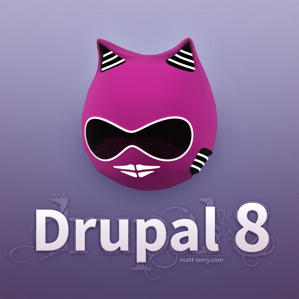
sphism CreditAttribution: sphism commentedThought that it was all a bit too alpha male... added one for the 'Women in Drupal'
Comment #53
sphism CreditAttribution: sphism commentedAnd just the feline druplicon on her own:
Comment #54
sphism CreditAttribution: sphism commentedAnyone got any good straplines for these graphics?
I'm thinking something like
Drupal 8
Whatever you need it to be
Comment #56
Bojhan CreditAttribution: Bojhan commentedI unpublished a previously entered comment for violation of our Drupal Code of Conduct.
Comment #57
thedavidmeister CreditAttribution: thedavidmeister commented#10 seems to be going in the right direction to me.
Anything we do that tries to be overly illustrative or "rendered" will date almost instantly.
I don't see what "needs review" here.
Comment #58
dddbbb CreditAttribution: dddbbb commented@Bojhan - Apologies. Wasn't intended to offend. @sphism and I are friends - perhaps that wasn't clear.
Comment #59
sphism CreditAttribution: sphism commentedHey bojhan, sorry I missed your post :)
@davidmeister: the thing about the Druplicon is it never dates, never looks old, still looks just as fresh as he did in 2004 eh? ;)
Drupal has changed a lot in 10 years, the Internet has changed a lot too, did YouTube exist? Facebook didn't, social media didn't.... So why has our logo remained the same?
This is a Do-ocracy right? So lets do it! Either we all do it, or I do it, either way Drupal 8 is gonna have new renegade Druplicons.
To get started read the first post and start a conversation about your thoughts ...
Comment #60
thedavidmeister CreditAttribution: thedavidmeister commentedI'm not a designer, I don't have the skills required to produce a professional druplicon. I'm not even going to pretend that I do.
The reason why I'm saying that #10 and Gabor's suggestions are going in the right direction is because the suggestions fit better into the way this task is framed by the issue summary.
@sphism, you may like your renegade Druplicon imagery, but objectively they address very little of the weaknesses outlined in the issue summary for the current Drupalicon, and IMO introduce new weaknesses the current icon does not have - such as having such intensely stylised colouring and textures that they would be incompatible with almost every design you could think of.
Comment #61
jbrown CreditAttribution: jbrown commentedI'm loving all your crazy designs @sphism!
I think #10 lacks the personality required for a community mascot.
It seems to evolve all by itself. There used to be competitions before DrupalCons to come up with the logo, resulting in some gems:


I really love the 3D Drupal 7 Druplicon in #37. Any chance it could be rendered as SVG?
The 2004 Druplicon looks dated because it is flat / Web 2.0. 3D will come back - we should be ahead of the curve.
Google image search for mascot comes up with some interesting results, including boy / girl Druplicons here: http://idleidol.net/wp-content/uploads/2010/10/police5.jpg
Did anyone ever make a fat Buddha / Druplicon mashup?
I think we should stick with the floating head idea.
Anyway - just some random thoughts.
Comment #62
klonos...just to be clear:
I'm sure no-one would object to these sorts of designs for DrupalCons and Camps and their respective websites and/or advertising gear (t-shirts, cups, badges, stickers etc). The reason why I personally (and my guess is that all others that feel the same) oppose the 3D ideas is that because we have in mind the logo that will be in the installer, the front page after each installation in the Seven theme as well as here in d.o. It's just that we need something more "plain" as the product "official" logo. Something in the spirit of #10 or #42 or what is in the issue summary at the time of writing this (personal favorite is the "E" series with the "fading" border instead of the "A" and "G" series with the white one that makes it look like a sticker).
Just my 0.02$
PS: Logo competitions for DrupalCons is a great idea to establish like voting for the next place that will be considered for DrupalCons.
Comment #63
sphism CreditAttribution: sphism commentedHey @klonos, thanks for making that clear. And thanks for referring the the tables I made in the first post :)
This is definitely a mis communication then, I'm not suggesting any of these would be on the installer, I'm just talking about the branding of Drupal in general and trying to portray an idea that you make make Drupal into anything you need it to be. Take bits out, add bits on, theme it, tuned for performance, lite weight web services.... Or whatever.
No one had posted in a month so I figured I'd get the ball rolling again
Comment #64
jbrown CreditAttribution: jbrown commented@klonos I think the Drupal Wordmark is supposed to be used instead of the Druplicon when we need to satisfy the plain / official requirement.
Comment #65
jbrown CreditAttribution: jbrown commentedThere is a Druplicon BoF at Drupalcon: https://prague2013.drupal.org/bof/druplicon-rip-long-live-druplicon
Comment #66
sphism CreditAttribution: sphism commented@jbrown, #64 is definitely how I understand it as well. I think there's definitely a place for icon graphics like #10, but also illustrative graphics are so handy when you're making larger scale graphics like posters, magazine adverts... I wouldn't really consider #10 a 'Druplicon', definitely a Drupal logo, but I think the little blue guy needs eyes.
That barcelona logo is really nicely done. You also make an interesting point about the web moving more towards 3d again.
I'm really confused by all is talk of mascot's, must be an american thing. My idea of a mascot is the dude wearing the team mascot suit at a baseball game. The baseball team may have a logo with that mascot on it... But the graphical representation of the mascot is a logo. As I understand it.
Anyway, have fun at that bof I'll be about 15,000 km away
Comment #67
jbrown CreditAttribution: jbrown commentedI think when people say that the Druplicon is a mascot they mean he is a character: https://en.wikipedia.org/wiki/Character_%28arts%29
He is someone we can pretend is a real person, like Homer Simpson.
Comment #68
sphism CreditAttribution: sphism commentedNo more renegade grpahics today, but I did have a thought about droplet shapes.
Is there a perfect droplet shape, in the same way there's a golden rectangle... Or a mathematical equation for a droplet, like there is for an elipse, etc ...
If so then that probably the best looking droplet shape
Comment #69
thedavidmeister CreditAttribution: thedavidmeister commenteda droplet at terminal velocity is basically a sphere that ripples as it falls, the stylised "pointy" droplet is just that, stylised. Any "perfect" droplet shape would therefore be contrived, but I'm sure you could come up with something pleasing to the eye by playing around with ratios that are generally considered "good".
Comment #70
carlnewton CreditAttribution: carlnewton commentedRegarding #10, great work! I really like the idea of a simple design.
Would this be the simplest method?
Comment #71
sphism CreditAttribution: sphism commented@carlnewton: Yeah it's tricky huh. I like the idea of there being some simple geometry involved in the droplet design, but I'm personally not very keen on the pointy bit being too curved, I was thinking it might be good to come up with a set of many different drop shapes and discussing them... but I've been busy.
Comment #72
sphism CreditAttribution: sphism commentedI've been busy busy. But over the weekend I tried to make a blue druplicon to go with the renegade set, and it's hard :)
The little blue fella is so recognisable that even the slightest alteration looks kinda wrong, but after much pixel pushing I've come up with the following. The eyes are the same shape as all the others, white instead of black glass with white rim.
I've altered the shape of the hose and mouth in an attempt to stop them looking like 1 big open mouth (if you start looking at the current druplicon and imagine the nose to be the top lip, and the mouth to be the bottom lip it looks really frickin freaky)...
Anyway, here he is with the other Renegade's:
Other alterations:
Comment #73
sphism CreditAttribution: sphism commented... and here at a more traditional angle, you can see the changes I've made to the nose and mouth, thoughts? I think it makes it a lot harder to see the nose and mouth as a big freaky open mouth.
Comment #74
rootworkBeautiful!
I like the subtle changes to the nose and mouth.
Comment #75
Gábor HojtsyNote that the DA/Dries picked a Drupal 8 marketing logo at https://association.drupal.org/node/18568, that is NOT a Druplicon replacement, so this issue is about different things. Just wanted to state that :)
Comment #76
sphism CreditAttribution: sphism commented@rootwork, thanks for that, the nose and mouth have been bothering me for ages, and those little tweaks were the result of a couple days work over the last few months. I might go a smidgen thicker, for when it scales down.
@gabor, yes indeed, thought it was a bit odd to show concepts a few weeks ago, then just choose one of them without doing much to it, how was the reaction at Drupalcon? Pity to pass up the opportunity to have an eight / infinity / eyes logo all in one... Actually lets not get off topic.
You're absolutely right that this issue is about Druplicon... All the other graphics, like the 'Drupal 8' etc are just for decoration.
So the blue droplet Druplicon is very svg'able - it's not obviously lit from one side, it kept the nose and mouth, which hopefully don't look like a big open mouth.... It's the colors from d.o header.... And I'm about 75% happy with it.
Anyone got any thoughts?
Comment #77
carlnewton CreditAttribution: carlnewton commented@sphism, the curve can be decreased by applying a margin. The thicker the margin, the lesser the curve.
Comment #78
echoz CreditAttribution: echoz commented@sphism on #73, I like the druplicon's expression so much more. He/she looks more confident and clever :-)
Comment #79
sphism CreditAttribution: sphism commented@carlnewton, that's really cool. It would be good to see a load of different Drupal logos to see what sorts of shapes they are and see f there's any sort of average droplet shape... Eg all the drupalcons
@echoz, I'm glad about that, it's such a recognisable face that it's really tricky to change. I quite like having it shaded with brighter at the bottom, kinda looks like water. The render I did last year was much more like water but that means it relies a lot on the lighting, this one is stylised and looks exactly the same with no lights etc...
I think there's still more work to do on it, but its getting there.
Comment #80
sphism CreditAttribution: sphism commented@jbrown re: #40: I just managed to output a blender render to SVG :)
It's not particularly straight forward, but i managed to use SVGWriter for Blender
It renders strokes with no fills, and required about 20 mins to clean up in illustrator, but the results are pretty good, here's the same render from #73 as a tidied up SVG file ... not allowed to upload .svg so I've zipped it...
Here's a little thumbnail of it:
Comment #81
Bojhan CreditAttribution: Bojhan commented@sphism Interesting, there could be many variations on this. For example, the outline now ocassionaly "clashes" with the gradient (e.g. its only matches in the top of the Druplicon). The mouth is a little uneven, probally because its difficult to have it "turned" and smiling. The eyes on the right, have a line - I understand this is to avoid connectiveness - but it might be worth playing with white space like the WWF logo.
Comment #82
sphism CreditAttribution: sphism commentedHey @bojhan, this all sounds a lot more positive :) think of #80 as a tech demo, jbrown was keen to get the stuff out of blender as svg, it sort of works and I know a few ways to make it work a little better.
The stroke is the same color as the dark blue of the gradient, I think echoz mentioned they liked that a while ago.
I think the head is turned a little too far, I don't love it when the eyes go past the edge of the head, also in the 3d model the eyes are thicker than they need be, worked well with the dark eyes with white light rims but not great for this version.
Weirdly the mouth is symmetrical, curves projected on to sphere's in perspective does funny things. I think it looks better more front on, and I think the mouth and possibly the nose need to be slightly thicker.
The line on the eyes is half a stroke, just because I did it quickly and the eyes are on top... Interesting idea to play with the white space.
I think there's still quite a bit of work to do on the face, but this is the first one I've been happy enough with to show, there have been a few versions that sucked.
But yeah, you can render straight from blender to svg, I think animated svg works as well but I didn't try.
@bojhan, what do you think about the alteration I made to the nose and mouth?
Have fun at the bof today
Comment #83
sphism CreditAttribution: sphism commentedLast night I made the druplicon nose and mouth a little thicker, and then stuck a big 8 on its back as similar to the new Drupal 8 logo as it can be in 3d (ie the 8 doesn't go full side to side since that would mean you could see it from the front)
Looks good, well, looks very similar to the Drupal 8 logo.
The mouth and nose I think look better, I'll post a render or svg or something soon.
Comment #84
peterx CreditAttribution: peterx commentedMake the next SVG Inkscape compatible. I made the previous on compatible with just one change. From:
to:
<!DOCTYPE svg PUBLIC "-//W3C//DTD SVG 1.0//EN" "http://www.w3.org/TR/2001/REC-SVG-20010904/DTD/svg10.dtd">Comment #85
peterx CreditAttribution: peterx commentedA Druplicon emphasing 8, as used on http://d8the.me/

Comment #86
rootwork@peterx that thing is staring into my soul with its dead infinite-loop infinity eyes.
Comment #87
webchickAgreed, but it's perfectly spoooooky for Halloween. :)
My favourite is still #43, but I love the creativity in this thread! :)
Comment #88
sphism CreditAttribution: sphism commentedHallow'een druplicon, now that's a great idea... but no time for me right now...
@webchick: #43 has no graphic?
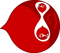
In other news I rendered up a hi res version of the black n red 'Cannonball' druplicon for a drupal assoc meetup in Finland... That druplicon is so freaking badass. Shoseki suggested I should make one that was like my website and that was the result.
What should we do next with all these graphics? Lost momentum a bit.
Comment #89
Crell CreditAttribution: Crell commentedIf the goal is to produce a new Druplicon render to be used in the default install and such, it needs to be simple; simple enough that it can scale down to a favicon. Many of the examples here fail that requirement.
If the goal is to produce cool looking Druplicons that we can collect and offer to people to use in unofficial capacities, we should setup a place to host such imagery and let people start filling up the collection. In that case, "simple enough for a favicon" is not really relevant.
Comment #90
sphism CreditAttribution: sphism commentedHey Crell.
The goal was more 'illustrative graphic' than 16px favicon.
Although the svg in #80 scales pretty well.
I have all the 3d blender files, plus some output renders.
Should I dump all that into a project on d.o or would it be better in github?
If we want to help people make their own druplicons then they would have full access to the blender files, but working with those is not straightforward.
We could provide layered psd's (or gimp files) with layers for body, eyes, mouth, nose, antennas etc... that might make it a bit easier to work with. ie you could change body color, add patterns and so on.
Is there already a resource like this?
Is there any demand for something like this?
Comment #91
lussolucaWhat do you think about a simplified version, and a construction with
base shapes?
I designed it from simple circles, and subdivision of the shapes
Comment #92
marcvangendFrom my perspective, that's not a drop anymore, that's a circle with a shark fin.
Comment #93
thedavidmeister CreditAttribution: thedavidmeister commentedThis might be controversial but... it's 2014 so I'm updating the title.
What do we see overwhelmingly in "good" design for commercial, not for profit and government projects alike in 2014?
- Flat design
- Less reliance on skeuomorphism to present an idea
- Refinement of responsive design patterns, including SVGs
- Inclusive/accessible design
Can I suggest that a blue little man's head with sunglasses (or are they eyeballs fused together?) rendered in 3D is none of these things, and so is not looking to the future and is not even on-trend for the present.
Looking to the future or at least being on-trend for now, a logo would:
- Use "flat" design aesthetic, definitely NOT be a 3D render or attempt a "psuedo-3D designy thing"
- Not put eyeballs or a face on a water drop, because nobody knows why it has eyeballs and it just looks goofy and alien to outsiders (I have literally had clients ask me why there is a blue alien on their website and were concerned that I had done something to put the "alien" there).
- Be SVG friendly, so that we could include it in a design at all sizes from favicons to billboards on buildings, and so automatically also be zoom friendly for people using assistive technologies
The Druplicon is part of Drupal's marketing and public image and we have to remember that many people in the world who make decisions about what software organisations use are still skeptical/dismissive/uninformed about Drupal and so we all have a vested interest in improving anything that makes it easier for people to not take Drupal seriously.
Comment #94
markhalliwellUmm... no. Just because there may be a few "clients" out there that may not understand the logo/design doesn't justify completely abandoning the iconic "logo" of Drupal. People accept what is presented, especially if you simply explain the fact that "it's their logo". Also, it isn't like one can't white label a site and remove all traces of this logo/[fav]icon for this to be considered a justifiable reason.
I do not agree with this at all. GitHub has the Octocat and I assure you, that looks more "alien" than our Druplicon. The Druplicon is our "brand". It is what is/has identified something as "Drupal" for many, many years.
I do not like the idea of scrapping the key components of the Druplicon: drop outline, infinity eyes, nose, mouth. That is what make it the Druplicon. How those elements are presented is certainly up for design, but removing them is not an option IMO.
#91 did not include the nose or mouth which is what makes it look odd to me, I'm still up in the air about the "shark fin" though and kind of agree it doesn't quite look like a drop anymore.
Comment #95
webchickA friendly reminder that there are constructive and less constructive ways to share feedback with people who are donating both their volunteer time and artistic skills (neither of which we as a community have in abundance). I also think there's no reason to box in creativity based on tradition. This should be a fun exercise in exploration. Some ideas will work, some ideas won't, but IMO we should allow anything to be on the table.
Comment #96
Crell CreditAttribution: Crell commentedBasing a long-lasting logo/mascot on what is "trendy" in design currently is a very short-sighted idea. What's trendy this year won't be what's trendy next year, or the year after. Flat design will pass. Drupal will not.
Also? This little guy hasn't changed in almost 20 years, and it hasn't hurt anyone: http://www.isc.tamu.edu/~lewing/linux/
webchick: Good design thrives with constraints. A constraint of "consistent with the history of the brand" rather than "what's trendy now" is an entirely reasonable constraint. Even with that there have been a lot of ideas tossed about in this thread so I don't think we're at risk of suppressing creativity.
Comment #98
markhalliwellI do not believe I was being "less constructive", I was simply trying to point out:
Which is what @Crell said, just better than I did :D
Comment #99
gmorleo CreditAttribution: gmorleo commentedI'm the italian designer of the "FLAT" logo
@marcvangend
yep, it seems to be a shark instead of a drop
but if the idea of the sketch is ok, (it's a 30 minutes try, every circle i used can be an ellipse) i can adjust the shark pin, and it will be a drop
@thedavidmeister
I do not agree with you about the eyes of the drop
and i agree with
@Mark Carver
i can try to insert the nose and the mouth
But i want to specify for the reader of this thread why i used the term "FLAT"
I wrote "FLAT" beacause i have to "sell" my design to other, i have to use new terms that are modern and attractive, but NOT to imitate only the trend of this year
i'll explain it responding to
@Crell
https://encrypted-tbn3.gstatic.com/images?q=tbn:ANd9GcRwJrKNxh8mfxeX7yeb...
http://2.bp.blogspot.com/-FojM8qm25EU/TWIxWCWrk1I/AAAAAAAAALk/sIYMvxUPtO...
http://2.bp.blogspot.com/-h7xqwWVE-BM/UrH9cD3Fy_I/AAAAAAAAIis/qdeKNn0RTr...
and more...
Now you can tell me that all the modern logos are FLAT?
Or it's simply a natural evolution?
You all work on the web i hope, if you use Drupal ;)
So we can be more constructive and rational with comments
Comment #100
LewisNymanIf we're being serious about this, then we should add these requirements to the issue summary instead of posting them in comments after the fact. Especially if there are requirements that are so subjective, we're running the risk of being “clients from hell”.
There's also a lot of solutioning in the issue summary that should be moved into comments.
Comment #101
peterx CreditAttribution: peterx commentedI think Flat design will be over by the time Drupal 8 is in common use. I think that a new logo for the new approach of Drupal 8 is consistent. As a comparison with the leader in another field, Rolls Royce changed their distinctive radiator.
One of the things I like about https://www.drupal.org/node/2057767#comment-7995835 is the direction, the face is looking up instead of down. The current logo could use a slight tilt up and a drift from fierce to happy.
.(:)
Comment #102
thedavidmeister CreditAttribution: thedavidmeister commentedI agree with #96 and #100, I'd like to focus on updating the requirements/constraints that we can agree are important so that suggestions can be reviewed more objectively against rather than limiting creativity by proposing "solutions" based on current trends.
I do still think it's important that we can represent the logo in a scalable format, such as SVG - this is *harder* but not impossible with 3D renders on small scales (like a favicon). This is already stated in the issue summary as an important consideration.
I do still think that it's important that the logo is comprehensible and approachable to as many people as possible, not just people who have worked with it for years and not just developers - this is *harder* but not impossible when you start putting eyeballs on things as you start wandering into "uncanny valley" type considerations (Github's Octocat has other body parts beyond eyeballs - I'd say the usual reaction to the Github mascot is "that's cute!" not "oh, ok... a blue spaceman"). I think it's sort of funny that we're apparently OK with human eye balls that are horrifically mutated to the point of being fused across the middle into a single, giant mono-eye but not something that looks vaguely like a shark fin. "The Drupal icon is weird looking and dated" is a *common* criticism of Drupal's branding that I have seen in Drupal's own IRC channels, have heard time and time again at meetups (not just Drupal meetups), from clients, friends, etc... Again, this is already stated as a primary weakness of the current logo in this issue's summary, in fact the weirdness and unapproachableness of the logo make up 5 of the 8 stated main weaknesses in the summary.
I also think it's a rather masculine looking logo, which isn't great for fostering an encouraging feeling of inclusiveness. The female renders in #52 and #53 are a bit extreme for my taste, but they do highlight that whether consciously or subconsciously, there are people out there who identify with the current Drupal logo as "a male thing". I feel this probably could be added as a weakness in the issue summary, but I'm curious to see whether others agree.
The issue summary itself *opens* with the premise that the Druplicon has been steadily becoming less relevant and marginalised over the last *9 years*, providing clear evidence/examples.
The main arguments I have heard (feel free to provide other arguments, I'm actually quite open to discussing this) in defence of the idea of the blue-drop-space-man as an immutable part of Drupal's branding are:
- That's just how it has always been and so how it must always continue to be
- Other successful products have logos that people find weird too (which is not the same argument as other successful branding has weird logos, arguably linux suffers from terrible branding/marketing/public perception issues compared to both Mac and Windows, which I think a lot of linux advocates tend to forget easily simply because linux itself is a great product, and this is a great example of what NOT to do if you're looking for mainstream acceptance)
- I don't personally find it off-putting/I don't accept or am suspicious of other people's claims that it is off-putting, there must be some ulterior motive there
- Anyone who doesn't "get it" is wrong somehow and if they just got to know Drupal more they'd love it exactly as much as I do
- People who do identify with the current logo would be incapable of accepting a change and will almost certainly like any and every other possible logo idea less, so we shouldn't even try to consider alternatives because they're guaranteed to be worse
- "It's subjective" and so any logo can be justified, even if "some minority of people" are pointing out issues in how it presents and what it represents
Arguments I have NOT yet heard from anybody defending the blue-drop-space-man:
- A blue-drop-space-man is clearly aligned with the community's goals, ideals and achievements because it represents X (I can see how the droplet metaphor works, but why the spaceman face? I could see other non-droplet metaphors working but that would be a much larger departure from tradition)
- There are clear statistics showing that other products/brands with stylised/mutated blue human heads perform well in the market
- If I were to invent a logo/mascot for Drupal today, in a world where it did not already have one, I'd probably choose a blue-drop-space-man after carefully considering all other options
I totally agree that "because tradition" is a valid argument when talking about logos and branding because you obviously don't want to throw away all your existing brand juice, but it's not the only consideration either and the graphics in #99 show that things can change and evolve over time too. If we did have a clear long-term branding goal (like, "less anthropomorphic" or "less masculine") we could always plan to iterate the branding towards that goal over multiple years in a way that allowed people to adjust their expectations gradually.
We absolutely do have a vested interest in being taken seriously and being viewed positively by people who are outside our existing community, and not "because of clients" (although clients are important too, the community owes a huge amount to the buy-in from clients). One of the main things I keep hearing from the D8 spruikers about is that this release represents a global scale attempt from our community to try to become more inviting and approachable to people outside our existing members - "getting off the island" as they say. I don't see much difference philosophically between wanting to embrace technologies that other PHP developers see as valuable, like Symfony, and wanting to embrace the aesthetics and branding ideals that other major open source PHP (and non-PHP) communities have decided to adopt.
The "flat design" thing was more about me suggesting a solution to the above, but forget I said anything about it as it's only tangental to the main points I wanted to raise.
Comment #103
peterx CreditAttribution: peterx commentedInteresting comment about male/inclusive and #52. In many other discussions, outside of IT, women are seeking strong images/role models. #52 would have to be a strong fierce cat.
Comment #104
tkoleary CreditAttribution: tkoleary commented@lussoluca
love the geometric approach you have taken as well as the fresher color. I have a version I have been using in all of Dries's keynotes that has a similar coloring and more flat approach.
I do feel that the mouth and nose are essential though, or at least the mouth. The smiling face has been documented to have a positive impact on users psychologically and it is not an accident that brands like survey monkey use smiling mascots.
References
http://blog.usabilla.com/effect-human-faces-web-design/
http://3.7designs.co/blog/2012/08/10-psychological-principles-to-design-... (#6)
Comment #105
tkoleary CreditAttribution: tkoleary commented@marcvangend
+1 to #92. It does look a little like a shark fin.
Comment #106
tkoleary CreditAttribution: tkoleary commentedSetting aside facetious comments and tangents about the d8 logo wordmark, history, the nature of brand etc. I'm going to make an attempt to summarize the consensus view so far:
Comment #107
tkoleary CreditAttribution: tkoleary commentedBased on the consensus summary I've put together a solution that balances all the competing objectives as well as I can.
Other problems with the current design that are not covered above:
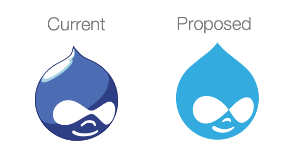
Below is also a description of how I arrived at a color that combines the median of colors in the proposed solutions in this issue and more accurately reflects the current state of colors across the Drupal brand which right now are similar but not exactly the same (the darker one is for the background color).
The original and the proposed solution:
Attributes that relate to topics in that arose in the issue
Images from the issue that were sampled for color
Derivation of the colors
How the icon might appear in Bartik with the revised colors
Comment #108
tkoleary CreditAttribution: tkoleary commentedComment #109
dcrocks CreditAttribution: dcrocks commentedThe nose and mouth are much better/friendlier but the eyes are either a tad too big or to close(low) over the nose. Seems a little out of proportion. Some attempt at multiple tones might add a little more pop. It wouldn't have to be as complex as the current icon and you could still get the flat look. My 2 cents.
Comment #110
dcrocks CreditAttribution: dcrocks commentedThe drupal.org site and bartik both have top-darker to bottom-lighter gradient for the header regions. Perhaps the icon could just go in the opposite direction?
Comment #111
tkoleary CreditAttribution: tkoleary commented@dcrocks
If others feel the same way about the eyes I'll try some variations on it.
I'd urge you to live with this one for a bit though. I think it will grow on you. The closer features are actually intentional. Children's features are closer together than those of adults and a younger face is more approachable and endearing which is helpful in countering the "scary alien" vibe.
As for the gradient. Flat is most definitely in. In fact for pure graphic designers (think Paul Rand or Massimo Vignelli), flat has always been in. I'd argue flat is just design for the web finally coming of age. If I'm wrong and the pendulum swings back we can always update it again with a gradient, but right now it makes us seem out-of-touch (personaly i'd remove the gradients from the headers of bartik and Drupal.org as well).
Comment #112
dcrocks CreditAttribution: dcrocks commentedEven IOS 8 isn't there yet, since many older icons still have gradients. But you're right, the dupal.org/bartik background probably doesn't serve flat icons well.
Comment #113
rootworkThis is great work tkoleary. I'm curious to see what other folks think but I just wanted to thank you for your comprehensive work synthesizing what's been offered above, and specifically addressing those issues in your proposal. I'm going to let it sit with me for a few days, but this is looking really good.
Comment #114
yoroy CreditAttribution: yoroy commentedNice synthesis but I worry that you've found an average that might work as a whole has a bland appearance. Not sure Druplicon should become more cute. Less freaky/aggressive sure, but not necessarily younger.
- I wonder if this blue provides enough contrast, even against white. I don't think it's necessary to find some middle value between all variations. Is there a strong reason to move away from the "official" colors?
- The forehead seems quite large
- There's friction between the 3/4 direction of eyes, nose & mouth and the drops point being exactly in the middle
The original druplicon has a certain dynamic and speed to it: squinted eyes, the assymetric drop shape. The proposed variation seems more static.
Comment #115
dddbbb CreditAttribution: dddbbb commented@tkoleary: Great effort and fantastic insight into your workings especially.
That said, I still feel that we need to be bolder/braver and that the best progression would be to lose "face" entirely - even in your revised version it's still the trickiest part to get right in terms of the emotion that it does or doesn't convey (let alone agreeing on what emotion, if any, should be present). I also feel that it's the part of the current logo that's the least timeless with too many clear connections to early-naughties logo design. The face is the point of most contention throughout this entire thread.
Losing the face entirely neutralises the logo, addresses the largest concerns surrounding it looking "dated" and makes it many times more flexible in terms of possible application. To me, this is an easy decision where the pros far outweigh the cons.
Comment #116
dasjothe proposal from #107 looks too static to me. the symmetry makes it appear less dynamic than the old one. at one hand side the druplicon now appears younger (nose and mouth) and maybe less mature. at the other, the eyes look a bit like grandma-glasses. color looks ok, but the contrast doesn't work well for the revised bartik example. i think the shapes need a more professional and dynamic touch.
sorry if i'm sounding very negative here. i very much appreciate the effort being put in and like the academic approach. thanks for your work and hope my comments can be seen helpful rather than turning ideas down :)
Comment #117
tkoleary CreditAttribution: tkoleary commented@rootwork
Thank you.
@danbohea
Did you read #104? Those are only two of many references you will find to the positive psychological impact of faces on usability. Like you I was initially for a solid drop but the research in this area has brought me back to the keeping the face both for historical and brand consistency as well as the positive UX impact.
@Yoroy
Very thoughtful analysis
I see your point here but I do still lean towards the cuter for the reasons already stated but also because it tends to counter the kind of aggressive masculinity noted by others in this issue.
Given that you're the second person to note this I'm ok shifting the lightness down within the same hue.
It's actually smaller than the original but I think I can mitigate that by bringing the point down slightly.
I think you may be right that this compromise between the symmetry crowd and the traditionalists has resulted in a weaker icon. See my revision below. I think this captures more of the "speed" and dynamism of the original without losing the friendliness.
Here's the two color variations on the bartik header. Gradient or not I think we will need some kind of subtle accent outline as shown here.
Comment #118
tkoleary CreditAttribution: tkoleary commentedComment #119
geerlingguy CreditAttribution: geerlingguy commentedC is really getting close, imo, more so than any other attempt in this thread. It preserves the best features of the old, yet feels more fresh and vibrant... Less potentially-super villian like the current druplicon; something about those eyes.
Comment #120
LewisNymanGreat work bringing some momentum to this thread Kevin!
I agree with the comments about the eyes and like the direction C is heading.
It feels like a outline would be a good way to add contrast, have you tried a very thin white(ish) outline instead of the thicker dark blue one?
Comment #121
dcrocks CreditAttribution: dcrocks commentedI'm not sure the outline the way it is done fits the flat design philosophy. A wider white might be better. The color of (a) above is 'flatter' looking and would be better against the various backgrounds I've seen the logo against.
Comment #122
rootworkReally liking B and C. I don't feel strongly about the color or the outline (other than the fact that I agree there needs to be something) but I like the modification of the peak.
Comment #123
John Pitcairn CreditAttribution: John Pitcairn commentedBikeshed alert ... I'm a graphic designer with 25 years experience, and a site builder working for small to medium businesses that operate in the real world (ie they are not primarily web-focused). The general reaction I get when clients see the Drupal icon (if I show it to them) is that it is cute, but not very professional-looking. When pressed, this is because it's a round smiley face, which they associate with emoticons and see as childish. I tend to agree with them. It's not about colour or fine tuning of detail or flat-vs-rendered or mathematically-correct shapes (WTF??), it's the basic concept. My advice on the Druplicon (not the logo) would probably be "lose it".
That said - B is too saturated, looks garish. C is the best of the color options so far, if it's on a white background. On other backgrounds, it's always going to suck to some degree. Both the Bartik examples are very problematic to my eye, blue-on-blue seriously reduces the integrity and impact of the shape, and you wind up just slapping band-aids on it. For this sort of logo, my usage rules to the client would begin with "it always has a white background".
Nowhere in this conversation is the "Drupal" type being given much consideration. Why not? Considering the typeface at the same time is an essential part of the design process, and may help to suggest some complementary subtleties for the druplicon.
Comment #124
tkoleary CreditAttribution: tkoleary commented@John Pitcairn
While I appreciate a view from off the island, and your experience (though I have you beat on both breadth and longevity), icons from the mail chimp to the Zurb Foundation Abominable snowman paint a different picture. There's nothing inherently unprofessional about a lighthearted illustrated mascot. It's all in the execution.
Comment #125
Crell CreditAttribution: Crell commentedJohn Pitcairn: The type/wordmark of "Drupal" as seen in the header of this page, which is what I assume you're referring to, is out of scope here for legal reasons. Druplicon is the "community mascot/logo", and has been licensed under the GPL for a decade. The wordmark is held by the Drupal Association separately and is used as a trademark, thus by nature must be more closely controlled. A closer linkage between the two could be problematic.
I agree that #117 C is one of the better options that's been put forth so far. It's more smiley, less creepy-grin. :-)
Comment #126
rootwork@John Pitcairn I don't really see this as a client issue. Most clients should never see this. To me it's more of a community issue. And this is the community, right here, discussing it.
In terms of the wordmark (the "Drupal type") that's a whole separate thing, and is copyrighted. See #605710: Decide on if and if so, how to implement the Drupal wordmark in core for recent discussion on using that. While the wordmark is Drupal's logo, the Druplicon is more like a logo of the community (thus the importance of it being remixable). Though I agree with tkoleary that plenty of "professional" projects -- that are not open-source and are not community supported, for that matter -- have cutesy logos. Most of the discussion above has sustained the overall look of the Druplicon, if anything defending it against what are seen as attacks (for instance removing the face) from its identity. The community consensus seems to be mostly in favor of the general cute- or cool-ness of the Druplicon.
Still liking both B and C, but agree there needs to be some accounting for being on blue or clashing backgrounds with a white outline or a shadow.
Comment #127
peterx CreditAttribution: peterx commented#117 b
Bright. Happy. Intelligent. Pretty. Just like me.
The asymmetric top bit makes the logo "forward looking".
The blue is dark enough for white backgrounds and bright enough to survive dull corporate blue backgrounds.
Comment #128
John Pitcairn CreditAttribution: John Pitcairn commentedFair enough. I did mean some consideration of the recommended typeface to be used in close association with the druplicon, not the typeface of the wordmark. Or is there no recommendation, and that choice would that generally be up to whoever was using it?
Comment #129
markhalliwellThe introduction of an "outline/drop-shadow" etc. just to deal with Bartik's conflicting color scheme is out of scope of this issue. It also severely limits the colors available. Once a new Druplicon has been adopted, we should open a new issue to figure out the best implementation for Bartik.
So far, I do like C the best and this does appear to be the general consensus of what I have read from others as well.
That being said, I think we will continue to run the risk of bikeshedding this issue if we don't limit ourselves in what should be accomplished here. Considering that we already have a lengthy discussion just about "how" we should update the Druplicon logo, I think this issue should needs rescoping from any sort of implementation to just being a new "policy" (so to speak) for the Druplicon.
Once a decision has been made, the appropriate nodes on d.o (https://www.drupal.org/node/9068, https://www.drupal.org/druplicon) should be updated and new issues to change files in core should be created. I would mark this NR, but we still need an issue summary update (I do not have time to overhaul this at the moment).
Comment #130
tkoleary CreditAttribution: tkoleary commented@John Pitcairn
The Drupal wordmark is tied to the "Drupal" name trademarked by Dries and can't be used without permission AFAIK. The druplicon is fully open source and can be used anywhere.
Comment #131
tkoleary CreditAttribution: tkoleary commented@Mark Carver
Good point. There will need to be an issue for Bartik.
That said I'm working up some guidelines for color and outline standards which I'll post here soon.
Comment #132
tkoleary CreditAttribution: tkoleary commentedHere's my first pass at a standard for use in core. I went back to the Seven blue (#0074bd) since it was so close to "c" and necessitates fewer changes in CSS.
In order to balance the seven blue to Bartik I have changed the gradient to: Top #005EA4, Bottom #007CD8, which would need to be added to that issue.
The outline proportion is 3px at 100px height or 3% of icon height and should scale proportionately.
The "don'ts" would only apply to where it's used in core (Bartik and seven themes), since it's GPL others can change it at will in their own themes.
Still to come is a style for "ghosting" needed for the installer.
Comment #133
tkoleary CreditAttribution: tkoleary commentedAnnotated version revised based on iterations since #107
Comment #134
markhalliwellI really like these clear "do"s and "don't"s :)
However, I strongly feel that there should not be an outline by default. I think there should only be one exception to this and that should be if the background is too close to the Druplicon "blue" (ie: seven blue). If that is the case (as in Bartik) then an outline of the same color as the eyes/nose/mouth (white) should be added and the background should be changed to transparent for an "outline" version of the Druplicon.
This would be the only variation for the Druplicon logo (in core anyway).
Comment #135
tkoleary CreditAttribution: tkoleary commented@mark carver, @lewis Nyman
My personal view is that the outline as used in the examples above goes beyond simply performing the function of creating sufficient contrast to the background. It acts as a stylistic focus to set the icon apart from any background it sits on (even white) and give it a kind of prominence not afforded other elements on the page.
That said, I think that Lewis should have the last word on this as the maintainer of seven style guide.
Comment #136
tkoleary CreditAttribution: tkoleary commented@mark carver
If your concern is around having too many variations of the druplicon file i'm sure we can get around that by producing the variations of outline color using CSS before and after elements with some radius cornered boxes like this:
Then we can have just two files: blue and transparent for bartik.
Comment #137
markhalliwellThat is partially my concern, but for I suspect perhaps for different reasons. In core, there often needs to be an explicit direction on what should be done in cases like this (i.e.: why we are finally getting a style guide for seven :)). This isn't so people cannot create their own variations (which they can and will do since this the Druplicon is GLP). This aspect of the Druplicon is to just help provide explicit instructions in how to implement it in core:
Being used on top of a background that is not or does not conflict with the shade of the Druplicon blue?
Use the normal Druplicon logo.
Otherwise:
Use the "white outlined" version which will be transparent and match any background.
It's more about providing (in my eyes anyway) a clearer "do" and "don't" scenario by limiting to option "A" or option "B". Introducing the various different shades of an outline, IMO, will just complicate matters and allow further bikeshedding down the road when it comes time for implementation.
I'm certainly not going to be up in arms if we do, this is after all just an opinion. I just thought I would share how I can see this being a potential issue and yes, I would like to hear @LewisNyman's thoughts on this.
Comment #138
EclipseGc CreditAttribution: EclipseGc commentedSo, I like this a lot. FWIW, I don't really dig the eyes. I wish that we rounded out their meeting point a bit (never disliked the "visor" look) or if we want eyes, let's actually separate them. Other than that, I thin this is great.
Eclipse
Comment #139
marcvangendThank you tkoleary for the amount of work you have punt into this. I really like the direction this is going.
My only concern is with the outline. The light gray outline on the white background looks strange to me. While the outline is about enhancing contrast and drawing a crisp shape, a gray outline on a white background does the opposite and seems to blur the druplicon like a drop shadow.
I agree with Mark in #137. Even though we cannot force anyone to obey the style guide, we should do our future selves a favor and define very clear instructions that leave no (or very little) room for interpretation. If the style guide would say "the outline can be a shade of gray in the range of #ffffff to #aaaaaa, optionally up to 40% transparent", we aren't helping anyone.
Comment #140
Schnitzel CreditAttribution: Schnitzel commentedUuuhh really really like the direction.
The outline discussion I leave to the Themers and Designers.
But Version C looks super nice.
Comment #141
John Pitcairn CreditAttribution: John Pitcairn commentedWhy not just make the outline always white, always the same transparency? Then it will be invisible on white, visible and matching on any color.
Comment #142
stella CreditAttribution: stella commentedThis looks awesome. Really liking C too - like the friendlier face and the modification of the peak from the previously suggested symmetric one.
Comment #143
peterx CreditAttribution: peterx commentedWhy is the style guide limited to CSS changes? Something like the shadow can be an element in SVG we can change and the style guide can say something about the range of changes. The options might be limited to delete or change to a different colour.
I am tempted to add a speed trail out to the left. Make the druplicon a brilliant comet in a universe full of cold dead rocks.
Comment #144
kattekrab CreditAttribution: kattekrab commented@tkoleary - kevin, wow. Thanks for this work. Likewise thanks to @lussoluca for picking up this thread again.
I really love the rationale outlined in #133 and the synthesis of consensus in the thread.
I'm, taking a deep breath, and tentatively marking RTBC. We could tweak it more, but I think it works beautifully as it is.
- Donna.
Comment #145
btopro CreditAttribution: btopro commentedechoing #137. I think that there should be a basic "this is the druplicon" type of icon for licensing / promotional reasons (people will always fork anyway). If there is an additional repository / location that has all this justification, usage, style guide, etc then I think that's the way to go because the variations (especially via css transformations if svg editions are supplied) would be the way to go.
From a design perspective it seems everyone loves the direction of iOS / Drupalicon, which is not my personal taste but I like the overlay w/ visual justifications / proportions. The only thing I'd critique in the current design iteration:
-- makes mention of dropping "skeuomorphism" yet the Druplicon is still looking down and to the right
-- it's a flat look w/ nice sharp edges with the exception of the smile which is still cartoony and the nose (also a bit cartoony)
-- is the druplicon intended to look more or less approachable? Right now it's like the D8 "logo". Flat, corporate, but still a little silly too. Which direction are we going?
What meaning are we trying to convey w/ Drupal via it's icon? To me the eyes have always been dangerously close to the infinitely sign without outright being one (kind of a lopsided infinity); suggesting that it is a framework with unlimited uses. The current design the eyes appear to follow the skeuomorphism w/ them seemingly wrapping around the outside of what you'd project to be a spherical surface, yet the added design cue's suggest that this is a flat item.
Also, as drupal has had an influx of corporate interest, the logo is starting to reflect this with a redesign taking a page from iOS 7+. Sanitizing the community component of Drupal visually, and reducing community to the smile. I also don't love the outline idea unless it had some color depth to allow the druplicon to appear to be sitting on the interface like a coin (slight sharp black edge to the bottom of the white outline would give it a raised feel).
I like the attention to detail in describing it in its current state, just providing feedback.
Comment #146
Crell CreditAttribution: Crell commentedTo piggy back on #143, I assume we will make an "official" version available as an SVG? That's the only version I use because... SVG. :-) (And it does allow for easy CSS-based customization as noted, although I rarely do that myself.)
Comment #147
markhalliwellRe #143 & #146:
Of course, even the current one has SVG. We should add an "outline" element to the SVG, but it is transparent by default. Then, when we need to achieve the "outline" look as I said in #137, it should be the same color and opacity as the face elements.
However, the point I am trying to make is about keeping future implementations in core from bikeshedding over when it's appropriate to use the outline and what color it should be. That is all.
No one is limiting what you want to do on your own time. I'm just saying that there should be clearer "do"s and "don't"s regarding how we implement it in core.
Any reasoning to justify altering the Druplicon to "deal with X implementation" is an entirely separate issue. For instance, Bartik (or whatever future theme we come up with) will have it's own color palette that may or may not conflict with the "official" Druplicon. That is when we discuss targeting, for instance, specific SVG elements and altering them there. We should not be discussing that here.
Comment #148
tkoleary CreditAttribution: tkoleary commented@Mark Carver, @crell, @John Pitcairn
The variations in #132 were intended to be the specific (proposed) appropriate uses, not a fuzzy range.
I think that could work. Trying it out.
Good idea. I will do that.
Comment #149
markhalliwellI understood that, however not everyone will. #139 just simply proved my point. Some people will just interpret it as a multiple choice. This is why I was saying that it should read more like option "A" or option "B" is all.
Comment #150
tkoleary CreditAttribution: tkoleary commented@Mark Carver
I'll revise to make that more clear.
Comment #151
YesCT CreditAttribution: YesCT commented@tkoleary when you revise.. .can you also update the issue summary with the current proposed solution and the do's and dont's?
This feels like it is getting close to me and an issue summary update would really help.
Comment #152
corbacho CreditAttribution: corbacho commentedI suggest moving the eyes *a bit* to the right. Once that you see them in the right angle, it's impossible to un-see it.
I've been helping to get the current Druplicon SVG fitting every possible background color in Bartik #2142653: Change default logo filetype to .svg and add an SVG version of Druplicon, and it's hard. *Good* that you postpone that for later, it can multiply the bikeshedding in this issue.
Comment #153
peterx CreditAttribution: peterx commented@corbacho, We can use javascript to connect your version of the logo to the video camera so the eyes follow the user around the room. :-)
Comment #154
tkoleary CreditAttribution: tkoleary commented@YesCT
Sure. The issue summary is getting a bit long is it appropriate to remove content that's no longer relevant or should I just add to it at the end?
@corbacho
Independent of your comment I just noticed the exact same thing this morning.
Comment #155
Gábor Hojtsy@tkoleary: yes, the purpose of the issue summary is it contains an up to date summary without earlier history (which one should get from comments). The goal of the summary is to be an as concise and yet as complete summary as possible.
Comment #156
tkoleary CreditAttribution: tkoleary commentedComment #157
YesCT CreditAttribution: YesCT commented:) thanks!
removing the needs issue summary update tag, and marking that done in the remaining task in the summary
Comment #158
YesCT CreditAttribution: YesCT commentedadding a before to the summary
Comment #159
YesCT CreditAttribution: YesCT commentedI think this needs work, for the move the eyes to the right as mentioned in #152 and #154.
But also needs review in general.
Feels like are getting really close here. How do we make the change "official"?
Comment #160
tkoleary CreditAttribution: tkoleary commentedComment #161
tkoleary CreditAttribution: tkoleary commentedComment #162
tim.plunkettI really like the current iteration, and even more I like the direction it has gone since the early versions.
I think the only remaining part I dislike (and this has been mentioned above) is that the eyes come to a point in the middle. It doesn't have to be as wide as it was before, but can it be smoothed out a bit?
Comment #163
kattekrab CreditAttribution: kattekrab commented@YesCT I think the shift to the right in #152 and #154 has been applied in the new revised version.
I pulled the proposed and revised side by side pngs into inkscape and compared with the animated gif. Without getting out a ruler, I can see it's definitely shifted. perhaps not quite as much as in the animation, but then I would guess @tkoleary was trying to preserve clarity at smaller sizes as spec'd in the annotated version.
@tkoleary can you confirm? And great work on the issue summary. It's really clear now.
@tim.plunkett - Personally I don't mind the point in the middle of the eyes. For me, it makes it even more like the infinity symbol which is nice.
As for deciding... I see two paths forward.
1. We call this done, and put out a general call through all channels and get a raw vote from as many people as we can. Simply asking "Is it time to update Druplicon?" Yes? or No? We shouldn't ask for extra feedback and revision at this point, just a yes or no to adopt this revision. Perhaps a post on groups, or perhaps even a news post on the front of d.o? Do we still have the ability to do a poll module on D.O?
or
2. Ask Dries to issue a Drupal Decree.
:-)
Comment #164
kattekrab CreditAttribution: kattekrab commentedComment #165
kattekrab CreditAttribution: kattekrab commentedComment #166
kattekrab CreditAttribution: kattekrab commentedRTBC
Comment #167
kattekrab CreditAttribution: kattekrab commentedOops, that should really be needs review.
Comment #168
markhalliwellWe have done this in the past and it just ends up further bikeshedding an issue because regardless if you state you just want a "Yes/No" answer, people are inclined to be opinionated. We're already at 168 comments. I say we go ahead and go up the latter on this one now that it's been flushed out. Personally, I think that's the only real "Yes/No" we need.
Was gonna assign to @xjm, but since @webchick has been on this issue I'll assign to her. Should this be escalated to Dries or should we do a community "poll" on this.
Comment #169
tim.plunkettI'd still very much like to see the eyes fixed first.
Comment #170
markhalliwellI agree with @kattekrab in #163:
Also from #107:
I don't think there is anything that needs to be "fixed".
Comment #171
webchickI'm not sure why this is assigned to me. Branding of Drupal is a project lead-level decision.
Comment #172
kattekrab CreditAttribution: kattekrab commentedOk - I tweeted.
https://twitter.com/LittleMsDrupal/status/530666541772046336
Comment #173
elv CreditAttribution: elv commentedCatching up after a long time. I still stand by what I wrote a year ago: I think a redesign would be better than a refresh.
It goes in the right direction though, and the intentions in the "What is changing and why" section are good.
That said I think the execution feels too engineered. Some curves are weird, like where the "hairline" flattens, and generally it could be more organic. Perception beats geometrical precision in this case imho. To me the proposed Druplicon feels more current but not better. Which is not that bad really.
Oh well, I should shut up, get my acts together, and pull some vectors.
Comment #174
markhalliwellAdded comment reference (#96) to "Proposed Solution" in the issue summary as to why this is a revision of the current look and not a complete redesign.
Comment #175
jide CreditAttribution: jide commentedI've always found the drupalicon scary because it has blank eyes.
Comment #176
kattekrab CreditAttribution: kattekrab commentedA couple of other people also expressed they have an issue with the eyes.
I wonder if making the border outline of the eyes slightly thicker would help? so that the drops making the eyes are more joined together.
I'll experiment. But I imagine @tkoleary will have a better idea.
@Mark Carver thanks for digging out that rationale about refresh over redesign.
This will always be a challenge to some extent. People love Druplicon, as a mascot, it's much like a family pet, we're going to have strong feelings.
There were a few replies
Comment #177
jide CreditAttribution: jide commentedI know this is blasphemous, but look how Druplicon looks more friendly with eyes.
Comment #178
sphism CreditAttribution: sphism commentedNice to see more work gone into this.
Quite sad to see that all of the work I did on it a few years ago has been deleted from the first post, but sort of understand that the summary should be concise, I may dig out those old graphics and add them back in somewhere.
And really sad to see the proposed solution, it's not a well executed piece of graphic design imo.
I might read through all the posts at some point and form a proper opinion.
What rationale is there for not using a 3d model? It can be rendered flat as the very first set of graphics I did in 2013 demonstrated. Plus it means the face is actually symmetrical in 3d (unlike the current or proposed logo), it can be rendered from any angle, flat or 3d, can be rendered as SVG as demonstrated a year ago.
Also from a brief look through the comments it seems a lot of you are very confused by 'flat design', take a look at this article about the new Yosemite icons, notice the use of 3d lighting effects on those 'flat' icons.
Also take a look at how many brands use their logo. Yes they have a flat icon, but almost always have a high definition illustrative logo as well. Both very useful in different graphics.
I could take another look at it if there's any interest in me doing that.
Comment #179
sphism CreditAttribution: sphism commentedAlso people are referring to skeuomorphism incorrectly. None of the 3d renders are skeuomorphs.
http://en.wikipedia.org/wiki/Skeuomorph
Here's an interesting article about the 'death' of skeuomorphism in iOs 7... http://gizmodo.com/skeuomorphism-will-never-go-away-and-thats-a-good-thi...
Also I'm not convinced the claim of 'accurate perspective' is correct, I'd have to check it, but it looks off to me.
I'll add the original revised druplicon into the summary. Then we can all compare the 2004 druplicon, with the final version of the revision I made, and the latest revision.
Comment #180
marcvangend@sphism, your work has not been deleted (it's still available at https://www.drupal.org/node/2057767/revisions/6584145/view, and I must say: you did a lot of work there!) but as you probably know, the role of the first post has changed over time. The first post now reflects (or at least: should reflect) the current state of the entire issue, with all its comments and files. This is not meant as disrespect for the original first post.
Comment #181
sphism CreditAttribution: sphism commented@marcvangend I understand, just means that some comments don't make sense since they refer to the original diagrams.
Would be handy if they were in the first comment instead but never mind.
All those very first druplicons were 3d renders ... the ones where we initially explored the shape of the eyes, orientation of the face, and relative importance of eyes / nose / mouth. It's very very hard to get the perspective right by hand, because you're projecting compound curves onto a spherical surface.
Ah, found them: 5th August 2013
I'll render off a regular blue one over the weekend and post it. The mouth and nose changed considerably from this early set.
Ah, it's actually exactly the same 3d model I used to make the drupal 8 pendant: http://shpws.me/vQVO (click along to the last thumbnail for a 3d preview)
Comment #182
sphism CreditAttribution: sphism commentedOk so I just rendered off the model from... hmm... looks like the last time I edited that file was 21st February 2014 but I think it's quite a bit older than that [edit it's from Sept 2013], rendered in flat blue, and placed into the comparison graphic... bear with me though it's 1am and I'm laying in bed without a graphics tablet :)
So revision A is from September 2013, revision B is from October 2014
Comment #183
sphism CreditAttribution: sphism commentedComment #184
sphism CreditAttribution: sphism commentedComment #185
sphism CreditAttribution: sphism commentedComment #186
corbacho CreditAttribution: corbacho commentedThanks for your work sphism. I think it has a lot of sense to make a 3D Model, and then flat it out, to get right the face perspective.
* I like more the clean simple strokes of the mouth/nose of B though. It has the right spirit IMHO.
* I have some doubts about the 50's sunglasses look of A's eyes. We want it to look contemporary. But B's eyes don't "click" neither. Maybe it's the perspective.
Comment #187
marcvangendIMHO a mathematically correct perspective is merely a design tool, not a criterion to judge the result by.
If you look at the architecture of ancient Greek temples like the Parthenon, there are no straight perpendicular lines; they're all slightly curved and concave. This would not have happened if they had favored mathematical correctness over visual effect.
I think it would be great to have a 3D model and see some flat renders from different angles. But let's not assume that the result will by definition be perferable. The human perception does not strictly follow mathematical rules.
Comment #188
tkoleary CreditAttribution: tkoleary commentedI think this discussion is getting a bit derailed. We spent a lot of time building consensus and revising design based on consensus up until #165 when it looked like we were ready to RTBC this.
Commentary from that point on has largely reopened questions over which there was already discussion and compromise.
To paraphrase comments above, mathematical precision does not equal visual harmony and 3D rendering is not graphic design. Yes it is important that the icon not look visually "wrong" in it's perspective and I have already adjusted the consensus version per #163 to correct those problems.
As to the issue about how the eyes meet, a significant number of people have commented on this so I have taken another look at it and revised slightly to "soften" it without detracting from the "infinity" effect.
At this point it's up to Dries.
Comment #189
webchickI agree.
Comment #190
Dries CreditAttribution: Dries commentedI'd like to make the final decision. Thanks for all the work but to be honest, this does not seem like a high priority. In fact, I'm not entirely sure why we're even considering to change the Druplicon. The issue summary states that "concern has been expressed by many that the icon is dated". I personally don't believe this is a widespread concern. Even if it is a concern for some, I'm not sure it is a problem. Changing the Druplicon has certain impact on the project as many websites, books, t-shirts, training materials, marketing materials will look 'outdated'. I'll certainly give this serious consideration, but I did want to set the expectation that this is not top of mind.
Comment #191
yoroy CreditAttribution: yoroy commentedI'm glad to see this final iteration with the revised eyes. It was the last thing that nagged me a bit as well.
This is a solid & professional looking update to Druplicon, kudos to Kevin for navigating this discussion so well. I think we should go for it.
Comment #192
rootworkI think this (#188) is great. I support moving forward with it.
Comment #193
dddbbb CreditAttribution: dddbbb commentedThe logo is dated, but Dries is right, that alone isn't enough to be concerned about.
The real issue IMHO is that the current logo just isn't very good. That's much more of a concern as it misrepresents Drupal. This has led to "many websites, books, t-shirts, training materials, marketing materials" choosing to sidestep the current icon altogether. A conceptual "drop" has naturally surpassed Drupal's official branding - because it's had to. I don't see the Drupal icon in its current, un-messed-with incarnation featured on the homepage of any of these high profile Drupal websites.
Most recent DrupalCons:
One of each con's Diamond sponsors:
More sponsors:
etc etc... you know this list is long, you get the point.
Widespread evidence that high profile sites with a direct interest in promoting Drupal for some reason choose to shy away from its official logo? Maybe. Either way, I'd certainly consider it a widespread concern and one that needs addressing.
I'd like to be as proud of Drupal's official branding as I am of everything else that it represents. I'm not.
Comment #194
dddbbb CreditAttribution: dddbbb commentedOops, forgot one:
(yes there's one in the inmotion ad but that doesn't count, it's a hosting ad)
Comment #195
sphism CreditAttribution: sphism commentedmarcvangend : #182 revision A is a 3d render. And the methematics in Ancient Greek architecture is incredible, they were more obsessed with it than anyone. The curves negate the effect of perspective to make them appear straighter.
One of the main points from last year was that the nose and mouth of the current logo can be viewed as the upper and lower lip of a big mouth.
In #182B that's still a problem, possibly more so than the original.
In #182A I tried to address that by resizing them and adding the 'serifs' to the nose and mouth to break those invisible 'vectors' which turn the nose and mouth into one big scary alien mouth.
Does anyone else see that big mouth thing?
Comment #196
sphism CreditAttribution: sphism commentedDanbohea I completely agree with you on [#193]
Comment #197
corbacho CreditAttribution: corbacho commentedReally good work tkoleary, now it really has the right perspective :) Thanks for working that out
It's gorgeous, I can't wait to have a sticker in my laptop.
Comment #198
rootworkRe #193: Every time we move toward consensus on a logo someone comes in and says we should do something else entirely.
The overwhelming community consensus is to stick with the Druplicon and simply update it. Reading back through the hundreds of comments here makes that apparent. Talking about this with long-time Drupal developers makes this apparent. Asking for feedback (and looking at what feedback was given) on Twitter makes this apparent.
I am really tired of seeing this conversation derailed after 98% of the work is done with "wait but maybe we should do something else completely."
That discussion is done. This discussion is about updating the Druplicon. If you want to propose killing off the Druplicon and adopting a new mascot (aside: Druplicon is a mascot, not a logo), then open your own issue.
Comment #199
dddbbb CreditAttribution: dddbbb commented@rootwork - I'm not trying to derail anything. I was simply trying to illustrate how important this issue is - particularly to Dries who seems to think otherwise.
I already added my opinion to the design process further up this thread - since then I've stayed quiet and just followed how the design has developed. @tkoleary has done a very thorough job.
Comment #200
peterx CreditAttribution: peterx commentedI vote for #188 then make any future discussion D9.
Comment #201
davidhernandezI'm not sure that other websites not using the logo as-is is evidence of a problem. Websites/groups/people want to be unique, and will modify the logo regardless of what it is.
Comment #202
sphism CreditAttribution: sphism commentedI vote we don't go for #188 because the nose and mouth still looks like a big open mouth, the eyes are more peculiar than the original, and the drop shape looks awkward.
Comment #203
sphism CreditAttribution: sphism commentedAlso I thought we agreed aaaages ago to tilt the face so it was looking more forward than down to its left.
Comment #204
sphism CreditAttribution: sphism commentedComment #205
tim.plunkettI don't think we're voting anymore. We're waiting on Dries to give his feedback.
Comment #206
sphism CreditAttribution: sphism commentedFair enough.
Comment #207
sphism CreditAttribution: sphism commented@dries, let me know if you want any graphics to make a comparison.
Comment #208
marcvangend@tkoleary, Re #188:
I love the detail where the eyes meet, well done. But why did the light gray border (#f5f5f2, may not even be visible on every screen) make a come back? It wasn't there in #160 and #161.
Comment #209
pwolanin CreditAttribution: pwolanin commentedDries already commented in #190. This is really not a good use of everyone's time, and I think it is a bad idea. I propose: "won't fix"
You are free to make any variant on the Druplicon you like, but we should not change the official mascot image.
Comment #210
marcvangend@pwolanin, the phrase "I'll certainly give this serious consideration" does not sound like "won't fix" to me.
Comment #211
tkoleary CreditAttribution: tkoleary commented@pwolanin
I don't think Dries comment was definitive or final.
I clarified with him and he made some design comments on the eyes and the smile "too kidlike", revising.
Comment #212
rpayanmWe could do a poll to the community.
Comment #213
pwolanin CreditAttribution: pwolanin commentedPlease provide any evidence for: "Concern has been expressed by many that the icon is dated and needs a refresh"
I think the entire issue is based on a false premise.
If you want to provide other variants that people can use, go ahead. If they become more popular, then an update is achieved, but doing it via issue seems problematic.
Comment #214
tkoleary CreditAttribution: tkoleary commented@pwolanin
If you read the issue in it's entirety you will see that this is expressed many times both as personal opinion and as quotes from customers, prospects, etc. I personally have not spoken to a single designer or front-end developer who does not agree that the icon needs a refresh.
As has been said before in the issue, the question is not should we do something about the Druplicon, but what should we do about it.
Comment #215
pwolanin CreditAttribution: pwolanin commented@tkoleary - respectfully, I like the icon the way it is. So, I disagree. I don't think there is any consensus for change in the broader Drupal community. Just among a majority of the people that happen to have been drawn to this issue.
Comment #216
davidhernandezI'm having a hard time believing major business decisions are being made based on the logo. But if that is a problem, and clients complain about seeing a little "alien" on their website, the only place they probably see it is the favicon. None of these changes will have a big impact there. The changes proposed are too similar to the original to make the favicon look less "alien".
This entire thread is about the personal opinions of the few people commenting here. I don't think we should claim to have a consensus of the community. That would require a much larger discussion, with a lot more people. If we really wanted to do this, why not announce it to more people? Why not have a design contest? Maybe that would be fun. If it is a community issue, why is it limited to the few that stumbled upon this post in the core issue queue?
I also agree with Peter that if people want to publish a variant, go right ahead. There is nothing stopping anyone. It is done all the time, and I'm sure lots of people, including me, will use it.
Comment #217
tkoleary CreditAttribution: tkoleary commented@pwolanin, @davidhernandez
Do we have a "code contest" to determine how to proceed with Drupal core?
The "people drawn to this issue" are primarily designers, themers, and front-end developers. These are professions that take many years of hard work to master and suggestions that we could just have a "contest" or that the quality of a design is just a matter of opinion are at best uninformed and at worst disrespectful.
A large number of highly skilled individuals have contributed over 200 comments to this issue and we are close to a strong consensus. That's how the process works with development, it should be no different for design.
In any event the issue is still RTBC and in Dries' hands.
Comment #218
webchickEven if you don't agree the icon needs a refresh, it was originally designed by someone who no longer associates with Drupal (to put it gently), and from talking to him a few years back, I think he would be extremely glad to no longer see his work plastered all over the Internet in support of Drupal. I will back up the customer/prospect perspective on the current Druplicon as well. It's been almost 10 years since the original incarnation. It's fully fine to explore this.
Design contests are viewed in the design world as extremely disrespectful and harmful (to put it gently). And while it's definitely true that the opinions here among ~50 people do not express the consensus of the community, the Drupal mascot would never be chosen via community consensus, in any case. It's a branding issue, so it's a project lead decision.
Design is by its nature subjective, but I think everything Kevin's done here is totally in the spirit of open collaboration. He has not only synthesized and responded to the feedback expressed, but also very clearly laid out his design choices and the reasoning for them. I think "thank you" is in order, moreso than "won't fix," even if this isn't ultimately committed to the repository. Once again, it's Dries's call.
Comment #219
davidhernandezNo, we don't, but we also don't say individual code changes are a community matter, as some people have stated with this. If the logo is a community matter, I have concerns about it being changed without larger community awareness. People working on the logo are experienced designers, but I'm betting most of the people "voting" in here are not. They were drawn to comment on this issue because they knew about it, which is probably excluding a rather large portion of the community, including many other design professionals. If Dries wants to treat it as purely a core/code issue, that is his prerogative, and it will be decided here, but if the logo is considered hugely important to the entire community, I think it's a mistake to not try for broader input.
Comment #220
davidhernandezTo be clear, I agree completely. I don't ever want to leave people with the impression that efforts and expertise are unappreciated, even if I might raise concerns about the process.
Comment #221
tkoleary CreditAttribution: tkoleary commented@davidhernandez
Don't assume that the input is only as broad as the commenters. Few issues I have seen have been been tweeted and retweeted as many times, often by people who read without commenting.
Comment #222
Bojhan CreditAttribution: Bojhan commentedI wholeheartedly agree with @webchick here. Kevin, Mark Carver and many others have done a great job iterating on it!
It takes some time to get used to it, just like any change - to the mascot/logo/design that you love. Although its indeed not the current focus for getting Drupal 8 out of the door, its also the type of contribution designers can really do well at this stage in the development cycle (improve our marketing material). Let's make sure that we welcome it appropriately.
It feels like Dries is looking for more argumentation, that the feelings that are shared here are more widespread. Which is something we can look into and summarise better? Why is it outdated? What makes it fresh and not fresh? Why do we need this now?
Comment #223
peterx CreditAttribution: peterx commentedBartik is up for rework in another issue. This is a chance to change the logo to a new flat blue and change Bartik to fit the logo.
Comment #224
peterx CreditAttribution: peterx commentedBartik is up for rework in another issue. This is a chance to change the logo to a new flat blue and change Bartik to fit the logo.
Comment #225
sphism CreditAttribution: sphism commentedI was expecting this issue to be done with, wasn't expecting so many new comments.
I originally set out in 2012 to update the logo. I kept it almost identical but just tidied up the eyes nose and mouth a little so that it was symmetrical.
The overwhelming consensus was "don't change it", especially when I then rendered it up like water.
Then in 2013 I started this thread to see if there was anyone else who felt it needed a little update. I never intended this to go on for so many months. It was just a quick little something that I could do for the community, as I've don't for many clients over the years.
There was a lot of talk about dropping the Druplicon entirely around the time the new Drupal wordmark came out. And Druplicon started being referred to as a mascot instead of a logo. My feeling was that people were dropping the logo because it looked so dated, and I hoped that tidying it up a bit could encourage people to love it agiain.
The more I worked with it, and I have spent wwaaayyyy too many hours working on it, I began to notice issues with the eyes, nose and mouth and began experimenting with altering them. What I learned is that when the logo is a face even the slightest change has a huge impact. I think this is because so much human communication is face to face and we are experts at noticing and interpreting slight facial movements.
I wasn't really getting far with updating it so I decided to spend a week coming up with the Renegade druplicons. Largely inspired by the toonix.com site I had been working on for years I wanted to make many different druplicons with totally different personalities. As I was working on them I felt like I wanted to represent the power and flexibility of drupal, and to represent the colossal changes being undertaken between Drupal 7 and 8.
i found it a hugely liberating experience not to be confined at all by the original design but to still retain the essential elements of what a 'Druplicon' is. As I was thinking of different styles to make, it came quite naturally to focus on the major changes in Drupal 8. The first was that d8 was a layer on top of a powerful symfony framework. The second focused on d8 being lightweight, the transparent gas one, heavily inspired by talks of stripping Drupal to a tiny core. Then I focused on the security and robustness of d8, and the result was cannonball looking one. I started thinking about doing a blue Druplicon again and was overwhelmed by how masculine they all were, and really how male dominated Drupal is. That's when I made the female version which came to symbolise (to me) the new style layer, twig etc, and how Drupal is a completely customisable system.
Now I'll admit that I was using shock tactics. I wanted to try to break people out of their current thinking about what Druplicon had to look like, and try to represent the flexibility of the software.
So it started off as tweaking the facial elements, but it ended up more as a complete paradigm shift in how we represent an infinitely customisable system.
But I guess I never communicated that to everyone else so well.
Comment #226
elv CreditAttribution: elv commentedIf we stick to the topic of the issue —Revise the Druplicon logo— then RTBC is the right status. Great job by lots of people, in particular @tkoleary and @sphism. And I say that despite my disagreement with large parts of the process. The end result fits the objectives and is good.
Also thank you @sphism for expanding on the history of this issue.
Several people, including Dries, wrote that a Druplicon refresh is not a widespread concern. I almost agree. I think the reality is it's no longer a widespread concern, because has been largely worked around by:
- creating derivatives, for the better or worse, in particular for Drupal camps. The result is sometimes very far from the original Druplicon (I love this quirky Drupal bee: Drupal Camp North West)). Even Drupalacon Munich's logo, the closest recent high visibility use of Druplicon, is actually a "resfresh": they removed the borders and multiple shades of blue, their Druplicon is simpler, flat. These derivatives used to be controversial as they departed from the official branding, but Druplicon is no longer the logo and the derivatives are now pretty much the norm ;
- using what @danbohea called the conceptual drop, as part of a logo. We've seen it for Camps, Drupalcons (since 2009, only two have used something close to the original Druplicon: Copenhagen and Munich), and most companies and associations that gravitate around Drupal: Acquia, Commerce Guys, Adyax (until recently), Curve, the Drupal Association itself…
I believe close to 100% of the designers think Druplicon is old, dated and will never use it. But they no longer mind because it's now very obvious they don't have to.
So, it's a pity Druplicon is not pretty as we'd like, but it's indeed not a high priority issue as long as it is not used for reference material. The wordmark should be used. The last time I've seen Druplicon on a book cover was "Pro Drupal 7 development" and it's from 2010.
Comment #227
sphism CreditAttribution: sphism commentedWhen you finish installing Drupal 8 is the Druplicon still the first thing you see top left? If it is then I'd say that's still a pretty high priority, or at least not low priority. If someone is evaluating Drupal for the first time it doesn't really matter about all the amazing work done if their first impression doesn't meet their expectation. But perhaps it was removed from the default theme. I'm not sure.
I was just looking back at the Druplicon I did in 2012, it's shown in #37 as the Drupal 7 version. Just tidied up eyes, the rest is almost identical. If that were flat rendered it would probably keep the majority of people happy.
Elv: agree with you about Druplicon having been worked around and derivatives becoming the norm.
Comment #228
kattekrab CreditAttribution: kattekrab commented@sphism - thank you so much for your comment at #225 - It was really interesting to me to hear your rationale for those amazing 3D renders and radical approaches to rethinking our beloved Druplicon. I really LOVE hearing the reasons behind designs. It's not always obvious.
That said, I do think we moved on from there, and the consensus was for a less radical refresh for our little friend. But @sphism - your contribution in opening the debate is a worthy one, despite Dries' misgivings about this not being a priority in the big picture, I sense a feeling it is "time" for this update.
@tkoleary - I'd like to echo the gratitude expressed by others. You've done a really great job. So Thank you ++1000 . A slight revision to accommodate @Dries feedback about the mouth seems reasonable. But that is a tweak and a polish compared with the overall effort that's been invested here. When you've done that, I don't care if it's committed anywhere or not, I'll be getting some stickers made. I love it!
@webchick - thanks for the note about the original designer. I didn't know that, and think it's a good point. As someone who has created logos for groups and organisations in the past (purely volunteer, amateur) I can appreciate that sense of NOT wanting my work associated with some of them long after the fact. It's never something I would express, as it belongs to that group. I guess, I'm just saying that resonated with me. Thanks.
Comment #229
tkoleary CreditAttribution: tkoleary commented@kattekrab thanks.
Here's my revision based on Dries feedback on the mouth and the "age".
Comment #230
pwolanin CreditAttribution: pwolanin commentedAgain - I think this effort is misguided. I like the ambiguous and somewhat mischievous look of the original. It's fun and emblematic to me of what the Drupal community is about. The flat designs lose all that.
Comment #231
elv CreditAttribution: elv commentedI've always thought the mischievous look was a drawback. Ambiguity and potential danger are not exactly what Drupal should inspire.
The spike still bugs me a little bit. I think it should be frankly concave or convex, but not almost flat. The latest take by tkoleary is no longer totally flat, but the difference is too subtle.

Here's my take. The concave is closer the original Druplicon, while the convex one moves faster ;)
Comment #232
tkoleary CreditAttribution: tkoleary commentedI'm ok with more concave, since I was going that direction already. To me it's just as "fast" but moving towards the viewer rather than to the right.
@pwolanin
Even just in this issue most have expressed the opposite view.
Comment #233
markhalliwell@pwolanin, I think we all get that you don't like this issue. There is no need to continue to try and downgrade the issue by reiterating the same opinion unnecessarily. The first one was enough and I respected that view.
It is very disheartening to see these kinds of comments. They are not constructive and dismissive of the various people whom have agreed it is time for a refresh. This is the type of behavior that has lead to me not participating in the queue as much. I don't have time or interest in this kind of unnecessary bickering.
---
It is not "wrong" for the Druplicon to evolve like the rest of Drupal has. It is what we visually represent to the world. Mascot, logo, brand... it doesn't matter. The Druplicon is, has been and will always be a part of Drupal. It is an iconic image that helps visually identify to people that this is Drupal. While many of us are familiar with and perhaps have even grown fond of the current look, the fact of the matter is: it is dated.
With D8 becoming more and more polished, with modern designs, the Druplicon is starting to really stand out. People like things that look like they belong together.
Despite the fact that this new refresh is "flat", it is what makes the image to appear "current" (social climate of design). It is the type of design the majority of people expect, subconsciously or not, influenced by skilled marketers.
Designs change, it is inevitable. The quadtone logo will make a comeback eventually, kind of like how the 60's and 70's colors are starting theirs now ;)
If I had the technical and design chops to do it, I would have championed this issue long ago.
@tkoleary you have 1000+ "thank you"s from me!
Comment #234
davidhernandezMark, it is not dismissive to state a dissenting opinion. If it is, than you can be called just as dismissive of Peter simply because he doesn't agree with you. I'd rather we all agree that everyone should feel comfortable stating whatever opinion they have, including those who have not already done so, and probably now feel a lot less likely to do so.
Personally, I agree that the newer designs seem to be missing something. They are certainly cleaner looking, especially with the nose and mouth being less rough looking, but there is character missing that the current one has. I don't how to better articulate that.
Just note that people change the current design a lot when they make their own logo for stickers, camps, and such, but the drop outline is quite often adhered to. That helps maintain a connection to the Drupalicon. We might want to pay particular attention to how the shape changes/looks, at least as much as the face.
Comment #235
corbacho CreditAttribution: corbacho commented#231 well noticed
convex => shark shape
concave => drop shape (better)
I like the latest revision. I might suggest moving the mouth:
* 1 pixel down (bigger distance mouth-nose will show more "age") and
* 1 pixel right (jaw is dislocated "a bit" in latest revision). Specially noticeable when druplicon is scaled down under 100pixels size.
^ this is an animated gif.
No strong feelings about it. Just an open suggestion.
PS. These images don't include #231 suggestion
Comment #236
peterx CreditAttribution: peterx commented#235 is up at http://d8the.me/. The cut from the jpeg does not work. Need an SVG.
Comment #237
sphism CreditAttribution: sphism commentedInteresting that the proposed design is morphing back to the original with each iteration.
Comment #238
peterx CreditAttribution: peterx commentedAn experiment with colour contrast using the old SVG: http://d8the.me/
Comment #239
elv CreditAttribution: elv commentedIs there an SVG file of the latest iterations somewhere? I used a jpeg and converted it to vectors in Illustrator, but there must be a better way :)
Comment #240
tkoleary CreditAttribution: tkoleary commented@sphism
Yes, it has moved back in the direction of the original a bit. It was always meant to be an evolution and to retain the essential qualities of the original so I don't think that's a bad thing. Heres a few examples of this type of evolution that simplifies without losing the essence of the original.
Comment #241
Gábor HojtsyThe issue summary would be great to get updated on what is RTBC. None of the recent proposals appear in the issue summary.
Comment #242
kattekrab CreditAttribution: kattekrab commentedComment #243
kattekrab CreditAttribution: kattekrab commentedIt seems like we started repainting the bikeshed a bit here.
The final version, with @tkoleary's tweaks based on Dries feedback is in comment #229 and I added that to the issue summary.
Comment #244
seantwalshFinally read all the comments here and just giving my input for what it is worth. There are points on both side of the discussion that are fair. I agree that the original logo is both iconic and dated, but I have to say Druplicon has a sentimental quality to me and I would hate to see the original deprecated. On the other hand the work done here is great and makes the logo fresh and friendly. At the end of the day I think the pragmatic solution is to give the community the option to use Classic Druplicon and New Druplicon. Over time people will update their variations or keep the original look and feel, keeping everyone in the community happy.
As for replacing this in D8 Bartik, that's for another issue once this is resolved as others have previously mentioned. Frankly, I think in D8 it should be the D8 logo.
Comment #245
sphism CreditAttribution: sphism commentedWhat's the plan for the big open mouth? Where people see the nose as a top lip and the mouth as a bottom lip?
That seemed like a pretty major issue when we first worked on it, and seemed to be why some people thought it looked so freaky.
Comment #246
tkoleary CreditAttribution: tkoleary commentedI think you really have to strain to see that. Nobody I have shown this to has seen it.
Comment #247
markhalliwellAgreed. You definitely have to stretch your imagination now to consider it an upper lip. @tkoleary addressed this concern by making the nose less wider than the original and it actually looks more like a "nose" now.
Comment #248
sphism CreditAttribution: sphism commentedFair enough, still looks like one mouth to me but good that it's been addressed
Comment #249
moonstruck CreditAttribution: moonstruck commentedThis is a great discussion. I love the passion of designers to create something better and I appreciate all the work that has been done by individuals. You are ALL awesome.
Here is my tuppence: Personally, I don't mind the quirkiness of the original. Maybe not something a design team would come up with and perhaps not as polished as some would like, but the character and brand recognition is undeniable. It has never seemed unfriendly to me. Perhaps a bit cheeky and irreverent, and that's why I like it. It doesn't have a corporate stamp on it. It goes its own way and doesn't "belong" to anybody (except the Community).
Having said that, I do think that making it flat gives it a more current design aesthetic, but do not see the need for substantial changes to features necessarily. The infinity eyes are iconic, and often used by Drupalers on their own because they are instantly identified as "Drupal" and I would like to see that stay and not get diluted. Nose and mouth could be tweaked to correct things like perspective and friendliness, but there is a danger that it could creep into smiley icon territory.
Thanks for listening.
Comment #250
rootworkI still really like the "latest" version (in #243 and the issue summary) and hope this can be moved forward. It preserves the legacy of the brand while updating it.
Also wanted to throw out there that by flattening it, we open up the possibility of using things like custom fonts to render it, and rather than having to throw a huge hi-res version in we'd have a very small custom glyph that would display great at any size.
That's a secondary concern to it looking good in my opinion (I don't think we should flatten it _just_ so we can use it in a font) but it is a nice side benefit.
Comment #251
kattekrab CreditAttribution: kattekrab commentedOk - Shall we see if we can get this into Bartik?
#2401449: Put the D8 logo in Bartik for D8 release
Comment #252
pwolanin CreditAttribution: pwolanin commented@kattekrab - I think the suggestion by crowdcg of the using the D8 logo for the theme would be much less controversial.
I suggest simply adding this updated version to the handbook or other locations as an additional option and let the community "vote" through their use over the coming year or two of it or the current version for their projects and websites.
Comment #253
kattekrab CreditAttribution: kattekrab commentedYes that's a good idea.
Comment #254
nerdcore CreditAttribution: nerdcore commentedMaybe I'm way off the mark here, but would it be desirable to add pupils to the eyes? Eyes with no pupils appear somehow disturbing to me. I've heard similar concerns from others.
Comment #255
markhalliwellRe #254:
The eyes have been discussed in length on this issue, the conclusion is that the "infinity eyes" are a recognizable part of the history of the Druplicon. This issue is no longer about changing the Druplicon, but rather revising/refreshing the existing design.
Issue summary:
#106:
There is only one example of pupils in the eyes (#177). It did not get much attention, I suspect, because many did not find it very appealing (including myself). It breaks the "infinity eyes" aspect of the Druplicon. I would also imagine that simply centering the pupils would lead to further misconstrued conclusions as to what they are intended to be.
Comment #256
Danny EnglanderWould there happen to be an .SVG or .EPS file of the finalized version? I can't seem to find one here or in any of "Referenced by" linked issues. Thanks.
Comment #257
chx CreditAttribution: chx commented-
Comment #258
jbrown CreditAttribution: jbrown commented@tkoleary can you post an SVG of the latest version?
Comment #259
jbrown CreditAttribution: jbrown commentedHas there been a discussion about exactly which shade of blue the new Druplicon should be?
The colour of the latest in the summary is #2f5ac3, but in #2401449: Put the D8 logo in Bartik for D8 release it is #0072c0.Sorry Firefox is rendering the image in a different colour than when I view it in a different program.
Comment #260
kattekrab CreditAttribution: kattekrab commented@jbrown - yep the colour choices are described in detail in #107 and tweaked a little darker in #117 Revised again in #132
Comment #261
jbrown CreditAttribution: jbrown commentedThanks @kattekrab!
Comment #262
corbacho CreditAttribution: corbacho commented@jbrown drupal.org doesn't allow SVG attachments
#2427443: Allow SVG files as attachment
Comment #263
Danny EnglanderI'd love to get a copy of the SVG for a presentation I am putting together for our local Drupal Camp in a few weeks. In light of #262 above, would someone be kind enough to PM me or perhaps post it to Dropbox or = with a link? Thank you.
Comment #264
peterx CreditAttribution: peterx commentedYou can zip the SVG and attach the .svg.zip file.
Comment #265
jcnventura CreditAttribution: jcnventura commentedI don't think this is a Drupal core issue, and in the meantime the community governance was setup. I'm assigning it to the TWG, since I couldn't find a Branding Working Group. Maybe that will help to unfreeze the RTBC into a decision on this policy.
Comment #266
jcnventura CreditAttribution: jcnventura commentedThis is blocking:
#2030027: Use the Drupal software logo in the installer
#2401449: Put the D8 logo in Bartik for D8 release
And in the meantime, I discovered the Drupal Association Marketing & Branding Committee, but this should definitively be a community decision, and I don't think the DA's MBC has a mandate to decide on something like this.
Comment #267
webchickNo, this is definitely a BDFL decision.
Comment #268
markhalliwellThis is not a release blocker, but rather a nice to have to finally modernize the Druplicon.
Also, I still fail to see how is "definitely a BDFL decision" when historically the Druplicon has been created, maintained and updated by community members (primarily Steven Wittens, who is credited as the "creator" of the current Druplicon). The "BDFL decision" was already made when Dries adopted the icon from Steven into Drupal way back when.
So, I could understand this being a BDFL decision if the Druplicon were being drastically changed from the overall concept (which would affect the overall "brand" for Drupal), but it's not. That isn't what this issue is about; the shape and "style" is nearly identical to its previous version.
This issue is just about touching up a few things to make the existing Druplicon look more modern. Can we please just adopt this already?
Comment #269
rootwork+1 to 268. I've commented above a bunch. I think this is a good direction and worth adopting.
Comment #270
pwolanin CreditAttribution: pwolanin at Acquia commented@markcarver - I agree in the sense that I don't see why "officially" adopting this is even relevant. Please post it as a variant in the handbook and see if people use it.
Comment #271
joachim CreditAttribution: joachim commented> I agree in the sense that I don't see why "officially" adopting this is even relevant.
That's would punt the decision on whether to make this official over to #2401449: Put the D8 logo in Bartik for D8 release...
Comment #272
markhalliwelltl;dr: I'm done with this issue. I've said my piece (more than once). Thanks @tkoleary and others, y'all have done a great job with championing this issue. Hopefully this will go somewhere at some point. I just do not have the patience or energy to expend on it anymore.
---
Comments like that is what makes me feel more and more like a "second class citizen" in the Drupal "community" each and every day.
That's basically how I just interpreted the above comment. Also, why is it that I'm the target of said comment? Because I'm passionate about what I'm actually good at? Because I'm not willing to back down just because someone said "no". Because I get updates to issues in an RSS feed and am considered "responsive"? Because I actually give thoughtful and meaningful feedback to relevant recent comments? Why???
Why is it that when it comes to UI/UX issues they're treated with seemingly more scrutiny from people who don't actually care in the first place and just argue to argue without providing anything meaningful to the conversation? Why is it that we as a community get to these points (personal bickering)? I don't even really know you, just your handle, which I'm sure is the same in reverse. Why can we not simply just move forward with something? It's not like it's "set in stone" and can never be changed again in the history of its existence.
No, this isn't just my "idea". It's been a community effort in this issue, IRC, at DCs and at camps. These kinds of issues are what both excite me and frustrate me to literally: no end.
"Officially adopting" !== "BDFL decision"
The community "officially" adopts new ways of doing things all the time without the need to involve Dries. Like I said above, if this issue were about changing the Druplicon to something completely different then yes, I agree, that would need Dries. But this is NOT about changing the Druplicon, it's about refreshing it (think of it like going through a car wash) so it looks "sparkling new".
As much as some may want to downplay that this isn't isn't a "core" issue or that "the Druplicon isn't used in core"... the reality is that it is and it does affect the "first impression" people have. See... they're right here:
http://cgit.drupalcode.org/drupal/tree/core/misc/druplicon.png
http://cgit.drupalcode.org/drupal/tree/core/misc/favicon.ico
So, I give up. I'm personally declaring this a smoking crater issue because I honestly could not care less with what happens to it anymore. I'm really tired of having to:
Yay! You "won", good for you! Now you just have to beat down... ahem, I mean... convince everyone else, good luck!
Comment #273
joachim CreditAttribution: joachim commentedI'm really sorry to have offended you.
What I meant -- which maybe you've misinterpreted -- is that deciding we're not doing anything official here just means that the other issue is faced with making that decision. It's just moving the decision-making over somewhere else.
I personally really like the new logo proposed here, so yes, why not post also it as a variant and see if people start using it. But when it comes to putting it in core, there does seem to be a general feeling that some sort of decision needs to be made that this is the new version of the official logo.
Comment #274
markhalliwellNo, not you @joachim. My comment was in response to #270.
edit: you just happen to comment while I was still typing
Comment #275
webchickI do not understand all the emotion in recent comments. Dries asked in #190 to have the final decision. He also said at that time that we have bigger fish to fry, and that making the change has many ripple effects, and so it was not a priority at the present time. If you think he should revisit that rationale, then please provide rational, objective arguments for that.
Comment #276
joachim CreditAttribution: joachim commented@markcarver: thanks! :)
Dries said in #190:
> Changing the Druplicon has certain impact on the project as many websites, books, t-shirts, training materials, marketing materials will look 'outdated'.
So maybe we should try to identify when is a good time to make the change -- in both the lifecycle of major versions of core, and the lifecycle of drupalcons. Though I fear there never will be a perfect time; drupal cons and camps are happening all the time, and the only point when books and marketing materials become outdated is a new version of core.
Comment #277
jcnventura CreditAttribution: jcnventura commented@webchick: we're getting closer to an rc1 release of Drupal 8. From what I saw in the other issues being blocked by this one, people want to adopt the modern look in themes and the installer, and some of the features will probably be too late to add once we reach that stage. I hadn't read #190, so indeed if Dries claimed this as something that he should decide, who am I to say otherwise. But he should indeed revisit the rationale to postpone it, and decide soon because:
1. The perfect time to do this is with the release of Drupal 8.
It's true that many websites and books will look outdated once a more modern Druplicon is decided. Not doing it now means that we might be carrying Druplicon v2004 around until Drupal 9 is released. The nature of Drupal means that those websites and books will be outdated on D8's release day anyway.
2. Priorities and bigger fish to fry.
I think that the people that are involved in this work and discussion are not the same ones that have the top priority of frying those 24 fishes. Except Dries himself, of course, but that's only because he wants to be the bottleneck.
3. The old logo is so 2004
Honestly, it is. I like the proposed "latest" from #229.
Can I propose a compromise, which I'm sure would make everyone happy? We update the shape of Druplicon to reflect the "latest", and then we make two versions official: the shaded version, and a flat version (similar to Joomla). Both get equal footing on the Druplicon page, and themers and designers are then free to choose which they prefer.
Comment #278
jcnventura CreditAttribution: jcnventura commentedSee also #2488864: Replace the favicon with the D8 logo, where I propose to replace the Druplicon favicon.ico with the D8 logo.
Comment #279
jcnventura CreditAttribution: jcnventura commentedComment #280
dasjoI think the "latest", proposed version would be a great, iterative improvement to the existing druplicon:
https://www.drupal.org/files/issues/final2.png
In #190, Dries states
In this issue, many people have expressed their interest in a more modern Druplicon.
Then there is
So I guess it boils down to checking if we have enough motivation to update the Druplicon. Brands update their logos all the time, often in an iterative way. Sure that's always an investment, but as the change is not drastic I think it is ok if the two versions transition gradually. The same goes for Drupal: there are still some Drupal 5 and 6 sites around while Drupal 7 is currently big and a few already use the shiny Drupal 8 :)
Maybe we could test this logo with some people who don't know Drupal at all and see which they like better?
Comment #281
rootworkFor folks who are following this issue and are at LA Drupalcon (I, sadly, am not) would you be willing to gather a little anecdotal data on:
a) should we update the logo?
and
b) how does the "latest" option in https://www.drupal.org/files/issues/final2.png strike you?
I actually think this has been a good (though very lengthy) iterative design process, so I'm not really excited about opening that version back up to comments, but it seems impolite to just ask people "hey what do you think about this new logo take it or leave it."
I fully understand that many anecdotes does not equal data, but if the concern (which I do not share) is that people don't really want to change the Druplicon, perhaps we could at least attempt to gather some evidence for or against that hypothesis?
Comment #282
rootworkOh and I should have reiterated (because this issue is long) that kattekrab did poll people on Twitter about an earlier design (that's how we got from the "last" to "latest" in that line-up image) in #172, and there were some replies on Twitter. But I would think we might be able to hit more people in person at Drupalcon.
Comment #285
dawehnerAnother two weeks without any reaction, too bad.
Comment #286
webchickI do know that Dries is aware that this issue was resurfaced during DrupalCon, and it's on his radar to check in again. However, I don't know that a decision here is particularly pressing, as long as it is made prior to RC (there were valid points raised above that if it's going to be changed, 8.0.0 would be the ideal time to do it).
Tagging for that.
Comment #287
kattekrab CreditAttribution: kattekrab as a volunteer commentedComment #288
fgmFrom a non-designer point of view, I feel that one part of the "quirky" look mentioned all along this issue comments (yes, I read them all) comes from the "visor" eyes, which only resemble an infinity symbol, but bear similarity to ski googles, or SF visors, which carry two positive aspects: one (which has been mentioned) is an energetic component (ski = sport), and the other one is a futuristic component (SF). These together carry a strong positive vibe, which most of the other works except the "renegade" variants are missing. It could even be what some are looking for without identifying it when they mention the eyes problem.
Coming back to the Drupalcamp Leuven mentioned earlier, this example completely does away with the drop shape and keeps the visor, and in doing so managers to simultaneously keep recognizability (eyes are so much more recognizable than approximate body shapes), and gain a more design friendly aspect ratio.
So, although I respect, even admire the analysis and work done here, which I would be utterly unable to replicate, I feel these refreshes, needed as they may be, still have been missing their goal.
But as I said initially, this is from a non-designer, so feel free to consider this bit of analysis misguided.
Comment #289
Dries CreditAttribution: Dries commentedBeen thinking about this the past couple of weeks, and I have been talking to some Drupal people offline about it as well (including Kevin O'Leary who was very active in this issue). Sorry for not reporting back yet. I'll make sure to provide an update this week.
Comment #290
dawehnerThank you dries!
Comment #291
XanoI would like to point out that telling people that their other efforts have a higher priority must be done very carefully.
People have different priorities, skills, and interests. On top of that we should remind ourselves that different people can commit different amounts of time, and the amount of valuable time they can spend on a project like Drupal greatly influences the issues they can and want to work on.
Comment #292
Dries CreditAttribution: Dries commentedFirst off, thanks for all the work on this. The fact there are many ‘cleaned up’ versions of the Druplicon around really suggests we have to clean it up. After giving this a lot of thought, I’m in support of changing the logo and getting the new logo committed to Git prior to Drupal 8 RC1. I like the direction of the new logo, but I feel the proposed Druplicon lost some of its uniqueness. While we are close, I would like to see us play around with the shape of the eyes a bit more (but keep the shape, mouth, and nose) and have asked Kevin to propose a few options for me to choose from (and work with others as needed). I’ve also asked Kevin to provide a frontal Druplicon in addition to the sideways Druplicon (not as a replacement). I think it would be good to ship with both . I plan to revisit this in the next couple of weeks to provide additional feedback.
Comment #293
sphism CreditAttribution: sphism as a volunteer commentedShould I make a new version? Happy to make a flat shaded one with altered eyes and mouth.
Comment #294
tkoleary CreditAttribution: tkoleary at Acquia commentedAt Dries request I have done some more work on this.
Taking a fresh look at this after not looking at it for a while I see that the RTBC version has lost some of it's "edginess" and—while it's valuable to arrive at consensus through compromise—that's usually not the best way to arrive at good design. In order to be bold it needs to be somewhat opinionated. Many have commented that the icon has lost it's "fierce" personality and I agree.
Another valid comment that I have heard from several people is that we need not be so doctrinaire about "flat" design in this case and what is more important is that the icon feels fresh and contemporary. I think one of the problems with the approach we have been taking so far is that we are not looking at this in it's proper context. Drupal is an open source CMS and it's also a web development framework. Given that I have placed my latest version with the most recent versions of others in that category.
Dries a;so suggested taking another look at having a centered version. I believe it is possible to have centered, right facing and left facing versions of the same icon, particularly if it is a mascot (See the example of the Zurb yeti) and I have executed those three versions.
Lastly looking at the icon in the context of the others I felt that the color was out of step with the more saturated current trend in color and I've made a minor adjustment in that direction.
Comment #295
tkoleary CreditAttribution: tkoleary at Acquia commentedAdded Images
Comment #296
webchickMy initial impression is: "looks kinda menacing" :D I'll check it again later and see if it persists.
Thanks for putting it in context of those other logos, that's really helpful!
Comment #297
davidhernandezIn #294, the image listed under "Latest" and the three faces below that are different. Was that a mistake, or are we reviewing one versus the other?
Comment #298
ar-jan CreditAttribution: ar-jan commentedMy first impression of #294 "Latest" was that it looks a bit like an evil grin, while the RTBC version has a more friendly smile.
Comment #299
rootworkI don't really want to hold things up at this point so much as get something fresher out there. But I do prefer the eyes on the RTBC one, and I really miss the nose. I'm not sure why "Latest" has no nose. In the three profiles, it has some shading that I guess is supposed to be a nose? But unfortunately it looks a liiiiitle too much like a Hitler mustache.
I don't mind the shading FWIW, or the pointed end of the mouth. Just prefer the eyes and nose of RTBC.
But if everyone else likes the new one don't mind me, especially since I get that the issue queue is an exceedingly hard place to come up with interesting designs.
Comment #300
tim.plunkettThe eyes on the newest one looks *very* angry/displeased, and the mouth looks smug, or like a smirk.
Considering the common feedback from outsiders is that Druplicon already looks like a creepy space alien, and we aimed to make it more friendly, I think this new angry/smug look is a step in the wrong direction.
+1 for the RTBC druplicon or something *slightly* different
Comment #301
Crell CreditAttribution: Crell at Palantir.net commentedAdding some depth back to the image is good. However, the "Latest" version looks like the evil villain from a cheaply made anime. :-) I'm pretty sure we're not villainous, most of the time...
The comparison grid (thank you!) tells me we're on the right track by bringing back some depth and shading. But it looks too much like the bad guy right now, and we don't want that. (I presume so?)
Comment #302
sphism CreditAttribution: sphism as a volunteer commentedI like the new approach.
Some graphical comments:
The shading on the eyes, I'm not sure if that makes them look onset or embossed. Bit confusing.
The mouth in the cantered one is the same slant as the one looking to it's left. But the mouth of the one looking right is opposite.
Dries requested keeping the nose and I agree.
I'm not quite sure when it was decided to make the head look more 3d I was under the impression it was meant to be flat rendered.
I wouldn't add a new color into the logo. The grey that is. The dark blue is ok but I'm not sure it really adds anything. It actually makes it look like a flat shape that's raised off the page. Rather than a spherical object.
I'm not convinced that the eyes of the cantered image are the same as the left and right version. Mapping complex curves onto a sphere really isn't possible without doing it in 3d.
Same goes for the top of the drip. I can't quite see how that's the same '3d object' but it might be.
I definitely prefer this to the previous version though.
It might be interesting to everyone here that the Ember JS community has exactly the same discussions about their logo as we are having here.
Comment #303
sphism CreditAttribution: sphism as a volunteer commentedNot looked at this file for ages, nice to have it open in blender again:
Front

and back

Comment #304
sphism CreditAttribution: sphism as a volunteer commentedHere are my 2 final images:
Some of changes:
What's not included:
What is included:
Side view
Front View
Comment #305
Gábor Hojtsy@tkoleary: I really like the trio of images (https://www.drupal.org/files/issues/left_right_center_2.png) from tkoleary, I agree the prior versions lost a lot of the personality of the logo. Also the issue summary is a huge stinking mess now :D
@sphism: it would be great to somehow post similar sized proposals, so the comments / issue summary is not overwhelmed and made more confusing. After all the logo will need to work on device screens in usually small sizes.
Comment #306
sphism CreditAttribution: sphism as a volunteer commentedI just set the max width of those embedded images to 200px. Can prep other graphics tomorrow if you want to see other examples.
Personally I think this thread went off course by trying to define the stroke and colours and gradient etc.
Let's agree on the shapes of the elements first.
That next level of detail is quite specific to the logo's application. eg as it's displayed in bartik, or embossed onto a t-shirt, or the intro to a set of video tutorials.
Comment #307
Crell CreditAttribution: Crell at Palantir.net commentedsphism: It seems like Dries is already on board with the version from Kevin, modulo a few tweaks. That means the first several layers (shapes of the elements, etc.) are already set, because Dries has said so. Let's not revisit questions over again unless we really really have to.
Dries is the very firmly the product owner on this one, so we should follow his lead.
Comment #308
tkoleary CreditAttribution: tkoleary at Acquia commented@Timplunkett
"looks like a creepy space alien"
Again, I think the feeling from Dries and others was that we lost some of the edginess. Yes, the original druplicon is a little weird and "space alieny". Let's own that. If it's an alien let's really make it an alien. If it's "fierce" let's play that up too, but let's do it in a way that looks contemporary.
People have said that the eyes look like goggles or a helmet visor, so I added the shadow and highlights to push it even further in that direction. People have said that they likes the sense of "speed" in the original, like he's head down flying forward, so I emphasized that more as well. People said that the nose was too "cute" or buttony so I de-emphasized that.
Crell said above that it looked like anime, I take that as a compliment. Anime villains are cool, and the fact that they are ironically exaggerated cartoons makes them non-threatening, kind of like a baseball cap with a bloodshot eyeball. ;)
Comment #309
Crell CreditAttribution: Crell at Palantir.net commentedAnime villains may be cool artistically, but I doubt we want Drupal associated with "villain", period, even a chibbi one. :-)
Comment #310
sphism CreditAttribution: sphism as a volunteer commentedCrell in reply to [#307]. I read dries' last post and it said the rtbc needed work. In [#294] there's an image of the original, rtbc and latest. The latest one has changed shape of all elements, color and shading. So I assumed dries hadn't chosen any of those things yet.
[#304] is an amalgamation of those three. It's the drop of the original, similar mouth and nose of rtbc and similar eyes to latest.
Comment #311
sphism CreditAttribution: sphism as a volunteer commentedTkoleary. One of the major concerns people had was that the logo looked like a weird scary space alien. I thought it was agreed fairly unanimously that was the one thing we wanted the official druplicon to not look like.
I'm pretty surprised you pulled a complete u-turn on this. Personally I think your latest version is a much better graphic than the rtbc one. But I don't see how it represents the sentiment in this thread.
Comment #312
sphism CreditAttribution: sphism as a volunteer commentedComment #313
sphism CreditAttribution: sphism as a volunteer commentedComment #314
sphism CreditAttribution: sphism as a volunteer commentedComment #315
jcnventura CreditAttribution: jcnventura commented@tkoleary and @sphism: No idea where you got those other icons, but at least three are wrong:
Github usually uses the official mark, not the octocat in the favicon and the site header: https://github.com/logos
Joomla all-blue is simply wrong, it always had and will have four colours: http://www.joomla.org/component/content/article/72-about-the-project/259...
Wordpress seems to be OK, but officially, there's no blue on white version, just white on blue: https://wordpress.org/about/logos/
If the idea is that we're comparing to others, at least we should strive to compare to the marks actually in use.
Comment #316
sphism CreditAttribution: sphism as a volunteer commentedjcnventura feel free to update them. All the images are the same size. Just drop them into Photoshop and phase the logos you prefer on top then export the jpegs and update the first post.
Cheers
Comment #317
jcnventura CreditAttribution: jcnventura commentedI don't have an image editor installed, and certainly not Photoshop, and it's not worth the effort to figure out how to install the GIMP. Just wanted to warn you in case you ever refresh those images.
Comment #318
joachim CreditAttribution: joachim commentedRegarding books and other publications: might it be an idea for someone from the DA to contact the major publishers of Drupal-related material (such as Pakt, for instance), and let them know this is happening? Even if there's no definitive new version of the Druplicon yet, it might help them when planning design work for upcoming D8 publications.
Comment #319
sphism CreditAttribution: sphism as a volunteer commentedJoachim that's a good idea. Do you want to send some emails?
Ideally there would be a style guide to go with the Logo with supporting graphics to make it as easy as possible to design book covers on brand.
That's one reason I like high detail illustrative versions of the logo. Makes it so easy to make print graphics when you have one nice illustration to use.
Comment #320
jcnventura CreditAttribution: jcnventura commentedNo need regarding the books. There's only one book coming out before end of September, and it's this one that's coming out in a couple of days (if not already)
https://www.packtpub.com/web-development/drupal-8-module-development
The September books are from O'Reilly, which feature other drawings. After that, the plan is a couple of Apress books in mid-November.
Comment #321
corbacho CreditAttribution: corbacho commentedGood work tkoleary, I like a lot he newest not-so-flat iteration. I love it.
It's true that "angryness" is cool, and likeable in cartoon-ish illustrations. See No Fear Logo, or Angry Birds... but it would be better for Druplicon to have a confident but not angry expression. I have to agree here.
See Sonic eyes/smile for example?
Comment #322
sphism CreditAttribution: sphism as a volunteer commentedFunny you mention sonic, i was thinking the same thing about the eyes
Comment #323
tkoleary CreditAttribution: tkoleary at Acquia commented@jcnventura
You are correct about the Joomla logo, but I don't think it's necessary to be so specific. The grouping was intended as just a quick swag of what's contemporary and relevant to us.
As for the Github octocat, the Zurb yeti, and the Woo ninja, I specifically included those because they are the mascots of those projects and not the official logo. Since that is that case with the Druplicon as well, the comparison is more appropriate (the Ember logo is both logo and mascot).
Wordpress, Joomla, Node, Backbone, Angular, and Polymer do not have mascots but they inhabit the same space as we do.
Comment #324
tkoleary CreditAttribution: tkoleary at Acquia commented@corbacho
I LOVE the Sonic reference. I think that's exactly where we should be going. What I think makes Sonic more approachable is the eyes. At various points through this process I have tried to introduce eyes to the icon because I felt that the absence of the pupils "dehumanized" the icon and was one of the things that made it "scary". Every time I put them in, though they just seemed wrong, like they were too playful or too "cute" or just too different from the traditional Druplicon, but I think I might have found a way for them to work.
After introducing the "fierce" expression to the face the eyes now seem less "cutesy" and since I introduced the reflection and shadow to what I'm calling the "goggles" the pupils can be shaded back like they are behind the glass of the goggles making them less of a dramatic change. Personally I think this is beginning to strike that balance between confidence and approachability, but let's live with it for a few days and hear what others have to say.
Comment #325
tkoleary CreditAttribution: tkoleary at Acquia commentedAdded image
Comment #326
tkoleary CreditAttribution: tkoleary at Acquia commentedFeels better out in the world too. Ninja: pupils, Yeti: pupils, Octocat: pupils, Gopher (?): pupils.
Side note. Recent studies show that users performance of tasks improves when a smile emoticon is shown on completion.
Totally non-scientific guess but I'm pretty confident a smile emoticon without pupils would be less effective.
Comment #327
tkoleary CreditAttribution: tkoleary at Acquia commented@sphism
Re: "I'm pretty surprised you pulled a complete u-turn on this. Personally I think your latest version is a much better graphic than the rtbc one. But I don't see how it represents the sentiment in this thread."
The paradox in the second two sentences precisely expresses the problem I've been wrestling with. It is not enough to simply "represent the sentiment" the icon also just has to be better. It was Dries comment that struck me most "I just don't like it as much as the original". That's what prompted me to "make a U-turn" as you say. People need to like it, not just agree on it. For people to like it, it needs drama, personality, it needs to be confident and not middle-of-the-road.
Comment #328
tkoleary CreditAttribution: tkoleary at Acquia commentedComment #329
tkoleary CreditAttribution: tkoleary at Acquia commentedComment #330
tkoleary CreditAttribution: tkoleary at Acquia commentedComment #331
tkoleary CreditAttribution: tkoleary at Acquia commentedComment #332
tkoleary CreditAttribution: tkoleary at Acquia commentedComment #333
tkoleary CreditAttribution: tkoleary at Acquia commentedComment #334
tkoleary CreditAttribution: tkoleary at Acquia commentedComment #335
tkoleary CreditAttribution: tkoleary at Acquia commentedComment #336
tkoleary CreditAttribution: tkoleary at Acquia commentedComment #337
tkoleary CreditAttribution: tkoleary at Acquia commentedComment #338
joachim CreditAttribution: joachim commentedThe pupils + the eyeshade just makes me think of fangs, sorry -- weird eye-fangs :/
Comment #339
davidhernandezI kind of like the pupils and understand the sonic references. Looking at them side-by-side, maybe the mouth is the issue? It seems to have more of a snarl than a smile, and perhaps that is where the meanness is coming from?
Comment #340
DamienMcKennaDefinitely preferred the version from comment #229 (https://www.drupal.org/files/issues/final2.png), the new "shades" one is going in a slightly disturbing direction; IMHO of course, but ew. :(
Comment #341
tkoleary CreditAttribution: tkoleary at Acquia commented@sphism
BTW, did you notice that the shade in the goggles was directly cribbed from your 2012 version?
Comment #342
rootworkNot a big fan of the eye-fangs, and still not a fan of the shaded-hitleresque mustache.
With @DamienMcKenna that I still prefer the "latest" version from #229.
I know it's productive to try out new directions, but I'm not feeling this one, at least compared to where we were.
Comment #343
tim.plunkettEither #229 or #304, I especially like #304 and it took into account Dries' feedback.
Comment #344
tstoecklerI looked at the new designs with the eyes earlier on my phone and - because the eyes are fairly small relative to the rest of the logo - they are indistinguishable at very small sizes of the logo. Then they look more like a smudge than pupils.
Now looking at the design at a bigger size I can appreciate the pupils as pupils, but wanted to point that out nonetheless.
Comment #345
marcvangendI'm with @damienmckenna and @rootwork in #342. The version from #229 is clean, has a very well designed silhouette, and works well on smaller sizes.
IMHO the evil grin really doesn't fit the Drupal community I know and love. I'm worried the fang-like pupils will only raise questions like "what happened to your eyes?" instead of making it more approachable or humanized.
Maybe we need user testing of some kind to see what people think who see the new druplicon for the first time. When we look at the designs proposed here, we take the time and look at all the little details, but in the end people need to get the right impression at a first glance.
Comment #346
baisongInspired by the cute, inviting glasses on the ember.js mascot:
Comment #347
baisongComment #348
corbacho CreditAttribution: corbacho commented@tkoleary I agree totally with your comment #324, pupils will make Druplicon human but it's going to be tough to come up with a pupils-version that doesn't look weird and still respects somehow the original expression of the Druplicon. You have a challenge in your hands.
I realised also that shades on the eyes are normally used in anime to show angriness (http://wallpaperres.com/2015/02/23/funny-face-when-angry-anime-japan-06/, or http://pre14.deviantart.net/db39/th/pre/i/2011/337/8/1/scorched_sonic_by... for example). And some people mentioned not liking shades, maybe is worth to experiment an iteration without them. Or smaller/subtle shades
@baisong great logo!. Dries was concerned about the new Druplicon losing its edge and being too cute. So this version goes probably in the wrong direction, although is super-cute :)
Comment #349
geerlingguy CreditAttribution: geerlingguy as a volunteer commentedFWIW, I'm still partial to the proposed final one from #229, though the I like the slightly-altered shape of the eyes (without all the extra decorations—shade, pupils, etc.) in #294/latest.
+1 to user testing, if that could be done... it would be interesting to see what feeling/emotion the icons would evoke in a newcomer to the community. Android's android feels techie and artificial to me, Go's gopher is cute and friendly, Mailchimp's chimp is crazy and fun... What do we want to evoke through our mascot's identity?
Comment #350
sphism CreditAttribution: sphism as a volunteer commented@tkoleary Funny you took the shading from the 2012 version i did. Cannot believe it's taken 3 years and kinda gone full circle. With you making way more badass druplicons and my versions getting more and more 'lowest common denominator'.
I think it's a very bold move adding pupils/eyes into the existing white eyes, that is such a change from existing druplicon. I totally appreciate why you'd do that, but I think that's going to be really hard to pull off.
@tim.plunket: [#304] was specifically designed to amalgamate the proposed solutions AND incorporate Dries' feedback. I added the proposed logos into blender and traced around various parts of them to make that final 'Echo' version.
Personally I would love to see a highly illustrated druplicon but I think that comes later, which is why I'm not into putting any shading or anything on the logo. If we can decide the shapes alone, not worry about the exact blue or the shading or the stroke or anything then I think we can make those alterations later.
A good logo needs to work in 2 tones (blue and white in our case) without anything else. I definitely agree that the scalability gets worse when you add more colors.
I'm just waiting on Dries to make a decision. As long as the final logo can be made in 3d then I'll make it in blender, I have it all set up really nicely so making new versions is fairly painless. Would be very cool to animate the eyes and mouth so we can make different expressions etc.
Comment #351
sphism CreditAttribution: sphism as a volunteer commentedComment #352
basvredeling#349 was spot on by asking:
#345 user testing +1
Personally I'd actually prefer the Druplicon to loose some "edge" and gravitate more towards the "pal" in Drupal. A friendly logo to enamor the non-technical crowd.
Comment #353
jbrown CreditAttribution: jbrown as a volunteer commented#229 latest is definitely the right choice: https://www.drupal.org/files/issues/final2.png
Comment #354
jcnventura CreditAttribution: jcnventura commented#229 latest was clearly the favourite (and still seems to be). The new iterations seem to go in completely new directions, which might be a good idea to explore, but I'm not sure if this is the best place to do so.
One suggestion is to split our 'mark' and our 'mascot' into different entities. The mark would be the project logo, and would be simpler and formal (see #229). The mascot, that one could be fun, and could easily be derived.. A Druplicon with barretina for DC Barcelona (see http://www.drupal.cat/), or surfing a wave with fellow water drops. And yes, it could have glasses and eyes.
Comment #355
marcvangendRe #354 we already have a situation like you describe. The "Drupal™" wordmark you see on drupal.org is the official protected mark. Druplicon is the mascot and while there is an "official" version, everyone is free to do fun things with it. I'm not sure which problem we would solve by declaring a more strict separation than we already have between the official druplicon (which this issue is about) and derived druplicons.
Comment #356
jbrown CreditAttribution: jbrown as a volunteer commentedPeople are always re-interpreting the official Druplicon. This is fine.
Comment #357
tkoleary CreditAttribution: tkoleary at Acquia commented@corbacho
My intention for the shades was to make it look more "googles". Here's a slightly less angry shade rev.
Comment #358
tkoleary CreditAttribution: tkoleary at Acquia commentedComment #359
webchickOMG I <3 #346 so much! :D I think we can't use it because it doesn't have "infinity eyes" and Dries didn't like "cutesy" but I'd totally put that sticker on my laptop! :D
Also IMO if Dries isn't asking for pupils, I'd recommend moving away from that direction because of said "infinity eyes" thing.. they make it harder to discern that shape. Infinity eyes also seemed to be the one thing (most) everyone in this thread agreed upon. :)
Comment #360
marcvangendThank you Webchick for the second paragraph of #359. (BTW weren't you on holiday? :-))
Of course experimenting and thinking outside the box is very important in a design process. But let's re-read for a moment what Dries wrote:
I would love to see some alternatives that merely "play around with the shape of the eyes" and nothing else. I would also love to play around with it myself, if @tkoleary is willing to share the SVG (?) files.
Comment #361
tkoleary CreditAttribution: tkoleary at Acquia commentedComment #362
webchickDiscussed this with the core committers. While it would be optimal to have this ready in time for 8.0.0, it's something we could actually roll out with any Drupal 8 minor release. We know we'll be making other visual changes (new features, new themes, etc.) in 8.1.0, 8.2.0, so a new mascot at that point would be a nice add-on.
Removing the "revisit before release" tag.
Comment #363
sphism CreditAttribution: sphism as a volunteer commentedAnd just like that the druplicon has vanished from the drupal.org site again... a sad day for drupal indeed.
Oh well, at least we tried
Comment #364
dcrocks CreditAttribution: dcrocks as a volunteer commentedBut we still have the tear drop(s).
Comment #365
a.ross CreditAttribution: a.ross commentedIt's still in the favicon, you insensitive clod.
Comment #366
sphism CreditAttribution: sphism as a volunteer commented@a.ross you're right, i missed the 4x3mm logo in my tabs bar, at least we have graph paper though, because, you know... branding, or something
Comment #368
rpayanmAnd so?
We will not have this druplicon in drupal 8?
Comment #369
sphism CreditAttribution: sphism as a volunteer commented@rpayanm correct, drupal 8 has the logo that was developed in 2 weeks so it could be used at drupalcon munich and the druplicon was removed from the drupal.org redesign when drupal 8 was released. Drupal now just uses generic drop outlines like a million other brands, have a look at this link, the druplicon logos stand out pretty easily compared to all the others. You'd never recognise the generic droplet used on drupal.org top left logo.
https://www.google.co.nz/search?q=droplet+logo&tbm=isch&tbo=u&source=uni...
The 8-drop logo is more recognisable, but then version 9 comes out and you have to start over again. Plus the 8 in that logo is like a slap in the face to anyone who likes typography :)
Comment #372
sudhanshug CreditAttribution: sudhanshug as a volunteer and at Google Summer of Code commentedSince Druplicon is discontinued #2863181: Druplicon's purpose changed - block it as we consider purpose/use of irc bot in the future and the same is replaced by Drupalbot. I think it's time to create Drupalbot's identity over the internet.
Comment #373
hass CreditAttribution: hass commentedWhat has this to do with the logo? Nothing.
Comment #374
joachim CreditAttribution: joachim commentedBoth the bot and the logo predate my involvement with Drupal, but my impression was that the logo came first, and the IRC bot was named after it.
Comment #375
geerlingguy CreditAttribution: geerlingguy as a volunteer commented@joachim is correct; this issue has to do with Druplicon, the mascot of the Drupal community, not the bot formerly known as Druplicon.
That said, I'm still +1 for version echo in the current IS. Maybe Dries could cut through some of the community's tension by making a final decision on the new look :)
Comment #376
jcnventura CreditAttribution: jcnventura commented@geerlingguy... Yes, he does own the trademark. This is the kind of decisions that I fully trust Dries to make.
But could you guys at Acquia step aside and not discuss the "community tension" topic? You're a vital part of the community, but you've got massive conflicts of interest here...
Comment #380
rfmarcelino CreditAttribution: rfmarcelino at Omibee commentedWe've been greatly improving Drupal across the years, but a few things still feel pretty much like the 90's.
IMHO, if changing the Drupalicon is something that may cause tension, keep it and just apply some basic cleanup.
Here's a proposal:
https://www.drupal.org/files/issues/2019-04-17/druplicon-proposal.jpg
Most of the people won't notice the difference but it will 'feel' more recent.
Comment #381
a.ross CreditAttribution: a.ross commentedThat actually looks pretty good IMO.
Comment #382
GrienauerI ust did a quick comparison from some of the proposals we already had in this issue and removed all noses…
Just to see them in comparison…
I really think we need to "fix" the old mascot/logo even if the druplicon should "not be used any more". It is an integral part of the community… we should update it to a version so that everyone likes to use it for community things.
Comment #383
Balu Ertl@rfmarcelino Thanks for bringing up this topic again with your design! I support the decreased number of colors in the shining.
@Grienauer I totally agree with you, the long-standing Drupal Community deserves a well-established mascot. As I see there's two (slightly) different target audiences:
So I think it unquestionable that Druplicon should keep travel with us on our journey.
Comment #384
geerlingguy CreditAttribution: geerlingguy as a volunteer commented(And just chiming in here, but at some point I think we will need the input of @Dries himself, or someone else to put a stamp on something—or just say "we will make a decision by X date"—otherwise I envision this issue remaining open another 6 years.)
Comment #385
Gábor HojtsyThe release of Drupal 9 is as a good time to revisit the question as ever. While I believe the plan is to finally get a resolution to a revised Druplicon (instead of having yet another version specific logo), I opened #3054413: Design a Drupal 9 logo in the interest of figuring out the higher level plan first, and if a revised Druplicon is to be done, then that will be closed. I don't know if the DA and/or Dries is the lead of that process, so I opened that in the drupal.org queue for now, which would be IMHO the first place to debut the logo, although it could be in the codebase in which case it would be a core issue like this one.
NOT marking this postponed as I believe there is no reason to stop tinkering with ideas for a Druplicon refresh even if there is going to be a Drupal 9 logo.
Comment #386
sphism CreditAttribution: sphism as a volunteer commented@grienauer Have a look at the original work I did regarding eyes, nose, mouth and general orientation. It was mostly ignored and then deleted for some reason but it was an attempt to approach this in some kind of analytical way.
https://www.drupal.org/node/2057767/revisions/6584145/view
Comment #389
rfmarcelino CreditAttribution: rfmarcelino at Omibee commentedI think we can mark this this issue as 'Outdated' since there's a new icon already.
Comment #390
geerlingguy CreditAttribution: geerlingguy as a volunteer commented@rfmarcelino - New icon, yes, but that's not the same as our beloved mascot, the Druplicon.
Comment #391
Gábor HojtsyAgreed with @geerlingguy, the new Drupal logo replaces the 8-drop which was not the Druplicon either. The community mascot remains and (IMHO) could use a refresh. Agreed with @Grienauer from 2019:
I think this issue suffers from lack of "executive leadership" and also decision paralysis. Dries would be the person to make an executive decision for the community, there is nobody else in a governance position to be able to do so. While my understanding is he is interested in the facelift of Druplicon, he is not invested enough, which sounds like a catch-22.
Comment #392
GrienauerYeah.
It sounds like a really simple task, but it is a really hard one :P
Even if we still have no conclusion for this, I appreciate and love some of the outcome we already have with lot's of ideas and new ways how it could look like.
Some small tasks which could help for now:
1. we should be clear, that this issue will not effect, how Drupal is represented e.g. beside other CMS systems in an overview. Therefore we now have the Drupal Drop Design
2. we could add a more accurate issue title, so people are not confused if it is still about "the drupal logo" or not. It should be clear, that it is just for our mascot. maybe: "[policy, no patch] Revise the Druplicon mascot design" as simple as that ;P
3. it would be great if we can update this page: https://www.drupal.org/about/media-kit/logos and add an info the the "Druplicon logos" section, that it should only be used for community related things and the Drupal Drop should be used to represent Drupal when speaking about the Drupal CMS System. So it is clear, that the Druplicon should not be used any more in CMS overview lists etc. (if this is the case, which I think it good)
4. maybe we could summarise all mascots which could be a possible candidate and just present them again in one bigger post.
Still no conclusion, but maybe some babysteps to move this issue forward ;P
Comment #393
nod_I mean if it's for the community, by the community no reason to have exec decision to have one "official" druplicon. if there is an official one then we will most likely fail on the "update it to a version so that everyone likes" critera.
Alternative solution: https://www.drupal.org/project/druplicon is available. It could be used to host different versions of the druplicon and let people choose the ones they like, just need to be careful around rules on how to add a druplicon, the validation process, the format expected, etc. There is already https://www.druplicon.org/ that could be a joint effort
Just trying to suggest a different path forward :)
Comment #394
hexabinaerHappy to see that this issue still hasn't died of age :-)
Having in mind that the community is still invited to play with the Druplicon and adapt, my main focus is on a modernized "official" Druplicon that people come looking for. Beyond all taste questions, it seems to me that we consent in finding the glossy touch outdated.
It always hurts my eyes to see that glossy version in one-click installers logo collections and such. While the software is constantly being modernized, the community visual looks as old as myself (not appropriate, believe me).
Could someone of you long-term involved people please take the effort and collect the most promising 1-2-3 modernized versions?
Hoping that @gábor-hojtsy can facilitate an executive leadership decision and break the catch-22.
PS
@nod_ - www.drupal.org/project/druplicon shows that gruesome glossy druplicon question mark - intentional? ;-)
Comment #395
joachim CreditAttribution: joachim commented> While my understanding is he is interested in the facelift of Druplicon, he is not invested enough, which sounds like a catch-22.
That sounds like a fairly typical case of 'the person with the responsibility no longer has the time or the interest', and for project maintainers, our general principle in that event is that they should step down and ideally find someone else to hand over responsibility to.
Obviously, Druplicon isn't just another contrib project, but the same principle should apply: can Dries officially hand over responsibility for this to someone else who's well-regarded in the community?
Comment #401
Grevil CreditAttribution: Grevil as a volunteer and at DROWL.de commentedAny updates on this? There are quite a few great propositions in here!
How and by whom would a change like this be accepted? The old "Druplicon" is still used in the official Logo and Wordmark Usage Guidelines and frankly it just feels old and not adjusted to the newly designed Drop Logo (Even if it is the Community Logo).
Comment #402
Grevil CreditAttribution: Grevil as a volunteer and at DROWL.de commentedStumbled upon this issue, because of the recent Drupal Vienna Logo, which again feels very outdated:

Compared to something like the upcoming DrupalCon in Pittsburgh:

EDIT: Reading this again, feels a bit harsh, I like the pop-culture reference and the Design in general! It was just a good example of the old Druplicon with the shine effect.
Comment #403
BramDriesenI actually like #380. Keeps many elements of the current version but does feel more modern.
Comment #404
Grevil CreditAttribution: Grevil as a volunteer and at DROWL.de commentedI have to agree with @BramDriesen, the Design from #380 looks great!
It still resembles the old look and feel of the Druplicon Mascot, but way more modern, through a simple clean up! Easy fix with a great outcome!