
 Support for Drupal 7 is ending on 5 January 2025—it’s time to migrate to Drupal 10! Learn about the many benefits of Drupal 10 and find migration tools in our resource center.
Zurb Foundation has a very nice Top Bar component and we've gone to great lengths to make sure it's well implemented and as user-friendly as possible in the 7.x-4.x branch of the Zurb Foundation theme.
Default implementation
By default, a standard Drupal main menu is output and the Foundation Top Bar will appear only for small screens. The top bar will display the site's main menu on the left side and the user menu on the right.
In order to enable/disable any of these menus, just disable their display as usual in the "Toggle Display" fieldset of the "General Settings" tab.
Theme Settings
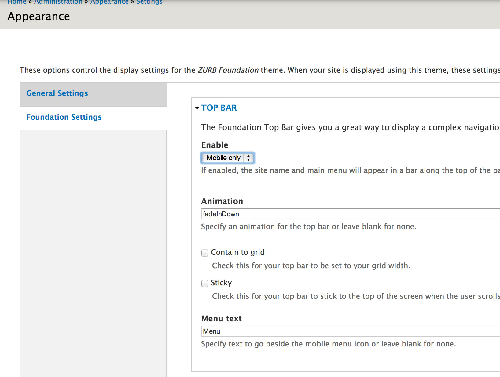
There's a comprehensive set of settings for the Top Bar under In Appearance -> Settings -> Zurb Foundation.
Here's what each of these settings mean:
- Enable
- Controls how you want the top bar displayed, if at all. Possible options are : "never", "always" and "mobile only". The most common option is "mobile only", which displays a regular Drupal main menu on larger screens and only displays the Top Bar on small screens.
- Contain to grid
- Check this option for your top bar to be set to your grid width. Unchecking it will make the top bar occupy 100% of the screen's width.
- Sticky
- Check this for your Top Bar to stick to the top of the screen when the user scrolls down. This is recommended when using a sticky layout with the Admin Menu module.
- Scroll to top on click
- Jump to top when sticky nav menu toggle is clicked.
- Hover to expand menu
- Set this to false to require the user to click to expand the dropdown menu.
- Menu text
- Specify text to go beside the mobile menu icon or leave blank for none. On small screens, the Top Bar will display a small "menu" icon and the word "Menu" next to it by default. Here you can customise or even remove this extra text.
- Enable custom back text
- This is the text that appears to navigate back one level in the dropdown menu. Set this to false and it will pull the top level link name as the back text.
- Custom back text
- Define what you want your custom back text to be.
Adding your logo to the Top Bar
The easiest way to add your logo to the Top Bar is to give .top-bar .name h1 some left padding and add the image via CSS as a background-image. You can also, as usual, override page.tpl.php and add your own markup to the default top bar links, however, if you do, you're on your own to style it! :)
Displaying the main nav on the right
Another popular request is to hide the secondary menu (User Menu by default) and display the Top Bar main nav on the right.
At the moment, the only way to do this is override zurb_foundation_links__topbar_main_menu() in your subtheme and change the line that adds class "left" to the wrapper.
Creating your own custom main menu
As mentioned above, we display a "standard Drupal main menu" on larger screens and resort to the Top Bar only for smaller ones. So how can you customise or override this menu?
The easiest way is to override the page.tpl.php file and replace the main and secondary menus yourselves:
    <?php if ($main_menu): ?>
      <nav id="main-menu" class="navigation" role="navigation">
        <?php print theme('links__system_main_menu', array(
          'links' => $main_menu,
          'attributes' => array(
            'id' => 'main-menu-links',
            'class' => array('links', 'clearfix'),
          ),
          'heading' => array(
            'text' => t('Main menu'),
            'level' => 'h2',
            'class' => array('element-invisible'),
          ),
        )); ?>
      </nav> <!-- /#main-menu -->
    <?php endif; ?>

    <?php if ($secondary_menu): ?>
      <nav id="secondary-menu" class="navigation" role="navigation">
        <?php print theme('links__system_secondary_menu', array(
          'links' => $secondary_menu,
          'attributes' => array(
            'id' => 'secondary-menu-links',
            'class' => array('links', 'inline', 'clearfix'),
          ),
          'heading' => array(
            'text' => t('Secondary menu'),
            'level' => 'h2',
            'class' => array('element-invisible'),
          ),
        )); ?>
      </nav> <!-- /#secondary-menu -->
    <?php endif; ?>
| Attachment | Size |
|---|---|
| zurb_foundation_top_bar_settings.jpg | 164.48 KB |


Comments
use a mobile-friendly Zurb navigation for the left-nav ONLY
What would be the easiest way to setup a regular left navigation and create the Zurb top-bar only for mobile?
I'm guessing the easiest would be to do this:
Duplicate the Top Nav for the Left nav,
then put a class="show-for-mobile" on the top nav in page.tpl.php,
and put a class="hide-for-mobile" for the left nav in page.tpl.php?
Don't think I can just clear out the top navigation aka 'Main menu', create those links in a new menu and add that menu to a left-sidebar block (or even 'Navigation'), then move those Zurb classes to the left nav will work since it uses 'links__system_main_menu', right? I'd rather not have to duplicate menu links though.
adding search form
Hello,
Can some one help me with steps of adding search form in the Top menu bar.
The variables in Top bar are some how confusing
Thank you
adding search form
Hello,
Can some one help me with steps of adding search form in the Top bar.
The variables in Top bar are some how confusing
Thank you
where is zurb_foundation_links__topbar_main_menu()
I've searched every folder... where is zurb_foundation_links__topbar_main_menu() - I'm trying to change the class from "left" to "right" as mentioned in this post.
found it!
For anyone else looking... it's in the template.php file. Line 147