
 Support for Drupal 7 is ending on 5 January 2025—it’s time to migrate to Drupal 10! Learn about the many benefits of Drupal 10 and find migration tools in our resource center.
By designguru on
As the founding college of the University of Toronto, UC maintains a historic stature within the context of Canadian higher education. However, this was not accurately represented through their existing website - in part due to it not having an over-arching aesthetic expressing UC's identity plus the site not being able to let staff and faculty maintain their own content.
Why Drupal was chosen:
Drupal offered us unparalleled flexibility to build a scalable solution that could develop as specific needs arise from UC in the future. Specifically, some major selling points in choosing Drupal were its support for accessibility, custom content types, dynamic content displays (Views/Panels) and of course its robust/definable user permissions.
Describe the project (goals, requirements and outcome):
Our aim throughout was to create a new aesthetic which is flexible yet representative of UC's identity whilst increasing inclusiveness amongst students, staff and faculty - allowing them to maintain their own content areas on the site.
This project entailed a series of stages in order to create a bespoke web publishing platform using the Drupal framework. We worked closely with the communications team at UC and involved other stakeholders as needed - from program heads to the Principal, Donald Ainslie.
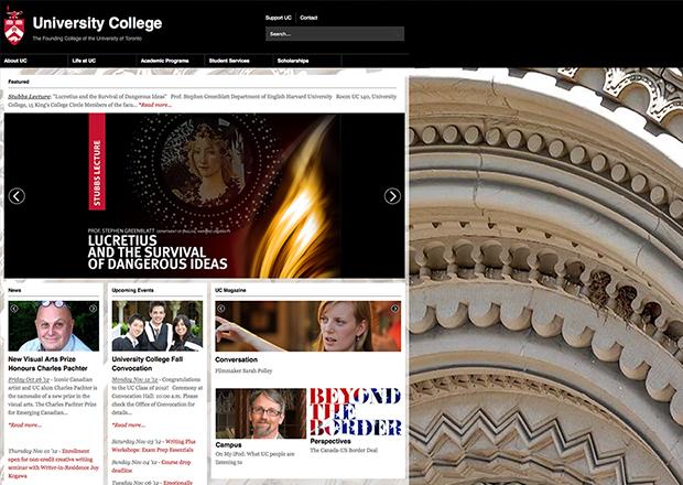
Our design process began with a comprehensive exercise considering aesthetic and interactive aspects of over 100 websites and apps in the educational sector around the globe (read about some of the best here). From this exercise we pursued an iterative process of screen designs resulting in the final approved aesthetic which was developed to skin a skeletal site structure.
The implemented design leverages story-telling potential of photography with z-index layering to imply depth of content. The site has various embedded slideshows plus contextual background images and transparent layering.
As with most of our client projects, our agile development methodology saw the user interactions refined once the skeletonal site was skinned; bringing UC staff into the process of simultaneously testing and planning for content relations and general interactions.
Despite trying to maintain a congruous aesthetic throughout the site, we wanted to give content maintainers control - and decided that leveraging photography and prepared graphics would really help them express the unique identity of each UC Program and site section. This meant employing:
- Page/section-specific full-background images,
- A simple custom content type called 'Voices' and
- Embedded slideshows.
Contrasting the horrible user experience of UC's previous website, we really wanted new content maintainers to feel comfortable adding and editing content on this site - which meant using simple javascript toggles to feature content on the frontpage etc... and making sure that all content forms featured similar conventions for assigning their site section plus representative thumbnail image etc... To that end we also imported a custom stock database of photos so that content maintainers can quickly embed images from a high quality collection with a few clicks of a button - and even custom crop their image selections (according to site design dimensions) on-site (removing any need for Photoshop training/usage!)
Depending on staff/faculty permissions, site members can login and easily upload images into embedded slideshows to display in whatever area of the site they maintain. These embedded slideshows can generally feature optional copy, link images to local or external links and auto-hide when empty. On the site's homepage, we used slideshows to relate the depth-of-content on-site as well as chronological relevance of some content types like News and Events. Featuring 4 main slideshows, the homepage draws eyes to featured content through full-width images, and allows users to play with additional features through smaller paused-state slides (they don't automatically rotate and require pressing next or previous buttons to change state.)
Our approach to way-finding was really to make fixed-position menus provide contextual information to users throughout the site - with two navigational levels provided by the main menu dropping down upon hover and then demonstrating menu relevance per-loaded-page by highlighting active parent menu items. Each section/page also shows a breadcrumb linking to parent pages plus a sub-menu with links to show the levels of navigational depth below the main menu (with active highlighting where parents are colored black with arrow icons.)
Technical specifications
Key modules/theme/distribution used:
Why these modules/theme/distribution were chosen:
We chose Zen as a solid framework for making a totally custom sub-theme, helping us ensure that cross-browser testing wouldn't be a nightmare. Our approach is always one with flexible scalability in mind; so when creating dynamic content displays (including slideshows) we wanted to be able to easily reconfigure what was being shown on the site - Views and Panels allowed whilst letting us assign admin permissions to specific user roles to control what is being shown in the Views/Panels we built out.
Apache Solr is a fantastic search facility and let us implement facets to search on the site. Improving SEO we used Pathauto to make our site URLs semantic and follow logical paths which site viewers could navigate at various depths.
Team members:


Sectors:
Education
