
Meta Issue:#1870944: [Meta] Mobile friendly admin pages
Problem/Motivation
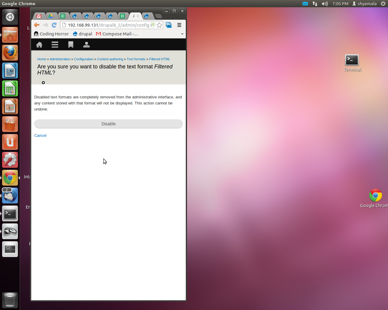
Confirmation message pages in NARROW screens:
Cancel text looks small and inconspicuous to the big disable button.
Admin URL eg: admin/config/content/formats/filtered_html/disable
Proposed resolution
To be determined.
Remaining tasks
To be determined.
| Comment | File | Size | Author |
|---|---|---|---|
| Confirmation message pages.png | 439.23 KB | Shyamala |


Comments
Comment #1
LewisNymanI'm not sure that this is a problem, cancel text is supposed to look inconspicuous compared to the main primary actions. It would be a problem if it we think the cancel button could be easily missed. If so then let's reopen this.