
 Support for Drupal 7 is ending on 5 January 2025—it’s time to migrate to Drupal 10! Learn about the many benefits of Drupal 10 and find migration tools in our resource center.
Thanks for working with those of us that have asked for a UI for altering modal sizes. I was looking for something like this as the modal form I was using for my contact form wasn't working very well for responsive design. My initial problem was that on phones the modal was much too large and was strangely off-centered so was pretty much un-usable on phones (see screenshot mobile-portrait for an example). If you want to see it for yourself, go to http://bevelsmith.com and click on the contact us link in the primary navigation. For desktop it works great - for phones it is un-usable.
I updated my local environment using the 7-dev version that was patched with the UI changes. I have some comments about the UI and then some experiences to share:
Modal popup small, medium, and large could use some clarification (at admin/config/development/modal_forms, under Styles and Options). If you provide the viewport or size cutoff you used to determine what is 'small' 'medium' or 'large' it will make it much easier for users to decide what type and width/height they will assign for each of these options.
I first tried using the Type: Scale for each of 'small' 'medium' or 'large'. For large scale I set it to .4 x .3, for medium scale I set it to .6 x .5, and for small scale I set it to .8 x .6. The behavior is kind of unpredictable with these settings.
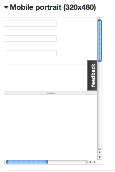
- Mobile portrait (screenshot mobile-portrait-2) looks close, but it would be best if the fields were scaled to fit the size of the modal. It looks like the text area is scaled to fit the modal, but the text fields are not scaled.
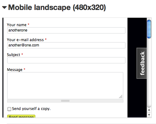
- It seems that depending on the orientation of the screen (portrait vs landscape) the width x height are changing, and for the mobile landscape the modal is no longer centered (screenshot mobile-landscape)
I next tried using the Type: Fixed and set it to small: 300x300, medium 400x400, large 500x500
- From using these settings it appears even for mobile (320x480) the small size isn't triggered, because if I inspect the modal it is actually 400x400. There also seems to be the issue with mobile-landscape that the modal is no longer centered (see mobile-landscape-fixed)
So to summarize:
I tried to be clear hear, but there are a few things going on. Please let me know if you need any more clarification - would love to see this working.
| Comment | File | Size | Author |
|---|---|---|---|
| mobile-landscape-fixed.png | 31.4 KB | kbrinner | |
| mobile-landscape.png | 39.21 KB | kbrinner | |
| mobile-portrait.png | 21.51 KB | kbrinner | |
| mobile-portrait2.png | 47.53 KB | kbrinner |


Comments
Comment #1
frjo CreditAttribution: frjo commentedThe different sizes are simply that, ready made sizes that can be used when building links to open a modal. The optional JavaScript files that can rewrite existing links in to modal links for some selected forms also sets a modal size. If you want a form to open in another size simply create your own JavaScript to rewrite the links or build modal links directly. More info in the README.
If I would do anything for mobiles with this module is would be to add a feature to completely disable modals on mobiles.
Comment #2
kbrinnerAgreed - thanks for taking the time to respond and I do see the necessary info in the README. It would be nice to disable this on mobiles - thanks for the handy module.
Comment #3
frjo CreditAttribution: frjo commented