
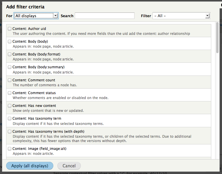
Problem/Motivation
The search box is often missed, even when its not hidden by scrolling. This is because its not a common pattern to put it in the top of the modal dialog and that it currently kinda blends in because of the intense data below.

Proposed resolution
We should probably figure out if we can attach it to the top of the modal. Rather than having it in the scrollable area.
| Comment | File | Size | Author |
|---|---|---|---|
| #31 | interdiff.txt | 1.13 KB | dawehner |
| #31 | drupal-1832872-31.patch | 2.56 KB | dawehner |
| #29 | drupal-1832872-29.patch | 2.26 KB | dawehner |
| #29 | interdiff.txt | 1.4 KB | dawehner |
| #27 | drupal-1832872-27.patch | 2.28 KB | dawehner |


Comments
Comment #1
lisarex CreditAttribution: lisarex commented+1 for moving the Search and Filter out of the scrollable area. I would also like to see Filter renamed to Type, since the word Filter in this UI already has another meaning.
Comment #2
Hydra CreditAttribution: Hydra commentedHow about a css solution like this one. There is still a problem with the width of the filterarea but I think this goes where we want it.
(Patch is for D7, sry for that)
Comment #3
dead_armScreenshots from my patch in progress, including requested label change from 'Filter' to 'Type'. Assigning to myself to finish up.
Pre-scroll
Scrolled
Comment #4
yoroy CreditAttribution: yoroy commentedWe can also add emphasis by removing other stuff. Can we remove the 'For [select list]' widget and instead transform the 'Apply' button at the bottom into a dropbutton? Maybe the search and filter options could then be made part of the header area:
Comment #5
arbel CreditAttribution: arbel commentedCan we add a sub option for the specific content type, so in the type dropdown you'd have
Node
Content
->page
->blog post
->artcile
->...
Taxonomy
I think that would really help on large sites with multiple content types.
another option would be to add a second dropdown, allow the search field to filter according to the content type.
Idan
Comment #6
yoroy CreditAttribution: yoroy commented@arbel: that may well be a good idea, but that is a feature request where this particular issue focusses on fixing a usability issue found with the current interface. Your idea would be better off in a new issue.
Comment #7
dead_armPatch attached gets this some of the way, but with a bit of nasty styling with CSS ( .views-ui-dialog .scroll { max-height: 439px !important; } in views-admin.css) that should be removed in favor of changing how the js calculates heights most likely. Also these changes work great for modals that utilize the scroll, like when adding fields, filters, or sort criteria, but not when adding a header or footer.
When adding a header or footer, 'Apply all displays' and 'Cancel' button section is pushed too far down
Header
Footer
Comment #8
dead_armThe idea to simply move the controls group seems much simpler than what I was working on, the screen shot for how that looks below. It also would not require any CSS to be added or js changes. A bit of CSS that is applied to #views-filterable-options-controls in views-admin.theme.css could be removed then since it adds too much space.
Comment #9
dawehnerThis is looking great!
Maybe you should also post the patch :)
Comment #10
dead_armEverything looks right visually but I broke the actual filtering. I think someone who has php skills should take over from here :)
Comment #11
dawehnerWell ... the actual filtering, so both the textfield as select field works fine for me,
but the actual output feels a bit wrong ;)
This happens on both FF and chrome with cleared cache and a forced reload.
Comment #12
tim.plunkettHere's another approach.
I don't have FF installed, can someone check it and post screenshots?
Comment #13
dead_armWorks in FF:
Also re-rolling with the label change from filter to type.
When minimizing the window, the fields stack badly in both browsers, but this behavior isn't caused by this patch, it just adds to it. Would consider opening a follow up issue for the CSS.
Without patch in Chrome:
With patch in Chrome:
Comment #14
dawehnerJust in general, this is a huge huge improvement!
This fixes the issue mentioned in http://drupal.org/node/1832872#comment-6778364 for me
The rest of the patch is RTBC for me.
Comment #15
tim.plunkettAh! That is an interesting glitch + fix, and it doesn't negatively affect the behavior for me, so RTBC.
Comment #16
Dries CreditAttribution: Dries commentedCommitted to 8.x. Thanks.
Comment #17
dawehnerSadly the javascript wasn't adapted so searching doesn't work anymore. once you fix that the listing looks odd :(
Comment #18
dawehnerLet's at least fix the javascript bug first.
Comment #20
dawehner#17: drupal-1832872-17.patch queued for re-testing.
Comment #21
dawehner#17: drupal-1832872-17.patch queued for re-testing.
Comment #22
dawehnerAnyone want to remove this annoyance?
Comment #23
aspilicious CreditAttribution: aspilicious commentedViews UI is kinda broken without this patch. I have no idea why, but this bug triggers a lot of js errors all around the place :s.
When this gets in it will be easier to test views properly.
Comment #24
webchickCommitted and pushed that fix to 8.x. Thanks!
Comment #25
tim.plunkettI have no idea what happened here, it was working for me as of #16, and the *new* patch broke it for me.
But apparently it was the opposite for @dawehner?
When I go to add a new field or filter, and I inspect the search box, I get this
Which clearly needs the original selector, not the one from #17.
Comment #26
dawehnerSo we finally figured out that '#tree' changes depending on the amount of displays you have (1 or more)
Comment #27
dawehnerThis also correct the visual appearance of master only views.
Comment #29
dawehnerThis time with a fix which actually works.
Comment #30
damiankloip CreditAttribution: damiankloip commentedFix looks good, not sure about this comment though :)
Comment #31
dawehnerUps right, here we go.
Comment #32
tim.plunkettLet's get this in, the UI is unbearable at the moment.
Comment #33
tim.plunkettChanging the title for a better commit message.
Comment #34
webchickThird time's a charm? :D
Committed and pushed to 8.x, with a tiny comment fix. Thanks!
Comment #36
klonos