
By Chapter Three on
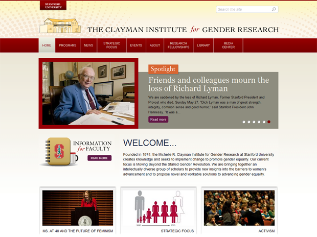
Women's equality has grown enormously in the last 100 years, but it's plateaued since the 1990s, with stagnation in salaries, leadership positions and political offices. As women ourselves in the male-dominated field of technology, our internal team quickly identified with this story. The primary goal of the Clayman Institute is to "bring together an intellectually diverse group of scholars to provide new insights into the barriers to women's advancement and to propose novel and workable solutions to advancing gender equality."
Why Drupal was chosen:
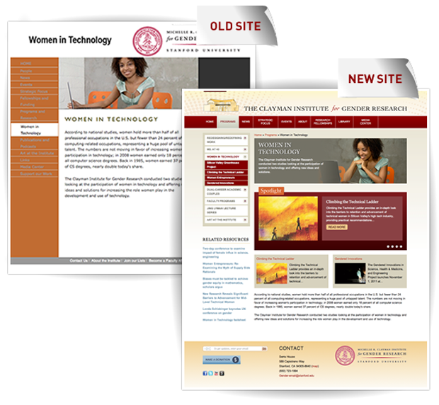
The Clayman Institute for Gender Research approached Chapter Three with a common problem for most university websites: their website had a fractured and disorienting information architecture paired with an outdated inflexible design. They needed a new site that encapsulated their modern, forward-thinking nature. Drupal was the best base to build such a website.
Describe the project (goals, requirements and outcome):
From day one, we engaged in a collaborative working relationship with Clayman. We provided the expertise in strategy, information architecture, UX and design, and looked to Clayman to take an active role in determining the future of their content. Like many academic sites, they had hundreds of pages of articles and information which needed to be vetted, updated and revisited.
Implementing a Content Strategy
We coached Clayman on how to perform a content inventory for their site. This exercise lays out your primary, secondary and tertiary navigation pages in a spreadsheet, documenting details such as "keep", "edit" and "delete". While this process is stereotypically loathed by all involved, it's surprisingly fast and instantly enlightens both parties about your starting point. The spreadsheet is then used further to task out such Herculean tasks as rewriting and editing the content, making it more skimmable for the web.
Information Architecture
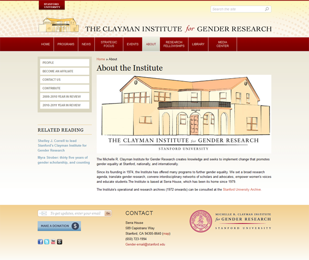
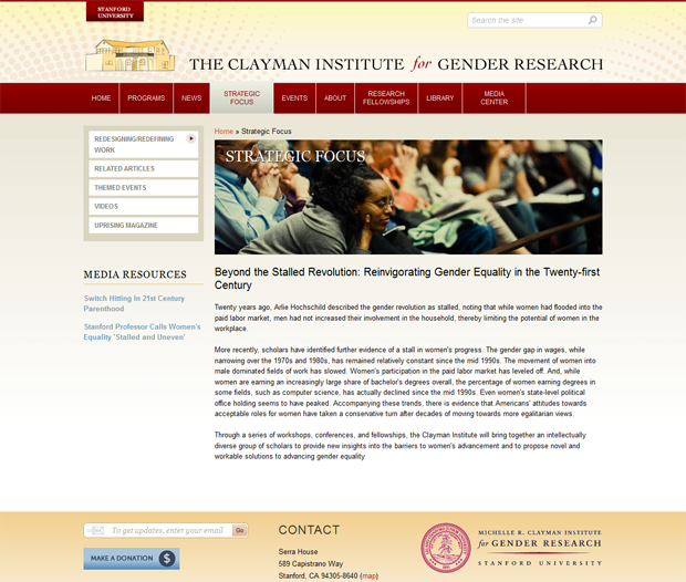
From here we defined the information architecture, using our content inventory notes on what pages and sections to keep or delete. Our audit of the existing site showed an abundance of microsites that needed to be logically folded into the main structure. We used a card sorting methodology to design a simplified navigation that also accounted for Clayman's anticipated future growth.
Moodboards
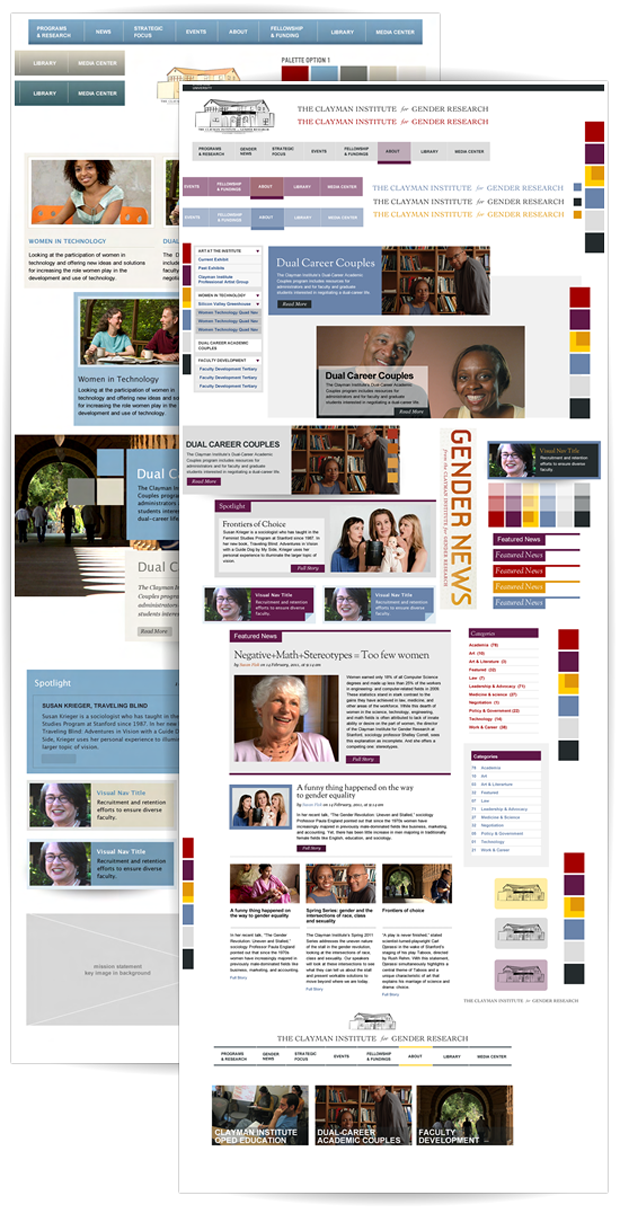
We produced several mood boards, exploring various style options and color combinations for key UI elements. Some refer to this method as creating style tyles, where your moodboard is expressed within real site elements rather than abstract imagery. Clayman was interested in creating a more vibrant and modern look than seen on the typical academic sites at Stanford.
UX
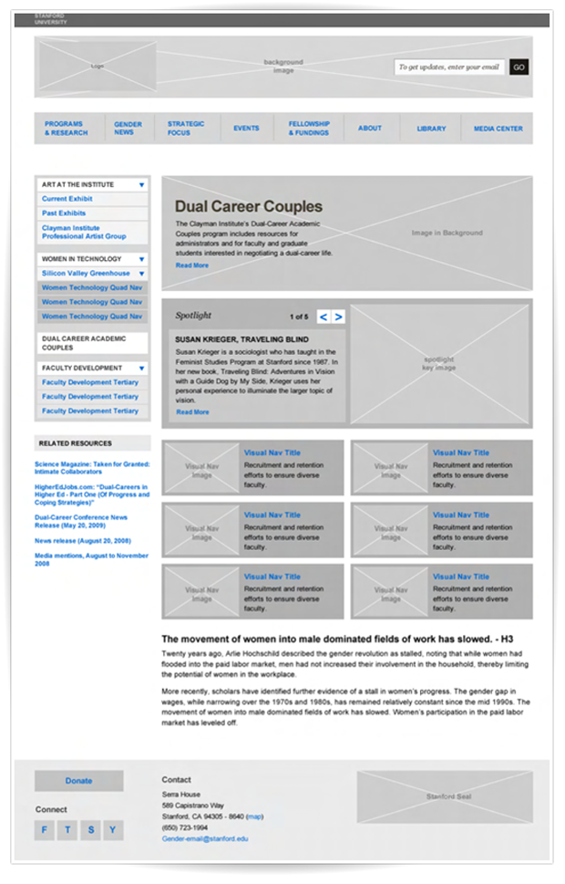
The biggest challenge for thie project was the microsite landing page, which needed to be designed to account for a wide variety of content displays (example 1, example 2, example 3). We had to define a structure to showcase between 1 and 6 spotlight content chunk with imagery and text; as our client defined it, "visual navigation". In short, they wanted several blocks with clickabe image and text teasers for visitors, with easy editing and control for themselves. The page could also have the option of a carousel, a key image, and some basic text. Each microsite would display some or all of these elements differently, so we needed to ensure that the design worked with all the different configurations. In the end, we set a requirement to keep showcased visual nav items grouped in pairs to preserve design symmetry. This provided them enough flexibility to show what was necessary and still feature more or less content as needed.
Design
For the design, we added a few accent colors, such as a deep purple and burnt orange, to energize the site's look and feel. We improved overall legibility with a larger font size and more contrast in the primary navigation elements. In step with our process point on collaboration listed above, we worked with Clayman to gather and implement more imagery throughout the site and showed them various ways to use that imagery effectively.
The Result
Clayman is thrilled with their redesign and happy to have a cohesive site that they can easily manage. They even sent us thank you cookies!
Technical specifications
Key modules/theme/distribution used:
Why these modules/theme/distribution were chosen:
They are basic for the functionality needed for this website.
Organizations involved:
Sectors:
Education
