
 Support for Drupal 7 is ending on 5 January 2025—it’s time to migrate to Drupal 10! Learn about the many benefits of Drupal 10 and find migration tools in our resource center.
Over at #1170478-91: Responsive Images, it's clear that breakpoints are also needed for images. While they probably need vastly different configurations, it might make sense to have a unified "breakpoints UI", within which you can then configure images, layouts and other screen-dependent aspects.
However, "breakpoints" implies screen resolution, pixel density, physical size. Is that really future proof? Isn't "device context" what really matters?
I can imagine e.g. device context dependent:
- text input: e.g. speech input
- location: some devices have GPS, how do we ensure that site owners can configure the site to either don't show a UI at all and use the devices' GPS instead, or allow both manual and GPS input, or disallow GPS input?
- videos: high-bandwidth computers get HD video automatically, mobile devices low quality video. Or even: some types of devices may not be designed to play videos and (w|sh)ould show static images instead.
- …
But probably those will be negligible use cases in comparison with just breakpoints.
| Comment | File | Size | Author |
|---|---|---|---|
| #8 | i1170478-136a.png | 46.6 KB | attiks |


Comments
Comment #1
Gábor HojtsySounds like responsive images would need to be resized based on their placements in the layout too, not just the breakpoint (device context) that is active. So even if you have a 780px breakpoint let's say, if you put the image to column grid that spans 1/3rd of the available space, the image would need to adjust to that. So sounds like that would be derivative from the placement, not needed on its own?
Comment #2
Wim Leers#1: You're absolutely right that it's also related to its container/parent, not just the breakpoint/viewport/device context. #1170478-96: Responsive Images, #1170478-102: Responsive Images, #1170478-103: Responsive Images are related to what you're saying. Unfortunately, container/parent-based resizing doesn't seem to be feasible just yet.
I think my point still stands though? I do think it's a "nice to have" though :)
Comment #3
attiks CreditAttribution: attiks commentedProposal for UI: #1690216-7: UX Improvements
Comment #4
attiks CreditAttribution: attiks commentedNew proposal for breakpoint ui in #1170478-127: Responsive Images, feedback more than welcome
Comment #5
attiks CreditAttribution: attiks commentedAs Bojhan requested in #1170478-145: Responsive Images we need to find a way to combine forces, I think there's already some overlap with resp_img D7 (using ctools to handle the breakpoints) so my idea was to create a separate module just to handle breakpoints.
What properties do you need on a breakpoint?
Comment #6
Gábor Hojtsy@attiks: breakpoints are not yet set apart from grids in layout module. See our thinking about that at #1682906-7: Communication requirements and format backend vs. frontend. It is not exactly clear to me what would be common in these breakpoints if they are not useful interchangeably.
Comment #7
attiks CreditAttribution: attiks commented@Gabor, this separate module will only be about what you're calling 'global breakpoints'
Comment #8
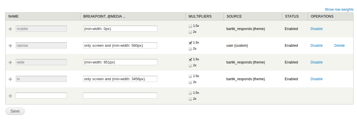
attiks CreditAttribution: attiks commentedFor the moment the 'responsive image' part uses this breakpoint object:
AFAIK, layout only uses:
Can be defined as follows in D8
name: mobile
suffix: __mobile
breakpoint: '(min-width: 0px) and (max-width: 560px)'
source_type: module
source: layout
status: TRUE
weight: 0
Comment #9
jessebeach CreditAttribution: jessebeach commented@attiks, what if we take your definition of a $breakpoint and wrap it in a model?
Breakpoints -- and the steps in between them -- are really just describing a geography. A stretch of space with inflection points along it. What we do at those inflection points is somewhat arbitrary. We could change the layout of a page or swap a small image for a large image. And the distance can be measured in the web space with two units: px and em.
Let's call these things progressions. We have four progressions below.
Default |----------------------------------------------------------------------------------------------∞
Device-driven |---------------320px-----------------------600px---------------------------960px-------------∞
Content-driven |-------------------28em----------------------------58em---------------76em------------------∞
Custom variant |-----------------------420px------------------------------------------------------------------∞
These progressions can be defined absent of content or layout. They simply define points of inflection. They might even mix units of measurement.
Now what we could do, once we have these defined, is assign them to components of our site that consume space: image, layout, widgets through image formattes, layout managers and block managers.
The type of thing they are applied to determines the attributes that can be manipulated. Assign it to a layout and you have the opportunity to also assign a grid and manipulate region widths within each step. Assign one to an image formatter, and you get to determine the behavior of the images within each step such as resolution, cropping, etc.
A site might have 10 progressions defined that site builder can use to determine when their content inflects. In fact, we could probably exhaust most of the common progressions with smart defaults.
Now, this does not address at all issues like how changing a progression affects live site content. We might have a rule that says once a progression is used, it can't be edited; it can only be cloned and swapped with another. Not sure how that would work either :)
But as a mental model, what do you all think? Wrapping breakpoints in a progression eliminates the need to manage their weight relative to all other breakpoints in a site. The progressive tells a story about how content will react to available space.
Comment #10
jessebeach CreditAttribution: jessebeach commentedIf it wasn't clear, as independent objects, breakpoints wrapped in progressions need not simply be associated with media queries. We could use them to hang JavaScript from.
I explored this idea in a jQuery plugin I wrote called BreakUp that fires callbacks when breakpoints are breached.
https://github.com/jessebeach/breakup
Comment #11
attiks CreditAttribution: attiks commented@jesse thanks for stopping by ;p
To be sure where on the same page: 'Device-driven' is a collection of 3 breakpoints, so inside on progression you still need to be able to store all the relevant info, including (relative) weight.
"And the distance can be measured in the web space with two units: px and em" this might not be sufficient for themers, they want full control over the MQ, at least that is what I learned from #1170478: Responsive Images
I like the idea of being able to assign them to various 'things', something to think about.
"BreakUp plugin" looks neat, but the idea is that all of this (the image part at least) will work without any javascript (except for a polyfill)
Short summary: add a way of grouping breakpoints into progressions so they are easier to manage, correct?
Comment #12
jessebeach CreditAttribution: jessebeach commentedYes, let's group them in objects. We'll prototype something like that in the Layout module or some other Spark offshoot soon so we have something concrete to critique.
The breakpoint data model your provided above is really useful, too. I'll incorporate that.
I think that MQ's can only be specified in px or em.
I think any responsive image solution (that isn't server-side based) needs to include JS until we get a browser solution. Something, somewhere has to compare the available size of the context to a list of available images and choose one. And even with the browser solution, the polyfill will be JS, so maybe we build that now and get the browser solution for free later!
Comment #13
attiks CreditAttribution: attiks commentedAre you going to create a separate module for the breakpoints/grouping, because I'm going to backport what I have now for resp_img to D7, creating a 'breakpoint' module to handle only the breakpoints? The current D7 version of resp_img even has most of the breakpoints stuff already in there.
MQ's can be anything, see http://css-tricks.com/css-media-queries/
@media screen and (color) and (device-aspect-ratio: 16/9) and (min-width: 520px) and (max-width: 33em)is validWith the 'without any javascript' I meant mostly without the need to have jQuery, I would like the polyfill to be pure javascript so the load on the client is as minimal as possible. Latest polyfill I'm using is at https://github.com/attiks/picturefill-proposal
Comment #14
attiks CreditAttribution: attiks commentedFYI: resp_img is split in 2 parts:
Edit: links added
Comment #15
attiks CreditAttribution: attiks commentedThere's now a D7 version of breakpoints, biggest miss is import/export of ctools.
Comment #16
Gábor Hojtsy@attiks: great! The main feature gaps for layout module are indeed (a) make it exportable/importable. We created a simple gridbuilder module to do that too for the grids, so we can source that from somewhere :) and (b) a simple value for when should the breakpoint "apply" (think "780px" or "23em"). The breakpoints your module work with are directly specified in a media query syntax which is good for direct CSS use, but is not good when we need concrete data about the breakpoint. The layout module needs the unprocessed "780px"/"23em" data to know how wide to display the layout editor basically.
I was thinking about possibilities to build this into the breakpoint module approach as-is. Eg. how would you define that from the .info file?
Comment #17
attiks CreditAttribution: attiks commentedI assume layout interprets 780px as (min-width: 780px)?
Since breakpoints can and will be shared with other modules, we need a full MQ, I think the best thing todo is to handle it inside layout:
Is this workable for you?
Comment #18
adoo CreditAttribution: adoo commentedLazy load of images with responsive image styles.
The JS to determine the size of the container and site, and choose from predefined styles.
Just a thought.
It would be a nice option.