
 Support for Drupal 7 is ending on 5 January 2025—it’s time to migrate to Drupal 10! Learn about the many benefits of Drupal 10 and find migration tools in our resource center.
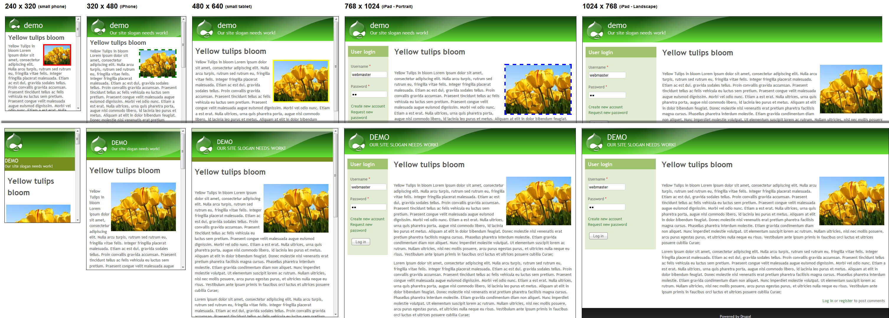
Following Jeffs recent post about further improving the themes responsiveness and ease of setup http://drupal.org/node/1576376 I was inspired to see if I could improve my site's images responsiveness, they look great on a PC screen but are oversized on a phone.
to pixture_reloaded.css I added:
.field-type-image figure img {
    max-width: 40%;
}
This means that for all but smartphone size the site is unaffected but once a screen or window browser window is reduced such that the standard images take up more than 40% of the space they begin reducing.
I did the same with the site logo and also reduced heading font size and line height on the smaller screens. The different border colours were added to the responsive... css files to help me ensure that I knew which css files were being called.
I can see great potential for Mobile first and responsive themes and again thank Jeff for all his hard work.
I have attached a (large) screenshot which you can see in a browser by going to http://mattkersley.com/responsive/ and putting the url http://ventura.server304.com/demo/node/4 into it or going direct to the demo site. I hope the above is of use to others or at the very least someone can tell me it already does this or I am doing it all wrong!
| Comment | File | Size | Author |
|---|---|---|---|
| responseimage2.png | 686.5 KB | artatac |


