
 Support for Drupal 7 is ending on 5 January 2025—it’s time to migrate to Drupal 10! Learn about the many benefits of Drupal 10 and find migration tools in our resource center.
Hi there. I have looked all over and I'm not seeing any documented issues or support requests talking about this, so hopefully I'm not duplicating. I apologize if I am.
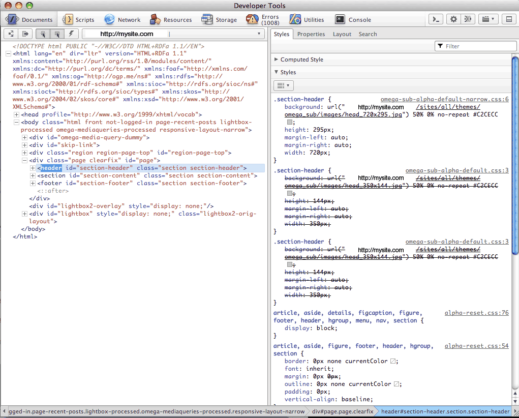
I'm trying to get my Omega site to shrink down to the mobile size. When I use inspect my css I see that when my screen is smaller than, say 350px, the omega-sub-alpha-default-narrow.css file is still overriding my mobile code in "omega-sub-alpha-default.css". I've also tried putting my mobile code in global.css instead of default and I get the same thing.
Not sure if this helps, but I tried the settings for my Omega-Sub theme and under "Narrow" I have used "all and (min-width: 740px) and (min-device-width: 740px), (max-device-width: 800px) and (min-width: 740px) and (orientation:landscape)"
I know that global.css is supposed to have taken the place of mobile.css, way back last year, but I wonder if I need to create that anyway?!
Or is it a matter of changing the weight in my omega-sub INFO file? I'm not sure how to do that without messing other things up, though.
Any help would be appreciated. I am attaching 2 pics of the css code (through Opera's developers tools). It shows what I mean about the narrow CSS overriding the default one. It also shows that the default one is being loaded multiple times - I thought that was weird, too, but maybe that's normal? I dunno!
Thanks for any help!!
SoniaWilk
| Comment | File | Size | Author |
|---|---|---|---|
| mobile-settings.png | 51.74 KB | Anonymous (not verified) | |
| normal-settings.png | 52.45 KB | Anonymous (not verified) |


Comments
Comment #1
Anonymous (not verified) CreditAttribution: Anonymous commentedHi again. Just a wee bump to see if anyone will bite. I would really appreciate ANY direction on this, as I'm completely stumped. If you need more information, let me know.
Please and thanks!
SoniaWilk
Comment #2
dhalbert CreditAttribution: dhalbert commentedYou should definitely be using global.css, not default.css or mobile.css.
Having said that, did you create your subtheme long ago, well before the present version of Omega? You may have some obsolete settings in the various setup files.
I would recommend creating a new vanilla subtheme according to the documentation directions and then trying a mobile-sized window to make sure only the CSS files you expect are getting used, to confirm it's not a browser problem. Then port your own subtheme over to the new vanilla subtheme. Avoid changing the .info file of the vanilla subtheme unless you absolutely have to. For most cases you will need to make very few if any changes to it.
Note that if your theme has a "-" or "_" separator in the name, you have to be careful to use the right separator, as it will vary in different places. It's easier just not to have a separator in the name, to avoid issues.
Comment #3
Anonymous (not verified) CreditAttribution: Anonymous commentedAha!! Got it. Thanks, dhalbert, for replying and setting me on the right track. I created the new sub-theme, with no dash or underscore in the name. Set the new subtheme to default, deactivated the malfunctioning subtheme and then had to delete the malfunctioning subtheme folder completely from the server to get rid of residual effects. It was stubborn! Cleared cache and it's now working as expected. My CSS is clean, now, as I resize my window. Only one stylesheet shows on mobile size, then the narrow style shows on the next screen size, etc, which is good to see.
Not sure if the dash was causing the issue or not, but something was messed and seeing the multiple stylesheets show in Firebug (or whatever developer tool you use) was the clue that something wasn't right in the backend. Nice thing was all I had to do was copy my css from my malfunctioning sub-theme, that I kept on my harddrive, to my new sub-theme, so I didn't lose any time re-doing code. I'm mentioning that in case anyone comes across this problem in the future.
Thanks again, dhalbert!
SoniaWilk
Comment #4
dhalbert CreditAttribution: dhalbert commented