
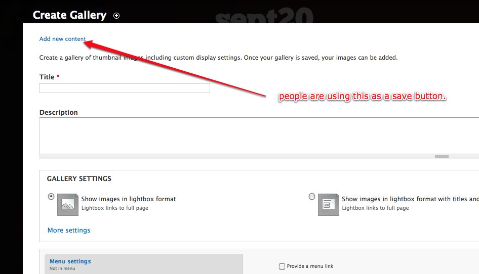
Usability testing by Jeff Noyes has turned up a serious usability problem for new users/content creators in current Drupal 7. The truncated breadcrumb link "Add new content" is interpreted as an action that would submit the node add form they are currently working on.
Also, it's totally unclear why the Home link is stripped by the overlay module (Bojan makes some hand waving about the home link in the toolbar - but that's silly, since the toolbar is not accessible to all users). Imho, breadcrumb should be consistent in and out of the overlay - or better yet be totally absent in the overlay as webchick suggested at http://drupal.org/node/548806#comment-1948492
| Comment | File | Size | Author |
|---|---|---|---|
| #3 | 897768-patched-1.png | 41.74 KB | pwolanin |
| #3 | 897768-no-place-like-home-1.patch | 783 bytes | pwolanin |
| 20100830-p9pckdjuceu8hekw3q73gqrypy.jpg | 60.09 KB | pwolanin | |


Comments
Comment #1
webchickNot convinced on critical (or even "major") status unless you can further quantify this. Was this one user in a pool of 30 that had this issue, or is it 30 users in a pool of 50, or..?
I like having the breadcrumbs there for "deep-nested" areas of the admin panel like image styles, fields, etc. so am pretty opposed to whole-sale removal of breadcrumbs. This looks more to me like node module just needs a better breadcrumb on node add pages.
Comment #2
webchickStupid tagging.
Comment #3
pwolanin CreditAttribution: pwolanin commentedHere's a patch that also makes the "Home" link show inside the breadcrumb (plus screenshot). Not sure if that's sufficient to alleviate confusion?
Comment #4
pwolanin CreditAttribution: pwolanin commentedcross posted
What would the node module do instead? I think people are generally agreed the /node is not the (sensible) parent of /node/add
Comment #5
webchickThat's basically what I meant, or else "Add new content >> Article". But the patch there changes this everywhere. I think that would be confusing because when you click "Home" in the breadcrumb you'd be taken out of the overlay. Let's see what the UX team says.
Comment #6
Noyz CreditAttribution: Noyz commentedI think it's ok if "Home" takes users out of the overlay. That's what I'd expect it to do actually. In testing, I see people clicking the home icon to get themselves out of the overlay all the time. A "home" link as a breadcrumb would just bring this link closer.
Regarding metrics, usability testing is usually on 6 to 7 like candidates. Of those six, if more than 2 or 3 people hit the same issue, it's likely that many more will too. Of the people we've on creating pages and creating gallery pages, a healthy 30% think this bread crumb is a commit since the actual Save button is below the fold. That's a significant number/problem.
Comment #7
Noyz CreditAttribution: Noyz commentedI missed the fact that you're also talking about keeping the current link. I think that's ok, so long as the current link is not an active link, and the link name is representative of the task... for example instead of
Home >> Add content
it's
Home >> Add basic page
Comment #8
webchick30% definitely does indeed sound pretty bad. Thanks for the additional background information. I'm splitting the difference at "major", since this is not quite as critical as the other bugs on the critical list, but still nasty.
Comment #9
Bojhan CreditAttribution: Bojhan commented@noyz Thanks for chiming in, I would love if you could do this more rather then hearing from pwolanin about a very serious usability problem (we are on a very limited time schedule)
The reason why we removed "Home" as trail in the breadcrumb as it seemed to add clutter (more items in the trail) and duplication of the link in the top, although bringing it closer is favorable that was conciderd not a very important strength.
However it seems all "not-so-deep" menu trails seem to suffer from having only 1 item in the trail, that is obviously not what we want. If adding the "Home" part will fix that issue, I am totally oke with it. Although webchick's suggestion is fine, I am unsure if its scalable to all contribs that have parent-less menu items.
The true correct trial would be "Home> Add new content > Create Article". Noyz addition of not linking the last in the trail is good. Lets get a patch up and more reviews, anything with breadcrumbs tends to be a can of worms.
Comment #10
webchickGetting any fancier than "Restore 'Home >>' to the breadcrumb" is not really something we have time for at this stage due to the "breadcrumb bikeshed" problem you mention. So as long as you're cool with that, that's probably the approach we should take.
That seems to be what pwolanin's patch in #3 does, based on visual inspection. RTBC?
Comment #11
Bojhan CreditAttribution: Bojhan commentedYup, I really pray we dont open a new can of worms.
Comment #12
casey CreditAttribution: casey commentedI agree on using pwolanin's patch.
Comment #13
Bojhan CreditAttribution: Bojhan commentedComment #14
webchickCommitted to HEAD. Thanks!
Comment #16
effulgentsia CreditAttribution: effulgentsia commentedFor anyone interested in follow-up UI work regarding breadcrumbs for D8 core and D7 contrib, please see #481564: Provide breadcrumbs as seperate module with block. (similar to path, menu and search.) and http://drupal.org/project/breadcrumb.