
I acknowledge the fact that install pages are pretty critical for get users going so it's better to provide enough (and more) info for user so he would not mess up. Then again, it's a thin line between the goal above and purely overloading user with techy info and giving him a feeling 'um, what's all this, all I wanted was to get to the fun stuff'.
Have a look at the comparison image I attached: how Wordpress 2.0 is providing almost the same functionality (sans dbtype) with 1/2 less screen estate and 2/3 less copy. Scroll to the bottom of image.
Look at the tone of voice of both copies: It's the girly wordpress (the famous easy to install one) speaking with light and trouble free tone and there is Drupal, a serious, thick glass guy with 'all the info you ever need'.
I can not deliver better text for a installation screens, I am no good English-speaker/writer, I just tried to outline the direction where the text should go and what should be cut and what emphasised.
There are basically 2 main ideas in the proposal:
- fixed, lighter copy (must have)
- put host and prefix as less-used options under collapsed "Advanced configuration" fieldset (nice to have)
| Comment | File | Size | Author |
|---|---|---|---|
| #27 | install_usability_3.patch | 8.72 KB | eaton |
| #26 | configuration.png | 8.36 KB | eaton |
| #25 | install_usability_2.patch | 8.71 KB | eaton |
| #20 | install_usability_1.patch | 8.81 KB | eaton |
| #19 | fieldset.png | 15.49 KB | eaton |


Comments
Comment #1
merlinofchaos CreditAttribution: merlinofchaos commentedHere are my stabs at some text replacement, numbered according to the original attached screenshot. (Text in quotes; responses to items on the png are not):
1) "Please provide the following information to configure your Drupal installation."
2) "Select the database your Drupal installation will use. If you have difficulty, try the [Drupal database troubleshooting page]."
3) In general I don't think the order of dbuser/pass/name matters but in terms of order of significance, name is probably first.
4) "This database must already exist, and should be provided by your database administrator or hosting provider."
5) "The hostname or IP address of your database server. Will probably be localhost."
6) I do not think these items need to be collapsed.
Comment #2
tayknight CreditAttribution: tayknight commentedI agree the database name should be above the other database information.
I know on Dreamhost, the database host is not localhost. I'd assume that on most shared hosting, the database name is not localhost. Would it be too wordy to list some of the more common situations where 'localhost' isn't going to work, like users on shared hosting?
Comment #3
Dries CreditAttribution: Dries commentedI love annotated screenshots! Great job, Kristjan. I agree with all of your points. Sholuld be a fairly easy patch.
Comment #4
simeAfter a person puts in their mysql username and password, is it possible for the install script to try the likely candidates like localhost, remotehost, remotemysqlhost etc and then auto-populate the field.
Also (if there are appropriate mysql user rights) could the script also query for a list of databases?
Comment #5
eaton CreditAttribution: eaton commentedI honestly think those options veer into the realm of 'trying to be too smart.' There are too many ways for that to go wrong: permissions, bad guesses, confusing the user with loads of options (none of which are correct), etc.
Provide a sensible default at this point with a minimum of fuss, and note that if it doesn't work, they should ask their hosting provider what the address of their database server is. Similarly, the name of the database.
Eliminating the unecessary verbiage does far more for usability on this screen than a lot of complicated code to guess what a user should find out from their host.
Comment #6
kika CreditAttribution: kika commentedAs the user can encounter database configuration screen as first screen ( see http://drupal.org/node/75264 ), the title should be possibly reworded to something like
- "Welcome to Drupal installation"
- "Drupal installation"
- "Drupal installation: Configure database" (next step can be "Drupal installation: Select site type")
- ...
In some point the whole installer look and feel can be refactored as (1) (2) (3) steps and wizard-style [Next step >>] buttons, but I rather work on this gradually
Comment #7
Steven CreditAttribution: Steven commentedActually, the first screen the user is most likely to encounter is the error message about making settings.php writable (which is another rather unfriendly screen):
http://acko.net/dumpx/installer-screen-2.png
Another possible first screen is the profile selection page, which appears if you have multiple profiles in /profile:
http://acko.net/dumpx/installer-screen-1.png
Perhaps we should refactor the profile selection page to double as a welcome page. We can even have a short paragraph about multiple Drupal profiles there. Then, if you have multiple profiles available, this is where you would choose them, otherwise there is a simple "Install Drupal" button.
This would mean that you could still run install.php?profile=some_profile with a pre-made settings.php to do a fully automated install (a requirement for some).
Comment #8
kika CreditAttribution: kika commented- i was about to tackle write permission error screen separately
- profile selection screen: you are right, I have seen that but I confused the dbconf<>profileselection screens
I can live with that merged intro/profileselect step, it's still an extra step for single-profile cases, but how long it's here to stay? (it seems wise to provide 1-2-(3) default profiles along standard Drupal package
Comment #9
Dries CreditAttribution: Dries commentedI'd like to have 2 profiles:
1. A barebones profile like we have now: nothing setup or pre-configured, you have to start from the minimal setup.
2. A quickstart profile: we setup a contact form, an about page with a clean URL (?q=about), we create an admin block subscribed to the security announcements, and we create an example/welcome node or two. (Most people want to set these up anyway.)
Comment #10
eaton CreditAttribution: eaton commentedDries, thanks for that comment. I've got a simple setup wizard working (code-wise) in my sandbox but hadn't yet figured out what 'hand-holding' steps it should take. I'll use that set of steps as the skeleton...
Comment #11
Dries CreditAttribution: Dries commentedAnyone going to take a lead in this?
Comment #12
eaton CreditAttribution: eaton commentedHere's a quick stab at cutting down the amount of text that's presented to users.
Comment #13
eaton CreditAttribution: eaton commented...And a screenshot of same.
Comment #14
eaton CreditAttribution: eaton commentedAfter a conversation on #drupal, it was suggested that the 'db_type' field should be hidden if only one option is available, and an error should be displayed if NO options are available.
If only one db_type is available, it's displayed as a textual note in the 'advanced options' section.
In the majority of cases, with this setup, users will only have to enter three values.
Comment #15
eaton CreditAttribution: eaton commentedA slightly scaled-down side-by-side comparison for those who don't have time to run the patch.
Comment #16
kika CreditAttribution: kika commentedwow, that's radical cleanup i not even hoped to see the light :) Liking it for simplicity, just some issues coming up to my mind:
- there is no mention to database type in inital collapsed state. Is it ok to have no reference at all? Perhaps do some conditional stuff like "/.../ your %a database /.../, %a => $db_type". One option is keep the dbtype presentation logic the same but move it to a first field.
- we have lost the link to supported database types. Is it ok? Or should be a genereric link to db configuration help?
Comment #17
eaton CreditAttribution: eaton commentedkika, a couple notes:
the db information ONLY appears down below when ONE db type is supported by the server. If multiple types are supported, the selection appears up at the top again.
I'm not sure if that's confusing or not; I think it qualifies as hiding needless options. But I'd love feedback on that field in particular. Overall, I think hiding the infrequently-used options and cleaning up the text have a really big impact and make it much simpler.
Comment #18
Dries CreditAttribution: Dries commentedFor the eye (and for semantics), it might be nice if the form elements at the top where also in a form element? (But one that can't be collapsed.)
Not sure though.
Comment #19
eaton CreditAttribution: eaton commentedDries, here's a screenshot of the page with everything in a fieldset. I'm not sure I like the feel of it -- everything appears more cluttered and squished, though I suppose some theming and CSS could change that.
Comment #20
eaton CreditAttribution: eaton commentedHere's the patch for the above screenshot. I still lean towards the one in comment #14 unless we do some serious CSSing to make it look cleaner. But I think the improvements are definitely worth committing. Thanks, kika :)
Comment #21
merlinofchaos CreditAttribution: merlinofchaos commentedI'm not fond of the fieldset.
Comment #22
kika CreditAttribution: kika commented1. Semantically the fieldsets are correct and we use similar structure in the options screens too. I am pro commiting it with it and tackle fieldset css in generic fashion later. But I can live with previous proposal too and with a later fieldsetter-patch
2. I find 'jumping db selection part' a bit strange...perhaps add it as first field and compile existing intro texts into one compact paragraph?
Comment #23
Dries CreditAttribution: Dries commentedI like it better with the extra fieldset (and it's semantically correct). I think this is ready to go? If so, set a RTBC.
Comment #24
kika CreditAttribution: kika commentedI'd still look into #22.2
Comment #25
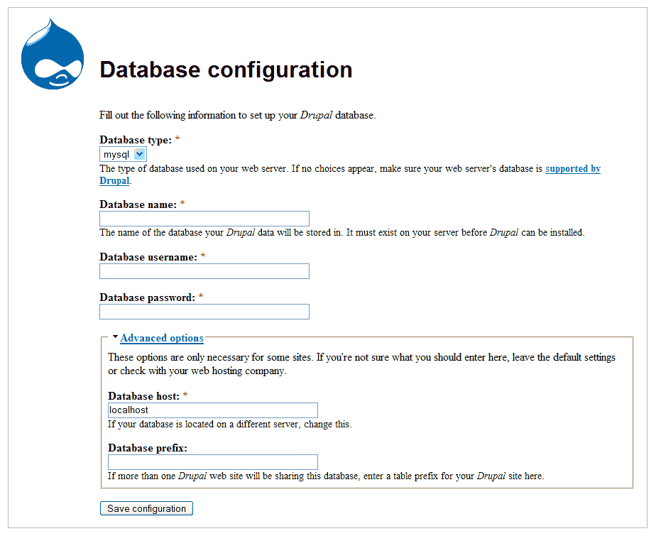
eaton CreditAttribution: eaton commentedAttached is a patch that moves the database type notice to the top fieldset, integrated with the 'Enter these pieces of information...' text when there is only one database type.
Comment #26
eaton CreditAttribution: eaton commentedAnd the screenshot.
Comment #27
eaton CreditAttribution: eaton commentedI didn't like that one. After consideration, it can be narrowed down further. Now, if there is only one DB type available, the description of the db_path field simply reads:
"The name of the %db_type database where your Drupal data will be stored."
The information is there, but it's unobtrusive. Yay.
Comment #28
kika CreditAttribution: kika commentedimho it's ready now
Comment #29
Dries CreditAttribution: Dries commentedCommitted to CVS HEAD. Thanks.
Comment #30
lekei CreditAttribution: lekei commentedMy installer (http://drupal.org/node/33581#comment-115069) captures the database errors and runs a wizard to install a new site.
The screen shots are at http://drupal.org/node/33581#comment-114471 and you can see that the theme matches the os you are using because the css uses system information.
The wizard requires the user to enter the drupal dbuser password for security and can create the dataases the first time if the user enters the dbadmin user and password if the host permits dbadmin login from that IP. (Many hosting providers require that you create the database and drupal dbuser through a control panel first).
Once you set the basename of the database server and prefix you never need to edit settings.php for a new site. It only takes a few seconds to install a new drupal site on the same server.
The only time settings.php needs to be changed is if you want to enable the debug option (not recommended to be left enabled on a live site).
I know that I am not permitted to contribute to Drupal, but have a look and use what you like.
Comment #31
eaton CreditAttribution: eaton commentedlekei -- It looks like the system you designed was set up to run under 4.6, while this one is built (mostly) on the work done by CivicSpace labs and the new hook_install() infrastructure introduced in Drupal 4.7. Please note that no one has ever said you are not welcome as a contributor to Drupal. You're as welcome to post patches and issues as anyone else here. :-)
Comment #32
lekei CreditAttribution: lekei commentedMy installer works on 4.6 and 4.7 and for modules that work on 4.7 but do not have install files but rather still have .mysql and .pgsql files (like Drupal itself).
It also automates some key settings like timezone (defaults to the timezone of the person creating the site), the site name, clean urls etc.
It also adds a "safe mode" to allow you to recover if some options you set (like clean urls) break your server.
Most of the magic happens in settings.php where it is relatively safe from the ever-changing code of Drupal.
I can't submit patches because my development environment is Windows.
Comment #33
eaton CreditAttribution: eaton commentedthe comments you've brought up aren't really related to this issue; if there are bugs or suggestions for improvements to the 4.8/5.0 installer, opening a new issue is probably best.
Comment #34
webchickWhat?! That's no excuse. :) There are a plethora of options for patching on Windows. But agree with Eaton, best spot for new features is a new issue.
Thanks for the feedback kika, and for the patch, Eaton. :)
Comment #35
(not verified) CreditAttribution: commented