
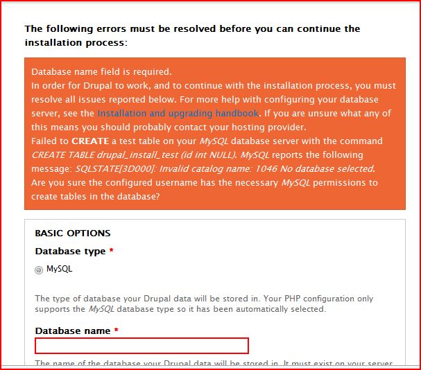
When an error message occurred during the install process (see also #638416: No messages in install / template logic for $messages) I noticed that part of the error message is not readable because it's pink (#EE5555) on an orange (#EE6633) background. See the attached image.
I'm not sure what the best solution would be so I'm not attaching a patch yet.
In case you wondered: it says "Failed to connect to your MySQL database server. MySQL reports the following message: SQLSTATE[28000] [1045] Access denied for user 'rooot'@'localhost' (using password: NO)."
| Comment | File | Size | Author |
|---|---|---|---|
| #13 | 638430_error_msg_color.patch | 549 bytes | Sivaji_Ganesh_Jojodae |
| #10 | seven_error_333.patch | 571 bytes | marcvangend |
| #10 | seven_error_333.png | 76.73 KB | marcvangend |
| #9 | v1.patch | 458 bytes | tobiasb |
| #9 | v2.patch | 569 bytes | tobiasb |


Comments
Comment #1
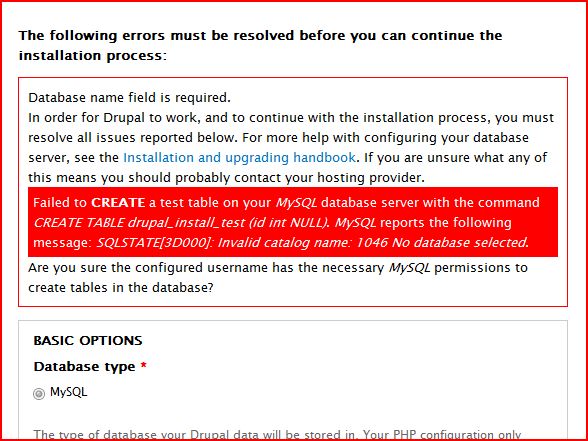
marcvangendFor the record, here is the complete error message (note: the 'Failed to connect' part is in p.error and Seven renders the li's as regular p's because there are no bullets):
Outcome of a conversation in IRC with Yoroy:
1. The error message is long, contains duplication and needs to be rewritten. Maybe the first paragraph can be deleted completely.
2. Seven's style.css defines div.error must have white text, but the pink text is in p.error, so it gets the pink color defined in system.css.
3. Probably, this long error message should be split into the actual error message and one or two help messages.
4. It is not clear if there is a need for separate p.error styling (visually different from the rest of div.error). It might not be needed at all, depending on point 3. If it is needed,
p.error { color: #333 }looks good.Comment #2
yoroy CreditAttribution: yoroy commentedSubscribe!
Comment #3
heather CreditAttribution: heather commentedJust embedding the image, because it's more eye catching/shocking.
Comment #4
webchickOh, that's *awful*!
Bumping to critical. Also tagging as "novice" since it's "probably" pretty easy to fix.
Comment #5
marcvangendI'm not sure about the 'novice' tag. It would be pretty easy to add
p.error { color: #333; }to /themes/seven/style.css, but instead of applying a quick CSS fix, it might be better to rewrite (and split up?) the entire message (see #1). For now, I'm setting the component to install system. I'll try to come up with a patch later this evening.Comment #6
tobiasb2 versions
Comment #7
tobiasbComment #9
tobiasbComment #10
marcvangendRegarding the conversation with Yoroy earlier: I've looked at the code, but currently there is no way to differentiate between the actual error and the help messages that come with it. It's all glued together in install.inc and then passed on to theme.maintenance.inc, where everything caused by an exception is regarded as an error. It would be nice if install.inc had the ability to return both error messages and help messages, but that would be a new feature (with quite some rewriting), so it's not an option for D7.
This leaves us with CSS that needs to be fixed in the Seven theme, and tobiasb made a good start. Tobias, I'm not thrilled with version 2, because it's too different from Seven's original graphic design. Version 1 is better IMHO, but still I would prefer some visual difference between the actual error message and the surrounding text. That's why I proposed
p.error { color: #333; }; patch and screenshot attached.By the way, the messages look even better with #563390: Seven theme lacks formatting on common html elements such as lists, paragraphs & <code> applied.
Comment #11
yoroy CreditAttribution: yoroy commentedThanks for checking that Marc. We'll want to rewrite that error message to be more concise anyway, because this box is just way too big. (not as part of this issue).
So, lets fix what is broken here. I asked Marc if he had considered using black text instead of the grey proposed here. He did and considered it too high in contrast. Which is what I would expect as well.
rtbc
Comment #12
Dries CreditAttribution: Dries commentedCommitted to CVS HEAD. Setting back to 'needs review' so we can follow-up with a better fix if necessary.
Comment #13
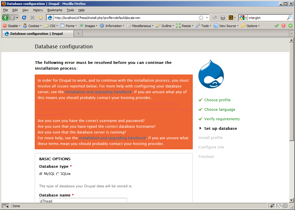
Sivaji_Ganesh_Jojodae CreditAttribution: Sivaji_Ganesh_Jojodae commentedI think the error message background (orange) and text color (white) needs to be changed. Probably they are not a good combination for reporting error message. Here my suggestion
Before Patch http://img.skitch.com/20091121-mensi4k55knpj1875pt7r9dkmu.png (taken from #639368: Contrast between error and link colour causes death to eyeballs)
After Patch http://drupal.org/files/issues/Screenshot-1_50.png
Comment #14
Dries CreditAttribution: Dries commentedThe original looks much better to me. The original seems to have better contrast and better design.
Comment #15
webchickI'm going to close this out as fixed. The bug of pink-on-orange has been resolved. Further work on refining the colours should take place at #639368: Contrast between error and link colour causes death to eyeballs which deals holistically with the links and the error messages in status messages.