
Ok next in my series is a cleanup for the book module. This patch cleans up the output, which is a mess in its current state. This patch accomplishes the following:
1. Significant reduction in CSS used, some unused classes were still left around that are now removed
2. No more floats nor clears are used to achieve the layout, this should prove less buggy for theme designers and across platforms/browsers
3. *Much* cleaner HTML (see below)
4. Semantic links now, no more 'next' nor 'previous' links. These aren't semantic, and don't help search engines at all. By putting the actual title to the page in the next link, search engines will rank the link as *much more* relevant. An indicator (same used in the pager) is used to indicate a next, up, or previous page. This makes scanning the links *much* easier and improves usability quite a bit.
5. Links are now centered, which will appear *much* better in a wider range of layouts, from small fixed, to large/liquid, etc. Easily changed/overrided by altering the CSS ever so slightly.
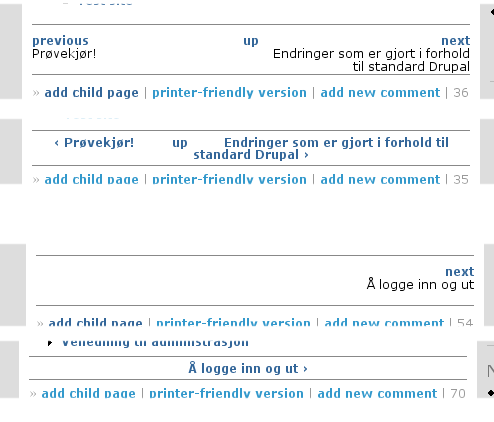
Before code:
<div class="book">
<div class="tree">
<ul class="menu">
<li class="leaf"><a href="/?q=node/1005" >test sub brother</a></li>
</ul>
</div>
<div class="nav">
<div class="links">
<div class="prev"><a href="/?q=node/1002" title="View the previous page.">previous</a></div>
<div class="next"><a href="/?q=node/1005" title="View the next page.">next</a></div>
<div class="up"><a href="/?q=node/1002" title="View this page's parent section.">up</a></div>
</div>
<div class="titles">
<div class="prev">Test book page</div>
<div class="next">test sub brother</div>
</div>
</div>
</div>
After code:
<div class="book-navigation">
  <ul class="pages-tree">
    <li class="leaf"><a href="/?q=node/1005" >test sub brother</a></li>
  </ul>
  <div class="page-links">
    <span class="page-previous"><a href="/?q=node/1002" title="Go to previous page">‹ Test book page</a></span>
    <span class="page-up"><a href="/?q=node/1002" title="Go to parent page">up ^</a></span>
    <span class="page-next"><a href="/?q=node/1005" title="Go to next page">test sub brother ›</a></span>
  </div>
</div>
| Comment | File | Size | Author |
|---|---|---|---|
| #25 | bad-align-solanas.png | 21.73 KB | solanas |
| #22 | css.png | 22.76 KB | veelo |
| #15 | drupal_49.patch | 4.3 KB | m3avrck |
| #1 | book.png | 20.38 KB | m3avrck |
| drupal_46.patch | 5.09 KB | m3avrck | |


Comments
Comment #1
m3avrck CreditAttribution: m3avrck commentedScreen shots.
Comment #2
markus_petrux CreditAttribution: markus_petrux commentedhmm... using ul.menu allows you to fully reuse the CSS stuff defined for menus. Why replace ul.menu with ul.pages-tree?
Comment #3
m3avrck CreditAttribution: m3avrck commented@markus_pextus ... reason I did that was because book navigation is completely different then site wide navigation. Site wide navigation is really a 'menu' while the book navigation, is pretty different, still a menu, but not really, make sense?
One alternative would be to nest the class so class="menu" still applies but it has it's own unique class to override as needed. However, this seems like the *least* likely scenario and in the end, seems like more work for most people ... if they want the main site menu and book navigation to be the same, they can override the theme function. As a themer, I see this happening <1% of the time so I chose this route to appeal to the widest set of people while at the same time *not* restricting anything either.
Comment #4
markus_petrux CreditAttribution: markus_petrux commentedIn 4.6 the book tree and the menu looked the same, both where using div.menu (which is now ul.menu). If need to be different, themers has to do something. Now, you're changing that. See my point?
Comment #5
m3avrck CreditAttribution: m3avrck commented@markus_petrux: ok I see what you mean but if you look at the screen shots, they *still* look the same (before and after). However, while I do see your point about the way 4.6 did things, if you take a look at themes specific for 4.6 and then try to use on 4.7, a few things *will* break slightly. Easily fixed though. It's already happened with previous commits.
In this case, for example you may have:
div.menu {border: 2px solid red;}now to keep that with this proposed patch, you just change that to:div.menu, .pages-tree {border: 2px solid red;}and voila, they are the same.However, the benefit really boils down to the CSS Zen Garden approach, give everything unique and distintive class names; if you want them the same, use CSS to make them the same; but if you want them different, then you already have that too, with no extra work.
Comment #6
puregin CreditAttribution: puregin commentedI don't like this.
1) I believe that 'previous', 'up' and 'next' are good and useful link anchors.
This is part of a UI, and thus whatever search engines make of it should be
secondary. If anything, let's generate a second set of links to page
titles - best of both worlds, and themers can disable one or the other
with a 'display: none;'.
The claim that this way of generating links is more semantic is a red herring.
Semantics depends on context. The context here is 'UI'
2) I personally hate having junk like '<', '^', '>' generated in my output.
There's absolutely no way to eliminate this without hacking book module.
This is very unclean.
3) I disagree that this is easier to theme.
4) Could we leave off futzing with layout in drupal.css, which is going to break yet *another* thing for people? Perhaps paying attention to theming book navigation in nicely in a few of the major themes would be more helpful.
Comment #7
puregin CreditAttribution: puregin commentedSorry, in my point 2) above: ... junk like '<', '^', '>' ...
Comment #8
markus_petrux CreditAttribution: markus_petrux commented@m3avrck: If you want to make them look different, you can wrap ul.menu with whatever class is assigned to the wrapper div. There is always a wrapper div that can be used to make it different. But, by default, ul.menu would be enough to make the trees look the same.
The same goes for the next/prev/up links. There are already classes in drupal.css, why use more?
Sorry, don't link your changes as they are. But, it might be a matter of taste.
Comment #9
markus_petrux CreditAttribution: markus_petrux commenteds/link/like
Comment #10
Tobias Maier CreditAttribution: Tobias Maier commented+1 for this change
this is exactly what I want to have on my site all the time (but was too lazy...)
Comment #11
puregin CreditAttribution: puregin commentedTobias, could you expand about what exactly it is that you need/want from this patch (after all, it provides rather a lot of changes :)
Thanks!
Comment #12
Adrian Freed CreditAttribution: Adrian Freed commentedI don't have an opinion yet on the theming but I like the changes to the previous and next anchors both for search engines and people. What really makes it shine on my site is replacing the words next, prev and up with the character entities for graphic arrow symbols (also obviating translations):
The relevant lines (4.6.5)become:
Comment #13
Dries CreditAttribution: Dries commentedI'm not opposed to these changes but I agree that the menu-class should be used, and that the top-link looks plain weird.
Looks like this patch needs another iteration or two.
Comment #14
Tobias Maier CreditAttribution: Tobias Maier commentedwhat I like is the way how you name the classes. You can see in the drupal.css what they mean
and also you dont call them just "tree" you call them "pages-tree" this is very nice because it is not easy to apply false markup to this classes (people often accidently creat simple names for their classes and so it could happen that somone names something else tree too and then he has to search why book navigation changed too...)
I like that the link uses the nodes' title now
but it would be nice if the navigation could look more like it looked before.
I mean make a
<a ...>-Tag over "previous" and "next" and the nodes' title and put it on the very left side...and maybe we could change the up-Link too so that it prints the node title of this node
Comment #15
m3avrck CreditAttribution: m3avrck commented@Dries - new patch adds the menu class back in and also removes the little up ^ character.
@puregin - if you don't like the symbols, that is ok, they are all t() and you can remove them, same way pager works. But the icons *greatly improve* usability. Pure text is ok, but humans are visual, show them an arrow and they'll figure it out considerably faster then reading the word 'next'
Also, links *should* be descriptive. While 'next' and 'previous' are descriptive in their own, 'My book page title here' is *much* more descriptive, not only to person clicking on the link, but to Google too... that is a significant part of their search algorithm.
And no this *does not* break the layout at all in any sites. Actually, it makes layouts *easier*, because it *doesn't* use floats nor clears, two very troubling CSS attributes that affect cross browser layouts. This patch *removes* CSS, it doesn't add anything that affects layouts, not sure where that came from.
Also, with the changes for Dries, also found an obvious change on my part to remove even more markup (still keeping things themeable and looking *exactly* the same), here's the new outputted code:
Comment #16
Souvent22 CreditAttribution: Souvent22 commentedPatched clean, and worked well. This patch does need to go in, greatly cleans up the HTML, and the book-navigation look. 2-for-1, gotta love thoes.
However, I know that this is themeable, but even for the default, could we format the text a bit better? I tried it on a few themes, and on the default 'Bluemarine', the text is a bit 'close'. Example, my book navigation looks like this:
As you can see, that's a little hard to read. Perhaps change the CSS to add some spacing? Thoughts?
Comment #17
Souvent22 CreditAttribution: Souvent22 commentedMy drupal.css wasn't reloading. Even though patch ran w/o error, it was not patched. I downloaded a fresh drupal.css from head, and it patched fine. And thus, book navigation looks great...on all the themes I tried. I give this a +1.
Comment #18
Dries CreditAttribution: Dries commentedCommitted. Thanks. (The forum module has similar links.)
Comment #19
m3avrck CreditAttribution: m3avrck commentedRoger that! Next patch... forum navigation cleanup and if anyone else has ideas for general markup/CSS cleanups, please let me know, so much to get done before 4.7 final!
Comment #20
hadishon CreditAttribution: hadishon commentedDescription
After updating to 4.7 Beta 4, the "previous, up, next" navigation links no longer have alignment and they are bunched in a group to the left. It makes it appear as all the links are 1 word.
I tried to align the links in a css file and they wouldn't align. I could change how they looked just not alignment.
Since I can change the appearance, margins, etc of the links but not the alignment, I selected this as a bug verses a support request. If it is something I'm doing wrong verses a bug then feel free to change it but please let me know what I'm doing wrong, it's driving me crazy. -Thanks!
(I originally posted this here: http://drupal.org/node/47048 : I was told to post it as a bug here)
Comment #21
m3avrck CreditAttribution: m3avrck commentedCan you post more details... What theme are you using? Do you have custom CSS? Are you sure your CSS is *not* cached wrongly? That latter one was the case for someone else, they reported the same, turns out their cache wasn't updated and had an out of date drupal.css. Make sure your drupal.css has the classes '.book-navigation' if it doesn't, then your CSS is out of date.
Comment #22
veelo CreditAttribution: veelo commentedThis still needs some work IMO. Attached are two examples from bluemarine 4.6 (first) vs 4.7 (second). They illustrate the following problems:
1) The "up" link is seldomly centered on the page.
2) The "up" word mingles with titles in layout and placement. To be consistent, one would have to use the title of the up node...
3) Long titles create a mess.
4) The "next" link is not placed consistently. Having things centered is not an improvement IMO.
In these screenshots 4.6 performs well, 4.7 performs poorly :-(
Responding to some arguments:
a) Floats cause problems: OK, but there must be a way to achieve the old alignment without floats.
b) Causes better ranking by search engines: These are not links that should increase the relevance of the page. I can understand that you want to trick search engines a bit, but I doubt that two more links are going to make a big difference. Nevertheless, if this is such a big issue, one could make the titles a link without making them look like a link....
Let's think up an improvement :-)
Bastiaan.
Comment #23
veelo CreditAttribution: veelo commentedI just spotted another example of poor markup on the Drupal site: http://drupal.org/handbook/modules/event/
Regards,
Bastiaan Veelo.
Comment #24
Anonymous (not verified) CreditAttribution: Anonymous commentedOn my test site (4.7.0-rc3), using Bluemarine, I find the following discrepancies in the navigation block:
1. If the title for the next or previous page goes longer than one line, the second line will be centered (rather than flush left or flush right).
2. The "up" navigation element appears on the same line as the titles for "next" and "previous" (rather than on a separate line above them). This is untidy and confusing for the user.
(I originally reported this issue at http://drupal.org/node/60434.
Cordially,
O Govinda
Comment #25
solanas CreditAttribution: solanas commentedThe same here. My books use to have clear an large titles and now the navigation links of the books are confusing my users.
Is a good idea to use the tittle as a link and I'm agree it's better for Google, but I'm not sure it was good for accesibility. When you are reading a book usually you want to go to the next page and you don't need to know the title. Blind people must hear once and another time the tittles when they usually explore the diferent pages from the top page. I'm not a blind person and probably we will need their opinion.
May be the solution could be to use "next", "up" and "previous" links and the tittle attrib which shows the tooltip with the page tittle and not the "Go to previous page"
In that way I'm sure that google will consider the keywords typed in the tittle property.
I propose this other code
I attach my screen.
Comment #26
Anonymous (not verified) CreditAttribution: Anonymous commentedAs of 4.7.2, the links for "previous," "next," and "up" still present themselves in jumbled fashion, especially when the title of a page occupies more than one line.
I've somewhat improved the matter for myself by modifying the CSS as follows:
This fixes all but the placement of "up." For this, I suppose, one must modify the code for the book module itself, so as to generate the "up" link before the "previous" link. Since I don't know PHP, how to do this lies beyond me.
Am I going in the right direction with this? And could someone suggest how to finish the job by getting "up" in the right place?
Thank you.
O Govinda
www.jswami.info
Comment #27
Anonymous (not verified) CreditAttribution: Anonymous commentedI see what you mean, m3avrck, about the cross-browser problems with "float."
The CSS I gave makes the navigation look fine in Firefox and two variations of lousy in IE and Opera.
We still need a solution for titles that run to 2 or (good heavens!) 3 lines.
O Govinda
www.jswami.info
Comment #28
solanas CreditAttribution: solanas commentedMy users are confused. In the 4.6 versión they have no doubt about the funcion of the "next" and the "previous" links. Now they write me to say me they don't understand very well how to navigate throught the book with the links at the bottom. I have been forced to activate the navigation book panel loosing space for a better reading.
Maybe should be considered the posibility to add settings options to allow webmasters to decide the way they want to write their navigation links at the bottom on the book pages.
Best regards.
Comment #29
m3avrck CreditAttribution: m3avrck commentedNew patch to make the navigation more consistent: http://drupal.org/node/72467
Comment #30
zeitenflug CreditAttribution: zeitenflug commentedMy users are confused by the new previous-next-navigation with titles, because it's not a standard prev-next-navigation. Also I use it in a FAQ with very long titles (i.e. questions), which makes it hard to find the prev-next-links (they run over several lines). I changed the code in book.module to make things easier for my users. Since I now have to remember after every drupal update to change it, I'd prefer an admin option that allows me to specifiy how the navigation should look like (standard or with titles). This way admins who prefer google-friendly navigation can have theirs, and admins who prefer user-friendly navigation can have theirs.
Comment #31
magico CreditAttribution: magico commented@m3avrck: your initial patch was commited. But then this issue was re-open to discussed another points related to what you're patch have done. Could you give a small status about this? AFAIK, this issue could be closed, because it address the initial objective.
Comment #32
StevenPatzmarking as fixed, as the initial issue was committed.
Comment #33
Dries CreditAttribution: Dries commented