
 Support for Drupal 7 is ending on 5 January 2025—it’s time to migrate to Drupal 10! Learn about the many benefits of Drupal 10 and find migration tools in our resource center.
Problem/Motivation
When testing the Paragraphs UI, i realized how much Claro limits node edit form content width to 52em.
This limits the Paragraphs UI significantly, causing UX degradation.

Steps to reproduce
Proposed resolution
From interpreting the core claro theme pages in figma, i see the suggestion that some components could be wider.
It is, however, super hard to fix this problem as the selector "layout-region__content" is applying the limit.
This seem only be possible by using Javascript for dynamic width calculations.
If we go with a JS based solution, it would need to also cover resize events.
Remaining tasks
Check is there a solution without JS?
User interface changes
Data model changes

| Comment | File | Size | Author |
|---|---|---|---|
| #7 | wider-claro-paragraphs-widget-3332030-7.patch | 3.29 KB | pivica |
| |||
| #7 | interdiff-3332030-3-7.txt | 3.22 KB | pivica |
| #5 | Screenshot 2023-01-11 at 12-15-16 Edit Page Hero in Grid Drush Site-Install.png | 115.89 KB | mathilde_dumond |
| #3 | claro-tabs-small-bug.png | 10.36 KB | pivica |
| #3 | claro-paragraphs-1920px.png | 150.32 KB | pivica |
Issue fork paragraphs-3332030
 Show commands
Start within a Git clone of the project using the version control instructions.
Or, if you do not have SSH keys set up on git.drupalcode.org:
 changes


Comments
Comment #2
pivica CreditAttribution: pivica at MD Systems GmbH commentedHmm, IMHO i find very strange what Claro is doing by default. Why limit left column to only 52rem(832px). Additionally it looks weird when you center it and leave right column sticking to the right - looks super weird for bigger resolutions screens. Anyway...
> It is, however, super hard to fix this problem as the selector "layout-region__content" is applying the limit.
> This seem only be possible by using Javascript for dynamic width calculations.
Checked current problem and possible solutions and I do not see a reason to use JS for dynamic calculations - CSS with calc is very capable to do dynamic calculations on the fly. We can inject CSS that is improving this in paragraphs/css/paragraphs.widget.css.
It seems Claro is doing this max-width hack only for node forms, which means that the rest of entities forms (for example taxonomy edit) is expanding to full width of a viewport. I find this very inconsistent behaviour and would consider this as a bug in Claro implementation. They should decide to either let all forms expand fully or limit all entity edit forms to some max width.
So it is not a problem to increase the width, the question is how much and should we increase the width of only paragraph widget or the whole node edit form?
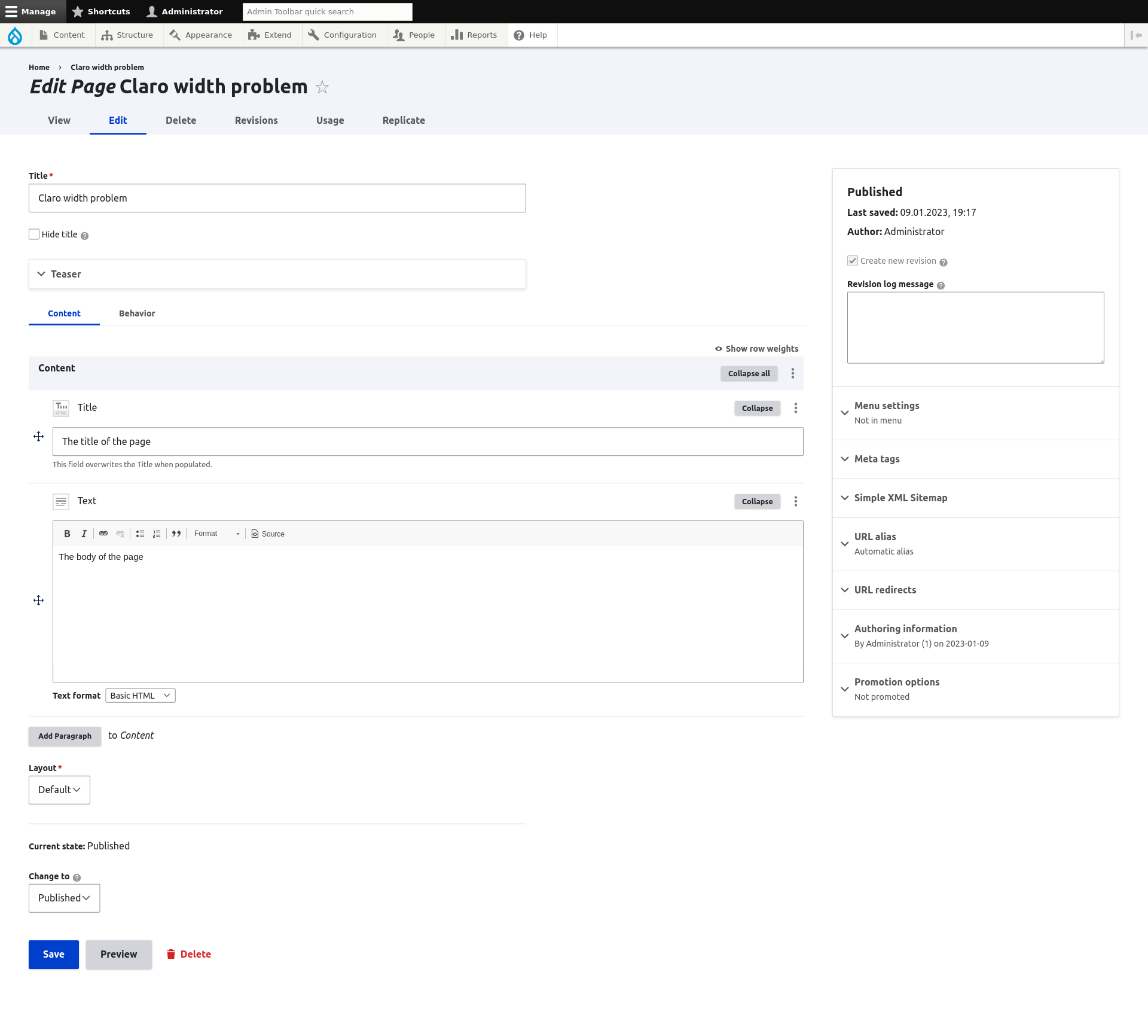
First let's do a screenshot of a default look:
I see three (for now) possible CSS solutions for this. For all solutions I will target Full HD screen resolution which, when we do calculations, gives us max-width of 82.5rem.
1. Just increase that max-width limit to something bigger
The CSS would look like this
And the screenshot
Sure the above selector is very general and it will target all node forms. If we want to do this for only node forms with paragraphs we would need to inject some CSS class for this.
2. Expand paragraph widget and don't touch the rest of the form
The CSS would look like this
The values used in this calculation should be clear if you just peak into Claro CSS code for all wrappers, but for sure we can add comments that are explaining this in more details if we pick this solution.
And the screenshot
Sure this will not work properly if toolbar is in vertical mode, it is removing 15rem from body element. I've never understood why core is just not doing simple overlay instead of changing body dimensions on toolbar vertical open, anyway...
To fix toolbar vertical position we need additional CSS like this:
Don't you just love that CSS selector... but hey it looks good with this :)
3. Centering is maybe weird
Maybe it is just me but I never liked centering. It works fine for some cases, but here I do not like it. Variation of approach in 2. where we just align everything to the left.
CSS with also toolbar vertical fix:
And the screenshot:
Comment #3
pivica CreditAttribution: pivica at MD Systems GmbH commentedDiscussed with @miro_dietiker and decision is made to expand only the paragraph widget to the right, and leave the rest of the form centered.
Here is a patch for this. Things get a bit more complicated while testing this, I found one more breakpoint coming from Claro and we need to apply min rule for smaller breakpoint so it work properly for smaller screens.
And here are the screenshots for various screen sizes:
768px:
1024px:
1440px:
1920px:
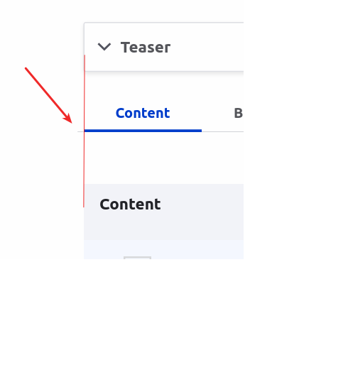
If you take a detail look at tabs you will see a small visual bug there - bottom border line is expanding a bit outsite, like shown in next screenshot:
This behavior is coming from next Claro CSS rule inclaro/css/components/tabs.css:
Usually you apply negative margin when you want to apply the same padding to the grid elements, no idea why here they decided to do it like this, maybe they like when bottom line is a bit outside of a parent? Anyway... I've decided not to change this for now.
Comment #4
pivica CreditAttribution: pivica at MD Systems GmbH commentedForgot to upload actual patch, here it is.
Comment #5
mathilde_dumond CreditAttribution: mathilde_dumond at MD Systems GmbH for GatherContent commentedtested that, and if you have a container then the width is not correct and overlaps with the sidebar:
Comment #6
pivica CreditAttribution: pivica at MD Systems GmbH commentedAh container in container, yes didn't check that case. Thx will fix it.
Comment #7
pivica CreditAttribution: pivica at MD Systems GmbH commentedShould be fixed now, @mathilde_dumond can you re-test?
Comment #8
mathilde_dumond CreditAttribution: mathilde_dumond at MD Systems GmbH for GatherContent commentedIt works well for me
Comment #11
BerdirRoughly browser width 1660 to 1791, the margin to the sidebar shrinks slowly to zero and even slightly overlaps then.
I'm also not sure this should grow forever, at width 3400, text fields are very wide which I think doesn't help readability.
Comment #12
saschaeggiSee https://www.drupal.org/project/drupal/issues/3398277#comment-15362136