
 Support for Drupal 7 is ending on 5 January 2025—it’s time to migrate to Drupal 10! Learn about the many benefits of Drupal 10 and find migration tools in our resource center.
The new password checker in Drupal 7 is very slick. It would be cool if it were just a *little* bit slicker. ;)
For example, when I install local development versions of Drupal, I frequently use the username a and the password of a because I am SO lazy. ;)
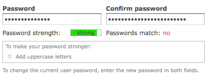
But it ends up looking like this:

All I see is green, so that makes me think things are great. And under absolutely no circumstances is 'a' a good password. ;)
I really like the functionality of https://www.google.com/accounts/NewAccount:

If you type in aaaaaaaa (8 a characters, since the password must be at least 8 characters) and it will show up as 1/3 filled up and dark red and say "Weak" next to it. If you add a '1' to the password, it will then fill up halfway and be yellow and say "Fair" next to it. If you add a capital A it will then jump up all the way, colour it green and say "Strong".
I believe Weak, Fair, and Strong are likely for accessibility since colours don't always translate for folks. I'm not sure where in the interface we have room to add this text, but we should try. And at the very least I would love for that tiny little bar to be red if it's < 30% filled and yellow if it's < 75% filled.
| Comment | File | Size | Author |
|---|---|---|---|
| #105 | colour_n_passwords.png | 468.97 KB | mgifford |
| #102 | core-js-user-color-331893-102.patch | 1.86 KB | nod_ |
| #101 | just_colouring_02.patch | 1.45 KB | mgifford |
| #81 | just_colouring_01.patch | 1.69 KB | mgifford |
| #76 | password.png | 11.09 KB | Bojhan |


Comments
Comment #1
webchickCorrecting title.
Comment #2
Bojhan CreditAttribution: Bojhan commentedAww, almost got away with it! This has been a highly requested feature in the previous ticket around this. We initially said no to this request for the following reasons :
The scenario you purposed could very well be true, that people go like "its green" so its good - while you want to trigger "I can make it greener". But so could the scenario "it's not really green at all, lemme fill it up" its kind of something we should test rather then just assume one scenario.
About adding description, it could definitely help for accessibility and maybe also people who don't really take the time to associate colour and just read and click submit. But I am not sure how we could place that in the interface and whether or not it really triggers those folks - to avoid adding even more clutter we should really think about this one)
To many people it sounded as an obvious solution, so it might be weird that we initially decided against it. But you have to consider that sometimes what big other sites do, might not work for people using Drupal.
Comment #3
webchickSo I want to clarify something as someone who was there witnessing poor users struggle with the password checker at U of M.
The problem wasn't the colour taking focus away from the fact that passwords didn't match. The problem was the *proportion* of the coloured big ugly box related to other things in the form, and how it magically popped out of nowhere:
If you really want to make the password match status more visible, stick a little checkmark/stop sign logo next to it like we have in admin/reports/status. But I think that might clutter the form unnecessarily. The colour is diminished here already because the area the colour takes up is MUCH smaller than it was before.
Here's why I filed this issue, and a summary of my arguments "pro" this:
* I got hung up here for a good 30 seconds or so thinking there was a bug. Since this was confusing for me -- I'm a user of Drupal too :P -- it's likely going to be confusing for others as well. alpritt pointed out though that I'm not exactly a "typical" user of Drupal, which might be true, but people who use Drupal every day are *also* our target market, remember. ;)
* yoroy pointed out that red is wrong because red means "stop" "error condition" etc. However, green is normally a colour that means "Yay! everything is great!" and in NO way is "a" a great password. :P
* Furthermore, this green bar is not a check for "did someone fill in the form" (otherwise we'd have green bars next to ALL of our required fields), it is an indicator for the strength of the password. And in terms of password strength, "a" *is* an error condition: it's horribly insecure.
* Every dynamic password checker I can remember using on any site does it the way Google does it. Jakob Nielsen points out that other people use other sites more than yours, so I'm not sure why we're not conforming to user expectations here.
* Bojhan pointed out that the above wan't true; Yahoo! does not use colour this way. However, it uses four separate rectangles to indicate the "how far along are you" which tells me there are 4 steps to secure passwords. Ours is just a bar along a single continuum so the correlation is not a direct match.
I think those were all the major points from our discussion.
Comment #4
alpritt CreditAttribution: alpritt commented@webchick:
My point was not that you are a highly experienced user of Drupal, but more that you have been involved in this specific issue. So you fall on the developer rather than user side, and so are more likely to be looking for problems. So, yes, there may be an issue here; but there is not necessarily one. We need to test against naive users to get a proper understanding.
I took a look at a couple of dozen password checkers before designing the current implementation. The current design is a lot closer to the norm, than what we had before. But as for getting closer to it, I'm not sure we can because there is really not a consistent design between them. So, at this more subtle stage, I again think we really need to test. I could argue the merits for the change either way.
Another option may be to go from grey to green.
Comment #5
webchickI think you meant green to grey. :) If so, I think that would definitely help. If the bar had been purple or grey or polkadots I don't think my brain would've triggered the "wtf?" It was the fact that green == OK that messed me up.
Could we talk about that in a separate issue though, since this one is about colourizing them?
I agree that I'm too close to the issue, and that the way to figure out the way forward is with actual user testing. So if someone rolls a patch for this and we get it committed, we can get two groups of users: one testing UNSTABLE-X (2 or 3 or whatever has the old behaviour) and one testing HEAD with the new way, and take notes on who was least confused. :D
Comment #6
alpritt CreditAttribution: alpritt commentedRather than red to green, I mean. So at 5% it would be grey and then the colour would gradually become more saturated until at 100% it is a nice intense green.
Comment #7
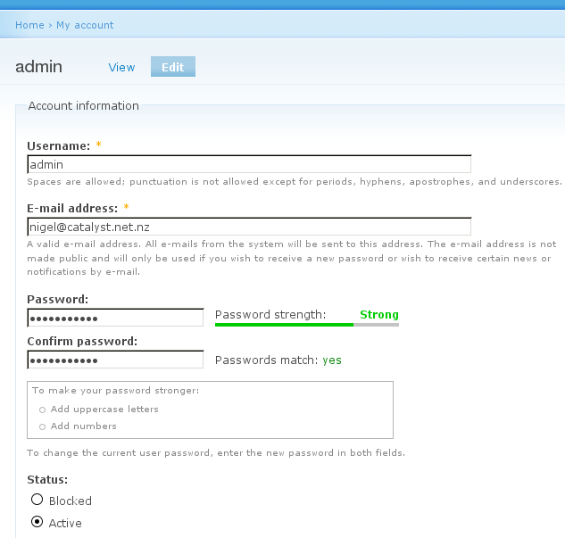
nigel CreditAttribution: nigel commentedHi folks,
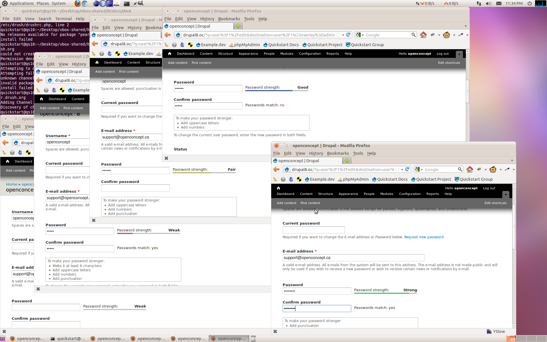
Attached is a patch to implement the password strength meter like google's one. It's my first cut, and probably needs some tidy up. I took some liberties by floating things in order to get the layout right in a hurry, and I have completely ignored the drupal translation system for the weak/fair/strong words, just to name two problems :)
Attached is also a screenshot of it in action, in case the patch doesn't apply for some reason. It works for me using latest drupal 7 head, in firefox 3.
Comment #8
Bevan CreditAttribution: Bevan commentedI didn't apply or execute the code but on code review this looks fine, except that it needs testing with RTL languages and will probably need some changes to system-rtl.css (or it's equivalent).
Comment #9
Josh Waihi CreditAttribution: Josh Waihi commentedtested, its better than before but the colors are a little strong still
Comment #10
nigel CreditAttribution: nigel commentedI'mna re-roll the patch with the following changes:
* Against latest drupal 7
* Fixes for RTL languages (which at this stage I am assuming will be CSS changes to float stuff the other way)
* Reduce strength of colours
* Hook words into the translation system
The colours are always going to be subjective - I'll throw a drupal up somewhere that people can see it in action and solicit some feedback then.
Comment #11
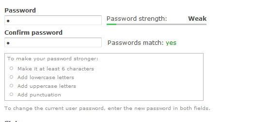
Anonymous (not verified) CreditAttribution: Anonymous commentedI expect that there is enough global exposure to European/American culture that using red, orange, and green is safe. I think we need to emphasize that a weak password is Danger-Will-Robinson bad. Neither green nor gray convey that meaning. Even outside of European and American cultures, gray carries a neutral or indefinite connotation.
I'm attaching the strength meter Microsoft uses on their online sign-up form. It has only four states. The gray state is used before the user has entered anything into the password field.
There are three visual indicators here: the color, the length of the bar, and the black text inside the bar (compared to the dimmed text).
Comment #12
Dries CreditAttribution: Dries commentedI think this is a good patch, but it seems like we're not 100% done discussing the colors yet. Bump.
Comment #13
nigel CreditAttribution: nigel commentedI've been away - will look at it sometime soon.
Comment #14
nigel CreditAttribution: nigel commentedSince we all agree about the status...
Comment #15
Josh Waihi CreditAttribution: Josh Waihi commentedI think Shannon Lucas is on the right track however, it doesn't seem right that with the change of a single character I could go from having a password with 1/3 the right strength to 2/3. Would a percentage be a better indicator? much like that talked about in #6. A full colored bar that starts of with a weak red that turns into a strong green as the password strength gets better? and of course also with text explanation weak|average|strong|awesome|are you gonna remember this?|ridiculous - we could it down maybe
Comment #16
Bojhan CreditAttribution: Bojhan commentedPercentage is a bad indicator, it might be weird to jump so suddenly - but it just colour bars would require less "figuring it out".
Comment #17
nigel CreditAttribution: nigel commentedOkay, I finally found some time, and have made a new patch. Screenshot attached too. I haven't got time to set up an install with it right now, but if it's necessary I'm sure it can be arranged.
I fixed the issues I said I would fix in #10. Please let me know if there are other things that need fixing.
Personally, I'm not sure about the weaker colours - having washed out colours makes the text harder to read. But it's up to you guys.
Comment #18
Amazon CreditAttribution: Amazon commentedThis patch is not linked correctly. I noticed it looking at the testing.drupal.org logs.
Comment #19
nigel CreditAttribution: nigel commentedIndeed. Here it is hosted elsewhere: http://stuff.nigel.mcnie.name/password-strength-meter-2.patch - picture: http://stuff.nigel.mcnie.name/password-strength-meter-2.png
Comment #20
wretched sinner - saved by grace CreditAttribution: wretched sinner - saved by grace commentedMarked #392320: Password widget strength bar colour as a duplicate of this issue.
Comment #21
karschsp CreditAttribution: karschsp commentedsubscribe
Comment #22
XanoSubscribing.
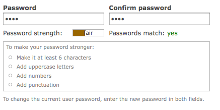
Comment #23
XanoThis patch changes the colour and label of the strength indicator, while the original layout remains. Colour changes are fluid, label changes occur at 35% and 75%.
Comment #24
Xano.
Comment #25
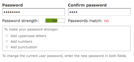
webchickI find myself getting a bit overwhelmed by so many visual indicators. The latest patch gives colours (at least 6 of them), bar size, and a word. Remember that we're trying to NOT scream at people on this form, lest we go back to the problems with the old password checker. The current one actually tested pretty well so I'm not sure this is as much a priority as we previously thought it was, but I defer to the UX team about that.
Also, I noticed that if I type in a strong password and then delete the password contents and then type 'a', it gives me a short green bar rather than a short red bar.
Comment #26
Josh Waihi CreditAttribution: Josh Waihi commentedI find a current problem with the current password checker is that I don't use the mouse to scroll down the install page but just tab my way through it, which means when I get to the password fields, I don't see the meter below, I have no idea how strong or weak my password is. Would it be a better idea to but the password meter/checker thingy on the side or above for accessiblity reasons?
Comment #27
Dries CreditAttribution: Dries commentedWebchick's comment in #25 suggests that there is a bug. Marking this 'code needs work'. 6 colours seems too much -- how about 3 colors? Red, yellow and green?
Comment #28
alpritt CreditAttribution: alpritt commented@26:
#325877: Password checker breaks if no description deals with this by automatically scrolling the password meter, etc into view if it is off-screen. (Or rather it will when I finally re-roll it.)
Comment #29
Everett Zufelt CreditAttribution: Everett Zufelt commentedtagging
Comment #30
mgiffordThis patch still applies, however in my first test I didn't get the color display. I updated the CVS and got "Fatal error: Class 'DrupalDefaultEntityController' not found" so I'm going to sit on this and hopefully test more later.
Comment #31
mcrittenden CreditAttribution: mcrittenden commentedSubscribe. Let's try and keep it as simple as possible.
Comment #32
Everett Zufelt CreditAttribution: Everett Zufelt commentedWondering if this is something that can be worked on after code freeze?
Comment #33
mgiffordI've re-rolled the patch as it didn't apply. The test now doesn't seem to produce the error I reported in #30 - perhaps it was just my system or perhaps the code's just improved.
I've attached various screenshots of the form. It's looking good!
I do think this is RTBC (I just moved the code around and changed quote types to single quotes), but I'm not in a position to do it.
Comment #34
Everett Zufelt CreditAttribution: Everett Zufelt commented+1 for this patch. I cannot evaluate the visual effect, but it is critical that the colored password strength bar also has textual representation, which this patch provides.
Comment #35
Jeff Burnz CreditAttribution: Jeff Burnz commentedLooks like a broken div in there Mike.
This review is powered by Dreditor.
Comment #36
mgiffordThanks. I didn't notice the html error in patch password_colouring_00.patch which I was working from.
It's fixed now (and still works).
Comment #37
Bojhan CreditAttribution: Bojhan commentedWe can do the text, but I see no reason at all to do all the colors.
Comment #38
Everett Zufelt CreditAttribution: Everett Zufelt commentedI think we definitely need the text. If we do the colours there should be a easy, and documented, way for themers to override the colours.
Comment #39
Bojhan CreditAttribution: Bojhan commentedPlease see #2, drop the colors, and just go with the text.
@Everett #38 that it should be easy, and documented should already be implied in any way we go.
Comment #40
Everett Zufelt CreditAttribution: Everett Zufelt commentedThe attached patch adds only the password strength label, and does not modify anything to do with coloring.
Comment #41
Cliff CreditAttribution: Cliff commentedSubscribing. Oh, we desperately need more information in the handbook on evaluating color contrast.
Comment #42
mgifford@Everett - that patch didn't work for coloring & positioning issues.
I like the red, and would much rather go with #36. However, if folks aren't sure about the red and want to stick with the existing green and add in the text I'd like to offer the following.
The shades of green change, but think it gets the point across nicely without worrying about what the colors mean.
Comment #43
mgiffordI still prefer the colour option discussed in #11 the best. I changed the js so it would just show the 3 colors. Red for weak passwords, yellow for fair ones and green for strong ones.
The text is there so that if your colour bland this should be fine.
I've also upped the definition of a strong password.
6 characters and one capital is not a strong password! Now you have to hit 85% in order to get a nice green password. So yes, you have to use a number or something like that.
Comment #44
Cliff CreditAttribution: Cliff commentedMike, once again trying to participate in several threads at once has me finishing a post after the discussion has moved on. Gotta stop doing that.
I'm glad that you went back to the color scheme in #11. The "red-yellow-green" metaphor to traffic signals is clean and works well for everyone who can distinguish those colors, regardless of whether they can see the true hues. The text is essential, so it's fantastic that it's there.
Here's my original post, which I won't edit because it makes other strong and valid points:
Reading through this thread, I see that the verdict on color has gone back and forth. I have a lot more confidence in sites that use color and text to encourage me to develop a strong password. I'll bet most other Web users do, too.
The text is essential. The color is an enhancement. One caveat: If color is used, check it with one of the many free color contrast analysis tools available online. If used as a background, make sure it is light enough that it doesn't reduce the contrast ratio with the text below 4.5:1 — preferably closer to 7:1. (In these patches, the text seems to be running small.) And if the color is used for text, be sure that it is dark enough that its contrast ratio to the background is in that same range.
Otherwise, a lot of us will be relying on screen readers to operate this interface. (Oh, by the way — because the color is an enhancement, Everett's idea of making sure it can be turned off is a good one. Ideally, not only any themer but also anyone who manages a site should be able to flip that switch.)
Comment #45
mgiffordI don't know how to turn off the colors. Right now it's in green. Having a tricolor set is fairly standard. Like the idea of having it be more customizable, but think I'm going to have to leave this to someone else.
I did test to see that this will work in alternate languages. It does.
I had to blow away the old install, but there's an example of this here now http://drupal7.dev.openconcept.ca/
Comment #46
Everett Zufelt CreditAttribution: Everett Zufelt commented@mgifford
Can you please let me know what exactly wasn't working properly in the patch in comment #40? I hink we need to get this commited with just the label, and then we can work on the coloring issue if people are interested.
Comment #47
mgifford@Everett
About 2/3rds of the screen was green with patch #40. It started right below the password strength checker and went down the rest of the page. I also think the position of the text was wrong, but that might have been a result of the big green background colour.
Who were the people who didn't like the colour? I am not sure which concerns we're addressing by not having more than one colour. Could all be grey I suppose, but right now it's solid green. Think for sighted people Red/Yellow/Green is good. For color blind folks there's the text which is pretty clear as well.
Comment #48
mgiffordFor what it's worth, patch #43 is way cooler than this one.
However, if folks like it solid green rather than red, yellow, green there's this patch too.
Strong is now at 85%
Comment #49
Everett Zufelt CreditAttribution: Everett Zufelt commented+1 The patch in #48 applies well and provides a textual alternative to the green bar for password strength.
Comment #50
Cliff CreditAttribution: Cliff commented@ mgifford: The only resistance to color AFAIK was from Bojhan. For usability for sighted people, I think the traffic signal metaphor is the best. Green means "go," so don't show it to me until you really mean that. As webchick notes in #3, the usability test participants were thrown off by an overwhelming block of color. This patch provides appropriate enhancement, not an overwhelming block. Everything else I have to say, I've said before. Can we mark this RTBC and move forward with the red-yellow-green approach?
Comment #51
Bojhan CreditAttribution: Bojhan commentedCan anyone apply the last patch, to me it doesn't seem to work well. I am not opposing red-yellow-green approach. I just don't feel we should promote jumpy behavior? It takes a second for someone to fill out their password, I don't want a rainbow effect when I fill out my password.
Comment #52
mcrittenden CreditAttribution: mcrittenden commentedRe: #51, perhaps we should wait till the user stops typing for half a second (or so) to do the magic?
Comment #53
heather CreditAttribution: heather commentedIf someone wants to user-test this should I test both #43 and #48?
FYI: This patch added to list of *hot* issues which need user testing.
http://groups.drupal.org/node/26409
I made videos of two of the options. Hard to tell what consensus is built on this issue at this stage (turning into bike shed?). Thought making videos could help others participate in the discussion w/o needing to apply patches.
#43 password_colouring_04.patch
Video: http://vimeo.com/6546823
#48 password_strength_label_02.patch
Vimeo: http://vimeo.com/6546877
I think the 3 colours changing is confusing. However, it doesn't make sense that it is 'green' to go a the start. Would it be possible to go from pale to brighter through the progress bar?
I made a palette to show, just a rough sketch, I didn't work out the values.
http://www.colourlovers.com/palette/954704/Go_green_go
Comment #54
Cliff CreditAttribution: Cliff commentedThanks for the videos, Heather. That's a great idea! This will help our discussion quite a bit.
#43 reflects the consensus as I understand it. From my experience, it seems to be the way true password checkers are being set up.
Comment #55
mgiffordOk, I've got a patch for your Go green go palette. I still like #43 the best and don't find it confusing.
One issue of having 4 colors of green is that there are only 3 text labels for those levels of security.
If we want four colors we need better labels than weak, fair & strong.
Right now there are four conditions I've defined here that should go with 4 labels: Under 30%, under 60%, under 85% & everything else.
I'd like some feedback on that.
Comment #56
heather CreditAttribution: heather commentedheh, vimeo said this file was too small
http://www.flickr.com/photos/feather/3920537107/
@mgifford you're right. i wasn't paying close enough attention to the issue when i made a 4 colour palette.
thank you for making this patch.
now we can see the grey/pale option. i agree. the pale green is even too green/positive and misleading. red to yellow to green seems much beter.
another kink: at installation shouldn't the list of recommendations be available? they do not appear at installation. the password check you see in this video is for installation.
Comment #57
Cliff CreditAttribution: Cliff commentedMike, I would make one more suggestion: In the video, the color band gets wider, taking up more of the box, as more characters are entered. I would get rid of that aspect: Just make the whole box red while "weak" is displayed, yellow while "fair" is displayed, and green when "strong" is displayed. Otherwise, I think we're ready to move on.
Comment #58
mgifford@heather can you give me a 3 color gray palette to work from? Think that would be easier than 4 unless we want to deal with the weak, fair, strong issue I posted last time. Keeping in mind that it has to be light enough to see the text under it and also hopefully meet a minimum color contrast so that it is visible. Might be good to match the color of the text for weak, fair, strong against against the backgrounds proposed here:
http://www.dasplankton.de/ContrastA/
@cliff It's easy to apply that. Just want to make sure I'm creating patches that help get us closer to getting this RTBC. Can we get a usability comment on whether or not we should get rid of the progressive element (the percentage bar) for this?
Comment #59
Cliff CreditAttribution: Cliff commented@mike, it's hard to be sure what is meant by the changing size of the bar. The metaphor is to traffic lights. Traffic lights typically change color, not size, so the changing size of the bar muddles the metaphor. and weakens the message.
On top of that, what does the changing size mean? Here are a couple of plausible misinterpretations:
So the implication of the change in size is the opposite of the implication of the change in color — at least it is until we get to green.
Here's another way of thinking about it:
I see only one drawback to making all signals the same size: The user would not get the idea that a password with a strength factor of 85 is not quite as good as a password with a strength factor of 100. If that troubles you, I suggest we just keep the bar yellow at 85. For it to turn green, the strength factor would have to reach 100 (or whatever other value you consider prudent).
Comment #60
mgiffordOk, here's another one for review. Based on @Cliff's suggestion of the bar being 100% full. I still like #43.
Slight changes include actually including 4 states. As soon as someone clicks in the box they shouldn't be getting an error message.
Not actually sure that a big red box is what most folks want to see when they type in their password.
I didn't bold the text. Not actually sure how to do it. The 0th state (before someone types in a password) should probably have the text "none" or something like that but currently it isn't showing up.
The red's too dark and I did try to tone it down a bit to make it easier to read.
Comment #61
heather CreditAttribution: heather commentedA Story About a Bike-shed
Let's re-cap the goals: To encourage the user to create a strong password.
First, look at existing conventions in use in the industry. Over time, more people will become familiar with this functionality as thoughtful developers include password checking. It's good to work within the existing UI conventions and establish a common language for users.
http://subeesh.wordpress.com/2008/02/19/flex-password-strength-meter/ - you can resize the bar and compare as many.
http://www.flickr.com/photos/feather/3921759419/
You can see those shown are "long"; the text is above the bar, not written on it; the colour bar is a thin strip.
Let's reconfirm our spec:
This indicates text above the bar, not on it, and a thin strip of colour so as not to be over powering.
In fact we were closer in the beginning of this patch to existing conventions
http://drupal.org/files/issues/password-strength-meter.png
Somehow we tried to make the progress bar "small", and fit the text together. This appears to have introduced some problems. We may also run into trouble if translations are not as short and don't fit into the bar.
I recommend we take a step back from making and applying patches, try out this experimentation page:
http://subeesh.wordpress.com/2008/02/19/flex-password-strength-meter/
And come to a consensus to save valuable developer's time.
Comment #62
mcrittenden CreditAttribution: mcrittenden commented@heather great post. :)
What do you all think about going the route of the first example at http://subeesh.wordpress.com/2008/02/19/flex-password-strength-meter/ ...you get all the colors but it's not as jarring since it's a gradual fade.
Comment #63
alexanderpas CreditAttribution: alexanderpas commentedhttp://drupal.org/files/issues/password-strength-meter.png - first response: YUK! ugly! too wide!
I'd say, use http://drupal.org/files/issues/Picture%209_12.png style, but from grey to green!
Comment #64
mgifford@heather - love the history you laid out for this bike shed.
Think the most critical part is that we're adding the password strength label as per #40.
Also, thanks for pointing out that the password changer suddenly went from a Google style password checker to something more unique to Drupal.
I'd like to take it back to the Google style so I started with #17.
I added a reference for Good so that there are now four categories. Google actually has a 5th for too short - http://ui-patterns.com/userset/39/image/150#focus
I wasn't able to do that with the present scoring. It would have taken a lot more adjustments to organize that.
@alexanderpas - the biggest problem I have with the style you prefer is readability. It's something I was struggling with in putting the dark warning behind the text. There's not enough contrast for many people.
@mcrittenden - putting in background images rather than colors would be the easy fix. Would that work for you? Does anyone have any examples of graphics to use for this?
Comment #65
mgiffordOh yea, trying to follow @heather's lead here are some videos:
This is for patch in comment #60:
http://screenr.com/fh7
And finally for patch in comment #64 above:
http://screenr.com/Dg7
Would be great to have folks contributing more patches or addressing some of the issues directly. One person's ugly is another person's beautiful some of the time, so suggesting a new stating personal preferences isn't going to get this issue RTBC any time soon.
Comment #66
Everett Zufelt CreditAttribution: Everett Zufelt commentedI definitely understand the importance of using appropriate colors for the password indicator bar.
However, as #521904: Add ARIA live region to password strength and match containers is blocked by not having a text label that describes the password strength, perhaps we could resolve the current issue with two commits.
1. A committed patch to add a text label.
2. A committed patch to modify the coloring of the password indicator bar.
Comment #67
Cliff CreditAttribution: Cliff commented@Mike, both are good. Even though the checker in the video based on #60 was what I asked for, I see the merits of and actually prefer the checker in the video based on #64. I don't think we need a "Too Short" state. (In fact, I'm not sure "Good" is necessary, but I wouldn't call for a recode to get rid of it. People will understand.)
@Everett, both versions have text labels that correspond to specific colors, so I think we are OK there.
@Heather, thanks for the summation. In the frenzy of fixing things, it can be hard to stay focused on the goal. And moving the color bar from behind the text and to the side actually does make it look like a progress meter, not a traffic signal. I can't explain why, but it does. In that light, allowing it to grow is just fine.
I think that anything further is gilding (or perhaps bronzing) the lily. Let's call it done. Fine job, all around!
Comment #68
kat3_drx CreditAttribution: kat3_drx commented@Heather: awesome ^^
Just getting back now, will take a look at this soon.
Comment #69
mgiffordOk, this might be a bit simpler. It's exactly the same as in #64 (my current favourite is password_colouring_06.patch) except I've removed the colour changes.
This patch has all the positioning & style of the much earlier patch in comment #17. It's got the Weak, Fair, Good & Strong distinctions used in Google.
The goal here is to get the text into core so that we can start adding ARIA support based on the text we've agreed upon as specified in comment #66.
For @Everett's patch to add support for screen readers we don't need to have firm definitions of what happens under the hood (how we calculate that text) or what colors we use to indicate how good a user's done of defining a password. That can all change if need be.
However, not getting this text into core is holding up other development and real accessibility!
When this gets in we can then worry about bringing this stuff back in (with whatever modifications are required for maximum usability:
Comment #70
mattyoung CreditAttribution: mattyoung commentedsubscribe
Comment #71
kat3_drx CreditAttribution: kat3_drx commentedThe patch in #69 worked nicely...text cues and visuals both look good.
Incidentally, how easy is it to change the colors/text etc? I'm not sold that it's a necessity at least at first, just curious.
Comment #72
mgiffordGlad you liked it. What do we need to move this to RTBC?
Text is in both the PHP & Javascript. There's no easy way to over-ride either that I know of. Adding new elements would be difficult too.
The colors are all in the user.js file so it would be simpler than modifying the text.
I can see a solution (for the coloring) that might be more flexible. We could just have the CSS reference background graphics in the theme that could be over-ridden. Would take some experimentation though.
I'm not sure that there's energy here though to push through a patch that is as flexible as this for D7.
Comment #73
mcrittenden CreditAttribution: mcrittenden commentedI don't think we need to worry with flexibility here. Let's get it in first. A couple code review changes that need to happen (note that this is the first patch I've reviewed from this issue so I apologize if some of this was discussed earlier):
Two comments need periods at the end:
and...
Why is this line commented out instead of just removed?:
What's the deal here (i.e., why is there a need for two different tooShort's)?:
Once those changes are made, I'd be ok RTBC'ing.
Comment #74
mgiffordGood points. I've got them all in this latest patch.
I dropped the reference to color here too as in this patch there are no color changes.
The tooShort2 was when I was trying to exactly emulate Google. I don't think it's needed though. Or if it is would require a lot more work to get the logic right. Thanks for pointing out the old code (which I've now eliminated).
Comment #75
mcrittenden CreditAttribution: mcrittenden commentedThanks!
Comment #76
Bojhan CreditAttribution: Bojhan commentedTotally done with this issue, copy-c / copy-v of google's interface - will probably cause us more design community harm then we want - but meh, Drupal has no brand with these kind of issues, only consensus driven discussion.
Comment #77
mgifford@Bojhan
Are you willing to provide a patch or even a sketch for what you want?
I've rolled lots of patches for this issue as I think that what we've got now is very weak for everyone's accessibility. What's there now is much better than what we've had previously. It's also stronger than what was proposed with the changes brought in with comment #23.
Please tell me what you're going to do to move this issue forward.
Comment #78
mcrittenden CreditAttribution: mcrittenden commentedI'll stick it back at needs review until Bohjan gives us something. No point in keeping it at CNW when nobody knows what needs to be worked on.
Comment #79
Bojhan CreditAttribution: Bojhan commentedOhh, didn't mean to change status.
There is no point discussing the impact it will have on the Drupal brand in terms of design, since people don't seem to care about that (that was my whole point). It won't be addressed by an image or a sketch, its a conceptual direction we either agree on or just ignore.
But if you need a accessibility/usability point, if we do a copy-c, copy-v at least do it correct and implement the four colors.
Comment #80
Dries CreditAttribution: Dries commentedI think this is a step forward. Committed to CVS HEAD. Feel free to follow-up with the extra color coding -- I think that would be nice. Just re-open the issue.
Comment #81
mgiffordThat's great news. I've added the colour back in here with this patch.
Comment #82
mgiffordOh ya. I had to set this as needs review for the colour.
Also, wanted to note that I changed a quote to single quotes from double. Not sure what's the best for javascript and if there is any style or performance reasons for choosing one vs the other.
Comment #83
mcrittenden CreditAttribution: mcrittenden commentedAfter testing, I'm ok with leaving it as-is. As Bohjan said (somewhere in this thread) you see a little bit of green and want to make more of it. I don't necessary see green and think "good" here. I see green and think "needs to be more".
Comment #84
Cliff CreditAttribution: Cliff commentedBojhan, I really don't understand the rationale for four colors. Just because Google does it doesn't mean it makes sense. As I said before, the analogy to traffic signals is understood everywhere there is enough traffic to have signals — and many places where there isn't, because railroads use the same convention.
If having four colors will get this done, then, fine, let's have four colors. But I don't understand why you've decided that I and others involved in this discussion have no concern for "the Drupal brand."
If the Drupal brand was so important to you, why did you wait until just four days ago to bring it up — comment #76 — when this issue has been around for over 10 months? I really would have been happy to consider that point, and I'm sure others would have been, too.
It's not that we don't care. It's just that we hadn't thought about it from that perspective. Had the suggestion come up earlier, perhaps one of us would have thought of a way to make the Druplicon look weak, fair, pretty good, and then as strong as Superman, and Mike could have written code to support that model. And maybe the result would have worked for all of us — and maybe not, but at least we could have had the discussion (and Mike would have had more of an opportunity to respond to your request).
Please, in the future, if something really does matter to you, get it out into the discussion early. Don't ambush the rest of us with a new thought at the end.
Comment #85
yoroy CreditAttribution: yoroy commentedCliff: comment #2 by bojhan makes similar points. It's not an ambush. Bojhan speaks from experience in seeing people *stumble only a little bit* over the password checker during usability tests. Most of this was fixed in another issue, explicitly leaving the colors out of the discussion because they don't really matter that much in the total of this specific interaction. Then this issue got created and look here, we're almost 100 comments in, talking about which color to paint the bikeshed. Sure, with accessability improvements committed along the way, but still going on about picking colors.
What we're trying to argue here is that we should try and make our own choices, *not* copy google or others because the context in which this interaction happens is so different. Here it's part of a much longer installation process, most other examples given here are part of a much shorter and simpler signup. I guess Bojhan's last comment was cynical in the sense of "if we don't dare to make our own informed choices, then be sure to go all the way in copying".
It's fixing things that are not broken. See #83, which is feedback from actual usage for example. It's just frustrating to see so much energy being put into what's mostly a non-isssue based on assumptions rather then actual usability testing.
And I guess it's equally hard to tell who's who and who knows what they are talking about from just reading comments, but yeah, that's the issue queue for ya.
Comment #86
Bojhan CreditAttribution: Bojhan commented[Edit : yoroy said it all]
@Cliff Sorry I just didn't have the strength anymore, to get in earlier - I missed that we reached consensus so I didn't put in my voice earlier.
Comment #87
Bojhan CreditAttribution: Bojhan commentedoops
Comment #88
Cliff CreditAttribution: Cliff commented@yoroy and @Bojhan: Perhaps one day we can swap stories and share a few laughs over an appropriate beverage. I hope so. Still, I stand by my earlier comments. In #2, Bojhan does not mention anything about Drupal branding. Not even a hint. And to the extent that he's expressing concern about the usability test results, I think webchick in #3 quite clearly refuted his notion that the use of color was the actual source of the problem.
I, for one, have never seen Google's password checker. Everything I contributed came from the experience and professional judgment I've developed in years of Web design, Web redesign (!), and usability testing. So, although the "red-yellow-green" color scheme might not have been creative or even original, it would have been effective, and the suggestion that those who participated in this issue simply aped Google was completely out of line.
The well-designed small patch of red in the recent patches is a far cry from the big, ugly, obtrusive, and, coincidentally, red error message that triggered the problems in the usability test. I agree wholeheartedly with the point I hear from webchick in #3: It's important to incorporate testing by potential users into the design process, but it's even more important to be sure we identify and fix the actual source of each significant problem that process identifies.
In this case, the right answer was to replace something that was big, ugly, and obtrusive with something elegant — not to get rid of the color.
Comment #89
mgifford@Heather suggested a palette in #53. Might be others to explore too. There are four places to add color if we want it to. lighter to darker green is one option. Red, Orange, Yellow, Green would be another.
There are other common examples other than Google like say http://www.geekandproud.net/terror/ (a parody on the homeland security warning system)
Comment #91
mgiffordNot sure that this is really closed. Right now the bar's all green still and this is the last phase to evaluate it.
Mike
Comment #92
Cliff CreditAttribution: Cliff commentedMike, the only problem with the scale used by http://www.geekandproud.net/terror/ is color contrast. No two adjacent pairs have sufficient contrast to pass at level AAA; only one of the pairs passed at level AA for large text (which I assume would be similar to any bar used).
Keeping in mind that people who use the Web spend far more time on other sites than they do on yours, let's go with Google's palette. That will keep things simple and familiar.
Unless someone wants to come up with five different versions of the Druplicon, ranging from anemic to robustly healthy, to use in place of a progress bar, and can do so in less than three weeks, I don't see a way of making everyone happy.
Comment #93
mgiffordI don't know of a way to pass variables from a theme's .info file into jQuery. There very well might be a way to do this in which case it is something that could be over-ridden so that you could have a choice of color schemes to work from.
Maybe we have to wait till we can get something more customizable.
Mike
Comment #94
mgiffordIt doesn't look like we're going to be able to get consensus on color options on this for D7. For D8 though we're going to have to figure out how we deal with color. I've outlined in this issue some other places where it is a problem:
#660576: Ensuring Proper Color Contrast for Garland
Comment #95
bryancasler CreditAttribution: bryancasler commentedsubscribe
Comment #96
amc CreditAttribution: amc commented#81: just_colouring_01.patch queued for re-testing.
Comment #97
webchickComment #98
mgiffordCan this be brought into D7 using the Accessible Helper Module?
Comment #99
mgiffordThere must be a way to override the functions in modules/user/user.js to add color without hacking core...
Comment #100
mgiffordPulling from #383032: Option to load js library files from Google repository I thought I'd answer my own question here:
Which could be just usual user.js with this patch - http://drupal.org/files/issues/just_colouring_01.patch
On that note. This seems like it should work:
With this:
But it doesn't seem to, but not sure why.
Comment #101
mgiffordUpdating patch in #81.
Comment #102
nod_Reading
user.jsmakes me cry inside.There were two leaking vars here, and put the
cin the lastindicatorColorin lowercase, there is an issue for lowercasing every color. Also shouldn't the colors be inDrupal.settingsor something? no way to overwrite them right now.I'd like to put this as NW and refactor the JS so that it's all shinny and clean but at 102 comments that wouldn't be very nice. I'll open a follow up issue for the clean-up.
Comment #103
mgiffordExcellent! Thanks for the new patch. Please let us know where the new issue is to clean up user.js when you start it.
If we can bring in the colors here I'm happy to set up a new issue to define them in Drupal.settings
That too would be a bigger issue than simply trying to enhance the text around the password text.
Comment #104
Bojhan CreditAttribution: Bojhan commentedNothing new to review
Comment #105
mgiffordI've attached a screenshot after applying this to a fresh D8 install. Looks great. I'd say it's ready to RTBC. Especially since it's already gone through quite a lot of review.
@nod_ let us know where your new issue is.
Comment #106
catchLooks good. Committed/pushed to 8.x.
Comment #108
rzilouc2 CreditAttribution: rzilouc2 commentedNo, sorry, I was testing an plugin that I wrote for drupal. It's a sentiment analysis plugin, I didn't mean to save the comments.
Comment #109
Bevan CreditAttribution: Bevan commentedrzilouc2; Are you a spammer?
Comment #110
rzilouc2 CreditAttribution: rzilouc2 commentedComment #111
rzilouc2 CreditAttribution: rzilouc2 commentedComment #112
rzilouc2 CreditAttribution: rzilouc2 commented