
This is a follow up of the issue https://www.drupal.org/project/search_api/issues/2250141 .
Initial review (@LewisNyman)
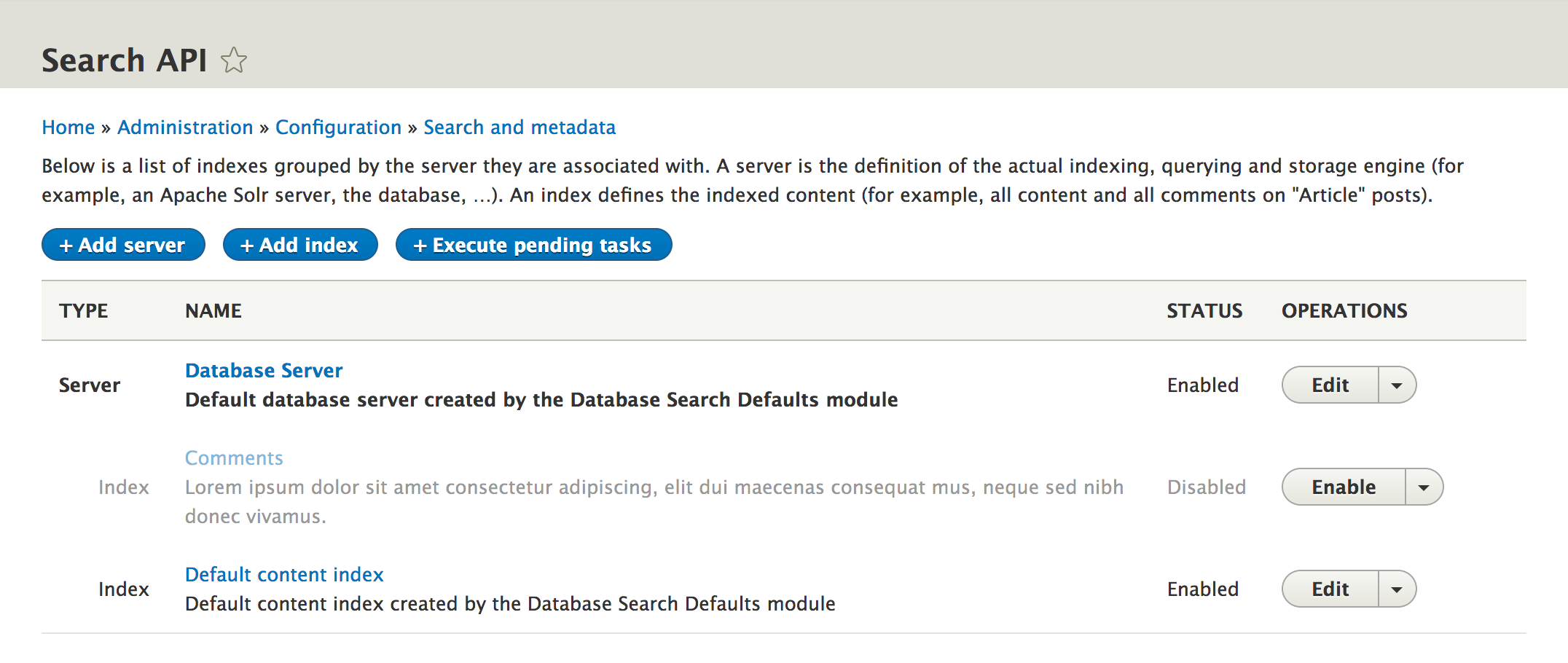
- I'm not sure if using the icons to represent the state of the server is consistent with how we use them. The red cross definitely signifies 'danger' which is not the case here. To be fair we don't have documentation on the semantics of the icons yet. Issue created: #2252721: [policy] Document Libricon semantics, including examples
- I noticed that disabled servers get italic font styling. This implies some kind of emphasis when I assume we we really want to do is deemphasise them because they are not being used. If you guys want to propose a greyed out styling as a new table row style then I would make sense to pull this into core so others can use it. You probably wouldn't need the status icons then either, assuming you only have two states.
Proposed solution
Clean up styling of disabled servers/indexes in overview: no italics, no symbols, maybe gray out the row or something.
Current UI (Search API 8.x-1.x - 1rst of november 2019)

| Comment | File | Size | Author |
|---|---|---|---|
| #5 | 3091785-5--clean_up_styling.patch | 3.34 KB | drunken monkey |
| |||


Comments
Comment #2
cedric_aHere is what I suggest :
- replace the icon by a text status as seen in user list (active/bloqued)
- remove italic styling
- apply a lower opacity to disabled line texts, as seen on admin UI form inputs (but not as much to preserve lisibility)
Here is what it looks like after applying the patch :
Comment #3
cedric_aComment #4
borisson_I agree that this is a better styling for that page. +1
Comment #5
drunken monkeyThanks a lot! Yes, this is much better!
However, while we’re at it, I have a few more tiny tweaks I’d like to propose:
<div></div>appended.Screenshot for patch #2:

Screenshot with my additional modifications:

Agreed? Otherwise, I can also just commit #2. Don’t want to hold this up too much.
PS: Sorry about the weird entity names. When creating dummy entities, I just pick whatever Firefox’s form autocompletion happens to suggest.
Comment #6
drunken monkeyHm, but thinking about it: Do we really want to display unavailable servers with lower opacity, too?
After all, this is usually something we want to draw attention to, not hide. (Hence, too, the red color.)
Comment #8
drunken monkeyCommitted. Thanks a lot again!