
 Support for Drupal 7 is ending on 5 January 2025—it’s time to migrate to Drupal 10! Learn about the many benefits of Drupal 10 and find migration tools in our resource center.
Problem/Motivation
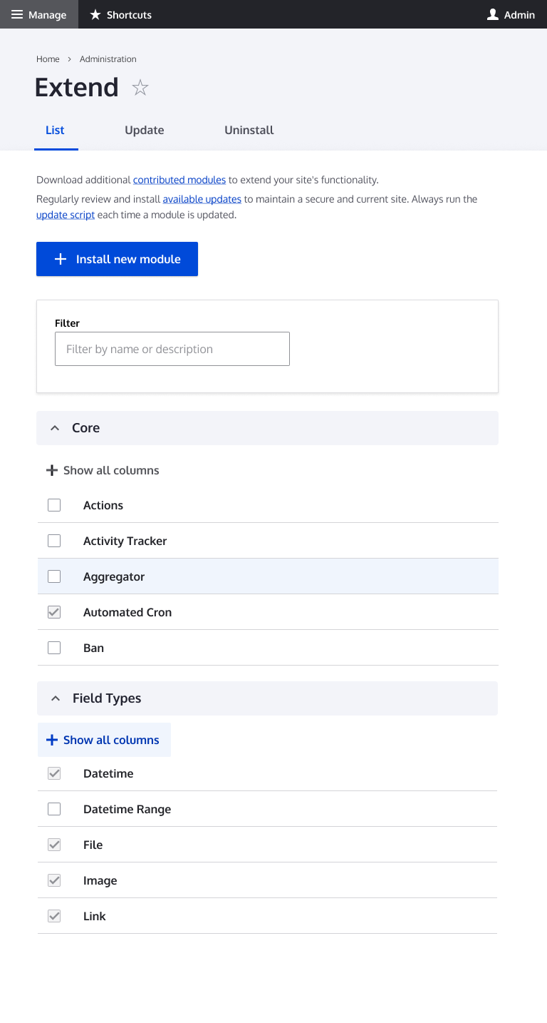
Redesign the current modules page. MVP provides the same interaction with updated styles / components.
Proposed resolution
Initial proposal can be found here https://www.figma.com/file/NpZUAp8BEkMJvm5gKBCDBB/Claro?node-id=16542%3A34
General specs
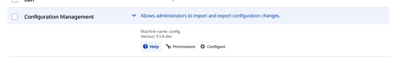
The details elements within modules
https://www.figma.com/file/NpZUAp8BEkMJvm5gKBCDBB/Claro?node-id=17544%3A327
https://www.figma.com/file/OqWgzAluHtsOd5uwm1lubFeH/Drupal-Design-system...
Full page (if anything in the full page Figma contradicts the details element Figma linked above, assume the details element Figma is the correct spec)

Remaining tasks
- Standardize the Details component across pages
- Determine design pattern for the module filter
User interface changes
Style changes to Details components, and possible style changes to filter component
Test Pages
- /admin/modules
| Comment | File | Size | Author |
|---|---|---|---|
| #44 | interdiff.txt | 465 bytes | lauriii |
| #44 | 3072772-44.patch | 47.06 KB | lauriii |
| #43 | interdiff.txt | 525 bytes | lauriii |
| #43 | 3072772-43.patch | 47.06 KB | lauriii |
| #41 | Screenshot 2020-10-15 at 12.21.49.png | 348.4 KB | Gábor Hojtsy |


Comments
Comment #2
ckrinaPostponing this until the design is done.
Comment #3
huzookaComment #4
ckrinaComment #6
bnjmnmCould we credit @harishkunta and @sauravk on this? They began making improvements in #3116270: Fix CSS style in modules page, which I closed as a duplicate of this. They were not aware that the designs for the Modules weren't yet completed. I think it was a good faith effort in a process that probably isn't immediately clear.
Comment #7
lauriiiComment #8
poojakural CreditAttribution: poojakural as a volunteer and at Srijan | A Material+ Company for Drupal India Association commentedComment #9
poojakural CreditAttribution: poojakural as a volunteer and at Srijan | A Material+ Company for Drupal India Association commentedComment #10
DyanneNovaI'm working on standardizing the design in the Figma to use the same details pattern as the Status Report.
Comment #11
DyanneNovaHere is the updated design. This includes the updated component for Details and an update to the filter component for consistency with the Content page and better segmentation for clarity.
Comment #12
lauriiiThe designs look good visually. ✨ I'm wondering if we actually need the details element for the groups since they are open by default? I guess we don't have data on whether they are being used. If we think we need these variations of the details elements, we should probably also add those variations to the component specification https://www.figma.com/file/OqWgzAluHtsOd5uwm1lubFeH/Drupal-Design-system....
Comment #13
bnjmnmRe #12
When test modules are configured to be visible, their details container defaults to closed.
Comment #14
lauriiiThanks for pointing that out 👍 I guess we could still render the test modules using details. Having test modules visible is an edge case which we probably shouldn't try to accommodate too hard. I'm fine with all of the groups being rendered in details, but I would recommend reconsidering that if the only reason to do so is that we want to close the testing group.
Comment #15
KondratievaS CreditAttribution: KondratievaS at Skilld commentedComment #16
DyanneNovaRe #13
1. I'm guessing it was from a copy/paste as well. I've fixed it.
2. I've added an example for the icon links to the Figma.
Re #12
I remember that I found the ability to close the different categories useful when I was a Drupal site builder, but I don't have a strong argument for either direction.
Comment #17
bnjmnmIt looks like they more resemble
.admin-item__link, which are for links not displayed inline, like the config items at admin/config.Wasn't sure if the deviation from the pattern was intentional, if there's an additional pattern I'm not aware of, or if the links should confirm with inline links elsewhere.
Comment #18
DyanneNova1. The updated component is here: https://www.figma.com/file/NpZUAp8BEkMJvm5gKBCDBB/Claro?node-id=17544%3A327
The Extend page updates should be visible now, they were in a different location.
2. That's an interesting point. The inline links in the Extend Figma match most of the pages in the Claro Figma, but none of those pages match the current Claro inline link styling. I'll update the Extend and Status Report pages. I'm guessing the Claro Figma just hasn't been updated since inline links were finalized.
3. I think that's a good idea.
Comment #19
DyanneNovaI've updated the Details Component to use the Action Link components.
Comment #20
ckrinaReally nice designs @DyanneNova!
I'd say they are necessary for smaller screens: it's too much info and would take too much vertical space otherwise, making it really difficult to navigate. Probably most people will use the search, but still it'd take ages to scroll.
And I'm not in favor of collapsing them by default on desktop, although it might be worth testing it on a design perspective.
Comment #21
lauriiiDiscussed the nested details elements with @ckrina and @saschaeggi. We agreed that the current solution is good enough for now, but we should open a follow-up to do a more invasive redesign. We could use something like Module Filter as an influence for the redesign. Removing the needs design tag and replacing with a needs followup tag to open a follow-up for the future design work.
Comment #22
bnjmnmI have two things that may require design input, but that does not need to block review.
LTR/RTL full page screenshots attached.
Comment #23
lauriiiSeems like the action links in the designs are using variation where the font-size is 12px. Is that a new variation of action-link because I cannot find that form the components?
Comment #25
DyanneNovaThe mockup is using the XS Text size, to match the description text. The Action Links components only has Medium and Small listed, but if we want to match the action links to the surrounding text size, we'll need an XS action link as well.
The module label color is the Text color in the Figma documents. It's still listed as the primary text color. Should we update the Figma to change the text color?
Comment #26
DyanneNovaI've added a mockup for #22 - 1 to Figma. It includes an action link for Show all Columns.
Comment #27
lauriiiThe specification for this is now complete and can be taken into account in the implementation: https://www.figma.com/file/OqWgzAluHtsOd5uwm1lubFeH/Drupal-Design-system...
Comment #28
katherinedI've updated the patch with the design for the "show all columns" link, adjusted some spacing and color, and added the small variation of the action links in the module details element.
In the process I defined a variable for
details-line-heightbecause it's reused a few time to reset that value. I changed it to rem units instead of em. I don't *think* that creates a problem anywhere, but I'd love for someone else to confirm that in case I have missed something.I'm a bit concerned about the implementation of the details element hover state below.
Highlighting the whole row across three table cells seems to introduce a lot of complexity that I worry may be a bit fragile and unsustainable. And since the module description details element is really a completely separate thing from the module name and checkbox, it seems like having them all hover together is an unexpected result. Focus, for example, doesn't work that way.
If feels like the natural behavior would be to either highlight the details element or the whole row, but it could be that I'm not thinking of the right solution, in which case I would love input.
For example:
The modules page will also ultimately benefit from #3057772: Ambiguous icons for collapsing/expanding menu items, so I didn't address that here.
Comment #30
lauriiiI'm getting some errors with the latest patch:
Comment #31
lauriiiWe could consider the focus effect from Gin because at least in my opinion it looks visually a bit nicer:
Comment #32
katherinedThis should fix the previous patch test error, and I removed the comment noise.
Comment #33
katherinedComment #34
bnjmnmThe property change in #32 needed to have the corresponding conditionals that referenced it changed as well. Also changed the details arrow positioning so it's always in the upper corner instead of 50% of the element height (this becomes apparent on module descriptions long enough to wrap), and changed a stray px value to rem.
Comment #35
DyanneNovaI think this is looking good. The mobile view looks like it's working correctly now and the details hover looks much better.
Comment #36
lauriiiIs it intentional that the width of the details element differs across groups? In Seven the groups have consistent width across all groups and I didn't any discussion about that here.
The details elements resize sometimes when they are opened. I'm wondering if this could be avoided since it's not something that usually happens with the details elements.
I feel like the design looks a bit busy in this state. There are various different margins, font-sizes and font-weights. Any thoughts if we tried to optimize some of those?
Comment #37
DyanneNova@#36
1. That's a good point. In Seven the first two columns have set % widths so that doesn't happen.
2. We should be able to avoid that by adding the fix for #1
3. I think the design is not any busier than Seven at this point and will get us to something that looks like Claro, so it's at least a good interim step. It sounds like we already want to update this page, so I think we can do more in the follow-up.
4. I've made a follow-up here #3175856: Redesign Extend Page in Claro
Comment #38
katherinedThis should address #1 and #2 in #36.
Comment #39
DyanneNova#38 covers #1 and #2, so I think this is ready to go. The column widths match those of Seven now and the elements don't shift around.
Comment #40
quietone CreditAttribution: quietone as a volunteer commentedHas the followup been made? It was asked for in #21.
Ah, I finally found it, it was made in #37. Removing tag.
Comment #41
Gábor HojtsyI agree that this is much better than the Seven/Claro mix we had before. I made this comparison screenshot:
Comment #42
Gábor HojtsyAttempted to commit this, got this error:
Comment #43
lauriiiFixed #42 by running
yarn run lint:css --fix. These changes are minor so moving back to RTBC.Comment #44
lauriiiForgot to build CSS again 🤦♂️
Comment #46
Gábor HojtsySuperb. Verified that the interdiffs were indeed accurate. Thanks all! As I wrote in #41 I agree this is a huge improvement.