
Problem/Motivation
Umami theme MVP is in D8.6.x core now, but focus styles for buttons still need review (we decided to relax the a11y gate for a while to get an MVP theme in core).
Proposed resolution
Make some clear focus styles. They'll need to meet the new WCAG 2.1 SC 1.4.11 Graphics Contrast
Remaining tasks
Design.
Implement.
User interface changes
Improvements to focus styles
API changes
None
Data model changes
None
Original report
Previously discussed on github -
https://github.com/lauriii/umami/issues/132
| Comment | File | Size | Author |
|---|---|---|---|
| #24 | interdiff-11-24.txt | 1.02 KB | markconroy |
| #24 | 2938194-24.patch | 3.53 KB | markconroy |
| #21 | interdiff-11-21.txt | 188.05 KB | markconroy |
| #21 | 2938194-21.patch | 199.48 KB | markconroy |
| #21 | search-icon-small-screens-outline.png | 89.02 KB | markconroy |


Comments
Comment #2
andrewmacpherson CreditAttribution: andrewmacpherson as a volunteer and at Annertech commentedmarked it major, I think this is a must-have
Comment #3
andrewmacpherson CreditAttribution: andrewmacpherson as a volunteer and at Annertech commentedComment #4
markconroy CreditAttribution: markconroy as a volunteer and at Annertech commented@andrewmacpherson is this a beta blocker? If so, can you add that tag please?
Comment #5
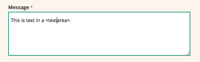
markconroy CreditAttribution: markconroy as a volunteer and at Annertech commentedHere's a patch for focus styles for
<input>and<textarea>.I think buttons have already been addressed, unless I am missing something.
The best place to test this is on the /contact page, since that has input, textarea, buttons.
Comment #6
mgiffordI haven't installed it yet, but those changes look good. Not sure why D8.6 isn't working on SimplyTest.me right now, but might be broader architectural changes. Not sure.
Comment #7
markconroy CreditAttribution: markconroy as a volunteer and at Annertech commentedOh, here's some screenshots.

When nothing is focussed:
Focussed textarea

Focussed input

Focussed button

Comment #8
andrewmacpherson CreditAttribution: andrewmacpherson as a volunteer and at Annertech commentedContact form:
----------------
The borders around the buttons are thick, but the borders on the text inputs only get a colour change. These would be clearer with a thick border, as the flashing caret isn't a prominent style.
Header search box:
-------------------------------------
The search box has an unusual focus style. I like the way the focus goes around the whole component (text input + submit button), then seems to "narrow down" to the submit button - that's pretty cool.
Two things that I don't like about it though:
1. When focus is on the text input, it uses a red colour, but around the submit button it's green. I don't understand that - it seems to sugest that red and green have different meanings, and nothing else uses a red focus outline.
2. When focus is on the text input, an existing border changes colour (grey to red) but stays the same thickness. When focus moves to the submit button, the border thickness changes.
How about making the text input focus style a thick green border? That would avoid any confusion about the meaning of red outline vs green outline, and make it convey focus better by shape instead of colour.
So we'd have:
search textbox focus => thick green border around entire component, textbox + button
search submit button focus => thick green border around button only
Banner block, pink button-style link:
----------------------------------
The focus style for this is a bit weak. The dotted outline is lost a bit with the background image. The underline is used, but is a bit out of place; we've made a link into a big rectangle, but the focus style isn't rectangular. Compare with real buttons.
Suggestion:
outline: 2px solid currentColour; outline-offset: -2px;will bring the outline INSIDE the button where it will stand out more. We know it passes 4.5:1 contrast ratio against the pink.Main menu:
-----------
When focused, link text becomes #ff6138-on-white. with contrast ratio 3:1. This is in the special exception range for large scale text, but the text isn't large scale. Computed size is only 20.25px, regular 400 weight. Large-scale text needs to be bold or 24px.
Comment #9
andrewmacpherson CreditAttribution: andrewmacpherson as a volunteer and at Annertech commentedWCAG 2.0 only says focus should be visible, doesn't really offer any advice about making it clear. WCAG 2.1 brings in level AA "graphics contrast" to tighten this up. Normally I'd say level AA means a normal priority issue, but clear focus styles have a HUGE impact for users who need them, so I'd call this one major.
Not sure whether to call this a beta blocker. It would be good to address this while the original design team are still active on the theme, rather than retro-fit them later.
Comment #10
markconroy CreditAttribution: markconroy as a volunteer and at Annertech commentedHere's a patch with those items from #8 attended to.
Menu link colour is now #da3c13 (suggested by html_codesniffer). We should perhaps consider changing all our oranges to this colour for consistency.
Comment #11
markconroy CreditAttribution: markconroy as a volunteer and at Annertech commentedThis patch stops the search submit button being placed inside the
<input>and gives a specific focus style to each search block element.Also, some margins added to stop the rest of the page jumping by 2px when you focus in/out of those elements.
Screenshots:
Comment #12
andrewmacpherson CreditAttribution: andrewmacpherson as a volunteer and at Annertech commentedCool. great progress. Can we get screenshots of them all?
Re: #9 - I'm inclined to say this is NOT an umami beta blocker for the current window of opportunity for an 8.5.x backport, because...
Screenshots, screenshots, screenshots!
Comment #13
andrewmacpherson CreditAttribution: andrewmacpherson as a volunteer and at Annertech commentedAlso, it would be good have a list of focus styles we might want to improve in follow-ups:
If I get time I'll have a go at such a list, but anyone can start it.
Comment #14
andrewmacpherson CreditAttribution: andrewmacpherson as a volunteer and at Annertech commentedComment #15
andrewmacpherson CreditAttribution: andrewmacpherson as a volunteer and at Annertech commentedAbout screenshots for focus styles....
The default focus styles vary considerably between browsers, and fall into two camps:
1. The WebKit/Blink "blue ring"
2. The 1px dotted outline of IE/Firefox.
It's a good idea to look at a browser from both of these groups when doing screenshots.
Comment #16
andrewmacpherson CreditAttribution: andrewmacpherson as a volunteer and at Annertech commentedSome elements to appraise and gets screenshots for. Helps to decide which ones we're saying are done, versus needing a follow-up.
Comment #17
markconroy CreditAttribution: markconroy as a volunteer and at Annertech commentedComment #18
andrewmacpherson CreditAttribution: andrewmacpherson as a volunteer and at Annertech commentedThanks Mark, I'll take the focus styles patch for a manual spin soon.
On the whole I'm not keen on having treating links vs buttons/inpouts differently, where we have appearing-dissappearing underlines for links but 4-sides outline for buttons/inputs. The default browser focus styles differ a lot, but they all agree on having some kind of 4-sides outline for everything.
These screenshots are about identifying follow-ups though, rather than go/no-go
Comment #19
andrewmacpherson CreditAttribution: andrewmacpherson as a volunteer and at Annertech commentedShould technically count as a bug - missing focus styles would be a failure of WCAG 2.4.7 Focus Visible at level AA.
Comment #20
andrewmacpherson CreditAttribution: andrewmacpherson as a volunteer and at Annertech commentedText boxes and buttons are RTBC worthy. Likewise the mobile menu button and desktop search box.
The underline cam be removed from the banner button now that is has an outline, do that here as a quick win for RTBC here.
The mobile search icon focus style is a bit of a pale background too. Use an outline like the menu button for RTBC here.
Follow-ups:
The main menu links are poor. The underline is a bit pale looking. What contrast is that? Also the focus style is only distinguished from the current page by colour alone. That's a level A failure so make it a major follow-up.
I think links which get underline on focus is a weak style. Let's have follow-up issues for improving these, with an outline style. (I'd like to follow that up in Bartik and Seven too in good time.)
Underlines are best for indicating the presence of a link at all, in their resting style, especially inside sentences. The footer links would be better with an underline to distinguish them from nearby text, so they'll need an outline focus style.
The coloured background of link focus in a sentence is a bit weak, and will not survive in Windows high contrast mode. An outline is preferable. outline-offset:1px can make it look a bit less crowded.
Comment #21
markconroy CreditAttribution: markconroy as a volunteer and at Annertech commentedHere's a patch to remove the underline on the pink link in the banner and set an outline for the search icon on small screens.
No underline on banner link:

Focus style for search icon on small screens:

Comment #22
markconroy CreditAttribution: markconroy as a volunteer and at Annertech commentedFollow ups:
Comment #23
andrewmacpherson CreditAttribution: andrewmacpherson as a volunteer and at Annertech commentedScreenshots in #21 are good - RTBC worthy, covers all the things #20 says to fix in this issue.
Follow-up issues are files correctly.
Patch in #21 is needs a re-roll because it has lots of unrelated changes...
- stuff outside demo_umami profile folder - mostly content_moderation and migrate modules, and an installer file.
- some changes of Umami profile installation config, and installation helper classes.
- a renamed image in umami demo content
- umami test classes
- umami twig files - relevant here?
details....
Comment #24
markconroy CreditAttribution: markconroy as a volunteer and at Annertech commentedrerolling patch.
Comment #25
andrewmacpherson CreditAttribution: andrewmacpherson as a volunteer and at Annertech commentedRTBC.
- patch re-roll looks good
- manual testing (firefox + chrome) confirmed screenshots from #17 and #21
Many focus styles still have the default browser outline in addition to our custom style, so some browser inconsistencies exist. The existing follow-ups can address these.
Comment #26
andrewmacpherson CreditAttribution: andrewmacpherson as a volunteer and at Annertech commentedfiled another follow-up. #2942506: Better focus style for image links in Umami
Comment #27
andrewmacpherson CreditAttribution: andrewmacpherson as a volunteer and at Annertech commentedBTW, all the follow-ups are things which have focus styles which technically pass WCAG SC 2.4.7 Focus Visible, but are various levels of mediocre. WCAG 2.0 just wants focus styles to be present, but says nothing about their contrast or clarity. WCAG 2.1 introduces a graphics contrast criterion, so that's why I want them to be improved later.
Comment #28
andrewmacpherson CreditAttribution: andrewmacpherson as a volunteer and at Annertech commentedsorry I broke the tag in #26
Comment #29
Gábor HojtsyComment #32
Gábor HojtsySuperb, thanks, committed to 8.6 and 8.5.