
Problem/Motivation
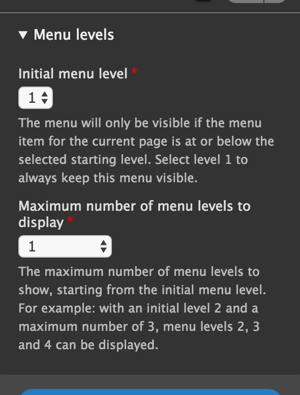
The current description strings in this fieldset are:
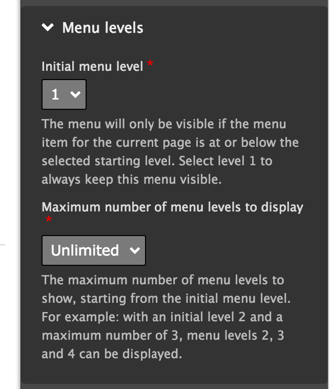
Label: Initial menu level
[select box]
Description: The menu will only be visible if the menu item for the current page is at or below the selected starting level. Select level 1 to always keep this menu visible.
Label: Maximum number of menu levels to display
[select box]
Description: The maximum number of menu levels to show, starting from the initial menu level. For example: with an initial level 2 and a maximum number of 3, menu levels 2, 3 and 4 can be displayed.
These are quite long and not particularly clear.
Proposed resolution
Shorten and simplify the descriptions.
Remaining tasks
Write new descriptions
User interface changes
Shorter descriptions.
API changes
None
Data model changes
None
Before
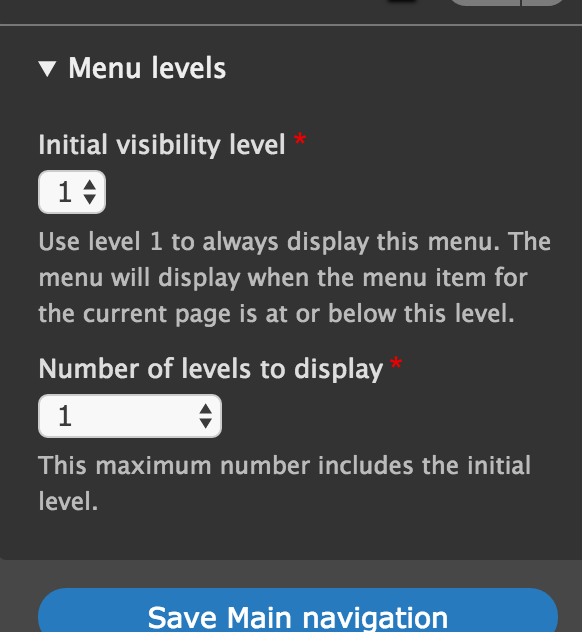
After
| Comment | File | Size | Author |
|---|---|---|---|
| #29 | simplify_the-2803203-29.png | 106.02 KB | lomasr |
| #29 | simplify_the-2803203-29.patch | 1.81 KB | lomasr |
| #20 | simplify_the-2803203-20.patch | 1.71 KB | lodey |
| #20 | Screen Shot 2016-09-30 at 16.12.57.png | 61.62 KB | lodey |
| #18 | AFTER-screenshot-18.png | 54.39 KB | lodey |


Comments
Comment #2
tkoleary CreditAttribution: tkoleary at Acquia commentedMy suggestion:
Label: Initial level
[select box]
Description: The first level to show. Should be no greater than the current page level.
Label: Max levels
[select box]
Description: How many levels to shown, including the initial level.
Comment #3
tkoleary CreditAttribution: tkoleary at Acquia commentedHow this would look in the confined space of the outside-in edit tray:
Before
After
Comment #4
tkoleary CreditAttribution: tkoleary at Acquia commentedComment #5
tkoleary CreditAttribution: tkoleary at Acquia commentedComment #6
joachim CreditAttribution: joachim as a volunteer commented> Description: The first level to show. Should be no greater than the current page level.
I'm afraid that's no clearer, to me at least. What is the current page level?
Comment #7
lodey CreditAttribution: lodey as a volunteer and at NDP commentedI'm working on this issue for DrupalCon Dublin
Comment #8
lodey CreditAttribution: lodey as a volunteer and at NDP commentedThe original menu descriptions are not too bad, but they could be slightly shorter and remove the potentially confusing example. This has the advantage of clearing some space on the new slide out toolbar.
I proposed some simple alterations to make this more concise and readable.
Initial Menu Level
The starting level where this menu should become viewable. Level 1 will always show the menu.
Maximum levels displayed
The maximum number of menu levels to show underneath the initial menu level selected.
Comment #9
AndreaD CreditAttribution: AndreaD commentedI will look at this issue.
Comment #10
AndreaD CreditAttribution: AndreaD commentedComment #11
yoroy CreditAttribution: yoroy at Roy Scholten commentedI agree with @Joachim that "Should be no greater than the current page level" is not clear.
Maybe we can try and make the labels more meaningful. Some ideas:
## Label 1
Show the menu starting from level
Initial menu visibility level
Initial visibility level
Start showing the menu from level
Show the menu from level
## Description 1
Use level 1 to always show this menu.
## Label 2
Number of levels to display
Number of levels to show
How many levels to show?
## Description 2
The maximum number of menu levels to show.
(And we're not consistent in display vs. show…)
Comment #12
Sutharsan CreditAttribution: Sutharsan commented@lodey, It is helpfull for others to understand the issue, to place the 'before' screenshot in the issue summary. Can you do this too?
Comment #13
ifrikThanks,
looks like this is one of the issues where UI text standards would be useful :-)
So for consistency, I would opt for "display" rather then show because that what we use for concepts such as display modes.
Also, we should try to avoid duplication between the label and the additional help in the description. However, the question what this visibility is about shouldn't be removed.
So from the different proposals so far, I would go for:
Menu levels
Initial visibility level The menu is only visible if the menu item for the current page is at this level or below it. Use level 1 to always display this menu.
Number of levels to display This maximum number includes the initial level.
Comment #14
AndreaD CreditAttribution: AndreaD commentedOk, I have tried to review it, the first thing that comes to my mind, is why we are not using the descriptions, already existing in the /admin/structure/block/manage/* pages?
##Title
Initial menu level
##Label
The starting level where this menu should become viewable. Level 1 will always show the menu.
##Title
Maximum levels displayed
##Label
The maximum number of menu levels to show underneath the initial menu level selected.
BR, Andrea
Comment #15
AndreaD CreditAttribution: AndreaD commentedComment #16
lodey CreditAttribution: lodey as a volunteer and at NDP commentedHi AndreaD, The code for the labelling is the definitely used for both the slide out tray or the main configuration page, so any change we make will be reflected in both locations.
Comment #17
lodey CreditAttribution: lodey as a volunteer and at NDP commentedThanks ifrik - completely agree some UI standards would be handy! I find it useful to reference the Google materials design guide for some ideas on this. https://material.google.com/style/writing.html#writing-language
Also agree regarding the consistency and like your changes. It would be great to further condense the first description purely to be more readable in the slideout tray, but I think we would struggle to do so and stay informative enough.
Comment #18
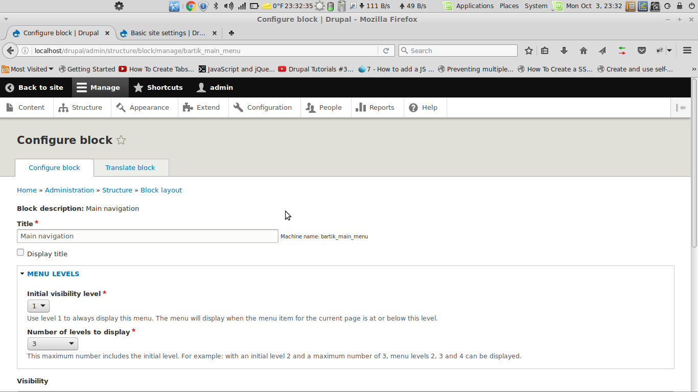
lodey CreditAttribution: lodey as a volunteer and at NDP commentedThis patch will enable the changes suggested by ifrik. Its worth comparing the before and after screenshots for context.
Comment #19
yoroy CreditAttribution: yoroy at Roy Scholten commentedAgreed it's really hard to shorten that first description. What if we started with the easy, more reassuring bit though?
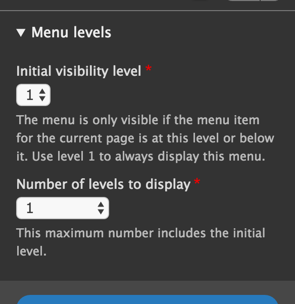
"Use level 1 to always display this menu. The menu will display when the menu item for the current page is at or below this level."
Comment #20
lodey CreditAttribution: lodey as a volunteer and at NDP commentedI like that. This is now much clearer than the original.
New

Old

Comment #21
yoroy CreditAttribution: yoroy at Roy Scholten commentedComment #22
lodey CreditAttribution: lodey as a volunteer and at NDP commentedHi Everyone,
Thanks for helping to work on this issue at Drupalcon last week.
It would be great to try and push this to review, and also to understand how to stop issues like this one from stalling out - any tips on the best way to get traction around that without annoying the heck out of everyone?
Comment #23
lodey CreditAttribution: lodey as a volunteer and at NDP commentedHi Everyone,
Thanks for helping to work on this issue at Drupalcon last week.
It would be great to try and push this to review, and also to understand how to stop issues like this one from stalling out - any tips on the best way to get traction around that without annoying the heck out of everyone?
Comment #24
lodey CreditAttribution: lodey as a volunteer and at NDP commentedHi Everyone,
Thanks for helping to work on this issue at Drupalcon last week.
It would be great to try and push this to review, and also to understand how to stop issues like this one from stalling out - any tips on the best way to get traction around that without annoying the heck out of everyone?
Comment #25
yoroy CreditAttribution: yoroy at Roy Scholten commentedI tested the patch on simplytest.me and can confirm the patch looks good.
Comment #26
yoroy CreditAttribution: yoroy at Roy Scholten commentedComment #27
xjmOverall this looks great. I have one concern about @yoroy's proposal in #19 though:
This can be read as "The menu will display when the menu item for the current page is at or below level 1." I had to read it a second time to understand it the other way.
Assigning to @yoroy for feedback on whether that's a concern. If the usability team still thinks that is the best way around for the two sentences, though, I'm also fine with them re-RTBCing it.
Aside to @lodey: Three days over a weekend without a patch review is not the issue "stalling out". :) A couple good ways to get reviews are to share the link in IRC, to reach out to someone previously active on the issue, to trade reviews with another contributor, or to join a team of people like the usability team who are collaborating on the same kinds of changes. (Posting comments asking for reviews isn't going to be successful at not annoying people though.) ;)
Comment #28
lodey CreditAttribution: lodey as a volunteer and at NDP commentedThanks for taking a look and the feedback @xjm :)
Comment #29
lomasr CreditAttribution: lomasr at gai Technologies Pvt Ltd for gai Technologies Pvt Ltd commentedTested patch #20 . It looks great . I think adding example will help the beginner's in future. Adding patch which includes "For Example".
Comment #30
tkoleary CreditAttribution: tkoleary at Acquia commented@lomasr Let's not add back the example please. It's not adding any value and every additional word we add increases overall cognitive load.
@joachim
With the settings tray open the user should know "the current page" mean the page they are on but perhaps we can be even more clear with "the page the menu is on".
@lodey
This is true, however if we solve for the less experienced user here (in the tray) that description should also cover the more experienced one.
@ifrik
Consistency is good but we're sliding back to the "tech jargony" wording users were reacting against in the Minnesota study. Our current standards need to evolve away from that.
We need simple everyday language:
"Show" not "Display"
"Shown" not "Visible"
"Largest" not "Maximum"
"Chosen" not "Selected"
"First" not "Initial"
"Link" not "menu item"
We're also defining 'description' too broadly. It's not a full explanation or a tutorial, it's simply a clarification of what the field is for if the field itself, it's label, or it's context are not sufficiently self-explanatory. So:
If the user has a menu with 3 levels and wants to show all three that's what they will choose, If they only want to show 2 they will choose 2.
By using "maximum" we are forcing the user to grok the dimensions of time, space, and multiple users and mentally formulate "I only have two menu levels now but I want to set it at four because later on another user may add more levels and if it goes to five the indents will strain the horizontal width of the sidebar I'm putting it in."
"Levels to show" follows to the common case and is simple and clear. The complex case is not rendered any less achievable.
Given all of the above the text would then be:
[fieldset label]
Levels
[field label]
First level to show
[description]
Choose "1" to always show this menu (menus only show if the link to the page they are on is at or below the chosen level).
[field label]
Number of levels to show
[description]
Includes the first level (chosen above).
Comment #31
tkoleary CreditAttribution: tkoleary at Acquia commentedComment #32
yoroy CreditAttribution: yoroy at Roy Scholten commentedAhem. So looking at this again, I think that last change reordering the sentences was not so good.
So the patch in #18 would be the one we want to commit.
Comment #33
tkoleary CreditAttribution: tkoleary at Acquia commented+1
Comment #34
tkoleary CreditAttribution: tkoleary at Acquia commentedThe patch at #18 as @Yoroy suggested.
Comment #36
xjmAlright, #18 looks good to me too. In the future, please be sure to upload the correct patch as the last patch on the issue, so that it can be properly tested by the testbot and so committers don't review or commit the wrong thing.
Committed #18 to 8.3.x. Thanks!