
Problem/Motivation
As a site builder, I would like to be able to place a block from any page and intuitively see where it will display
Proposed resolution
Create an experimental module that adds a feature to core so that you can initiate a "place blocks" workflow from any page seeing the "place block" button in each region. Clicking the button would bring up the block picking modal already used in core.
Concept came from Dries keynote, but planning a minimal implementation.
The implementation concept was vetted with bojhan and yoroy in person at Drupalcon
First pass implementation is similar to technique used by https://www.drupal.org/project/refreshless to swap the page variant plugin.
Remaining tasks
Review, improve patch
User interface changes
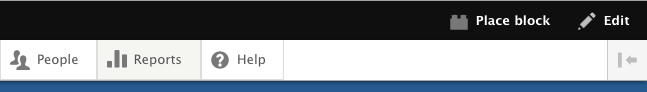
Add a link to the toolbar to initiate this "place blocks" workflow
API changes
Data model changes
none
Tasks
- #2735277: Let users set the weight of blocks after placing them from place-block
Required follow-up issues after initial commit as experimental module
- #2513520: Add a contextual link to add a block to a region
- #2732443: Finalize the behavior for triggering view/edit/build modes from the toolbar (and fix the "disappearing toolbar")
- #2732643: Remove Action link for 'add custom block' from Block Layout Modal
| Comment | File | Size | Author |
|---|---|---|---|
| #208 | Screen Shot 2016-06-22 at 10.22.50 AM.png | 56.95 KB | webchick |
| #208 | Screen Shot 2016-06-22 at 10.22.37 AM.png | 67.73 KB | webchick |
| #208 | Screen Shot 2016-06-22 at 10.22.30 AM.png | 68.13 KB | webchick |
| #208 | Screen Shot 2016-06-22 at 10.22.03 AM.png | 12.36 KB | webchick |
| #208 | Screen Shot 2016-06-22 at 10.21.09 AM.png | 23.78 KB | webchick |


Comments
Comment #2
pwolanin CreditAttribution: pwolanin as a volunteer commentedHere's a first pass based on discussion with tim plunkett and prior discussion with Wim Leers.
The links look odd since they are too wide - might need to add the region name.
Also, after submitting the block you end up on the blocks admin page instead of where you started, and the "back to site" link has the trigger query string in it.
Comment #4
pwolanin CreditAttribution: pwolanin as a volunteer commentedquick minor cleanup, and a hack appending "destination" to the query string to avoid the back to site link include the trigger query string.
Also added the region names by copying the code from the demonstrate block regions code.
Comment #5
pwolanin CreditAttribution: pwolanin as a volunteer commentedSmall test fixes.
Comment #6
pwolanin CreditAttribution: pwolanin as a volunteer commentedoops - copy/paste fail
Comment #10
pwolanin CreditAttribution: pwolanin as a volunteer commentedOne of those fails was sporadic. Maybe fixed the other.
Flipped the position of region labels based on feedback from Bojhan.
Added some simple test code to start.
Comment #12
Bojhan CreditAttribution: Bojhan as a volunteer and commentedThis is great to see :) Thanks for working on this!
Comment #13
Wim LeersGreat first step/prototype! :)
I was going to say: , but that clearly does not work, since the PoC demo video in Dries' keynote showed "plus icons" to add blocks upon hover, which does not work when using touch.
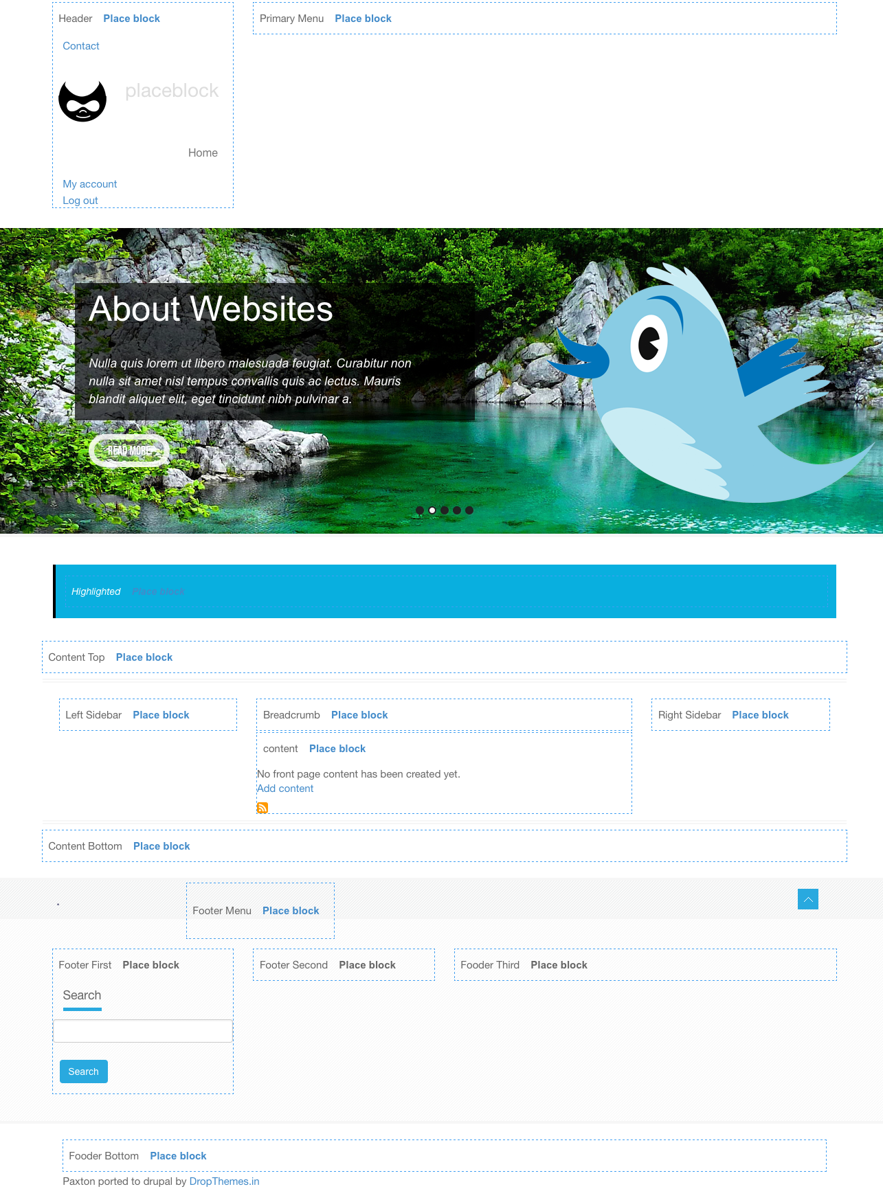
This beautifully demonstrates what IMHO one of the key problems is: the fact that some regions completely disappear if there are no blocks in them. This screenshot for example clearly shows how problematic that is for the "Highlighted" and "Featured top" regions:

We could fix this for particular themes, but we can't force this on themes, at least not in D8, that'd be a BC break.
Comment #14
pwolanin CreditAttribution: pwolanin as a volunteer commentedYEs, the fact that the regions are not there in the markup means that going to a URL with a query string to trigger the behavior seemed like the kind of thing necessary for robust behavior. Adding blocks only into regions that are already populated seems less than ideal, and we don't have any other way to force themes to emit the regions, as you say.
Comment #15
tedbowThere is an existing issue that relates to this #2513520: Add a contextual link to add a block to a region
Should we close that one as a duplicate?
Comment #16
tedbow@pwolanin I love the idea but I think it is a little confusing to be directed the main blocks layout page and then have to click "Back to Site" to see the block in place. Especially if you were new to Drupal.
What if changed the workflow to
Step #5 would look something like

Starting from step 5 it would be different from existing steps. I think since this module idea seems to be target at the new comer to make it easier to know how to get a block on the page it would be nice if they quickly saw it on the page they originally were on without having to see the main blocks layout page.
Comment #17
SKAUGHTthis is in overlay modal in bartik, safari 9. vertical tabs show css break. this will be a basic issue in many themes as inheritances collide.
if http://caniuse.com/#feat=style-scoped can be added to the modal it would help.
(just a random example)
EDIT
----------------
.vertical-tabs__menu-item {left:230px}
seems to fix this for each li tag
Comment #18
tim.plunkettRe #17, shouldn't need additional CSS, I'm guessing something just isn't being loaded.
Re #16, I think what @tedbow proposes is a good second step, but for the initial flow I'd probably just skip the reordering bit completely, and just have it added to the top or bottom of the region, wherever the button is. Then we can iterate on other ideas for reordering from the front end in general.
Comment #19
SKAUGHTthis is NOT the vertical tabs issue, but for the yellow bar cutoff. tabs issue is not clear.
should be tested against a variety of themes.
Comment #20
tedbowOk here is a patch for my suggestion in #16. without the re-ordering as @tim.plunkett suggested.
Comment #21
SKAUGHTonly diff from #20:
This moves link into demo-block header, which is more similar to to block layout page. Also gives better spacer for Trobber gif. overall more compact on page.
Comment #23
pwolanin CreditAttribution: pwolanin as a volunteer commented@SKAUGHT - thanks - aligning the button and region tet was suggested at Drupalcon but not something I'd had time to try.
That test fail seems odd - did you rename something?
Comment #24
SKAUGHTsorry, i missed adding the composer.json change.
Comment #25
SKAUGHTComment #26
tim.plunkett@SKAUGHT, can you please provide interdiffs for future changes?
I'm attaching one for the changes between #20 and #24.
Here are some minor tweaks to things to bring it up to core standards.
Comment #27
pwolanin CreditAttribution: pwolanin as a volunteer commentedIt would be good (I think) to also move the "place blocks" link to the right near the IPE toggle, but not sure how best to achieve that.
Comment #28
pwolanin CreditAttribution: pwolanin as a volunteer commentedcrap, stale comment form
Comment #29
pwolanin CreditAttribution: pwolanin as a volunteer commentedBrant Wynn mentions some possible overlap or maybe just nicely complementary features with https://www.drupal.org/project/feadmin which lets you drag blocks around on the front end
Comment #30
saltednutThe feadmin module also allows for dragging blocks from a sidebar onto the page into both existing and non-existing (Edit: Currently occupied by a block v empty) regions. Not the same form of interactivity as the modal, and much more dependent on having a mouse. I would think this MVP could potentially be a better solution on tablets and mobile. NTM it is much less complex than the contrib module mentioned.
Comment #31
SKAUGHT#27. i had that thought as well.
Comment #32
SKAUGHTI think one of the general concerns with feadmin (and Panels) using drop and drag is the difficulty to make accessible. where as this a smaller starting point still will be more UX/a11y friendly. A drop and drag component should come next, not first. @progressive enhancement.
edit
---
i've cleaning looked at feadmin (currently rc5). yes, cool but visually jumpy in this current state. certainly lacks degrade. uses it's own message notification popup (screen bottom). doesn't seem to let you add new blocks, just move around current context. not mobile friendly.
Comment #33
SKAUGHTComment #34
saltednut#32 Agreed. Definitely not calling for adding JS or Drag and Drop to this patch. Just wanted to ensure everyone working on it was aware of other solutions coming out of contrib.
edit, because I now see the #32 edit:
---
While feadmin does allow for adding blocks (check the "blocks" checkbox in its sidebar, unfold the list of blocks, drag one onto a region) it is an interactivity pattern that again relies on Drag and Drop, which is not a11y friendly.
Comment #35
SKAUGHTi was always fond of https://www.drupal.org/project/bud (has d8 dev, i haven't looked at this in a while)
Comment #36
saltednutAdditionally, re: #32, Panels has made great strides towards a11y/mobile friendly interactivity via the Panels IPE. Again, a much more robust solution. But the blanket statement that Panels != a11y should be alleviated a bit by this video that was created recently.
https://www.youtube.com/watch?v=WLcXgJXxU2E&feature=youtu.be
Comment #37
SKAUGHTrandom thoughts:
certainly is nice to see the +/- in panels. but certainly that not the only a11y issue against panels. The whole drawer up idea lends to accessibility/usability/mobileUX concerns. i haven't been keeping up on that corner of things myself lately. when it's closer to an RC, it'll be nice too. Certainly panels is still a mouse-first/desktop site building tool. @peace with panels!! amen.
With/when layouts plugin get into core, and i'll have to assume that work on layout [builder] gets picked back up.
It'll be very interesting to see how drop 'n drag will be introduced. of course, it will happen somehow.
Next missing component: 'none node pages'
Comment #38
SKAUGHTi've made an icon for the toolbar. icons turns white when active.
Comment #39
SKAUGHTComment #40
SKAUGHT#13 missing regions if empty.
also missing: "A place for JavaScript status messages".
As feadmin modules demonstrates by making their own solution (or even, panels should have an action complete notice) a common approach from core is needed for ajax messeage, as will be for drop 'n drag event notices.
Comment #41
SKAUGHTadding link: https://www.drupal.org/sandbox/phenaproxima/2237839 i haven't tested yet myself.
Comment #42
tim.plunkettCan you open a separate issue to discuss other solutions or future iterations? It'd be nice to keep this issue on track.
Comment #43
saltednut#42++ should move all of this stuff about other modules into some kind of meta issue or book page.
Comment #44
SKAUGHTof course, the most basic aspects of this ticket request are now complete.
i'm not otherwise aware of how/where to open a book page -- if my account can? sorry, i'm not familiar with that process.
Comment #45
pwolanin CreditAttribution: pwolanin as a volunteer commented@KAUGHT previously I had the text change when in the mode so that you could exit the mode. I think that is a better pattern?
Comment #46
SKAUGHTThat toggle and text change is still there. Now with the addition of a lighter coloured custom icon.
OFF mode
ON mode
Comment #47
Dom. CreditAttribution: Dom. as a volunteer and at ACINO commentedHi all!
I just wanted to add some thoughts on what has been said here, mainly regarding comparison with feadmin module.
I just did feadmin module on a couple of days when I had time, to try-out Dries inside-out approach. It is a POC and does not aimed to be usable yet. Unfortunately I did not had time yet to explore it as much as I would like to. Here are some comments though.
@SKAUGHT: from your comment #32 ( saying "visually jumpy") I suppose you tried rc5, not latest dev, since I came up with the same conclusion and another approach.
@brantwynn: Indeed, it relies to much on mouse interaction to be mobile friendly. The whole point is that this module is about administering Drupal from front, not just blocks. It took this mouse interaction as an assertion to explore as discussed with @yoroy on IRC. But this approach highlighted more issues then it solved indeed.
I guess it is wrong to compare this module to feadmin. The purpose is different for me. Here, I see this module as a replacement for admin/structure/block/demo/bartik. This in the same way, let's you visualize your theme region, plus let's you add blocks in it like admin/structure/block page does. In the same way, it also takes a full page reload to visualize the regions.
On the other end, feadmin aims to explore a way to define ONE interaction scheme to administer (ie add, but also edit, move, delete) VARIOUS core concepts, such as blocks, but also menu items, fields, etc... Of course, the drag&drop interaction scheme it currently offers is bad in many ways, but I don't think it serves the same purpose (though I could be wrong). I would be more then happy to expand on the goals of feadmin, the challenge it hightlights, like the necessity of #77245: Provide a common API for displaying JavaScript messages and others, but I guess it is not the proper issue to do so !
That being said, once more I love this, as a replacement or an extension of admin/structure/block/demo/bartik.
If you intend however to complete this by adding solutions to truly administer your blocks, then I would love to combine this with feadmin, for it could thus become one tool available for feadmin among the others. Moreover, this could be made as a global interaction scheme to let others (including other feadmin plugins) to also define similar tools for other concepts, once more, menu items, fields, etc...
Comment #48
SKAUGHTjust remember this already works with ANY theme. i've tested with zircon, paxton, drupal8_zymphonies_theme & adminimal_theme (just as random themes to try) and works well. some minor issues depending on that themes style base... but to be expected.
certainly, more flexibility will come as a roadmap for this progresses. I think the key to remember is to keep it progressively enhanced. especially with all conversations/issues about adding in a JS framework (bigpipe, refresh-less).. and whatever/when a revamp of the theme system will probably occur. [personally, i think the Drupal prototype and Drupal.behaviors need to be promoted differently.. we already have a steady base.]
at this time, this ticket has a limited scope.. and that good. start small.
next to step would be (which then basically is feadmin):
but the think to keep in mind is what other contexts that block is used in. for most Site Admin, it's not clear that *'this block is here an this content type' and 'another block variant is used on another' so that will be the issue in working with sites with many landing pages, deeply nested pages, many block everywhere from custom blocks, programmatic blocks, view block, panels... and layouts coming..
Comment #49
pwolanin CreditAttribution: pwolanin as a volunteer commented@SKAUGHT thanks for the clarification and screen shots. Haven't tried the latest locally yet.
Comment #50
pwolanin CreditAttribution: pwolanin as a volunteer commentedI think the change in #24 to use the blocks demo page instead of the current page is a step backwards. I want to place blocks in context.
We should probably change this number to be -2000 or as Wim to use a different value in refreshless module
This looks like the wrong approach.
I want to place blocks on the CURRENT page, not the blocks admin page
Comment #51
SKAUGHT#50 point 2. i'm not sure what your testing (or just looking directly at code..) patch in #38 does return to original destination. that link is to call the block admin page in the modal. that is correct. and links will degrade to standard page loads without JS.
of course, the module does not currently 'set block to this page' directly. but the for block visibility are steps in the general workflow from that point. IMO: it should be as such. The user will have a better since of what blocks are where on their site and if they are want to deal with paths and wildcards, node id's vs content types. Over assuming they want it 'only on this page'. what if it was a multilingual site? only this language?? logic spiral.
as for point 1: perhaps would should point this out to Wim.
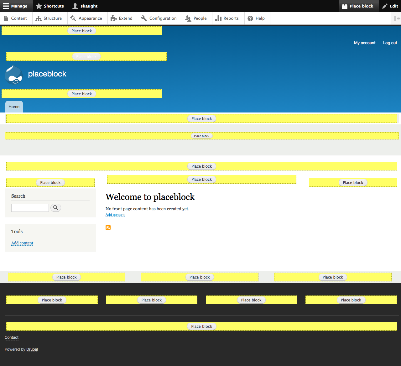
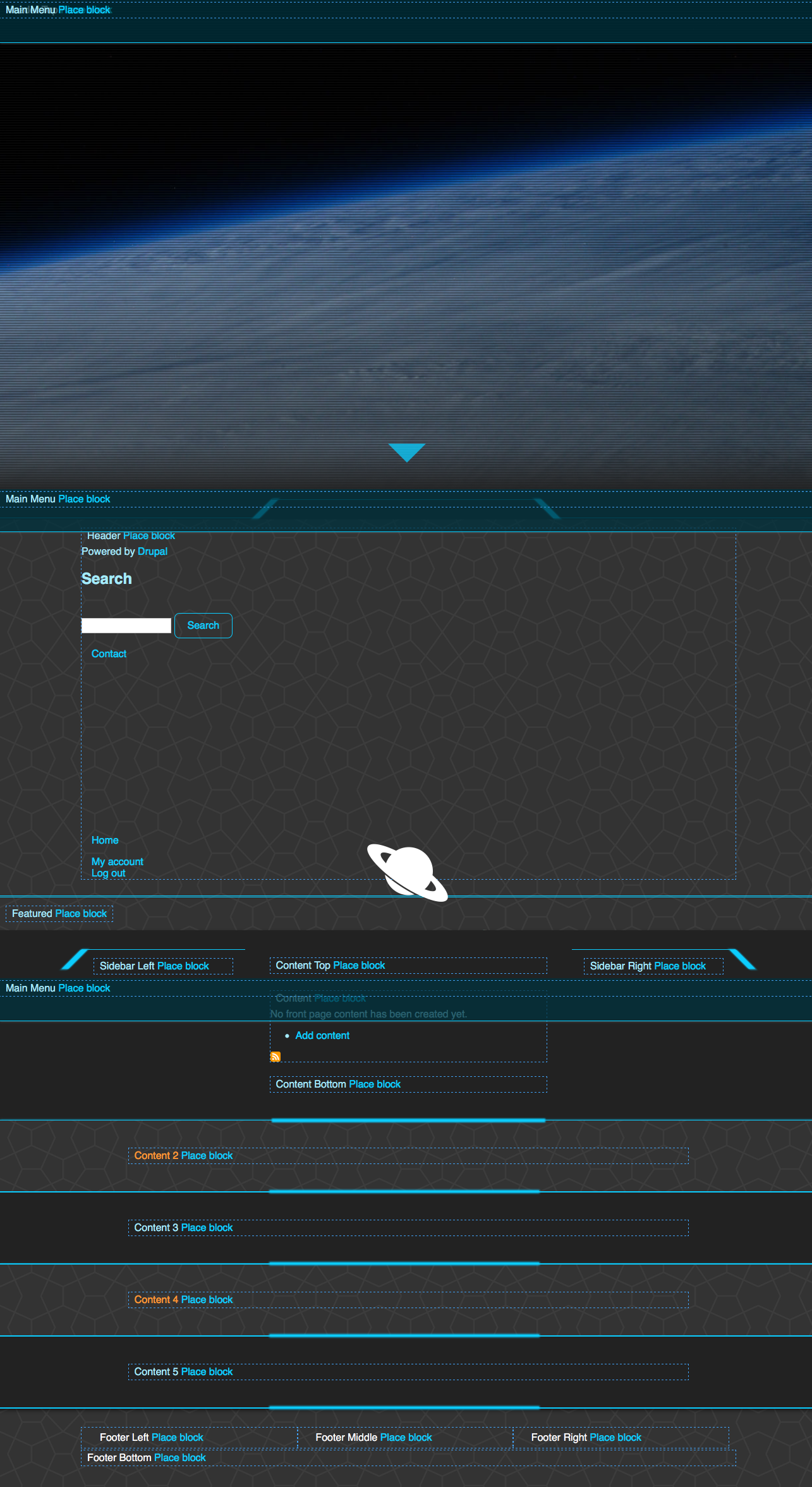
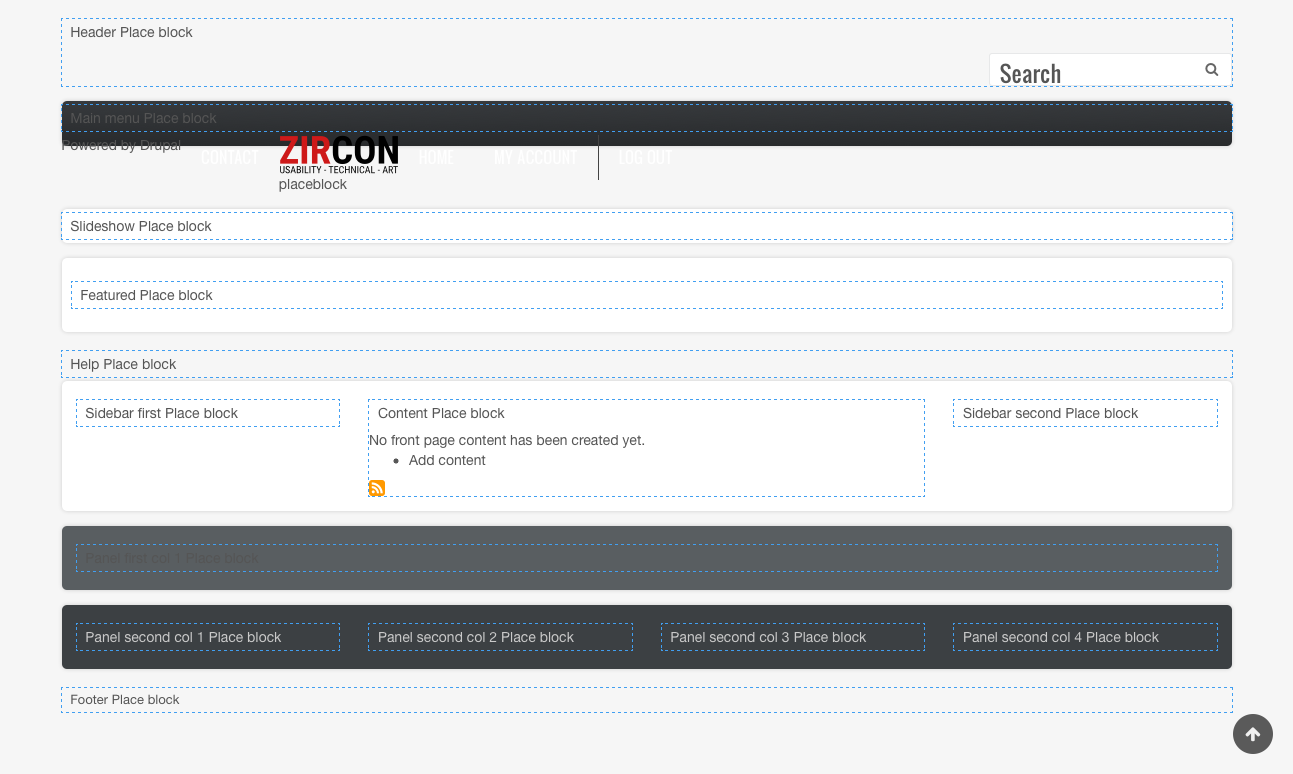
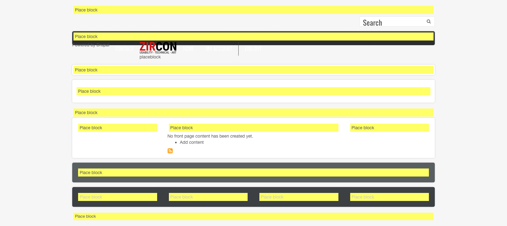
Comment #52
SKAUGHTComment #53
pwolanin CreditAttribution: pwolanin as a volunteer commentedLet me try the patch. I'm think I'm confusing myself.
Comment #54
pwolanin CreditAttribution: pwolanin as a volunteer commentedNeeds work at least for:
This doesn't do what we want - on a node page it sets it as /node/{node}
Comment #55
pwolanin CreditAttribution: pwolanin as a volunteer commentedOk, this sets and actual destination= query string which is passed along through and could be used to implement alternate flows.
That lets us skip the hack of adding
-destinationto the original query string (which is a buggy check anyhow that might get fixed).Expands the test coverage a bit.
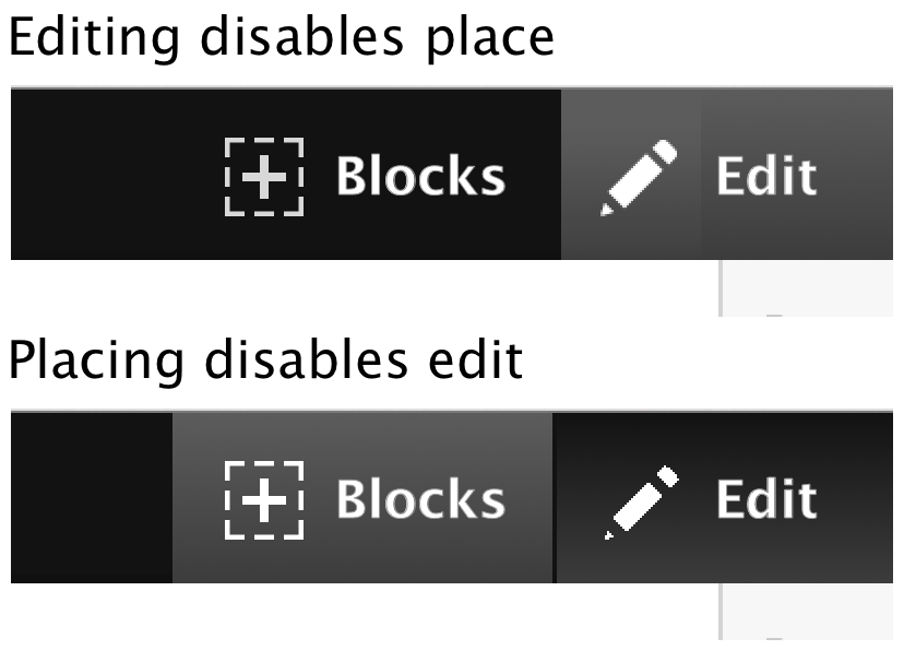
I seem to be repeatedly activating the quick-edit pencil also - I wonder if the JS is somehow triggering from the place blocks link? Possibly it due to the HTML ordering, since edit link seems to be before in the HTML?
Seems like the remaining work is mostly to fix the vertical tabs CSS (or figure out how to render the modal using the admin theme), and fix this edit triggering?
Comment #56
pwolanin CreditAttribution: pwolanin as a volunteer commentedThe use of the class contextual-toolbar-tab to float right seems to have side effects in from the editor JS. Also, that's coming from the contextual module as opposed to the toolbar module.
I'm not sure if it makes sense to add to the toolbar module CSS to support links on the right, or to just add that to this experimental module?
For now, just removed, so the link is back towards the left. Also a little code simplification in PlaceBlockPageVariant.
The modal seems to have vertical tabs styles from extra stylesheets also applied, as compared to when it's opened from the normal blocks admin page. Not sure how to debug that.
Comment #57
SKAUGHTre: vertical tabs. perhaps increasing the breakpoint for vertical tabs would help. secondly, making the modal narrower (i'm in favour of changing the breakpoint.)
As #17 moving left only fixes bartik -- then breaks every other theme.
i noticed the edit getting triggered. i took a quick look through edit but couldn't see why that would be. it would make since for Toolbar to support right-side/left-side items. This module as a POC, left if fine, but right would be better. ):
otherwise, current patch seem good. However, we do need a vertical tab fix before it can move on.
Comment #58
pwolanin CreditAttribution: pwolanin as a volunteer commentedAs before, I think there are incorrect style sheets getting added to the modal. The content should be rendered the same regardless of where it's called from, but seems ot be different if it's called from the front end vs. admin theme.
To move the link on the right, probably this just needs some small amount of specific CSS the way contextual module has some.
Comment #59
pwolanin CreditAttribution: pwolanin as a volunteer commentedI think I see the problem.
The 1st modal the request has:
ajax_page_state[theme]:bartik
The 2nd modal triggered from within the 1st modal has:
ajax_page_state[theme]:seven
So possibly there is a bug in the ajax system that is not carrying the original theme state through to the 2nd modal
Comment #60
SKAUGHTi'm a strong fan of 'on the right' -- also has rtl to float:left
also, adds overall gradient to active state, adjusts color (i had used the color from the second line icons, oops). and removes 'Generator: illustrator' comment from .svg's
Comment #61
SKAUGHT#59 could it be: it's switching to Seven because the Block Layout is an admin route. thus defaults to using Seven.
Comment #62
SKAUGHThiding old files
Comment #64
SKAUGHTMigrate test failure flux continues.
Comment #65
tkoleary CreditAttribution: tkoleary at Acquia commentedWorks great!
There's a few things we can simplify though.
The "place block" link in toolbar is an anti-pattern. Left-hand side stuff in toolbar is navigation not page manipulation. There are at least two other ways to handle this:
Show "place blocks" links when edit is toggled on
Follow Preston So's suggestion of having a "build" toggle next to the "edit" toggle, and show place blocks links when that is toggled on
With either of these we can also show the "place block" links on hover even when "edit" or "build" is not toggled on.
It is not difficult to accomplish this, I hacked it quickly together in chrome inspector with this CSS:
This also took out a lot of the extraneous styling from "demonstrate regions" which IMO should be disabled if this module is enabled.
I would also suggest that we could further simplify the design by putting the region name in the button eg. [Place block in header]
Lastly, the "add custom block" link in the modal should bring the user back to the place block modal and then to the page they started on when the custom block has been created. If that's not possible, then the link should not be there.
Comment #66
SKAUGHTwe can't assume Edit will be active to be used to trigger Place Block. Edit has already established an (anti-)pattern. it has made it 'right side changes things on this page' --- sorry, also patch on #60 moves back to right side.
Aside: I would hope this module is more directly included into the full Block module.
I'm not sure 'build' is as clear a term.. we're not building Views... not building Layouts... not building entities nor forms. we are just placing blocks.
my own concern (form your video clip) is any time we 'hide' something and hope a user will do something find it..it's just not usable. secondly, using css hover it won't be mobile/table responsive building friendly. of course JS could do it, none the less we're just hiding things.
i do like the idea. but region name are in code and not translatable. And often region names are 'strange' (see below) As this is now, the name then the btn is as the /admin/structure/block is... so it's familiar.
i'm not found it that button, but at this time this modules is simply calling the 'choose block' utility that already exists in core. But really, a User may just want to place a custom block.. we shouldn't limit that ability here.
example of 'strange' block name (sample from zircon)
Comment #67
SKAUGHTComment #68
Bojhan CreditAttribution: Bojhan as a volunteer and commentedWe discussed this patch over the UX-team hours (webchick, yoroy, cosmicdreams, bojhan, tim, gabor).
During this review we had the following understanding:
Out of scope
The space that this patch is trying to resolve is riddled with huge challenges, that deserve a in-depth design process to be resolved. There has already been a lot of great thinking on this from the in-context, ipe, panels, etc. approaches.
For this patch to continue without being derailed we believe, some challenges need to be descoped:
Removing this from the scope allows us to make a first step of bringing in-context interactions into core. We obviously need to iron out many challenges, but the point of experimental modules is being able to do this in core.
What's needed for this to become a experimental module
We are already quite close to including this in core. The patch needs additional front-end and back-end review, to go in - but the bigger concepts have reached agreement.
Comment #69
tkoleary CreditAttribution: tkoleary at Acquia commentedMuch better
We are just placing blocks *now* but I think we should build this so that it could gracefully scale up into a modal state for handling any block and layout related tasks in-place. I can see that even in that case "build" might not be right but I don't have any other ideas just yet.
Of course. My assumption was that we would treat the same as we do with contrextual links: show on hover but toggle on with the "build" toggle.
Ideally I'd like the "place" buttons to be just plus buttons with no text at all like in the mockups I made for Dries blog post, but I feel like that may need to be a later addition. Perhaps we can remove region names altogether since the region name will be in the modal anyway?
This is essentially a big part of the problem. The region names are a construct that the user should not need if they have a way to simply "put the thing here."
I agree, but we can't then strand them back in the block UI to find their own way back. :)
Comment #70
yoroy CreditAttribution: yoroy at Roy Scholten commented#2513520: Add a contextual link to add a block to a region for exploring the use of contextual links to provide the 'add block' option
Comment #71
tkoleary CreditAttribution: tkoleary at Acquia commented@bojhan
That assessment of scope sounds right to me. I *think* that my comment above fits within scope but let me know if you agree.
Comment #72
yoroy CreditAttribution: yoroy at Roy Scholten commentedAdding another issue for the designing global view/edit/build toggle.
@Kevin: Removing the region names sounds good, it's not very useful information because you can add in place, so the location is always “Right here” :)
Add block buttons are ok for now, it's consistent with current blocks page. Plus-icons could be an option, maybe explore that in #2513520: Add a contextual link to add a block to a region.
Comment #73
SKAUGHT@tkoleary
i was just re-looking over the add custom block action link. Even on the base Block Layout page; it is very odd that once you hit 'place block' we then get the Action link to add custom..user adds title/body..another screen where user sets vertical tabs -- then again is asked what region to place custom block. Even though they already selected a region on step 1.
I am now thinking this should just be removed for both the Block Layout overlay and this module. It's true, it works poorly across the board.
Comment #74
SKAUGHTComment #75
SKAUGHT#68 address vertical-tab position while in modal, as an approach.
#2727523: Bartik's '.header .demo-block' needlessly sets width should be reviewed/committed as well. this issue is outstanding apart from this ticket.
Comment #76
SKAUGHTComment #77
SKAUGHTthis includes an actual .library.yml to add css for block-place. ensures 'yellow background' of region name on all themes. also prevents button wrapping seen in some breakpoints.
button wrap example:

Comment #78
SKAUGHTtriggering test bot
Comment #79
tkoleary CreditAttribution: tkoleary at Acquia commented@skaught
Yes, it is sub optimal in all cases.
Awesome. I had noticed that bug but forgot to mention.
God that yellow background is screaming at me. If we are going to leave it in we should tone it down a bit.
@bojhan Isn't there a softer yellow in the Seven style guide?
Comment #80
tkoleary CreditAttribution: tkoleary at Acquia commented@SKAUGHT
If I want to quickly spin this up in simplytest.me which patches should I include?
Comment #81
SKAUGHTticket opened, tim has already suggested fixing over killing.. so we're see as it goes.
it is the yellow from block.admin itself -- in various themes it will, at least, stand apart (: but, as a developer i'm happy to stand out of color discussions.
Comment #82
Bojhan CreditAttribution: Bojhan as a volunteer and commented@kevin There is, I think this is adjusted to Bartik though.
Comment #83
SKAUGHTsorry, pre wasn't firm enough!
Comment #84
pwolanin CreditAttribution: pwolanin as a volunteer commented@SKAUGHT thanks for the CSS fixes. However, I think the broken vertical tabs may still represent an AJAX rendering bug that should be resolved directly if possible.
Comment #85
SKAUGHT#82
block.admin and bartik (demo-block.css) are using the same yellow: ffff66.
Comment #86
SKAUGHT@pwolanin #84
vertical tabs issue only occurs with bartik, other contrib themes i've tested are fine!
Comment #88
SKAUGHTfail note: 77 was cancelled.
@tkoleary #80
-- all my patches are whole commits. please now use #83. [i promise i won't add else anything for..at least now (: ]
Comment #90
SKAUGHTi'm not sure why this test is failing. i'll see if i can figure it out later today.. i think is just need to add an override library to Stable.
Comment #92
tkoleary CreditAttribution: tkoleary at Acquia commented@SKAUGHT
A couple of notes on the toggle.
Icon and state:

I can provide SVGs if we like this.
Comment #93
tkoleary CreditAttribution: tkoleary at Acquia commentedWhen blocks are being placed the affordances for the regions are confusing. The fact that the buttons are inside the div that contains the region name suggests that what is "in the yellow area" is the region, which is not the case.
We need to clearly delineate the regions with the same type of wrapping affordance that we use in Edit module for fields (in fact we should just use the same CSS).
Current patch
Suggested
We will probably also need to put a background just on the region name so it is visible in any theme.
Comment #94
SKAUGHTperhaps a dashed grey line -- blue is too much Drupal/bartik centric, this is for all themes. Actually, this might be better for future, once drag-ordering becomes a thing.
also to note: once we get into adding borders, we could start breaking the styling/layout of those actual blocks. creating other visual disturbances while in 'place mode'
from Bojhan #68
for both these i think this is what he is talking about. in so, shouldn't Edit's icon reflect on/off status?? -- this is a larger discussion.
Comment #95
tkoleary CreditAttribution: tkoleary at Acquia commentedIn the modal the focus is in the wrong place and the order of elements does not match the 80% use case (place).
The focus should be on filter (see below). I *think* the tabbing manager can be used to change the focus with the aria role data attribute. The "add custom block" button can be simply floated right (see below) to make it a secondary read.
Current patch
Proposed
Comment #96
SKAUGHT#95
yes.. however this should be an issue against Block.module itself -- as we're just re-implementing one controller.
Comment #97
tkoleary CreditAttribution: tkoleary at Acquia commented@SKAUGHT
The solid blue outline style from fields in quick edit is what I was suggesting for outlining regions. That color, weight and other CSS—like the fact that it uses box shadow so that it does not displace other items in flow—were all very carefully considered and tested for the express purpose of working well with any theme. Let's not re-invent that wheel. :)
It is not a "generic" action icon. Generic plus (add) icons are generally in circles:

The dotted line square with plus is very specifically designed to echo a drop zone which almost always has a dashed border, and always suggests "a place to add something to a page" which is what the user is doing here.
I could perhaps make it more clear by adding a radius to the corners of the square which is also a common affordance.
Comment #98
SKAUGHTmy general worry is a plus sign doesn't flow into the rest of the toolbar icons.


and when in a mobile viewport -- it would just be + sign -- which looses all context.
Comment #99
pwolanin CreditAttribution: pwolanin as a volunteer commented@tkoleary - I would rather get this in as experimental and see user feedback rather than pushing to make this match some vision from Dries keynote.
I feel like this of UI tweaking should be in response to actual user testing. This patch is re-using existing facilities from core as much as possible - hence the yellow regions, etc.
We started with the button below the yellow instead of inside it. We could go back to that pattern if it would be clearer, but I'm really not prepared to agree that users are going to be confused by the current UI. Again - we need actual end user testing, which is the goal of getting this in as experimental.
Comment #100
webchickThe suggestion in #93 does also re-use an existing core pattern, which is Quick Edit module. If that's by chance fairly easy to do, that would look approximately 786 billion times more awesome. If it's not, it could be done as a follow-up though. I agree that I'd like to get this in sooner and have more opportunities to iterate on it over time rather than make it 100% in one go.
Comment #101
tkoleary CreditAttribution: tkoleary at Acquia commented+1 to Angie.
Even with the suggestions above this is *very far* from the vision in Dries's keynote, has already been carefully scoped down by the UX team and is very much an MVP.
I think we need to clarify, though, that an experimental module is not something that is "built without design" then committed to core for live user testing, it should be well designed, but Minimally Viable. The lean loop is "build, measure, learn" not "learn, measure, build." Everything we do in an experiment should be a well considered hypothesis about how the module will be used that's validated by users who install it. If we just push things out without really rethinking them we squander that learning opportunity.
Anyway we're not talking about massive changes here. All of the above involve very few lines of code, mostly CSS, and I've already created the SVG for the icon.
Comment #102
tkoleary CreditAttribution: tkoleary at Acquia commented@SKAUGHT
Revised icon with radius corners.

The same could be said of many of the icons, including the lego block. The assumption is that the user on mobile is also a desktop user and there's a level of accumulated memory.
Comment #103
SKAUGHTonly change in this version: remove 'close' from 'close place block'.
more importantly:
i'm stabbing at this test error. i can't get this test to run even before patching for this on my local machine -- i'm having trouble running certain tests. This makes no sense to me, as this test is matching twig templates, which there is no override in Stable, as we have no templates... i've added in a library override in Stable, maybe it is matching libraries and i don't see it.
Comment #105
SKAUGHTarggh. forgot to check own test. luckily the Stable side is clear?
Comment #107
SKAUGHTsorry, late in day error ):
also retesting #83
Comment #109
SKAUGHTmy change in Stable's library override proves to be a good guess.
Cheers.
Comment #110
yoroy CreditAttribution: yoroy at Roy Scholten commentedBoth design suggestions of "borders around the whole region instead of yellow bars on top" and the updated icon are worthwhile to pursue within the scope of this issue. The borders have a working implementation as pointed out in #96, the icon is mostly replacing an existing graphic, no?
My own very loose rule of thumb is that ±150 comments is ok for a single issue. If we go too far beyond that we're not focussed enough. I don't know how far along the actual code is (good enough for experimental?). If the code is as good as done then it would be good to try and incorporate the proposed design changes. Kevin is right in that we want to test a deliberate and considered design instead of a bare functional implementation.
Also: @SKAUGHT thanks for working on this and pushing it forward, very much appreciated!
Comment #111
yoroy CreditAttribution: yoroy at Roy Scholten commentedAdding a section to the issue summary outlining the required followups after commit as experimental.
Comment #112
SKAUGHT#110 --re: icons. yes, replacing 2sets of active/inactive icons would do the trick.
as for a shift toward bordering/outline. I'ld still say keep it grey (wireframey) as yes, edit is using blue, but then with block place and edit both On -- then thats a whole lot of blue lines. and again, blue is very Drupaly...be not afraid to move away form it! IMO, most contrib and custom project themes will flow well with grey's. A/B test away!
Comment #113
yoroy CreditAttribution: yoroy at Roy Scholten commentedSee #92
Edit and Block placement would never be on at the same time. Regardless, lets not get hung up on the color of borders please :-)
Comment #114
tkoleary CreditAttribution: tkoleary at Acquia commented@SKAUGHT
As I suggested in #92 having both edit and place block active at once will be *really* confusing to users and I strongly advise that they be mutually exclusive.
If we do that then there is no need to disambiguate the borders of regions and fields with color. In fact here is a strong argument to be made that they should be the same so that the user has a consistent experience of "blue outlines signify areas that have been 'activated' for editing" not to mention the fact that we don't need to do any additional user or a11y testing because we already have done this for the blue borders from quickedit.
Comment #115
tkoleary CreditAttribution: tkoleary at Acquia commentedJust realized Roy said essentially the same thing. :)
Comment #116
SKAUGHTthis intermix of tasks is going to happen. Of course, don't underestimate, nor overpredict the User.
Edit does toggle on to 'show context links' in its own. so it does happen. then, the users temptation to mix activities is real.
i have run though this in my own testing.
i spend a bit of time this morn playing with the border idea too. and after playing with various contrib themes i still do feel the yellow bar is clearer to use than bordering regions.
please run your models with other contrib themes. bartik isn't
evenenough to evaluatei had not seen the keynote till last night..so now that i've seen dries's demo i get the hide/reveal in hover concept source. i do still believe hiding things is a negitive. i think thats why Edit forces display of context links.. we could just let people hover about -- but its not clear, even to those who are visually capable --desktop-- sitebuilders
Comment #117
tkoleary CreditAttribution: tkoleary at Acquia commentedWhat I am saying is that we should *explicitly* force that not to happen by making the action of toggling on "blocks" also toggle off "edit." I suspect that what you are talking about is behavior that happens when you use contextual links
toggling it on. eg.
This would, of course, be bad and I think it should also be prevented. To do that we would need to disable contextual links completely when "blocks" is toggled on, which I think is a reasonable approach.
This also permits us to deal with the labels in a way that is more in line with the affordances for edit. For example:
If contextual links are disabled now we can put region labels in their place! What's more we could also position them absolute (as the contextual links are) and then not "push apart" the theme in such an awkward way eg.
Here's my CSS from chrome inspector:
Of course I would like to see the blue borders as well, but with the above approach I think you might only need to see them on hover and focus which would be much less obtrusive while still instructive about where the block will go.
Comment #118
tkoleary CreditAttribution: tkoleary at Acquia commented@SKAUGHT
This was already de-scoped by UX team IIRC.
Comment #119
SKAUGHTyour designing for implementing in Bartik when getting into float the region name and button to the right.
attaching my screen grabs of various contrib themes 1) with yellow bar 2) outlined for each. (toolbar is disabled just so i can use a dumb screen grab tool)
Comment #120
SKAUGHTmissed one Space. which is also a good example of a dark theme.
#118 --just that, i now that i've seen the presentation. of course, it's been a view all of us have (:
#117 re: Edit module changes/integration. it certainly a good idea. will need involvement from others.. off hand, i don't know Edit's codebase/js well enough to jump on to that.
Comment #121
tkoleary CreditAttribution: tkoleary at Acquia commented@SKAUGHT
Ah, now I see what you mean. The problem there is that the styles are not sufficiently comprehensive and namespaced to wall them off from theme styles bleeding through.
In quickedit we went to a lot of trouble to do this and you will find (in most cases) that the contextual link and quickedit toolbar styling does not change from theme to theme. That is what we should do here as well, existing contextual link styling providing a very good starting point.
Here's the contextual link styling for example. Notice that it uses .trigger and not .button which would expose it to inheritance of any number of attributes from the front-end theme's .button styles as has happened in the examples you list above.
As far as "float" is concerned, the second screenshot, which is my recommendation is using position; absolute; right; 0; not float, which would be more unpredictable as you suggest.
Comment #122
tkoleary CreditAttribution: tkoleary at Acquia commented@wimleers could you weigh in on this?
Comment #123
SKAUGHTwe all wait for Web Components and browsers to support Scoped CSS
Comment #124
tkoleary CreditAttribution: tkoleary at Acquia commentedIndeed. :)
Meanwhile we take baby steps in that direction #2702061: Unify & simplify render & theme system: component-based rendering (enables pattern library, style guides, interface previews, client-side re-rendering)
Comment #125
SKAUGHTIn order to reduce the visual wording of region names as seen in contrib themes especially in breakpoints, this removes the region name previous to the Place Block button and sets it as visually-hidden phrase (and add title attribute with same phrase):
IE:
Place block<span class="visually-hidden"> in the <em class="placeholder">Highlighted</em> region</span>test changed to check for div[class] / a['Place block' ] // em[%region_name]
Also adds access check to remove from toolbar tab from admin paths and all natural block demo pages, as the intent is for public spaces in a project (like Edit's tab).
Comment #126
SKAUGHTupdate summary image
Comment #127
tim.plunkettShould just be
$admin_demo = \Drupal::routeMatch()->getRouteName() === 'block.admin_demo';Comment #128
SKAUGHTcheers tim. changed.
also touches up small css whitespace.
Comment #129
tkoleary CreditAttribution: tkoleary at Acquia commentedComment #130
SKAUGHTsorry, i've just realize i've messed up the all numbers on the interdiff names today. they are paired correctly
Comment #131
pwolanin CreditAttribution: pwolanin as a volunteer commentedI don't really like hiding the region names - having them only appear as hover text is seems a bit annoying to me.
What do others think? Maybe that's just because I'm use to thinking about the regions as named.
Otherwise, I think just minor questions about where some of this css is living:
Should this be in the block_place module css instead of toolbar module css?
Should this be in the block_place module css instead?
Comment #132
andypostLooking at #2566831: Remove user.icons.admin library from core CSS I suppose css should live in stable but library defined in module
Comment #133
SKAUGHT#131
IMO hiding the region names
a. works better in mobile viewports (especially with contrib themes where names get odd/long)
b. with the assumption the User 'just wants to place a block' he doesn't really care what a theme calls that region. Even, he already knows
The css location is just kinda 'like the others are'. ie: Editor is like this too, agmonst others. also the icon are in /core/misc for that same reason. yes, a bad druaplism.
the css that's in the actually module is there as the 'correct base sample you would override'. it is then picked up in Stark to carry forward.
#132
i've come across several issue about icon/css/js locations like this over time..
the problem is, these sort of location issues are common in core. i'm not sure if we should worry about straightnen them all out in this module.
Comment #134
tim.plunkettThis should really only be adding files, and changing composer.json
The BlockLibraryController change should ideally be in a standalone issue with dedicated test coverage
Comment #135
yoroy CreditAttribution: yoroy at Roy Scholten commentedThis thing really works, so cool! :-)
Looks like we can start to move from building into shipping mode:
- @pwolanin and @tim.plunkett have been reviewing already, looks like we're almost at the "good enough for now" state.
- Make sure the necessary followup issues are opened and defined
- Get committer feedback on product, release and framework (I remember talking with Alex Pott in New Orleans about name-spacing, i.e. will this module be the container for more user facing block handling features?)
Comment #136
pwolanin CreditAttribution: pwolanin as a volunteer commented@tim.plunket - yes, ideally the BlockLibraryController change should stand alone, but the whole workflow is broken without it since you land on the admin page instead. A follow-up for test coverage is probably a fine idea.
@SKAUGHT - I'm not referring to the icon files themselves but to the CSS that references them. See attached minor change to the patch. Or perhaps tim.plunkett is suggesting the CSS changes just live in the module - I'm not sure why the stable theme needs to do anything for an experimental module? I'm not sure.
@yoroy - ideally if the functionality is seen as a complete and a useful default behavior for core, I'd want to see it merged into the block module itself in e.g. 8.3.x
Comment #137
SKAUGHTit's just that the css & icon locations are shared like this. the css is in toolbar.. and the icons are in misc
bartik does inherit from stable. off hand, Stable has this same type of override thing with block css..and i believe that theme developers are encouraged
to work from stable.. no?
in my testing with other
contib theme adding to Stable
was beneficial to maintain the expected look, even though it is very simple at this point
i cant review your patch right now..i happen to be in moving right now.
Comment #138
pwolanin CreditAttribution: pwolanin as a volunteer commentedIt looks like we have to attach the library - not sure what was going on before, since the block_place css wouldn't have been applied at all.
Comment #139
tim.plunkettThere are now two #attached in the patch (which is correct). The other was in PlaceBlockPageVariant::build().
Comment #140
tkoleary CreditAttribution: tkoleary at Acquia commented@pwolanin
To the user who wants to place a block the region names are largely irrelevant as long as they can clearly see the area that the region encompasses. This is why the outlines are important.
Comment #141
pwolanin CreditAttribution: pwolanin as a volunteer commented@tkoleary - adding an outline seems a little tricky since we probably can't inject a class into the region DIVs so we'd need to have CSS that applies only when block placement is active.
Comment #142
tkoleary CreditAttribution: tkoleary at Acquia commentedPlease forgive the size of this patch, I did things in the wrong order (not used to rolling patches). I didn't commit after applying the patch from 138 so this one has all the tests in it as well.
Key things I did were:
Comment #143
tkoleary CreditAttribution: tkoleary at Acquia commented:/ Failed in simplytest.me. Rerolling
Comment #145
pwolanin CreditAttribution: pwolanin as a volunteer commentedUh - there are a lot of changes to info.yml files and other unrelated changes. Maybe you had other local changes?
Can you try again, or detail what changes you intended to make?
Comment #146
ipwa CreditAttribution: ipwa commentedI had to test the patch twice before I found the place blocks button on the toolbar. I do really really like this but it needs to have some detailed instructions because I can see a lot of people getting lost and thinking this just doesn't work.
Comment #147
ipwa CreditAttribution: ipwa commentedComment #148
tkoleary CreditAttribution: tkoleary at Acquia commentedI think this one's cleaner.
Comment #149
tkoleary CreditAttribution: tkoleary at Acquia commentedComment #150
tkoleary CreditAttribution: tkoleary at Acquia commentedOk let's try this again.
Comment #151
tkoleary CreditAttribution: tkoleary at Acquia commentedComment #152
tkoleary CreditAttribution: tkoleary at Acquia commentedFixed broken svg link in toolbar
Comment #153
tkoleary CreditAttribution: tkoleary at Acquia commented@pwolanin
The last one (152) is working now
@ipwa
True. Quickedit has the same issue, but:
Your comment points more to the fact that there's no general orientation tour of the front page when you install. But I think there is an issue to create one.
Comment #154
pwolanin CreditAttribution: pwolanin as a volunteer commented!important doesn't seem usual in core css?
In general the CSS changes seem too much to me - I'd also have approached this by splitting the toolbar icon CSS and the block place CSS into 2 files s
Comment #155
tedbowSetting these to needs review to trigger tests
Comment #156
yoroy CreditAttribution: yoroy at Roy Scholten commentedThis is exactly what we should not be doing at 150 comments in :-(
@tkoleary I fully agree with you that this needs a lot of design love still and your changes make it look a lot better, but we're also opening up another can of CSS worms to review it seems.
Lets keep in mind that committing this patch does not equal shipping the feature (to the larger audience at least). We have until october to get it right. It's super uncomfortable for many of us to go and commit this minimal, not-even-sure-it's-viable piece of product, but if we start polishing this now, in here, we're giving in to our old (current) mindset of polishing before publishing and that's exactly the thing we want to change. (I know design is more than polish of course, but what can you do if coders start patching quicker than we can design :-)
Lets make sure the right followups are in place, that it is clear they are required for this experimental module to graduate to core for real, etc. but for this issue here, lets only do the things necessary to get the raw functionality in.
If these latest CSS changes can be whipped into good enough shape quickly, all the better, but I'd rather be uncomfortable with the intial commit of this and start a fresh in a new issue than stretching out this issue.
Comment #157
xjm@yoroy, thank you, that is exactly what I've been hoping to post on this issue, but explained much more effectively. :)
This is the initial prototype of an experimental module. Design work is required for the prototype to become shippable. However, it should happen after this prototyping issue.
So we need to halt the polishing of the UI here, narrow the scope of the patch, and create a plan of followups.
Comment #159
webchickSpun off #2739075: [plan] Make Place Blocks module functionality part of the Block module (etc.) as a starting point to deal with required/desired follow-ups from this issue.
Comment #160
pwolanin CreditAttribution: pwolanin as a volunteer commentedOk, let me re-roll from #138 since the last one is still failing tests.
I don't think changing to the + icon makes sense at this point.
Comment #161
pwolanin CreditAttribution: pwolanin as a volunteer commentedOk - split the CSS into 2 libraries so each is only attached where relevant.
Added :hover with an outline for the whole region (see screen shot).
adjusted the DIV class to be just
block-place-regionInterdiff is relative to patch #138
Comment #162
jibranNice work everyone. I just want to leave a little note that Drupal usually use following pattern v/adj noun i.e. quickedit, responsive_image, automated_cron, basic_auth and maybe block_content so I think it should be place block not block place.
Comment #163
tkoleary CreditAttribution: tkoleary at Acquia commented@yoroy
Ok. Let's RTBC this then and put the CSS in a follow up.
Comment #164
tim.plunkettThis change should likely go in a dedicated issue that blocks this one. But even if that is determined to be too strict, this still needs explicit test coverage alongside the change.
I don't know if this is how we usually document CSS. But either way, this needs signoff from a Bartik or CSS maintainer.
Why are we changing Stable here?
Comment #165
tim.plunkettAlso, the BlockLibraryController probably should consult the redirect.destination service
Comment #166
pwolanin CreditAttribution: pwolanin as a volunteer commented@jibran - my eventual goal is that if this is a success, it should just be merged into block module - it's hardly worth standing on its own, and hence the "backward" naming to keep it somewhat together with block.
@tim.plunkett - I have no idea what CSS should go in what theme or not. Should this just all be in the module itself? I have not really followed the theory of what goes into stable, so I was just following on from earlier patches.
re: redirect.destination service, you mean in place of this line?
Comment #167
tim.plunkettI think it should be entirely self-contained.
And yes, unless you see a reason to not use it.
Comment #168
pwolanin CreditAttribution: pwolanin as a volunteer commentedOk, here's a patch that I hope addresses Tim's feedback. Limits CSS changes to the module itself, changes to use redirect destination service, adds tests coverage.
It doesn't looks like any existing test even made a request to the block library page - is that possible?
Comment #170
pwolanin CreditAttribution: pwolanin as a volunteer commentedThe fail in StableLibraryOverrideTest seems to contradict Tim's assertion that we should not override the css library assets, but possibly that's broken for experimental modules?
The redirection test case seems to be failing either due to triggering a check for external URLs and/or a DrupalCI bug where there are 2 levels of "checkout" directories.
Comment #171
tim.plunkettThis should fix that one test fail.
Still need someone to fix the change to vertical-tabs.component.css. Also I believe we usually minify SVG files.
Comment #173
pwolanin CreditAttribution: pwolanin as a volunteer commentedWe cross-posted that same test fix for excluding experimental. This also tries to fix the other test by using a trick from this $this->clickLink() test method.
(meaning I just noticed now that my comment failed due to the issue changes by Tim).
@tim,plunkett - what other fix can we apply to vertical tabs? This change is basically a work around for an ajax modal bug, I think, but I don't fell like blocking this on some resolution for that.
Other SVG files seem to have whitespace removed - is that what you mean by minified?
Comment #174
pwolanin CreditAttribution: pwolanin as a volunteer commentedCode comment fix per tim.plunkett's patch plus minified svg files using some web service that seemed to work (reduced size ~25%). Is there a standard one?
The title of this issue (for 7.x) describes exactly the bug I saw that I think is what broke the vertical tabs and required some css hack - so possibly it's still a bug in 8.x
#1671432: Drupal.ajaxPageState.theme overwritten with the front-end theme on ajax request, causing second ajax request to load theme css
Anyone know of a more current issue for this?
Comment #175
Wim LeersThe
id,xmlns:xlinketc. stuff can surely be removed? This SVG is not as minified yet as our other SVGs.Much more importantly: all our icons in
core/misc/iconsare currently from https://github.com/ry5n/libricons (hence that license atcore/misc/icons/license.md).This sets a precedent of mixing those libricons icons with custom ones. I think that's bad and confusing
Furthermore, it means the changes here are in fact not isolated to
core/modules/block_place.Let's move these into
core/modules/block_place.Comment #176
yoroy CreditAttribution: yoroy at Roy Scholten commentedWe've agreed on not nitpicking the design in here, please do keep the same in mind for these kinds of things as well :)
Same for the icons: pick the "+" one from libricons or commit without an icon. Only fix the bare essentials for this patch, refinements should happen in followups.
Comment #177
pwolanin CreditAttribution: pwolanin as a volunteer commentedOk this just moves the icons to be with the module. As far as I can tell, the only substantial concern is the 1-line css hack needed for the vertical tabs due to the ajax bug. Is there some other work-around for that or a better fix that could go into that css?
Comment #178
Wim LeersNow all changes except for A) a minor blocking bugfix in Block module, B) a very minor, very specific addition to Bartik are isolated to a new experimental module.
This is as low-risk as it gets. Let's get this in so we can iterate.
Comment #179
tim.plunkettThere are a LOT of "needs" tags left.
This should be handled by #2745911: Block add links should respect destination.
This breaks on RTL, and is an arbitrary magic number. Also it shouldn't be needed at all!
Comment #180
Wim LeersApologies.
Comment #181
pwolanin CreditAttribution: pwolanin as a volunteer commented@tim.plunkett - I disagree that there is any value in splitting the fix out here for the destination, but I'll throw the patch over there if you are willing to review it quickly?
As far as the CSS, some work-around *is* needed for the ajax bug. That bug has existed since 7.x, so I don't I am very opposed to blocking this patch on a fix. Can you suggest a CSS magician who could provide a cleaner work-around that doesn't break RTL?
Comment #182
tim.plunkettI consider #2745911: Block add links should respect destination and #2745915: StableLibraryOverrideTest does not respect experimental modules to be blockers. Investigating the vertical-tab part myself now.
Comment #183
Wim LeersReflecting #182.
Comment #184
tim.plunkettThe root cause of the problem is that the modal is loaded with the admin theme's CSS on top of the existing page's CSS.
We have a mechanism to prevent this, but it must be opted into for EACH route.
#2745953: AjaxBasePageNegotiator should not require _theme: ajax_base_page to be specified is a possible fix for that.
This patch should combine all 3 blockers
Comment #185
pwolanin CreditAttribution: pwolanin as a volunteer commentedShould we unblock this for commit by setting the _theme option on the relevant routes? That could then be removed in #2745953: AjaxBasePageNegotiator should not require _theme: ajax_base_page to be specified
Comment #186
tim.plunkettIt's blocked by two other issues anyway. We can discuss that option if it's the only remaining blocker.
Comment #187
davidhernandezWhy include this? It is giving the placement boxes a fixed width. It looks odd on desktop, and is a bit problematic on mobile. It looks to be copied form the blocks demonstration functionality. Maybe that is a mistake that shouldn't be duplicated.
Featured top is a Bartik specific region. A module shouldn't be targeting individual regions.
I want to say something about this extra specificity, but I see toolbar's CSS sucks. That might be a problem to deal with.
Comment #188
tim.plunkettAttached is a combined patch with all 3 blockers, and the patch for this issue alone.
Comment #189
tim.plunkettI crossposted with @davidhernandez.
Yep, that's 100% copied from Bartik's demo-block.css, which I called out in my latest interdiff. Seven doesn't seem to have any styling for it (or Stable).
I think most agree that the styling is less than ideal. I think using (copying) the Bartik CSS is fine for the first attempt, in order to minimize further tweaking.
Comment #190
davidhernandezI don't understand what sense it makes to copy CSS from Bartik. This isn't generic styling. It is directly referencing regions that are specific to Bartik in a core module. If a site isn't using Bartik those lines do nothing. If another theme is used and coincidentally uses those regions, it will have unpredictable results.
Comment #191
tim.plunkettDo as you wish. Once those blockers are in, this is functionally done.
Comment #192
SKAUGHT'white' svg icon was broken. removes 500px width header regions #2727523: Bartik's '.header .demo-block' needlessly sets width
Comment #194
SKAUGHTComment #195
SKAUGHTcorrect diff for #194
Comment #196
SKAUGHTComment #197
tim.plunkett#2745915: StableLibraryOverrideTest does not respect experimental modules was committed.
Comment #198
tim.plunkettOther two blockers are RTBC
Comment #199
tim.plunkettAnd then there was one!
Comment #200
tkoleary CreditAttribution: tkoleary at Acquia commentedVideo of prototype with related design for view/edit toggle has been posted into this issue: #2732443: Finalize the behavior for triggering view/edit/build modes from the toolbar (and fix the "disappearing toolbar")
This prototype is going to be usability tested before we proceed.
Comment #201
tim.plunkettLast blocker is in. This is ready for final review.
Comment #202
Wim LeersThe only change outside of the new experimental module that this adds is in
core/composer.json.This is perfectly isolated.
I don't think this even needs anymore, we want to gain velocity.
IMO this is RTBC.
Comment #203
davidhernandezWell, it's adding a new feature to core. Doesn't that always need product manager review?
Comment #204
Wim LeersI thought http://buytaert.net/handling-context-in-outside-in was probably enough.
I'm just trying to support @yoroy in his quest to make things go faster.
Comment #205
yoroy CreditAttribution: yoroy at Roy Scholten commentedThanks for working through the remaining blockers. Time for committer review methinks.
Comment #206
jibranI still think new module should be named place block.
Comment #207
webchickAwesome! I just reviewed this with @Bojhan, @tim.plunkett, @tedbow and several others on Hangouts. From a product management POV, we are good to go. The functionality works well, and accomplishes the goal. So removing that tag.
I see this is also tagged for framework/release manager review, but I don't know that this is necessary, given it's being proposed as a standalone, optional, experimental module. I pinged the other committers to see what they say.
Regarding the name, we have a "pre-existing condition" of the Custom Block module being machine-named "block_content" (of all the things :P), so I think calling this "Place Blocks" with a machine name of "block_place" is consistent with that. I'm comfortable moving forward on the existing name. If we want to tweak it later, that's very easy from a policy POV (not necessarily from an "actually doing it" standpoint, though. ;)).
Looking over https://www.drupal.org/core/experimental, the other things to figure out are a list of outstanding to-dos to "graduate" this to a "real" core module (that's now at #2739075: [plan] Make Place Blocks module functionality part of the Block module (etc.) and reflects consensus of Bojhan/tim), as well as a "deadline" for getting this work completed, which we can just use the default of 2 minor releases (so 8.4, in late 2017).
I'm happy to commit this once the other committers are ok with that. :)
Comment #208
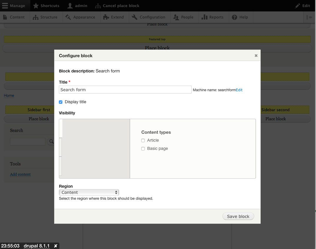
webchickAlso here are a bunch of screenshots from my testing.
Turn on module:
You get the warning about Experimental modules. (Twice ;) - once on the confirm form, and again back on the modules page. Might be worth a separate issue for that.)
Place Blocks button added to the toolbar (on right, though.. hard to find/see. But we have a "must-have" follow-up to discuss this more.)
This exposes the regions on the page (even hidden regions) with a bunch of "place block" links (styled as buttons). This is ugly as sin, but we've already discussed that, and there's a "must-have" follow-up to design this more intentionally.
The region names are not visible, and that's a bit jarring, esp. in mobile or themes such as Stark where everything appears stacked on top of each other, even left/right sidebar. However, if you hover over the "Place block" link, it does say the region name, so that's great.
This pops up a modal with the standard Block page search. Too bad this doesn't have a preview of any kind; it's really difficult to know what you're actually adding. Something for another follow-up feature, maybe (affects admin-facing block UI, too).
This pops up the block config form, also in a modal. The weird vertical tabs Bartik/Seven styling smoosh has been fixed. It is a bit weird that this opens in the front-end theme vs. the back-end theme, though. The only way to fix this would be to do it in an iframe; else the two themes' CSS stylings will conflict with one another. Might be worth exploring more in a separate issue.
The only other thing we discussed was possibly hiding the region selector here since we already know it (this is also the case for the general block UI). Worth a follow-up, but tagged accessibility, since screen readers still need to be able to change it.
Block is placed. Ta-da!
Also tested in Stark, and in "mobile" (by smooshing the screen down). Worked well in all areas.
Comment #209
xjm@webchick wimleers et al Adding new modules (even experimental ones) does affect what the product contains; the extent of its technical debt, release timeline, etc.; and depending on the functionality might also be making architectural decisions. So IMO it makes sense to tag for all three roles. Just a product manager saying "yes, this makes sense to have in core", a release manager saying "yes, this is self-contained enough as an experimental module and has a path to becoming stable" and if appropriate a framework manager saying "yes, the basic architecture is reasonable". This issue is actually quite lightweight, but for something like (e.g.) the Migrate UI it becomes very important.
Our committer team is highly responsive so I don't think makes sense to imply committers are slowing velocity by being given a chance to sign off. Also note that it is merely a chance to sign off, not any requirement to do an onerous review or anything. And our governance timeboxes that chance to sign off, so if somehow no framework manager ever said "yeah I'm OK with this" (nor "whoa hold the phone") after being given that chance, the issue could still go forward.
I looked over #2739075: [plan] Make Place Blocks module functionality part of the Block module (etc.) and it looks totally reasonable to me. The patch here is also self-contained and non-disruptive, not risky for security or data integrity, etc. +1 from me. Great work everyone! I'm looking forward to seeing how this works out as an incremental improvement.
Comment #210
jibranIf @effulgentsia would review it and remove the "Needs framework manager review" tag then we'd have a hat-trick. ;-) :-D
Comment #211
larowlanSome observations, like the implementation and love the BTB tests
should these use the BEM pattern? region--place-block if its a flavour of region, or region__place_block if its an element inside the region block?
Shouldn't they be in module namespace - block-place implies block module right - place-block is our wheelhouse here?
Should this have a narrower scope? All regions?
Edit: nevermind, I see this is only added on the page variant when block placement is active (detected via query args)
Same BEM comment here. These look to be very specific selectors and could lead to
!importantand specificity wars. With BEM we would make it toolbar__tab--place-block, but given we don't have toolbar__tab in core (instead toolbar-tab) we could just use toolbar-tab--place-block - to indicate its a place block modifier of the toolbar-tab block? Note: INAFE (I'm not a front ender)Is there a reason we didn't make this a for real template. Themes might want to have a say in this markup.
<3
Comment #212
tim.plunkettThis is experimental code, and the CSS is mostly copied from other places in core.
We punted the bikeshed on design, we shouldn't waste time BEMifing this CSS.
Comment #213
xjmSounds fair, let's create a followup for the CSS stuff as a child of #2739075: [plan] Make Place Blocks module functionality part of the Block module (etc.)?
Comment #214
Wim LeersThat's not at all what I implied.
This issue was effectively ready since June 7. It was then blocked on child issues. That means 16 days of "lost time".
Exactly! Migrate is several orders of magnitude more complex.
I'm just deeply concerned that the lack of velocity is demotivating for UX people & designers. That's why I wrote what I wrote in #202.
I'll refrain from posting such comments in the future.
Comment #215
alexpottI can't see any architectural issues that should block commit and prevent further experimentation. Committed 7844d04 and pushed to 8.2.x. Thanks!
I fixed a couple of cs issues on commit.
Comment #217
alexpottComment #219
Wim LeersMarked #1947260: Add contextual links to regions as a duplicate of this.