
Problem/Motivation
Desktop before:

Mobile before:

Desktop after:

Mobile after:

Testing steps
- Install drupal 8
- Change admin theme to /admin/appearance to bartik
- Create a node /node/add/article
- Edit the node
- View the form buttons in both >600px and <600px
Proposed resolution
- Style the Save button arrow as rounded.
- Set preview & delete buttons full width on mobile.
Remaining tasks
- Test patch #31 with 8.2.x.
- Address dropdown toggle corners
- Per comment #38 - "code review and more manual testing"
| Comment | File | Size | Author |
|---|---|---|---|
| #70 | submit-buttons-Desktop.png | 13.54 KB | Manjit.Singh |
| #70 | submit-buttons-Mobile.png | 20.06 KB | Manjit.Singh |
| #65 | 2643206-65-after-with-delete.png | 29.24 KB | seanpclark |
| #65 | interdiff-2643206-58-65.txt | 1.14 KB | seanpclark |
| #65 | bartik_fix_button-2643206-65.patch | 1.65 KB | seanpclark |


Comments
Comment #2
gnugetCan you provide more info ? I can't replicate the bug, this is how it looks to me:
Comment #3
Chi CreditAttribution: Chi commented@gnuget just set Bartik as administration theme. It looks you have tested it in Seven theme.
Btw, 'Delete' link on your screenshot does not look well. Does it?
Comment #4
Chi CreditAttribution: Chi commentedComment #5
gnugetNot sure if this is the best way to do it but here my first attempt
patch attached.
Comment #6
psebborn CreditAttribution: psebborn as a volunteer and at Zoocha commentedThe fix in #5 does improve the display of the of the preview button, but if you're editing a pre-existing node, there's a delete button as well which doesn't sit nicely (see screenshot).
Also, rather than using an ID for the CSS selector, I'd use a class, perhaps something like:
I'm not that well up on Drupal coding standards though so someone else might be better placed to help you on the specifics!
Comment #7
gnugetFirst I tried using classes instead of the ID but then the .form-actions class could appear in a different non-related page, so I used the ID to force those buttons to look ok on that specific page.
But true, we can use classes and after do manual tests to make sure to it looks ok everywhere.
Comment #8
Sakthivel M CreditAttribution: Sakthivel M at UniMity Solutions Pvt Limited commentedHi,
I have created a patch to solve the issue mentioned at #6.
Below is the screenshot After the patch applied
Comment #9
Sakthivel M CreditAttribution: Sakthivel M commentedComment #10
gnugetGreat work!
Some nitpicks in the last patch.
We need to remove this change.
All the files needs to have an extra new line in the end of the file.
Also this is going to need manual testing to make sure to this is not broke something else.
Thanks!
Comment #11
johnrosswvsu CreditAttribution: johnrosswvsu as a volunteer and at Promet Source commentedHi,
Based on @gnuget updates and @Sakthi M last passed patch, I have created a patch. This is done against 8.2.x and 8.1.x already.
PS: As per @gnuget this still needs manual testing.
Local testing has the following output for me, which confirms fix.
Comment #12
johnrosswvsu CreditAttribution: johnrosswvsu as a volunteer and at Promet Source commentedComment #13
Sakthivel M CreditAttribution: Sakthivel M commented@gnuget @johnrosswvsu Thanks!
Comment #14
gnugetI think we can merge these 3 lines in one.
Comment #15
Anishnirmal CreditAttribution: Anishnirmal as a volunteer and at UniMity Solutions Pvt Limited commentedHi,
gnuget It's a good suggestion and i have recreated the patch at #8. Good work @Sakthivel M.
Comment #16
Truptti CreditAttribution: Truptti at Axelerant commentedVerified the patch ' bartik_form_button_appearance-2643206-15.patch' on drupal 8.0.x site
Steps performed are as follows
1.Installed Drupal 8.0.x and reproduced the issue
2.Applied the patch bartik_form_button_appearance-2643206-15.patch
3.Cleared cached and verified if buttons are aligned properly, but the changes are not reflected for delete button.
Attaching snapshot for reference.
Comment #17
Sakthivel M CreditAttribution: Sakthivel M at UniMity Solutions Pvt Limited commentedI have recreated the patch for delete button #16
After Patch
Comment #18
emma.mariaThe code must not contain IDs as this is going against the Drupal CSS architecture coding standards... https://www.drupal.org/coding-standards/css/architecture#avoid-structure
This has already been pointed out in #7.
Please study the coding standards for Drupal Core carefully and try another fix.
Thanks.
Comment #19
therealssj CreditAttribution: therealssj commentedModified the patch in accordance with comment #18
Also made some changes as the style was not getting applied on anchor tags of other pages.
Comment #20
therealssj CreditAttribution: therealssj commentedComment #21
gnugetAlso, the delete link doesn't look like a button for a reason this is on purpose because this makes the user to differentiate between the other actions and this one.
I'm not sure if we should just change the appearance of the button.
What do you think emma.maria ?
Comment #22
edurenye CreditAttribution: edurenye at MD Systems GmbH commentedThis also happens if the actions are inside a wrapper that is too small.
It's possible to do it depending on the size of the parent element instead of the size of the screen?
Then it would work in both cases.
Comment #23
harilakshmanan CreditAttribution: harilakshmanan commentedComment #24
therealssj CreditAttribution: therealssj commented@gnuget in bartik administration theme the delete does look like a button
The only thing we changed was increase width and add margin
Comment #25
soumyajit.basu CreditAttribution: soumyajit.basu at Srijan | A Material+ Company commentedPreview button appears to be fine. Save and publish button needs to be centre aligned
Comment #26
soumyajit.basu CreditAttribution: soumyajit.basu at Srijan | A Material+ Company commentedComment #27
prateekS CreditAttribution: prateekS as a volunteer and at Srijan | A Material+ Company commentedI have checked this issue, and have applied patch as mentioned in comment #19, its working fine. I am attaching screenshot for reference.
To check this, i made 'bartik' theme as an admin theme for node add/edit page too, then tested.
Comment #28
prateekS CreditAttribution: prateekS as a volunteer and at Srijan | A Material+ Company commentedComment #29
harilakshmanan CreditAttribution: harilakshmanan at UniMity Solutions Pvt Limited commented@soumyajit.basu Save and publish button working perfectly when administration theme is bartik. maybe you are choosing your administration theme is seven at the time Save and publish button text does not come at center.
Comment #30
harilakshmanan CreditAttribution: harilakshmanan at UniMity Solutions Pvt Limited commentedComment #31
Risse CreditAttribution: Risse at Vaiste Productions Oy commentedSo the issue is that centering the text in the dropdown button looks a bit off center.
So my solution is to add left padding 2em, which is the size of the dropdown toggle on the right side.
Attached is the patch for this, otherwise the button seems to look fine.
Comment #32
Risse CreditAttribution: Risse at Vaiste Productions Oy commentedComment #33
prateekS CreditAttribution: prateekS as a volunteer and at Srijan | A Material+ Company commentedI have checked this issue with patch mentioned in comment #19 and its working fine. I think we should close this issue.
Comment #34
waybigsky CreditAttribution: waybigsky commentedI'm at MidCamp Drupal Sprint, and I'm looking at this.
Comment #35
waybigsky CreditAttribution: waybigsky commentedJust tested the patch on Simplytest.me running 8.0.5. Can also confirm patch at #31 works properly.
Comment #36
iMiksuCleaning up drupalcampfi tags.
Comment #37
emma.mariaComment #38
emma.mariaI am assigning this to myself so I can take a look at this before this goes anywhere near RTBC. This needs at code review and more manual testing than just the specific component you are looking at here.
I also understand that Seven has exactly the same issue here #2643210: Seven theme: Fix text alignment on form submit buttons and we should also compare the work between issues.
Comment #39
syamnath CreditAttribution: syamnath at Zyxware Technologies commentedHi I have a suggestion on the presentation of the delete button. I have tried to revert the colors. so that it will be more deletious :)

I am attaching the Mock up
Comment #40
emma.mariaThe design of the buttons themselves are out of scope for this issue.
However, we can raise a brand new issue for the theming of the Primary (eg. Save) and Danger (eg. Delete) buttons in Bartik.
@syamnath_zyxware please have a read of these issues about the design of components in the Seven theme and button styles specifically.
Proposal: A Style Guide for Seven
#2278715: Introduce a primary-danger link/button class
#1986074: Buttons style update
Comment #41
emma.mariaHi
@Sakthivel M,
@johnrosswvsu,
@Anishnirmal,
@therealssj,
@Risse
When you create a patch can you please please *please* also create and upload an interdiff file.
It shows the differences between your patch and the previous one so a reviewer can clearly see the changes and decisions made between patches.
https://www.drupal.org/documentation/git/interdiff
Thanks!
Comment #42
therealssj CreditAttribution: therealssj commentedThe css was so small and had a simple change that's why i skipped interdiff.
Will keep that in mind in any future patches.
Comment #43
shinjanidhar CreditAttribution: shinjanidhar commentedComment #44
therealssj CreditAttribution: therealssj commentedWhy this closed without any discussion?
The patch also hasn't been merged yet!
Comment #45
stpaultim CreditAttribution: stpaultim as a volunteer commentedUnassigned this from Emma Maria at DrupalCon New Orleans and asked for an interdiff file between the two most recent patches.
Comment #46
emma.mariaThanks @stpaultim!
Comment #47
seanpclark CreditAttribution: seanpclark commentedHey I'm at Drupalcon New Orleans and I'll work on the interdiff for you.
Comment #48
aofficer CreditAttribution: aofficer commentedIm at Drupalcon New Orleans and Im looking at this.
Comment #49
seanpclark CreditAttribution: seanpclark commentedWorked on this with @aofficer. Attached is an interdiff of #31 and #19.
Comment #50
seanpclark CreditAttribution: seanpclark commentedComment #51
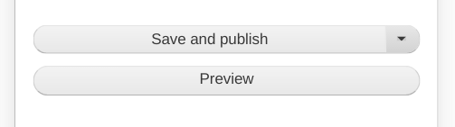
aofficer CreditAttribution: aofficer commentedThis patch scales and rounds corners of the save button.
Comment #52
aofficer CreditAttribution: aofficer commentedAttached is an interdiff of #31 and #51.
Comment #53
aofficer CreditAttribution: aofficer commentedComment #54
aofficer CreditAttribution: aofficer commentedComment #56
drnikki CreditAttribution: drnikki as a volunteer commentedI'm reviewing this patch now.
Comment #57
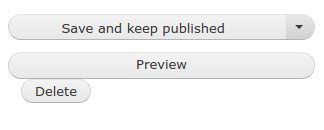
drnikki CreditAttribution: drnikki as a volunteer commentedThis is a HUGE improvement over the unpatched version. The stack with the delete button looks good in desktop and mobile, but without the delete button the rounding is off on mobile. Two screenshots attached:
With delete, looking snazzy

Without delete, looking almost snazzy

Comment #58
aofficer CreditAttribution: aofficer commentedThis patch handles one pixel issue.
Comment #59
aofficer CreditAttribution: aofficer commentedComment #60
drnikki CreditAttribution: drnikki as a volunteer commentedThere's now a 1px in the other direction, but I'm marking this as RTBC and we can open another issue for the small, teeny, TINY offset.
Comment #63
cmanalansan CreditAttribution: cmanalansan at CGI Federal commentedThe test passed. Previous failures a false negative possibly due to Migrate.
Comment #64
emma.mariaComment #65
seanpclark CreditAttribution: seanpclark commentedThis patch should address #60 and issues that may arise from different radius units. Rather than apply the radius to multiple elements, this adjusts the position of the parent so that the absolute positioned child (.dropbutton-toggle) honors the overflow:hidden of its container.
After, with delete:

Comment #66
drnikki CreditAttribution: drnikki as a volunteer commentedIf the ticket is still open for a pixel nitpick, the grey semi-circle is still a pixel too-high, but I'd mantain it's best to open a second issue for that and get this one merged in.
Comment #67
drnikki CreditAttribution: drnikki as a volunteer commentedComment #68
emma.mariaI'm going to take a look at the latest patch and review the CSS against the Drupal coding before handing it to @Cottser to assess for commit :-)
Comment #69
chetan2111 CreditAttribution: chetan2111 at Srijan | A Material+ Company commentedHi,
Tested the functionality and it is working as expected the changes are correct on multiple browsers and mobile devices.
Not moving the status as @emma.maria will review the code.
(Reviewing patch first time!)
Comment #70
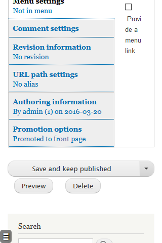
Manjit.SinghCode looks good to me. I have done some manual testing, here are some screenshots that i captured in narrow device.
But i have some confusion about the desktop view. There are irrelevant margin in delete button as compared to preview button.
I have already checked the issue description but Is it the part of bartik design ?
Comment #71
Anishnirmal CreditAttribution: Anishnirmal as a volunteer and at UniMity Solutions Pvt Limited commented@Manjit.Singh : Can you please suggest me the proposed solution. Is it a part of bartik.? or needs to fix the margin for the delete button.?
Comment #72
starshapedI reviewed this patch. It fixes the original issues, and I can confirm that the spacing issue brought up in #70 was not introduced by this patch - it exists on a bare install of Drupal 8.2. If we think this is a major problem, a new issue should be created for fixing the spacing.
Comment #73
Manjit.Singh@starshaped Agree with the thoughts.
Thanks.
Comment #74
emma.mariaComment #75
xjmThanks, all! Assigning to @Cottser as per above.
Comment #76
star-szrThis should make it into 8.2.x and can go in during beta. If not it can still go into 8.3.x.
Comment #77
star-szrThere are definitely some flaws with dropbuttons in Bartik but that's outside of the scope here and I think at least one issue exists already. (Background color of the arrow when hovering, and the arrow background not filling up the entire space.)
This is a big improvement and code-wise looks good. Removing the manual testing tag since that did happen (and I just tested as well).
Committed d9a6637 and pushed to 8.2.x. Thanks!