
Problem/Motivation
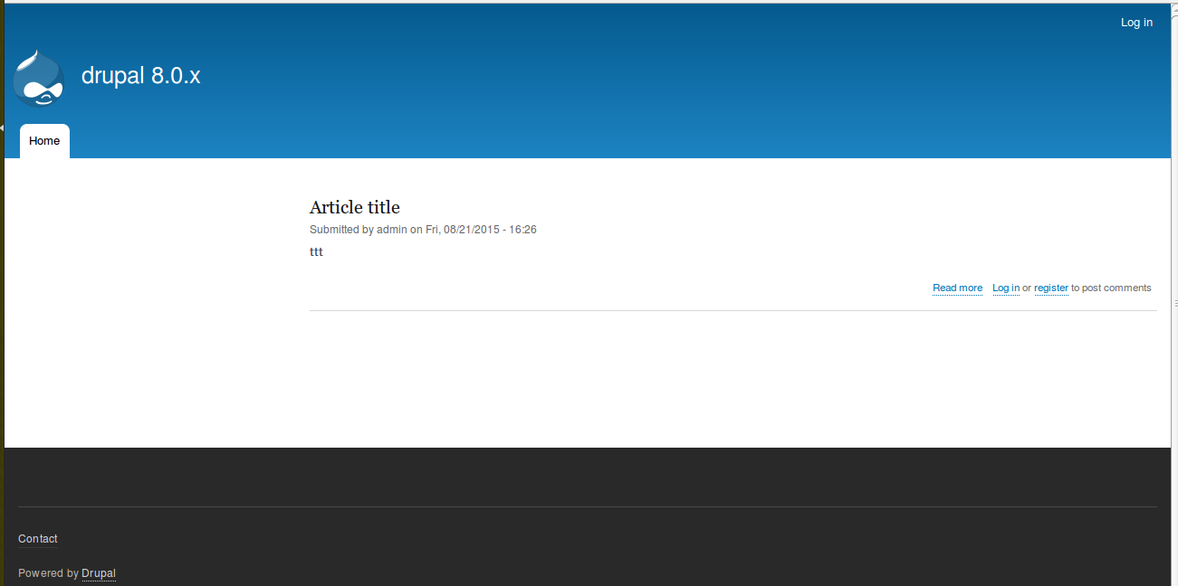
The standard profile enables the user login block by default. This takes up quite a lot of screen space (especially on mobile) and makes the page feel heavier.
Most sites have a log in link at the top of the page rather than a large block with a login form, so this would bring the standard profile up to date a bit.
Proposed resolution
Don't enable the block. Instead add a 'login' or 'login/register' link to the user menu.
Remaining tasks
Write a patch, take screenshots to show the difference.
User interface changes
Yes. No more user login block in standard profile
Screenshots: see #43.
API changes
No.
| Comment | File | Size | Author |
|---|---|---|---|
| #147 | switch_from_user_login-2503755-147.patch | 19.34 KB | Wim Leers |
| #116 | Screen Shot 2015-10-01 at 12.28.27.png | 323.33 KB | Wim Leers |
| #115 | switch_from_user_login-2503755-115.patch | 16.84 KB | Wim Leers |
| #112 | empty-sidebar.png | 945.52 KB | emma.maria |
| #97 | Screen Shot 2015-09-15 at 16.30.17.png | 48.34 KB | Wim Leers |


Comments
Comment #1
Anonymous (not verified) CreditAttribution: Anonymous at FFW commentedComment #2
Anonymous (not verified) CreditAttribution: Anonymous at FFW commentedHere is patch. Please review.
Comment #3
tstoecklerLooks great @bobrov1989! Thanks.
I asked myself whether it makes sense to disable the current user login block (as you did in the patch) or to remove it alltoghether. Not sure, thoughts?
One minor hick-up in the patch:
Please add a newline to the end of the file.
Comment #4
Anonymous (not verified) CreditAttribution: Anonymous at FFW commentedI fixed file ending. I think it'll be better if this block will present after installation and admin will have ability to enable it.
Thank you.
Comment #5
Anonymous (not verified) CreditAttribution: Anonymous at FFW commentedComment #7
Anonymous (not verified) CreditAttribution: Anonymous at FFW commentedComment #8
Anonymous (not verified) CreditAttribution: Anonymous at FFW commentedComment #9
Anonymous (not verified) CreditAttribution: Anonymous at FFW commentedRemoved login block file from this profile. Please review.
Comment #13
tstoeckler...requested a re-test.
@bobrov1989 the patch looks great now from a code review. I have yet to try it out on a fresh install, so not setting to RTBC. Thanks for the quick follow-up!
Comment #15
Anonymous (not verified) CreditAttribution: Anonymous at FFW commentedComment #16
Anonymous (not verified) CreditAttribution: Anonymous at FFW commentedI found where is the problem.
Comment #17
Anonymous (not verified) CreditAttribution: Anonymous at FFW commentedComment #18
bill richardson CreditAttribution: bill richardson as a volunteer commentedOnly issue that i can see with latest patch -- login link showing when you are already logged in + text should be just " log in " rather than login.
Comment #20
Anonymous (not verified) CreditAttribution: Anonymous at FFW commentedI changed link title and add base route, it seems that login link visibility is a bug. Details https://www.drupal.org/node/2463753
Comment #31
dawehnerYou don't need base_route in menu links, just skip that line. route_name is enough to begin with
Comment #32
Wim LeersThis is IMO the best justification.
Comment #33
Bojhan CreditAttribution: Bojhan as a volunteer commentedThis sounds good to me :) Definitely an annoying thing on mobile.
The only thing that the new place is quite undiscoverable.
Comment #34
Wim LeersComment #35
Wim LeersAddressed #31.
Comment #36
Wim LeersForgot to upload the interdiff.
Comment #38
Wim LeersComment #39
andypostmaybe there's existing CR that needs update
+1 RTBC
Comment #40
Wim LeersCR created: https://www.drupal.org/node/2554545.
Comment #41
andypostLooks good
Comment #42
catchTagging 'needs screenshots' would make this easier to review.
Assigning to webchick since this is a product change.
Comment #43
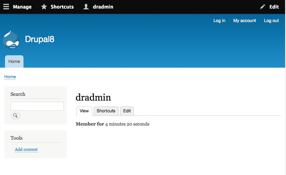
dcrocks CreditAttribution: dcrocks as a volunteer commentedSome images. Possibly needs more styling. Why make it part of User Account Menu? Actually looks a little weird to me. Maybe part of Main menu, hopefully not visible when logged in?
Comment #44
Wim LeersThanks for the screenshots!
It probably only looks weird because you've never seen that menu up there? That's how it's been styled since forever, including in Drupal 7. Nothing weird about it. Just different than what you've grown used to :)
Comment #45
dcrocks CreditAttribution: dcrocks as a volunteer commentedBut when the login form is displayed the text for the 'log in' menu is black when it should be white. That's why I changed it to needs work.
Comment #46
Wim LeersThat may not be the prettiest, but it is definitely not a bug; it's intentional that we style the active link differently. Looks like Bartik could use an override for this though. But can we please first get feedback from @webchick on whether this is an acceptable change overall? I'm sure she'll kick it back for this very reason, but before fixing that by getting Bartik people involved, it'd be useful to know whether she considers this an acceptable change or not.
From
core/modules/system/css/components/menu.theme.css:One thing I missed and that should be fixed first: https://www.drupal.org/files/issues/loggedin.jpg shows that the "Log in" link is still present for a logged in user. That's not acceptable.
Comment #47
dcrocks CreditAttribution: dcrocks as a volunteer commentedThis may be working as designed. The log in link only appears on pages for users with the 'link to any page' permission. This is on for the administrative account on a default install. If you create a standard user account you won't see the login menu item when logged in. See #2463753: [regression] Do not bypass route access with 'link to any page' permissions for menu links and #2267603: "Login" link shows up for logged-in users as well for discussion.
I would like to argue to add the 'log in' link to the 'main' menu rather than the 'user account' menu. The login link looks a little lost way up their in the corner(unless you're on a mobile device).
Comment #48
catchMoving back to CNR.
While the login link might look a bit lost, it it's in the same places as the 'logout' link when you're logged in, which is quite useful.
Comment #49
Wim LeersOh! Hah!
Comment #50
andypostAnother issue that left sidebar is always displayed, so

.layout-sidebar-first .main-contentbreaks layoutComment #51
Wim Leers#50:
Also, that's a pre-existing bug: #953034: [meta] Themes improperly check renderable arrays when determining visibility.
Comment #52
dcrocks CreditAttribution: dcrocks as a volunteer commented#50 A new user has hardly any permissions, not even search, though I don't know why the 'Tools' menu doesn't show up.
Comment #53
Wim Leers#52: #50 is the anon user. The anon user doesn't get have permission to use any of the links in the 'Tools' menu. The authenticated user does get to see the 'Tools' menu.
Comment #54
yoroy CreditAttribution: yoroy as a volunteer commentedOverall this would be a good change: less ui bloat, easier on the eyes and on page load, not only on mobile.
The login link looks to be in the right place as well. Top right is a very common place to put it. Having both 'Log in' and 'Log out' links show at the same time is weird, even if that is as designed, would be nice to have that not be the case. And a fix for Bartik to not show the active state as black would be needed as well.
Comment #55
Wim Leers#54: many thanks for your review!
It only affects user 1, or any user with the permission that has permission to "link to any page".
Agreed, but let's first hear what @webchick thinks about this overall change, minus the cosmetic problems.
Comment #56
webchickSo doing a quick survey of some of http://www.alexa.com/topsites in Ingocnito mode...
- https://www.google.ca / https://www.youtube.com/: "Sign in" button, upper right.
- https://www.facebook.com/: Log in / Sign up form immediately visible on home page, on right:
- https://ca.yahoo.com/: "Sign in" iconed-button, top right.
- https://www.amazon.com/ is weird, but once again top-right:
- https://en.wikipedia.org/wiki/Main_Page: create account / log in in top right:
- https://twitter.com/: Log in / Sign up form immediately visible
Based on this, the trends clearly indicate:
So it's pretty clear to me that a) Drupal is breaking best practices atm (it does a login block on the left, on all pages, which none of the other "top 10" sites do), and b) it's also making assumptions about the types of sites that are being built with Drupal as being mainly social networking where authentication is the major use case (which based on the usage stats of modules such as https://www.drupal.org/project/user_relationships do not seem to bear out being the 90% (or even 10%) use case).
So I'm definitely on board with kicking the block out of standard profile and moving to a link instead.
Not very on board though with exposing both Log in and Log off, even to user 1. That's a UX regression, breaking all of these web patterns. In testing, it seems to redirect user/login to user/1, so can we just re-title the Log in link to "My account" for privileged users?
Comment #57
andypostAlso would be great follow-up to login link in modal (maybe contrib module)
Comment #58
dcrocks CreditAttribution: dcrocks as a volunteer commentedOne or both of these should address the UX regression.
Comment #59
yoroy CreditAttribution: yoroy as a volunteer commentedThanks webchick! Good idea to rename the 'Login' link shown to a logged-in user 1 to "My account". Needs work for that.
Comment #60
Wim LeersThat'd mean they'd end up getting a redirect every single time they want to go to their profile. If I need to make the title change dynamically for authenticated users, then I might just as well change the route name too.
Other than that detail, this patch does exactly that.
This patch also fixes the CSS problem.
Comment #61
Wim LeersSo IMO the problem with the the patch in #60 is that it's relatively confusing to have a "My account" link that turns into "Log in". Wouldn't it be better to the "Log in" link turn into "Log out" and vice versa? That seems much more logical.
Comment #64
webchick"Wouldn't it be better to the "Log in" link turn into "Log out" and vice versa? That seems much more logical."
Oh, yes, that would be fantastic. :D You should only ever see one or the other.
Comment #65
Wim LeersMy thoughts exactly :)
This should be green!
Comment #66
andypostAny reason for quotation tag? and other lines are small caps
Comment #68
Wim LeersBecause it says for the current user, since the current user is always going to be authenticated if they can view this UI. So I want it the UI to be clear, and therefore show "Log out ( for anonymous users)".
Comment #71
Wim Leers#2529560: Expand support for link objects landed yesterday, that caused those exceptions.
This should finally be green!
Comment #73
Wim Leers#2005546: Use branding block in place of page template branding variables (site name, slogan, site logo) landed this morning, which caused the patch to not apply anymore.
Comment #76
Wim Leers#2005546: Use branding block in place of page template branding variables (site name, slogan, site logo) landed, which also adds the
config:system.sitecache tag. Previously, it was only the login block that was adding that cache tag, so we were able to remove it. Not anymore. Just slightly less change!This should actually be green… :)
Comment #77
tstoecklerOnly in case this needs to be re-rolled again:
Double space between or and "Log
(Or maybe can be fixed on commit)
Comment #79
moshe weitzman CreditAttribution: moshe weitzman at Acquia commentedNice to see this getting to green and code review looks good to me. See #78 for single space that can be removed on commit (I hope).
Comment #82
Wim LeersBroken PIFR testbot:
It can't die soon enough.
Comment #83
andypost+1 rtbc, just a nit for commit time ;)
extra space before "Log out"
Comment #84
isntall CreditAttribution: isntall at Drupal Association commented@WimLeers: the PIFR bot, with the URL of /ec2-52-27-255-15.us-west-2.compute.amazonaws.com, has been terminated.
Comment #85
Bojhan CreditAttribution: Bojhan as a volunteer commentedAwesome :)
Comment #86
alexpottIs there test coverage for these changes?
Is this an issue to make this sort of thing easier for contrib - this seems a really odd place to hard code this.
Comment #87
dawehnerI think the proper way would be:
$url = $instance->getUrlObject(); $url->isRouted()menuLinkCheckAccessWe have a unit test here, so we should expand our test coverage, and then see whether our fix works.What about adding a new follow up to have an adminLabel() method on the menu plugin to do stuff like that?
Any reason for this change? Seems totally unnessary and kinda limits stuff.
I can haz injection?
Does that mean we need an update path for that?
Comment #88
Wim Leers#77 Fixed the space nit :)
#87
#87:
user.logout, then there really would be zero need for an upgrade path. That probably makes more sense. Did that.I've also attached two fail patches: the
FAIL1patch is without hunk one (inDefaultMenuLinkTreeManipulators), theFAIL2patch is without hunk 2 (inMenuLinkBase). They'll show the test coverage is adequate.Comment #89
dawehnerWell, I just think we loose a bit of test coverage when we deal with plugin IDs instead of route names.
Nice, less problems!
Comment #93
Wim Leers#2511516: Make local tasks and actions hooks provide cacheability metadata, to make the blocks showing them cacheable conflicted with this. Rebased.
Analogous FAIL patches as in #88.
Back to RTBC per #89.
Comment #96
alexpottI can't see how can commit this until #953034: [meta] Themes improperly check renderable arrays when determining visibility is resolved? There's a massive visual regression on the anonymous frontpage of bartik.
Comment #97
Wim LeersThat issue hasn't gone anywhere in five years. :(
Bartik relying on that (see
bartik_preprocess_html()) IMHO is a long-standing bug, which simply has had no incentive to get fixed because in the 99% use case, we have something in the first sidebar, both in core tests and in actual contrib usage. In 99% of cases, we don't have a second (right) sidebar.This is the first issue in years that just happens to make this problem more apparent.
Because, in fact, this exact same problem exists in HEAD also. To reproduce:
Comment #98
alexpott@Wim Leers yes fine but with this patch we expose it to everyone all of the time.
Comment #99
Wim LeersOf course.
I'll ping some Bartik people and get their thoughts. Perhaps they see an easier way forward.
Comment #100
dawehnerComment #101
Wim LeersComment #105
dcrocks CreditAttribution: dcrocks as a volunteer commentedLooking at the issue summary this patch was primarily about bartik in a mobile environment. Bartik's design is very sparse and removing the login block emphasizes that on larger screen formats while making it look less clunky on mobile. But that is Bartik's design and custom themes won't be affected.
A drop down login block was suggested but that would still leave a largely empty screen for anonymous users. Or a much trimmer, leaner login block could be designed.
Bartik has the same front page content as Stark, just more visual. This doesn't look like a visual regression to me, it just emphasizes that bartik is stark.
Comment #109
catchYeah I feel similarly to dcrocks - the empty space is an improvement on the login block for me.
Comment #110
LewisNymanFrom usability point of view you wouldn't want text that spans the whole width of the page. I think keeping the main content column this narrow is a good thing. I'm concerned that Bartiks "flexi layout" implementation is effectively broken but from reading the comments it sounds like this is already the case.
Assigning to Emma for the final decision.
Comment #112
emma.mariaI agree with removing the user login block and having the login link in the same place.
I also agree with #110 that the main content should not span full width. However that is not possible right now with the layout-one-sidebar logic that is kicking in because of the empty sidebar printing.
This issue now makes Bartik look sparse with content which is fine but I do not agree with the sidebar wrapper printing empty and forcing all main content to the right.

If you add real content, the gap on the left caused by the sidebar is very obvious and it looks like a bug. I have shown the screenshot to a few others and they have winced at it too.
I know we have this issue that tries to fix the cause of the sidebar printing #953034: [meta] Themes improperly check renderable arrays when determining visibility but it looks like there will not be a solution anytime soon.
Comment #113
emma.mariaComment #114
Fabianx CreditAttribution: Fabianx as a volunteer commented#112: Lets open a dedicated bartik issue. While placeholders are a reality now as access is checked and cached separately we should be able to fix that particular bartik problem easily.
Actually there is an issue already:
#2529308: bartik_preprocess_html() only works correctly without lazy rendering, without placeholders, without cacheability metadata for access checks
Lets discuss that bug over there.
Comment #115
Wim LeersHere's a straight rebase of #93. #93 no longer applied cleanly.
Comment #116
Wim LeersI rerolled #2529308: bartik_preprocess_html() only works correctly without lazy rendering, without placeholders, without cacheability metadata for access checks, that should be able to go in now.
Except that that patch does NOT actually solve the problem. Because of the reasons already cited in #97, which I'll repeat here:
But I think I can make it more clear by showing a screenshot of the everything is in at the time where
bartik_preprocess_html()runs, and thus at which time it tries to decide to add either thelayout-two-sidebarsclass, orlayout-one-sidebar, orlayout-no-sidebars. Here you go:As you can tell, the structure looks like this:
bartik_toolsblock is present. Because any user can in fact access that block. It's just that that block may turn out to be empty in the end, if the user does not have access to any of the links in that block.layout-no-sidebarsclass. Then, a block is delivered, and the first sidebar is no longer empty, so we then suddenly apply thelayout-one-sidebarclass. That would cause massive jumping of content. We don't want massive jumping of content, therefore we don't want the behavior thatbartik_preprocess_html()currently has.In other words:
bartik_preprocess_html()'s conditional page-level classes do not make sense at all in a world where you want things to be fast, because it requires you to always render everything on the page before assembling the page, which inherently implies very poor cacheability, and rules out lazy rendering.Comment #118
moshe weitzman CreditAttribution: moshe weitzman at Acquia commentedGreat reply, Wim. Note that custom themes are welcome to make assumptions about empty regions and such, but core themes need to always lay them out as per #117
Comment #120
moshe weitzman CreditAttribution: moshe weitzman at Acquia commentedHow about we fix "bartik_preprocess_html()'s conditional page-level classes" in a separate issue? As Wim has shown, this is a pre-existing condition.
Comment #121
Wim LeersAFAIK we won't be changing the Standard install profile after RC1.
So if this doesn't land before RC1, 8.0.0 will ship with this antiquated look that's mobile-unfriendly to boot (see @webchick's research in #56), as well as lesser performance.
Given that this is RTBC again, and I don't want this to frustrate people, here are some thoughts that I think will address the concerns here and therefore make this completely independent of #2529308: bartik_preprocess_html() only works correctly without lazy rendering, without placeholders, without cacheability metadata for access checks (which is a very thorny issue that we probably don't want to resolve before RC).
I think we could easily solve the concerns raised about this being ugly by … having more sane permissions and blocks in the Standard install profile:
Use searchpermission to all users. The "Search" block is already placed in the left sidebar by default, so that would make that region never empty.Both of those address very common needs and can be found on many (if not most) sites.
We could make either or both of those additions to the Standard install profile in this issue (if people are +1) or a separate issue (if people want to discuss it more).
Comment #122
Wim LeersWrong tag, sorry for the noise.
Comment #123
Bojhan CreditAttribution: Bojhan as a volunteer commented@WimLeers I think we can change the install profile for "new" installs just not for existing ones
I am definitely +1 on making search enabled by default it shows of that we have a CMS, with more advanced capabilities. I am not 100% sure about recent content block as that will show up empty at first, leaving it up to Emma to decide there.
Comment #124
Wim LeersThat is exactly what this does :)
Comment #125
emma.mariaI am +1 to these blocks, but does it make sense to do it in a follow up if it guarantees it will not land before RC? If we only have enough time to commit this one issue, the follow up becomes pointless. I think it makes more sense to make these changes here.
Comment #126
Wim LeersYep, totally makes sense to me too :)
I'll do only the Search block/permissions, because the "Recent content" one perhaps merits further discussion because of what Bojhan said. I think the Search block one is zero risk, so let's do that one here first. We can still do "Recent content" in a follow-up if we feel strongly about it.
Comment #127
Wim LeersSo, after a fresh install, this is what you get to see with #126:
(i.e. things don't look strange anymore)
Comment #128
Bojhan CreditAttribution: Bojhan as a volunteer commentedLooks great, given that this is tied to the RC deadline I'd rather get this in sooner than later. We can always add one more block.
Comment #129
LewisNymanExcellent. RTBC++
Comment #130
Fabianx CreditAttribution: Fabianx as a volunteer commentedRTBC + 1
Maybe we can add some sample content (release deadline polishing) to show off some of standard profile's capabilities.
Do we have a follow-up already?
Comment #131
emma.mariaRTBC++++
Also along with @FabianX would like to know where to follow the follow up issue.
Comment #132
geerlingguy CreditAttribution: geerlingguy as a volunteer commented4x RTBC on this—I was just thinking earlier today that other account junk is stowed in the top right corner, so why not the log in link. I came to this issue just now and noticed the latest screenshot is exactly what I pictured, and makes the default Bartik header layout consistent logged in/logged out out of the box. So effective, so simple a change, it works great.
Comment #133
catchBack to webchick.
Comment #134
webchickYep; seems like an elegant solution to the problem.
FWIW, we should be able to change Standard profile in any minor release; it should only affect new installs, not existing.
Committed and pushed to 8.0.x. Thanks!
Comment #136
Wim LeersGlad to read that, @geerlingguy. :)
Thanks all, this was a tough one!
Comment #137
pwolanin CreditAttribution: pwolanin as a volunteer and at Acquia commentedPlease revert. Breaks sqlite and pgsql tests in HEAD, as found in #2580485: Test fails on sqlite and pgsql ToolbarAdminMenuTest::testLocaleTranslationSubtreesHashCacheClear
Comment #138
catchComment #139
catchReverted.
Comment #141
Wim LeersI found the root cause.
There are two.
On MySQL,
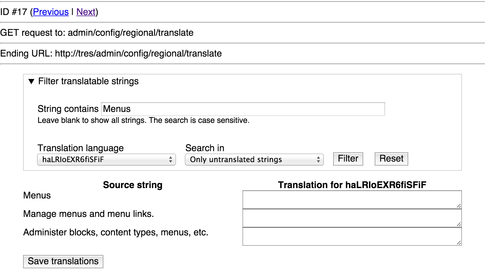
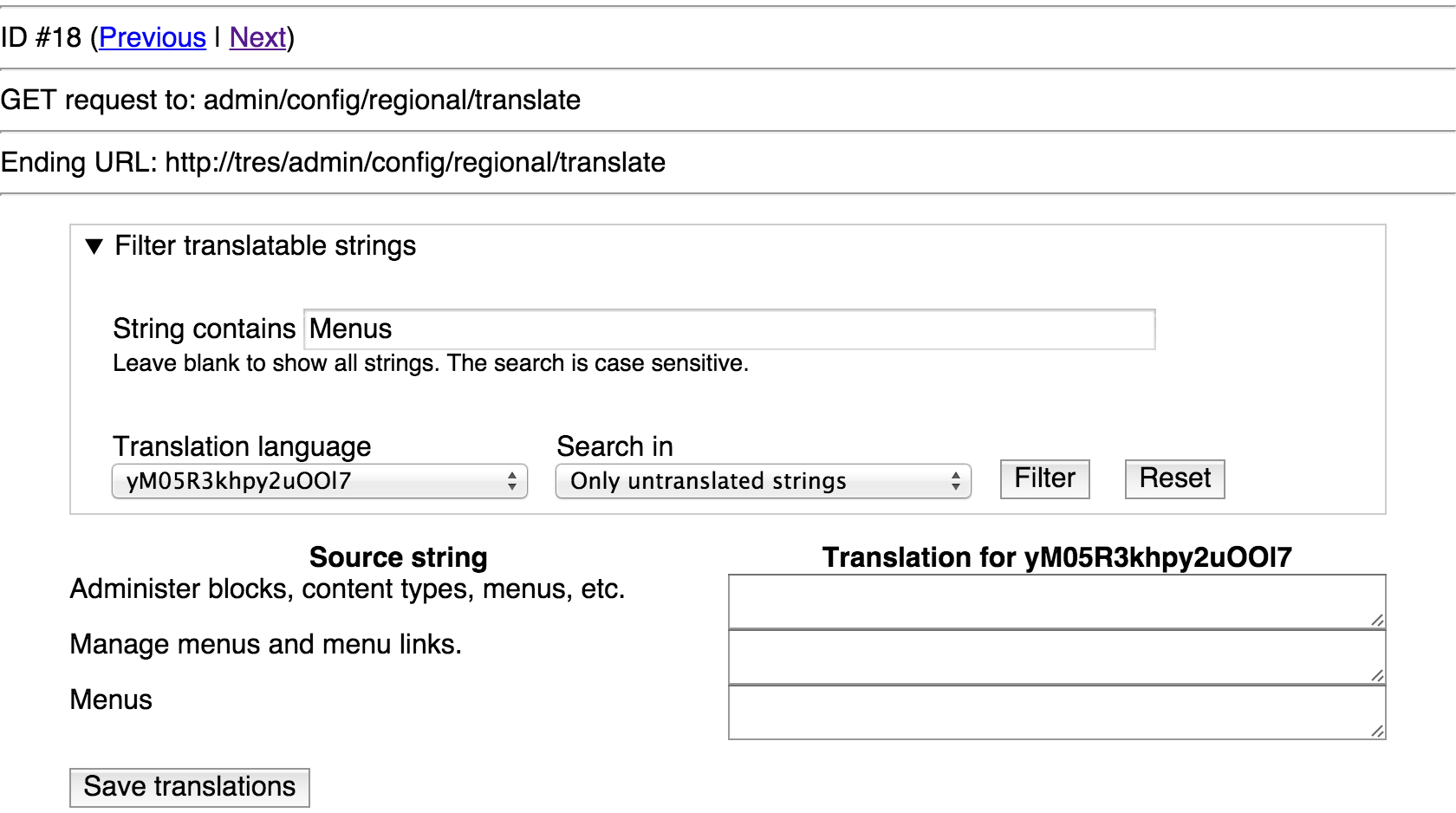
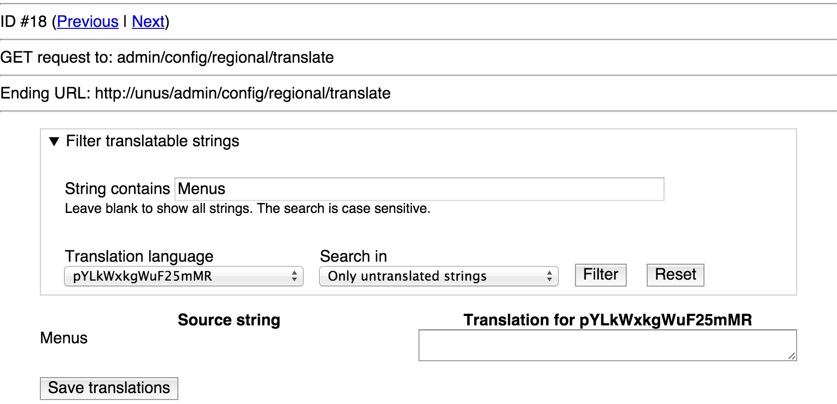
ToolbarAdminMenuTest::testLocaleTranslationSubtreesHashCacheClear(), where it saves a translation ($this->drupalPostForm('admin/config/regional/translate', $edit, t('Save translations'));) is posting the translation for to the first text area on this page:On SQLite, it looks like this:

On SQLite, but without this patch's

DefaultMenuLinkTreeManipulatorsandMenuLinkBasehunks, it looks like this:config_translationbehaves differently in SQLite/Postgres vs. MysqlDefaultMenuLinkTreeManipulatorsand/orMenuLinkBaseare causing a different ordering of those 3 matches.So the test translates the WRONG string, and therefore the toolbar menu is the same before and after, and hence the subtrees hash doesn't change on SQLite/Postgres.
Clearly, there are much deeper problems at play here.
This was one giant WTF! It'd be funny if it wasn't just before RC and I now have to somehow fix SQLite support in code totally unrelated to this issue…
Comment #142
webchickLooping in the multilingual team.
Comment #143
Gábor HojtsyThe search is supposed to be case sensitive, as noted in the help text. That it is not on SQLite/PgSQL is indeed a bug. It is not really "by chance" that "Menus" should be the only result, if the search is case sensitive, there is no other result that would be shown.
Comment #144
Gábor HojtsyLooking at the locale schema (the bug has nothing to do with config translation):
So in both cases, specifies blob only for MySQL specifically. I don't know if there was a reason to not specify blob for other DB engines given the 'type' key itself supports blob as per our docs:
As per our database.api.php. OTOH looking at the SQLite schema driver, it would only make a text field case insensitive if we did explictly provide a binary key with a FALSE value:
Did not find the relevant code in the PgSQL driver.
Comment #145
Wim Leers#143:
Of course not!
But the thing is that in HEAD with SQLite we have three matches, and so it's only by chance that the first one happens to be the one we want, which is why this problem went unnoticed until now. That's what I was saying:
Comment #146
Gábor HojtsyI don't think we need to fix the locale schema here BTW, we can translate a different menu item that also shows up in toolbar but is more unique in the search or we can make the UI test more specific in which textarea it will enter the translation in and then resolve the locale schema in its own issue (with its own test). It would definitely mix too much responsibility in here if we'd need to fix that here too.
Comment #147
Wim LeersDiscussed the strategy for this issue with Gábor Hojtsy and webchick. The problems on SQLite/Postgres are not introduced by this patch, but are pre-existing problems that this patch merely exposed. As #141 demonstrated.
Therefore, we decided to move the fixing of those pre-existing to a separate issue: #2580671: Locale DB schema case insensitive (blob) only on MySQL not on other databases.
Interdiff relative to #126. Simply choosing a string that doesn't have multiple matches in
locale.module's search fixes the problem on SQLite/Postgres — again, proper solution of the underlying problem is for #2580671.And, of course, also testing against SQLite and Postgres.
Comment #148
Gábor HojtsyFix looks like in scope on this issue, RTBC pending green test feedback :)
Comment #149
webchickNice work. Take two!
Committed and pushed to 8.0.x. Thanks!
Comment #152
webchickGrrrrowl.
Comment #153
Wim Leers/me sends a llama stampede to spit the PIFR bots into oblivion.
Comment #154
cilefen CreditAttribution: cilefen commentedCan we get the CR published, because #2581139: Login block is missing from the standard install?
Comment #155
catchDone that, but fwiw I think everyone has access to publish change records (and is welcome to especially when they get forgotten).
Comment #156
moshe weitzman CreditAttribution: moshe weitzman at Acquia commentedDid we forget to put a destination=[current.path] on the login link? Without that, the link dumps you on the profile after signing in. Thats not nice IMO. We can append the querystring param via javascript in order to not bother the static and dynamic page caches.
Comment #157
YesCT CreditAttribution: YesCT commented@moshe weitzman opened #2582797: [Regression] login link has no destination=drupalSettings.path, so dumps you on the profile to look into that. needs steps to reproduce.