 Support for Drupal 7 is ending on 5 January 2025—it’s time to migrate to Drupal 10! Learn about the many benefits of Drupal 10 and find migration tools in our resource center.
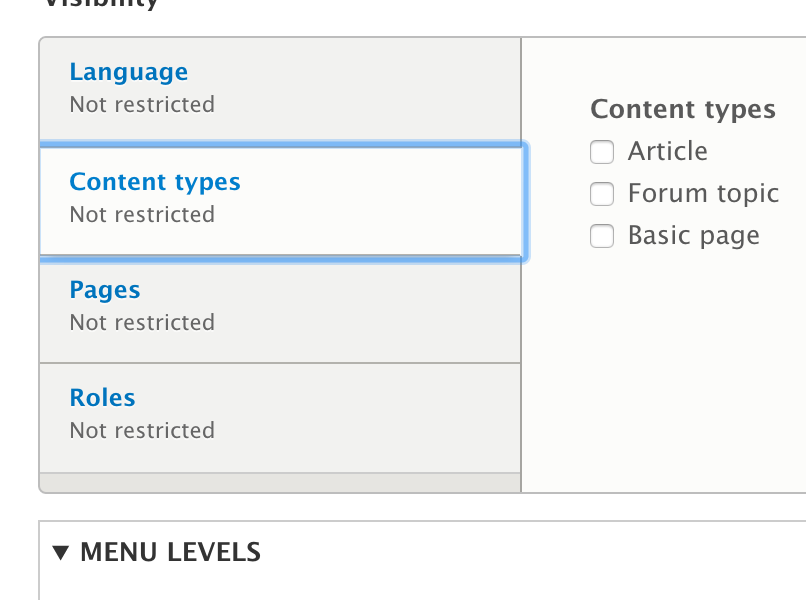
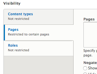
The vertical tabs are "open" on the right so that the user understands that the active tab relates to the content to it's right. The default focus effect "closes" the opening and looks wrong.
Proposed that we add a focus effect to the left of the tab using border and remove the default outline.
Current:
Proposed:
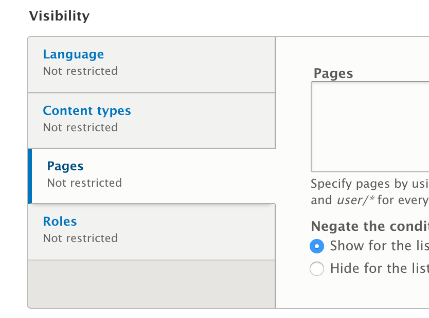
CSS for above solution
.vertical-tab-button.selected a {
border-bottom-color: #b3b2ad;
color: #004f80;
+ border-left: 4px solid #0074bd;
+ outline: none;
}| Comment | File | Size | Author |
|---|---|---|---|
| #69 | Screen Shot 2015-04-13 at 18.17.32.png | 55.19 KB | lauriii |
| #69 | Screen Shot 2015-04-13 at 18.17.38.png | 55.05 KB | lauriii |
| #68 | ltr-chrome.png | 60.33 KB | koence |
| #68 | rtl-chrome.png | 39.73 KB | koence |
| #67 | 2368373-67.patch | 1.32 KB | pjbaert |


Comments
Comment #1
tkoleary CreditAttribution: tkoleary commentedComment #2
tkoleary CreditAttribution: tkoleary commentedComment #3
tkoleary CreditAttribution: tkoleary commentedThe same solution should also be applied to Bartik theme
Comment #4
tkoleary CreditAttribution: tkoleary commentedComment #5
LewisNymanI like this! I will write a patch soon..
Comment #6
LewisNymanComment #7
Maninders CreditAttribution: Maninders commentedComment #8
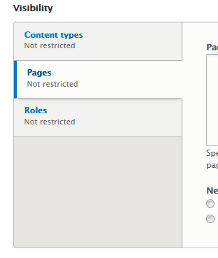
Maninders CreditAttribution: Maninders commentedI worked on the border part of it. And its working fine for me. And screenshot is also attached for your reference.
Comment #9
LewisNymanThis patch is changing the selected styling, not the hover styling, this is the selector we want to use:
Also bear in mind that an underline is being added to links by default, so we will probably also need a
text-decoration: noneto prevent that.The other problem with this implementation is that the border pushed the content inside a bit, so there is an indent, instead of being aligned with the rest of the tabs. We can reduce the padding-left styling by 4px to fix this.
Lastly, we need RTL styling as well. Thanks for this!
Comment #10
Anonymous (not verified) CreditAttribution: Anonymous commentedBut if we use only the a:focus the border will disappear when you click the textfield for example is that intended or?
Anyways heres RTL styling and the padding fixed so content does not get pushed over, also removed the underline as per requested
RTL images :
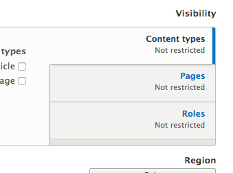
LTR Images :
Comment #11
Anonymous (not verified) CreditAttribution: Anonymous commentedforgot to update status..
Comment #12
Anonymous (not verified) CreditAttribution: Anonymous commentedAand my vim config was bit wrecked so tabs werent using spaces.. heres a correct one.
Comment #14
BrightBoldComment #15
esod CreditAttribution: esod commentedLooks good to me. @BrightBold are you working on the patch for the Bartik theme?
Comment #16
BrightBoldIn Safari with the patch applied the outline style is still present, in addition to the focus styles added by the patch, so that needs to be overridden. (The patch looks great in FF & Chrome on Mac, but I also can't reproduce the original problem there.) See screenshot. I'll work on a revised patch.
Comment #17
BrightBoldOK, the problem was that Safari puts the focus style on the
<li>, and we were only overriding outlines on the<a>. Attached is a patch with outlines removed for.vertical-tab-button.selected:focus. I left the outlines in place for the :active pseudoclass, thinking that is probably still useful for accessibility purposes. If we want to remove the outlines for :active also, we should apply the focus styles (or some other distinguishing style) to active as well.I'll work on Bartik next.
Comment #18
BrightBoldSame change for Bartik. Same issue with :active.
Comment #19
esod CreditAttribution: esod commented#17 looks good to me. I'll check it on some Windows OSes.
Comment #20
esod CreditAttribution: esod commented#18 doesn't apply. Have a look at the patch, you'll see it.
Comment #21
idebr CreditAttribution: idebr commentedThe outline was already removed in another issue: #2368393: Fix focus effect on summary details
Comment #22
esod CreditAttribution: esod commentedI got it. #18 doesn't apply after #17. Cool.
Comment #23
BrightBold@esod re: #22 - right. #18 contained the Seven and Bartik changes. However, I forgot to port Kevin's style changes to Bartik, so one more patch is coming.
@idebr re: #21 - That issue affected the summary and details elements, but the markup for vertical tabs appears to be different. I was able to reproduce this issue today against head, whereas the issue you reference was committed a week ago.
Comment #24
BrightBoldOK, here it is again with the blue border stripe in Bartik.
Comment #25
arunkumarkTested and Reviewed in Safari, Opera, IE 11, Chrome and Firefox on Windows.
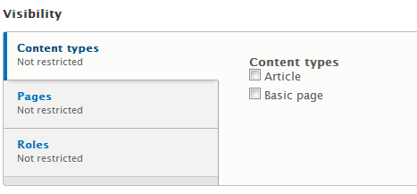
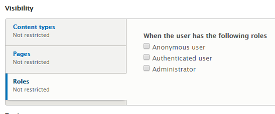
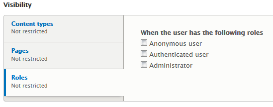
Attached Screen shot for Safari:
Attached Screen shot for Chrome:
Attached Screen shot for Firfox:
Comment #26
aspilicious CreditAttribution: aspilicious commentedNice!
Comment #27
LewisNymanHi, thanks for the work here. I found a few issues that would be good to fix
I don't think we should add this styling to Bartik. The visuals of the two themes are very different. The design suggestion in this issue is for Seven
This should probably apply to the button all the time, not just when it has the .selected class
This styling here isn't actually for focus, we need to use the :focus selector
It seems like this should be on the link element, not on the strong? Also, we should remove the li from the beginning of this selector
Comment #28
Anonymous (not verified) CreditAttribution: Anonymous commented#27 your @your 4. point, it needs to be on the a:focus strong as the underline is stated like that selector for it is .vertical-tab-button.selected a:focus strong i added the li in front so no need for !important;

Comment #29
LewisNymanAh ok, well nothing we can do about that here. We will have to fix it in #2408511: Rewrite vertical-tabs component inline with our CSS standards
Comment #30
Anonymous (not verified) CreditAttribution: Anonymous commentedSo we should just leave the underlining in then on this patch?
Comment #31
tkoleary CreditAttribution: tkoleary commented@BrightBold cool, Looks/works MUCH better now
Comment #32
BrightBold@tkoleary Thanks, but also credit to maninder & b0unty — I just continued their work.
@LewisNyman Another question — if we remove the .selected from
then shouldn't we also remove it from
as well? (So instead we'd have
.vertical-tab-button:focus a.) Otherwise, there won't be any focus styles at all when the tab's not selected.Comment #33
Anonymous (not verified) CreditAttribution: Anonymous commentedi think what lewisnyman meant is that when theres :focus selector the color of the border is #0074bd and when its not focus but just .selected #004f80
Comment #34
BrightBoldRight, but what I'm saying is don't we want the blue border stripe in the opposite case too, when it's :focus but not .selected? Seems like:
:focus=> blue vertical border on outside of tab;.selected=> white background, box-shadow bottom border, and no vertical border on inside of tab.There's no need for us to be involving
.selectedin any of this:focus-related code unless we need it for specificity, right?Comment #35
Anonymous (not verified) CreditAttribution: Anonymous commentedUnassigned & addded needs reroll
Comment #36
jedihe CreditAttribution: jedihe commentedReroll attached. Merge was automatic.
Comment #37
lauriiiComment #38
idebr CreditAttribution: idebr commented@Lewis Nyman mentioned in #27.1: I don't think we should add this styling to Bartik. The visuals of the two themes are very different. The design suggestion in this issue is for Seven
outline: 0; is already inherit by a:focus in elements.css, so it can be removed here.
According to the Drupal CSS coding standards LTR specific styling should be appended with a /* LTR */ comment
Outline is not prone to LTR/RTL specific styling, so it can be removed here.
This declaration is already inherit by .vertical-tab-button.selected a and can be removed here.
When overriding the padding-right, the padding-left should be reset to its default (15px)
Since .vertical-tab-button a already has a border-bottom, the blue border bleeds into the grey border:
This can be fixed by using a different selector for the border or using a pseudo element (eg, :before or :after).
Comment #39
rafuel92 CreditAttribution: rafuel92 commentedThis patch fixes this behavior by using a different selector for the border.
Comment #40
rafuel92 CreditAttribution: rafuel92 commentedComment #41
idebr CreditAttribution: idebr commented@rafuel92 Thanks for working on this issue!
In your screenshot the border pushes the vertical tab button out of its container and the bottom border should be fully grey instead of starting with a bit of blue border. The points mentioned in #38.1 through #38.6 also still need to be addressed. Would you like to have a shot at that as well?
Comment #42
rafuel92 CreditAttribution: rafuel92 commentedOk, sure i'll check this today, thanks for your support.
Comment #43
rafuel92 CreditAttribution: rafuel92 commentedOk, those problems are now fixed.
Comment #44
rafuel92 CreditAttribution: rafuel92 commentedComment #45
rafuel92 CreditAttribution: rafuel92 commentedSorry, this is the correct patch file
Comment #46
idebr CreditAttribution: idebr commented@rafuel92 Thanks for your work, your changes are looking great! Just a few more things before this is ready to be committed:
The suggested focus effect is for the Seven theme. These changes are for Bartik, but they are not part of the scope of this issue and can be removed.
When removing the border-bottom, the attribute for border-bottom-color can be removed.
These attribute are not specific for RTL, so should be moved to the LTR selector if applicable or removed if not applicable.
These changes should not be included in the patch, as they are unrelated to the scope of this issue.
Comment #47
rafuel92 CreditAttribution: rafuel92 commentedOk, thank you for your support, this patch should include those changes.
Comment #48
rafuel92 CreditAttribution: rafuel92 commentedComment #49
rafuel92 CreditAttribution: rafuel92 at Kelyon for Drupal Association commentedSorry, this is the correct patch :)
Comment #51
idebr CreditAttribution: idebr commentedThe patch in #49 no longer applies after #2408511: Rewrite vertical-tabs component inline with our CSS standards was committed.
Comment #52
sushylComment #53
sushylRerolled patch on #49 for comments on #51.
Comment #54
kerby70 CreditAttribution: kerby70 at Blink Reaction (now part of FFW) commentedThis looks great!
Comment #57
kerby70 CreditAttribution: kerby70 commentedDon't know why testbot reran and failed that after I saw it was greeen.
Comment #58
alexpottNeeds a reroll.
Comment #59
rpayanmComment #60
idebr CreditAttribution: idebr commented@rpayanm Thanks for the reroll! I did a manual test to confirm there were no changes since #53
Comment #61
alexpottWhy the different values - I think the padding-right should be 11px.
Comment #62
idebr CreditAttribution: idebr commentedCorrect, this should padding-left: 15px; The RTL version should be padding-right: 11px;
Comment #63
rpayanmComment #64
idebr CreditAttribution: idebr commentedThis should be
padding-left: 11px;instead to correct for the border of 4pxIn addition to setting the
padding-right: 11px;the padding-left should be reset to its default value:padding-left: 15px;Comment #65
pjbaertI fixed the remarks mentioned by @idebr
Comment #66
idebr CreditAttribution: idebr commented@pjbaert Thanks for picking this up! I missed something with the last review, sorry about that:
The RTL selector does not match to LTR selector. The correct state is
.is-selectedComment #67
pjbaertWow, didn't notice that either.
Fixed in this patch.
Comment #68
koence CreditAttribution: koence at XIO commentedQuick review from chrome, looks OK to me.
Anyone for other browsers?
Comment #69
lauriiiChange looks clean and it works! :)
Comment #71
alexpottThis issue is a normal bug fix, and doesn't include any disruptive changes, so it is allowed per https://www.drupal.org/core/beta-changes. Committed dba9518 and pushed to 8.0.x. Thanks!
Comment #73
Bojhan CreditAttribution: Bojhan as a volunteer commentedSo a little bit funny, this solution doesn't actually solve the problem from this issue. There is still no accessible hover state on vertical tabs.
So reopening, don't know how that got past everyone :)
Comment #74
Bojhan CreditAttribution: Bojhan as a volunteer commented#2487704: Use underline as the focused state (not border left/bottom)
Also when aesthetically pleasing hover and focus should be the same.
Comment #75
mark.labrecqueThe original issue description doesn't ever reference a hover state. I think the issue at https://www.drupal.org/node/2487704 would cover this functionality. Could we possibly close this to focus on the other issue, or is there something that is needed further to satisfy this issue?
Comment #76
LewisNymanThe change made in this issue changes the
.selectedstate when it should of only changed the focus state.Comment #77
disasm CreditAttribution: disasm at AppliedTrust commentedLets add updated screenshots and update the issue summary to show how things look now after the patch was committed and why it doesn't resolve the issue.
Comment #78
mark.labrecqueIn order to keep consistent with the Drupal style guide, shouldn't the focus state simply have an underlined title/link? This is mentioned on the issue with a similar ask here: https://www.drupal.org/node/2487704#comment-9917960
This would go against the suggestion in the screenshots above. Thoughts?
Comment #79
kfitz CreditAttribution: kfitz at Acro Commerce commentedIMO the focus state should be made consistent with Drupal Style Guide and have an underlined link.
Comment #80
tkoleary CreditAttribution: tkoleary at Acquia commented@kfitz, @mark.labrecque
While I appreciate the desire to maintain consistency, this would be consistency at the expense of good design.
The underlined link style of the horizontal tabs is appropriate to those precisely because they are horizontal and as the eye scans across them it stops at the one that is in focus. Here the tabs are vertical, the users eye is scanning across them vertically and therefore it makes sense to stop the eye with a vertical line proximate to the beginning of the text.
"simplifying" it to just an underline would be a design regression.
Also, we do not need to add an additional underline on the text when in focus, the underline is an affordance which indicates "link" and should appear only on hover. The fact that we allow the underline to serve a dual purpose in the horizontal tabs (with two different colors for focus and hover) does not mean we should muddy the waters here.
Comment #82
malcomio CreditAttribution: malcomio commentedI think this is fixed - the tabs have focus and hover indicators, and the focus effect is consistent with the tabs