
 Support for Drupal 7 is ending on 5 January 2025—it’s time to migrate to Drupal 10! Learn about the many benefits of Drupal 10 and find migration tools in our resource center.
Problem/Motivation
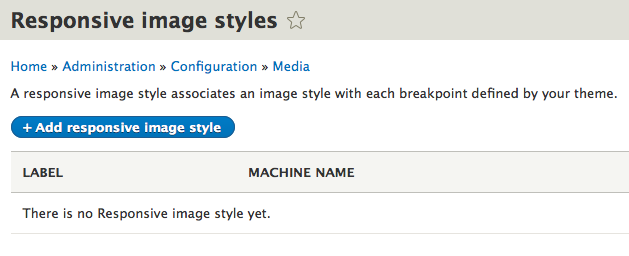
The Responsive Image module supports the current responsive images specs and the Picturefill polyfill that allows it to work in older browsers. This includes the critically important sizes attribute which, in conjunction with the srcset attribute. Sizes it much easier to provide multiple image sources at various viewport sizes, the primary use case for responsive images.
However, right now we don't have a UI in Drupal 8 to use sizes on a responsive image mapping. We only have a UI option to match an image style with a separate media query for each source element, which isn't always the best way to provide responsive image support.
We do have sizes support within responsive image mappings, but since there is no UI, the only way to make use of that support is by editing configuration files within a theme, for example. After a theme is installed, those configuration files are no longer editable. This makes using sizes extremely difficult.
Proposed resolution
Drupal 7's Picture module already has a UI that supports sizes/srcset. This can be adapted for the Drupal 8 mapping configuration UI.
The mapping UI already has an option to select a style for each breakpoint, which creates a source element with a media query in the markup. That should continue to be an option. The UI also currently allows you to not use a breakpoint in a breakpoint group, and that too should remain an option.
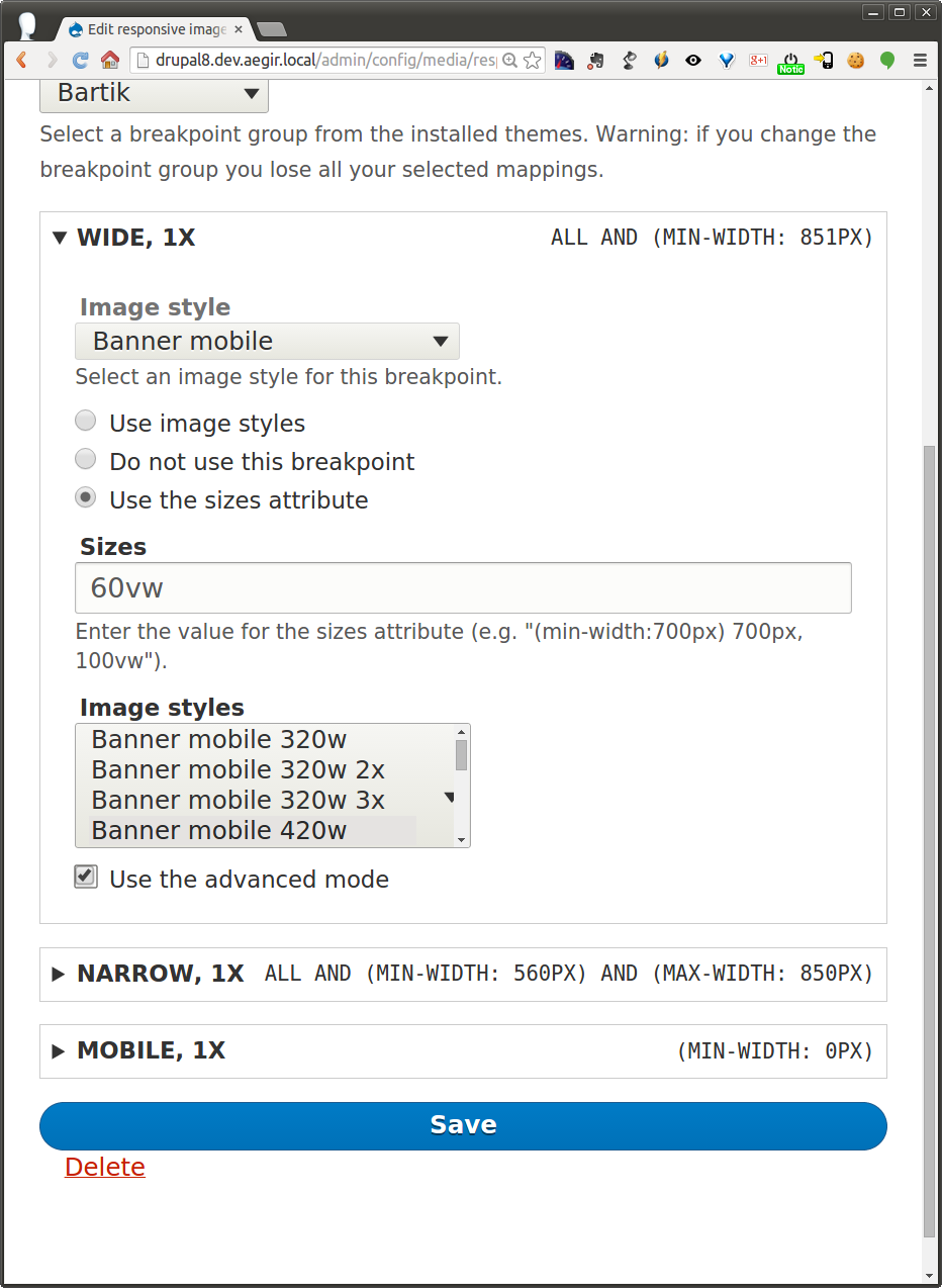
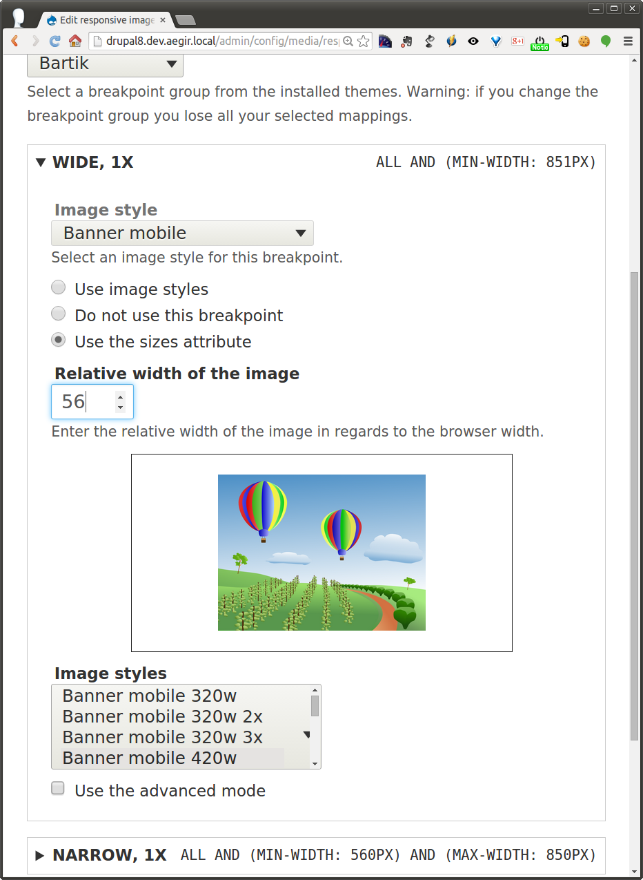
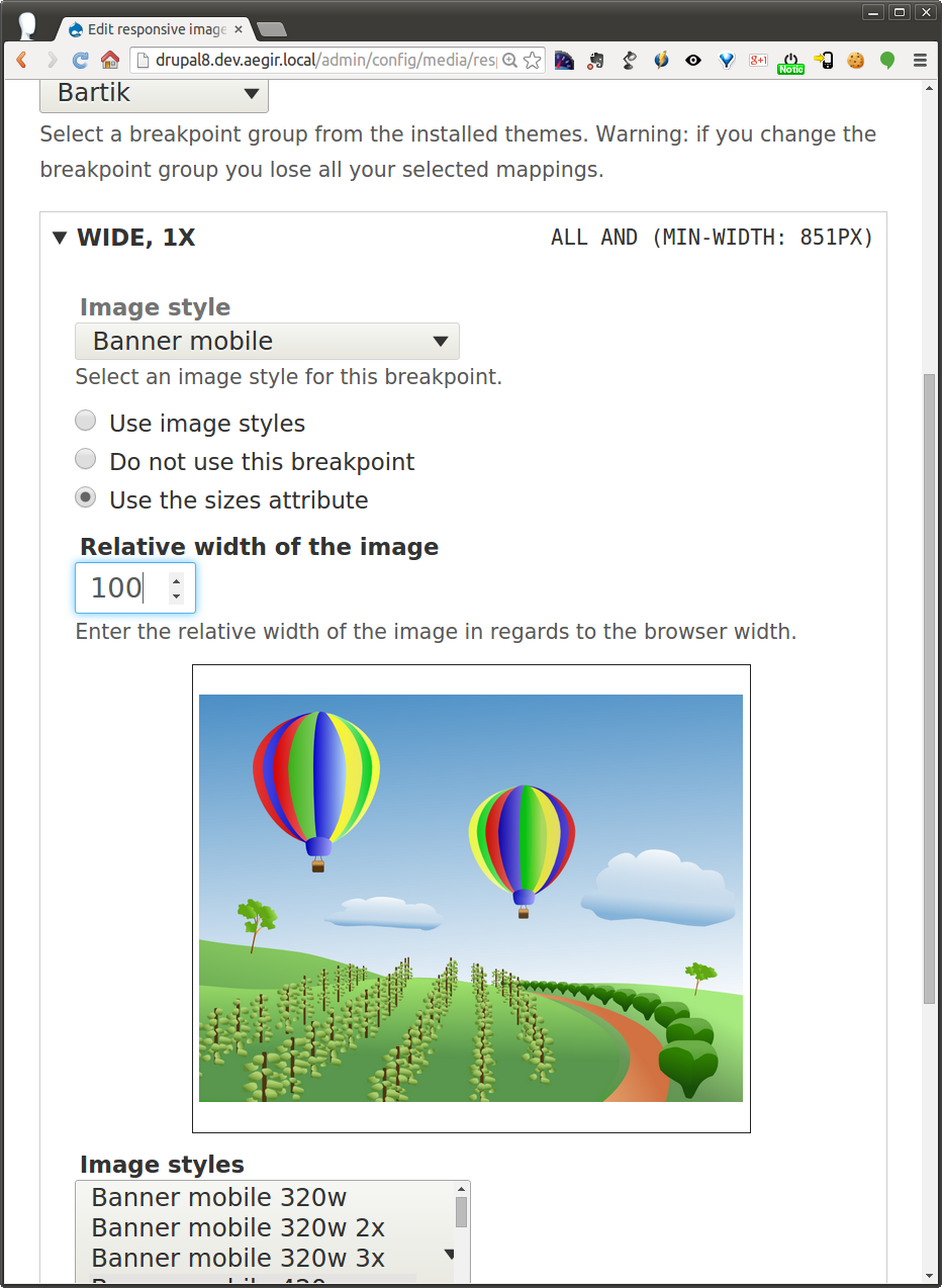
However, we need a third option, which is to use the sizes attribute. If that is selected, then there would be a text field to enter the sizes attribute information, as well as a checkbox interface to select which image styles would be used within the associated srcset.
This straightforward addition, which will already be familiar to those who have used the Drupal 7 Picture module interface, will make responsive images much easier to use in Drupal 8.
Remaining tasks
Add new form elements to mapping configuration page.
Test to make sure it works.
All tasks completed.
User interface changes
Described above.
API changes
There are no API changes: those have already been taken care of in other issues. This would just improve the ability to make use of those API changes through a UI.
Background information
Selecting the right source file for an image is greatly simplified with the new sizes attribute, which is available for either the img element or for source elements within the picture element, in conjunction with a corresponding srcset attribute.
The sizes attribute lists a series of potential sizes for an image, along with possible media conditions associated with those sizes. For example:
sizes="(min-width: 50em) 25%; (min-width: 30em) 50%; 100vw"
This means that if a viewport has a minimum width of 50em (in most cases 800px), an image takes up 25% of the width of the viewport. Below that, if a viewport is at least 30em (typically 480px), the image is 50% of the viewport width. Below that, the image takes up the full width of the viewport.
This can then be paired with a srcset attribute that contains a list of image files and the width of each image file. The browser can then do the hard work of calculating at any given viewport size which source file best fits the available space given the resolution of the device. The browser can also take into consideration bandwidth, delivering a lower-quality image if bandwidth is shoddy, so the page loads faster.
For a lot of use cases, an img element plus sizes and srcset attributes provides a great responsive image solution that is much easier to implement than a full picture element.
There are definitely use cases for the full picture element, particularly if you are providing different types of image files (webp for browsers that can handle it, jpg for those that can't) or if you're going to do art direction (cropping an image more closely at smaller sizes, so the main subject is easier to view). We don't have a good way to do art direction in core, but that will likely be possible through contrib. Yoav Weiss, who has been implementing the picture element in Chrome and Safari, has a great writeup of the various use cases: https://dev.opera.com/articles/native-responsive-images/
Beta phase evaluation
| Issue category | Task because this a follow-up to a recent critical change. |
|---|---|
| Issue priority | Major because the sizes attribute will be very difficult to configurate without this UI change. |
| Prioritized changes | The main goal of this issue is improve usability for the new sizes attribute. Making this easier to use will give Drupal 8 full ability to make use of the responsive images specification, which ultimately means better front-end performance for Drupal 8 sites. This is also a follow-up change to a recent critical, #2260061: Responsive image module does not support sizes/picture polyfill 2.2. |
| Disruption | This will not be disruptive for core, contrib modules or themes. This only adds easier configuration and does not change the underlying APIs. |
| Comment | File | Size | Author |
|---|---|---|---|
| #110 | interdiff-108-110.txt | 2.15 KB | Jelle_S |
| #110 | 2334387-110-sizes-ui.patch | 23.62 KB | Jelle_S |
| |||
| #92 | 2334387-92-sizes-ui-reroll.patch | 11.08 KB | RainbowArray |
| #81 | Screen Shot 2015-05-24 at 4.11.42 PM.png | 43.08 KB | webchick |
| #81 | Screen Shot 2015-05-24 at 4.10.02 PM.png | 42.42 KB | webchick |


Comments
Comment #1
JohnAlbinComment #2
RainbowArrayComment #3
RainbowArrayI am tempted to start by taking a stab at setting up *.sizes.yml. I am a bit concerned that the way this data is handled could be a concern with the beta imminent.
Comment #4
webchickI talked with Marc on IRC a bit about the *.sizes stuff and read a bunch of his provided background info on the picture element etc. which was really enlightening. (http://blog.cloudfour.com/dont-use-picture-most-of-the-time/, https://dev.opera.com/articles/native-responsive-images/)
My take is that *.sizes.yml is beta-safe, because it doesn't break any APIs, only adds them, and it's necessary to complete the D8 features of Mobile/HTML5, so not really introducing "new" functionality in that respect.
Comment #5
attiks CreditAttribution: attiks commentedI think providing 2 image formatters might be easier to solve this problem, the first will be using a picture mapping allowing you to combine any breakpoint with sizes and/or image styles, the second - not available yet - is a formatter that allows you to enter (or select) sizes and a list of image styles.
FYI - OT: We implemented and 'image with sizes' display formatter, but the output is still using the picture tag to avoid that browsers will prefetch the src of the img tag.
Comment #6
webchickThat's true. Site builders are most likely going to want control over this.
I just want to be clear on terminology: are you proposing two image effects (which could then be combined with others such as scale, crop, and selected from the "Manage display" screen) or are you proposing two image formatters (of which the current one just lets you select different image styles). I'm a bit confused on how this would work as image formatters, at least without confusing people really badly and requiring to potentially repeat entry a bunch of times + difficult to keep the sizes synchronized across different content/entity types.
Comment #7
attiks CreditAttribution: attiks commented#6 In #4 I was talking about 2 formatters, 'responsive images' and 'image with sizes', we need better names but that's another discussion.
If we are able to pick meaning full names, I think it might work, most other fields do have multiple formatters as well.
Keeping sizes synchronized is a different discussion: is this needed and if so how can we solve it.
Comment #8
attiks CreditAttribution: attiks commentedThere's another use case discovered today, re-use the same breakpoint multiple times when creating a mapping, this will be needed if you want to output different MIME types for the same breakpoint. [edge case]
Comment #9
webchickHm. Let's drill into a use case more to help flesh this out.
Use case: I'm trying to migrate an e-commerce site like http://www.thinkgeek.com/ to Drupal.
I'm going to need various content types:
- Apparel
- Toy
- Gadget
- Office Supply
- Outdoors Thing
- etc.
Each of those are going to have an image field "Product image."
In a listing like http://www.thinkgeek.com/interests/gameofthrones/?icpg=HP_BrandLogos_Top... I'm going to want all of the product images (across content types) to be of a similar style. This means scaled + cropped to a square, which I can make into an Image style called "Scropped" and select from Manage displays, Views, etc. I'm also going to want them to be responsive, so if I go to that page on a cell phone I don't have a scrollbar.
How do we accomplish this if these are image formatters which would then (I think) turn your choice to "do you want them square or do you want them responsive" which is not a choice most people would want to make.
Comment #10
webchickBecause if I could edit "Scropped" and select a "Generate image sizes for smaller screens" (or whatever) effect, and add my sizes exactly once, then everywhere I use the "Scropped" image style (sidebar blocks, search results, etc.) would all be the same. I don't understand how to achieve the same thing if responsive is a "Generate image sizes for smaller screens" formatter instead. I would need to re-enter my sizes every single instance in which I use that formatter. No?
Comment #11
attiks CreditAttribution: attiks commentedDiscussed with @webchick and @mdrummond, IRC log for now
Comment #12
attiks CreditAttribution: attiks commentedFYI: Included the screenshot of the "UI" that - for the moment - is part of the picture module.
Comment #13
attiks CreditAttribution: attiks commentedComment #14
attiks CreditAttribution: attiks commentedIf you want to read up on sizes and srcset, http://ericportis.com/posts/2014/srcset-sizes/ is a good - funny - overview
Comment #15
attiks CreditAttribution: attiks commentedWe discussed this with Kevin, John, Rupl, Roy, Bohjan, ...
First prototype is in the picture module (new_ui branch)
Attached some screenshots
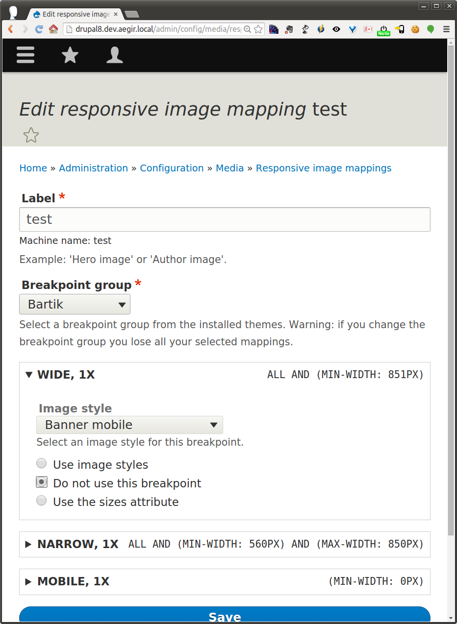
1/ Edit page, breakpoint label and multiplier to the left. Media query to the right

2/ Selecting an image style is the default behavior

3/ If you select 'Do not use' the image style is disabled

5/ If you select sizes, you can enter the vw using a number element

6/ Changing the width,changes the image so people say what is needed

7/ Selecting advanced mode at the bottom hides the image and show a textfield so you can go nuts

Comment #16
attiks CreditAttribution: attiks commentedFYI: We need the following committed first
Comment #17
attiks CreditAttribution: attiks commentedLink to the repo: http://cgit.drupalcode.org/picture/tree/?h=new_ui
PS: Themes can define all image styles and image mappings, so a site builder is using this to make minor changes.
We opted for easy to understand defaults (select an image style) and hide advanced options to make it more user friendly
Comment #18
RainbowArrayI think the interface for working with breakpoint-based mappings looks pretty good.
The thing I'd like to see us do is to provide an option when you first come to the responsive mappings page to not use breakpoints but to instead use either: 1) screen-density-based srcset (1x, 2x, 3x) or 2) sizes. For sizes, the interface could look much like what is above.
If that is chosen instead of using breakpoints, then the responsive image mapping would output an img element rather than a picture element.
Ideally each breakpoint could also choose to use screen-density-based srcset.
In terms of how this would work with the UI, I'd envision doing something very similar to the above. To start you could have radio buttons where you would choose one of three options:
1) screen-density-based srcset
2) sizes
3) breakpoints
If user chooses breakpoints then the UI above is displayed with the section for each breakpoint.
I'd also like to see in the advanced sizes interface a select option to use a code-defined sizes definition. This would be based on something like *.sizes.yml, which would be similar to *.breakpoints.yml but based on the constraints of the sizes attribute (I believe I went through that in the issue summary).
That would really give us the best of all worlds with a relatively simple UI that site builders could use along side a way to define things in code which would be better for front end developers.
Thoughts? If you need me to sketch this out further, let me know.
Thanks for working on this all!
Comment #19
RainbowArrayOh one more thing, we might eventually want the UI to have an option for image type: webp vs jpg, etc.
Comment #20
attiks CreditAttribution: attiks commented#18 A rough sketch would be great
Regarding the sizes.yml, I think it is too much and in the wrong place. A theme can ship with image styles and mappings so site builders can just use them. But for the the content the sizes will depend on the content, For example I add a view with an image in one column, the sizes string will depend on the number of columns I have in my view.
Comment #21
attiks CreditAttribution: attiks commentedPS: #2349461: Move fallback image style into the responsive image style entity created as well, so needs to be a part of the interface as well
Comment #22
RainbowArrayI'd want to make sure we set up sizes.yml so that you could set up different sizes mappings for those different sorts of images. You need to do the same thing with breakpoint-based responsive image mappings, create different sets of sizing rules based on where in the layout the image will appear.
I'll work up some sketches this weekend. Wish we could just sit down in a room for a couple hours to hash this all out. :/
Comment #23
catchPostponing on #2260061: Responsive image module does not support sizes/picture polyfill 2.2 and #2348851: Regression: Allow HTML tags inside detail summary.
Comment #24
Wim Leers#2260061: Responsive image module does not support sizes/picture polyfill 2.2 got committed (YAY!), hence this is now unblocked :)
Comment #25
RainbowArrayI'll write more later, but quick point is that I no longer think sizes.yml is needed. Here's what I wrote in https://www.drupal.org/node/2260061#comment-9599607:
I also don't think we necessarily need to let people decide to use image@srcset@sizes vs picture/source@srcset@sizes. Functionally they're the same.
I would like for us to add an empty media query breakpoint in Bartik so that it's easy to demonstrate how to use sizes/srcset. If somebody can select an empty MQ breakpoint, enter sizes in a text field and select a set of image styles for srcset, I will be very happy.
I think that it's challenging to do that now as you can only do so with a YML install config file that can't be modified once a theme is installed. So getting some UI, even if it's basic, would be a huge win.
Comment #26
attiks CreditAttribution: attiks commented#25 Adding an empty breakpoint is a good idea
Comment #27
attiks CreditAttribution: attiks commentedIssue created + patch #2424587: Make the mobile breakpoint for Bartik empty
Comment #28
znerol CreditAttribution: znerol commentedFound this issue by searching for "picture art direction" on d.o. I do think that there are legit use cases for swapping out the whole image, for example responsive hero images. But I agree that this use case is special enough that it should be left up to contrib.
Wait... baby ducks? Kittens!
Comment #29
RainbowArraySince this got bumped, good reminder that it would still be good to find UI for sizes.
I've been using the sizes interface in the D7 version of picture, and that is working fairly well. Not surprisingly, that's pretty similar to what attiks proposed earlier. I'd be very okay with something along those lines. When creating a picture mapping, for each breakpoint, have the option to select using image styles or sizes or not using that breakpoint. And if you are using sizes, checkboxes to select which image styles should be used and a text input to manually enter sizes.
That would be very straightforward, and I've found that to work well.
I can't remember if the mapping now includes the default/fallback style. That would certainly be nice, if we have that in the schema. Felt strange to have select that every time I used a picture mapping.
Comment #30
Jelle_S@mdrummond There is a separate issue for moving the fallback image style to the responsive image style: #2349461: Move fallback image style into the responsive image style entity
Comment #31
Wim Leers#28: ROFL at that link!
Comment #32
RainbowArrayComment #33
RainbowArrayI overhauled the issue summary and added a beta evaluation. The scope of what needs to be accomplished is now much, much smaller.
Comment #34
RainbowArrayHere's an attempt at a patch for this to kick things off. I tried to grab the relevant bits of code from the patch at https://www.drupal.org/node/2260061#comment-9094609 and update a few of the array keys. My local is borked right now, so I've been unable to test this. Hopefully this works.
I think the UI in #15 is overly complicated. The attempt to have a simplified and advanced UI for sizes seems misguided to me. It is unlikely that an image will take up the same amount of viewport space across at every viewport size, so providing that as an option seems misleading to me. There has been more and more education about the sizes attribute, and I think by the time we hit release this won't need to be oversimplified.
Comment #36
attiks CreditAttribution: attiks commentedI think it is safer to wait till #2123251: Improve DX of responsive images; convert theme functions to new #type element has landed
Comment #37
RainbowArrayAs far as I can tell, the two are mutually exclusive. My patch, which failed spectacularly, only dealt with ResponsiveImageStyleForm, and the DX issue doesn't touch that file.
Just wanted to get the ball rolling to make sure a solution gets in. Otherwise using sizes will be nearly impossible.
Comment #38
attiks CreditAttribution: attiks commented#37 You're right, I mixed up issues. I'll try to have a look at it this week.
Comment #39
RainbowArraySeeing what Testbot says now that #2123251: Improve DX of responsive images; convert theme functions to new #type element is in. Patch still applies.
Comment #40
attiks CreditAttribution: attiks commentedSpec has changed #2481635: sizes is now mandatory in the spec
Comment #41
RainbowArrayI hadn't brought over the test changes to the responsive admin UI, which is presumably why there were so many test failures. Those changes are in this patch, updated with hopefully the correct array keys.
Would really appreciate some help on getting this one in. We've done a lot of work over the last months getting the responsive image module to support sizes. This is the issue that makes all that work available to people through a UI. Without that, it will be very difficult if not impossible for people to actually use sizes. So any help would be appreciated. :)
Comment #43
RainbowArrayMissed one array key change. Hopefully this will fix the remaining fails.
Comment #44
RainbowArrayTestbot, assemble!
Comment #46
Lukas von Blarer#41 Totally agree. I am trying to use sizes in my theme but can't find out how to define them. Are there any examples?
Comment #47
RainbowArray#46: Yes, it's almost impossible to do so right now. You would need to create a config file in a theme that could only be used during theme installation, or you could possibly export the config for a picture mapping, manually edit it, and then re-import it. Neither would be doable for the vast majority of people. I couldn't get that to work. So we need to make sure this patch gets in.
Comment #48
RainbowArrayFound another bug. The $image_style_mapping needs to have an array key of ['image_mapping'], which is where the image style is stored for the image style mapping type. Or for sizes, ['image_mapping'] has an array with ['sizes'] and ['sizes_image_styles'] keys.
Hopefully getting closer!
Comment #49
RainbowArraySic 'em, Testbot!
Comment #51
RainbowArrayIf I ever get this to work, it's going to be through pure stubbornness.
That said, I do think I worked out what was going wrong.
The form field keys are an array of [keyed_styles] then the breakpoint, then the multiplier. Whatever array keys are below that are what gets saved as the responsive image mapping. image_mapping_type was a valid key, so that wasn't throwing any errors. However image_style wasn't a valid key, nor was sizes or sizes_image_styles. Instead there needs to be an image_mapping key: that can have either a single image style or keys of sizes and sizes_image_styles. So that's what I switched to using.
I also removed some of the assertions from the UI test. Some of the fields that were being checked won't show up unless the corresponding radio button is checked. So I removed the ones that shouldn't be showing up. I also moved the breakpoint label to the container: it was only showing up on the selection of an image style.
Crossing my fingers this works. I'm not at DrupalCon, but would really love to get this in this week. Or at least get it to a workable state.
Comment #53
Jelle_S@mdrummond: If you're looking for inspiration, have a look at http://drupal.org/project/picture. The 8.x-1.x branch has a form that supports sizes.
Comment #54
RainbowArray@Jelle_S: Thanks very much for the heads-up on that. I think I may have this worked out now. Looks like the key is in the save function, tweaking that when sizes is selected.
I also did the normalization on validate that was in the picture 8.x branch. I don't totally understand that, to be honest, but hopefully that part works.
Comment #56
RainbowArrayLooks like I need to make sure sizes and sizes_image_styles don't get passed in the mapping for image_style type mappings.
Comment #57
RainbowArrayTried this on simplytest.me, and while selecting and saving an image style works, choosing sizes does not seem to work. You can select sizes as an option, but if you enter a sizes value and select some image styles, then save, when you go back to edit the mapping, those settings are gone and that breakpoint reverts to none for the image mapping type.
I'm going to try removing the extra stuff added to the validation. I don't understand what's going on there, and it's possible that is interfering with saving the form.
Comment #59
RainbowArrayRemoving the extra validation code. I think it was maybe removing the sizes and sizes_image_styles form keys, which is maybe why there is an undefined index error for those keys?
Comment #61
RainbowArrayFewer fails at least! Looks like the remaining problems are with the sizes image styles.
Comment #62
RainbowArrayGood news is that I tried this on simplytest.me, and the sizes and sizes_image_styles values are actually saving now. Progress!
Comment #63
RainbowArrayI think I found the last bug. There were underscores in the sizes_image_styles checkbox selectors in the Admin UI test when we needed hyphens. Fingers crossed this one goes green.
A good reminder that simplytest.me is simply invaluable.
Probably could have found this if my local was working properly, but it's so easy to spin up an environment to check on something like this with simplytest.me. Invaluable service.
Comment #64
RainbowArrayGreeeeeen! Now we need reviews!
Comment #65
Jelle_SThere still is a TODO in the code related to this issue:
I'm not sure why the CMI Tests aren't throwing errors for this, but the config schema of Responsive Image defines 'sizes_image_styles' as a sequence, not a mapping. Currently (with this patch), when I create a responsive image style and export it, this is the result:
Note: for breakpoint bartik.narrow the value for 'sizes_image_styles':
This should in fact be:
The code referenced in the TODO no longer exists, but an other example can be found in \Drupal\user\AccountForm:buildEntity() (line 333, without the surrounding if statement):
Which, in our case, would result in code similar to this:
Note: untested code, written off the top of my head.
That's all I could find for now.
Comment #66
RainbowArrayNow I finally understand what was going on with that validation code in picture 8.x. It was replacing the value of the image_mapping key with the normalized sizes_image_styles and the sizes attribute, then removing the keyed_style if the breakpoint wasn't being used and removing the original sizes and sizes_image_style keys, since they're part of image_mapping. image_mapping just has the image style for image_style, so it's fine.
Made those changes and changed the save code back to what it was before. In theory, this should work, but we'll see!
Comment #68
RainbowArrayTrying a different approach from #66. This patch is based off of #63, which was green. Using array_filter on sizes_image_styles in save, rather than validate. Already removing unnecessary keys in validate, so it seems in theory like this would work.
Comment #69
RainbowArrayI checked the config export, and it's now:
sizes_image_styles:
medium: medium
thumbnail: thumbnail
So, closer!
Adding in array_keys around the array_filter. Crossing fingers this will be the one!
Comment #70
RainbowArrayBy jove, I think we've got it!
Here's the exported config now:
Manually tested this on simplytest.me, and it's working nicely.
Other reviews and feedback are welcome!
Comment #71
attiks CreditAttribution: attiks commentedSmall nit picks
===
elseif, ===
trailing comma
Comment #72
RainbowArrayThis fixes the issues mentioned in #71.
Comment #73
Lukas von BlarerI tested the UI for any setting I was used to in the D7 picture module. I did not find any issues creating, modifying and cloning responsive image styles. I created one that uses basically all three choices available and exported it:
Looks good to me.
I am going to use this to create responsive image styles for my current project and I will report back any issues I face.
Comment #74
Lukas von BlarerI found one way we could improve the UI: When using media queries in the sizes attribute, we could reuse the breakpoints from the selected breakpoint group, right? Maybe we could handle this in a follow-up?
Comment #75
attiks CreditAttribution: attiks at Attiks commented#74 It is possible, but in most cases you'll end up using different media queries for the sizes, so presenting the list of breqkpoints defined in the theme will probably give the wrong impression. Best to create a separate isssue so this can be discussed.
Comment #76
attiks CreditAttribution: attiks at Attiks commentedI tested the patch and had another look at it, but it looks great so RTBC
Thanks all
Comment #77
RainbowArray#74: No, sizes doesn't use full media queries, so using MQs in breakpoints.yml isn't guaranteed to work.
Yay RTBC!
Comment #78
RainbowArrayNeeds work was an error.
Comment #79
Wim LeersPatch looks good. Only a silly, silly, silly nitpick to be found, which should not hold up commit.
Nit: we use "elseif".
Comment #80
RainbowArrayNit fixed.
Comment #81
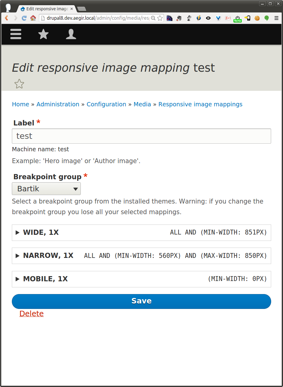
webchickFor those of whom, like me, need a bit of a refresher on what the responsive image UI even is, here's a reminder:
Step 0: Enable the module.
Step 1: Go to /admin/config/media/responsive-image-style.
(Seems unchanged in this patch.)
Step 2: Click that add button. (admin/config/media/responsive-image-style/add)
(Seems unchanged in this patch.)
Step 3: Now you get the same form back, but with expanded options.
Before patch:
(Under those drop-downs are a list of your configured image styles, e.g. Large, Thumbnail...)
After patch (note all collapsible field sets are initially collapsed):
If you select "Image styles," States API will load a selection of configured image styles, like the old UI:
Then there's this new option for using the sizes attribute. Which also offers the image styles, this time in checkboxes:
So... I can see why this is needed and why the old UI was insufficient. But as a site builder, or heck, even as a developer (but not themer), I really just have absolutely no idea how to use this UI. :( And some of that is "pre-existing condition"... it's not like the old UI was super intuitive either. But we've now taken an unintuitive UI and added more options to it, which... hm. :(
I then went to the help page, but there's no help there either. It only mentions the issue styles option, not this new one. So at the very least, that needs updating for the docs gate. Secondarily, we might want to put some additional description text on the main form, to help understand when I'd want to use image styles vs. sizes and image styles.
Sorry, I know it's really not nice to leave things RTBC for a week and then smack 'em with a hammer. I'd love to work with one or both of you to get this into a comnittable state. I'll be on IRC intermittently tonight/tomorrow/Tuesday.
Comment #82
webchickDoing what I said.
Comment #83
webchick>:\
Comment #84
RainbowArrayGlad to work to improve documentation and maybe add some additional text to the admin page. I don't think we can or should explain the whole responsive images spec on that page, but if there's some more help text we can provide that points people in the right direction, sure.
The UI we're adding here matches the UI for the Drupal 7 Picture module, so all the articles out there that have explained how to do this in Drupal 7 are still relevant here.
What I'm most concerned with is that we don't get stuck searching for the perfect UI and then end up with no UI at all. All of the work we've done getting sizes support into D8 depends on having UI. Even if it's UI that is most usable for front-end developers and themers, that is better than no UI: otherwise the only way to use sizes will either be to have a config file in a theme before the theme is installed or export config, directly edit a config file, then reimport it. That is significantly worse than what this UI would provide.
I am all for continuing to improve the UI once this is in and make it even more usable for those who are less familiar with responsive images. I just want to make sure we at least get in the basics first so those most likely to use this (front-end developers and themers) can make use of sizes.
I've explained this before, so I won't go into detail, but I really believe sizes is the more important use case than the old image style per breakpoint method.
It will be a couple days before I'll be able to really work on this again. I want to be clear, I am on board with improving documentation and adding help text with this issue. I just wanted to emphasize that I hope we can avoid letting the perfect be the enemy of the good.
Thanks for the review, webchick. Much appreciated. :) I know the RTBC queue is very full after DrupalCon, so I understand the long RTBC time. I've been reloading this page more than is healthy to see what the response would be, and I'm glad to help make the improvements to make this committable. :)
Comment #85
webchickRight, I want to be clear that I absolutely want to see this go in, and I definitely am not searching for a perfect UI. However, we do need to at least pass the docs gate (which means making hook_help() accurate to the new changes), and we should also look for some relatively simple things we can do to help people who don't know the responsive image specs by heart (which is, er, most people :)) at least take a stab at the right thing to do here (to pass the usability gate as well). Linking to the spec for more info, adding field descriptions to better explain the options, and if sizes is the more important one, ordering that first... that sort of thing. Good to know that Picture module tutorials will work, but it's not really okay that people would need to run to Google in order to use an interface in Drupal core.
Ping me when you're back around and we can work together on it, if you want!
Comment #86
RainbowArrayI am 100% on board with working together to make those changes to get this in. Thanks!
Comment #87
attiks CreditAttribution: attiks at Attiks commentedAlternative approach: what is we provide 2 edit screens, a basic to define the sizes and an advanced one as outlined above.
Basic one can be something like this:
1/ If your theme has a max width, enter the
max widthand enter thewidth of the image in px, so the browser will not try to download images that are too big.The output will be: (min-width: 80em) 424px
2/ A table with 2 input fields per row: one for the MQ, one for the width
"Start with the widest (when using min-width MQs)
If my page is
43emwide, my image is40% wideThe row will get translated into (min-width:
Column 1)Column 2vwThe output will be: (min-width: 43em) 40vw
3/ On mobile my image will be
90% wideThe output will be: 90vw
Output in the browser will be: (min-width: 80em) 424px, (min-width: 43em) 40vw, 100vw
At the top of this page we can instruct the user when they might want to use the advanced edit mode:
In case you want to support the art-direction case or you want to support multiple image formats simultaneously, you can use the advanced edit mode.
What do you think?
Comment #88
RainbowArrayI think that could maybe be an interesting possibility, but it would require a rewrite of the UI code and new tests to support it. I'm concerned that might not get done in time.
I'd suggest we start with improvements to docs and help text. Once that's in, sure, let's look at how we might do a simpler UI in a separate issue. Then if it doesn't get in for 8.0.x we still have some UI and can make it better for 8.1.x.
Comment #89
attiks CreditAttribution: attiks at Attiks commentedIt won't take that look, I'll have a look tomorrow to see what I can do.
Comment #90
RainbowArray@attiks: If you want to explore new UI options, I would highly appreciate if you do so in a new issue. You can base it off of this issue's latest patch so it's easier to commit if this gets in.
Comment #91
attiks CreditAttribution: attiks at Attiks commented#90 New issue created #2495389: Provide a simplified UI to support current responsive image standards
Teaser image
Comment #92
RainbowArrayPosting a quick reroll as a starting point for the interdiff on the ui improvements. Having Testbot take a look to spot if there are any issues while I work on help text and such.
Comment #93
RainbowArrayPosting this patch with UI improvements. Reviewed this with webchick at TC Drupal. I am going to also do another issue that will create two default responsive image styles, wide and narrow, along with a default Viewport Sizing breakpoint group. That will provide a semi-intelligent default so that site builders can go to those styles and edit them, see how one of these works, and then make edits as necessary or use those as an example (or use them on their site, even if the styles are not perfectly optimized).
This may also allow us to turn on the responsive image module by default.
Comment #94
RainbowArrayQuick note that the last patch updated the responsive image module help text, changed the order and naming of the breakpoint settings, displays a breakpoint's settings if the breakpoint is being used, updates help text and provides links to the responsive image help page.
Comment #96
webchickMarc and I sat together at Twin Cities DrupalCamp for at least a couple of hours walking through this UI. I got hung up on two things:
1) The terminology (e,g. Breakpoint group, fallback image) didn't make sense to me as someone who does not write front-end code, and there was no help text there to explain what I should enter there. Because these were required fields, this made me panic. :)
2) Without "smart defaults" I was left to read up on how the image srcset/sizes spec works. At this point, i'd be better off writing code than using a UI.
Marc addressed #1 with a combination of some actually helpful help text (I'd love to review this more when I can focus, aka when I'm not at a sprint), and field descriptions copy/pasted from said help text which describe what input is expected.
For #2, we came up with a plan to define a few additional image styles (Gigantic, Huge) for retina displays, and providing a couple of default responsive image styles (e.g. Narrow and Wide) that are pre-configured with the right options. This would make it much easier, because if I had questions about how the thing worked, I could simply refer to the examples, just as I can with image styles.
We also talked about other more radical proposals, however Drupal doesn't have the contextual knowledge of what the front-end is doing (e.g. margin, padding) to allow for this. And moreover since most front-end developers going forward are going to be writing IMG tags this way, abstracting it behind a UI will make them very angry. :)
Given that this is fixing a bug with the current UI, which is geared toward an older version of the responsive images spec, I think as long as we have sample content for people to learn from, I'm comfortable with this going in to resolve the major task. We can and will still do follow-up work on this UI in subsequent 8.x versions to make it more betterer.
Comment #97
RainbowArrayThis adds some additional help text to the image style selection. I still have some test fixes that I need to do.
Comment #98
Jelle_SLet's see what the test bot thinks of it so far.
Comment #99
Jelle_SOne small thing I found in the documentation:
"[...] only image style per breakpoint [...]" should be "only one image style per breakpoint".
Comment #101
Jelle_SThe tests seem to fail because the
help.pageroute does not exist (as far as I can see).So we need to either:
Comment #102
RainbowArrayFixed some potential test bugs.
Responsive image module already referenced help.page, but there may have been some syntax errors I tried to fix here. I also updated the test coverage to account for the fact that now responsive image styles already exist.
Comment #103
RainbowArrayErg, well this is going to fail. I'm getting the test fails confused with https://www.drupal.org/node/2513604, which is where the responsive image style defaults are added.
Comment #105
RainbowArrayRealized that help.page is being called in the admin form as well as the module help. I haven't found other examples of that in core. Changing the placeholder to @, as I saw that in some other places in core. Also, I think there may have been an issue with trying to add a link inside a label, so moved that to a description. Since that description is still visible when sizes options are visible, I removed the link to the help page in those options as it seemed redundant.
Comment #107
RainbowArrayComment #108
RainbowArrayWrapped help link on form with check that help module exists. Moved help link to description for the radio fieldset.
Comment #109
Jelle_S2 small remarks by just reading through the patch:
Nit: Punctuation. I'd say either give all options a '.' at the end, or none of them. I'm not sure what the standard is here throughout core (if there even is one).
So if the help module is disabled, there is a link here that goes nowhere?
I'll manually test the patch now but codewise it already looks good.
Comment #110
Jelle_SThe patch needed a reroll, so I did that and addressed the issues I mentioned in #109.
Comment #111
RainbowArrayThanks for the review! Changes in #110 look good.
Comment #112
attiks CreditAttribution: attiks at Attiks commentedGreat job guys, patch looks good and improves the UX a lot
Comment #113
Bojhan CreditAttribution: Bojhan as a volunteer commentedI will not have time to review this before next week. Glancing over the help text it is not in alignment with most of our UI standards, which clearly state that we shouldn't explain the UI - but instead only explain core concepts that are difficult to just know. I am a bit worried we keep using the same labels, and try to solve it with more descriptions.
Comment #114
alexpottAssigning to @webchick since her feedback drove the latest changes. Also before getting this in it would be great to have @Bojhan's review.
Comment #115
RainbowArrayLooking forward to @Bojhan's review. When you do take a look, Bojhan, it would be good to also apply the patch from https://www.drupal.org/node/2513604, which sets up default responsive image styles. When @webchick and I worked on this at Twin Cities Drupal Camp, having those default styles in place was key to improving the UX. Those default styles provide some basic styles that can be used out of the box that make use of sizes and serve as examples of how sizes can be used.
If we can continue to improve labels and on-screen help text, glad to do so. I apologize but I wasn't aware that there were UI standards specifying what sort of help text can appear on the screen. Are these the standards in question, or are there different standards for D8? https://www.drupal.org/ui-standards I will make sure to review these to see if there are further tweaks we can make.
Time is really short to get something in. This is the last step in a very long journey to get to this point. If you have some tangible suggestions for items that can be changed to get this to the point where it can be committed, that would be very much appreciated. Look forward to your feedback, Bojhan. Thanks!
Comment #116
webchickOk, had a hangout today (well, actually a joint hangout/skype/phone call...(*&@#ing technology :P) with @Bojhan and @mdrummond to talk more about this.
Let's start with: All three of us are on board with the fact that we need to get this in, since the current UI is essentially a bug, because it still refers to the old picture spec.
Marc (re-)demoed the UI to us and really only three things of note came up:
- (minor, fix in this patch) There's a bit of help text on breakpoint group that is slightly lying and referencing themes vs. themes and modules.
- (major, follow-up) We need some kind of states API / ajax update for the breakpoint group form, because it is currently very confusing that you need to save the form, refresh the page, and only then see the relevant breakpoint groups in the details elements. It also can cause minor data loss if you fill out breakpoint group A, switch to breakpoint group B to check it out, and then flip back to breakpoint group A, because you need to save each time, which clears your previous settings.
- (normal, follow-up) The help text in general (both field descriptions and actual help page) does not conform to UI guidelines and needs clean-up. Specifically, it's all way too long, and it focuses on exposing the underlying technical details vs. being more use-case focused "Use this to foo your bar so your users can baz." See Field UI settings descriptions for an example.
So given that, while this UI could definitely use some pretty major refinement to be more usable to non-W3C-spec-readers at large, that can also happen in 8.1.x+ and/or contrib. Versus fixing the UI really does need to happen prior to RC.
Therefore! Fixed the bogus descriptions mentioned in the first point, and committed and pushed to 8.0.x. YEAH!!! Great work, all, on this important issue. Sorry it took quite a few twists and turns to get there. Thanks very much for your patience/persistence.
We will need follow-ups for those other two points, so adding that tag.
Comment #118
attiks CreditAttribution: attiks at Attiks commentedfollow ups created:
- #2547917: Add states API / ajax update for the breakpoint group form
- #2547919: Improve help text for responsive images
Comment #120
2dareis2do CreditAttribution: 2dareis2do as a volunteer commentedWill this new UI support the use of srcset w attribute?
i.e.
<img src="https://ericportis.com/assets/2014-03-24-srcset-sizes/men-in-black/16th.png" srcset="https://ericportis.com/assets/2014-03-24-srcset-sizes/hammering/8th.png 1280w, https://ericportis.com/assets/2014-03-24-srcset-sizes/yay-peas/half.png 1880w" alt="A rad wolf"/>http://jsbin.com/xiwuyoruce/1/edit?html,css,js,output
It is worth mentioning this should be used as an alternative to the multiplier and not in combination.
Comment #121
RainbowArrayYes, the new UI allows you either use 1x, 2x, etc. or the sizes attribute in conjunction with srcset with w modifiers. Not both at the same time.
Comment #122
2dareis2do CreditAttribution: 2dareis2do as a volunteer commentedThis sounds awesome. A very good reason to start using Drupal 8 in my opinion.