
Problem/Motivation
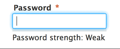
From #2247049: Redesign password strength indicator so it's less fragile:
Sorry for bike-shedding, but do you think we could update the background color to be lighter (like #DDD), so it increases the color contrast. Currently is a poor 1.2 when "Fair" strength is displayed. It's difficult to see it, specially in Chrome because of the blue-focus border.
Also, we should probably change the colour to match the Seven styleguide colours.
Proposed resolution
TBD
Remaining tasks
Write a patch with colour changes
User interface changes
Colour changes to the password indicator
API changes
None
| Comment | File | Size | Author |
|---|---|---|---|
| #8 | password-color-tweaks-2311279-6.patch | 1.49 KB | emma.maria |
| #6 | password_strength.gif | 32.42 KB | emma.maria |
| #6 | password_indicator.png | 29.9 KB | emma.maria |
| #2 | password.gif | 71.52 KB | corbacho |


Comments
Comment #1
corbacho CreditAttribution: corbacho commentedAdding link to Seven Color palette https://groups.drupal.org/node/283223#Color
It doesn't need to pass the WCAG test, (as I understand) but it's nice to have it as a reference. Calculator: http://snook.ca/technical/colour_contrast/colour.html
That calculator has a nice hue slider. Someone could start from a Seven Theme color (for example #0074bd) and pick colors from the same "color space" modifying only the hue.
Comment #2
corbacho CreditAttribution: corbacho commentedWe could add transition properties too. It helps to notice the bar changes:
From Bootstrap theme:
Comment #3
Bojhan CreditAttribution: Bojhan commentedI wonder what is causing these fails. IS it the background? The password checker colours should have been checked before
Comment #4
LewisNymanI am happy with adding the transition, it feels like it could be a little faster than the one in bootstrap.
Comment #5
emma.mariaComment #6
emma.mariaThe red, yellow, blue and green indicator colours now use the messages colours and Drupal blue from the Seven style guide. I also changed the grey background to be a lighter grey also taken from the Seven style so the contrast between the grey and the indicator colour are much much better. The transition suggested above has also been added and I matched the value with the one set for the progress bar transition.
From this work I also noticed a few different bugs related to password strength so I have created follow up issues:
Password field focus is interfering with the password indicator. #2318677: Password field focus is interfering with the password indicator strength bar
Password strength title Strong drops onto a second line. #2318679: "Password strength: Strong" wraps onto a second line
Comment #7
Bojhan CreditAttribution: Bojhan commentedNice! Could you also post the patch :)?
Comment #8
emma.maria*facepalm* here is the patch :)
Comment #9
Bojhan CreditAttribution: Bojhan commentedTwo notes:
1) The only color that is kinda weird, is the blue. Though from the style guide, we don't have another available color.
2) Shouldn't strong fill up the whole bar?
Comment #10
mgifford@Bojhan, I too was wondering about why the strong didn't fill up the whole bar too. Mind you, it doesn't in Core now. It just had never occurred to me, perhaps the animation helps raise awareness of this..
I like the solution. I can't see any accessibility problems with this CSS transition. +1.
Comment #11
emma.maria@Bojhan These choices were already existing and originally decided within this gem of an issue :) #331893: Add colouring (and description) to password checker. The levels and colours were based off of Google's password strength indicator, so that is where the Blue - Good level comes from.
I still cannot work out why Strong is not 100%, Google used 100%. I did some research and couldn't find anything to explain the less than 100% green bar. Maybe the strength indicator is only to strongly prevent weak passwords but also not be a firm 100% guarantee of strong passwords (hope this makes sense).
Comment #12
LewisNymanYay for nicer, more consistent, and more accessible colours!
@Bojhan Take that bike shed outside :P
Comment #14
alexpottTo fill up the whole bar you need a password like qQ12se£$
Committed 4505b78 and pushed to 8.0.x. Thanks!
Comment #15
nod_I know it's minor but still :p Why are we even hardcoding that in the JS anyway? shouldn't that be a class?
Comment #16
mgiffordThat would make it way easier to theme.. But probably should be a new issue.
Comment #17
LewisNymanYes we did notice this but tried to keep the issue focused. Follow up created: #2321167: Move password indicator colours into CSS