
In #2113911: Modal style update nod_ mentioned that the contrast on the modal header was too low.
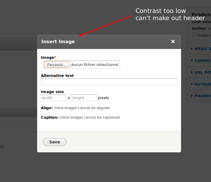
This isn't a hard accessibility requirement because the text in the header has excellent contrast, so I think it's just a design discussion.
Let's discuss and try out some variations.
| Comment | File | Size | Author |
|---|---|---|---|
| #25 | 2226193-25.patch | 488 bytes | BarisW |
| #24 | Screen Shot 2014-09-23 at 6.02.00 PM.png | 21.29 KB | mgifford |
| #24 | 2226193-23.patch | 501 bytes | mgifford |
| #18 | Image-Without-Patch.png | 33.7 KB | mgifford |
| #18 | Image-Without-Patch-Contrast.png | 35.05 KB | mgifford |


Comments
Comment #1
LewisNymanComment #2
vorvor CreditAttribution: vorvor commentedsome variatons
Comment #3
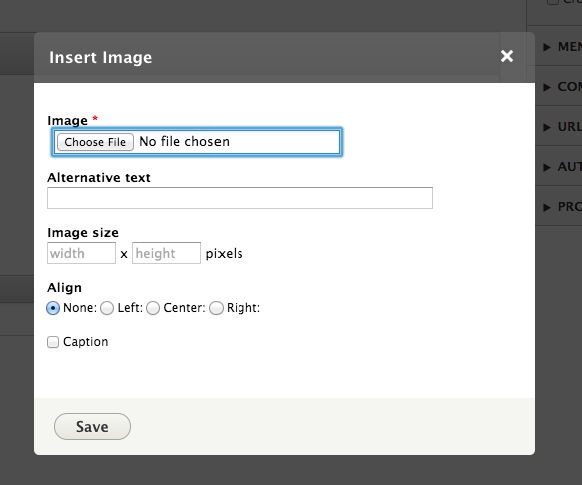
Bojhan CreditAttribution: Bojhan commentedI'd like the following things first:
1) Remove transparency
2) Change background to better match https://groups.drupal.org/files/20.modal-dialog.png
Comment #4
damiankloip CreditAttribution: damiankloip commentedI agree totally with #3, I like the new look. The header just needs to be easier on my eyes :)
Comment #5
nod_Yeah it doesn't need a drastic change. It's just that on a large screen the background and header just blend too much and you just don't know what's what. Tweaking opacity should be enough.
Comment #6
LewisNymanI would prefer a tweak, during development full opacity looked a bit ugly.
Comment #7
damiankloip CreditAttribution: damiankloip commentedYes, in my mind tweaking the header colour/opacity is all that's needed.
Comment #8
damiankloip CreditAttribution: damiankloip commentedFor me, something like this does the trick and appeases my eyes :)
Comment #9
mgifforderror: core/themes/seven/dialog.theme.css: No such file or directory
Comment #10
damiankloip CreditAttribution: damiankloip commentedLooks like #2113911: Modal style update got reverted?
Comment #11
nod_yeah but when it gets in again, same issue.
Comment #12
damiankloip CreditAttribution: damiankloip commentedok, cool. Comments etc.. still welcome on the screenshot above I guess :)
Comment #13
Bojhan CreditAttribution: Bojhan commentedThis looks acceptable to me, could you share a few bigger screens?
Comment #14
LewisNymanReopening now that modal is back in
Comment #15
LewisNyman8: 2226193.patch queued for re-testing.
Comment #17
mgiffordfiles moved.
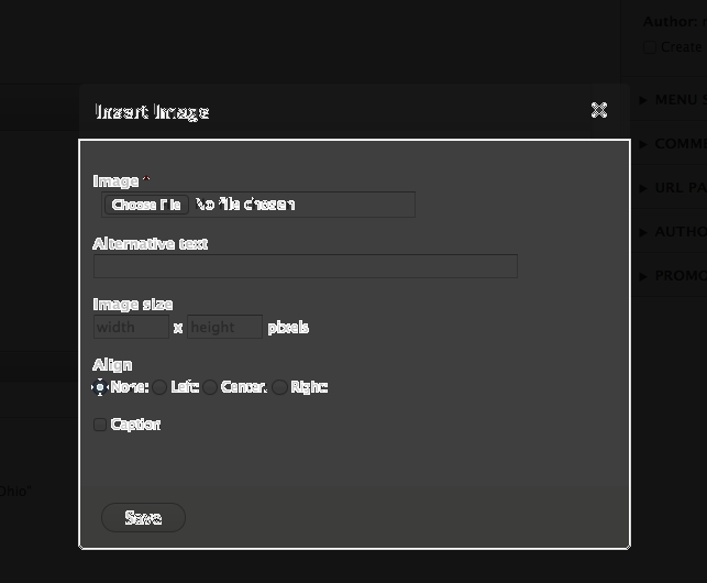
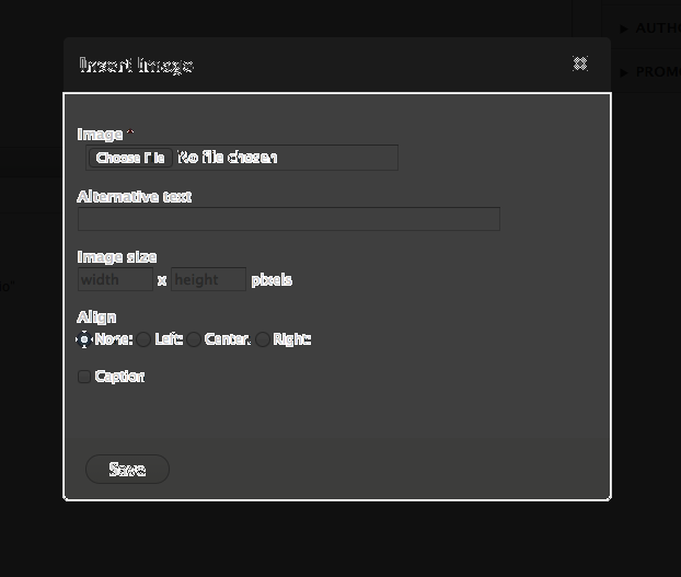
Comment #18
mgiffordIt's not easy to track down contrast issues with rgba scripts. This contrast-ratio is helpful. As is Chrome's Color Contrast Analyzer it looks like:
This is what it is without the patch:
and With patch:
Maybe I'm getting something wrong here though.
Comment #19
mgiffordComment #20
davidhernandezPart of the problem is the transparency. In one of your screenshots the header is sitting on top of the ckeditor toolbar which has a darker color, so it is picking up part of that making the background actually come out darker. The modal background, with transparency, is also somewhere around #4C4C4C (76,76,76) which is darker than both 107s and 120s. Making it less transparent would affectively make it lighter, right? I'm attaching a contrast scan with the header completely transparent to show the difference.
Comment #21
mgiffordComment #22
mgiffordComment #23
Bojhan CreditAttribution: Bojhan commentedI am fine with choosing a background without transparency.
Comment #24
mgiffordIn that case, why not just this.
Comment #25
BarisW CreditAttribution: BarisW commentedLooks good to me, except that we don't need
rgbaif the alpha is 1. So here's one with the same effect. but usesbackground: #6b6b6b;Comment #26
mgiffordYa, I wondered about that too.. Think RGB is better, thanks for the re-roll. It's one line of CSS. I'm going to mark it RTBC.
Comment #27
BarisW CreditAttribution: BarisW commentedComment #28
Bojhan CreditAttribution: Bojhan commentedVisual RTBC too :)
Comment #29
star-szrComment #31
alexpottCommitted c09e314 and pushed to 8.0.x. Thanks!