
The style guide proposal should be applied to dblog.
https://groups.drupal.org/node/283223
We played around with the proposed messages color decoration without too much success.
In the table, we need to have zebra working. This makes applicaiton of background color schemes very hard. Thus i recommend to drop the background color.
The vertical intense-color line is nice, but colors are no more that nice if these lines touch each other. Also applying a vertical line within a table has a problem with table rendering: For items without special color decoration, you need to add a neutral color border.
I will post screenshots of our experiments with past module. We decided for a variant of the patterns proposed - already committed and ready to play with.
| Comment | File | Size | Author |
|---|---|---|---|
| #17 | 2070323_screenshot_test_dblog.jpg | 313.97 KB | pakmanlh |
| #14 | 2070323-with-border.png | 97.35 KB | tompagabor |
| #14 | 2070323-with-icons.png | 98.66 KB | tompagabor |
| #14 | 2070323-dblog-table-14.patch | 704 bytes | tompagabor |
| #12 | 2070323-20140326-state.png | 152.28 KB | tompagabor |


Comments
Comment #1
miro_dietikerThese images are from the current past 7.x module (dblog replacement).

We have tested 4..5 different unsatisfying looks to apply the D8 style guide before but didn't persist them, sry. :-)
Also with a new monitoring project, we decided to apply icons in tables only for excalation - thus no green "check" icons.

Comment #2
Bojhan CreditAttribution: Bojhan commentedI gotta try some things for this.
Comment #3
LewisNymantaging
Comment #4
echoz CreditAttribution: echoz commented@Bojhan, note that there's an active class on cells, invoked by the sort, which has been used for a background color, BUT I discovered in #2048895: Dblog CSS results in background image repeating that when the sort is by date, the active class is on the type column, and when the sort is on type, the active class is on the icon column! Sort by user currently results in a php error, but we'll be able to test that eventually. So if we want to use the active class to indicate the "sorted by" column, this needs to be fixed.
Comment #5
LewisNymanI had a bit of a play with this, I tried out using white space between the rows but that didn't flow that well. It was pretty clear we needed borders around the whole table to give the background enough contrast. Once I'd done that it seemed like those same colours could work between each row. The error row looks a bit weird though.
This is a tricky page because we don't know which colour will be the majority, shall we be optimistic and assume green is and give the warnings and errors more dominant borders?
Comment #6
yoroy CreditAttribution: yoroy commentedI never understood why all the green has to be made so explicit (like on current status page), using it as a background color for the whole row. I'd look into only using the left border for the green status, keeping those rows on white background. *That's* what will make the reds and yellows stand out.
Comment #7
klonosI OTOH like the green because -as it's already been said in previous related issues- it communicates an "All green" status.
BTW, I kinda got used to the blue status color for information rows (like the Drupal version for example).
Comment #8
LewisNymanI didn't realise the green was omitted intentionally, it looked like a bug because the green was still referenced in the CSS. It is a bit overwhelming, I think I'm a bit too used to the old one.
Comment #9
BerdirNote that this issue was created about the dblog page (recent log messages), not the status overview, although both probably need to get the style guide applied.
Comment #10
Bojhan CreditAttribution: Bojhan commentedYes is omitted intentionally. And this page should reflect that decision.
Comment #11
LewisNymanAccidently mixed this issue with #665790: Redesign the status report page. Should we continue in that issue or open a follow up?
Comment #12
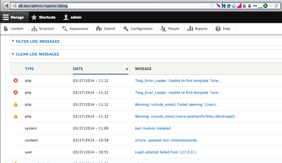
tompagabor CreditAttribution: tompagabor commentedIt looks like the dblog uses the new table design. See the attached image.
Somebody tell me, what we need to do with this?
Eg we could use different left border-color for info-notice-warning-error?
Comment #13
LewisNymanCould we remove the background color from the cell and add the left border? That might be enough? Maybe we don't even need the left border.
Comment #14
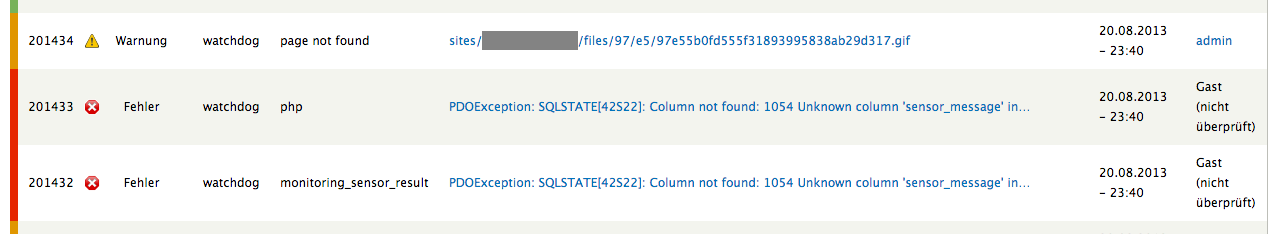
tompagabor CreditAttribution: tompagabor commentedI removed the background color. Also tested the left border, but i think we don't need this. The icons is enough.
Screenshots and patch file attached.
Comment #15
LewisNymanI think so to. Let's get sign off from Bojhan.
Comment #16
Bojhan CreditAttribution: Bojhan commentedAgreed, the icons will give enough visual affordance.
Comment #17
pakmanlhPatch apply and it looks fine, great work :)
Comment #18
LewisNymanComment #19
webchickCommitted and pushed to 8.x. Thanks!