
 Support for Drupal 7 is ending on 5 January 2025—it’s time to migrate to Drupal 10! Learn about the many benefits of Drupal 10 and find migration tools in our resource center.
More Seven Theme issues: #1986434: New visual style for Seven
Problem/Motivation
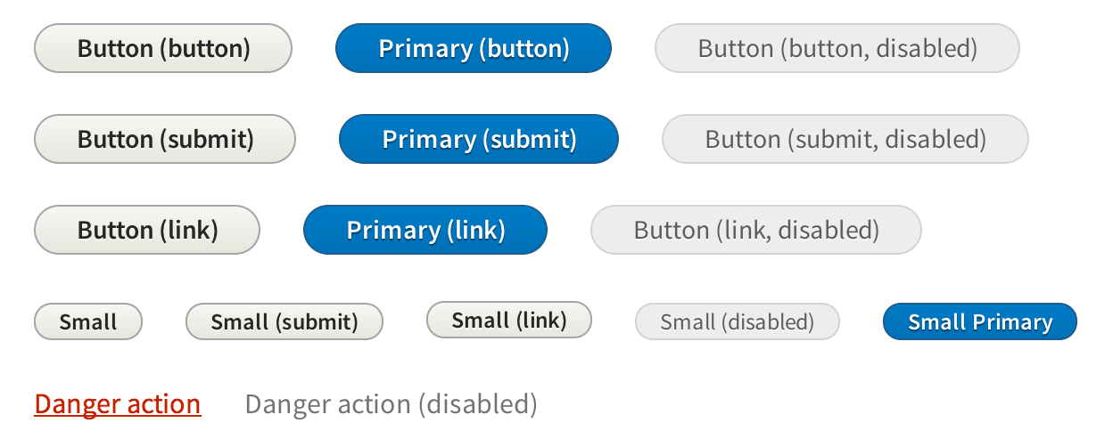
Buttons are an integral part of the admin UI experience, and currently there are many different styles of buttons used in core (dropbutton, manage display cog button, form buttons). None of these are aligned in style.
This has largely happened because we lacked of a styleguide for Drupal’s admin UI. Even though great, coherent UX work was done for Drupal 7, and we have functional UI standards, there was no central guide for the visual conventions used in Drupal’s core admin theme, Seven.
Since then, we developed Proposal: A Style Guide for Seven. This issue aims to introduce the proposed styling for buttons to core to create a unified and consistent look and behavior.
To quote the rationale provided:
Buttons should be clearly identifiable as such, with normal and primary actions inviting interaction. At the same time – for visual conciseness – graphic effects are limited to a subtle gradient (and border, where necessary for contrast with a background). For an informal, friendly appearance, identifiability among other UI controls, and for continuity with Drupal 7, discrete buttons have a fully rounded “pill” shape.
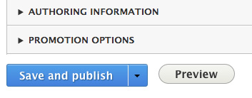
As with input fields, focus is communicated with a blue halo. The hover state brightens the button (optically, light colours ‘advance’) and adds a small shadow beneath, causing it to ‘stand up’ and invite a click. Primary buttons – the save button on a node form, for example – are emphasized using Drupal blue. This carries through the main brand colour, and, since blue is a calming colour, the added emphasis remains respectful, not yelling or rushing the action.
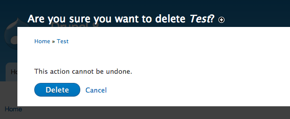
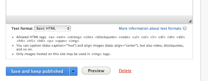
Delete buttons – those that perform a destructive action such as deleting a node – are colored red, since they must call attention and signal caution. However, they should not draw the eye away from more common actions, so their border and background is removed, appearing instead as a plain link. An underline provides an affordance, since danger buttons have neither the standard link colour nor the standard button style.
Note that all button colours pass WCAG 2.0, except for the primary button’s hover state, which warrants some consideration.
Proposed resolution
In #1945522: Add remaining buttons we laid the ground work for this change.
We propose to change the font, change the styling to be more round and finally a new color revised color palette. Just the last two changes are part of this patch.
Remaining tasks
- Make a patch
- Review accessibility
User interface changes
The button style will be changed, no functional differences.
Test Pages
- /core/install.php
- /admin/content
- /node/add/article
- /admin/structure/views/view/content - Try changing a few settings
- /admin/structure/views/add
- /admin/structure/block - Try adding a block
- /admin/structure/types
Related Issues
| Comment | File | Size | Author |
|---|---|---|---|
| #114 | Screen Shot 2013-11-22 at 4.14.59 PM.png | 12.44 KB | webchick |
| #109 | seven_buttons_1986074_109.patch | 17.4 KB | LewisNyman |
| #98 | interdiff.txt | 3.21 KB | LewisNyman |
| #98 | seven_buttons_1986074_98.patch | 17.19 KB | LewisNyman |
| #94 | seven_buttons_1986074_94.patch | 17.22 KB | LewisNyman |


Comments
Comment #1
Bojhan CreditAttribution: Bojhan commentedAdding tags.
Comment #1.0
Bojhan CreditAttribution: Bojhan commentedwtf
Comment #1.1
Bojhan CreditAttribution: Bojhan commentedUpdated issue summary.
Comment #1.2
Bojhan CreditAttribution: Bojhan commentedUpdated issue summary.
Comment #1.3
Bojhan CreditAttribution: Bojhan commentedUpdated issue summary.
Comment #1.4
Bojhan CreditAttribution: Bojhan commentedUpdated issue summary.
Comment #1.5
Bojhan CreditAttribution: Bojhan commentedUpdated issue summary.
Comment #2
ry5n CreditAttribution: ry5n commentedPatch incoming; give me two days.
Comment #4
oresh CreditAttribution: oresh commentedr5yn, thanks for the buttons :)
also please take a loot at the button for search (from #1986418: Update textfield & textarea style);
I couldn't find any search without autosubmit, but we have different styles for that. Thank you.
Comment #5
ry5n CreditAttribution: ry5n commented@oresh Thanks, I’ll look for that. For now I’ve just done the basic buttons. I’ve tried to apply the correct classes (
class="link link--danger") for the danger buttons, using hook_element_info to define a new pre_render callback for button form elements, but that’s not working; can anyone help figure out why?Comment #5.0
ry5n CreditAttribution: ry5n commentedtweakage
Comment #6
Bojhan CreditAttribution: Bojhan commentedComment #8
Bojhan CreditAttribution: Bojhan commented@r5yn Not sure what you are trying to do here, nor do I think it makes much sense to sneak in the font here :P
Comment #9
ry5n CreditAttribution: ry5n commented@Bojhan OK, here’s what the patch does, part-by-part:
1. Changes default classes for form buttons to the new class name standard
2. Adds the new Seven button CSS
3. Removes the existing Seven button styles (commented out for now, should be actually deleted)
4. Tries to alter the classes on delete buttons in Seven only, because Seven’s delete buttons are styled like links, so they need different classes. Rhis doesn't’t work for some reason
5. Styles depend on Source Sans, they will need tweaking with a different typeface, so Source sans is hacked in for testing. We need somebody to say yes or no on that before a final version of this patch can be rolled, and that would not include Source Sans. Not trying to sneak anything in.
Patch may need to touch Bartik to accommodate the change in CSS class conventions for buttons. At this point I just need help with the danger button classes.
Comment #10
Bojhan CreditAttribution: Bojhan commented@r5yn Not sure what you are trying to do with the danger button, it already has a class? Do you need something else?
Comment #11
ry5n CreditAttribution: ry5n commented@Bojhan Yeah, they are not the right classes for Seven. Seven’s delete buttons are styled like links, so it doesn’t make sense to apply a button variant class that has to strip out all the button styles. Put another way, a class name describes an object’s appearance: it’s a label fot the way it looks. Since Seven’s danger buttons look like links, they need
class="link link--danger", not button classes.Comment #12
mcpuddin CreditAttribution: mcpuddin commentedComment #13
mcpuddin CreditAttribution: mcpuddin commentedRE: hardcording Source Sans Pro
One of the people at todays con addressed #1986082: Add a webfont version of Source Sans Pro font, so if you apply that patch you can remove the hard-coding
RE: why hook_element_info_alter doesn't work
I noticed that you entered seven_element_info_alter to call seven_form_pre_render_button. I took a look at the invocation of hook_element_info_alter in common.inc and I noticed 2 things:
I believe the next steps are:
I haven't had time to debug farther to see the specific issue but I'll take a look farther once I get a moment.
Comment #14
mcpuddin CreditAttribution: mcpuddin commentedI though it might be because hook_element_info_alter might be made only for a custom module not a theme ( not sure ? ) but I tried it in a custom module and it also didn't work properly
Comment #15
tim.plunkettNote, this comments out code removed in the major bug #2003908: Regression of primary button styling
Comment #16
ry5n CreditAttribution: ry5n commented@mcpuddin Thanks for looking into the hook_element_info_alter thing. I don’t really know where to start on #13 step 1. Any ideas? Really all it needs to do is change a couple of class names if the button #type is 'danger'.
@tim.plunkett Thanks, good to know. Those commented sections were intended to be deletions in the final patch.
Comment #17
mcpuddin CreditAttribution: mcpuddin commentedComment #18
tim.plunkettThe aforementioned regression was fixed.
This needs to be manually tested with a non-node entity form, preferably the Views UI.
Comment #19
ry5n CreditAttribution: ry5n commented@tim.plunkett Thanks; also, yes for lots of manual testing. Before that though, I’m stuck on #5 (see #9.4 for more info). Any chance you could point me in the right direction?
Comment #19.0
ry5n CreditAttribution: ry5n commentedmeta issue added
Comment #20
LewisNymanI got this patch to apply cleanly again, my D8 install is borked so I wasn't able to look into the hook_element_info stuff.
Comment #21
LewisNymanComment #23
LewisNymanRe-roll
Comment #25
LewisNymanI've taken a different approach with this patch.
We were being a bit anal about mark up and CSS. There is a time and a place for that and this is not it. I've added the button--danger class so it resets the base button class styling. Not optimal but it keeps an issue moving that has otherwise stalled.
I've modified the installer forms as an example: They add the button type semantics, they display as primary buttons. I'm not sure whether we should aim to add the correct button type semantics to all forms or leave that to follow up issues?
Comment #26
LewisNymanComment #28
Bojhan CreditAttribution: Bojhan commented@Lewis I would split that off as much as possible. That might need a little more discussion as it should be done all over Core. Not just Seven.
Comment #29
LewisNymanWith that in mind, I've focused purely on getting the CSS up to scratch. I've removed some conflicting CSS and patched up some specificity related errors.
Comment #30
LewisNymanComment #32
LewisNymanLooks like I need to update some tests for this to pass. I've never had to do that in a patch before.
Comment #33
Bojhan CreditAttribution: Bojhan commentedI looked around core and noticed all the different buttons, it looks pretty nice - including the danger button. I personally dislike the "pressed" state which shows an inverted gradient. But I am OK with fixing that later.
Small action button - there seems to be not enough letter spacing/tracking making illegible.
I'd say the issue above is the only thing that needs to be fixed here still.
Comment #34
Bojhan CreditAttribution: Bojhan commentedOh tags.
Comment #35
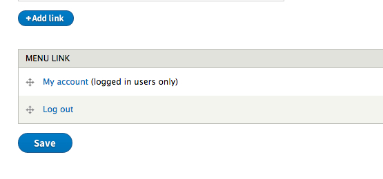
tim.plunkettI think my only major complaint is the reduced line height on local actions ("Add link" in this picture)
I still think the overuse of rounded corners is silly, but that line height is the only blocker I can see.
Comment #36
LewisNymanA little bit of work tweaking button--small. I've added 1 pixel of vertical padding either side. I looks a bit beter now but it no longer matches the height of form elements, which was quite nice.
I also removed the inverted gradient on press. I didn't like it either, just the inset drop shadow is nicer. I thought it was an accessibility thing.
Comment #37
Bojhan CreditAttribution: Bojhan commented@Lewis It kinda was an a11y thing, but frankly I am not sure if it needs to be there. I hope that a11y people at some point will chime in, sadly they haven't been providing much feedback yet.
Could you show the tweaked action button? Lets keep in mind though that we designed it to be smaller than an ordinary button. Because if its as big as a button, it is distracting and voluptuous which is at odds with our more tone-down styled. It also looks weird when you have two buttons near each other, as they don't differentiate.
@tim I understand you don't like the roundness. I hope you our arguments in the https://groups.drupal.org/node/283223 explain our position from the visual design side, with a style change like this its really hard to please everyone - as different tastes exist, its hard to find one that pleases everyone . Our goal is to make a consistent but strong style, with that we will introduce elements that not everyone likes. But in the end it will hopefully strengthen the brand, we fear that trying to please everyone will instead create a very broad style guide - which will be far less effective.
I am very open to discussing this more, as I am on vacation its a little hard - feel free to ping me on IRC about this, once I am around, I wanna make sure we are not upsetting anyone with this.
Comment #38
LewisNymanRe-roll
Comment #39
edward_or CreditAttribution: edward_or commentedLooks great. Few questions
1. Should we wrap text in a button if text is larger then width? Currently text doesn't wrap. See screenshot.
2. Should we set explicitly set .button to not be underlined as a default? If this class was to be useable on a link tag for example.
Also noticed that .button--primary had its text-shadow set with rgba and not hsla. Also not sure if intentional or not it had 1px set as the y-offset which looked a little worse to me.
Comment #40
mordonez CreditAttribution: mordonez commentedI've tested the new button for local actions and looks like the image.
Comment #41
mordonez CreditAttribution: mordonez commentedComment #43
edward_or CreditAttribution: edward_or commentedTrying again with a more recent version of 8.x
Comment #44
edward_or CreditAttribution: edward_or commentedComment #45
LewisNyman#43: seven_buttons_1986074_40.patch queued for re-testing.
Comment #47
LewisNymanRerolled
Comment #48
fubhy CreditAttribution: fubhy commentedThis is my application for the most nitpicky review ever. (period)
Oh I hate myself for saying this, but please use ' instead of `
Missing period.
Missing period.
.boxshadow is commented out. Is that correct?
Typo in 'temporaily'. Also, 80 characters.
Missing period.
Missing period.
Missing whitespace after the typecast.
Can we move these to #attached somewhere?
Missing period.
Comment #49
oresh CreditAttribution: oresh commented@fubhy - you're a period lover, aren't you? :)
/*.boxshadow*/ - @LewisNyman please verify. either remove the class or remove the comments :) Don't leave a commented selector in css. Thank you!
Comment #50
ry5n CreditAttribution: ry5n commentedThose commented .boxshadow selectors are there because I wanted to only override focus outlines in browsers that can render the alternative – otherwise it’s an a11y issue. However, the boxshadow test was deemed too expensive to add to core’s version of Modernizr, so the styles are commented out. We should be able to use a conditional class or something to restore outline for IE8 at least.
Comment #51
LewisNymanI think, for the sake of getting the new styling in, we should postpone the focus styling to a follow up issue.
Comment #52
LewisNymanI have removed the focus styling and implemented all the changes in #48 apart from:
Based on the conversation in #1969916: Remove drupal_add_js/css from seven.theme I don't think it's feasible to implement #attached right now. I could be wrong in this instance though.
Comment #53
Bojhan CreditAttribution: Bojhan commented@Wim Could you provide feedback on this, how to handle the attach issue.
Comment #54
LewisNymanLooks like there's an answer here.
Comment #55
LewisNymanI've added the same technique used in #1969916: Remove drupal_add_js/css from seven.theme. I also removed the outline from the hover/focus styles, I'm not sure if we can get away with just the current focus styles alone.
Comment #57
LewisNymanWhoops! I mixed up the file names.
Comment #58
tstoecklerWrong indentation here.
Leaving at needs review for actual code review.
Comment #58.0
tstoecklerUpdated issue summary.
Comment #59
Outi CreditAttribution: Outi commented#57: seven_buttons_1986074_56.patch queued for re-testing.
Comment #61
Outi CreditAttribution: Outi commentedI rewrote the patch as the latest one didn't apply on the actual state.
Comment #62
Outi CreditAttribution: Outi commentedSome screenshots of the buttons with the latest patch on the test pages:
/admin/content
/node/add/article
/node/1/edit
/admin/structure/views/view/content
Comment #63
LewisNymanComment #64
Bojhan CreditAttribution: Bojhan commentedHmmm, it looks like the buttons are a bit big - especially their font-size.
Comment #65
LewisNymanI think the previous font sizing was based on Source Sans Pro. I've reduced the font size by one pixel to 14px. 13px looks too small.

Comment #66
Bojhan CreditAttribution: Bojhan commentedThere we go, that looks much better :). The font weight is incorrectly applied to the danger styling, that should not have a 600 point weight, it should have no additional weight.
Comment #67
LewisNymanComment #68
Outi CreditAttribution: Outi commentedSets the danger button font-weight at 400.
Comment #69
Outi CreditAttribution: Outi commentedComment #70
Bojhan CreditAttribution: Bojhan commentedYup, this looks correct! Thanks
Comment #71
rteijeiro CreditAttribution: rteijeiro commentedPatch applies well and danger button size looks correct. Let's go for RTBC!
Comment #72
LewisNymanI've tagged this issue with “styleguide-independent”, which means it can be committed on it's own without causing visual regressions.
Comment #73
nod_I'm concerned about this patch use of drupal_add_library and #attached, need wim, sdboyer or catch to double check.
Comment #74
Bojhan CreditAttribution: Bojhan commentedLets see if Wim can help us
Comment #75
nod_Checked with sam on IRC, all good for now.
Comment #76
sdboyer CreditAttribution: sdboyer commentedyeah, lemme just qualify that a tad. in the hard problems discussion of render caching/
drupal_render(), Fabianx and catch suggested a refactoring ofdrupal_render()that *should* allow this sort of thing to be OK...but that remains theory. as things currently stand, however, adding libraries in#attachedwhile within preprocess or theme functions would be breaky for our attempts to rip outdrupal_add_css()anddrupal_add_js()globals.i talked with catch about it briefly, and he didn't have a gut feeling on whether or not this should go forward. my feeling is that *actually* killing all the globals is still a little ways away, and since we already have instances of these sorts of things elsewhere, i won't un-RTBC. i will, however, say that if there IS another not-terribly-difficult way of moving the library attaching into somewhere that's neither a theme function nor a preprocess, then please, do that :)
so yes, i hereby vow to eat shit if we end up not being able to accommodate library declarations in theme/preprocess functions.
Comment #77
Wim LeersI'm sorry, lots of small problems here … :) But looking very nice, and LOVING the explanations for the "specialty CSS"! But, really, I think this should be reviewed by a CSS expert who hasn't worked on this issue yet (maybe John Albin?) — I'm not the right person to review this. I think you're almost there though, and can't wait to see this improvements land to Drupal :)
This is AWESOME. Thank you.
s/@TODO/@todo/
Why can't this be done yet in this patch?
Commented CSS? Should be removed.
I haven't seen this pattern before in Drupal core. Is this acceptable?
Why a newline here, but not above?
WTF?
Why repeat this if it's already set on .button?
Why not apply the similar nice whitespace indentation thing that is applied to the linear gradient background CSS?
Same as .button--primary — why repeat?
I'm not a CSS expert, but it feels weird to be using px sizes for this rather than relative sizes? If there's good reasons for this, just answer "for good reasons, you CSS n00b", and forget about this :)
Another unresolved todo that looks like it could be resolved.
Comments that should be deleted.
80 col wrapping
!important — WAT?
Already set in .button--danger.
Missing trailing period.
s/modernizr/Modernizr/
Wrong indentation.
s/@TODO/@todo/
s/$types/$type/
(As per the other hook implementations.)
- s/modernizr/Modernizr/
- Missing trailing period.
1) Why do we have this if we're attaching it in the preceding hook implementation anyway?
2) This should be changed to
Comment #78
XanoSome of those code comments that Wim quoted contain contractions or abbreviations. We should only use full words for readability.
Comment #79
ry5n CreditAttribution: ry5n commentedNote it’s the box-sizing rule only that should be moved to Seven’s base css.
Can be removed if we are dropping the custom focus styles. Otherwise should be uncommented and retained.
These are from my original work; this is my preferred sectioning style but does not conform to Drupal standards. Can be removed, although it makes the stylesheet less readable.
Stray newline can be removed.
This should be fixed to use either em or (preferably) rem units. We can use rems since IE8 is no longer supported, and they provide global scalability while ensuring that buttons won’t grow or shrink in size when placed in sections with different font sizes. Unless that is the desired effect (in that case, use ems).
`text-decoration` repeated on all states as a specificity precaution – it’s likely to be specified elsewhere on hover, e.g. a:hover. The less desirable alternative is !important.
`linear-gradient` prefixed rules are indented so their values align (making multiline editing easier). This follows the same pattern.
Since `.button--primary` is applied always to `.button` elements, we need to ensure that the primary’s border color doesn’t get overridden by the base hover state.
Should be a relative unit, em or rem.
Same here.
And here, etc.
These appear visually as links, not buttons, so they should get the .link class and extend it as .link--danger. This lets us avoid resetting the hell out of the button styles. The tricky part is to apply the right classes on the right elements. This is harder than it should be :)
Comment #80
ry5n CreditAttribution: ry5n commentedBTW (and maybe @LewisNyman can answer this) do we have anything using the `button-group` styles in yet? Otherwise, maybe they can be moved into the patches for the issues that need them?
Comment #81
LewisNymanYep, we should move any button-group styling to #1989470: Dropbutton style update for Seven
Comment #82
mcjim CreditAttribution: mcjim commentedIncorporated comments from #77 and #79.
Removed button-group styles for now as per #80.
Comment #83
BarisW CreditAttribution: BarisW commentedI believe this needs a little bit more love.
Some screenshots.
Performance page: good.

Save theme config: variant 1

Save theme config: variant 2

Delete a node: no red button / link?

Edit node: do we need three different styles?

Comment #84
Bojhan CreditAttribution: Bojhan commentedThe Save theme config: variant 1 should ideally be fixed. There is no reason not to have a general Save button below the fieldset, it being in a fieldset is a little wierd.
So I think all these delete button issues are separate. We have different styling applied to different places, this should all be made consistent. I am not sure if that is part of this patch, but it would be great to fix.
The save and keep published has a new design, I assume once this is in we work on that.
Comment #85
LewisNymanThe save and keep published design will be tackled in #1989470: Dropbutton style update for Seven
There are loads of places where we are not using the correct button type. Let's break those down in other issues though.
Comment #86
nod_#82: seven_buttons_1986074_82.patch queued for re-testing.
Comment #87
nod_Should apply fine, let's get that in and work on the follow-ups :)
Comment #89
LewisNymanLooks like theme_menu_local_action shifted. Good catch!
Comment #91
LewisNymanMy mistake, messed up my branches.
Comment #92
Bojhan CreditAttribution: Bojhan commentedOk, RTBC :) Please credit the designers.
Committers keep in mind that bugs like noted in #83 will be there, they are however not related to this patch
Comment #93
tim.plunkett.
.
Comment #94
LewisNymanThanks.
Comment #95
Bojhan CreditAttribution: Bojhan commentedComment #96
nod_#94: seven_buttons_1986074_94.patch queued for re-testing.
Comment #97
Wim LeersSorry to spoil the party, but this still isn't ready yet.
Why is this still a @todo?
(I asked that in ##7, on Sep 25 already!)
From ry5n's comment in #79:
Why can't we do this here yet?
That's a whole lot of
!important…Spacing is off.
\Drupal::l()Because…?
Comment #98
LewisNymanThanks for the review Wim.
I've address all the issues mentioned above apart from the two @todos:
Sorry I must of missed that. A global box-sizing rule is a very difficult thing to retro fit onto an existing 'framework'. It has the potential to break every CSS width set in the theme or a module. IF we do decide to do this, it should be well considered in a separate issue.
I've been trying to reduce the temptation to widen the scope of these styleguide issues beyond styling. It's not their role to perfect the markup in Drupal, that's the role of dreammarkup. We've made a few easy and subtle mark up changes here but removing the button class completely is a lot more complex and not essential for implementation. I've created a followup dreammarkup issue and referenced it in the comment #2123731: edit CSS file using .button:not(a.button--danger) so that no reset is needed on button--danger.
Comment #100
LewisNyman#98: seven_buttons_1986074_98.patch queued for re-testing.
Comment #101
Wim Leers#98: Can you create follow-up issues for that first @todo that you can't fix today, so that you can link to it from the code? Then at least people won't go "WTF?" because they'll be able to see the reasoning you just posted there :) Just like you've done for the second @todo!
BarisW's "Delete a node: no red button / link?" remark of #83 is also not yet solved.
Just three more comments for the interdiff:
Two spaces instead of one, and should be
\Drupal, notDrupal.Didn't have to be removed, but more importantly: now leaves a stray empty line above it.
How is this any better? That's a crazy, crazy value. Plus, it should probably be documented why we have two successive font-size properties (probably due to lacking browser support).
Re-reviewed the entire patch, found one more extremely nitpicky problem:
Should respect 80 col wrapping.
Did manual testing, looks great, I will RTBC as soon as the above things are fixed :)
Comment #102
LewisNymanBojhan covered BarisW's "Delete a node: no red button / link?" remark in #84. It's a separate issue.
Everything else is covered though! Crossing fingers.
Comment #103
Wim LeersPoint 1 is feedback/concern about the process. Point 2 is the very last nitpick…
Wow.
1) That's a much less crazy value :)
2) The result is that button text is now far less "OMG HUGE" than in the previous patch, which I must say was unexpected.
3) The fact that such a big difference requires a non-designer like me to make obscure remarks about crazy-looking values is kind of scary to me. How is it possible that neither you nor Bojhan noticed this? A simple simplytest.me uncovers it right away!
You forgot to update this one.
Comment #104
Bojhan CreditAttribution: Bojhan commentedYhea, we need to go form by form and see if the right styling is applied. There are many delete links that are wrong, primary buttons that are not styled primary, double primary buttons, etc. However that is not the goal of this patch, therefor I think its better to deal with them in a separate issue.
3) I thought those crazy values had a reason, I am no CSS expert :) So I ignored it.
Comment #105
Bojhan CreditAttribution: Bojhan commenteddoh, crosspost
Comment #106
LewisNymanIt's common to have numbers with many decimal places when dealing with relative values. That's the result you get when dividing 14 by 13. That changed dramatically in the last patch when we switched to rems because the root font size is much bigger than our base font size. I guess I was in a rush and missed the massive buttons.
Comment #108
LewisNymanWhen I look in menu.inc at the original
theme_menu_local_actionI see this:I don't really know what's going on here but I would think the lines in seven.theme should match?
Comment #108.0
LewisNymanAdded test pages
Comment #109
LewisNymanComment #110
LewisNymanI've changed the theme function l() calls back to match the original theme function in menu.inc. If they don't fail there I don't see a reason to change them in the theme.
Comment #111
Wim LeersOh, it's equally inconsistent in menu.inc… then there's definitely no reason for me to insist to do things correctly. That can be a different quickfix nitpick patch.
Patch still works as expected. RTBC again!
Awesome work — thank you! :)
Comment #112
Bojhan CreditAttribution: Bojhan commentedIn terms of crediting designers, please make sure you credit "r5yn, Bojhan, yoroy". We spend many weeks, iterating on these buttons - fine tuning all the different styles, a11y optimisation etc.
Comment #113
Xano109: seven_buttons_1986074_109.patch queued for re-testing.
Comment #114
webchickWow, this is a great patch! That new button style really "pops!" :D (Seriously; awesome work!)
The only thing that looks wonky is the node add/edit form, because it has a dropbutton next to a regular button and right now that looks like this:
This will get cleaned up once #1989470: Dropbutton style update for Seven is in core, so I'll head over there and tag that one as an alpha target to hopefully get some more visibility on this.
In clicking through, I also found a couple of other wonky things (lots of admin pages without a primary button declared, esp. single-button forms which is weird, admin/people has not one, not two, but THREE apply buttons, admin/structure/types/add has two primary buttons, etc.) but they're not strictly related to this patch, so I'll file follow-ups for them.
Committed and pushed to 8.x. ROCK!
Comment #115
Dave ReidIs it worth asking what happens when the primary button is also disabled? Does it revert to the non-primary styling? Does it not change from the primary style?
Comment #116
Bojhan CreditAttribution: Bojhan commented@Dave Reid In short, yes. https://groups.drupal.org/node/283223#Buttons is a more accurate visualisation.