
Problem/Motivation
Now that the module page has gotten a bit of a makeover, time to make it a bit more usable. There have already been several issues discussing this (see "related" issues below) but it became clear that the changes being discussed need to be completed in smaller chunks. This issue is meant *only* for the "lets let users filter the modules in the list" chunk. It should be committed or rejected only on that specific bit of functionality.
Proposed resolution
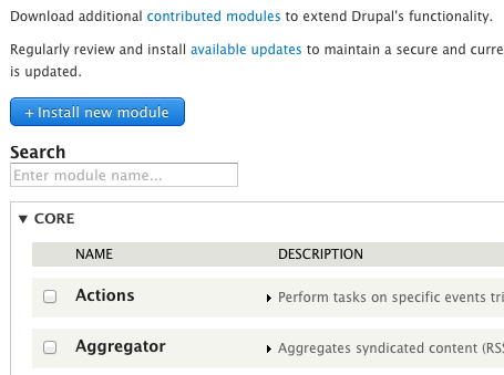
The goal here is to add a "filter by" textfield to the modules listing page, similar to the filter box used in the module filter module.
Remaining tasks
Review & refine submitted patches
User interface changes
The goal here is to add a "filter by" textfield to the modules listing page, similar to the filter box used in the module filter module.
Related:
#538904: D8UX: Redesign Modules Page
#1790280: Module page redesign 2.0
#396478: Searchable modules page
| Comment | File | Size | Author |
|---|---|---|---|
| #64 | module_filter-1848064-64.patch | 5.24 KB | Wim Leers |
| #61 | core-js-module-list-filter-1848064-61.patch | 5.24 KB | nod_ |
| #59 | module-filter-1848064-59.png | 36.53 KB | star-szr |
| #56 | drupal8.system-modules-search.56.patch | 5.22 KB | sun |
| #56 | module-search-input.png | 6.75 KB | sun |


Comments
Comment #1
bleen CreditAttribution: bleen commentedHere is a very rudimentary first swing ... plenty to improve here, but it does work.
Comment #2
bleen CreditAttribution: bleen commentedComment #3
bleen CreditAttribution: bleen commentedFor what its worth, #1 is green ... testbot is just not updating the issue right now: http://qa.drupal.org/pifr/test/390558
Comment #4
sunIf this is purely JS-driven (which is fine with me), then we need to hide that form element by applying the
.js-hideclass.There's only one small flaw with that; the current style in system.base.css is defined as
.js .js-hide, which means that it is only triggered if JS is enabled. I do not understand that decision at all and thus I think we should simply remove the.jspart from that as part of this patch, so that .js-hide means .js-hide, regardless of whether JavaScript is enabled or not.Comment #5
bleen CreditAttribution: bleen commentedThis patch makes the changes suggested by sun in #4 ... still needs some love though
Comment #6
eigentor CreditAttribution: eigentor commentedSo now there issues. Any reason why not stick to the other one? I like fresh starts, but this one may have a harder time getting the eyes it needs.
Comment #7
greenSkin CreditAttribution: greenSkin commentedWhy do we need to hide the filter textfield when JavaScript is enabled, i.e., why do we need js-hide on the textfield? Are we meaning .js-show?
#335185: Add js-show CSS class for hiding elements when JavaScript is disabled
Comment #8
greenSkin CreditAttribution: greenSkin commentedAdding/removing .js-hide to the element I think would be more efficient than trying to animate the row's visibility. The list can grow to be quite long and animating potentially hundreds of rows at once can be intense.
Comment #9
Wim LeersReroll, together with Bojhan on a mini sprint we did :)
Changes:
element-hidden(i.e.display:none) and the new.js-show(which only shows something when JS is enabled)#placeholder, the form title is marked as invisiblequeryinstead ofq<details>when they're emptyComment #10
tstoecklerThese should be two separate strings.
There's already #335185: Add js-show CSS class for hiding elements when JavaScript is disabled. Don't know if we should include that here or mark this postponed.
Comment #11
Wim Leers@tstoeckler Thanks for the review! You're of course right that those classes should be separated. The latter I agree with in principle, but that issue has been silent for more than 7 months, so I'd rather just do it here. We can continue to bikeshed the details post-feature freeze, but it'd be sad to not see this huge improvement go in because of such a minor obstacle.
Comment #12
bleen CreditAttribution: bleen commentedAgreed!
Comment #13
tstoecklerOK, I'm fine with that, can we please incorporate the "element-hidden" part, then though, please? It seems the way the patch implements it, whenever I want to use 'js-show' I actually need 'element-hidden' and 'js-show'. The following should make that simpler:
Comment #14
Bojhan CreditAttribution: Bojhan commented@tstoeckler Perhaps you can roll a patch :D?
Comment #15
sunRelated, but not the same: #1868444: Introduce tags[] in module.info.yml file to categorize modules by provided functionality.
Apparently, I took a very similar HTML5 + JS-driven approach there. We might want to coordinate the direction of these two patches in terms of their server-side and client-side architecture. AFAICS, they're architecturally not very different, so that should be easy to coordinate. I don't mind whichever lands first, but ideally we don't make it harder for the other one follow afterwards. :)
Lastly, let me also clarify the title of this issue to match its actual goal, and to differentiate it from aforementioned issue.
Comment #16
tstoecklerHere you go :-)
Works quite nicely BTW!
Comment #17
eigentor CreditAttribution: eigentor commentedFrom a user's perspective this works very well and blazing fast.
Below a short video that shows how it works to celebrate it :)
http://screencast.com/t/ZwsMU3zG
Comment #18
Bojhan CreditAttribution: Bojhan commented@sun Could you perhaps provide feedback, what we need to do to streamline the architecture? I do think that tags needs a lot more discussion, so I agree that we should not make this patch dependant upon tags.
Comment #19
nod_Some code improvments around selectors. Some of them are not as useful as they look (caching
$rowsAndDetails,$details,$labels) since jQuery has an internal cache but I'd rather make this explicit (it's on the 1 or 2 ms scale).See:
http://jsperf.com/drupal-filter-table/2
http://jsperf.com/text-html
Not putting an interdiff since I only touched the JS and it's much clearer to compare the two patches side by side than within an interdiff. Hopefully this form of the code is more obvious to understand (also named functions helps debugging and profiling).
The perf improvement is not huge, it can be seen though. The biggest one was the filter table jsperf link, this one would have hurt once there are a lot of packages. Most of it was just moving code around.
Comment #20
Wim LeersThanks, tstoeckler and nod_ :)
Two notes on your reroll, nod_:
- I had looked up the performance difference between text() and html(), and the latter was deemed faster. I guess that data (on StackOverflow) was outdated, if not: wtf.
- IIRC selecting the "real" table based on a class was not reliable because the sticky headers JS is what sets the class that you're currently selecting on. And that class only gets set if you scroll down far enough. Hence I was selecting the last table instead of a table with a certain class. If you're certain that your approach also works, then that's of course better but you'll still have to update the comment.
Comment #21
nod_yeah on js perf I used the wrong class name. In the patch it uses sticky-enabled which is set on the PHP side and used by tableheader.js script. As long as the module page is using tableheaders there won't be a problem.
Comment #22
sunJust to clarify the significant difference between this feature and #1868444: Introduce tags[] in module.info.yml file to categorize modules by provided functionality.:
Both can be helpful, and both definitely improve the discovery of extensions on that page.
And: Both are not able to make any sense of the packages/groups on this page. In fact, the JS code here is much more complex than it should be, just because of the weird details/package groups + multiple tables. It's really time to get rid of them.
That said, the above screenshots might not be fully correct, since it appears that the JS failed to search in the descriptions. (Typing "allow" should have yielded tons of results, but the actual results were empty.)
I'm going to have a quick look into that + a few other details.
Comment #23
nod_While I might agree with searching the description, placeholder does say "Search module name".
Comment #24
sunAh, that's more like it!
Comment #25
sunI'd be happy to rather move on quickly here.
That said, it should be clear for everyone that this is a utility for advanced users. A search always means that you already know what to search for. Novice users don't know what to search for.
Comment #26
Wim LeersMakes sense if we want to add more filters, as @sun is planning :)
Is this an appropriate use of the rel attribute? It *seems* okay, but I'd like to see this confirmed. Especially because you're using jQuery selector syntax, instead of just "system-modules".
Nice — thanks.
Currently, it looks like the comment applies only to the first CSS declaration, but it actually applies to both. I'm not sure what the convention is here, but it definitely would be less confusing if the newline in between the two wasn't there.
This used to refer to the key in the form render array, but that's no longer how it's called. Should be updated.
Why the .once()? AFAICT this won't have any effect at all?
Comment #27
Bojhan CreditAttribution: Bojhan commented@sun Yup, its known-item seeking. I think its oke, thats why we are making this, things like tags is much better at discovery.
Comment #28
tstoecklerI totally agree, but I think our (sort of upcoming) CSS standards dictate a newline between declarations. I think it would be fine to "violate" that here, because core is very inconsistent in that anyway and, as you explain, it would make things clearer in this case.
Comment #29
tstoecklerAs a matter of fact, here goes: http://drupal.org/node/1887862#comment-6992780
Comment #30
sunOK, final patch.
Comment #31
TravisCarden CreditAttribution: TravisCarden commentedThis should probably be plural (i.e. "Search modules..."). But since there's no other indication in the interface of whether or not it searches description text, too, I think "Search modules by name..." would be even better.
Comment #32
Wim LeersI'll get this done.
Comment #33
sunThanks for testing!
So apparently, the old/previous code assumed that there is only one possible string source for each table row. Hence, it first matched the module label (positive match for "act" » showing the "Actions" row), and then it matched the module description (negative match » hiding the "Actions" row).
That was a little bit more tricky to figure out. ;)
Comment #34
Bojhan CreditAttribution: Bojhan commentedHow close is this? Its hard for me to figure out
Comment #35
TravisCarden CreditAttribution: TravisCarden commentedNow it works! Nicely done.
Comment #36
Wim LeersRTBC.
Only a tiny comment change.
Comment #37
nod_RTBC +1
Comment #38
webchickOh this makes me SO HAPPY!
However, I'm assigning to Dries because he was against it back in the day for D7.
Comment #39
Dries CreditAttribution: Dries commentedWhy wouldn't you use your browser's search functionality? You would think that site builders know how to.
Comment #40
moshe weitzman CreditAttribution: moshe weitzman commentedSome people don't know how, and some people know how but don't think of it so they scroll. This module is very popular in Contrib, so I think the need has been expressed by site builders. For folks who don't follow links, there are currently 75,000 D7 sites running Module Filter module.
Comment #41
webchickThis is why. :)
https://dl.dropbox.com/u/10160/modulefilter.mov
Comment #42
webchickVideo success! :D Dries is convinced. ;)
Feedback from Dries:
- We should put a label on the field. (I think is is probably also important for accessibility)
- It should probably be aligned to the right, like search boxes in other applications (e.g. Chrome, etc.). The placement where it is right now is weird and hard to see.
Comment #43
webchickComment #44
sunThe browser search matches on strings that you do not want to match on.
Also, the browser search loops over the entire (huge) page, instead of doing the opposite that the table filter is doing: namely, present filtered data results, instead of hopping through a large set of unfiltered results.
This interface feature has been requested many many times already. It consumes almost no code, and definitely improves the ability to find modules — especially since the multiple details-wrappers/tables are getting "compact" with an active filter. The focus is on "filter", not "search".
If you try it, you will see that there is a big difference in terms of user experience.
Also, the base JS functionality for filtering/searching tables that we're introducing here has the potential for being re-used for other tables. I will definitely look into that after this patch has landed.
Comment #45
redndahead CreditAttribution: redndahead commentedProbably a cross post see #42
Comment #46
sunHm. I will see what I can do about the feedback in #42.
Comment #47
Bojhan CreditAttribution: Bojhan commentedyay, @Dries agreeing with everyone else :)
The reason its not on the right, and with a label on top. Is because you can't really stretch this as a pattern to other pages, as they might have the weight selector exposure on the right. But also because your eye then doesn't have to move from the far right, to the far left (this is actually quite important, in terms of effectiveness) And there is no label on top, because purely a11y we do not require it - and because its visually a bit of a "hang on" given that its not part of any vertical stream of forms. But given that the module page is already a special beast, I am all for doing this if that keeps it from going in.
Comment #48
Wim LeersNote that a label is in fact present, it's just not visible. It's only there for screen reader users.
Comment #49
sunI looked into this, and do not have a new patch, but only arguments for the current implementation instead:
I'm happy to re-evaluate the label + alignment situation in combination with that other issue once more, but for now I think that the existing patch is good and ready.
Comment #50
salvisThis is working very nicely, but I wish I could search for module machine names as well.
Search for 'locale' and you come up empty, because locale.module is called "Interface Translation"...
Comment #51
Wim Leers#50: that could be a follow-up. (That could potentially confuse the user because you're filtering on a string that is not presented to the end user at all!)
Comment #52
sunI really like the idea of #50, since I know that these mismatches have tripped up pretty much every developer out there. But I also agree, we can do that in a follow-up.
I think we're actually back to RTBC here.
Comment #53
Wim Leers+1 for everything that sun said :)
Comment #54
webchickHm. I still think we need something more like #24, with the label showing. That's what Dries asked for here.
Comment #55
webchickBtw, if we want to use HTML5 fancy placeholder text, I think that's fine, but it should be a follow-up. Here would be the first time we're introducing it into the interface, and it's a bit awkward when compared with surrounding forms.
Comment #56
sunWe are using the same pattern in Search module's search block form already. That said, the search block only has an invisible label, but no placeholder text yet, so it looks like that wasn't fully upgraded for HTML5 yet.
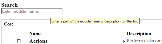
Anyway. I performed the following changes:
1) made the input label visible
2) renamed the label to "Search"
3) renamed the placeholder text to "Enter module name..."
4) added a 'title' attribute (tooltip) to further explain usage.
Comment #57
jibran#1892872: Add title attribute to modules administration page Related and potential follow-up discussed in #50 and #52
Comment #58
bleen CreditAttribution: bleen commentedI really, really think we have it this time ... applied and tested locally
Comment #59
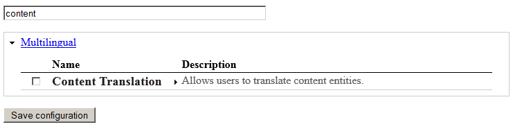
star-szrHere's a new screenshot:

I don't think this is quite working as expected, unless I have something funky going on locally.
These searches didn't work as expected, i.e. they don't find the module in question:
Comment #60
star-szrI'm pretty sure only the description is being searched.
Comment #61
nod_Looks like sun rerolled with an old version of the code. Should be fixed now.
Comment #62
star-szr#61 works as expected, thanks @nod_. RTBC from me.
Comment #63
star-szrMinor nitpick: we should probably use an ellipsis character (…) instead of three dots (...) in the placeholder text. The patches from #9 through #24 had this.
Comment #64
Wim Leers#63: good catch! I used the ellipsis in #9. It appears sun has accidentally swapped the ellipsis for three dots. Fixed in this reroll of #61.
Comment #66
Wim Leers#64: module_filter-1848064-64.patch queued for re-testing.
Comment #67
tstoecklerBack to RTBC.
Comment #68
TravisCarden CreditAttribution: TravisCarden commentedForgive me if this is an ignorant question, but shouldn't we use HTML entities for non-ASCII characters like ellipses (
…)?Comment #69
tstoecklerI wouldn't know of any issues with using the ellipsis character directly in this case. Either way, this is the way we do it in some other places in core as well, so if there are problems, please open a new issue.
Comment #70
tstoecklerOh, and it's definitely not an ignorant question :-) I never know these sort of things either, but I tried out the patch and it works, so...
Comment #71
Wim Leers#68–#70: It's a good question indeed — please see http://stackoverflow.com/a/436748 for the rather mundane answer :)
Comment #72
TravisCarden CreditAttribution: TravisCarden commentedRe #71: So I suppose the question is, does having a Unicode character in our source code pose any potential problems for contributor's whose editors may not support it? Presumably there aren't any Git pollution concerns since we already have special characters in contributor's names in MAINTAINERS.TXT files.
Comment #73
sunHTML entities generally date back to 1) the HTML4 era and lack of browser support for UTF-8/Unicode and 2) the lack of UTF-8/Unicode support in text/code editors. They are no longer used today, since proper UTF-8 support has finally arrived everywhere.
The only common exceptions are characters that are invisible and which could be overlooked and mistakenly removed, such as
. Regarding non-breaking spaces, as well as paragraph separators and line-feed characters (yes, there are even characters for that), Unicode actually provides multiple incarnations for them with different widths/lengths/heights/sizes, but browser support as well as text editor support is lacking behind. There are chances, however, that, in a very distant future, HTML and browsers will understand them natively, and that they might even replace the P and BR elements entirely.Comment #74
webchickI'm going to call this a major task, rather than a normal feature. This page is virtually unusable without this functionality, so I don't think it should be blocked by feature freeze.
Checked this over with Dries, and he approved. Committed and pushed to 8.x. YEAH! :D :D Great job, everyone!!
Comment #75
Wim LeersYay :D
Comment #76
webchickOops. Thought I actually did that. :)
Comment #77
Dries CreditAttribution: Dries commentedI was okay with this being committed -- it is better to have something than nothing. :)
However, I'd like to discuss the placement of the search button some more.
Bojhan wrote: The reason its not on the right ... is because your eye then doesn't have to move from the far right, to the far left (this is actually quite important, in terms of effectiveness).
I disagree with this. It is an extremely common pattern to have search on the right -- and I'm sure it has been usability tested to death. By putting the search on the left, directly above the table, it kinda suggests that searching is required. It is not. I feel we put too much UI-emphasis on search now. People may wonder why they have to search.
Comment #78
Bojhan CreditAttribution: Bojhan commented@Dries That its common, doesn't necessarily mean its more effective - just means its more common, it was actually evaluated a lot - but you are missing context in your argument. Browser search has no relation to placement on the page, in our case the search box does - you are searching on the titles placed right below. They are on a fixed position - its not variable like it is in browser search (CTRL-F). See a search engine for example, in an application use case for example Gmail the search box is aligned nicely with the titles of the e-mails. Imagine if in gmail, the search box would be on the far right - that would be a pain you'd have to move your eye from the far left to the right, every time you search.
Personally however I am fine with placing it on the right, and would actually prefer it that way - because as Dries mentions its too prominent atm. However we cannot do this yet - because we often have the "expose weights" links there - which would kind of create a "blurb" of stuff on the right rather than a nicely aligned search box. It does look like we might be able to remove that link though, given that the new toolbar configuration uses ARIA to indicate how to move things up and down and announces its place. If we can make that happen I am more than happy to move it to the right.
Comment #79
Wim Leers#78: there are no weights on the modules page. So, no risk of causing a "blurb" :)
Comment #80
Bojhan CreditAttribution: Bojhan commented@WimLeers Sure, I am just thinking ahead - when we employ this pattern elsewhere.
Comment #81
sun@Dries: Can you create a follow-up issue for the placement, please? Thanks!
Comment #82
BerdirLiked this enough to open #1919470: Add a search field to the test overview page :)
Comment #83
LewisNymanHey guys, this is hot stuff, well done!
Just so you know we introduced a bug when using the Overlay module. Issue here:
#1919564: Listing for Overlay module's layout changes when viewed within the Overlay
Comment #85
yannickooJust opened another issue to set an autofocus on the "search" field.
#2096347: Add "autofocus" attribute to the module search