
Problem/Motivation
This is a spin-off from #1510532: [META] Implement the new create content page design. We need to implement the two-column layout as designed.
Proposed resolution
Drupal has a new layout system, but as of this writing layouts cannot yet be put to use (if you know otherwise, please post). The best thing for Drupal is to implement the proposed layout for the node form the old-fashioned way and convert when the layout system is in place. The form styling is a separate issue, as is the conversion of vertical tabs to collapsible elements.
Follow-ups
| Comment | File | Size | Author |
|---|---|---|---|
| #111 | 2col-message.png | 38.56 KB | echoz |
| #103 | 1838156-103.patch | 491 bytes | echoz |
| #103 | 2col-no-space.png | 33.9 KB | echoz |
| #100 | Screen Shot 2013-08-13 at 2.31.14 PM.png | 21.77 KB | tkoleary |
| #100 | Screen Shot 2013-08-13 at 2.47.05 PM.png | 31.27 KB | tkoleary |


Comments
Comment #1
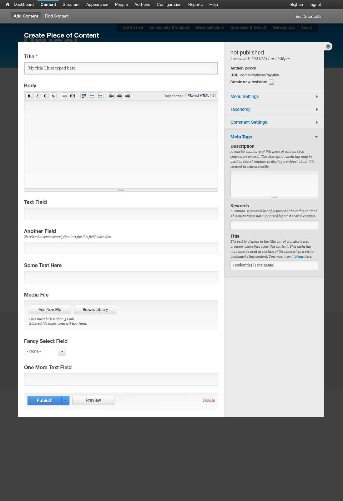
ry5n CreditAttribution: ry5n commentedThis is the general idea.
Comment #2
ry5n CreditAttribution: ry5n commentedThis patch adds the layout css and moves things about as far along as possible until #1838114: Change node form’s vertical tabs into details elements is ready. Also: tagging.
Comment #3
ry5n CreditAttribution: ry5n commentedThis can receive a first a11y review now, for things like source order, and a review for the general implementation, which is provisional until we have the Blocks and Layouts features ready.
Comment #4
ry5n CreditAttribution: ry5n commentedNeeds review! Can't be committed after feature freeze!
Comment #5
ry5n CreditAttribution: ry5n commentedSince this is part of #1510532: [META] Implement the new create content page design, which is major, making this match.
Comment #6
aspilicious CreditAttribution: aspilicious commentedProblem still is that accesibility wise the submit button should come after the content on the right. So basicly it has to jump from the left side to right and back to the left in the end.
Does that make sense to you? And can it be done?
Comment #7
ry5n CreditAttribution: ry5n commented@aspilicious Already done in this patch I think; the form actions (buttons) are printed in $regions['footer'], the collapsible fieldsets in $regions['secondary']. That's what we want for accessibility, correct?
Comment #8
eigentor CreditAttribution: eigentor commentedUh, oh this does not really work:
Problem is the widths do not fit. The content (layout-region-main) has 65%, the meta which should be right (layout-region-secondary) has 35. So far, so good. layout-region-main also has 2em of padding-right, also layout-region-secondary appears to have a tiny bit of padding right.
Also the fieldset with the published information is not inside layout-region-secondary but -primary and thus does not get floated right at all.
The padding of layout-region-main needs to be in percentage values, say 2% and deducted from the region.
When fixing the widths, it still does not look quite right:
It should go right to the top of the overlay. But #page contains everything and cannot go up there because #branding that holds the breadcrumbs is in the way. Even when that is gone it does not fit...
Nothing big, but needs adressing.
Another problem is the summaries on the fieldsets that show the status (published, promoted to front page...). But I guess this one is easy as those should be gone completely.
I applied all three patches: for the Published checkbox, the vertical tabs as fieldsets and this one. Maybe there is some unwanted interaction between the patches.
Comment #9
ry5n CreditAttribution: ry5n commented@eigentor Thanks for the review. Much appreciated.
The layout CSS numbers look wrong at first because I'm using
box-sizing: border-box. They should work though, I believe the layout is broken for you because, ironically, I tried to keep this patch independent of #1838114: Change node form’s vertical tabs into details elements and that patch is not accounted for. I'll to post an update so it works.You're right about the #branding area being a problem, but it's more than that. It's also also the messages/console area (success/error messages), system help block, secondary tabs (even though not visible on this page) and the node preview content that all go in various divs at the top of the overlay (screenshot). We discussed the problem in the original issue but we never resolved what to do about it.
In my opinion, the best way to solve this in the short term is a combination of a header area with a full-width bottom rule like this, and moving some of the UI elements (like breadcrumbs) out of the overlay, as I proposed here.
Ugh, that's a lot of intertwined issues.
Comment #10
eigentor CreditAttribution: eigentor commentedYeah I think you are right. As nice as it looks having the grey extend to the very top, this is still a node form and needs to be functional first and foremost. Avoiding five cans if worms and going for something easier to implement sounds sensible.
Comment #11
ry5n CreditAttribution: ry5n commentedNew patch requires applying patch #23 from #1838114: Change node form’s vertical tabs into details elements. I've overhauled a fair amount of the CSS, which I expected, plus made the preprocess code more robust.
This patch should fail, that's normal considering the dependency.
Comment #13
ry5n CreditAttribution: ry5n commentedPatch is actually still 'needs review'. See #11.
Comment #14
eigentor CreditAttribution: eigentor commentedThe patch fails to apply.
Reroll appreciated.
Comment #15
ry5n CreditAttribution: ry5n commented@eigentor Just checking: did you apply node-form-collapsibles #23, then #11 from this issue? I tried
git apply --checklocally and it seems like it should work.Comment #16
eigentor CreditAttribution: eigentor commentedNow the other patch does not apply completely as well. Here my results with a fresh copy of core HEAD: http://screencast.com/t/PjJIqxlr
Are you sure you are chasing head and always do a git pull before creating the patches?
Well, the drop may be on the move quite fast these days, so it may be an athletic challenge... :P
Comment #17
ry5n CreditAttribution: ry5n commented@eigentor The big details patch got committed last night, so this and the other both need re-roll. I'm working on it, should have new patches
tonighttomorrow, since I have a bad cold and need to rest tonight instead :(Comment #18
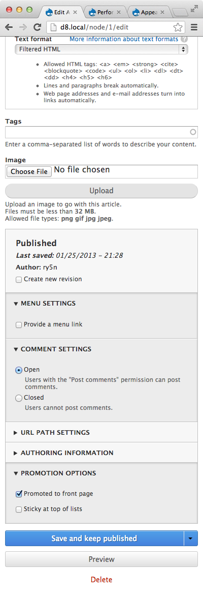
ry5n CreditAttribution: ry5n commentedNew patch. Leaving status at 'needs work' until the parent issue #1838114: Change node form’s vertical tabs into details elements gets in and tests can pass.
Comment #19
eigentor CreditAttribution: eigentor commentedAh, Patch (as well as the other two) applies cleanly now. Just learnt about git apply -v patchname :)
Looking good http://screencast.com/t/4bwn1QZ1h , just as it should. Off we go. Needs someone with coding skills to RTBC though.
Comment #21
Gábor HojtsyI was pretty happy seeing the layout system being used here, but then realised that it is not really used through the layout system, it is used from there as a template and CSS file. We can do much better than that now. You can get the layout system generate the output for you with the template + an array of -reprendered regions. For an example, see layout_page_view() in core/modules/layout.admin.inc in core:
This will add the CSS that and render the template with the rendered regions provided.
Second, I'm not sure this layout should be defined in layout module,
notbut node module. Especially if we want it to be presented as THE node editing layout, not some general "two column with footer" layout.Finally it would set a requirement for layout module on node module as well for layout module, but the reuse is worth it IMHO. As more and more things will use layouts, it will be ubiquitous.
Comment #22
ry5n CreditAttribution: ry5n commentedGábor That's great news! I basically was trying to keep this as close as possible to a 'real' layout until the system was ready. I'll take a crack at switching it over.
Comment #23
andypostProbably layout could be assigned with a help of #1875992: Add EntityFormDisplay objects for entity forms that part of meta #1875994: [meta] EntityDisplays
Comment #24
swentel CreditAttribution: swentel commentedSo there are some problems with using the layout module:
I'm not sure either to set a dependency in node in layout is interesting in case at release of D8 this is the only implementation in core - unless we move it to system where it would make more sense IMHO to live there.
I'm going to investigate a little more to see if I can workaround the problems I mentioned.
So, currently, the patch uses a simple template and preprocess function the 'old' way and it's inside the templates folder.
Patch is attached, but needs still more work re: styling for with and without overlay - it doesn't have all css either as I still have apply problems, but that's for later. Screenshot attached for temporarily reference.
Comment #25
cosmicdreams CreditAttribution: cosmicdreams commentedGreat work!
Comment #26
sannejn CreditAttribution: sannejn commentedAdded some theming for the overlay mode & non-overlay mode. Swentel removed the template preprocess function as it is redundant.
Still need to do a little crossbrowser testing. Attached some screenshots in Chrome.
Comment #27
swentel CreditAttribution: swentel commentedSetting to needs review.
Comment #28
moshe weitzman CreditAttribution: moshe weitzman commentedScreenshots look great.
In a follow-up, we might want to revisit the sections and consolidate them since it seems silly to have groupings when we virtually always have one item in the section. WOuld be good to get Yoroy thinking about that.
Comment #29
LewisNymanTested on an iPhone emulator and mobile opera emulator, looks great! I've attached the best view I could of the create content screen at 320 pixels.
It also looks good on Firefox and iPad.
Comment #30
LewisNymanoops, here's the firefox screen
Comment #31
swentel CreditAttribution: swentel commentedReroll, the drop is moving fast the last hours.
Comment #33
swentel CreditAttribution: swentel commented#31: 1838156-30.patch queued for re-testing.
Comment #34
swentel CreditAttribution: swentel commentedSmall fix to remove the white space in the overlay at the bottom, all credits go to sannejansen
Comment #36
swentel CreditAttribution: swentel commented#34: 1838156-34.patch queued for re-testing.
Comment #37
moshe weitzman CreditAttribution: moshe weitzman commentedNice work!
As a followup, it would be nice to get the whole section header to be clickable (e.g. Menu settings) instead of just the text,
Comment #38
sannejn CreditAttribution: sannejn commented@moshe: there's (for the moment, as far as I could find) no support for the tag in Firefox and IE, so i wrote a workaround for that. Now the whole bar is clickable (not just the text). Also added some IE8 & 9 fixes.
Comment #39
sannejn CreditAttribution: sannejn commentedI mean the
<details>tag.Comment #40
moshe weitzman CreditAttribution: moshe weitzman commented@ sannejanssen - thanks!. Without an interdiff, it is hard for me to see what you have added/changed. I do know that some work around the details element is happenning at #1839158: Replace collapse.js with a proper polyfill for <details> and we should not duplicate it here. Are we duplicating? If so, lets just go with prior patch (could you reupload that for test bot).
Comment #41
sannejn CreditAttribution: sannejn commented@moshe: the fixes are pure css. Attached the patch & the interdiff.
Comment #43
webchick#41: 1838156-41.patch queued for re-testing.
Comment #44
webchickOne thing that's a bit odd is that the layout still shows in single-column mode even in iPad landscape mode. Is this intended?
Comment #45
Dries CreditAttribution: Dries commentedThis looks great, although I think the breakpoints can be improved a bit (see Angie's comment above).
Let's wait for this to come back green and then it can be committed IMO.
Comment #46
sannejn CreditAttribution: sannejn commentedI don't think it's supposed to be like that. If it turns green i'll update the media query, unless someone thinks otherwise?
Comment #47
moshe weitzman CreditAttribution: moshe weitzman commented@sann - we decided recently to do anything special for IE8's lack of media query support. see #1645494: Allow core themes to display single-column on IE8: do not compensate for lack of media query support
I agree that we should have 2nd column on ipad horizontal orientation.
Comment #48
webchickOk, marking needs work then. This is looking great, btw! :D
Comment #49
sannejn CreditAttribution: sannejn commentedI see. I kinda had a feeling the ie.css file was pretty empty.. I'll take it out then?
I just checked on the iPad, and maybe we can even have the 2 columns on the portrait view? I think there's still enough space to have both columns next to each other. Or is there some kind of agreement on this?
Comment #50
swentel CreditAttribution: swentel commentedcrosspost :)
Comment #51
moshe weitzman CreditAttribution: moshe weitzman commentedYes, remove IE8 CSS please. IE9 does media queries so I'm not sure what you are doing. It might be appropriate or maybe not. I guess ask someone who was in that issue that I linked to.
Sure, two column on IPad portrait sounds good.
Thanks.
Comment #52
yoroy CreditAttribution: yoroy commentedI'm unsure about 2 columns in portrait mode (think Ipad mini for example). But don't let that hold up an initial commit, if the next patch shows 2 col in landscape this is good to go.
Looking very good. Also makes it very clear that we have some regrouping to do on what lives in which tab :)
Comment #53
sannejn CreditAttribution: sannejn commented@moshe will do.
@yoroy good point! Haven't had the change to look at the ipad mini in detail, but I'm sure your right. Let's stick to the two column for landscape then.
Comment #54
ry5n CreditAttribution: ry5n commentedSorry I haven’t had a chance to work on this with you this past week. Seems it’s progressing nicely; good work!
I just wanted to make sure we‘re testing this to account for:
<details>at once.Comment #55
eigentor CreditAttribution: eigentor commented@yoroy I guess Ipad Mini will get a different media query that will also fit for 7-Inch tablets like Nexus 7 if it is too cramped. Dang, mobile devices have too many screen sizes.
Comment #56
ry5n CreditAttribution: ry5n commentedInitial CSS review:
Why is this necessary?
I don’t think we should be forcing the active tab color to match the meta settings background. The active tab is only sometimes positioned over top of the meta settings column. Besides which, a real solution means solving what to do with messages and secondary tabs:
My proposed fix was and remains a header area at the top of the overlay:
The \9 hack is not a safe CSS hack. If we need to target IE8 specifically we should be using conditional comments. See http://mathiasbynens.be/notes/safe-css-hacks
The
cursor: pointershould go in a system stylesheet.Comment #57
ry5n CreditAttribution: ry5n commentedNew patch tackles the CSS and makes some definite improvements. Other changes are going to be more controversial:
- narrow screen layout in overlay has margins (elements were pressed up against the overlay edges)
- simplified some CSS, removing hacks for FF and IE
- moved some theme styles out of node.edit.admin.css and into Seven
- reverted the details “twisties” moved to the right. I know the design has them there but this is totally inconsistent with the rest of core and Seven. This should be done globally in a follow up or not at all.
- fixed messages breaking the layout
- added breadcrumb back in (for now)
- added a bottom border to the settings region in widescreen (non-overlay).
- renamed layout parts to be more abstract
- improved contrast between details elements by keeping borders dark (but not as dark as before).
Screenshots attached for Chrome, Firefox and IE9/8. Known issues in IE8 are the same as the original details patch and need to be resolved in #1839158: Replace collapse.js with a proper polyfill for <details>. I suggest we give no special treatment to IE8 for media queries and allow it to get mobile styles.
Comment #59
ry5n CreditAttribution: ry5n commentedHuh. The patch in #57 was corrupt somehow. New patch is simply a re-roll. It applies locally, so this should pass.
Comment #61
ry5n CreditAttribution: ry5n commented#59: 1838156--59.patch queued for re-testing.
Comment #63
moshe weitzman CreditAttribution: moshe weitzman commentedThat upgrade failure is unrelated.
Did you change the media query to show 2 columns in tablet widths (portait and landscape)?
I think that can be just render($form)
Comment #64
ry5n CreditAttribution: ry5n commentedThat's weird. The same tests pass locally for me…
I haven't changed the media query yet; currently the breakpoint is 780px, which I chose based on where the columns start to get uncomfortably narrow. I prefer breakpoints based on the needs of the content, rather than specific devices. In any case, most 7 to 10-inch tablets should already get the two-column layout, no? I expect two columns in portrait would be too cramped.
Comment #65
yoroy CreditAttribution: yoroy commentedyeah, agreed that whenever we mention a specific device we're basically doing it wrong. Define breakpoints on the needs of the content is an excellent guideline. Two-column portrait seems too cramped indeed.
Comment #66
ry5n CreditAttribution: ry5n commentedOk, thanks. I'll try just using render() and double-check that this works in landscape on iPad.
Comment #67
ry5n CreditAttribution: ry5n commentedI tried
render()and I get “allowed memory size exhausted” PHP fatal errors. Same fordrupal_render(), so I’ve left it alone.Tablets in landscape should work now, but it was trickier than I thought. iPad (for one) always reports its width as 768px regardless of orientation, so quite a fancy media query is required. Also, since the vertical toolbar is triggered at narrow screen widths, I had to add an additional override to suppress the two-column layout for the range of widths where there would normally be enough room, but not with the vertical toolbar.
All of this is actually a problem, because:
1) the media queries dealing with the toolbar bake in the width of the toolbar. If that ever changes, these media queries would have to be updated to match.
2) the Seven theme builds on the basic layout from node.edit.admin.css, but that means that both Seven’s style.css and the node layout CSS *must* contain identical media queries.
In both cases, we have code in totally separate places of core that have to be manually kept in sync. This is pretty insane, and I am not sure what the best solution is. I’ll float the idea that modules should never provide page layout; only themes. Doesn’t solve the toolbar thing, though.
Comment #68
swentel CreditAttribution: swentel commented@ry5n maybe we should special case this two column implementation *only* to seven then ? This would remove some code in the nodeFormController then (like switching to container type and the theme etc). We're done then with a simple hook_node_form_alter() in Seven and all CSS can be moved to Seven then - I guess ?
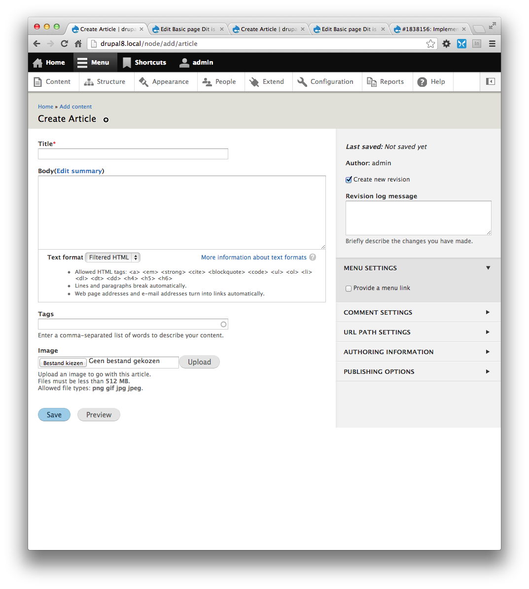
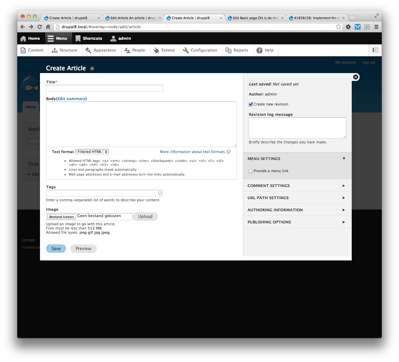
Also the two column looks a bit weird when there's no overlay, it kind of floats to much, but I'm not sure if we want it like in #26 - http://drupal.org/files/01.create-article.png - I remember asking Bojhan and he kind of agreed that was the way to go, however I'm not sure how hard that is to implement ?
Comment #69
ry5n CreditAttribution: ry5n commented@swentel I don't really know what the solution is for those duped @media queries. I suspect that the solution lies in yet-to-be-built layout infrastructure from scotch. I wonder I'd sun has any ideas?
You're right about the non-overlay settings region. I'll get it looking better (closer to that previous screenshot).
Comment #70
webchick#67: 1838156--67.patch queued for re-testing.
Comment #71
ry5n CreditAttribution: ry5n commentedThis is about the best I can do with the sidebar in non-overlay mode; I can’t find a sensible way to get the sidebar full-height. It looks more like the intended design but it still looks wrong with messages displayed (see second screen attached). There’s no way to have this look decent with and without messages *and* still have the sidebar 'bleed' to the top and side.
Comment #73
effulgentsia CreditAttribution: effulgentsia commentedThis needs a reroll both due to corruption of the included images, and for recent changes in HEAD of NodeFormController.
Comment #74
swentel CreditAttribution: swentel commented@ryan are you able to reroll - I'm bad with images and stuff :/ I'll look into the messages problem after that. Note that there's a form_alter now in Seven theme that should be used to tell the node form to use the two col template. It also means that the CSS is now exclusively for Seven, so maybe some css can be moved around ?
Comment #75
ry5n CreditAttribution: ry5n commentedI hope this reroll works… it does apply locally. It took some doing to resolve merge conflicts, so I haven’t had a chance to move any CSS around. This actually needs someone to look over who knows what’s going on in NodeFormController, since this patch seems to contain some stuff that the last patch didn’t…
Comment #76
ry5n CreditAttribution: ry5n commentedComment #78
ry5n CreditAttribution: ry5n commentedI’ll try this again tonight.
Comment #79
ry5n CreditAttribution: ry5n commentedLet’s see if either of these works.
Comment #80
ry5n CreditAttribution: ry5n commentedComment #82
ry5n CreditAttribution: ry5n commentedYes, but http://drupal.org/files/1838156--78.binary.patch passed testing :D
Comment #83
podarok#79 looks good for me
Comment #84
podarokYup
The binary one )
Comment #85
mgiffordTested it with keyboard only & ChromeVox and both worked fine.
Comment #86
podarok#79 just found a small design typo
Comment #87
podaroktag
Comment #88
LewisNymanI can't seem to recreate the layout issue in #86, it might be cause by the increased word length using the non-default language? Although it is posible to set styles different on a per language basis I don't think I've seen that kind of complexity elsewhere in core.
The styling of the delete button is global and we should probably handle it in #1848292: Consolidate Seven button styles
Comment #89
effulgentsia CreditAttribution: effulgentsia commentedA lot of really great work has been done here, and I think it's ready enough to be committed. Once it's in HEAD, I'm sure people will discover further tweaks that are needed. I can confirm that #86 does happen when you change the Delete button label to something long enough and make your window small enough, so that's one follow up worth opening.
Comment #90
sunDidn't we just revert these changes back to the original code in the other issue?
Also, something doesn't quite seem to work with the two column layout:
Comment #91
ry5n CreditAttribution: ry5n commented@sun I had to do a manual merge with HEAD and did my best to pick the right changes. I might have got something wrong.
Comment #92
swentel CreditAttribution: swentel commentedIndeed, we moved this to seven_form_alter() , see attached interdiff. This patch will not influence any other theme anymore at this point besides seven now.
Follow ups I see, but not yet created:
We can start finishing #1751754: Implement new form style for Seven, based on blueprint mockups.. Also note that the 'delete' styling is intentional as you can see in the screenshot (unless you're referring to the background) - but is open for discussion of course ;)
Comment #93
effulgentsia CreditAttribution: effulgentsia commentedThanks. Much better. Since we're getting close to feature freeze here, RTBC. However, here's some minor feedback/questions for either quick addressal before commit or in a follow up.
Has this issue been filed? If so, please link to it.
This isn't needed.
I think this improvement to the Overlay's close button is great, but why is it included in this issue?
Why is this commented out? Should we delete it, or is it serving some purpose?
Accidental removal of leading space?
Comment #94
Dries CreditAttribution: Dries commentedCommitted #92 to 8.x. Great work moving this forward. Setting back to 'needs work' for the issues identified in #93, and possibly one from #90.
Comment #95
Bojhan CreditAttribution: Bojhan commentedWhooo! Thanks Dries, it looks like we might be able to get this thing changed in core.
Comment #96
David_Rothstein CreditAttribution: David_Rothstein commentedThis looks great, but what happened to the vertical tab summaries? I thought we agreed to keep them in the new design (see #1510532-148: [META] Implement the new create content page design and subsequent comments), i.e. similar to what was shown in earlier designs such as http://groups.drupal.org/files/8_add-content_b.jpg. This was because intermediate and advanced users find them helpful, and also because Drupal 6 usability testing showed problems with pure collapsible fieldsets for beginners as well (although recent tests have apparently been less conclusive).
Followup to add those back?
Comment #96.0
David_Rothstein CreditAttribution: David_Rothstein commentedNicer formatting.
Comment #96.1
ry5n CreditAttribution: ry5n commentedLinked to issue to determine direction for vtab/details summaries
Comment #97
ry5n CreditAttribution: ry5n commented@Dries Thank you! And thanks to everyone who helped out.
@David_Rothstein The vtab/details summaries remain, but they are simply hidden with CSS. How exactly to deal with them is still an open question, as far as I recall. I created a new issue to fix that: #1919956: Determine when and/or how to display summaries for vertical tabs and details ui components. If there was a consensus that I have forgotten about, this might be a quick one.
@effulgentsia There is definitely some code cleanup needed here. Should that be done in a new follow-up, or can we re-use this issue?
As for #1751754: Implement new form style for Seven, based on blueprint mockups., the “blueprint mockups” really refer to just the content creation page visual design. That design, though good, doesn’t take all of the Seven admin styling into account, and we are already faced with quite a lot of look-and-feel inconsistency in Seven right now. For the past two months I’ve been working on a unified and updated visual style for Seven that I think does a good job of looking at the whole picture. Myself, Bojhan and yoroy posted it on g.d.o this weekend. We’re looking for lots of input: http://groups.drupal.org/node/283223.
Comment #98
sunAt minimum, we should remove the node.edit.admin.css file as a follow-up patch here. The entire styling is performed in Seven theme.
Comment #99
echoz CreditAttribution: echoz commentedFollowup to remove obsolete IE css committed from this issue, #2021073: Remove Seven's ie.css
Comment #100
tkoleary CreditAttribution: tkoleary commentedAdditionally we should correct a deviation from the original design that occurs when overlay is disabled:
As you can see there is white space above and to the left of the right column. This could be removed by adding negative margin top and right to .layout-region-node-secondary and setting the overflow on .layout-node-form to visible:
Resulting in the desired look:
But that seems like the wrong way to do this to me and I suspect it would mess up overlay. Really the right approach would seem to be removing the margin on #page and applying it instead to .content but I lack the CSS skills to make that happen. Anyone care to try this?
Comment #101
LewisNymanThis is a minor fix, tagging novice.
Comment #102
Bojhan CreditAttribution: Bojhan commented@tkoleary The design changed to accommodate breadcrumbs, can we make sure that wraps correctly then? Other than that major plus to fixing this.
Comment #103
echoz CreditAttribution: echoz commentedThis patch addresses #100 with similar css that had been used for the overlay, lines 1745-1752 of seven's styles.css, adjusting #console and .messages.
Unrelated, I noticed for no overlay, there is still a broken breakpoint between 780px - 832px (52em) where the media query css was written only for overlay, present before and after this patch.
Comment #104
tkoleary CreditAttribution: tkoleary commented@echoz
Awesome work! That was quick. I'm going to ask Angie to review and mark RTBC.
Comment #105
webchickSorry, I can't review CSS patches. :) But once it's RTBC I'm happy to take a look!
Comment #106
LewisNymanThis CSS looks correct. I'm a bit confused why we are printing an empty #console div on the page?
Comment #107
tim.plunkettThat's a render/twig bug #953034: [meta] Themes improperly check renderable arrays when determining visibility
Comment #108
echoz CreditAttribution: echoz commented#106 yep, this is a compensation for the empty #console div's margins.
Comment #109
tim.plunkettSo it should have an @todo pointing to that issue.
Comment #110
LewisNymanBut with this patch applied, won't they look incorrect when they do have content in them?
Comment #111
echoz CreditAttribution: echoz commentedThe patch just moves the (top, bottom) margins from #console to .messages in this display, as the overlay css in the committed patch does.
Screenshot of #103 patch with message:
Comment #112
tkoleary CreditAttribution: tkoleary commentedSeems like what's needed is either:
Comment #113
Bojhan CreditAttribution: Bojhan commentedYup agreed, it shouldn't push down the sidebar, it should only push down the contents of the form.
Comment #114
LewisNymanI don't think that's possible with the way that the two column layout has been implemented. We aren't using the traditional content/sidebar region method because it's all part of one form.
Comment #115
tkoleary CreditAttribution: tkoleary commented@LewisNyman
So if that's the case version 1: A change to the console region to give it a 100% width border-bottom.
Or even better we could make the console messages "toasters" that appear and fade in a fixed position like growl messages :)
Comment #116
webchickActually, could we split this discussion + the patch at #103 off into a sub-issue and mark this issue as fixed? We're already at 116 comments, and it's looking like this needs more discussion.
Comment #117
rteijeiro CreditAttribution: rteijeiro commentedJust opened this issue to address #103 issue. Uploaded #103 patch as webchick suggested.
Comment #118
LewisNymanComment #118.0
LewisNymanProper link to new follow-up #1919956: Determine when and/or how to display summaries for vertical tabs and details ui components