
 Support for Drupal 7 is ending on 5 January 2025—it’s time to migrate to Drupal 10! Learn about the many benefits of Drupal 10 and find migration tools in our resource center.
This is another follow on /spin off from #1510532: [META] Implement the new create content page design. It will remove the 'Published/Unpublished' option and change into a Dropbutton to immediately publish or unpublish the node.
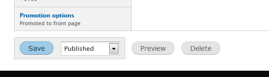
Desktop
Mobile

Depending on the state of the node, the order of the buttons will be different.
Create
-----------------
Save and Publish
Save as unpublished
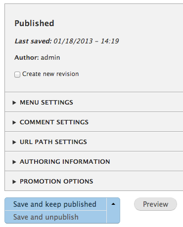
Updating a Published Node
-----------------------
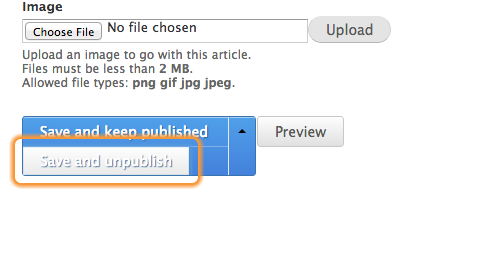
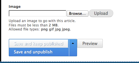
Save and keep published
Save and unpublish
Updating an Unpublished Node
--------------------------
Save and keep unpublished
Save and publish
In case the user has no access to change the state of a node, the button will simply be 'Save'.
Follow ups
Following issue is not part of this patch and will be handled seperately.
#1776796: Provide a better UX for creating, editing & managing draft revisions.
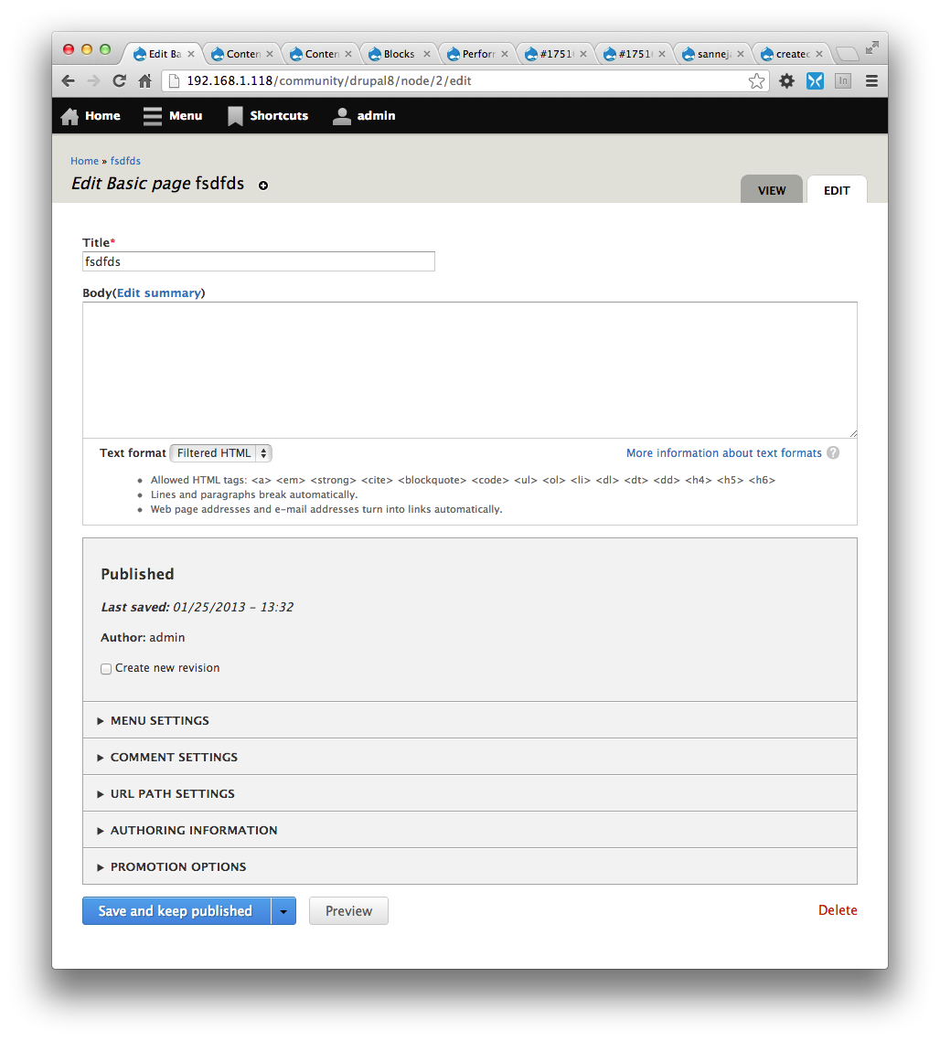
Original report
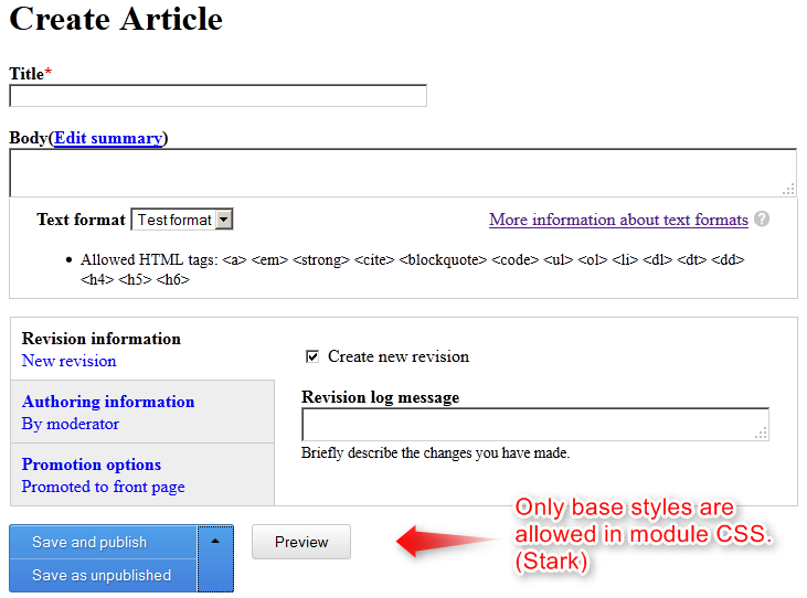
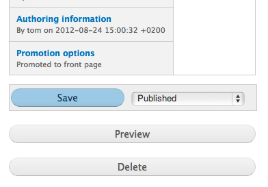
It handles changing the Published status checkbox to a select list, and moving it out of the vertical tabs and repositioned at the bottom of the form, by the submit button. This is inline with the approved mockups in the previously referenced ticket. Minimal styling is applied in the Seven theme (see attached).
NOTE: This patch relies on the patch from #1238484: Ability to mark the form buttons to be of a specific type (so that they can be styled differently).
| Comment | File | Size | Author |
|---|---|---|---|
| #133 | ChromeVoxSaveButtonWith.png | 34.25 KB | mgifford |
| #133 | FireFoxSaveButton.png | 36.84 KB | mgifford |
| #126 | node.published.126.patch | 29.37 KB | swentel |
| #126 | interdiff.txt | 6.11 KB | swentel |
| #125 | Screen Shot 2013-01-28 at 11.35.00.png | 11.29 KB | swentel |


Comments
Comment #1
mrfelton CreditAttribution: mrfelton commentedThe patch...
Comment #3
mrfelton CreditAttribution: mrfelton commentedYeah, it will fail testing as it depends on the patch from #1238484: Ability to mark the form buttons to be of a specific type (so that they can be styled differently) being applied first. Setting back to needs review to get some more eyes on it.
Comment #4
kika CreditAttribution: kika commentedI guess the dependecy from #1238484 is too strong to make these two issues totally separate?
Comment #5
kika CreditAttribution: kika commentedI can see a pattern but perhaps ! is too much :)
Comment #6
mrfelton CreditAttribution: mrfelton commentedYes, because here we are extending
EntityFormController::actionsElement()withNodeFormController::actionsElement(), and some of the stuff that we need inNodeFormController::actionsElement()relies on the implementation in the parent. Also, we need to add to the css that is provided by that other patch, and I couldn't find a way to add the css without causing a conflict between the two.Comment #7
mrfelton CreditAttribution: mrfelton commentedThe alternative is that we do not provide any css in either of these 2 patches. The css in those patches will be changed anyway once we get the wider form css changes in pace. But, I do think it makes sense to include the css with these patches, otherwise the result of committing these 2 patches will just look bad until the new css comes along.
Comment #8
kika CreditAttribution: kika commentedNow with less "!".
Comment #9
kika CreditAttribution: kika commentedAdding relevant tags.
I personally prefer more non-dependent, easily applicable patches to temporary layout gotchas.
Comment #10
mrfelton CreditAttribution: mrfelton commentedI may be wrong, but I think youd have a hard time trying to convince others that its ok to commit a patch to core that screws up layout.
Comment #11
Everett Zufelt CreditAttribution: Everett Zufelt commentedWe have certainly commited things to core in the past that had cleanup dependencies required. That being said, I prefer that what we deploy is shippable. If not, the followup issue needs to be Critical.
Comment #12
ry5n CreditAttribution: ry5n commentedFYI I just posted a new patch for http://drupal.org/node/1238484#comment-6581564. Let's get these both in!
Comment #13
nod_Reroll, let's see what the bot says. Somewhat hold up on #1238484: Ability to mark the form buttons to be of a specific type (so that they can be styled differently).
Comment #14
Bojhan CreditAttribution: Bojhan commentedWhy is it held up on that? That doesn't make much sense.
Comment #15
ry5n CreditAttribution: ry5n commentedNow that Seven's new reset is in, this patch fixes some styling glitches and cleans up some CSS for the .form-action-group and its child components (removing some hard-coded widths, hacks and overcomplex selectors).
Comment #16
ry5n CreditAttribution: ry5n commentedThis really only depends on #1238484: Ability to mark the form buttons to be of a specific type (so that they can be styled differently) in one place, which does not affect functionality. New patch comments out the single dependency with a @todo and a @see to that issue. Interdiff with #15 attached.
Comment #17
ry5n CreditAttribution: ry5n commentedWould really love to get this reviewed, it should no longer have any dependencies.
Comment #18
ry5n CreditAttribution: ry5n commentedSince this is part of #1510532: [META] Implement the new create content page design, which is major, making this match.
Comment #19
ry5n CreditAttribution: ry5n commentedRerolled against latest.
Comment #20
ry5n CreditAttribution: ry5n commentedTouches a JS file.
Comment #21
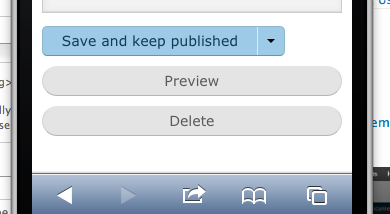
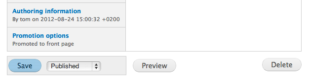
eigentor CreditAttribution: eigentor commentedThe patch applies and works as expected in FF, Chrome and IE8 (did not test newer versions of IE). Important for people testing this: Clear cache, else it does not display correctly. The div surrounding the save button and published/unpublished dropdown toggle is displayed as inline-block which works fine.
There are issues with the mobile view, but that is the fault of the overlay, which gets rendered in desktop browsers if the screen is too narrow. I guess the overlay should not get rendered. The effect is that the overlay is wider than the screen itself, so the buttons extend beyond the visible window.
I cannot give a code review other than the css, which appears to be fine.
Comment #22
ry5n CreditAttribution: ry5n commented@eigentor Yes, the overlay is supposed to be disabled for narrow screens, but appears to be not working perfectly. In any case, it is a problem with the overlay in HEAD as well. For those wondering, this is how #19 adapts to narrow screens:
Comment #23
nod_the overlay is disabled or not on page load, it doesn't work if you resize the screen. Just like vertical tabs in #22. At this width the wouldn't be enabled.
Comment #24
sunHm. I'm a bit confused by this UI/design proposal. I've read the original/parent issue, but couldn't find any details or answers to my questions.
1) The published status is a binary flag, which is why it is a checkbox. I do not understand why it is turned into a select box?
2) The change to a select makes the control less intuitive and requires users to discover the options first.
3) Content does not necessarily have a published status, or the current user may not be permitted to set the publishing status (which may even differ per individual content). Since this control is mixed into the central form actions here, that can lead to confusing/disorienting user interface situations, depending on whether there's a publishing status option or not.
4) Earlier designs proposed a split-button, which at least resolves the problem of too varying UI controls, since the split-button would simply turn into a single/simple button. However, a split-button shares the problem of the select box approach because the (IMHO pretty fundamental) alternative option of saving a draft has to be discovered first.
5) Ultimately, I don't understand why we don't keep the checkbox, and only move it out of the vtab and use a better label?
Comment #25
Bojhan CreditAttribution: Bojhan commented@sun So you are correct to assume, there is some hand-waving around implementing this. Let me try and address some of your concerns.
Primarily because we assume, that by default core will come with several options. The question is obviously if this is multiselect or single select, although I can see the possible mutliselect workflows (in review, and in draft) - I am not sure multiselect is going to be a common usecase?
Hiding does not directly mean less intuitive, however you are right that instead of finding it in a vertical tab it is now hidden under a select option. I am not sure which of the two, is necessarily harder to find by giving it a unique position we give it additional visual weight, it being close to "Save" enhances that weight. So in my mind your assumption that its less important, and thereby will be missed is incorrect. Its position and styling will make it more important, and hence more likely to be looked into.
Shouldn't it simply be hidden if there are no permissions?
This is the "handwaving" part, somewhere down the line we figured putting it into the button - might really be hiding it too much. Because it really isn't expected behavior a button at the bottom of form, has different ways of "submitting" we figured it might be better just reserved as a select list. I am not really sure, this is a correct assumption but it is the one we took at that moment.
Where do you imagine we placed it, in vertical tabs it was simply missed by users - this design choice is largely about elevating it from the other options. And how does a checkbox account for more workflow states? A select list does.
Lets discuss this some more.
Comment #26
sunYeah, but what I tried to focus on in 3) is that this design proposes to mix the additional form element into the primary form actions:
There is an additional container, with extra styling, and there is an additional control crammed into the form actions.
Thus, if that element sometimes exists, and sometimes not, then the entire presentation of the central form actions looks different.
Also, looking at this interface, I must say I really find it hard to find and determine the form button I want to press. The UI of the form actions looks distorted to me.
Comment #27
ry5n CreditAttribution: ry5n commentedIIRC, the reason for moving this control out of the vtabs was people were not seeing it, and not expecting 'save' to publish their content. Some thought it would be saved as a draft. So I think it was the right direction to avoid putting this option in a dropbutton menu, since people are still likely to miss it there, at least if the label remains 'Save'.
The other wrinkle is as Bojhan says, use cases where there is an editorial workflow where publish status is no longer boolean (could be draft, submitted to editor, approved by editor, published). I don't know enough about those use cases, so we need input from someone who does.
Here's an idea though:
1. The majority of sites will only have boolean states: 'published' or 'draft'. We could go with a proven model there, i.e. WordPress, and have two buttons: 'Save and Publish' and 'Save as Draft', with the first one being a primary button and hence emphasized.
2. For more complex workflows, support additional options either by:
a) putting all secondary options in a dropbutton, with the main button label changed to 'Save and Publish'. This should avoid confusion about what the button does, and encourage people to look inside the dropbutton menu for others.
b) expose all options, including a readout of the current publish status (this is what WordPress does)
@sun I’m interpreting your impression of the actions area being 'distorted' means that it is visually confusing. Perhaps better UI design, along the lines of what WP does, would help. Their 'publish meta box' solves this by dividing up their actions area and having the final form submission actions (publish/update and delete) at the bottom.
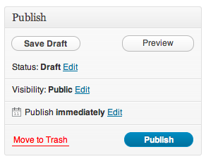
Comment #28
sunFunny, I wanted to post the exact same screenshot of WP ;)
I do not think that WP's Publish meta box interface is "golden", as it takes me several seconds to orient myself (each time I want to use it).
However, I do think what WP gets right is to provide a dedicated container for publishing/meta details nearby the central form actions:
Comment #30
eigentor CreditAttribution: eigentor commentedDiscussion is silver, user testing this is the only way to find out if it is intuitive or not. Maybe there should be a curated list of core UI changes that need user testing? I volunteer to help working on it.
Maybe some kind of Meta issue would do, separated by changes that already went in and proposed stuff.
Comment #31
ry5n CreditAttribution: ry5n commented+1000 for user testing. If this issue or any other on our list is bound to feature-freeze though, we need to get it in now and file bugs against it if user testing suggests it needs changes. I support a meta issue for doing that testing.
Comment #32
klonos...coming from #1123696: Does 'Save' publish my content?.
Why don't we simply "promote" the checkbox to a "Publish" button? We'd then have:
[ Publish ] [ Save ] [ Preview ] [ Delete ]
For users not having the permission to publish content, this button could be hidden/disabled.
Comment #33
ry5n CreditAttribution: ry5n commented@klonos In essence that's what WordPress is doing, which I think is a good thing. @sun's got a good point though that there's room for improvement, and I like where he's going there. Ultimately if we're going to re-design this we need some mockups that take into account all the possible states so we can properly evaluate.
However, I want to find out if this thing is bound to feature freeze because I don't think we have time for that if it is. If it is bound to FF, I vote we get #19 or #28 in now, in the hopes that we can improve it as a bugfix later.
Comment #34
eigentor CreditAttribution: eigentor commentedAs for user testing: The patch applies an interface pattern from views which we find in core in various places now.

Recently there was a user test of Views. I am pretty sure people used the buttons there all over the place. So we could see if there were any results how they got along with it or watch the videos to find out http://drupal.org/node/1833926#guide. Ah, there are no videos. But I don't find a mention of the dropbutton as an issue :). The people who conducted the tests will probably remember, so they might weigh in. If one asks abot consequence in re-using established interface patterns, this is a go.
Comment #35
klonosI understand, but if it is to make it before the feature freeze, then perhaps we should go with the simple/er(?) solution I propose and see if we can improve after feature freeze. It'd be a shame not to improve things where we have the chance to do so. Just my 2c.
Comment #36
ry5n CreditAttribution: ry5n commentedSo with feature freeze extended to complete in-progress issues, where does that leave us? Do we do more work on this? Do we RTBC #19 or #29? Both (with additional work as a follow-up)?
Comment #37
aspilicious CreditAttribution: aspilicious commentedI seriously don't think #28 is better than #26. Will leave this to bojhan as he did some tests with this UI some months ago. Anyway it can't be rtbc as it don't passes the tests.
Comment #38
klonos...and I seriously think that mixing buttons and drop-downs/checkboxes is a really bad idea UX-wise. What do we have against making the Published Status a "Publish" button again? ...I mean, we would kill 2 birds with one stone (the other one would be #1123696: Does 'Save' publish my content?).
Comment #39
ry5n CreditAttribution: ry5n commented@aspilicious, @klonos: OK, back to 'needs work'.
I have nothing against changing this to two buttons, although there are considerations for editorial workflows. See #27. My concern was getting this in for feature freeze, which we can probably still do because it's an in-progress issue and we have a little extra time for those now.
Comment #40
mrfelton CreditAttribution: mrfelton commentedI originally started this issue as a spin off from #1510532: [META] Implement the new create content page design, in which the intent as I understood it was to implement the new create content page as per the designs which were already agreed on following UX testing. Has something changed with regards to the original UX feedback? If not, should we not be proceeding here as per the original plan? The reason why I implemented as I originally did (publish status as a separate control beside the save button) was that I saw this as a first step in the process to getting to the end goal - which is to have publish and save draft combined into the one button much like i the design pattern shown in #34.
Comment #41
jstoller@klonos, it seems to me that the solution proposed in the issue summary also takes care of #1123696: Does 'Save' publish my content?. Given the way the dropdown selector is tied to the Save button, I think it will be very obvious to users that when they save something it's going to be published. What I like about the dropdown is that it makes implementing multi-state workflows much easier. You could still do that with buttons, but I'm dealing with a six-state workflow and that's a lot of buttons.
Small accessibility question. Should we put the dropdown before the button? That way screen readers would see the workflow state before "save".
Comment #42
jstollerSorry. Cross-post. Resetting status.
Comment #43
eigentor CreditAttribution: eigentor commentedHaving the dropdown has an advantage: less buttons. The more buttons you can click, the more choices you have to make. I don't have the studies ready but I bet there are some that prove that four buttons instead of three slow the user down considerably.
The Preselection of published as default can ideally take away one decision from the user, as in more than 80% of cases you want to publish on save. The second time you click save I would claim you see those two as one control.
I still remember using Wordpress and being confused by the "Publish" button. The concept of publishing a node is the most abstract in the row: Save, preview, and delete are pretty clear, but publish? What does this mean? So it is one that makes you stop. If it is preselected I guess (hope) not so much. Typically users trust default options if there are no negative connotations involved.
So I see a solid reasoning for keeping it as it is now, also as the concept of the dropbutton (which is different I know because it is a button that triggers an action) is already common to the user.
Ultimately any reasoning needs verification, of course.
Comment #44
ry5n CreditAttribution: ry5n commentedJust had a quick chat with Bojhan on IRC. We agreed that we may be able to improve this for the 80% case where the publish status is boolean (possibly doing two buttons instead of a button and a select). However, @mrfelton is right in #43 that this issue is really intended for implementation of the existing design. I'll add that the final designs had in one version a select list and another a dropbutton. Bojhan and I agreed a while back to go initially with the select.
We’d both like to finish this as an implementation issue with the select element (since that does improve the situation over D7) and then follow-up with improvements.
With that in mind, attached is a re-roll of #19.
Comment #45
klonos@mrfelton, #40: Sure, I know that this issue here was spawned from #1510532: [META] Implement the new create content page design (I was and still am following it), but at least 3 months have passed since and I believe we are not married indefinitely to solutions. IMHO, If we find something to be better or that there's room for improvement, we should adjust initial designs.
@jstoller, #41: The dropdown might indeed make implementing multi-state workflows much easier, but is this within the scope of this issue here or of #1510532: [META] Implement the new create content page design to begin with? Are we doing this for D8 in core or should we leave it for contrib?
@eigentor, #43:
How is the dropdown menu not another choice to make or widget to click? I fail to see your argument as a successful one.
Assumption and assumption I say.
With this one I agree ;)
The way I see it, the simplest use case is the one where save means publish as well. This scenario might make sense for personal blogs for example where the same person that authors the nodes is most likely the one that publishes them. If you take this a step further, then you have different people with rolls that either have the permission to publish or they don't. In this case, having an extra "Publish" button that is available to only those with permission makes more sense to me. That button becomes "Unpublish" for published nodes and is available again only to those with the permission to carry that action. So "simple" authors only see 3 buttons at the most ("Save" for sure / "Preview" if configured / "Delete" if they have the permission) and thus don't get overwhelmed with options.
Having this Publish/Unpublish button spares users from extra click(s). In the case where they simply what to save a draft, with the dropdown menu, they'd first have to select "Unpublished" (if published is the default). Having the "Save" button only save a new revision (without changing the node publish/workflow status) achieves exactly that action for them. So, I think it is very important to decouple the "Save" button from any other possible action. That's what I personally consider the 80% use case.
Of course from this level you can take it even further in order to cover other more complex scenarios with multi-step workflows (but this should be left for contrib IMO). I agree that in these cases it would most likely make more sense to have a drop-down menu as a widget to hold all available states a node can take. But only in these cases. Do you actually believe that these are the 80%? I honestly don't.
Comment #46
klonosTo make my case more solid, please consider the following scenario and the points where the assumptions we make actually make no sense:
Lets say that with the drop-down menu design a user with node publish/unpublish permissions hits the "Edit" tab of a not yet published node. We assume that the are there to publish it and have the "Save" button coupled with the "Published" drop-down. What if they came only to make some edits and save the node in a still not published state? That's right: extra click on the drop-down to select "Unpublished" - then hit the "Save" button.
Lets consider the same case again with the same user editing a published node this time. What would the drop-down have as a default action? If it is "Published" why do we assume that the user came here only to edit and save as published and not that they came in order to unpublish the node? If we decide that the sensible default is to be "Unpublished", why do we again assume that the user came here to unpublish the node and not to edit and save as draft? Again we end up in possibly forcing users in making extra clicks/actions.
I hope that these examples make clear what I'm trying to communicate.
Comment #47
Bojhan CreditAttribution: Bojhan commented@klonos Could you use the "edit" button? Frankly, it wouldn't hurt if you could structure your comments a bit I totally get lost between what your concerns are, how you wish to address them and how this provides us direction towards RTBC - all I can see are a lot of usecases, we obviously can't all cover.
Let's go with select list for now, as we know it attempts to solve at least two of the major issues (knowing what status you set it when you click save, knowing what status it is). I'm fine with discussing this further, but I also don't really see the point - as none of that seems to be taking us any closer to a reasonable solution, that isn't a one/off for a particular workflow :)
Comment #48
eigentor CreditAttribution: eigentor commentedPatch applies and works as the current route of progress should.
Coder needed to RTBC.
Comment #49
klonosMy main concerns are:
1. I think that mixing drop-downs and buttons in a single horizontal place is confusing (and plain ugly).
2. Using a single "Save" button + another "Publish"/"Unpublish" button results in a single click in order to accomplish most common tasks while with the coupling of a "Save" button + a drop-down it would take at least two additional clicks.
3. As long as there are only two states in the drop-down, we should definitely replace it with a "Publish"/"Unpublish" button anyways.
4. The core edit UI should be kept to a minimum and not be built to account for multi-step workflows. These should be left for contrib.
5. Even if multi-step workflows are planned for inclusion in D8 core, the node edit UI should still be kept simple. Additional drop-downs or whatever is required to accomplish this feature should not come into play unless the respective module is enabled and a multi-step workflow is also defined for the content type of the node being edited.
Comment #50
attiks CreditAttribution: attiks commentedWhy is this changing from FALSE to 0, status is a Boolean field, so I would expect to be able to do $node->status === TRUE
Comment #51
ry5n CreditAttribution: ry5n commented@klonos I understand your concerns, it's just a question of do we start this discussion over again before committing code, or can we live with the select element as a likely improvement and work to make it better in follow-up? I'd rather do the latter.
@attiks I actually have no idea – that code comes from the original issue and I just trusted it was doing something good/necessary :) Do you think we should change it back?
Comment #52
attiks CreditAttribution: attiks commented@ry5n I prefer if it's rolled back, but it might be that it's done for a reason.
Comment #53
sunFWIW, I still stand by #26.
I cannot believe that mixing arbitrary form controls into the list of form buttons can improve usability in any way.
The resulting UI might achieve a better visibility of the publishing status option, but that visibility comes at the huge cost of making form actions barely usable. It distorts something that was crystal clear previously:
I also do not see a clear path forward from there. The injected select/dropdown list is neither part of the originally proposed design, nor is it compatible with dropbuttons or split-buttons. Just the select on its own cannot be a permanent solution, IMHO, as it does not improve usability and is also barely themeable.
The alternative that has been discussed here and which seems to have been part of the original design, a dropbutton/split-button, would equally not be very clear, as it essentially turns the form actions into this:
In other words, as @klonos already mentioned, it would not be clear what the primary action and what the secondary action of the dropbutton would be, with regard to "Save" vs. "Save as draft" - depending on the entity's current publishing status.
And I'd even like to go one step further and ask: Why is "Preview" not the/an alternative action to "Save"? Those two actions are much more interchangeable than "Save" and "Save as draft".
And as the above, abstracted depiction of the form buttons clarifies, it wouldn't be clear why "Save as draft" is in the dropbutton/split-button, but all other alternative actions are not.
Given all of this, I still think we should do something along the lines of #28, which essentially introduces a "meta" container for compact controls like the publishing status, which can be output right before the form actions - or as in the originally proposed design, as first, uncollapsible container in the right sidebar column.
Comment #54
Bojhan CreditAttribution: Bojhan commented@sun Stop making everything sound like a drama, it distorts discussions to focus on feelings instead of the actual problem at hand. I do not think #28 is any better, it is simply a floating select list - there is no visual association to the "Save" action (other than the last position in the "stream" of form elements, this is a weak affordance).
The problem we have is the disconnect between clicking "Save" and what that does to changing the state. It is a simple as that, and all this solution tries to do to solve that is to bring both closer visually. It is no perfect solution, but it gets us a step closer. I'd love suggestions, that try to solve this problem.
I don't see at all how any of this is moving forward, I am tempted to just postpone this issue. There are many other major parts of the content creation redesign that are still not in.
Comment #55
klonos@sun, #53:
The way it is now, for each content type the preview can be set to Disabled/Optional/Required. Only the case of "Required" makes the "Save" and "Preview" buttons interchangeable. The "Disabled" simply removes the button of the equation, while "Optional" calls for two separate "Save" and "Preview" buttons.
@Bojhan, #47/#54:
Sorry mate, but... excellent ways to shoot people's opinions down :/
Then please take a second look at my proposal in #49 (especially points 1. and 2.). Thanx in advance.
@ry5n, #51: I can file a new (follow-up) issue for my suggestion, but I seriously doubt that it would pass usability/UX review ://
Comment #56
jstollerIf we are only worrying about supporting a two state workflow, then using buttons, as @klonos suggests, could work, but they would need to be explicit in what they do and they would need to adapt to the context. So, in the case of an node with no currently published revisions, the buttons would read:
[Save and publish] [Save draft]
If its a published node that's not using revisions, then it would be:
[Save and publish] [Unpublish and save draft]
If it's a published node that uses revisions, then you'd have to account for forward revisions, so it would be something like:
[Save and publish] [Save draft] [Unpublish and save draft]
Note that the proposed dropdown selector, whether part of the button or next to it, will likewise need to take forward revisions into account. Though changing options in a dropdown somehow seems simpler than changing buttons.
Personally I'm still leaning toward the "Save" button with a visually integrated state selector, but either approach would be a huge improvement over what we have now.
Comment #57
Gábor HojtsyLooks like if there is one thing people agree on this issue is that if the dropdown is a native browser dropdown (vs. a drop-button), then it looks confusing/ugly either if displayed above the buttons or inline with the buttons. @jstoller: indeed, the problem is that if there is a more-than-two state workflow, then the buttons explode in numbers; also the buttons would be different from node to node depending on their workflow state.
Let's cycle back to the original design which this issue set as a goal to achieve in followups, not directly here:
Now looks like the proposed intermediate steps did not satisfy reviews, so what can we do to implement the actual dropbutton? I suspect it is not as easy as plugging in the new core dropbuttons because those are links and would not behave accessibly as good as actual buttons? How can we work around this problem? Generate more buttons and collapse them to one on the client side with some JS magic?
Comment #58
tim.plunkettActually, Views UI does its own workaround for putting submit buttons into dropbuttons, we could abstract that out.
Comment #59
moshe weitzman CreditAttribution: moshe weitzman commentedI agree with gabor that a dropbutton looks much better than the standard select thats in the Issue Summary.
@timplunkett - where would someone find that workaround code mentioned in #58?
Comment #60
tim.plunkettIt's in Drupal\views_ui\ViewEditFormController::getDisplayDetails(), but it's not pretty.
Simplified some, it looks like this
Comment #61
mrfelton CreditAttribution: mrfelton commentedInitial implementation attached.
Needs some work on the theme side for sure, but I think this is a step in the right direction. Tests will definitely need some work too.
Comment #63
eigentor CreditAttribution: eigentor commentedLooks good! I was not with the nitpicking on the previous implementation, but this is indeed better. Re-using of established UI Patterns (Dropbutton in this case) should help us in resolving long discussions.
Comment #64
ry5n CreditAttribution: ry5n commentedI’m happy to see this moving forward, implemented this way.
I’ve tested the latest patch and the dropbutton interaction works. However, the form failed to submit, with the server producing no response. Something to do with the dropbutton may be messing up form processing.
One other thing: labelling. I’m not sure this got discussed at all, but this gives us an opportunity to tailor the buttons labels by context. For the node/add form, for example, the labels could be: 'Save and Publish' and 'Save Draft'. For node/edit, possibly something like 'Update' and 'Save Draft (Unpublish)'.
Comment #65
stevectorIs the code behind "Save Draft" in progress anywhere? I've got a quick and dirty start to a Workbench-Moderation-like module for 8.x that does little more than verify that a "save as draft" could be done in contrib if not in core. I'm wondering if I should start a separate issue for that. Perhaps it should just be done as part of #1776796: Provide a better UX for creating, editing & managing draft revisions.
Comment #66
Gábor Hojtsy@stevector: #1776796: Provide a better UX for creating, editing & managing draft revisions. did not have activity in a couple weeks before Dec 1st, so I guess it would depend on whether the save draft backend functionality is considered a new feature or not. We already have forward unpublished revisions in core in Drupal 8 but no UI. The UI might not be considered a feature in itself. Either way probably #1776796: Provide a better UX for creating, editing & managing draft revisions. gets you the most exposure for any work like that IMHO.
Comment #67
jstoller#1776796: Provide a better UX for creating, editing & managing draft revisions. was a followup task for #218755: Support revisions in different states, which had a committed patch before the 12/1 deadline, so I certainly hope it will be grandfathered in, if anyone cares to work on it. From a UX standpoint, I think it is extremely important.
I do hope everyone on this issue understands that the "Publish" and "Save draft" options shown in these mockups do not replace the functionality of our current publish checkbox. "Save draft" in no way equates to "Unpublish". I think the drop-button is a big improvement, but the options in the list need to properly account for publishing, unpublishing and saving forward revisions.
Comment #68
stevectorI've posted my test module over in #1776796: Provide a better UX for creating, editing & managing draft revisions.
Comment #69
swentel CreditAttribution: swentel commentedRe-posting as it didn't apply anymore and also to see the testbot results so I can debug those.
Comment #70
hass CreditAttribution: hass commented#61 looks excellent. It solves a lot of usability issues that I see every day with Workbench Moderation users who miss to set the status very often from Draft to Needs review and complain than, that their written content has not published...
@stevector: We should try to port this to Workbench Moderation D7 soon. I really have a lot of this usability issue complains...
Comment #71
hass CreditAttribution: hass commentedCode wise this sounds a bit confusing to me. Save a Draft does not really mean "unpublishing" content. We are writing Drafts for forward revisions in workbench modules, but the save action of them is not an unpublish action.
Comment #72
swentel CreditAttribution: swentel commentedYes, the 'Save as draft' is confusing. For the purpose of this patch only we need good labels of the buttons, maybe depending on whether the node has been saved already or not and then let #1776796: Provide a better UX for creating, editing & managing draft revisions. figure out new actions.
Any suggestions for those labels, and as ry5n also points out, we have a node/add and the node/x/edit which could potentially have different labels.
Comment #74
swentel CreditAttribution: swentel commentedLet's see what this does.
Comment #76
eigentor CreditAttribution: eigentor commentedMaybe the labels could be adressed in a follow-up. I can imagine heated discussions about them.
Comment #77
jstollerFor now I would just label the options "Publish" and "Unpublish", since I assume that's all they do. If we get some help on #1776796: Provide a better UX for creating, editing & managing draft revisions., it should be easy to update those options later, I would think, to support saving draft revisions.
Comment #78
swentel CreditAttribution: swentel commentedNew patch fixing more tests. I agree with #77 and also talked this briefly through with Bojhan to just keep Publish and Unpublish for now because that's indeed what they do.
Comment #80
ry5n CreditAttribution: ry5n commented+1 for #77
Comment #81
swentel CreditAttribution: swentel commentedThis should be better. One of the missing key pieces in the patch was that the node validate functions weren't called anymore.
Comment #82
Bojhan CreditAttribution: Bojhan commentedCan this get a screen?
Comment #83
swentel CreditAttribution: swentel commentedReroll + screenshot.
Comment #84
moshe weitzman CreditAttribution: moshe weitzman commentedtheme_item_list() now accepts render arrays as items so I think we can pass an array of operations and use #theme = 'item_list'. This would get rid if the prefix/suffix annoyances. If that's not possible for some reason, then I'd slightly prefer adding the UL with a #theme_wrappers callback instead of two #markup items. #theme_wrappers have the advantage of being easily overridden by theme system.
Comment #85
swentel CreditAttribution: swentel commentedThis is how it looks on mobile - updated in issue summary as well, how do we handle the 'dropdown' on mobile ?
Will reroll for the theming function in a few minutes.
Comment #85.0
swentel CreditAttribution: swentel commentedUpdated issue summary.
Comment #85.1
swentel CreditAttribution: swentel commentedUpdated issue summary.
Comment #86
swentel CreditAttribution: swentel commentedPassing the elements into theme_item_list made the submit buttons unresponsive, so that wasn't really an option. They also miss the ID property when rendered then. Used a #theme_wrappers callback function now, but it feels a bit overhead to me, but it works. In case this goes in, we can convert this ViewEditFormController::getDisplayDetails() so I'll try to ping to VDC people to chime in here.
Comment #87
moshe weitzman CreditAttribution: moshe weitzman commentedThe patch needs wording and UX help that should not be deferred, IMO. The biggest problem is evident when you edit an unpublished node. You have no way to know that it is unpublished and the Publish button is the default. So, I propose the following ordering and labelling of dropbutton options. We ran these by Yoroy and he gave +1.
Create
----------
Save and Publish
Save as unpublished
Updating a Published Node
---------------
Save and keep published
Save and unpublish
Updating an Unpublished Node
---------------
Save and keep unpublished
Save and publish
Comment #88
mrfelton CreditAttribution: mrfelton commentedLook at the original designs for these forms in #1510532: [META] Implement the new create content page design. The published status of a node is very clearly showin in the right sidebar.
Lets not forget that this is a subtask of that larger initiative.
Comment #88.0
mrfelton CreditAttribution: mrfelton commentedUpdated issue summary.
Comment #89
swentel CreditAttribution: swentel commentedNew patch that address #87 - new screenshots and added to issue summary.
Need a testbot run now to check where all these label changes fail now.
I played around a bit as well with the colors, but couldn't really fine anything usefull or 'appealing' enough, I suggest that we do that in #1751754: Implement new form style for Seven, based on blueprint mockups. , including optimizing mobile behavior (although there was an issue for that iirc somewhere for the dropbutton already).
Comment #90
swentel CreditAttribution: swentel commentedComment #90.0
swentel CreditAttribution: swentel commentedUpdated issue summary.
Comment #92
swentel CreditAttribution: swentel commentedLet's see if I got all changes of the labels.
Comment #94
swentel CreditAttribution: swentel commentedComment #95
moshe weitzman CreditAttribution: moshe weitzman commentedMuch nicer with new wording. Thanks.
Comment #96
webchickNeeds a post-Poll module RIP re-roll.
Comment #97
swentel CreditAttribution: swentel commentedre-rolled
Comment #99
Wim LeersI don't think this could cause
BareMinimalUpgradePathTestto fail. Retesting.Comment #100
Wim Leers#97: 1751606-97.patch queued for re-testing.
Comment #101
moshe weitzman CreditAttribution: moshe weitzman commentedBack to RTBC
Comment #102
webchickLooked over this patch with Alex, Dries, and Moshe.
So in testing this, one thing we found confusing is that because the drop-down and the buttons are different shapes, what we originally wanted to do was choose an option from the dropbutton and then click "Preview" to "submit" it. Oops. We think what was confusing is that the way it's styled right now, because it just looks like a light blue select box; not actually like a button.
Compare/contrast the patch with the mockup at #1838156: Implement the two-column layout for the new create content page:
We think the reason the mockup is not confusing is because:
a) the dropbutton/button shapes are both the same
b) the dropbutton is styled much more strongly in the mock to actually /look/ like a button.
So it feels like this issue needs to deal with those issues as well, because otherwise discovering the save operation is much harder than before.
Comment #103
webchickAlso, it seems like the dropbutton needs the styling that the buttons have to bring it all the way across on narrow screen sizes. Here's a screenshot from an iPhone simulator.
Comment #104
swentel CreditAttribution: swentel commentedHmm ok, I saw this coming :) We talked about it and I more or less kept this for #1751754: Implement new form style for Seven, based on blueprint mockups. which is going to implement the style guide, however, I agree it might be confusing.
Comment #105
Bojhan CreditAttribution: Bojhan commentedYhea, I am not terribly upset with the different styling. We have loads of different styles in core atm. We need to clean that up consistently, however if webhick feels strongly we need this one to commit to atleast a certain styling - lets do it.
Comment #106
sannejn CreditAttribution: sannejn commentedUpdated the button theming. For the moment I only took care of the node add/edit form actions. If the styleguide is completely implemented, all the buttons will be taken care of. Some screenshots attached.
Comment #107
webchickThat looks HOT! I guess one thing to watch is to make sure those styles match with the action link styles on admin listing pages so we don't end up with 30 variations of "big blue button with white text," but otherwise NICE!
Comment #108
Gábor HojtsySending for testing.
Comment #109
sannejn CreditAttribution: sannejn commented@webchick maybe we can take that to the styleguide implementation? Because I think there are still a lot of elements that ar 'almost' the same but actually not the same. I think the implementation of the styleguide will take care of these kind of differences.
Comment #110
Gábor HojtsyChanges look good. Resolved the button look problem.
Comment #111
webchickYep, that works for me. The last little bit of feedback that I thought of since leaving that comment is the way we're doing "Save and keep published" isn't really scalable to sites using more complex workflow modules, because it might realistically (ok, maybe not realistically, but) be something like "Save and Send to the poor bastard who has to sit there and crop pictures in Photoshop all day" and that would of course break the design. :D But that's something we can deal with in a follow-up. Kevin is toying around with some ideas on the inline editing side over at #1898946: [Meta] Simplify and reconcile the behaviors of edit-submit actions in node/edit and edit (edit-in-place).
So now the only thing blocking this is how completely over the moon on thresholds we are atm. :( Sigh. :(
Comment #112
Dries CreditAttribution: Dries commentedLooks great now. Committed to 8.x.
Comment #113
sunThanks everyone for working so hard on this! :)
This is definitely a step in the right direction. The previous "Published" checkbox totally was not discoverable, even though it had a significant meaning.
However, seeing these changes in the commit log also was a negative surprise to me. Details are following below, but when taking a step back, it looks like we're facing a situation here that is very typical to Drupal core development in its history:
That's a very abstract run-down though. This particular commit involves changes that represent major WTFs even for module developers, but which, for some reason, have been completely ignored and brushed aside during the code review process. At the very minimum, those should have rang alarm bells on all fronts.
Now, I can perfectly understand that we have a lot of tasks to do in this space. And, yes, we want to. And, perhaps, it's even fine to rather move forward quickly, instead of ensuring that the code and implementation is 100% correct and final. However, if we commit a change like this, then we also need to accept that this triggers a range of major/critical follow-up issues that will effectively prevent a stable release.
What's most concerning there are the double standards we're applying — the DX and TX implications of this change are so massively huge that any other patch that would have proposed this would be a straight won't fix or needs work. Just to name a few:
$form['actions']. » BROKEN.In short, this commit triggered at least two critical bugs, in exchange for a slightly enhanced usability.
In addition, this commit also introduced new code that does not follow our guidelines for separating CSS styles, whereas a swath of front-enders tries really hard to clean up the utterly wrong CSS we have in core for years already. So while this commit means "victory" for some, at the same time, it means "OK, F*** THAT, I GIVE UP. THEY DON'T GET IT, AT ALL. LET'S LOOK FOR STH BETTER THAN STUBBORN DRUPAL." for others. That's especially true, since that crowd is underrepresented in core development. And guess what? Primarily because most of the stellar & excellent contributors we had before, resigned, and. gave. up.
This is a hard and unpleasant truth, which we failed to combat and improve in the past. And that's also why I'm leveraging my schizophrenic ability in these kind of issues to literally forget about core/developer aspects, and instead, shift focus on the needs of our fellow themers, who will have to live with whatever-insanity-happens-to-be-in-core.
So, putting on my pure themer hat, this is what I find:
If these .08 have a substantial effect, then there should be an inline comment explaining why they are needed.
Otherwise, we should revert this to 2em.
Major follow-up: #1899236: Add new Splitbutton render element to eventually replace Dropbutton
#type 'operations' was not meant to be used as a (primary) "submit button".
Operations is what you see in listings/tables. Not a submit button.
Friends, I'm all-in for improving the content authoring experience.
But this represents a total, complete WTF for all module developers and themers.
Some 'actions' are moved into a new container 'operations'?
Arbitrary #weights?
Blatantly removing the entire 'submit' key, regardless of whether anything else might be contained in there?
#prefix + #suffix to create raw list item markup? Including CSS classes with substantial meaning?
I don't know why especially @moshe rtbc'ed this patch, given that he strongly argued for removing #prefix + #suffix altogether from the render API in other issues recently (which I'd disagree with, but anyway, this RTBC totally contradicts itself).
This entire CSS does not belong into node.admin.css.
Seeing a change like this getting committed means that there is still no understanding for what core CSS files are supposed to contain, even though the front-end/markup marines literally spent years with preaching, documenting, and doing countless of DrupalCon sessions to educate on Doing It Wrong™ and Doing It Right™ :(
Seeing this change/commit in core today is absolutely discouraging for everyone who tried and tried and tried hard to improve the themer experience in core. It literally violates every rule that has been set up for core CSS files, without exceptions.
The concepts we should have introduced here are:
I'm sorry for the partially rough & rampant language in this comment. Primarily caused by first-sight reaction. The (hopefully more sensible and) toned down intro and outro are merely caused by taking a deep breath and step back, but the mere colorfulness of these words is not meant to decrease the importance of the critical problems I'm raising.
In any case:
Thanks for improving Drupal! :) & We'll figure it out ;)
Comment #114
andypostI'd like to see this rolled back because it breaks a lot of things and have no test coverage!
Additionally to @sun stated above this patch breaks a lot of things in contrib mostly all workflow-related modules and does not take in to account a that node could have more states then Draft/Published. So all contrib will be slowed down in porting - they have to Remove core implementation for this kind of "buttons" and there's no clear path how to inject own buttons
Do we really needs 2 wrappers here?
What CSS path is wrong?
We have no tests for this
Comment #115
swentel CreditAttribution: swentel commentedAs sun says, we'll fix it, no need to roll back imo, we've done worser things than this imo which might/probably will come and haunt us back one day :)
Let me think about this during the weekend how to untangle this.
Comment #116
sannejn CreditAttribution: sannejn commentedThe reason some of the styling is in the node.admin.css is because it would break all the other buttons. And that was not part of this issue, but of this issue: http://drupal.org/node/1751754 There was a choice to make: or use very specific selectors for the node admin buttons, or put the css in the node.admin for the moment, untill the styleguide is implemented. I guess I made the wrong decision. I'll think about it overnight!
Comment #117
sunThe major problem is this:
I'm inclined to bump this issue to critical, since we cannot release with the current code in HEAD. From a themer perspective, this presents a critical bug.
I'll see what I can do to fix this. However, I also want to amend that 1) it's much harder to fix existing code in HEAD instead of rewriting/improving an in-progress patch, and 2) it's not exactly fun to work this way.
That said, we might have to do #1899236: Add new Splitbutton render element to eventually replace Dropbutton as part of the required fix, but I'll try to hack around it for now.
Comment #118
sunIt looks like we're missing test coverage (or existing test coverage is insufficient) — the committed change led to the exposure of the save/publish/unpublish buttons in cases in which they must not appear; i.e., when users are required to "Preview" a post before saving it. Attached patch fixes that. I'm not going to add test coverage for that here; separate issue.
Attached patch rewrites the whole thing, based on the following design assumptions:
That leads to a significant clean-up of the committed code.
This follow-up patch does not fix and does not intend to fix the critical architectural problems I've mentioned in #113. Any module or theme that intends to add or alter form submission handlers for the node form has absolutely no reliable way to do so. You can try it yourself. You'll realize that the operation that previously took a single line of code now consumes a dozen of lines of relatively complex, dynamic logic to figure out which save-alike buttons are available, and to which buttons it's appropriate for your code to attach additional form handlers. We still need a major/critical follow-up task for this.
Detailed changes:
Comment #119
sund'oh.
Comment #120
sunComment #122
sunSome test failures are caused by the fact that the committed code in HEAD does NOT check whether the current user is actually allowed to 1) save, and 2) change the publishing status. Affected tests need to be reverted to look for the "Save" button again.
A few other test failures might be caused by the logic for applying the publish/unpublish button labels.
Is anyone able to confirm whether the matrix + logic in this patch is correct?
Comment #123
sunApparently, reviewing #87 and the code in HEAD once more, the logic is slightly different, and there are five different button labels, instead of
threefour. (btw, that will be a pain for test authors.)Comment #125
swentel CreditAttribution: swentel commentedThis should fix the tests on the item_list + added one more to verify the attributes.
The logic looks good and I've tested it manually. Going to write tests for it as well.
Buttons would need some margin between them, but I'm not touching the CSS for now ;)

Comment #126
swentel CreditAttribution: swentel commentedAnd here's a bunch of tests for these buttons.
Comment #127
sunThanks, @swentel.
It's a little weird that Seven does not show a margin between the buttons, whereas Stark (without any custom styling) does show margins. But anyway, that entire markup and front-end implementation uses the dropbuttons in a way they were not designed for, and this needs to be properly fixed in #1899236: Add new Splitbutton render element to eventually replace Dropbutton.
So this looks RTBC to me, and I'd recommend to move forward rather quickly here, since I've seen that there's at least one other issue in the queue currently, which started to base its node form related code on the current code in HEAD.
Lastly, I also finally came around to create the major follow-up issue for #113:
#1901216: Modules cannot reliably enhance or alter the node form anymore
Comment #128
swentel CreditAttribution: swentel commentedAlright, following both issues, and yes, we need to revise the two column patch when this one goes in, both for CSS and the way it's implemented, I've got some ideas to make sure it's sane and I'll make sure you have seen it before that one goes RTBC :)
Marking RTBC as per #127
Comment #129
jstollerWhen I saw the pretty pictures earlier in this issue, I thought this would make implementing advanced workflows much easier, but now that I've played with the code a bit that doesn't seem to be the case. I spent my weekend updating #1776796: Provide a better UX for creating, editing & managing draft revisions. to use the code previously committed here and it's a little insane. If this is going to make significant changes again, I'd like to see it in sooner than later, so there's time to react.
I'd encourage people to look at #1776796: Provide a better UX for creating, editing & managing draft revisions. to see a very simple workflow implementation of this. Right now I have up to three different buttons in the list, with labels and visibility changing based on the current state of the node being saved.
Comment #130
webchickCommitted and pushed to 8.x.
Comment #131
tkoleary CreditAttribution: tkoleary commentedSee this related Meta issue which includes design proposals on some additional improvements http://drupal.org/node/1898946
Comment #133
mgiffordOk, just noticed now that this has problems for keyboard only users. It looks bad.. CSS isn't right.
This was a new instance just spun up on http://simplytest.me
Comment #134
hass CreditAttribution: hass commentedThis UI need to be ported to the #1875252: [META] Make the block plugin UI shippable. I have not found a case for this yet.
Comment #135
tkoleary CreditAttribution: tkoleary commentedRecent test of the UI by Dharmesh uncovered that "Update" was preferable to "save and keep published" by users. Update is the more common nomenclature found in other web applications and CMSs (notably Wordpress).
Comment #136
klonosI like the idea of "Update" instead of "Save and keep published" (how come we didn't think of this earlier?) but what will then happen to "Save and (un)publish"? Does "Update" fit all these cases? If so, we need to merge.
Anyways, this issue needs an update of its summary and title.
Comment #137
tim.plunkettCan't this please be a new issue? We shouldn't start a new approach/discussion at 130+ comments.
Comment #137.0
tim.plunkettUpdated issue summary.
Comment #138
tim.plunkettThis issue has already had two commits, one sneaking in major changes to how dropbuttons are used, and this issue is now way past being relevant. Please open a follow-up.
Comment #139
BerdirIn case someone is looking for that follow-up, it has existed for a long time but got stuck on naming and eventually turned back to more or less reverting this back and just adding back a checkbox but that was never implemented: #2068063: Change "Save and keep un-/published" buttons to a "Published" checkbox and an included "Save" button.