
 Support for Drupal 7 is ending on 5 January 2025—it’s time to migrate to Drupal 10! Learn about the many benefits of Drupal 10 and find migration tools in our resource center.
Touch
Many form elements are too small for be usable on touch screens.
Small
Layout of form elements cause problems on small screens.
| Comment | File | Size | Author |
|---|---|---|---|
| #8 | forms2.png (522×1113).png | 124.52 KB | moshe weitzman |
| #5 | 1751150_forms-on-touch-screens_5.patch | 2.23 KB | jessebeach |
| #4 | forms.patch | 1.58 KB | moshe weitzman |
| #3 | forms2.png | 98.52 KB | moshe weitzman |
| #1 | drupal-small_touch_forms-1751150-1.patch | 1.66 KB | LewisNyman |


Comments
Comment #1
LewisNymanHere's a first go at a patch. I've only added one media query at 600px for now but we can split this up into what makes sense.
Comment #2
LewisNymanTagging
Comment #3
moshe weitzman CreditAttribution: moshe weitzman commentedPatch needed a reroll. I also attach a screenshot of a narrow view.
Lewis' small patch just adds a media query to show buttons bigger and to expand the textfields to full width when on a narrow viewport. Looks good to me so RTBC.
Comment #4
moshe weitzman CreditAttribution: moshe weitzman commentedOops - here is the patch
Comment #5
jessebeach CreditAttribution: jessebeach commentedI refactored to match coding standards i.e. one selector per line and properties in alphabetical order.
Comment #6
moshe weitzman CreditAttribution: moshe weitzman commentedThanks Jesse.
Comment #7
Dries CreditAttribution: Dries commentedCan we do before and after screenshots? Would be helpful for reviewers.
Comment #8
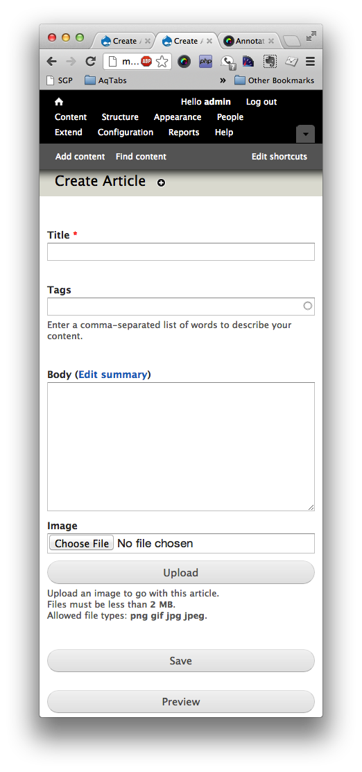
moshe weitzman CreditAttribution: moshe weitzman commentedThe after is in #3. here is a before. The main difference is wider buttons and wider form elements on narrow devices.
Comment #9
moshe weitzman CreditAttribution: moshe weitzman commentedEr, the screenshots look the same. This is not ready.
Comment #10
Bojhan CreditAttribution: Bojhan commentedI looked at this on my android, and consider it RTBC. I'd love before/after screens too, but applying patches for mobile is an incredible hassle.
Comment #11
Bojhan CreditAttribution: Bojhan commentedThis is really a biggy, without it most forms create a bug where it stretches the width of the theme - making it hard to use.
If you use your mobile phone you will quickly find this to be true.
Comment #12
webchickTested on http://spark.webchick.net/8.x/, looks good there.
Before:


After:


Committed and pushed to 8.x. Thanks!
Comment #14
LewisNymanCross posting:
#1751150: Improve usability of forms on touch screen and small screen devices
Maybe worth discussing if we should keep this styling per theme?