
 Support for Drupal 7 is ending on 5 January 2025—it’s time to migrate to Drupal 10! Learn about the many benefits of Drupal 10 and find migration tools in our resource center.
Problem/Motivation
As part of the Drupal 8 Mobile Initiative all of Drupal core's themes need to be converted to have responsive designs. This includes Stark.
Proposed resolution
Leave Stark's current layout as-is for large screens and create 2 new layouts, one for mobile sizes and one for mid-sizes.
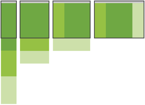
Stark's layout in D7 is already a fluid grid. (The grid is a 5 column grid with 20px gutters, btw.) So we can continue to use that layout for the larger screen sizes.
For mobile sizes, we should make it be a simple 1 column layout. This should also be the default when a browser can't handle media queries.
For the mid-sizes, we should use a 3 column grid with 20px gutters. I was thinking of a viewport width of between 480px and 960px. 480px is the first multi-column breakpoint of the 320 and Up project. And, 960px, of course, is a traditional desktop size. In that 3 column grid, the content div should take up 2 columns of space. When the first sidebar has blocks, it will take up the 1st column in the grid with the second sidebar below it (if it has blocks). If there are no first sidebar blocks, then the second sidebar should take up the 3rd column if it has blocks.
Layout overview:
- Mobile: 1 column fluid grid
- Midsize: 3 column fluid grid (between 480px and < 960px), if "first sidebar" exists, both sidebars are on the left, otherwise "second sidebar" is on the right.
- Desktop: 5 column fluid grid (960 and larger), one sidebar on the left, one on the right. <-- this is what Stark in D7 uses
Remaining tasks
Review patch, confirming RTL layouts also work.
User interface changes
Stark will respond to varying screen sizes.
Original report by JohnAlbin
As part of the Drupal 8 Mobile Initiative all of Drupal core's themes need to be converted to have responsive designs. This includes Stark.
Fortunately, Stark's layout in D7 is already a fluid grid. (The grid is a 5 column grid with 20px gutters, btw.) So we can continue to use that layout for the larger screen sizes.
Suggested layouts:
- Mobile: 1 column fluid grid
- Midsize: 3 column fluid grid (between 480px and < 960px), if "first sidebar" exists, both sidebars are on the left, otherwise "second sidebar" is on the right.
- Desktop: 5 column fluid grid (960 and larger), one sidebar on the left, one on the right. <-- this is what Stark in D7 uses
| Comment | File | Size | Author |
|---|---|---|---|
| #64 | 1322794_64_eof.patch | 634 bytes | scor |
| #59 | IE8StarkHTMLOutput.txt | 6.24 KB | Tor Arne Thune |
| #58 | ie8.png | 209.46 KB | Schnitzel |
| #57 | IE8NativeStarkAlwaysUsingNarrowLayout.png | 103.03 KB | Tor Arne Thune |
| #53 | IE8StarkAlwaysUsingNarrowLayout.png | 87.86 KB | Tor Arne Thune |


Comments
Comment #1
JohnAlbinI know I'm supposed to be encouraging others to work on the mobile initiative issues, but I couldn't help taking the ceremonial first shovel full.
Here's a patch that implements the proposed solution above.
Comment #2
JohnAlbinNeeds review.
Comment #3
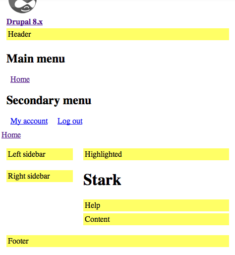
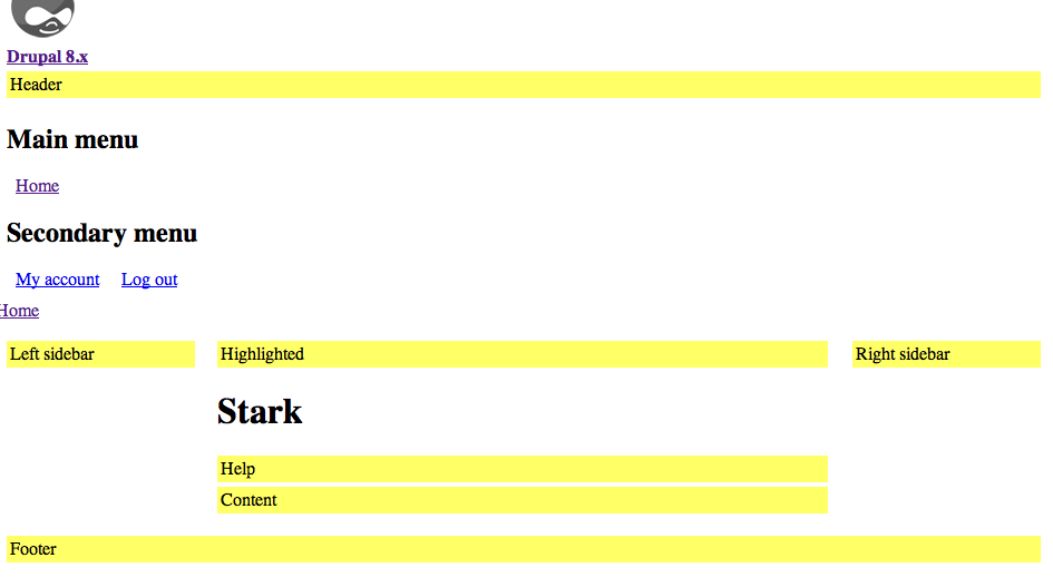
JohnAlbinHere's some screenshots to help review.
Configurations with a left sidebar and an optional right sidebar:
Configurations with a right sidebar and no left sidebar:
Comment #4
JohnAlbinRe-rolled patch after massive core/ directory change. :-)
Comment #5
rovoThis looks great!
Comment #6
ruplWe might as well start this discussion somewhere: which media query approach should we use?
I see both min- and max-width conditions in #4. I find myself constantly avoiding max-width. I find it easier to grok one condition, and feel it's more predictable in terms of overriding rules later in the document. Some might mention the mobile-first aspect, but in this case there are no mobile styles to override whatsoever, so we're doing that either way.
And what about location of queries? For Stark I am in favor of one stylesheet containing all media queries (as the patch is now). All of our core themes are simple and lightweight enough that single-stylesheet will probably be the best option.
Thanks for getting this started, John! I don't think anyone objects to you making the first move :)
Comment #7
anthonyR CreditAttribution: anthonyR commentedGood to see the first step to responsive base themes!
@rupl: I also try to avoid max-width conditions, especially for base styles like these. Why is it being limited with a max-width in this case?
Comment #8
moshe weitzman CreditAttribution: moshe weitzman commentedCan we get some momentum here? This is a tiny patch (hurray!). Whats left before RTBC?
Comment #9
ruplHere's the #4 patch rerolled against today's HEAD. Will circle back and provide another patch that takes my thoughts above into consideration.
Comment #10
ruplWhat about IE support for these media queries? I've pushed an 8.x branch of respond.js module to help people test, but that's probably the biggest blocker for this issue.
I don't like the idea of hardcoding too many polyfills into Drupal's default output, so unlike #1077878: Add HTML5shiv to core, we should add the JS to each theme itself instead of common.inc.
Comment #11
JohnAlbinUsing only min-width in media queries should be our default way of using media queries. It follows the CSS cascade pretty nicely. As the viewport size increases, additional rules are added to the mix.
However, for moderately complex layout CSS where different elements are receiving different properties, it is a PITA to override all of the layout CSS of smaller-sized media queries in each subsequently-larger media query.
That's why I used max-width for some of the rules in Stark's layout. It made the CSS file shorter. Less CSS is easier for me to grok, personally. I originally wrote Stark's layouts with just min-width, but it took forever to get it to work because I wasn't (at first) overriding all the properties I needed to. Once I finally got it working, I re-architected it to use a few max-width which simplified the rest of the CSS.
I'm working on my slides for Drupalcon Denver and I'm re-booting the classic Sith rules of CSS specificity to include media queries. I'm not going to say how, but hopefully it will make it easy to comprehend.
First, using media queries inside the "media" part of the .info file is a bad idea because it will hurt performance. Drupal is unable to aggregate dis-similar media CSS and browsers will download all the CSS files regardless if the query in the "media" attribute applies to the CSS download.
Secondly, since the media queries need to be written inline in our normal "all" CSS files, then we should just use media queries anywhere they logically make sense. For example, media queries that alter the node links should be placed right next to the non-media-queried styling for node links.
I'm not particularly wedded to one solution. Two points… 1. Respond.js is nice and small, but is redundant if a theme wants to use Modernizr (a very popular JS utility.) 2. IE 8 and earlier are known to be desktop browsers, so, technically we don't have to serve theme media queries. Here's some solutions we could tackle:
Add Modernizr to core or to each theme— Since best practices for Modernizr 2 say to use a custom build for your theme, its impossible to add a custom build of Modernizr to a CMS that has to be capable of handling any situation. I'd say this option is out.Hmm… #3 is starting to sound pretty good actually. But I'd like to see more people chime in with opinions.
Comment #12
dcmouyard CreditAttribution: dcmouyard commented+1 to adding respond.js to each theme individually. As mentioned above, not all themes will need it.
Comment #13
JohnAlbinAdding the "sprint" tag for a mobile holiday sprint. :-) http://drupal.org/project/issues/search?status%5B%5D=Open&issue_tags_op=...
Comment #14
moshe weitzman CreditAttribution: moshe weitzman commented#3 sounds fine to me too. Would be great to keep this one moving along.
Comment #15
ruplOk, yet another roadblock: respond.js now includes MIT/BSD-licensed matchMedia.js. They are not keen to add a third license.
I'd like to get an opinion in here from someone familiar with the status of the Drupal third-party packaging whitelist to understand it more thoroughly. Namely, does this whitelist apply to distros only, or can we put these whitelisted libraries in core itself?
Here's the new respond.js (v1.1.0rc1) with matchMedia.js included: https://github.com/scottjehl/Respond/commit/cb581e52f8d2bb76cc5929781779...
Comment #16
Dries CreditAttribution: Dries commentedComment #17
moshe weitzman CreditAttribution: moshe weitzman commentedI spoke with webchick about respond.js and did a little research. We can commit respond.js to core at git.drupal.org. We just need an exception as per http://groups.drupal.org/node/14734#comment-51709 and http://groups.drupal.org/node/14734#comment-49264. I don't see an immediate need to open an infra issue as suggested this is a prominent core issue where Dries is expressing support.
So, feel free to proceed with respond.js.
Perhaps we should call a Skype conference to make a plan on this issue?
Comment #18
ruplI was thinking about this issue just last night and wanted to reconsider the first option John listed above. Why not just use the conditional comments built into core to provide IE with double stylesheets? It's a smaller performance hit than the JS, and we're avoiding the dependency. Even with no comparison data, it appeals to me. There might be minor maintenance issues, but they wouldn't be any more complex than existing issues with RTL CSS staying in sync with LTR.
Given that we've dropped IE6/7 support, we would be adding respond.js for a single browser (IE8). While reconsidering the progress of this issue (before Moshe posted comment #17) I came to the conclusion that it's a bit heavy-handed to saddle core with the library to cover what we will likely consider to be an edge case in August 2013 (D8's proposed launch date). Finally, there's this issue with respond.js:
Drupal 7 and 8 output
@imports by default, only printing<script>when CSS aggregation is enabled. That means this script will have no effect on a default installation of Drupal. I have to keep a separate section on my contrib page because I get so many questions about this. That's a big -1 for out-of-the-box functionality.To conclude:
Comment #19
JohnAlbinRupl's analysis is spot on. The respond.js script wouldn't work out of the box; it would only work when you turn on CSS aggregation. (We kept bumping our heads on this issue on a recent project.)
And since IE8 is the only desktop browser that D8 supports that doesn't have media query support, we should just feed it a desktop-specific layout.
Now, there's 2 ways to feed a desktop-specific layout to IE8:
In Zen 7.x-5.x, I've opted for #2. But people should read this article which goes through all the pros and cons: http://mathiasbynens.be/notes/safe-css-hacks
Comment #20
daniel.nitsche CreditAttribution: daniel.nitsche commentedJust a note: Firefox < 3.5 also doesn't support media queries, although Firefox 3.5 is over 2 and a half years old now. Is that going to be dropped in Drupal 8?
I've been using technique 1 (conditional stylesheets) for dealing with IE < 9 for a while, because I found respond.js to be too buggy and not worth the effort for IE. Below is what's in my theme if it's of interest.
John: you mentioned 320 and up in your initial post: have you thought about using this CSS framework instead of a desktop-first approach?
Comment #21
ruplI would say FF 3.5 usage will be too low to care in 2013. It is negligible even today. I don't know of a definitive source for global browser usage, so here are two different graphs. When this comment was posted, one showed FF3.5 at 0.47% - the other didn't list it.
http://marketshare.hitslink.com/browser-market-share.aspx?qprid=2&qpcust...
http://gs.statcounter.com/#browser_version-ww-monthly-201101-201201
We've already decided to use technology that we know will marginalize less capable web browsers. It doesn't mean Drupal won't be able to support them, just that out of the box it won't offer full support.
Comment #22
JohnAlbinWho said we're using a desktop-first approach? That's insanity.
Since this is the Stark theme, our mobile-first layout is no layout at all. The patch adds media queries for larger viewport sizes, but defaults to the mobile layout (i.e. no layout).
The question I posted in #19 still needs answering before the patch can be re-worked.
Comment #23
jensimmons CreditAttribution: jensimmons commentedChiming in on the above debate about putting response.js in core vs. in each theme (even though it's not at hand for Stark anymore. I'm going to use respond.js as an example to make a broader point):
If people decide to use respond.js in one of the core themes, or use another polyfill library to fix up something, I believe those libraries should be added to each theme, and not to core itself. Now I know, it could be argued that it's redundant — adding respond.js to Stark, and then adding it to Bartik, and then adding it to a new-to-D8-theme might seem like a hassle or too many bits or a waste. But adding a library to core itself has a completely different effect than simply supporting all the core themes... adding something like respond.js to core says: hey everyone building website in Drupal from 2013-2018, we are convinced this is a pretty great solution for your needs. Adding it to core themes instead (even all of them) says: hey everyone, this library is needed for theme X, let me explain in the comments why, you might want to do something similar in your theme, check it out / hey person who never looks at code, this just works, you are welcome.
I don't like the idea of adding respond.js to core, imposing it on all Drupal projects evar. I love respond.js. I use it on every project I build these days. But it's still changing. The way I use has changed more than once in the last year. Best practices are changing. I will likely stop using respond.js at some time in the future and replace it with something else. As mentioned above, if I use Modernizer, I don't use respond.js. And this is true with all of the detailed solutions to the hiccups in mobile-first responsive web design. It's a fast moving world right now. Lots of options. People are popping up with new versions of this and that, new ideas to solve the same little problems. One is faster than the other. Another is easier than the "best practice" of two months ago. A third solves a problem we didn't even realize we had, while wiping out the need for the thing you were using before.
If Drupal core — the level of Drupal that provides code for all sites, not just the ones using a core theme — institutes a solution, it needs to be only because that solution is a best practice that's fairly locked down and not changing any time soon. And an important solution that is pretty much required for every site. The HTML5 Shiv is a great example of such a thing. The code hasn't changed in years. It's required for every HTML5 site. No one in the broader web design community has debated yes/no to the HTML5 Shiv in many years. There's no reason to not include it in core itself.
But most of these other things.. they will come and go. Something that's super important and awesome in Spring 2013 might become an old and tired solution, long replaced by something else by Summer 2014. We've run into pain of trying to keep jQuery and jQuery UI updated. jQuery-in-core soon lags years behind while jQuery update module can lag months behind. (It's still the best solution, imo, to have jQuery in core. We just have a good example of the downside of including solutions from the world outside of Drupal in Drupal core, and should see if there are ways to avoid the hassle and lag.)
I'd hate to be filing issues over and over to update respond.js, update ios-orientationchange-fix,js, update query.widowfix.js, update imgsizer.js, update selectivizr.js… these are all libraries I use on every project, and I'm sure I have a different favorite combination in the future. I don't want to either impose a particular formula on every Drupal project, or keep thrusting aged-versions that have been long abandoned. Let's instead add libraries to core themes, even if that means including something more than once. (They are tiny files btw). So if it's deemed best to not use respond.js for Stark, but people want to use it in a new theme for Drupal 8 — then let's not use it in Stark, and just add it to that new theme. If a group takes a look at imgsizer.js and wants to use it in every core theme, then lets add it to every core theme — and not core itself. That way we don't have to worry about updating it or replacing it. These libraries aren't going to break. They will keep working just fine for anyone using a core theme for their site. I feel no need to go back to sites I built last year and replace respond.js with the new version. (Staying current with emerging best practices are simply about making the sites we make have longer shelf-lives and supporting more devices as those devices are discovered or invented. The "old" technique of month-before-last isn't going to explode anything.)
By adding these libraries to each core theme, and not core itself, we allow everyone who builds a new website in Drupal 8 from 2014 to 2018 to use a particular library or not use it, to add it to their custom theme or not, to use whatever Drupal-contribute base theme they want (and the maintainer of that theme can make the call / keep up with industry best practices… or not), without people wondering in 2016 why Drupal is making them use a technique that hasn't been in favor for years, or wasting time trying to figure out how to disable what Drupal is forcing on them in order to do what's the current best-practice. We already have enough of that going on. Let's not add more.
Comment #24
jensimmons CreditAttribution: jensimmons commentedAs for the question at hand, I prefer to use body (or html) classes like '.ie8' to allow me to write ie8-specific CSS inline with all the other CSS. It's a technique more and more front-end developers are using these days, now that we don't have to write as many i.e.-bug fixes.
The use of such classes should be consistent throughout core though, imo. This should not just be for the media queries, while the older bug-fix CSS is called by conditional comments. We should change the way core handles all i.e. CSS. Which is a larger issue beyond Stark and beyond responsive design. It will affect all of Drupal theming.
For reference, JohnAlbin pointed to this discussion of classes vs separate stylesheets, pros and cons: http://mathiasbynens.be/notes/safe-css-hacks
Comment #25
dodorama CreditAttribution: dodorama commentedI just filed an issue to drop IE8 support in Drupal 8. It might sound crazy today but for when Drupal 8 will be released (August 2013?) and for when it will start to be used extensively (2014?) we might see it having a marginal marketshare. Look at the issue for all the motivations. #1465948: [meta] Drop some IE8 coddling from Drupal core
That would mean native support for media queries (and HTML5). Yes!
Comment #26
echoz CreditAttribution: echoz commentedConditional classes on the html tag cause IE to ignore the meta X-UA-Compatible tag and show the compatibility mode button. IE9 still uses this horrid compatibility mode.
A solution for D8 could be to use the conditional classes on the body tag, if in fact the reason this is not the current practice is because of IE6 support, and with many body classes already used, that browser not working with dot classes (.class.otherclass).
Apologies if this is considered cross posting, with what I originally posted in the Zen issue cue #1468104: conditional classes on html tag cause IE to ignore meta X-UA-Compatible tag and show compatibility mode button, which has more summary and references, but the body tag solution is not for D7.
Comment #27
JohnAlbinOk. I think I may have derailed the central issue a bit with my question in #19. There have been some fantastic responses, but it seems clear we need more discussion (in its own issue) about how to implement IE conditional classes as a replacement for the conditional stylesheets we currently use.
For now, let's add a IE conditional stylesheet for IE8 to give Stark a desktop-appropriate layout. (We can replace all the conditional stylesheets in that new issue which I'm creating now.)
Comment #28
KrisBulman CreditAttribution: KrisBulman commentedas a follow-up to John's post above, the ticket in question is here: #1471382: Add IE-conditional classes to html.tpl.php
Comment #29
Jeff Burnz CreditAttribution: Jeff Burnz commentedYes this is what I do now, totally dropped respond.js usage, too many issues to deal with and forcing the use of drupal_add_css(), I still support the option for using it, but its off by default (contrib projects).
Comment #30
ruplI really discourage the inclusion of respond.js directly in any contrib theme. It's extra work for a theme maintainer to support, it's another piece of code to keep up to date, and it's just generally a pain. After writing that sentence I'm not sure why I created the module :) But it is ultimately a good set of reasons not to include respond.js within Stark or any core theme.
Comment #31
KrisBulman CreditAttribution: KrisBulman commentedI very much agree with the no respond.js / d8 desktop approach.. How are others handling this Ina mobile and up setting?
Comment #32
effulgentsia CreditAttribution: effulgentsia commentedMany of you are already participating in #1471382: Add IE-conditional classes to html.tpl.php, but for those who aren't, reviews on #1471382-47: Add IE-conditional classes to html.tpl.php would be much appreciated. Thanks!
Comment #33
yoroy CreditAttribution: yoroy commentedBumping priority, at least for as long as Drupalcon is on.
Comment #34
jrbeemanI'm working on this during the DrupalCon mobile sprint. Per @JohnAlbin's comment #27, I'll be using conditional stylesheets so that we can get this done and committed. Once #1471382: Add IE-conditional classes to html.tpl.php is hashed out, we can move things around accordingly.
Comment #35
jrbeemanHere's a new version of @rupl's patch in #9 with the following changes:
Add ie.css and include it using a conditional statement. IE 8 and lower should render using desktop layout (>960px)
Move the growing number of CSS files into /css.
This patch has not been tested in IE 8 (still getting an environment setup on my laptop), so it needs review and testing. Expected behavior is that Stark is non-responsive in IE 8 and lower.
Comment #36
jrbeemanWhoops - attached the wrong patch in that last comment. This patch is the correct one.
Comment #38
JohnAlbinOoh. We changed the path to the CSS files and broke some simpletests. I can fix that.
Comment #39
JohnAlbinFixed the simpletests. No other changes.
Comment #41
alanburke CreditAttribution: alanburke commented#39: 1322794-39-responsive-stark.patch queued for re-testing.
Comment #43
alanburke CreditAttribution: alanburke commentedSmall addition.
When we have 2 sidebars, we let the blocks in the second sidebar use the width of the page.
Comment #44
alanburke CreditAttribution: alanburke commentedTest most recent patch please
Comment #45
alanburke CreditAttribution: alanburke commentedThis might be better
Comment #46
alanburke CreditAttribution: alanburke commentedA bit better
Comment #47
JohnAlbinLoving the inception patch in #45. ;-)
But I've compared the patch in #46 to #39 and its definitely the correct patch. I saw this Luke Wroblewski post this morning: http://www.lukew.com/ff/entry.asp?1514 And asked Alan to tweak Stark's layout to match the "Column Drop" pattern Luke describes.
Comment #48
Schnitzel CreditAttribution: Schnitzel commentedTested patch with a couple of devices and together with this patch: #1488754: Add mobile friendly meta tags to the Stark theme
- iOS 5.1 iPhone 4S
- Android 4
- Android 2.3.5
- Android 2.1
- Kindle Fire
- Nokia N900
- Safari 5.1.4
- Firefox 10
- Chrome 17
- Internet Explorer 9
I created some Menus and Nodes via Devel and for all devices it works as expected with the responsive Design.
Tested these Block Settings:
- No Left Sidebar, Right Sidebar
- Left Sidebar, No Right Sidebar
- No Left Sidebar, No Right Sidebar
- Left Sidebar, Right Sidebar
With IE 8 it gracefully degrade to non responsive and works as Stark as usually.
Also tested in Internet Explorer Mobile 6 which loads the narrow layout (1 sidebar and content, right sidebar below) but then fails in correctly floating. But because we don't support IE6 this is fine.
There is only one problem, if applying this patch after #1488754: Add mobile friendly meta tags to the Stark theme it fails because it also tries to add a new template.php to Stark Theme.
Comment #49
yoroy CreditAttribution: yoroy commentedIf it helps: I support this particular pattern for how we reflow regions here, I was there when we chose it during the sprint.
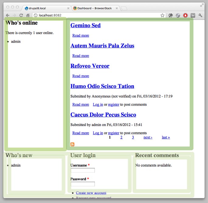
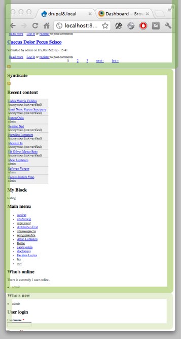
I asked to add some screenshots of how things look for different screen sizes. There's an additional tweak we're adding here: when the right sidebar drops below the content area, we reflow the block in it to float: left, widht: 33%.
Comment #50
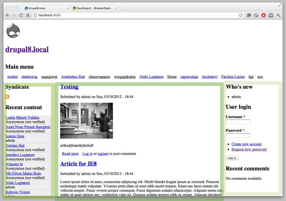
Schnitzel CreditAttribution: Schnitzel commentedhere some screenshots of the testsite which shows the usage of "Column Drop" and RWD.
Check the narrow.jpg, it shows how the blocks of the right sidebar are shown in a 33% grid
Comment #51
JohnAlbinI've also tested this. Though not nearly as thoroughly as Michael! Awesome review!!!
Yep. We'll have to re-roll that other patch once this lands. Or vice-versa. I'll work with a committer about getting these committed together.
Comment #52
Tor Arne Thune CreditAttribution: Tor Arne Thune commented#46 works as expected in
Chromium 17 on Linux
Firefox 10 on Linux
Opera 11.61 on Linux
Internet Explorer 9
But on Internet Explorer 8 it always uses the narrow layout, as in 1 column layout.
Comment #53
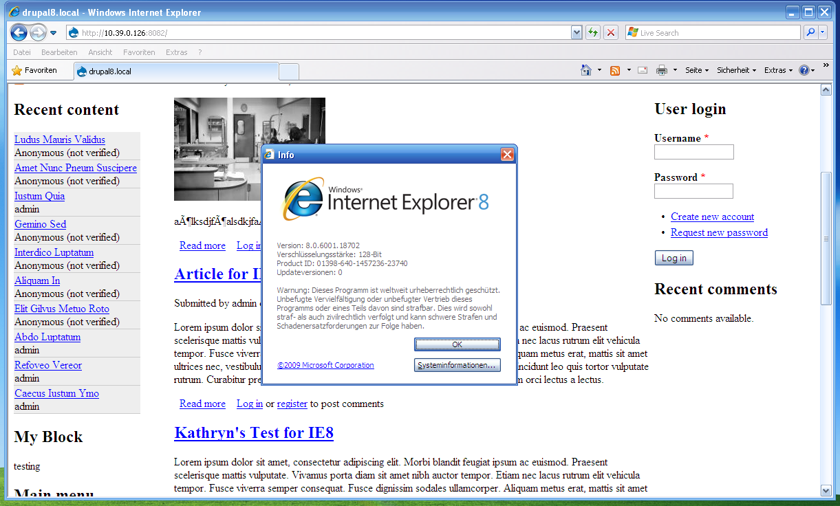
Tor Arne Thune CreditAttribution: Tor Arne Thune commentedComment #54
Schnitzel CreditAttribution: Schnitzel commentedmhh for me it works in IE8 as expected: normal desktop layout.
Let me test this again on a fresh D8 install.
Comment #55
dcmouyard CreditAttribution: dcmouyard commentedRegarding #53, testing in IETester isn't as reliable as using actual copies of IE.
Also, I've read that IETester doesn't always load HTML5 shivs/shims correctly.
Comment #56
Tor Arne Thune CreditAttribution: Tor Arne Thune commented@dcmouyard: Thanks for the heads-up. Will try to install IE8 and see if it's IETester bugging.
Comment #57
Tor Arne Thune CreditAttribution: Tor Arne Thune commentedStill the same problem with IE8 native.
Comment #58
Schnitzel CreditAttribution: Schnitzel commentedstrange, tested on an 8.0.6 and it works.
will update now to 8.0.7
Comment #59
Tor Arne Thune CreditAttribution: Tor Arne Thune commentedI'm not seeing the ie.css loaded in the HTML output when viewing the page in IE8, or am I missing something?
Comment #60
Tor Arne Thune CreditAttribution: Tor Arne Thune commentedApparently it was a cache problem on my part. After clearing the cache Stark uses the normal non-responsive layout in IE8. Back to RTBC, sorry for holding this up! Learned a lesson there.
Comment #61
alanburke CreditAttribution: alanburke commentedGreat testing on IE - thanks!
Comment #62
Schnitzel CreditAttribution: Schnitzel commentedretested this patch because of the removing of
target-densitydpi=160dpiwith a lot of different devices:- Android 4
- Android 2.3
- iOS (Ignores the target-densitydpi completely)
- Firefox
- Chrome
- IE 8, 9
Comment #63
Dries CreditAttribution: Dries commentedCommitted to 8.x at the DrupalCon Denver code sprint.
Comment #64
scor CreditAttribution: scor commentedfollow up patch fixing the \ No newline at end of file in ie-rtl.css and ie.css
Comment #65
alanburke CreditAttribution: alanburke commentedIt's a fair cop guv.
I missed that.
Thanks Stephane!
Comment #66
Dries CreditAttribution: Dries commentedCommitted to 8.x. Thanks!
Comment #67
webchickYAYYY!
Comment #68
Schnitzel CreditAttribution: Schnitzel commentedI just wanted to add a short notice here:
The Theme will work on Mobile devices only perfect if the Mobile Friendly Metatags #1468582: Add mobile friendly meta tags to the html.tpl.php are also commited.
Comment #70
effulgentsia CreditAttribution: effulgentsia commentedPatch to remove IE8 special layout CSS: #1645494: Allow core themes to display single-column on IE8: do not compensate for lack of media query support.