
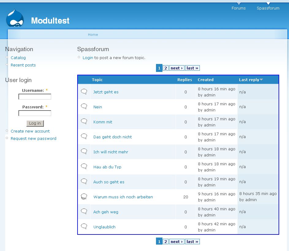
hi there,
I think in 5.0 there should be some new icons at the forum.
The present ones doesn't look like 2006/2007.
| Comment | File | Size | Author |
|---|---|---|---|
| #200 | forum-icons.svg_.txt | 219.44 KB | yoroy |
| #180 | forum-closed.png | 700 bytes | yoroy |
| #180 | forum-default.png | 640 bytes | yoroy |
| #180 | forum-hot-new.png | 820 bytes | yoroy |
| #180 | forum-hot.png | 750 bytes | yoroy |


Comments
Comment #1
bloomaniac CreditAttribution: bloomaniac commentedits me again.
I am still thinking that it would be great to have some new forum icons with a more modern look.
Comment #2
bloomaniac CreditAttribution: bloomaniac commentedwrong title
Comment #3
bloomaniac CreditAttribution: bloomaniac commentedwell, nobody seems to be interested in this.
I'm attaching the icons I'd suggest for use. I've taken them from the Silk Icon Library.
What do you think?
Comment #4
MichelleI doubt icons that require a link back will ever be part of core.
Michelle
Comment #5
Frando CreditAttribution: Frando commentedRight. famfamfam icons are licensed under a CC license. That means they're incombatible with the GPL and therefore can't be used in core.
Comment #6
BrightLoudNoise CreditAttribution: BrightLoudNoise commentedI'm happy to take a crack at this, I have created a number of icon sets in the past, including forum icons.
Comment #7
BrightLoudNoise CreditAttribution: BrightLoudNoise commentedOops, looks like I dropped a trailing slash on the forum icons link, sorry about that.
Comment #8
cosmicdreams CreditAttribution: cosmicdreams commentedGood work. I've been looking for a clean, small icon set for the major nodes (blog, poll, event, forum). Do you have anything like that?
Maybe its just me, but additional icon sets for the forum module sounds like an issue best handled with themes. Rather than trying to change the core forum's iconset perhaps you should just roll a theme and have a showcase for your art?
Comment #9
BrightLoudNoise CreditAttribution: BrightLoudNoise commentedI'm happy to clean up the core forum icons so everyone has a good starting point, and then may look into releasing some fashion of forum sub-themes.
Comment #10
JirkaRybka CreditAttribution: JirkaRybka commented+1
The icons linked in #7 are nice, and generally in line with my thinking about Drupal's forum.
Comment #11
bloomaniac CreditAttribution: bloomaniac commentedI created some icons for the forum module too.
You can see them here and download them here!
Please give me some feedback.
Comment #12
JirkaRybka CreditAttribution: JirkaRybka commentedI like these more than #7, because they are more simple (i.e. understandable in the tiny size). Generally I prefer any kind of these comics-like bubbles over Drupal's default envelopes, as comments / forums are more of a "speaking" nature (or even "chatting" somewhere), while envelopes suggest rather some kind of e-mailing list, or something private, hidden, which is not the case.
(BTW I already used a bubble as Forum/Comment icon on my site, although it's a bit different place: http://naturista.cz/drupal/?q=diskuse/nuda_na_olomoucku - I've a different icon and color-schema for each node type, to give various content types own look&feel a bit, so users know what they are looking at, even if they came by a random link from somewhere. It's all just theming, but while I speak of it - it might be also nice to have some basic set of these content-type-indicators with Drupal. Or is there one already, somewhere?)
Comment #13
MichelleJirkaRybka - Have a look at http://groups.drupal.org/node/6422
Michelle
Comment #14
BrightLoudNoise@drupal.org CreditAttribution: BrightLoudNoise@drupal.org commentedI've put a link to some of my forum icon tests here http://groups.drupal.org/node/6422#comment-19350
Comment #15
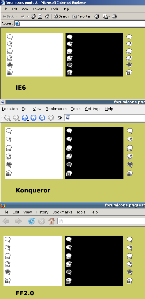
BrightLoudNoise@drupal.org CreditAttribution: BrightLoudNoise@drupal.org commentedAnother forum icon theme I'm working on, which has more traditional style, it also uses 8bit PNG's with alpha transparency, so it degrades pretty gracefully for older browsers (ie5.5, ie6).
Comment #16
yoroy CreditAttribution: yoroy commentedEDIT: Sorry for duplicating this issue. Folding my posts into this one, continued below.
Comment #17
yoroy CreditAttribution: yoroy commentedGabor told me to add my stuff here, so here goes:
Comment #18
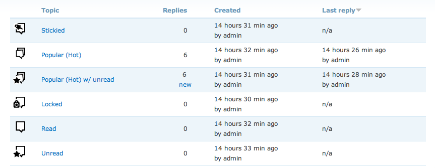
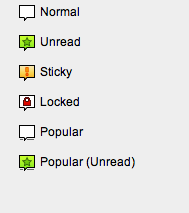
yoroy CreditAttribution: yoroy commentedAttached a mockup of the icons "in action". You'll see the big dot for "new" makes them quite scannable.
Color would definately enhance this, but I think they already work as is.
I chose the dot because that's how unread messages are marked in my mail app (OS X Mail). Is that a common thing in your inboxes too?
Regarding the fileformat and transparency: there's a trick in Fireworks that allows you to use multile colors for the alpha channel, which kinda degrades ok-ish in IE. it's described here: http://www.sitepoint.com/blogs/2007/09/18/png8-the-clear-winner/
Brightloudnoise links to some tests with that technique here: http://groups.drupal.org/node/6422#comment-19350
Also attaching a layered .tif file (remove the .txt extension to expand the zip) with the forum screengrab as well
(Webchick: I don't now what you mean with "new placeholder").
Comment #19
alpritt CreditAttribution: alpritt commentedThese are my comments from the duplicate thread (http://drupal.org/node/190773#comment-624998), but I've rewritten slightly since things have moved on slightly.
--
So as I said in IRC, I'm really enthusiastic about these. No envelopes or flames is a winner in my book. The icons seem clear and recognisable. The hot topic icon is a very clever idea. The designs are friendly looking without being distracting or too stylised towards one kind of site. They look very professional.
The large dot for unread posts is visually clear, and appears easily scannable. I agree with yoroy in that colour will enhance the ease in which we can scan, but it already is scanable in monotone.
What I don't know is how understandable the dots are without explanation. If it is used on the Mac then that is a good sign. Still it will be interesting to show the mock-up of these in context to naive users to see if it makes sense to them.
I won't rehash my thoughts on the file format since Yoroy seems to have an answer. I don't understand this Fireworks miracle, but it sounds like the perfect solution.
How do these look on different background (especially darker themes)?
Comment #20
MichelleI hate to be the downer on this thread, but I just don't get them. Looking at the use case, the only thing that's obvious is the one with the padlock. Not having used a Mac, the dot is meaningless to me. To me, it's not super important because I never pay attention to the icons anyway. I look for the "new" and "updated" label and the post count. The icons are just decoration to me. But, since you're spending so much time on this, I thought you might like to know that they aren't understandable to someone who uses a PC. FWIW, I don't get the envelope ones, either. I ended up looking up the meanings and putting a legend on my forums.
Michelle
Comment #21
Gábor HojtsySo far yoroy's gradient less icons fit the best with Garland (and are also portable enough for other themes, and could also be recolorable I guess :). I agree that the dot for the new marker is not easy to grok.
Comment #22
JirkaRybka CreditAttribution: JirkaRybka commentedAnother +1 to these nice icons, and another BIG -1 to the dot. If not told here in the thread, I would not understand what it meant.
I would definitely vote for some sort of a star for "new" marker, either small and solid, or bigger and just outline. I know that somebody says it might be confused with 'rating stars', but I don't think so. If there's only just ONE star, on top of another picture (preferably top-right position), then it definitely means "new", based also on widely understood "new folder" icon of Windows, or simply just being "new and shiny".
Comment #23
elv CreditAttribution: elv commented+1 for removing the envelope, forum is not mail.
-1 for the dot, too.
I like the speech bubble idea. The sticky one remind me of a logo, but I can't remember which one. I prefer the solid color version for legibility.
My only concern about the icons, is that at small sizes they are very similar, so it defeats the idea of identifying topics at a glance. Only the sticky icon really looks different from the others.
Couldn't we introduce a few color spots? That would be a good way to escape the "blue mood" a bit, but more importantly it's far easier for the human eye to differentiate colors than shapes. Orange would be appropriate for "new", because that's how it's already used in the forums and groups on Drupal.org.
Comment #24
yoroy CreditAttribution: yoroy commentedI'm making the wrong assumption about "new" I think. I interpreted "new" as meaning "has unread messages". But it seems it's a label for the age of the forum-thread itself, right?
Comment #25
JirkaRybka CreditAttribution: JirkaRybka commentedI was unsure about this, but examining my site's behavior, I see the yellow 'new' envelope on threads with new posts that I've definitely visited previously (even authored myself), so you were correct: It means "has unread posts".
The issue with the dot is, that it's a generic shape, which is really NOT self-explaining, unless the user already got used to understand it some way. And many users, perhaps even majority (given the feedback above) are NOT used to it.
Comment #26
BrightLoudNoise@drupal.org CreditAttribution: BrightLoudNoise@drupal.org commentedI've attached another iteration on the speech bubble icons, which try to reinforce their meaning through the use of colour. I prefer to think that green is a better signifier of new/unread as opposed to orange. But we can definitely discuss.
Are there significant reasons as to why we are still limiting ourselves to 16x16 sized icons? with the trends in font size these days, they look positively tiny. Moving up to 24x24 would make a significant improvement in legibility and probably fit within most line heights.
Comment #27
psicomante CreditAttribution: psicomante commentedi agree with brightloudnoise. 24x24 would make a significant improvement. Thread types would be immediately recognizable.
Comment #28
Gábor Hojtsybrightloudnoise: instead of arguing on principles, do what yoroy does and put your icons into perspective. How does those look in a default Garland forum topic table? How would 24x24 icons fit? We can only decide based on what we see.
Comment #29
psicomante CreditAttribution: psicomante commentedIMHO, the behaviour should be:
grey tonality - read/viewed (as a lot of BB/Forums/Mail clients do)
yellow/colored - to read/to view (as a lot of BB/Forums/Mail clients do).
A lot of people said that a forum with the different icon but same colors was much worse than same icon but different colors. All imho.
Then, i don't like very much the colors choiced by yoroy. I would prefer more contrast between new and read icons (the circle is wonderful, but it's not enough).
EDIT:
The test with brightloudnoise icons on our www.drupalitalia.org/forum. The "read" icon was modified by me (it's pretty ugly i know!) to suit my opinions about colors.
EDIT2:
The used template is garland.
Comment #30
alpritt CreditAttribution: alpritt commentedThe idea is to see if the icons work without colour first. Really what we are look at here is whether the shapes work and are understandable. Then we can add to that with the colour.
Examples in #29 are in 32x32. This is definitely too big. It's not just what we have room for, but also the visual weight against the text.
Comment #31
BrightLoudNoise CreditAttribution: BrightLoudNoise commentedI've attached a sample of what the discussion bubble icons I'd already posted in #26 would look like at 16x16 in Garland, I'll post a 24x24 sample tonight, which will have shapes which are easier to scan and will be monochrome.
The envelope style icons from #29 were from an earlier test and are no longer relevant to this discussion, I may release them as an icon pack at a later date if there is interest.
This started off as a pretty informal exercise (for me at least), however there are now a lot of rules being applied to the process after the fact which have caused some confusion. Let us please be patient with one another, as we all share the same end goal of improving the default forum icons.
Comment #32
BrightLoudNoise@drupal.org CreditAttribution: BrightLoudNoise@drupal.org commentedAttached is a 24x24px monochrome test of the discussions icons, they still fit well within the space available in the Garland theme.
I think the consistent placement of the status badge makes them easy to scan, however I think the indicator for popular topics needs some tweaking.
Comment #33
yoroy CreditAttribution: yoroy commentedOk, here's my next volley :-) The dot is no more. Please meet the update-asterisk. Yes, of course that has to be a star, indeed the dot was rather meaningless.
New option for "sticky":
Rationale for adding a solid background to the first version of "sticky":
Sticky = stuck = can't be moved = static = a solid square. This is a very usefull "visual device" here. You could make any content-icon "sticky" by filling its background to a solid square.
Rationale for instead adding a fill within the bubble:
Equally "heavy" presence. May suggest a push pin ("punaise").
Also, the fill-background trick takes away theming options (custom background color) because it'd remove transpareny.
I've added usecases for 16px and 24px versions and a variation on a dark background. The 24px is already quite heavy I think. (yeahyeahyeah, maybe 20px? :-)
Michelle: very good idea to add a legend, we should do that here, too. That would require a real patchy patch, something you shouldn't trust me on just yet ;-)
Your thoughts?
Comment #34
MichelleThe star is nice. I don't know why a star says "new" to me more than a dot does but somehow it does. :)
To be fair, I wasn't the one that suggested the legend. I just happened into the conversation and pointed out my site as an example of doing that.
I still would really like to see these in colour. I understand what you're saying about getting the concepts right, first, but my non artist eye is having trouble really seeing it without the colour.
Michelle
Comment #35
FiReaNGeL CreditAttribution: FiReaNGeL commentedYoroy, the only one I'm not sure about is the 'sticky' one. All the others are great (but would be better in color obviously).
Comment #36
BrightLoudNoise@drupal.org CreditAttribution: BrightLoudNoise@drupal.org commentedI've revised my set some, played with line weights and placement of badges after some discussion with Yoroy. I've also changed the indicator for popular discussions and replaced the exclamation mark with the venerable push pin.
Comment #37
psicomante CreditAttribution: psicomante commentedgreat bright, this icons are beatiful. The only issue is the forum 'read' icon. I would make it grey tonality.
Comment #38
Gábor HojtsyGreat, the icons converge to each other :) I was thinking about the applicability of the icons earlier today. Although I do think blue icons are "in color" (they match the Garland theme and are possibly fine for the other core themes which are also blue-ish or are fine with blue colors), they will probably not be fitting for other themes. However, adding color support might be a bit too much to do now (ie. recoloring forum icons would require quite some changes to both color module and the supported theme). Ideas on how can we proceed here?
Comment #39
JirkaRybka CreditAttribution: JirkaRybka commented#36:
I think that there's not that much of blue mass, it's rather just only lines, not too intrusive, and generally resembling the color effect of plain text. So I would be fine with the blue ones, which are also fitting to any white/grey backgrounds nicely, which is perhaps most frequent. Also we can suggest that people can replace these files in misc directory with any custom icons they like, it should be a pretty easy operation. Black ones are more neutral, but to my eye also a tiny bit ugly on default Garland.
Otherwise, the icons are notably square, but consistent with each other and understandable well. Would be really an improvement.
Comment #40
BrightLoudNoise@drupal.org CreditAttribution: BrightLoudNoise@drupal.org commentedI've rigged up a proof of concept for customizing the color of Yoroy's and my own icon sets using color.module at http://drupal.brightloudnoise.com/node/85, the caveat at the moment is that they would end up with a solid background as we need to mask off the areas we don't want colored.
Color.module overlays semi-transparent .pngs on background areas of color and then slices the output up to achieve its result, 100% transparent areas will pass the color applid without any further manipulation.
I'm not sure if there is a way to pass an additional transparency mask via the GD library using another .png to define the outer boundaries of the icons, or if we can throw away 100% transparent areas during the process.
Comment #41
MichelleOoooh... I like that. :)
Michelle
Comment #42
JirkaRybka CreditAttribution: JirkaRybka commentedFantastic, thanks for setting up the test page!
This looks really good. And when it comes to this visual comparison of icon sets on the same screen, I would vote for the round ones (Yoroy), with the star very nice ones.
Comment #43
alpritt CreditAttribution: alpritt commentedRe. color.module integration..... caveat aside... The icons with the consistent white-inside seem clearer to me. However, it doesn't quite work at the moment because the colour of the outlines always look too dark. Can we make the lines 100% transparent so that they match the exact selection in the colour wheel? This would be particularly helpful for use on darker themes.
Comment #44
yoroy CreditAttribution: yoroy commentedHere's another usecase mockup. Here the icons are size 20 x 20 px. I think this is a nice size, more readable than 16px, but not as prominent as the 24px verions.
Re #38: I've made these a darkish gray. I agree the pure black/white versions are too high in contrast in relation to the page they are on. Any use of color for the outlines will make these not look nice with certain colors. Without using color.module, gray is the best option.
re #43: Interesting suggestion, this would basically result in square images with the lines transparent, to be colored by the background color. Would make for really "boxy" icons though.
Another caveat: all these usecases as well as Brightloudnoise's color module demo relies on correct rendering of 24bit pngs with 8bit alpha channel. Which a certain browser (IE6) just doesn't. IE6 will display a grey background instead. There are fixes for this but Drupal core does not ship with one.
If we want these icons to look the same in IE6 as well without hacks, then Brightloudnoise's versions would be a better option, since his icons' outlines are mostly straight lines which don't need fancy transparency. Hmm…
Thoughts?
Comment #45
BrightLoudNoise CreditAttribution: BrightLoudNoise commentedMy current color.module demo only flattens them to a solid background or masks them off with a solid color at the moment, I've been looking into a way to achieve the necessary transparent background after coloring using libgd functions. This appears to be easier in PHP5 as the image handling is greatly improved.
I'm happy to assist in exporting Yoroy's icon set as 8bit png + alpha (this is possible in fireworks) if the group decides to use his set. A users ability to color and re-export either icon set as 8bit + alpha will also be dependent on their having fireworks, otherwise they'll be left with 24bit png + alpha which doesn't degrade well in ie6 and earlier.
Comment #46
MichelleAre you planning on doing any other forum icons? It would be nice to have re-colorable ones for things that are currently links, such as reply, quote, edit, delete, new post, new comment, etc.
Michelle
Comment #47
BrightLoudNoise CreditAttribution: BrightLoudNoise commentedI'm sure we can put something together for those, once a decision has been made on the iconset.
We'll need a moved icon too.
Comment #48
JirkaRybka CreditAttribution: JirkaRybka commentedLet's agree on some replacement for the ugly existing core-icons first, and try to get them in.
As for me, #44 is simply *perfect* and should go straight to core. :)
Comment #49
Gábor HojtsyJirkaRybka: I agree #44 looks ready for core as it is, and I asked Dries a few hours ago to consider this issue. I hope he will visit this issue as soon as he has time.
Comment #50
MichelleBrightLoudNoise - Great, thanks. And, yeah, I realize this iconset needs to be decided on first. I'm just looking to the future as I'd like to use these in Advanced Forum.
Thanks,
Michelle
Comment #51
JirkaRybka CreditAttribution: JirkaRybka commentedyoroy (#44) & BrightLoudNoise (#45) - given the positive feedback (and Dries coming ;)), I think it might be a good idea to provide final single files for these icons, so that we have an option to set something as RTBC here... Personally, I would love to.
Comment #52
yoroy CreditAttribution: yoroy commentedHmmm, I made a test to look how the tricked out 8bit pngs degrade in IE6. It's not pretty…
I'll try some more settings for this, I think the 8bit versions look even worse that the 24bit ones without the transparency.
Brightloudnoise: these were made with that ASwing.org AIR tool.
Comment #53
JirkaRybka CreditAttribution: JirkaRybka commentedHm, indeed IE6/8bit is not perfect, but at least there's no box around. GIF won't be any better - and that's the only transparency I ever succeeded with on IE6. If you can't find any better option, then I might say these are acceptable - but I would like to see them on white background first (very common use case). I guess adding another thin line around, just for the sake of dark lines protection in IE6, is not a good option (?)
Comment #54
yoroy CreditAttribution: yoroy commentedJirkaRybka, thanks for following along and your feedback. I've been fiddling the settings some more and I've managed to keep the outline intact in IE6 and still have the smoothness in other browsers. This is probably the best compromise I can reach within 8bit pngs. I found that only IE6 and Konqueror did not render the alpha transparency, other browsers show these icons as in the FF2.0 screenshot here.
Comment #55
yoroy CreditAttribution: yoroy commentedAnd these are the single icon files as used in the screenshot of #54
Comment #56
JirkaRybka CreditAttribution: JirkaRybka commentedWow, now THIS is much better. I would love to see these in core :)
Comment #57
catchI've arrived on this a bit late, but #55 looks very, very nice. +1 from me.
Comment #58
jrabeemer CreditAttribution: jrabeemer commentedIs it me or does yoroy's "sticky" icon - dark dot inside text bubble, doesn't mean sticky? The sticky icon should have a pin in it or maybe an icon that looks like a stamp with its corner being peeled away. "New" should have a sparkle-style icon. The closed icon has a lock on it, which implies it's "locked" not closed. If they mean the same thing, then ignore my comment on it.
I like the icons being dark gray and with clean vector art.
Comment #60
catchTo me, the dark circle inside the bubble looks like the head of a drawing pin (albeit a bit abstracted). In context with the others it looks fine to me. Closed and locked are the same thing, and locked is more common for forums.
Comment #61
BrightLoudNoise CreditAttribution: BrightLoudNoise commentedHere's what my design looks like at 8bit png with alpha transparency in IE6 and Firefox on various backgrounds for comparison purposes.
The squared design works quite well with the limited transparency options, I have some ideas for tweaking the white outline for the status badges for IE6 which I'll tackle tonight.
EDIT: I've also attached the single icons
Comment #62
jrabeemer CreditAttribution: jrabeemer commentedYoroy, another idea, instead of a star for new, put a big dot to the left side of the text bubble. This is like how iTunes represents new podcasts. Stars in Firefox 3, represent bookmarking. And for me, stars mean "important" or "popular" as in ratings.
Comment #63
profix898 CreditAttribution: profix898 commentedI definitely like the smooth round icons in #55 better, although I agree that the new ones are slightly easier to grab. But its good to see new stylish icons here at all in the first place :)
Comment #64
yoroy CreditAttribution: yoroy commentedmomendo, if you read the whole thread you'll see I started out with a big dot top right, with the same reasoning you mention. Lots of people did not interpret the dot as meaning "new".
Re: the sticky icon: the advantage with sticky threads is that they have another thing that seperates them from other threads: they are always on top of the list. So, I think it's enough to just make this icons visually distinct from all other icons. The dark fill gives it visual "weight/importance" and sets it apart from the others.
If you really want to nit-pick, it wouldn't even make sense to illustrate "stickyness" (glue? tape?) with a push pin either. Though I understand it's a commonly used metaphor.
Comment #65
sepeck CreditAttribution: sepeck commentedVisually I prefer BrightLoudNoise icon set. They are simple and I 'get' them immediately. Also I tend to be prefer that style so am biased by personal preference. The sticky 'push pin' metaphor is instantly accessible to me, though I am unsure how that translates worldwide.
yoroy's set is also attractive but the 'sticky' icon is not intuitive, perhaps try a variant with the 'push pin' icon? Also, the lines with the 'hot' icons do not convey 'hot', it conveys shaky to me. This may expose my lack of scanning other forums and current internet iconography though.
This is merely personal opinion, both are pretty.
Comment #66
jrabeemer CreditAttribution: jrabeemer commentedI agree with sepeck. I think if you look at the icons used in PHPBB, the hot icon is animated http://www.phpbb.com/community/styles/prosilver/imageset/topic_read_hot.gif Lots of other samples which look nice.. http://www.phpbb.com/community/viewforum.php?f=46
Comment #67
psicomante CreditAttribution: psicomante commentedUnderlining #66 and memendo.
Look at the read and unread icons. Different colors to put more differencies as possible between read and unread messages. Unread messages should be more visible.
http://www.phpbb.com/community/styles/prosilver/imageset/topic_unread.gif
http://www.phpbb.com/community/styles/prosilver/imageset/topic_read.gif
Comment #68
Gábor HojtsyPsicomante: those different colors would need to work with at least all core themes. And then how many themes did you see coming with a forum icon set? Close to none? Right. So ideally these icons would work well with most color schemes too. How does picking colors up front fit into that?
Comment #69
JirkaRybka CreditAttribution: JirkaRybka commentedColors, animations... The aim in this thread was, as far as I understood, to provide color-neutral, and more or less style-neutral icons, fitting more or less any theme. Core needs such approach. So I think we should keep just shapes, as it is now.
As for preferences - Yoroy's #55 is definitely better for me. The square ones seem a bit more ugly to me (or not along the style I expect to be universal today, to phrase it differently), and might be offending in some themes. As for the lines on "hot", these definitely mean that there's a lot inside (a pile of speech bubbles, rather than single one), to me.
The push-pin on sticky would be a nice improvement, though.
Comment #70
BrightLoudNoise@drupal.org CreditAttribution: BrightLoudNoise@drupal.org commentedI've tweaked the outlines a bit so they behave in IE6 and have also changed the shape of the "hot" icon as suggested by Elv.
Comment #71
JirkaRybka CreditAttribution: JirkaRybka commentedSeems like there's not full agreement on which set should go to core. I still think that square ones are too explicit style to be theme-neutral, but that probably just means that we need more feedback here.
So setting CNR - this is not strictly a patch, but needs feedback quite the same.
Comment #72
catchI continue to like #55 - I can see them working well with my modified zen theme (and lots of other themes), whereas the square ones seem too specific to me.
Comment #73
blackdog CreditAttribution: blackdog commentedMy vote also goes to the ones in #55.
Comment #74
MichelleI prefer #55 as well and it would be great if they could work with the color module. I'd like to use them in advforum and having the forum recolor itself to match the rest of the site would be awesome.
Michelle
Comment #75
BrightLoudNoise CreditAttribution: BrightLoudNoise commentedLet's go with Yoroy's set, I agree that they fit better with most themes.
I'll continue working on a way to recolor the icons, and will release a contrib module as soon as I have something to show.
Comment #76
jrabeemer CreditAttribution: jrabeemer commentedYoroy's #55 hot icon is bad. It looks like it's shaking or zoomed in. It should use some kind of flame icon overlay.
Comment #77
catchA flame wouldn't work in b&w, also the #55 hot looks like "lots of speech bubbles" to me, which indicates a busy conversation. I think that's a good, simple way to refer to it.
The idea is to have refreshed usable icons that will work with most themes, if people want something different for a custom theme it's easy to swap new icons in. I think these are ready, given BrightLoudNoise has put his weight behind #55 as well, I'm going to set back to RTBC.
Comment #78
yoroy CreditAttribution: yoroy commentedBrightLoudNoise: Thanks much, that's very nice of you.
Catch: please don't RTBC just yet. I'm working on some last tweaks for a few of the icons, coming soon.
Comment #79
yoroy CreditAttribution: yoroy commentedOk here's an updated preview. I made a new version for the sticky icon which I think is a big improvement. Also closed the underlying bubbles for the "hot" variations. Hopefully this way people are less likely to interpret it as shaky or zoomed in. Because a stack of bubbles implying a busy conversation is indeed what I want to suggest there.
Comment #80
yoroy CreditAttribution: yoroy commentedThe separate files as used in #79
Comment #81
JirkaRybka CreditAttribution: JirkaRybka commented"Hot" is now good IMO.
"Sticky" doesn't look right to me, though. The work *is* definitely moving in the right direction, the pin itself is good as I see it, but IMO it should point to the center of the bubble, or at the very least *somewhere* inside the main body of bubble. We're saying that the bubble (= it's content) is pinned to a background (sticky, doesn't move), while the current picture is pinning the pointer of the bubble, or even aiming the pin at the imaginary speaker for that bubble. I think that if the pin was, roughly guessing, somewhere between 1/2 and 2/3 of current size, and moved as far top-left as possible (handle emerging out of the bubble a bit, and the tip somewhere inside the bubble body), that should be much better as far as I see it.
Comment #82
jrabeemer CreditAttribution: jrabeemer commentedNice update. How about this for hot discussions. Instead of the shake, we add anothr smaller flipped bubble to the left. It's rough and I'm sure you can create a better one in vector.
Comment #83
JirkaRybka CreditAttribution: JirkaRybka commentedAs for the "Sticky" one, I played a bit - attaching a rough idea (pin size 75% from #79, rotation 25deg., horizontal flip). Unfortunately, with the pin top-left (most commonly seen), it didn't play nicely with the bubble pointer being the same line/direction.
Comment #84
jrabeemer CreditAttribution: jrabeemer commentedI can see how the tack looks big. You can change the perspective to top-down 2/3rds view. Also, you don't necessarily need to use a thumbtack, you could use a pin (a thin metal bar with a plastic ball at the end). This would be simpler to draw in 2/3rds view.
Comment #85
JirkaRybka CreditAttribution: JirkaRybka commentedI think the currently used pin (it's called "thumbtack"? I'm not very good on English... ;) - that's quite more understood worldwide today IMO (?)
Comment #86
catchThe new sticky from #80 looks beautiful to me, they're icons, supposed to be a bit abstract/stylised. +1000 etc.
Comment #87
yoroy CreditAttribution: yoroy commented#81, #83, #84: I don't see how making the pin smaller would make the icon more understandable. And pseudo 3D and perspective have no place in this stylized, flat approach.
#82: the filename of your sketch indicates why this variation isn't better for indicating a (one) forumthread with lots of replies: something like this might work as an indicator of forums (multiple).
Appreciate the feedback but IMO these suggestions will not improve #80
Comment #88
catchI agree with yoroy's comments in #87 - the simple fact that people are easily able to mock up alternatives to these shows how well designed and flexible they are.
So, back to RTBC.
Comment #89
jrabeemer CreditAttribution: jrabeemer commented#87 Respectfully, I don't agree and #83 is valid feedback despite it not looking so clean. To all, if there is anybody that knows some professional graphic/icon designers, I ask that you pass this bug post around and get some feedback for the icons.
If this gets committed, I submit that yoroy must post the original source vector files in EPS along with the patch for other designers to make modifications. I'm sure once the next beta roles around and more designers look at it than us programmers, we'll get some better feedback.
Comment #90
catchOne quick point, a bit out of scope - I understand these had to lose transparency because of IE6. For those of us who use IEpngfix on our sites, can I add a slight feature request for 32 bit versions with transparency to get posted at some point?
Comment #91
yoroy CreditAttribution: yoroy commented#89, momendo: I agree #83 is valid feedback, but it just won't make for a better icon: it doesn't pin the icon down any more than mine, the composition is off-balance and a smaller pin isn't better than a large one. There's been a lot of very usefull feedback in this issue and I have incorporated the bits that actually were improvements, this just isn't one of them. I have no problem with posting the source file (it's a photoshop file, 256 x 256px with vector layer masks, not an eps though) but for now I'd prefer to be the one that makes the necessary changes.
Also, equally respectfully and I know your not implying it explicitly, but for what it's worth: I've been a professional designer for the last 10 years! :-)
#90, catch, mind you, these ARE transparent, but for IE6 result in a crispier outline, see bottom of screengrab #79. I'll be sure to offer 32bit versions as well, no problem.
Comment #92
MichelleI'm not a designer but -1 from me on #83. It just looks off balance to me. I think #80 looks great.
Michelle
Comment #93
JirkaRybka CreditAttribution: JirkaRybka commentedYes, my #83 is not perfect, I just wanted to demonstrate my point - well - about the tip of pin pointing to the important thing. I asked myself also if we need the bubble at all, if the pin is important here, but probably no need to discuss this at lenghts...
Otherwise - I forgot to say - that was just a minor nitpick. If #80 go into core as-is, I would call it 95% perfect (as compared to 100%), which is still good enough, by far! :)
So RTBC still.
Comment #94
eigentor CreditAttribution: eigentor commentedHey - you are talking icons and sure yoroy got his hands dirty in it - good work from JirkaRybka also. Wonderful this is getting ahead.
Comment #95
tj2653 CreditAttribution: tj2653 commented+1 on #80 by yoroy. It makes a lot of sense to me, and is light years better than the current set (envelopes don't make sense for a forum).
Comment #96
eigentor CreditAttribution: eigentor commented@yoroy: since the sticky one with a pin is the most disputed and surely the weakest (designwise): Have you tried to symbolize a pin (with round head and a needle) lie these http://www.schoenherr.de/shop/product/351918.html?PHPSESSID=b9986dee0467... ? If it works it is better because more elegant. Sorry for not doing it myself, but I know I would spend hours being dragged into it. What else coul symbolize sticking? Plaster, Glue... Or something symbolizing it is fixed opens a different road of associative Ideas: being tied , a nail instead of a pin, or metal fittings like you use to tie prisoners to the wall... what ever. The pin breaks the astethic line of round and oval.
Comment #97
jrabeemer CreditAttribution: jrabeemer commented#96 Those were the kind of pins I was talking about in #84. I think the icons are RTBC for now. I'd like to see them get in before the next beta. That will get more exposure and hopefully more designers will get behind some of the graphics & branding. Unless Yoroy is taking in the constructive feedback and updating the icons very soon, I'd say this should be committed but the bug should still be kept open.
Comment #98
sepeck CreditAttribution: sepeck commentedI like the one with the pin and disagree it is a 'weak' design. It seems balanced and visually contained.
Comment #99
eigentor CreditAttribution: eigentor commentedI support momendo: even if the pin may be ugly to some people: there is no hindrance putting the icons in and changing this one later. So yoroy: just do it, you got backup from a lot of people ;)
Comment #100
JirkaRybka CreditAttribution: JirkaRybka commentedYes, #80 seems now generally agreed upon, but now it's a core-commiter we need, to consider and/or commit. The #80 set, although few of us voiced some minor nitpicks, would be a great step forwards.
Comment #101
Gábor HojtsyI have asked Steven Wittens (original author of the current icons BTW) to look on this issue. His feedback:
The source files and license is dealt with above in the comments, so I guess Steven missed those follow ups. I also did not notice the icons getting more crappy as better support for IE6 was implemented. Anyway, other concerns are still open from him, and do not look like fixable in the D6 timeframe. I wonder what would solve non-monochrome icons with support for different kind of themes. Any ideas?
Comment #102
JirkaRybka CreditAttribution: JirkaRybka commented1. - Yes, I think the license is implied by the fact that yoroy proposed these icons for core (just like any other patch), and he already agreed to post the source in #91.
2. - I strongly disagree about monochrome choice being bad. Any colors will make the icons NOT cross-theme compatible, which is unacceptable for core IMO.
3. - The icons are NOT crappy elsewhere, I see that too. The compatibility is pretty good IMO.
4. - I'm not daring to discuss something being 'unbalanced' (my #83 lame attempt was also called 'unbalanced' by someone, and strictly taken, no speech bubble at all is able to be 'balanced' with the tip on one side only), but the starred design looks pretty good to me, and is a very common acronym for 'new' (see "new folder" in Windows). Cut outline is true, but IMO no good reason for making all the icons smaller.
5. - The screenshot #79 was about how the outlines degrade in IE6 as I understood it, but otherwise it's nothing like misaligned to my eyes (others are free to feel differently). I understand this issue being about the icons (=image files) and not alignment (=core themes).
Some reaction from yoroy would be really welcome now.
Comment #103
elv CreditAttribution: elv commented"The choice for monochrome icons also seems a bad one, because color naturally lets you scan the icons and prioritize the various graphical cues."
What I understand in Steven's quote is that even if the shape of the icons is monochrome, some parts could be colored : yellow star, orange pin?
Comment #104
BrightLoudNoise CreditAttribution: BrightLoudNoise commentedRed lock for closed topics would make sense as well.
Comment #105
tj2653 CreditAttribution: tj2653 commentedI pretty much agree with everything JirkaRybka has said. Here's my take. If we start adding colors here and there for a core icon set, then people are going to either have to deal with some colors that might not work well with their theme or they can change the color themselves. If for instance, a red lock is added for closed topics, what if my scheme has a lot of red, and the hue of red is different (making it look a bit bad)? Or the importance of making it red in the first place (to stand out) is diminished, because most of the site is red. So someone would have to modify the icons, which is what they would have to do anyway, if the icons were released in monochrome. I see no reason not to get yoroy's set out there now...it's compatible with a wide variety of schemes, it's more intuitive than envelopes, and it seems to be the most agreeable set of the bunch. There will always be people who don't agree how this or that looks, but 1) you can always change it yourself and 2) does anyone actually think that what is proposed in #79 is worse than what we have now? Again, not everyone will ever be happy with everything. Just my 2 cents :)
Comment #106
jrabeemer CreditAttribution: jrabeemer commentedI don't think there's a "one set of icons to rule them all" that would work with all the themes. Either we make some simple generic icons that look great in some themes (garland especially) but not so great in others or build sets of icons that look great in each theme. Obviously the latter is not impossible (we need more designers to step up) but seems difficult due to the lack of people to create them. Also, I sense a bit of "Designer's Bias (TM)" towards the icons. Gabor is essentially asking Mr. Wittens, "Hey, we're thinking about replacing your icons with some new ones that look better than yours! What do you think?" That's a no win situation in terms of getting consensus. He also seems to be knocking the new drag-n-drop interface inside Safari and the lack of polish in D6?!?!? You can't please everybody.
I'm for the iterative approach. IMO, let's post what we have now, and that will light a fire/scratch an itch and get people to design some icons.
Comment #107
yoroy CreditAttribution: yoroy commentedWe're doing quite well huh, 100+ replies and counting!
1: Yes, I'm fully aware these should be GPL, yes I'll provide sourcefiles. I'm unsure about the possibility of PSDs being GPL'd though. Advice welcome.
2: Like Elv, I read that as a suggestion to maybe add color for differentiation. The process so far has been to find something that works in monochrome first, maybe add color later. We could work on that, has nothing to do with IE6 png display. All colors would be fixed though. I can imagine using drupal-updated-orange for the star, but any color added always decreases compatibility with certain colorschemes. I'd prefer the Drupal core set to be monochrome for that reason.
3: Icons display fine in modern browsers. The bottom row in #79 shows IE6 display, these are transparent too, but with the hard outline. I've tried to make the best image-only solution without introducing browserspecific fixes in css or js. Maybe when Drupal drops PHP4 support in Drupal 7, we should drop IE6 support for the frontend too… For now I've tried to improve the icons within these limitations.
4: Finally someone mentions the star outline cutoff! That took you all way to long :-) It's more apparent with very dark backgrounds and kind of hard to fix, I have looked into itm and it moves the star too much to the center of the bubble and weakens the outline along the top right, but I'll give it another look.
Re: unbalanced. True, the star is dark, so it's pretty heavy visually and on the same side as the bubbletip. But moving it to top-left would make it even shakier. (JirkaRybka: I feel your mockup's unbalanced more because of the two different directions of the pin and the bubbletip. The lock is on the bottom because otherwise it would cover the bubble tip and because it moves the black/white contrast compared to the starred ones AND because that lock is just too heavy to carry for a poor little speech-bubble…
5: Screenshot #79 is a photoshop mockup. We should check if forum.css needs changes because of the new 20x20px imagesize. Anybody have a testforum around to take some screenshots of #80 in the wild and maybe inspect it with firebug?
The bigger vision here is to create something that is generically elegant and universally meaningful enough to be part of core. And maybe even be a first step in defining some Drupal icon basics. But this issue's scope is the forum icons. I'm trying to improve an existing set of outdated and not-so-comprehensible icons, not to litter core.
And while I struggled with writing this, tj2653 and momendo sum up most of my thoughts as well, and better. Especially #105's point 2 and momendo's suggestion of an iterative approach.
Again, thanks for all the mostly constructive feedback. For now, I'm leaving #80 as is, but let me know what you think could be done to improve. Thanks.
Comment #108
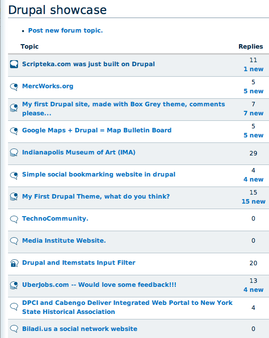
MichelleIf anyone wants to see them live, I added them to Advanced Forum. Hopefully yoroy won't mind that I didn't wait for a response to my email to him. I wanted to get the latest committed. Anyway, you can see it on the demo site here: http://advforum.shellmultimedia.com/?q=forum/4 .
Michelle
Comment #109
JirkaRybka CreditAttribution: JirkaRybka commented#107 Re:Re: Unbalanced - Two different directions of the pin / bubbletip were my intention, that's the point I tried to express. As I see for example in photography, if two unrelated objects of similar shape happen to be positioned behind each other (like a noticeable tree exactly in front of a streetlamp), it looks weird. The bubbletip and pin just happen to be vaguely similar shape, but are entirely different in meaning - one points to a speaker (who is outside the picture, naturally), other fixes the bubble in some position. I tried the (smaller) pin top-left, but it still suggested the pin echoing the bubbletip's speaker-pointing purpose rather than fixing the bubble - note that I understand the pin "in action", like observing the bubble being really pinned to a wall, as opposed to being just laid on a table, with an unused pin pointlessly lying on its top. The pin stabs the background; so the bubble hangs on it, not the other way around. Therefore, the important point to my eyes is the tip of the pin, as a point where the pin and bubble interact - that's why I wanted to see this central point in the middle, rather than in the very corner (where I saw it like the bubble is about to spin around the pin-tip, and then hang bubble-down, tip-up).
I'm writing this all just to explain my point. The fact, that quite a few people here disagreed, is entirely different, and I fully accept their right for opinion, and me being outnumbered. Feel free to proceed in other direction, if that's the choice here.
#108 demo looks good to me, alignment is fine as I see it.
Comment #110
catchAs to IE6 - it's definitely too late to put any of the IE alpha/pngfix solutions into core, if that was even desirable. We then have the choice of 1. dropping support for IE6 or 2. icons which are simplified in order to support it. #80 is the result of 2 which seems sensible at this stage. Certainly in D7 this could be revisited though.
As to alignment - to me, they look vertically a couple of pixels too high. This is the same with drag and drop (which I'll open an issue for).
Comment #111
JirkaRybka CreditAttribution: JirkaRybka commentedBut #80 is not simplified for IE6, as I understand it: These are only just stored in 8-bit format, which makes really no difference to modern browsers, except that IE6 is capable of rendering it too (with rough edges, but that's the best we can do, and it ONLY occurs on IE6). #79 demonstrated that all. Or am I missing something?
Comment #112
catchSorry, I meant the file format was simplified, and the gradient removed (compared to say #17). Not the actual shapes.
Comment #113
eigentor CreditAttribution: eigentor commentedReality speaking its word.
Yoroy, Michelle is getting you ahead. Look at the screenshots (you probably have seen before) in the attachment. She is using them in advanced forum which is in the oven and works quite well already.
Especially in yoricons-2.jpg it is very obvious to me: the weight is too high as they are there.
Would you mind making a version with smaller size and brighter color?
It might also be an interesting concept to think about different color-sets. In the given theming with garland black or grey are just wrong to me - or might be elsewhere. I'd love to see them in blue. How do you do it: just rendering from vector data? This could make scaling easy.
Comment #114
eigentor CreditAttribution: eigentor commentedIE6 screenshots
Nót too bad, as you see.
Compatibilty issues with Garland appear to be much worse than with the icons ;)
Just the edges are a bit rough, what can be seen better in Original:
http://advforum.shellmultimedia.com/?q=forum/4
Comment #115
jrabeemer CreditAttribution: jrabeemer commentedHard aliasing is unavoidable with no alpha-PNG support in IE6. The code could be placed in an IE6 style sheet with DXTransform CSS hack or content-replaced at render time with a Javascript/jQuery/DXTransform. http://www.tjkdesign.com/articles/png_overlay_with_no_extra_markup.asp
p.s.
I could care less about IE6 since IE7 is out and IE8 will be released next year. IE6 is a bad browser and web designers/users need to be reminded of that everyday. :-p
Comment #116
tj2653 CreditAttribution: tj2653 commentedI don't care about IE6 either. MS is pretty much forcing IE7 on users anyway by pushing it out through an Automatic Update, so I expect IE6 will be phased out soon.
Comment #117
JirkaRybka CreditAttribution: JirkaRybka commentedI'm often forced to use old junk systems (like Win98/IE6 being the only install I've access to on my workplace, no upgrade possible), so I guess there are areas on this planet, where old versions persist a little longer. But the point here is, that yoroy managed to make the icons acceptably IE6-compatible, without any costs for other browsers. I'm happy with this aspect, personally.
Comment #118
yoroy CreditAttribution: yoroy commentedFixed the cut-off outline of the star.
Here's some more variations for the sticky ones and the latest source.
Comment #119
catchis there a particular issue preventing an outline around the pin?
Comment #120
JirkaRybka CreditAttribution: JirkaRybka commentedGreat work.
I agree with #119 (if I understood that well): The best sticky icon for me is the upper one on "F" (F1, F3), but III. (F5, F7) clearly shows that the pin needs a white outline similar to the star (also for consistency on all non-white backgrounds). In this (#118 shown) comparison, my opinion is that the pin is enough; the dark fill (F2, G1) looks to me too heavy now, and inconsistent rather than needed.
As for the 'hot' ones (C-D) - I have only a tiny nitpick here (which really doesn't need to be considered a problem, unless others feel the same): My eyes seem to be missing something to the right of the bubbletip, as if the outline of lower bubbles in the stack was expected to show there (a tiny bit). Perhaps it's just the shape of the partial 'lower' bubbles suggesting this to me, dunno. In this aspect, the new one (C-D/2-4) is better, but in the other hand the old one (C-D/1-3-5-7) is better dealing with various backgrounds - C-D/6 is no different from A-B/5, which I consider a bit more of a problem. So in the end, I would vote for the good old C-D/1-3-5-7 (either with a minor change, or unchanged - really, that nitpick is nothing really important).
Comment #121
Pepe Roni CreditAttribution: Pepe Roni commentedIf you are in doubt of psd could be GPL, why not use SVG as base format for the icons. And with http://www.inkscape.org/ there is a platform independent software available to manipulate the icons. Inkscape can export the graphics as png. The svg files itself can be used in some browsers (not IE6) and, without knowing farbtastic, can be changed in colour very easily, I think (change XML data).
To the support of IE6: I have read a book about webdesign (transcending css by Andy Clarke and Molly E. Holzschlag), where the authors state, not to care too much about outdated, malfunctioning browsers. If a browser lacks functions, it lacks! They show designs, where IE6 only shows black and white and in the footer an icon is shown, where the user is informed that he/she is using an outdated browser, all with css only!
Just my two cents.
Comment #122
JirkaRybka CreditAttribution: JirkaRybka commentedTaking our users' site-visitors hostage against the IT industry and/or their local administrators sounds nasty to me. If there's no other choice, then drop the backwards compatibility indeed, but I don't like saying basically "we don't bother about your needs, just pay and pay and pay for newer Microsoft crap to solve your problem" Here (above), yoroy dealt with the problem quite well. :) (The rest needs to be commented by him personally.)
Comment #123
yoroy CreditAttribution: yoroy commentedA full redraw of all icons in illustrator, should work when saved as SVG too and be editable in Inkscape.
- added white outline to the sticky icon for consistency indeed. thanks catch.
- browsertest.png shows display in modern browsers and that other one…
- JirkaRybka: have a look at 'screenshot.png'. If the bubbles underneath would be same size as above, then yes there would be some of the outline visible on the right side of the bubble tip. But scaled down to tiny sizes that results in an ugly dark spot there. So I squeezed the underlying bubbles a bit to the left.
Looking at the usecase mockup, I find the sticky-icon with white fill and the pin top right too similar to the bubble with the star. I think the dark gray one with the white pin inside would be better, even if that one has the (very small) chance to only show the white pin when the backgroundcolor is the exact same grey as the icon's. It would be a bit odd looking then, but certainly not meaningless. Again, small chance and the added contrast with all the other icons is big plus.
Comment #124
yoroy CreditAttribution: yoroy commentedposting the icons as presented in #123
Comment #125
JirkaRybka CreditAttribution: JirkaRybka commentedHot: Ah, well, now I see. Good as is now :)
Sticky: You're right, quite similar to the star. In that case, I would suggest the (#118 F/2-4-6-8) b-version WITH dark fill. To avoid the problem of grey background, what about white outline around the whole (dark filled) buble?
Comment #126
yoroy CreditAttribution: yoroy commentedWhite outline doesn't really work. When adding a stroke on the outside, the icons becomes bigger than the others on darker backgrounds (1b & 1c). When added to the inside, the icon becomes smaller than the others on light backgrounds (2a). Also, I'm not to happy with using two outline colors; the white around the dark bubble but a dark outline around the top of the pin. Looks less clean and a bit more crowded then the other icons. I'd say stick with version in row 3.
Comment #127
JirkaRybka CreditAttribution: JirkaRybka commentedMy vote goes to row 2, but we need other opinions here. Hope to hear some ;)
Comment #128
derjochenmeyer CreditAttribution: derjochenmeyer commentedI actually also like 2 at the first glance, but maybe row 4 is the best, because with less contrast it does not draw too much attention and will look calmer in different theme environemts.
Comment #129
MichelleRow 3 for me.
Michelle
Comment #130
PanchoRow 2 or 4 from my point of view.
Comment #131
tj2653 CreditAttribution: tj2653 commentedRow 2 or 4 (4 preferred) for me too :)
Comment #132
yoroy CreditAttribution: yoroy commentedAh, you should know the one in row 4 is there for reference only. It's way too similar to the forum-new icon with the star. Look here:
http://drupal.org/files/issues/usecase.png . I updated the image in #126 to reflect this.
Comment #133
yoroy CreditAttribution: yoroy commented-- sorry double post --
Comment #134
catchI still like 3, but I still think we need a core committer to comment on this (again) since voting isn't doing us any good here.
Comment #135
BrightLoudNoise CreditAttribution: BrightLoudNoise commentedI also prefer 3 as it is far more distinct while still following the general style.
Yoroy, great job on keeping this ball rolling.
Comment #136
rickvug CreditAttribution: rickvug commentedI too like the style of #3. Great work on this Yoroy! This little graphical change really puts a fresh face on the forum module. It will also work well with a wider gamut of designs in comparison with the old icons. This is great as one of Drupal 6's big selling features is the theming improvements.
I'm setting as RTBC as we really need to get a core commiter's eyes on this considering that Drupal 6 is in release candidate mode now. I see no reason not to let this slip in as there are no code changes involved. It would be a shame to have these changes wait another year or so for Drupal 7...
Comment #137
yoroy CreditAttribution: yoroy commentedThanks all. It's the attachements in #124 that are RTBC, preview it in #123 and #126
Comment #138
yoroy CreditAttribution: yoroy commentedSVG versions of all icons, opening fine in Inkscape. Remove .txt extension and unzip.
Comment #139
JirkaRybka CreditAttribution: JirkaRybka commentedLet's get this in - it took quite a while (now RC1 is out even...), but regardless tiny nitpicks, it would be a great improvement for D6, which doesn't break any code/string freezes. In this context, I'm absolutely fine with *any* of the proposed 'sticky' versions. Good work, yoroy! :)
Comment #140
Dries CreditAttribution: Dries commentedI'm going to postpone this to D7.
Comment #141
MichelleAwww, that's too bad. I was hoping they'd make it. The good news is that they will live on in advanced forum in the mean time :) Thanks, guys, for all your hard work.
Michelle
Comment #142
birdmanx35 CreditAttribution: birdmanx35 commentedSubscribing.
Comment #143
VM CreditAttribution: VM commentedmaybe this is a seriously goofy question, but I've got to ask anyway.....
couldn't images like this be treated the same way tpl.php files are ?
core could ship with its own set in the misc folder, but if the theme folder provided a set , use those ?
This would allow theme developers and users to easily replace a set of icons, buttons and the like, easily. Especially considering how often a theme is downloaded and the color scheme altered.
or is it a necessity to call these through css, so they must be the way they must be ?
Comment #144
MichelleVM - That's what I'm doing with advforum. I ship the module with these, but they can be replaced in the theme.
Michelle
Comment #145
VM CreditAttribution: VM commented: )
I understand the manual replacement method. I meant more of a way that core actually handles tpl.php files now without anyone actually doing anything other than naming the tpls correctly.
ie:
page-front.tpl , core knows to use it if its found
Comment #146
MichelleI guess I don't see the difference... If you have a .tpl with the right name, Drupal will use it. If not, it uses the default. Icons will be the same way in advforum. It's not totally there, yet. Still tweaking the theming.
Michelle
Comment #147
VM CreditAttribution: VM commentedThe difference is only core vs. adv_forum
if core provided this type of feature it would work with or without adv_forum : )
or maybe it is I, who isn't making myself clear enough in this case.
Comment #148
MichelleAh, yeah, would be nice if core would do it. They've got "misc/" hardcoded in there.
I'm going to be trying to move as much of advforum as I can into core for D7 so we'll see how it goes. :)
Michelle
Comment #149
JirkaRybka CreditAttribution: JirkaRybka commentedPersonally, I would like to see the default icons refreshed first - that's the main goal in this issue after all :) The #124 attachments are RTBC for quite a while now...
Comment #150
Liam McDermott CreditAttribution: Liam McDermott commentedGood idea, should probably be a seperate issue though. One step at a time and all that. :)
Comment #151
VM CreditAttribution: VM commentedI didn't want to create a seperate issue without knowing if the idea isn't feasible. My apologies for the diversion.
Comment #152
moshe weitzman CreditAttribution: moshe weitzman commentedso, how about committing the icons in #124? or something.
Comment #153
yoroy CreditAttribution: yoroy commentedThanks for bringing it on the radar again. I'm all for it of course… Sourcefiles attached in #138, anything else I can do?
Comment #154
Liam McDermott CreditAttribution: Liam McDermott commentedLet's get on with it! And get these icons committed (*sigh* I know, I know, sad but I couldn't resist). :)
But seriously, is there anything holding this up, any reason these haven't been committed that we can help with?
Comment #155
floretan CreditAttribution: floretan commentedDrupal 7 shouldn't ship with the current forum icons which look very outdated in a modern "web 2.0" theme like garland. I'm with moshe on committing the icons from #124. Bumping to critical to get this taken care of.
Comment #156
Gurpartap Singh CreditAttribution: Gurpartap Singh commentedBump.
Comment #157
robertDouglass CreditAttribution: robertDouglass commentedCritical is stretching it a bit.
Comment #158
jrabeemer CreditAttribution: jrabeemer commentedI think the commiters are looking for more feedback and a competing set of icons. What happened to BrightLoudNoise and bloommaniac?
Comment #159
catchBack to review for more feedback then.
Comment #160
MichelleFWIW, yoroy's icons have been in advanced forum for some time and people seem to like them. They are definitely better than what's currently in core. Why not commit them? If something better comes along in the future, they can always be changed again.
Michelle
Comment #161
wretched sinner - saved by grace CreditAttribution: wretched sinner - saved by grace commentedsubscribe
Comment #162
BrightLoudNoise CreditAttribution: BrightLoudNoise commented@Momendo: I agreed with the general consensus back in #75 that we should go with Yoroy's icon set. Mine was considered too stylized, and I haven't worked on it since.
@All: I think with the addition of some colour cues for some of the status icons Yoroy's set works well, and I agree with Steven Wittens that we should no longer worry about ie6's broken png handling for this and future icon sets. Especially now that Windows XP SP3 forces an IE7 upgrade.
Comment #163
catchI'd also agree to dropping IE6 support (for pngs at least) - yoroy, does that change anything in regards to the latest set of icons?
Comment #164
yoroy CreditAttribution: yoroy commented@catch: yes it does. The latest still have a little optimisation for IE6. I'd also like to bump the size from 20 to 22x22px. (16, 22, 32px are standard sizes for icon sets)
I'm strongly in favor of dropping IE6 support for PNG transparency.
So, let's have some more feedback then on these latest, with a color for the 'new' star:
I'm not sure it's very helpful. The (standard Drupal 'new')-orange seems too light, blue may not be very appropriate, though in the context of error-messages it is used for 'information'. I'd prefer not to use yellow ('warning'), red ('error') or green ('ok').
Comment #165
jrabeemer CreditAttribution: jrabeemer commentedIt's possible to have IE6 transparency with some IE6 CSS hacks or JS hacks. I think we can make the argument to drop IE6 support in D7 when IE8 is released in the coming months.
Comment #166
Gurpartap Singh CreditAttribution: Gurpartap Singh commentedThere's some method to render/save transparency somehow so that it doesn't have to conflict with IE6. I don't remember it exactly, however I had followed a tip and had managed to get images working well in IE6 without the need of any hack(s). Not sure if that would have any caveats though.
BUMP
Comment #167
aaron CreditAttribution: aaron commentedI think you could just include gif versions and have the ie6-only stylesheet use those.
Comment #168
Pasquallewhy are these icons so familiar to me? http://drupal.hu/forum
Comment #169
Michelle@Pasqualle - Probably because they're the ones in this issue...
Michelle
Comment #170
Gurpartap Singh CreditAttribution: Gurpartap Singh commented^^ :-)
http://drupal.hu/sites/all/themes/bodzang/images/forum-hot.png
hmm does not look like hot forum... of course these are clean and good looking, but this one, to be exact, isn't easy to make a quick guess about what it is indicating..
Comment #171
jrabeemer CreditAttribution: jrabeemer commentedFor transparent PNGs, this jQuery library works well.
http://jquery.khurshid.com/ifixpng.php
It has some caveats in that PNGs converted with this method breaks certain CSS styles like background image and margin/padding. But if we are willing to work around this, it may be worth it to distill the method and integrate it for IE6 transparent PNG support.
Do we even care for IE6 PNG support with the upcoming IE8 and the final deprecation of IE6? D7 will be out next year, well ahead of IE8 release in November 2008.
Comment #172
yoroy CreditAttribution: yoroy commentedThis discussion is not about fixing transparency issues. The technique Gurpartap suggests in #166 is what is already being used here.
Anyway, I'm not really interested in getting these into core anymore, at least not until a core committer expresses intent to commit them.
I'll finish this set sometime though and release it on my own site.
Comment #173
Xano+1 for the icons in #164.
@Gurpartap: I like the icon for hot forums. It shows several text balloons which IMO indicates that a lot of people are talking (look at it like you would at a comic).
Comment #174
MichelleFixing the status. Someone (sorry forgot who) pointed out that there isn't actually a patch here to commit. If it has any hope in getting into D7, someone needs to write a patch for it. And probably tests, too, though I haven't a clue how that would work.
Michelle
Comment #175
XanoMichelle, I'm not so sure about code testing for images ;-)
Could a fix for this issue also move the images from
/miscto/modules/forum?Comment #176
MichelleI would like to see the directory moved as well as made an option but this issue has struggled enough... I don't think introducing scope creep is a good idea. :)
Michelle
Comment #177
XanoKick!
Do we want to have a fancy forum or not?
Comment #178
jrabeemer CreditAttribution: jrabeemer commentedLooking forward, D7 will most likely be released after IE8 is released. I think it would be a good time to break PNG transparency since IE6 compatibility would not be a factor.
Comment #179
yoroy CreditAttribution: yoroy commentedUpdate, now with subtle gradients and a bit more swing in stroke widths
Comment #180
yoroy CreditAttribution: yoroy commentedHmm can't seem to edit my attachments in previous post, let's try again
Comment #181
yoroy CreditAttribution: yoroy commentedchanging status
Comment #182
XanoGlad to see you're still working on it! The gradients add a little depth, but it is not so much overdone as in earlier versions. Excellent job!
Comment #183
eigentor CreditAttribution: eigentor commentedI think it's fun but i like the purist line-drawings without shadows or gradients better. Also the icons could be smaller by default.
Old nagging eigentor again ;)
A problem is that the grey gradients are strange to Garland since they do not reoccur in other places.
Comment #184
eigentor CreditAttribution: eigentor commentedI think it's fun but i like the purist line-drawings without shadows or gradients better. Also the icons could be smaller by default.
Old nagging eigentor again ;)
A problem is that the grey gradiends don't reoccur in Garland and thus appear strange.
Comment #185
yoroy CreditAttribution: yoroy commented- I'm using gradients because that way there will never be a solid background color that will 'merge' with the color of the outlines. There will always be a part of the outline that's different from the background color now. So, not so much an aesthetic choice but a functional one. I'd prefer you'd compare them to the ones we currently ship with Drupal though! :-)
- These images reside in /misc, not in a specific theme's images folder. I never intended to really optimize these for Garland.
- Previous discussion seems to generally agree with a larger size.
Comment #186
catchI agree with yoroy, I don't think we should optimise these icons for Garland - we should optimise them to be generic enough for use on sites which run forums - (edited to clarify: most of which won't end up running Garland).
Comment #187
eigentor CreditAttribution: eigentor commentedAll right :) I think I understand the reasons.
Comment #188
Krummrey CreditAttribution: Krummrey commentedI like the ones without the gradients better too. It has nothing to do with Garland, I just think the outline ones are more generic.
Are all germans bauhausy? In a purist kind of way?
Comment #189
yoroy CreditAttribution: yoroy commentedThanks for looking but "I like" comments aren't really helpful, please give some reasoning on why you'd think something works better or worse.
Remember, I'm trying to improve on
 ,
,  ,
,  ,
,  and friends.
I will take constructive comments to make these more *effective* , but creating something that everybody likes is impossible. I'm sure we'll get past 200 comments though.
And I like DaDa better :-)
Comment #190
XanoI'd add an extra pixel to the bottom of the lock.
Comment #191
FiReaNGeL CreditAttribution: FiReaNGeL commentedThanks yoroy for being so patient on this issue; we lost contributors in the past due to such issues. I think almost 2 years is long enough for new forum icons.
The new icons are perfect and a big improvement on the previous ones. They should get committed, and if problems arise, new issues should be opened to address them.
Comment #192
XanoIt might be a good way to reposition balloons within their image, so if different images are aligned, the balloons stay aligned too. This does mean some balloons may be positioned off-centre.
Comment #193
XanoNever mind me (A)
Comment #194
MichelleAs I've pointed out before, there is no patch here. The icons are great, I've committed them to Advanced Forum, but nothing gets committed to core without a patch. And possibly tests, too, though I'm not sure if that's possible in this case.
Michelle
Comment #195
yoroy CreditAttribution: yoroy commentedI don't know how to do that.
Comment #196
MichelleActually, I talked to webchick on IRC and this is one of those rare things that can't be patched. Evidentally you can only add text files via patching and not binary ones. So setting the status back. She's aware of the issue but I don't know any more than that.
Michelle
Comment #197
webchickBecause...
* The icons are clearly a step WAY over and beyond what we have currently...
* They work well on both light and dark backgrounds...
* I asked Michelle if any of the ~3,000 users of Advanced Forum who have been using these icons for about a year have ever had any complaints, she said no...
* And there's a forum-icon.tpl.php just in case you *really* hate them...
* And I want to try and average one usability-related commit per day for the next month...
...I decided to commit #180 to HEAD. :) Thanks a lot, folks!!
Comment #198
MichelleWhooo hooo!
Thanks webchick and thanks yoroy for not giving up!
And to anyone who wants them in D5/D6 but doesn't like replacing things in /misc, advanced forum uses them right in the styles so no mucking with a core directory needed. :)
Michelle
Comment #199
yoroy CreditAttribution: yoroy commentedPheeew! I'm Really happy they are in, but that took waaay too long people. Thanks fireAngel for having the guts to setting this to rtbc again!
Attaching the source file here.
Comment #200
yoroy CreditAttribution: yoroy commentedUgh. #200! :)
Comment #201
Fiasst CreditAttribution: Fiasst commentedI've created some forum icons for Drupal. View Icons | Download.
Comment #202
eigentor CreditAttribution: eigentor commentedFiasst - if you would have read what this thread is really about, you would understand that your comment is really annoying. So please read and understand. Your Incons look exactly like the old Drupal ones it took yoroy and the others blood, sweat and a lot of endurance to replace. I even suspected you of comment spam, which luckily doesn't seem to be the case.
Comment #203
catchEither way, I removed the promotional link. Signatures are disabled on issue followups for a reason.
Comment #205
Anonymous (not verified) CreditAttribution: Anonymous commentedCheers guys! Very nice indeed!
Comment #206
elv CreditAttribution: elv commentedThere is a way to somewhat fix the transparency for IE6 and below: using 8 bits PNG with an alpha channel.
In IE any pixel with at least 1% transparency in an image of that format is just considered totally transparent, so you loose the translucent part (the anti-aliasing in our particular case) but the image is still legible. The nice this is you don't need any hack, the fix is in the image itself.
Of course the image is converted to 8 bit (256 colors) instead of 24, but here it really doesn't matter at all as the icons are in grey levels. As an example, the original forum-closed_4 image used only 116 colors anyway.
Here's what the icons looks like on white and colored backgrounds:
http://elv.free.fr/pub/drupal/forum-png8.png
I'd say it look a better than with the grey background. It could be improved with a tiny bit of sub-pixel peeping but it's probably not worth it.
As far as I know the only graphic app able to save them in this format is Adobe Fireworks, and even I don't own it. But there are command line utilities that can *convert* them.
The library I used is pngquant (http://www.libpng.org/pub/png/apps/pngquant.html).
Actually for the sake of speed and simplicity I use png8alpha, a Cocoa wrapper for OS X, so I can drag n' drop the PNG files to convert them.
(it seems I can't attach files, there's an issue in the drupal.org upgrade issue queue. So here's a direct link to a zip with all the icons http://elv.free.fr/pub/drupal/forum-icons-png8a.zip)
Comment #207
elv CreditAttribution: elv commentedOk, editing my comment doesn't work.
I just wanted to say clearly: of course in other standards browsers the icons display perfectly *with* the transparency, exactly like with a png24. You won't notice any difference. The jaggy look is only in IE6.
Comment #208
jrabeemer CreditAttribution: jrabeemer commentedI'm against this. IE6 days are coming to an end. D7 is targeted for Q3/Q4 of '09. IE6 is at around 20% marketshare and will dip drastically once IE8 releases in a couple months.
Elv, if I remember correctly, there is a separate forum icon module from yoroy that you can provide a patch against.
Comment #209
catchPlease (please) open another issue to discuss IE6 PNG support. Closing this again.
Comment #210
andypostFollow-up #851496: Invalid to use the CSS background to display non-background images in Forum