
By Amazon on
By now you’ve noticed that Drupal.org looks a little different! To understand why these design changes were made it may be helpful to read the redesign user experience research lead Leisa Reichelt’s post Why is it so? Some insights into our design strategy. Here’s what’s new on Drupal.org:
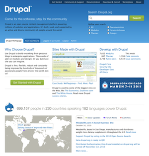
Homepage
Last month Drupal.org had over 2 million unique visitors, many of them coming to the home page to learn about and evaluate Drupal. The home page was designed with these visitors in mind. Our UX research revealed that Drupal.org is primarily a searching site, so the home page features a large search box with optional search filters. The rest of the home page focuses on the needs of Drupal evaluators, including a section showcasing the newest and best Drupal sites.
The home page also shows stats and Drupal community activity. The world map indicates the worldwide breadth of the Drupal community’s recent code commits, updates to documentation and more. A post detailing the map implementation will be posted in the near future.
Dashboard
 During the user research it became clear that regular users were passionate about their issue queues and how they digested information from drupal.org. But there was no consensus on what information needed to be presented. The concept of a customizable dashboard was something that was very popular on social sites and other web content management systems. The solution to the varied demand for different IA’s is a dashboard that has a default set of widgets that can be rearranged and added or removed.
Get Started
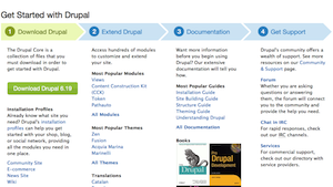 The Get Started page provides a guided process to help new Drupal users be successful. A direct download is helpful for most advanced people, however many others want to evaluate Drupal first and seek help before they start. Ensuring people have the resources they need will help with successful evaluations and increase adoption.
Community & Support
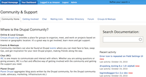 The Community & Support section helps to categorize community resources more effectively. The tabs provide access to different methods of engaging with the community online, as well as find a local Drupal user group. The large search documentation block allows people to find the documentation team’s curated content. The recent activity block shows how active the community is, an important evaluation criteria.
Community Spotlight
The strongest asset of the Drupal project is the community. The Drupal community values its users and critics, but we celebrate the contributors. The user research suggested that it was critical to feature members of the community on the new site, which is done in the Community Spotlight.
Groups and Meetups
Connecting groups.drupal.org site to the main drupal.org site through the information architecture, single sign-on, and search results is important to unifying the user experience. Getting people from the drupal.org site to join a common interest group and ultimately attend an event organized through the local groups where people can meet other Drupalers in person is key to growing the Drupal community.
Documentation Search
With thousands of useful handbook pages and helpful comments, the challenge for people wasn’t whether the information they wanted existed, but was whether they could find it. A dedicated documentation search block helps users find the curated information they need. We have plans to include this search block on the Documentation page soon.
Logging In
Drupal.org has grown organically to almost 20 different sites including Drupalcon sites. A dedicated single sign-on solution (called Bakery because it makes web browser cookies!) was deployed to allow seamless integration between these sites. The Groups, Association, Localize, Drupalcon San Francisco, Copenhagen and Chicago sites, and API sites are all using this single sign solution.
Search
 The key observation from the user experience research was that Drupal is not a browsing site, but a searching site. We needed a fast, scalable document search system that allowed for faceted search of different types of content to be presented.
Faceted Search
The redesign team created search facets to be displayed as filters in pages and blocks in the Apache Solr module. These improvements allowed for faceted search results in blocks in our Download & Extend landing pages as well the search results page.
Multi-site Search
Drupal.org sites have rich and valuable content, for example, the curated Drupalcon videos and working groups. Unifying that content into a single set of search results helps users discover what the community has to offer.
Download & Extend
 Download & Extend landing pages allow users to quickly discover the ways they can extend their Drupal website. Some of the individual blocks of extensions are delivered with Solr searches instead of Views so that we can quickly search (and crucially sort) across very large data sets with diverse fields spanning many database tables (such as the usage statistics, release activity, and so on). Doing these queries directly in SQL via Views would be extremely expensive. Instead of denormalizing the data into another SQL table, we can put everything we might want to filter or sort projects on into the Solr index, and then the queries are all equivalently fast.
Download & Extend landing pages for project types
Each project type has its own landing page, including specific blocks depending on the project type.
Faceted search on Download & Extend pages
Each type of project can have different search criteria. Modules can be searched by categories, and in the future themes will be searchable by theme-specific attributes (e.g. mobile vs. desktop, fixed vs. fluid width, etc).
Module Categories
 A new page we added is the Modules categories page, which lists the top 5 most installed modules from every module category on the site. This not only provides a good overview of all the different kinds of modules available for Drupal, it helps people find the most used modules at a glance. Each category links to a faceted search for further exploration.
Project Home Pages
 Project home page improvements have been deployed throughout the redesign process. For example, the blocks in the sidebar (“Maintainers for X”, “Recent Issues” and the “Issues for X” summary) were deployed in 2009. However, when the redesign went live we added a new “Project information” block with the following features:
- Makes the “Maintenance status” field visible so users can get an idea of how actively maintained a project is.
- Displays if a project has automated tests.
- Displays the current number of sites that report using the project (in the future, we’ll include a ranking here, as well).
In the future, the Project home pages will see even more improvements, including visual displays of automated quality metrics, and ratings and reviews.
Where’s the Druplicon?
![]() The Druplicon is our beloved mascot. It appears on the front page, the Community & Support page, as the favicon, and will eventually have its own dedicated section as it appears in this Druplicon section prototype. To learn more about the Drupal project’s mascot, wordmark, and trademark read we need the fish.
The Druplicon is our beloved mascot. It appears on the front page, the Community & Support page, as the favicon, and will eventually have its own dedicated section as it appears in this Druplicon section prototype. To learn more about the Drupal project’s mascot, wordmark, and trademark read we need the fish.
How to Improve Drupal.org?
The redesign is not just a redesign of a series of websites, but the creation of a platform to allow the developers, designers, themers, and content contributors in the Drupal community to improve their home. If you’ve identified a problem with the current drupal.org implementation, check the redesign issue queue and make sure we know about it. If you’d like to help, you can learn how to work on the new Drupal.org.
Redesign Acknowledgments
The effort to redesign drupal.org began in August, 2005 at the OSCON Drupal meet-up. Drupal.org needed a great design and we set out to create the Drupal association and raise money for 2 years to hire a design firm. In late 2007, the Drupal association kicked off the design firm hiring process. At Drupalcon Boston in March 2008, the association committed that redesigning Drupal.org was it's number one priority. By late 2008 the community kicked off a series of six in person sprints to implement the redesign. By Fall 2009 we moved from in person sprints to an online collaborative implementation process by recruiting volunteers from the community. At Drupalcon San Francisco in 2010, the Drupal association acknowledged the depth and complexity of the implementation effort and committed to hire a team to remove some of the technical hurdles that prevented the community from completing the redesign. The association redesign implementation team lead by volunteers and in collaboration with the community volunteers led the redesign to this phase one completion.
A partial list of the people and organizations involved in the redesign effort are listed on the redesign acknowledgment wiki page.


Comments
So exciting!
This has been an incredible endeavour, and the new site makes me even more proud to call drupal.org my "
"home". I know it was a long time coming and I am SO excited about what it represents for new folks in the community. I've shown the site to a couple of people who are familiar with Drupal but not so embedded in the community... and the response has been unanimously positive.
Congrats to everyone involved!!
Love it
I concur. Drupal.org is looking quite polished!
Congrats
It looks great. A more modern feel is bound to bring more site developers to the fold, and while I liked the previous layout, it did feel quite dated which I can see might put off anyone evaluating Drupal.
I'm getting used to the new
I'm getting used to the new look now, but I still wish:
1) That news was above the fold. News is important and should be up front if we want anyone to read it.
2) There was a direct link to the forums in the header. The forums really are the community, and shouldn't be 2 links deep (and again, they're stuck below the fold).
If not fixed, I think these issues will hurt Drupal in the long run. I've already noticed a serious drop off in new replies on the forum tracker since the redesign kicked in.
--
John Forsythe
Need Drupal hosting? You should read my review.
Drupal Modules - Search, rate, explore. 1900+ module reviews!
+1 with having a direct link
+1 with having a direct link to forums on the header.
If the site is really a search site, the forums serves as a point where people find issues and solutions to their issues, adding another layer for them to reach it is counter-intuitive
but over-all great job for the whole community!
I think it makes sense not to
I think it makes sense not to have a direct link to the forum because sometimes the forum is not the best/fastest/ideal way to get the information you need. There's also the chat and mailing lists for instance and they don't get a direct link either.
I disagree... I'm for putting
I disagree...
I'm for putting a link on the forum. You're right that its not always the ideal way, but it is a way that people know and understand (as opposed to IRC chat, or getting on a groups mailing list). People use and understand forums.
So, +1 from me.
Agree
Most people head to forums first. More techy people use IRC or join groups.
+1 for news being above the fold and forums more prominent.
The Google map, is a nice little gimmick but IMHO that's all it is and wastes too much real estate.
Don't touch the map!
The map works to both break up the page (The old site was hungry for some graphics) and display why Drupal isn't merely a blogging platform.
I would like to see those menu items up at the top become drop-down menus so that one could get to the forums quicker.
A list of some of the Drupal sites I have designed and/or developed can be viewed at motioncity.com
Customization of the dashboard
The home page is targeting new visitors and Drupal evaluators. The dashboard is targeting Drupal 'insiders', the people who are most likely to be helpful in responding to forum posts.
Forum posts are listed on a tab on the front page. The community & support page has a block surfacing forum posts from the tracker.
I think we will see people switching their home page to be the dashboard increasingly. What might be more useful is to include a default widget in the dashboard that surfaces these forum topics that need attention.
Please propose some blocks that you think should be added to the dashboard in the redesign issue queues.
Kieran
Kieran Lal
Issue Cues
First a big "atta boy" on the site. Looks and functions really well.
Next, where ARE the issue cues for this project? Because I'd like my Dashboard to include links to the Post Installation forum http://drupal.org/forum/22 at the very least. Or maybe even a way to display all the forums in a dropdown menu.
Thanks And "Good Job"!
A list of some of the Drupal sites I have designed and/or developed can be viewed at motioncity.com
Add drop down menus
An easy implementation to make a link to the forums on the homepage is to add drop down menus when you hover over the links at the top (e.g. Get Started, Community & Support). This way you don't have to click twice to get to the forums for example.
Looks Great
I'm so glad the team decided to make the search bar so prominent (with intuitive filters!). I had a (very strong) feeling drupal.org was primarily a search site. Way to put that research data to work!
Kinda sad to not see the blue guy as much anymore, but glad he's not completely gone.
Congrats and thank you to the redesign team!
The key observation from the
I'm sorry to say but the search function on drupal.org is still absolutely useless to me.
Google is the best place to search the drupal site.
Example of how to search drupal using Google:
site:drupal.org your search term here
Current Search improve much more than before
Yes, I agree with you, Google is a nice tool to search content on Drupal site.
Also I don't agree with you, regarding to new search function.
If we use the proper keywords and modify the search options (All, Modules, Themes, etc), the new search work very well. We can find more useful information than before.
Best regards
i also used mainly ggl for
i also used mainly ggl for search as drupal was useless but seems this new search will be much more useful
Adriadrop Drupal development
Site looks beautiful, but
Site looks beautiful, but Drupal is waaaaaaayyyyy behind google in search functionality. Site search with google ALWAYS, 100% of the time, yields better, more up to date results than the drupal search. I won't use the stock drupal search on any of my personal sites, because it makes the site look super unprofessional. Who wants to select some radio button to search when they are so used to using google to search without checking anything? I, personally, would rather type in "site: drupal.org search term" then move to the mouse from the keyboard or press tab, luckily chrome has extensions to search sites, so I don't have to use the core drupal search. It is just not consistent with the rest of the web. Why is facebooks search so amazing? I have never understood why drupal doesn't use the site search module. Anyway, i love drupal, and the community, and I really don't like it when people are negative on drupal, but I have been thinking this for a very long time, and this super focus on search pushed me over the edge. hahaha
Try searching for modules, themes
Hi, try searching on drupal.org using the faceted search. For example if you are searching for views modules you get these results:
http://drupal.org/search/apachesolr_multisitesearch/views?filters=ss_met...
I can filter that list by date, author, most installed, etc.
Google site search gives:
http://www.google.com/search?client=safari&rls=en&q=site:drupal.org+view...
I get 5 of the results returning actual views modules. But I also get archived content, issues, documentation, taxonomy term results in no sensible order. Google just doesn't understand what a Drupal project is, let alone a module, or specific attributes. Google is awesome when you want to search the Internet, and it's good at general searches for a specific site, but it simply can't compare to Drupal Apache Solr when you've got rich meta data added to the indexes and faceted search.
So use both, but be sure to give Drupal.org Solr search a deep dive.
Kieran
Kieran Lal
The new faceted search does
The new faceted search does work very well now that I've tried it a few times. But after 4 years I already know the names of many things and also some Drupal lingo, new users however could find Google a better tool. You guys did do a great job overall and I'm happy with the fonts now too.
Search is good but finding is better
I too beg to disagree. Whoever says that is taking the method (searching) for the aim (finding). I would rephrase the statement saying:
I don't think, anyway, that putting the forums two links deep or putting the news behind a "more news..." link near the bottom middle of the front page helps me (or any other user) to find what I am looking for. Am I supposed to use the search button to find everything? I rather doubt it.
But hey, what do I know? I am just a user ;)
Forums tab on the front page
There is a forums tab on the bottom of the front page. We are working to add forum specific widgets to the dashboard so that users can have their favorite forums tracked easily.
In the user research we found that directing new users straight into forums, or documentation just overwhelmed them. The Get Started and Community & Support landing pages are intended to help give some context to users about the information that is available on Drupal.org.
The focus on new users has meant that we've introduced an additional barrier to the 'insiders' who know exactly where they want to get to. That's a trade-off the design intended. In exchange for those barriers the Dashboard is intended to have a collection of customizable widgets which will allow regular users to get what they wanted right away when they set their dashboard as their home page. We are still building new widgets so it may take a while before everyone has the dashboard as they want it.
There are several navigational issues that have been filed and we are working to make the secondary navigation through out the site more streamlined. We also know that forums are key to keeping a site active and we need to do a better job through out the site to surface forum posts and keep that activity up. We also need to add better navigation for active users to get straight through their site work flow.
We are listening and continuing to make improvements. Keep participating in the redesign issues, that's where the changes are actually going to happen.
Kieran
Kieran Lal
ok, i'm also have trouble finding
I've been using Drupal.org for almost three years now, how time flies.
Thanks everyone for all the useful and entertaining and awesome and wowing that it has provided me.
But, I would have to agree some things seem to be lost in the redesign and gone are some of the useful work flows I had going with the old site.
Now today I was looking to add a new Forum post rather than an issue post and couldn't find it as easily as it was on the old site so I resorted to searching about the redesign to see if it would help me and found this. So I thought I'd add my little bit of sorrow.
I was actually looking for the place to post issues regarding the Drupal.org web site.
But, I'm still wondering how to get to the post installation forum - ahh, I should search for those three words.
Maybe, this "search to find" design will help people become better at developing their search phrasing skills and we can use "search navigation" on sites and do away with menus and links altogether. No more finding things where you saw them before :-)
Regrets aside, thanks,
Izzy
Ha ha
I'm not sure if you were trying to point out the irony or not. But if you search for "post installation forum" on that big search box, you do not get the post installation forum.
I agree with you 100%. Although I like the redesign I think the forums should be much more front-and-center. At a minimum I wish there was a way to add frequent forums to my dashboard. But I also think "Community & Support" should be a drop-down with "post installation forum" being one of the choices.
I check in and help out on the post installation forum nearly every day. Here is my (rather silly) workflow to get there:
1.) I go to Drupal.org
2.) I check my dashboard and see if there are any posts to threads I am participating in and open them in a new tab.
3.) After reading and replying, if I am fortunate enough to be left with a tab from the post installation forum, I can use the breadcrumb to get back to http://drupal.org/forum/22
4.) If not, I usually scan my Dashboard list under "Your Posts" for one I think was from the support forum. If I guess right, then I can get to http://drupal.org/forum/22 in two clicks. Sometimes I just type into the URL line to get there. This is faster than the 3 clicks to go Community Support>Our Forums (takes a while to load)>Post installation.
My point: Either I am too dumb or there is a UI and UX problem here. I just hope it is the latter.
A list of some of the Drupal sites I have designed and/or developed can be viewed at motioncity.com
This is incredible! I love
This is incredible!
I love the new Drupal.org layout and I LOVE DRUPAL!!
I can't wait until I can upgrade my sites with Drupal 7 - I may try anyway!
Did anyone run these pages /
Did anyone run these pages / layouts through a click/visibility tool?
I love the new clean look and seriously needed search improvements; but the readability on each page is actually a bit harder than before.
I would check, for instance, the issue comment layout against 3M's Visual Attention Service; I've actually missed the Tracker block when posting/updating an issue in the queue because it's easier to miss!
i would agree on this,
i would agree on this, readability is worse eveything has a bit of a pale feeling, contrast are worse and harder on eyes.
Adriadrop Drupal development
I totally agree with that!
I totally agree with that! It's almost rare nowadays to find a site with bad readability. So I'm quite surprised to find myself squinting at the new redesigned website. deepM has a good point that it's probably because of lack of contrast. It's hard on the eyes, and there are no clear visual cues for my eyes to trace through. It's pale and hard on the eyes.
Great looking site... very
Great looking site... very contemporary... I like the dashboard idea
Quick suggestion: when I was first learning Drupal, I found http://drupal.org/node/27367 to be very helpful. Perhaps you could update that page when you get a minute?
...
Don't worry, that page will be updated when the dust settles and the redesign team gets a well-deserved hour off. :)
~silverwing
possible to add modules page
possible to add modules page to "my favorite" & subscribe issues pages (each single issue)
+1 on the need for a
+1 on the need for a "subscribe to issue" feature to easily monitor specific issues from the dashboard. I was really surprised this wasn't included in the redesign, given that the issues queues are filled with "+1" and "subscribe" posts. Otherwise though, the redesign is a clear step forward for Drupal.
I love love love the redesign
Pretty much everything I've disliked about d.o over the past four years has been fixed. The new site is both beautiful and functional. Love and thanks to everyone on the redesign team!
For folks making feature request in the comments, try searching the issue queue. A lot of the suggestions people are making already have issues open.
Cool
This is one of the best Search Specific Layouts that I have encountered. Can we get a copy of the basic theme?
Theme private to drupal.org
In order to protect brand of Drupal we are going to follow the same policy as the previous theme and keep this exclusive to drupal.org. We want drupal.org to be special and not be copied to every blog and site.
You can learn more about how the 960 base theme was used to implement the Blue Cheese theme: http://groups.drupal.org/node/56698
Kieran
Kieran Lal
Loving new design
Thanks for all the good work guys. Loving new design every second.
Sumit Kataria
http://sumitk.net
http://twitter.com/sumitk
I agree completely...
I agree. The news should be above the fold and the forum should be one click.
While it definitely "looks" nicer, I think the text is awful. It's much harder to read, too much noise. Also for the life of me I cant understand why Drupal got rid of it's logo.
EDIT: Didn't want to be all negative. The dashboard is freakin sweet
Logo versus mascot
Hi, thanks for adding some positive feedback as well. It's very welcome.
We still have Druplicon as the Drupal mascot. Here's some background on Drupal's logo, mascot, and trademark: http://www.garfieldtech.com/blog/drupal-org-logo-trademark
Kieran
Kieran Lal
Text is really hard to read
I love the new layout, the dashboad, and most of the new stuff.
But the new font styles make text really hard to read, especially titles.
Color contrasts are too much low too.
I am not visually impaired, so imagine how hard it might be for visually impaired persons to read the new site.
Text and Font issues
Hi, there are a number of issues reported about the font and readability. Here's an open one:
http://drupal.org/node/919640
Here's some issues issues related to the readability issue.
Kieran Lal
font size
Agreed. One thing that get me 'engaged' with the old design is the font size. It made me easy to skim through the text and find what I need. The border around the comment (as in old design) also make it more readable.
Fonts
Do you think the use of Lucida Grande is part of the problem? The type seems to be a little more kerned out than many other sans serif fonts.
A list of some of the Drupal sites I have designed and/or developed can be viewed at motioncity.com
Bingo
Changing the font to arial makes the whole site a lot easier to read for me. There's just something a little off about Lucida Grande, it hurts my eyes/
Yes.
Lucida Grande is an unusual choice, I don't know of any other major site using it as the main display font. I agree it's not great for readability, but I'm getting used to it.
Edit: Signatures are back, yay! :)
Facebook using "Lucida
Facebook using "Lucida Grande". This is a Mac font, love to see how Drupal.org looks in a mac, anyone take a screenshot??
also wonder to know how it looks if a WINDOWS PC installed first 3 fonts (fonts like "Myriad Pro" in windows' browsers look so damn.)
"Lucida Grande","DejaVu Sans","Bitstream Vera Sans",Verdana,Arial,sans-serif
DejaVu Sans
DejaVu Sans looks great for me on both Linux and Windows (LCDs + ClearType) but there are people who experience rendering issues. Why is currently a mystery.
facebook
Hm, you're right about Facebook. It looks much more compact and readable at 11px, so I guess I never had a reason to notice it before. Drupal is using 13px, which ends up being much wider due to strange kerning.
Edit: Here's a comparison with Arial, rendered on OS X in Firefox.
http://imgur.com/swgQJ.png
Personally, I find Arial to be more readable. It's much easier to spot individual words. With Lucida, the kerning is so wide, it takes more effort to see the word boundaries.
Oh Gosh!
How counterintuitive! Reducing the size of the font does look better!
Lucida Grande is an unusual
Ummm... http://apple.com, http://facebook.com, http://twitter.com?
heh.
You got me, I didn't actually go scanning the Alexa 100 for style sheets before posting that. My point about kerning still stands, though.
PLEASE bring back - Similar modules
Similar modules block is missing, i used that a lot, helps to find what you need in millions of drupal modules. Please bring it back
Adriadrop Drupal development
Related modules to be re-launched very soon
Hi, we've been testing out the recommendation features as part of the redesign.
Follow this discussion: http://drupal.org/node/947526#comment-3622350
The recommendations could be live as soon as tonight.
Kieran
Kieran Lal
I second this. Very useful to
I second this. Very useful to have.
Related modules is now live
The related modules feature is now back: http://drupal.org/project/views
Kieran
Kieran Lal
Great, I've been missing that
Great, I've been missing that feature too. It is hard to find among different modules alternatives and to choose among them the best for projects.
By the way....
By the way... Great Job! I know I have mentioned the font issue and that I wish I could get to the forums in one click. And when I scan this thread I see a lot of criticism. But I want the people that were closely involved in this re-design to know that I appreciate the work.
I love the personalized Dashboard. I think the global map that interactively pings what is going on in the world of Drupal is genius. It's a great metaphor for what Drupal is (and what other "blogging" CMS systems are not). It's lively, it's quick, it's global. Can you do this with Wordpress? I didn't think so.
I also like the Drupal™ logo type style and I appreciate that "Droppy" (or whatever the mascot is called) is seen less.
So, Great Job!
A list of some of the Drupal sites I have designed and/or developed can be viewed at motioncity.com
For the record...
I also think the Dashboard is pretty nice. ;)
-1
-1
Very and very
Very and very impressive!
Great work, thank you!
Special thanks for the faceted search.
Unfortunately Dashboard has very limited choice of blocks to select, in fact, I'd prefer to have Contributor links block (and some others too) to be tunable, i.e. to have ability to select the modules I'd like to monitor news from (twitter-like ;)
Add Issues for Modules to Dashboard link on project page
If you would like to follow specific modules on your project pages go to the project page and look for the link "Add Issues for 'Module Name' to Dashboard link on project page".
e.g. http://drupal.org/project/views
This will give you a block for the module issues you want to track.
Kieran
Kieran Lal
New site is amazing!
I am so very impressed with Drupal and it's community.
The new site is exceptional. You have delivered an even easier to navigate, clean and functional site. I think I'm addicted to looking at the homepage!
I really wish there was a
I really wish there was a visited link color that was different than the standard link color. When I do a search it is difficult to determine which links I've already read.
+1 Cool. I am always miss
+1 Cool. I am always miss this point and think we don't need "visited link color" and now i can notice we should do that, especial in search pages.
Please file an issue
Hi, please file an issue: http://drupal.org/project/issues/search?issue_tags=drupal.org+redesign+q...
Better yet, get involved and file a patch for the theme.
Kieran
Kieran Lal
Already in the issue queue
If you look at the issue queue for the drupal.org theme you'll see there's already an issue for this:
#956062: Add distinctive color to css a:visited on D.O
In fact, it recently caught my eye, so I've already got a patch and screenshots there for review...
___________________
3281d Consulting
phishing
Weren't the a:visited property being thrown out of webkit and gecko because of the phishing attacks they are used for? Anyway, Leisa, all others, wow, brilliant job.
Don't Like
I guess I'm in the minority. I don't like the new layout at all. While the color scheme is great and the layout looks slick, I find the site a lot less functional and can't seem to find anything anymore.
New administration
I feel it's kind of like a regime change. It's not the same, and it takes a while to get used to. In the end it's progress, but not actually "better".
I'm not happy with a lot of changes too, but I wouldn't want us to go backwards. Given that the whole community will never ever agree about the website, I'm happy with what we have accomplished.
*sigh*
-Wes
Navigation issues
Hi, here's some discussions in issues about how to improve navigation on the site.
http://drupal.org/project/issues/search?text=navigation&projects=&assign...
There's a number of issues we've identified and are working on. Please review and see if these cover your issues.
Kieran
Kieran Lal
Thanks
Thanks, I'll take a look!
The new site looks terrific
The new site looks terrific and the dashboard is incredibly useful. Congrats Drupal team!
great drupal!
great drupal!
Missing features
First of all: congratulations - it´s a great piece of work !!!
Maybe you can extend it in the future with some, I think, usefull features:
1. a possibility to "bookmark" my most wanted modules in a list
2. more screenshots, yes this depends on the module developer, for the module section/pages
Especially for me as a designer it´s sometimes difficult to understand what the module does and how it behaves.
Screenshits from the back- and frontend would make the selection & previewing much more easier.
A good example are the extension pages of google:
e.g. https://chrome.google.com/extensions/detail/alelhddbbhepgpmgidjdcjakblof...
I am sure this would attract much more people, especially newbies which are interested in drupal.
More modern - good, tables and issue queues - not so good...
For me as a high power user of the issue queues and projects I now have many more clicks and much reduced scan-ability of tables and issues - the table design is hard to scan and seems rather low contrast and crammed, and the small overall font-size is not good for my older eyes.
Other than that I think its very good, not so impressed by the downloads page which seems rather confusing and my contributors block is no longer available on every page (which as a huge plus in the old design), now I have more clicks and need to bookmark thing in my bookmarks bar to get the places I need to in one click (like my projects page).
Also so the hidden forums, I will assume much has been said about that already in this thread because they're hidden away and quite hard to find which does not seem very community friendly. Before it was very easy, now you really have to hunt for that link to the forum which is near invisible.
Pimp your Drupal 8 Toolbar - make it badass.
Adaptivetheme - theming system for people who don't code.
New design looks amazing! Was
New design looks amazing! Was a pain to re-adjust to the layout, but much nicer once familar.
Would be great if someone could give us an insight to the customizations of the Dashboard feature. I use Homebox (apparantly, so does Drupal) but I don't understand how Drupal gets away without the lousy popups, and has the ability to specify the post count etc. Would be great if someone knew how.
Think it's actually the dashboard module
I've not used Homebox or Dashboard, but judging from the source the new Drupal Dashboard is provided by the dashboard module.
People never like change, which is why it should be managed carefully. I like the new site and the map rocks. Can't wait to hear how that was done.
I love the way it looks, only how do i get my site to look
I love the way it looks, only how do i get my site to look like this. My first site is here:
http://animalnepal.org/drupal_hum
I would like to get the technique for "logged in as [username] Logout" string as displayed on this site. Also, can I suggest a BIG GIANT button that says something like Newbies go here, and when they get there all of their questions can be automatically answered? That's what I need :)
jigs
Phoenix.Consultants.Nepal (www.phoenixstudiosnepal.com)
Crashes on Safari
Besides that the new theme make a white sceen on death if you log in with Safari 5.
Have not tried to use Safari 4 but a theme that craches on some browsers have some serious problems.
You have to delete all cockies to access the site again. Dont think that anyone with this problem can read this, but anyway.
ON SAFARI? DONT LOGIN!!
I got similar problem
I got similar problem yesterday with Chrome 8. Chrome said redirect loop error and told me try to remove cookies.
Clear all caches / cookies / sessions
I had something kind of like this & droplet had on Safari. I cleared all active sessions cookies and caches and it went away. I think it is a stale cookie or some other session related thing sucking you into the white hole of doom - (and yes people who visit this thread with a diff browser can see it)
I had the same (or at least
I had the same (or at least very similar) problem with Firefox 3.6 under Ubuntu 10.10.
Debugging single sign-on
Hi, the Drupalcon Chicago team deployed some new features to allows for account creation on subsites. This has resulted in some bugs related to the domain name used in the cookie. We are working on it here: http://drupal.org/node/957438#comment-3652888
Kieran
Kieran Lal
I congratulate those who
I congratulate those who worked on the redesign as they've done quite a good job! The new design is better as it is more informative and the dashboard is very useful! Thanks to all who contributed!
less useful
this new design is indeed new but pretty much useless. the old site is less polished, but i got the info I need(new releases, key news) immediately. please...give me back the old interface.
this new design made me less interested in drupal, believe it or not.
Notifications?
Still no way to send email notifications on issues/posts etc?
surely not
Is this still the case? Surely not, I would think this would be a necessity?
the layout can cause eye strain
everything is hard to read. the fonts, the colors really hurt my eyes, the layout can cause eye strain. Please hire Real Designer who really understand usability.
Excellent
The new look seems to be so well-ordered, clean, beautiful in font and colours... Congratulation
Erp Development
I totally agree, a complete guidelines on how to proceed with this site is explained correctly here and found helpful for me, thanks for sharing.
Recent Posts
Where is recent posts . not on frontpage??
Recent front page posts are in your dashboard
Hi, recent posts are at the bottom of the front page in the tab labeled news. It's beside the map.
When you log in, the dashboard default top left block is labeled Drupal News.
Cheers,
Kieran
Kieran Lal
Hopefully drupal.org
Hopefully drupal.org webmaster could add bookmark function on all contents, such that I can easily to keep track my favorite contents
+1 ON THIS!!!!
+1 ON THIS!!!!
Flag module please
There are still loads of hard to find pages on d.o and I think the flag module would be ideal for adding bookmarks. Then just add a block of Your Bookmarks to the dashboard. Possibly even make them public so we can see what others bookmark.
I think this is a really easy win for d.o usability, assuming Flag module scales well ;)
Kudos to all
A huge round of applause for everyone involved with the redesign. The new look and improved functionality are fantastic.
I've been around for almost two years now, and it's just amazing that this was all in the works back before I got here.
In my opinion, Drupal has thrown down a gauntlet for other CMSs - and thrown the door wide open to their users. When they are eventually left wanting by the limitations of their chosen system, many more will make the conversion to Drupal when they come looking. The improved look and functionality have brought a new level of credibility to both the community and the framework. Kudos to all.
See #375570: User rating and reviews for contributed Modules.
And without faith it is impossible to please God, because anyone who comes to him must believe that he exists and that he rewards those who earnestly seek him. - Hebrews 11:6
Whats about bookmarks
Meanwhile I feel very well with the new Drupal.
I'd still like to see nice_menus or superfish - it helps when not logged in and no dashboard is available.
And I'd like to work with personal bookmarks (maybe custom per-user-taxonomy).
Flag module ships with
Flag module ships with bookmark functionality. Would certainly be useful
Drupal.org has great look after revamp but no logo on home page
I also really appreciate the new design. I think the site is of great help for beginners or experienced learners as it offers detailed instruction, useful information and update. Drupal.org is a great resource for Drupal developers, designers as well as SEO and others keen to learn Drupal. Why have you removed the logo from header, if this had been added it would be good. Drupal search cannot supersede Google search. Is there any big repository or directory where only Drupal sites could be added as this site adds very selective ones.
The logo is there.
The "druplicon" is not a logo, it's a mascot. The "Drupal™" wordmark you see at the top left of the site is the logo.
Logo
All I can say is "YAY!"
I feel strongly that "Droopy" or whatever the mascot's name is should be seen less. The new presentation is much more professional.
A list of some of the Drupal sites I have designed and/or developed can be viewed at motioncity.com
Giant leap ahead!
Great work-- this is an awesome move forward. There is only one more thing that I feel we desperately need, and that's the automatic association of a drupal group with every project. This would make groups generally more effective and organised, help keep the issue queues focussed, and provide a much-needed resource for all projects.
It appears that this was considered, but fell off the agenda a year ago:
http://drupal.org/node/372017
Any word on if this might happen? Let me know if I can help.
bluebeach released ?
Not sure if I should ask this question so please forgive me in advance.
Flipping between d.o and g.d.o made me missed the old design. Call me old fashion. Is there any possibility that when all *.d.o switched to bluecheese, bluebeach would be released as theme for public consumption ?
The more I use the new site,
The more I use the new site, the more I appreciate it. I think its a fantastic piece of work and all contributors should be congratulated. Its clean, fast and slick.
Quite beautiful.
Quite beautiful. So much better than a lot of other open source sites.
_______________________________________________________
Senior Tech
Drupal is User Friendly
It is better that drupal.org stay like this so that it would be simpler. I also advise that you visit drupal forums, dont just read but click the links they give to teach you how to do drupal very well... try to visit mine for me to give you tips