 Support for Drupal 7 is ending on 5 January 2025—it’s time to migrate to Drupal 10! Learn about the many benefits of Drupal 10 and find migration tools in our resource center.
On this page
- Drupal Admin Design System
- Basic principles
- Accessibility
- Focus state
- Base
- Typography
- Color palette
- Iconography
- Layers and surfaces
- Spacing and sizing
- Individual Components
- Buttons and Dropdowns
- Form fields
- Selects
- Basic Form Controls
- Tables
- Messages
- Tags or Entity reference
- Breadcrumb and page title
- Navigation list
- Details and accordions
- Pages
- Node edit form
- Content list
- Admin forms
- Source files
Design
Drupal Admin Design System
We created a Design System that defines a complete set of principles, patterns, and tools for building a coherent and user-friendly Drupal administrative user interface. It is defined by some standards (goals, principles and visual design language) and a visual interface library (components, patterns and animation).
Basic principles
The design principles are based on Drupal’s Values & Principles and we are adapting the original Seven’s style guide visual principles:
- powerful: confident, precise shapes and strong contrast, especially for user-controllable elements.
- empathetic, responsive: give emphasis to what matters; use hierarchy to explain the relation between elements; use predictable patterns; elements adapt and react to inputs.
- clear, clean, concise: define crisp lines and spaces, decisive shapes; avoid texture and ornamentation; each element should serve a clear purpose; make measured use of whitespace: room to breathe, but avoid sterility and emptiness.
- accessible, transparent: appeal to the greatest possible number of people; choose a legible typeface; set text for optimal readability; emphasize what matters; use consistent visual clues for affordances.
- natural: neutral tones; define continuity between spaces.
- friendly, collaborative, democratic, respectful: choose cheerful colours; avoid high contrast at large scales (too bold/aggressive); prefer well-known design patterns, iconography and affordances; avoid visual indulgence, ensure visual style is extensible and flexible.
Accessibility
Complying with the latest accessibility standards is important. The designs have been built with previous feedback in mind and we have had several experts giving us feedback since the beginning of the project. If you are interested in providing us with some more accessibility feedback, we have an issue for that: [META] Accessibility guidelines for Claro.
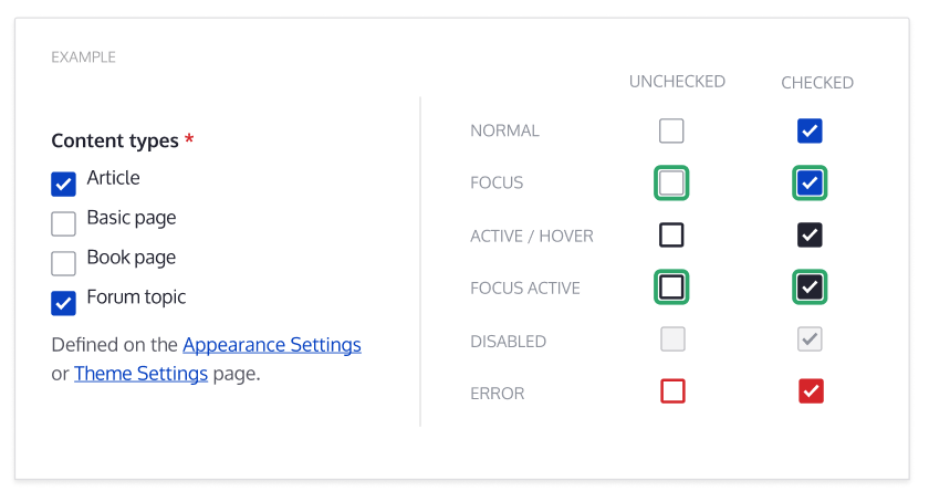
Focus state
To improve UX and Acessibility the focus style has been designed to aim for consistent focus indicator throughout the theme and components.
Base
Typography
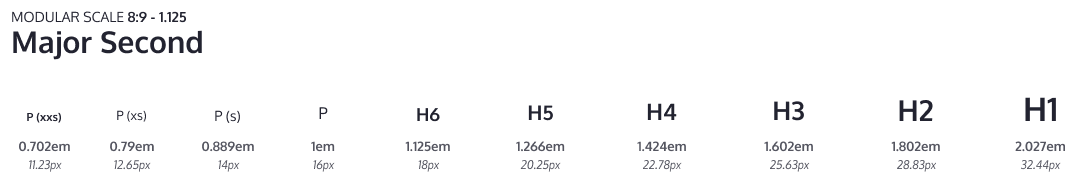
The base font size used on the style guide is 16px. For other font sizes, a modular scale is used to keep a good rhythm across the UI texts, but a small one that let us have enough font-size variations and hold hierarchy.
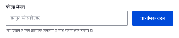
This style guide is designed to use system fonts which comes with various benefits, including improved performance and better support for various writing systems. Using system fonts will also make the UI feel like more familiar to the user since the look and feel will be closer to the users' environment.
Mockup of the interface with text written using Devanagari writing system rendered using system fonts on macOS.

Mockup of the interface on Linux, KDE (Oxygen) and Mac OS (San Francisco).
Color palette
This style guide is using a light color palette where the blue is vivid and greys are more neutral. The goal is to get a visually simple UI where important things like primary buttons stand out. This proposal evolves the 4 primary colors currently in Seven, and adds a wider range of greys.

Iconography
Icons should be reduced to its minimal form, expressing essential characteristics to be interpreted. Avoid outlined versions of icons to keep the UI clean and simple. Icons with a packed or swamped interface with too many lines should be avoided also.
To preserve the hierarchy and proportions several standard sizes have been defined.

Layers and surfaces
Spaces and elements will emulate physical qualities like depth and shadows to recreate an environment easier to understand and perceive.

Spacing and sizing
Spaces and sizes like paddings, margins or icon sizes will be tied to the modular scale defined by the typography to help us shape the interface with a proper rhythm and balance to make layouts more predictable and scannable.


Individual Components
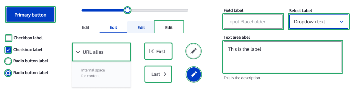
Buttons and Dropdowns
The main goal for buttons is to be easily identified as elements that can be clicked and interacted with. Several size variations also have been created to use in places with reduced space like tables.


Form fields
Basic text field works as a base for the styles used in all form elements. The main goal is to keep the form elements simple with the minimal graphic elements needed to keep them discoverable, usable and accessible. Font size is being incremented for labels to 14px and to 16px for values following the modular scale.
Field design also takes into account different elements that can be placed on it such as counters, icons or errors. These are included in the style guide for future support.


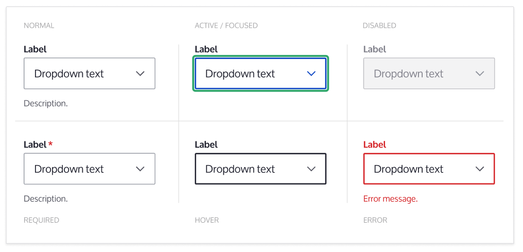
Selects
The select default style has been customized to fit in with the new design system and improve UX. We are aware this change could affect accessibility so that’s why we’ll make sure its implementation will keep selects accessible.
Basic Form Controls
Form elements like checkboxes and radios follow the same visual guidelines as other form elements to keep the design consistent.
The style guide contains designs for each possible variation to keep accessibility in mind, even they may not be widely used.

Tables
Tables have been designed to have high row height to accommodate large text sizes and adapt the color palette. The design uses icons for indicating when a column is sortable or sorted.

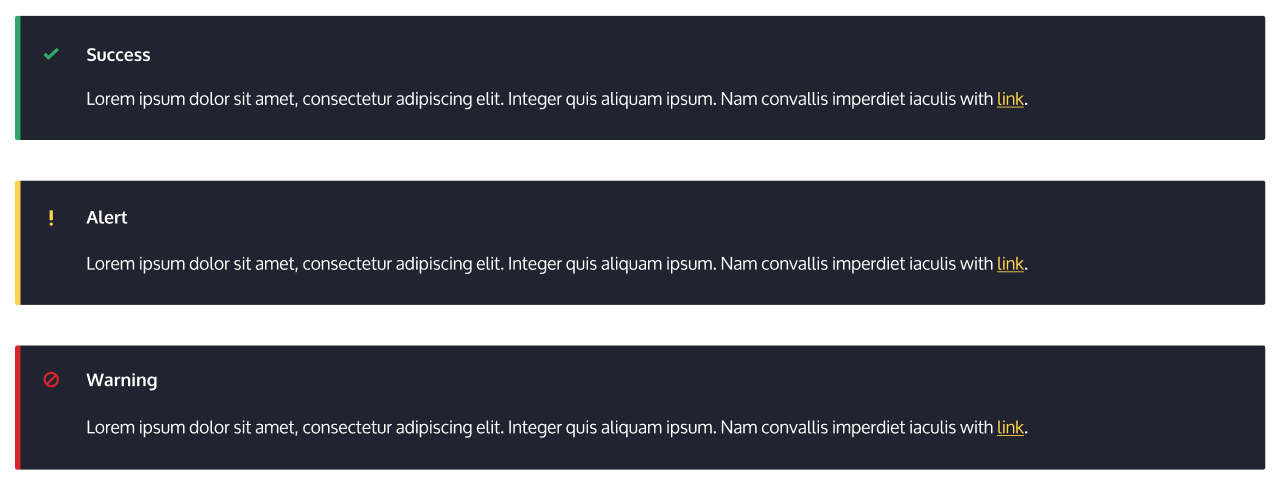
Messages
The goal for the messages design is to reduce the amount of colors used and make sure there’s good color contrast by using the same styles the regular text has (link color, bold…). To do so, the color bridge has been widened to have enough color space to represent the warning level and to accommodate the icon. This solution works well for both small and long error messages.
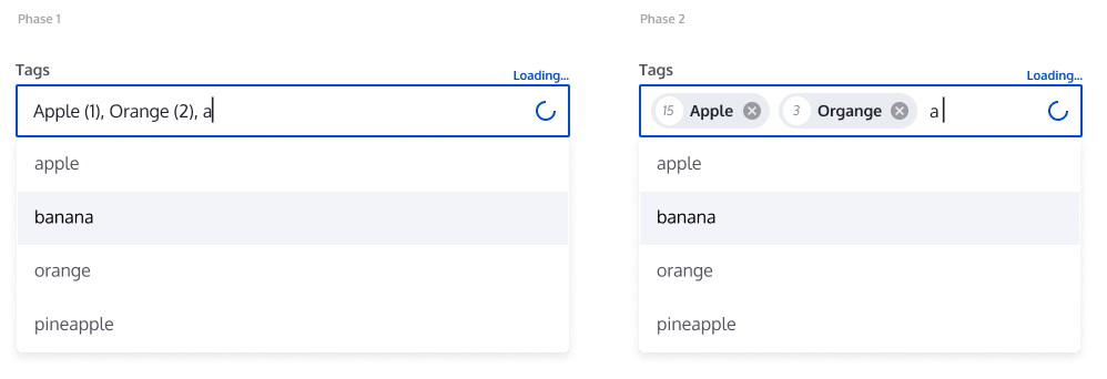
Tags or Entity reference
The implementation for this component is planned to have 2 phases. The first one will refresh the current field with the new field styles and will add a new throbber. A second phase will introduce a new component to represent entities inside fields.
Breadcrumb and page title
The combination of the page title and the breadcrumb, together with the shortcut link, results in the header. The breadcrumb has been placed over the title to make it easier to find the current location in the application.

Navigation list
The navigation pages on the admin UI has been designed with an emphasis on readability, and reusability of existing styles from other components.

Details and accordions
This specific component will have several variations defined together with the main goal to unify all the related implementations by using similar properties and behaviors. For example, different implementations can be the html details, the accordion in the sidebar in a node form or the toolbar when it’s placed vertically.
All the variations will use the same directions for arrows (pointing right when collapsed, pointing bottom when opened) and the label for details is going to be 16px.

Pages
To help you review and give feedback on the proposed visual styles in-use, we’ve prepared several pages with the new designs implemented.
Node edit form
As explained in previous sections, the changes on this first iteration will remain on a CSS level. In this page the perception change relies on the text size increment, the increased spacing, the element simplification and the lighter colors. This way, the content will get more relevance because only the focused, active or clickable elements are highlighted.

Content list
This page works as an example to see the proposed design for tables. The text size increment, the row minimum height increment and the color palette keep the focus on the actionable or clickable elements on content on a busy UI. In this page the pager component is visible to see it working together with the table. Also, 2 different button sizes have been used.

Admin forms
The 4 forms pages attached demonstrate several implementations of the designed components, using tables, details, tabs or fields. A component introduced here is the vertical tables in the Configure block. You can find attached the Block Layout, the Configure Layout, Text formats and editors and Cron forms.
Source files
We create designs with Figma because it allows several people to interact at the same time, leave comments and share links online.
The Design System figma file contains the components, while the Claro UI figma file includes the UI Examples for the Claro Theme (based on the components of the Design System.
Help improve this page
You can:
- Log in, click Edit, and edit this page
- Log in, click Discuss, update the Page status value, and suggest an improvement
- Log in and create a Documentation issue with your suggestion


