
 Support for Drupal 7 is ending on 5 January 2025—it’s time to migrate to Drupal 10! Learn about the many benefits of Drupal 10 and find migration tools in our resource center.
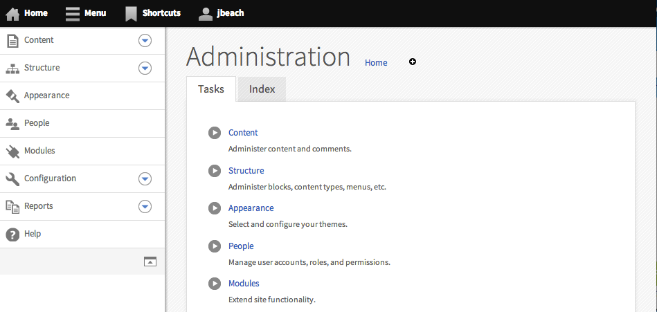
Note: Previously named "Mobile Friendly Navigation Toolbar"
A very simple mobile friendly navigation toolbar introduced as part of the Spark project to solve mobile editing problems with the Drupal 7 shipped toolbar, that is not very friendly to small screen sizes.
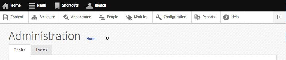
The Navbar module displays a bar containing top-level administrative components across the top of the screen. Below that, the Navbar module has a drawer section where it displays links provided by other modules, such as the core Shortcut module. The drawer can be hidden/shown by clicking on its corresponding tab.
In addition to providing responsive access, the vertical orientation of Navbar provides deep-level access into administrative functions without refreshing the page.
Prerequisites
Navbar requires the following:
- Libraries module (version >= 2.0)
- Backbone JavaScript library (version >= 1.0)
- Underscore JavaScript library (version >= 1.5)
- Modernizr custom build (version >= 2.6.2)
Please read the documentation for detailed installation instructions as Modernizr, in particular, requires additional attention.
Always always always check /admin/reports/status to see if you are missing any requirements for this module.
Icons
The toolbar uses the SVG icons designed by ry5n: https://github.com/ry5n/libricons.
If you are creating a custom tab or menu item that needs an icon, either draw them from this library, request a new icon, or use an icon as a base for your needs. Do send a pull request to the libricons and give back if the icon your create fills a gap in the set.
Supporting organizations:
Project information
 Maintenance fixes only
Considered feature-complete by its maintainers.- Module categories: Site Structure
 7,731 sites report using this module
- Created by Gábor Hojtsy on , updated
 Stable releases for this project are covered by the security advisory policy.
Look for the shield icon below.
Releases
7.x-1.8
released 26 January 2022
released 26 January 2022
Works with Drupal: 7.x
✓ Recommended by the project’s maintainer.
Development version: 7.x-1.x-dev updated 26 Jan 2022 at 12:45 UTC


